Custom Map Legends
Scenario Description
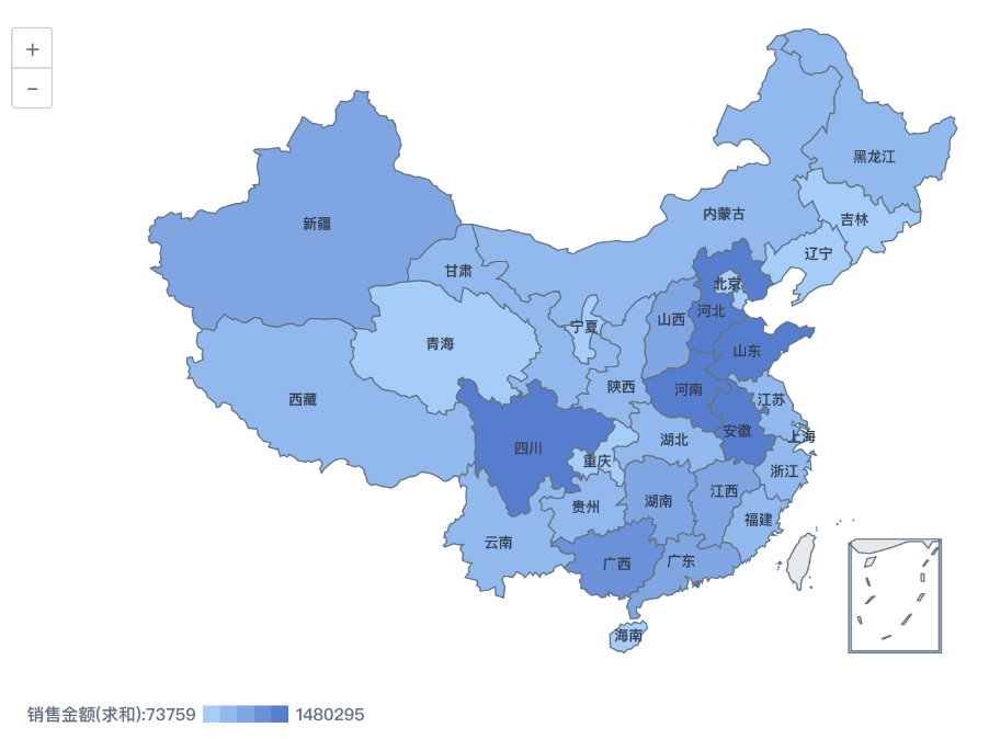
When creating a China administrative map visualization, if no settings are applied to the legend below the map, it is displayed with the default gradient colors. If you want to display different colors based on specific intervals, how should you configure it? This document introduces two methods for reference.
Solutions
Method 1
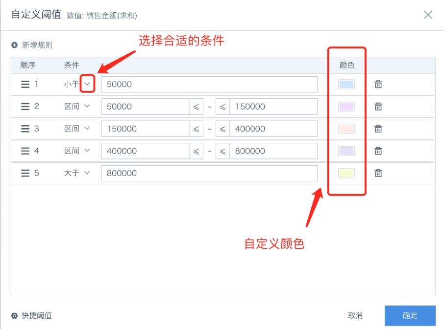
Place the metric field in the Color area. Click the field and choose Color Settings — Custom Threshold. Create rules and set the interval ranges and colors.

The effect is shown below:
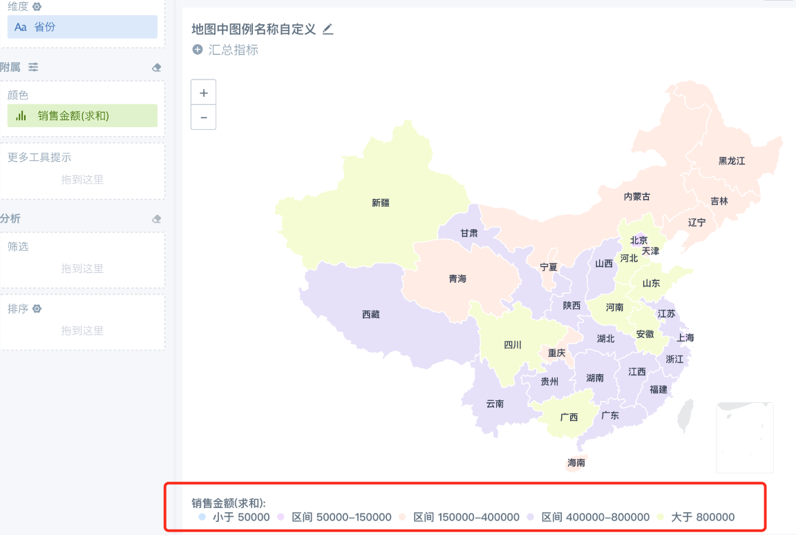
Because the legend does not support data format settings, this display effect may not meet requirements when the data values are large. In this case, refer to Method 2.
Method 2
You can implement this by creating a metric name with a CASE WHEN function.
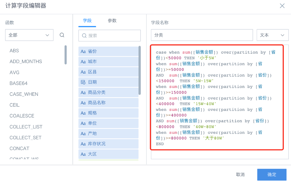
- Create a text field named "Category". Refer to the following function:
case when sum([Sales Amount]) over(partition by [Province]) < 50000 THEN 'Less than 50K'
when sum([Sales Amount]) over(partition by [Province]) >= 50000
AND sum([Sales Amount]) over(partition by [Province]) < 150000 THEN '50K~150K'
when sum([Sales Amount]) over(partition by [Province]) >= 150000
AND sum([Sales Amount]) over(partition by [Province]) < 400000 THEN '150K~400K'
when sum([Sales Amount]) over(partition by [Province]) >= 400000
AND sum([Sales Amount]) over(partition by [Province]) < 800000 THEN '400K~800K'
when sum([Sales Amount]) over(partition by [Province]) >= 800000 THEN 'Greater than 800K'
END
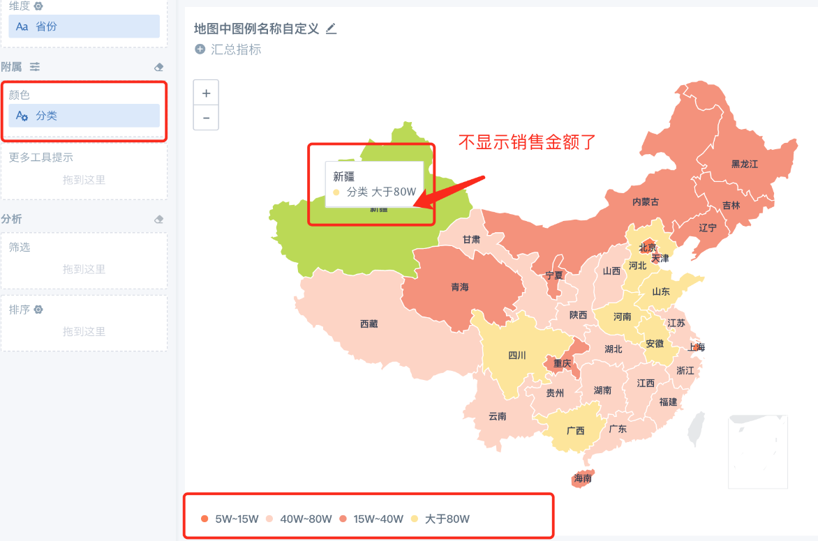
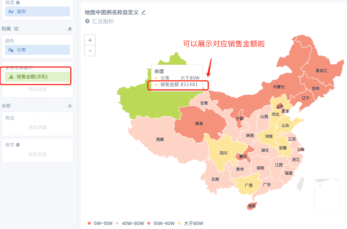
- Drag the Category field into the Color area. At this point, the legend can already be displayed according to the function settings, as shown below. However, you will notice that the sales amount is no longer displayed in the data label. Add the Sales Amount field to More Tooltips to complete the configuration.
- Finally, you can choose a suitable theme color through Theme/Color settings.