Use Arrows in Tables to Show Growth Trends
Background
When analyzing data growth trends, such as YoY or MoM, in traditional Excel tables, many people are used to using upward or downward arrows and different colors to show data change trends. When creating table reports in BI, many users also want to keep this habit. How can this effect be implemented in Guandata BI?
Implementation Methods
There are three implementation methods. The demo case uses YoY/MoM calculation as an example. Choose the appropriate method as needed.
1. Simplest Method
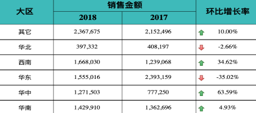
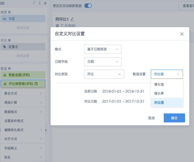
- In the table, use the advanced feature YoY/MoM to calculate the comparison value, growth value, and growth rate as needed. Because the arrow must use a separate field, drag in one more field to obtain the YoY/MoM growth rate.
Note: The calculated values above all use the same value field and display the same column name. You can set aliases separately to distinguish them.
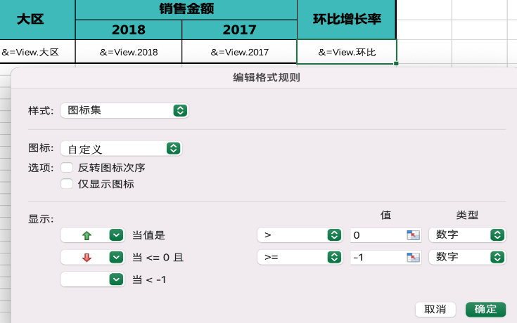
- Click one of the growth rate fields, which is named Trend, select Set Conditional Formatting from the menu, and create a column rule. Set the numeric range of this field to less than or equal to 0. For Replace Data, select Replace with Symbol, choose the downward arrow, set the font color to green, and click OK to save. Then create another column rule for the red upward arrow. If subtotals and totals are displayed in the table, you can select Apply to Subtotals and Totals and save.
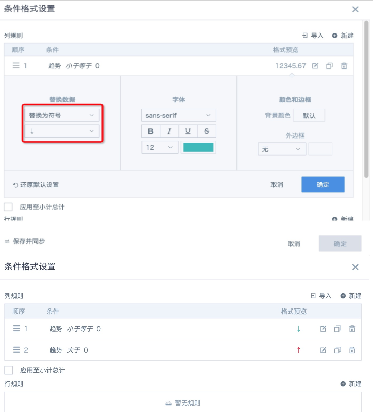
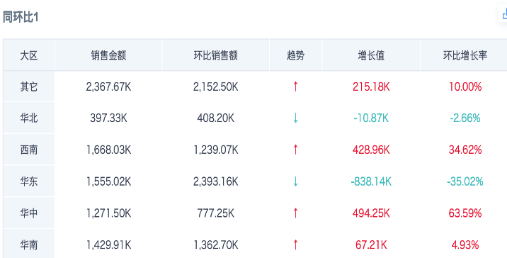
- If other fields need to use the same color style rules, follow the previous step to create column rules and keep Replace Data as None. The final display effect is shown below.
2. Better but More Complex Method: Requires Familiarity with SQL
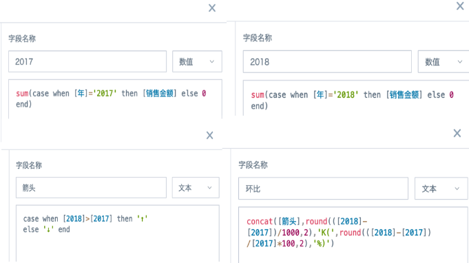
- Create calculated fields to calculate data for the current period and the comparison period separately. In the figure below, four calculated fields are created to calculate sales amounts for 2017 and 2018, the arrow, and a field that concatenates the arrow with the growth value and growth rate. The growth value and growth rate must use functions in the formula to directly specify format and precision.
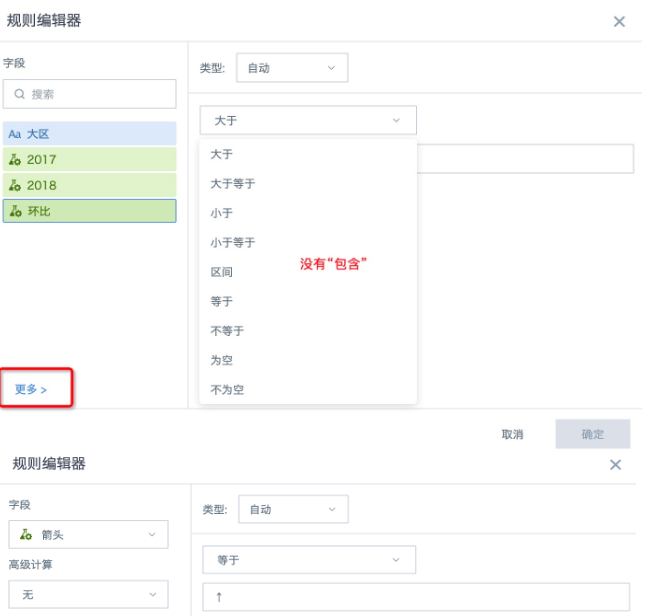
- Drag the newly created fields into the value area as needed, and click the MoM field to set conditional formatting. Because newly created aggregated metrics are treated as numeric fields by default, the Contains relationship cannot be selected when configuring rules. Click More in the lower-left corner to manually select the Arrow field created in the previous step, set the field equal to ↑, set the arrow color, and click OK to save. Configure both upward and downward arrows and save.
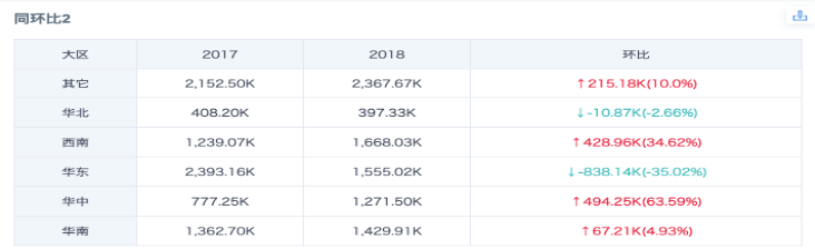
The final display effect is shown below.
3. Excel-Like Method: Requires the Complex Report Feature to Be Enabled in BI. This Feature Is a Value-Added Service.
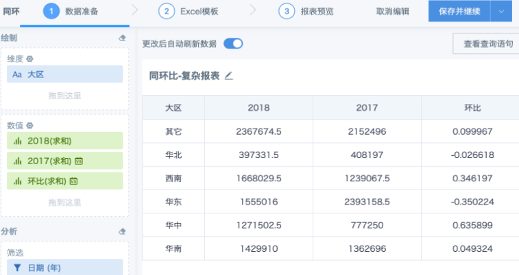
- Create a complex report. In the data preparation interface, drag in fields and use the advanced calculation feature YoY/MoM to calculate the required data.
- Create an Excel template locally, configure the table header, cell format, and formulas. For the MoM growth rate column, set the field format to percentage and configure conditional formatting as shown below.
- Save the Excel file, upload it to BI, and save. The display effect is as follows.