Pareto Chart Usage and Scenarios
Background
A Pareto chart, also known as Pareto analysis, is a type of bar chart. The length of each bar represents frequency or cost, such as time or money, with the longest bars arranged on the left and the shortest bars on the right. In this way, the chart intuitively shows which situations are more important. As a root cause analysis tool, it is considered one of the seven basic quality tools.
Pareto analysis is a statistical technique used in decision-making to select a limited number of tasks that produce significant overall effects. It uses the Pareto principle, also known as the 80/20 rule: by completing 20% of the work, you can obtain 80% of the benefit from the overall work.
Using quality improvement as an example, the vast majority of problems, 80%, are caused by a few key reasons, 20%. This technique is also called the Critical Few and Trivial Many, and is an important concept in Six Sigma and DMAIC.
Extended Knowledge
-
Six Sigma, 6 Sigma, is a management strategy. It mainly emphasizes setting extremely high goals, collecting data, and analyzing results to reduce defects in products and services. The principle behind Six Sigma is that if you can detect how many defects exist in your project, you can find ways to systematically reduce defects and make the project as close to perfect as possible. For an enterprise to reach Six Sigma standards, its error rate must not exceed 3.4 per million.
-
DMAIC is an important process improvement tool in Six Sigma Management. It is a process improvement method consisting of five phases: Define, Measure, Analyze, Improve, and Control. It is generally used to improve existing processes, including manufacturing processes, service processes, and work processes.
Pareto Chart Application Scenarios
-
When analyzing data related to the frequency of problems or causes in a process.
-
When there are many problems or causes and you want to focus on the most important ones.
-
When analyzing broad causes by looking at specific causes.
Application Example
The following uses a simple scenario as an example:
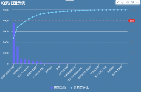
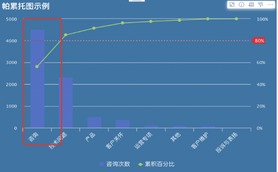
An enterprise provides after-sales service for customers. It uses a Pareto chart to analyze which types of customer problems account for the largest proportion of daily issues solved by staff. This helps locate the main areas where customer issues concentrate, determine the key capabilities staff must have as hiring requirements or training priorities, and support decision-making and efficiency improvement.
-
Data preparation: prepare the corresponding dataset. We recommend cleaning the data in advance.
-
Create a card: Create Card - Visualization Chart - Select Data Table - Search Pareto Chart.
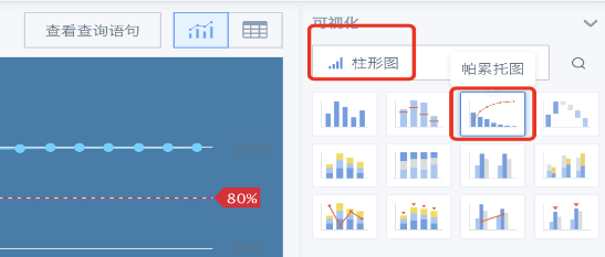
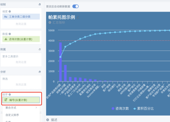
- Drag in dimension fields and one value field as needed. Sort the value field. Descending order is recommended to improve chart readability.
-
We recommend making good use of chart properties, such as theme colors, legend settings, and card property settings, to beautify the chart and enhance visualization.
-
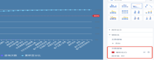
We recommend adding an 80% reference line to the Pareto chart so that the important 20% is clear at a glance.
Effect