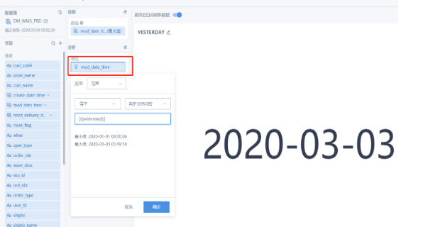
Display Dates on Cards to Indicate Business Data Timeliness
Requirement Description
Scenario 1
Display the data update time at the beginning of the entire page to understand the cutoff date of the current data.
Real-time page:
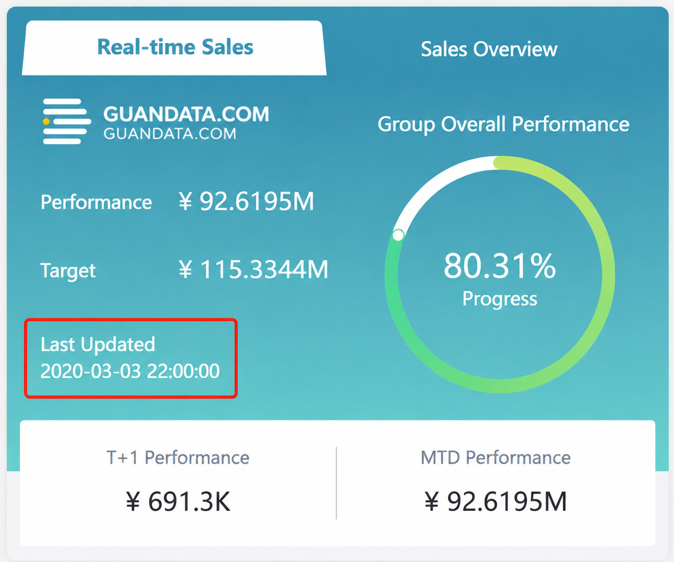
When the page is subscribed to or exported as PDF, the file must include the date and time.
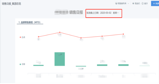
Scenario 2
In a column-line chart, the axis displays dates and only displays days. The card needs to tell users which month the card's data belongs to, or provide other similar information.
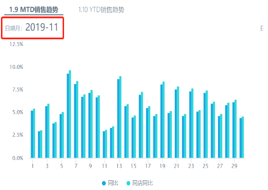
Scenario 3
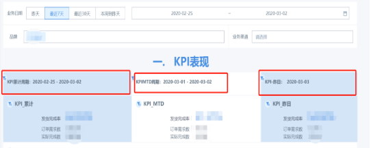
In analysis, business users need to filter by arbitrary time ranges, but some content is fixed-period data. In the example below, the time filter shows the most recent 7 days. One metric shows the cumulative value for the selected range, one metric shows MTD, and one metric shows yesterday. The date also needs to be displayed on the card for business reference.
Demo Experience
Log in to experience the demo case: Display Dynamic Dates in Card Titles.
Case Download
Download this case from Guandata App Marketplace to your local environment: Dynamic Time Macro.
Requirement Implementation
There are two implementation methods.
Method 1
Implement this by referencing card data in a text card, or by creating a KPI card or comparison KPI card. The specific implementation is as follows:
Step 1: Create a new text card and click Reference Card Data while editing.
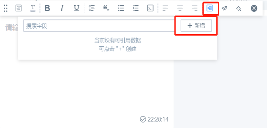
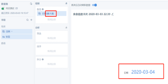
Step 2: Click Add, and drag the date field into the value area of the KPI card as needed.
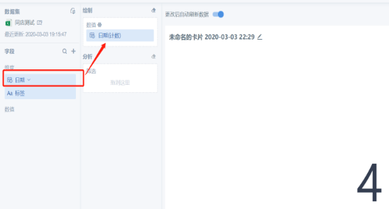
Step 3: Change the field aggregation method to Maximum or Minimum so it can be displayed in date format.
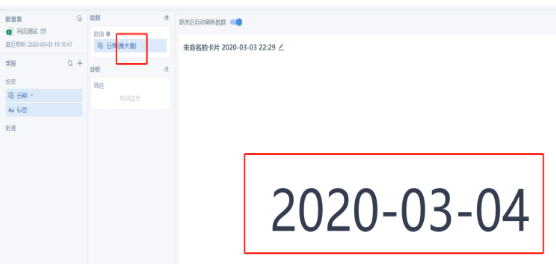
After Maximum or Minimum is selected as the aggregation method, the corresponding result has only one value.
· When the page has a date filter, the linked date has only one value and changes with the filter.
· When the page has no filter, you can drag the date field into the card filter and adjust the date to be displayed.
You can also directly create a KPI card or comparison KPI card to display the date. The steps are the same as creating a card, and the key step is also Step 3.
Method 2
For cards that support creating summary metrics, use the following steps when a date needs to be displayed:
Using a grouped chart as an example:
Step 1: Create a grouped chart card and drag in the required fields.
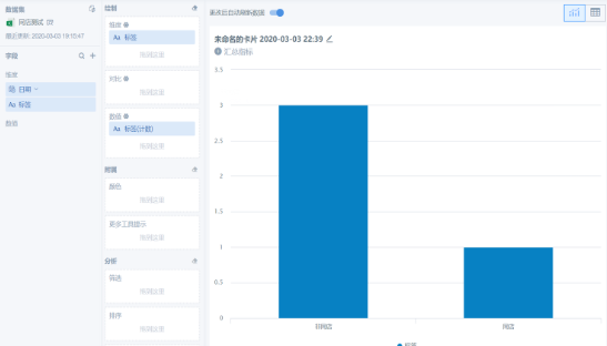
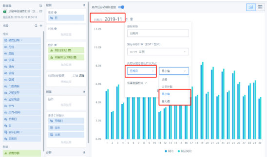
Step 2: Click the summary metric, select the calculated metric as the date, and change the aggregation method to Maximum or Minimum.
Brief Implementation Summary for the Three Scenarios
Scenario 1: Method 1 can solve it.
Scenario 2: Method 2 can solve it.
Scenario 3: Method 1 can solve it, but it also needs to be combined with a date filter and newly created fields. The following screenshots illustrate the setup:
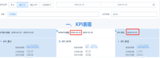
KPI cumulative period:
· Start date: select Minimum as the aggregation method.
· End date: select Maximum as the aggregation method.
KPI MTD period:
· First day of the month: create a field and use the function trunc([Date], 'MM'). Select No Processing as the aggregation method.
· End date: select Maximum as the aggregation method.
Yesterday:
· Date: select Maximum as the aggregation method and do not link it with the date filter.
Alternatively, use a time macro in the card's date filter.