Set Dynamic Date Ranges Based on Date
Scenario
In visualization dashboards, column charts and line charts are often used to display period trend changes that include the current day. However, whenever a new period starts, such as the beginning of a year, month, or week, the data volume is small, and the column chart or line chart may show an obvious downward trend. This can mislead dashboard viewers into thinking that business performance or operations have problems. Therefore, at the beginning of a period, the current period should not be displayed; only data from previous periods should be displayed.
Case
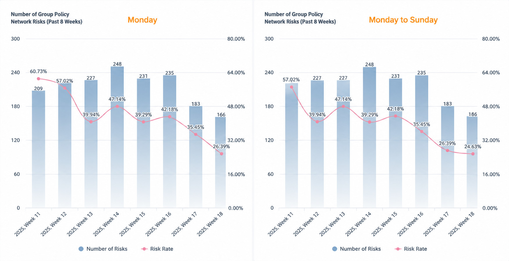
Create a user group activity trend chart for the most recent 8 weeks. Expected effect: every Monday, do not display current-day data and display data from the previous 8 weeks. From Tuesday to Sunday, display data from the current week and the previous 7 weeks. See the figure below. The date range displayed on the X-axis changes dynamically with the current date.
Implementation Steps
1. Extract the Monday Date and Distinguish Dates by Week
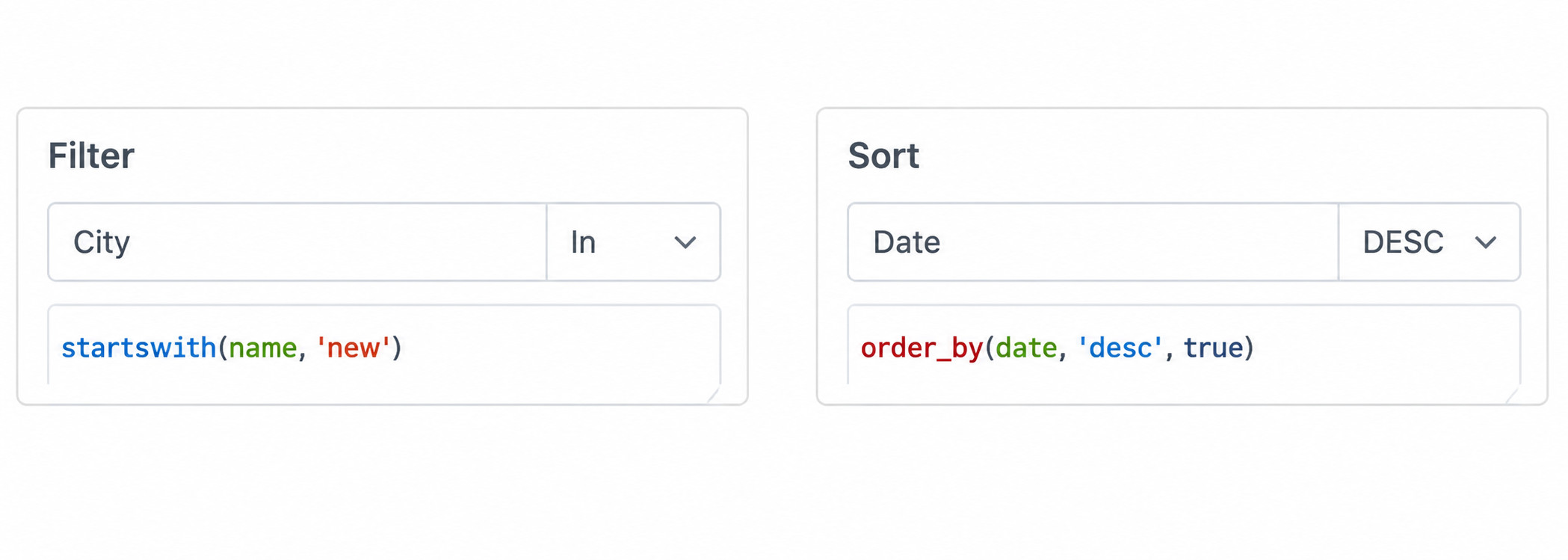
Create a calculated field named Week Date in the card. Use trunc, which returns a date format, or date_trunc, which returns a datetime format, to obtain the Monday date of the week that contains the date field.
2. Determine the Most Recent 8 Weeks Logic
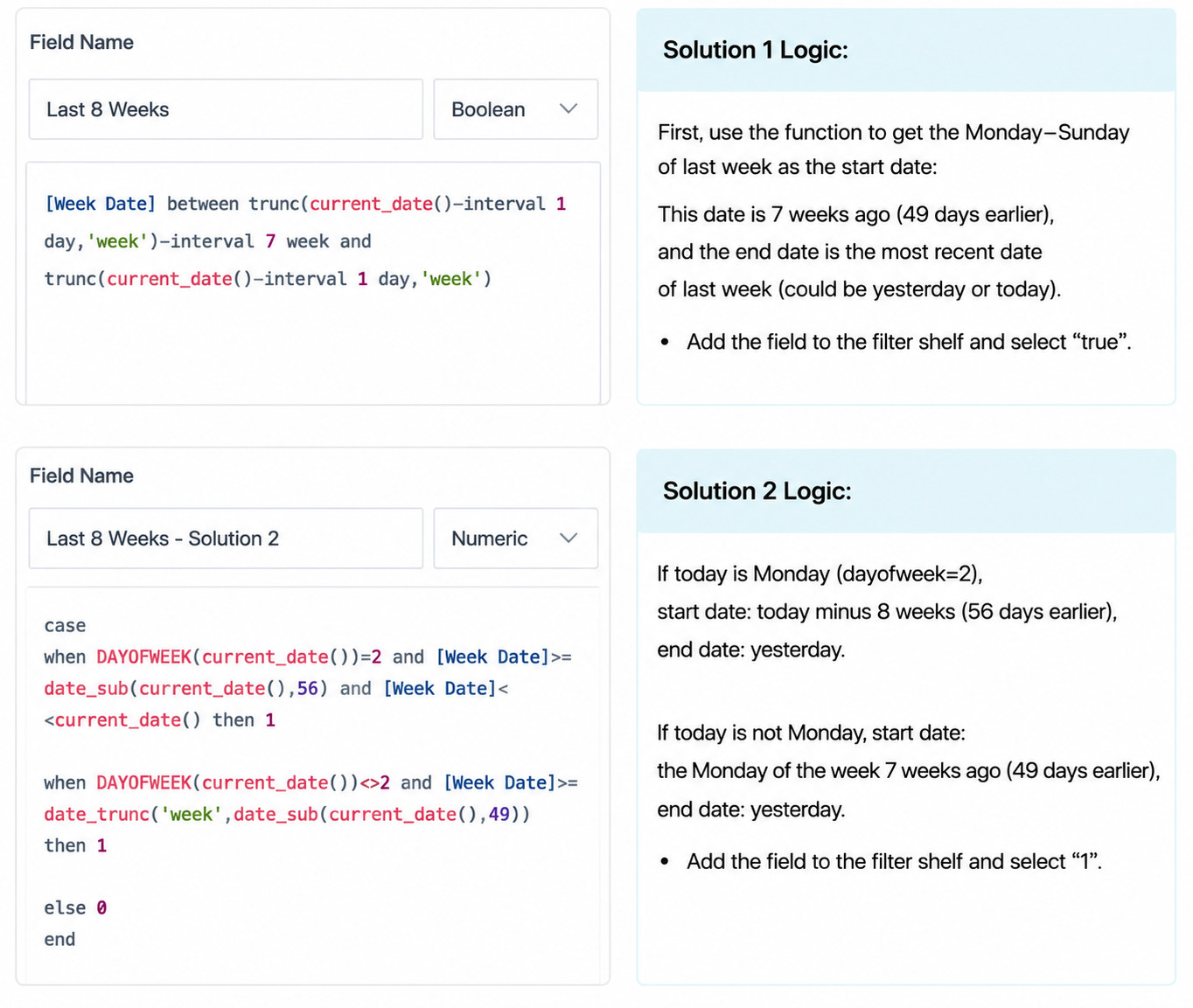
Create a calculated field named Most Recent 8 Weeks and place it in the filter area. There are multiple ways to determine the most recent 8 weeks. The following provides two options for reference.
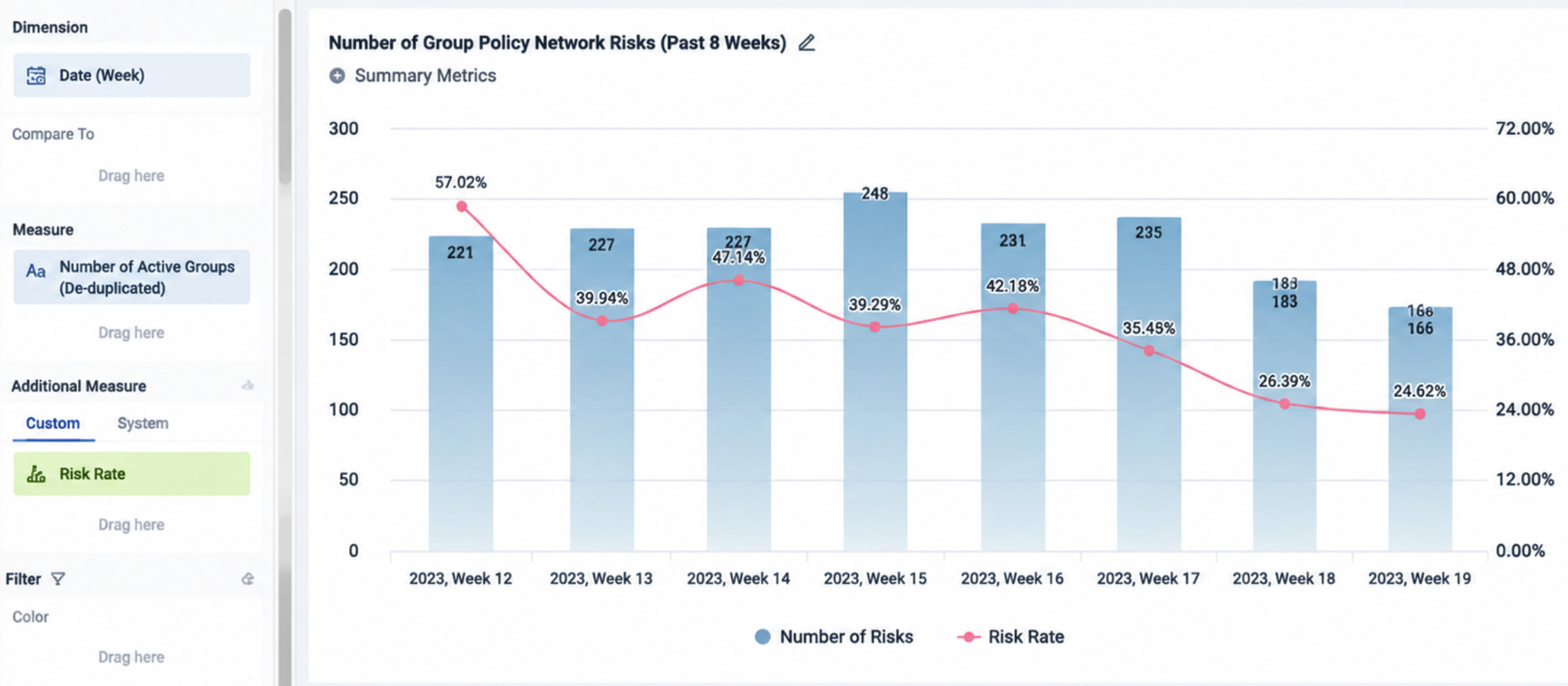
The overall card settings are shown below.
Notes
In scenarios where data needs to be aggregated to the week dimension, some users are used to using the weekofyear() function to obtain the week number and then using this week number to control date filtering. In this case, Most Recent 8 Weeks can also be filtered with the following formula.
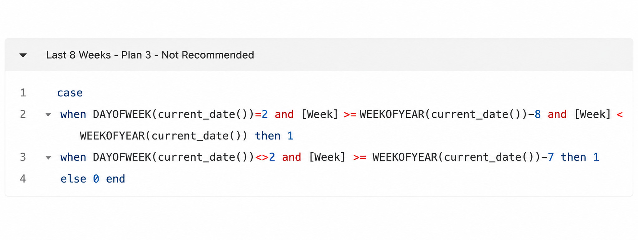
However, this option is strongly not recommended. The main disadvantages are: when the dataset contains multiple years or cross-year data, not filtering by year causes the same week in different years to be mistakenly included in the calculation. Filtering by year causes data from the previous year in the most recent 8 weeks to be unavailable after a year boundary, such as in January or February each year.
Others
For non-period trend charts, if a filter only needs to filter a single period, such as the current month, you can use a selection filter and set the default option with a time macro. This allows the default display to show the previous period on the first day of a month or on Monday, and to show the current period at other times. See the figure below for filter settings.
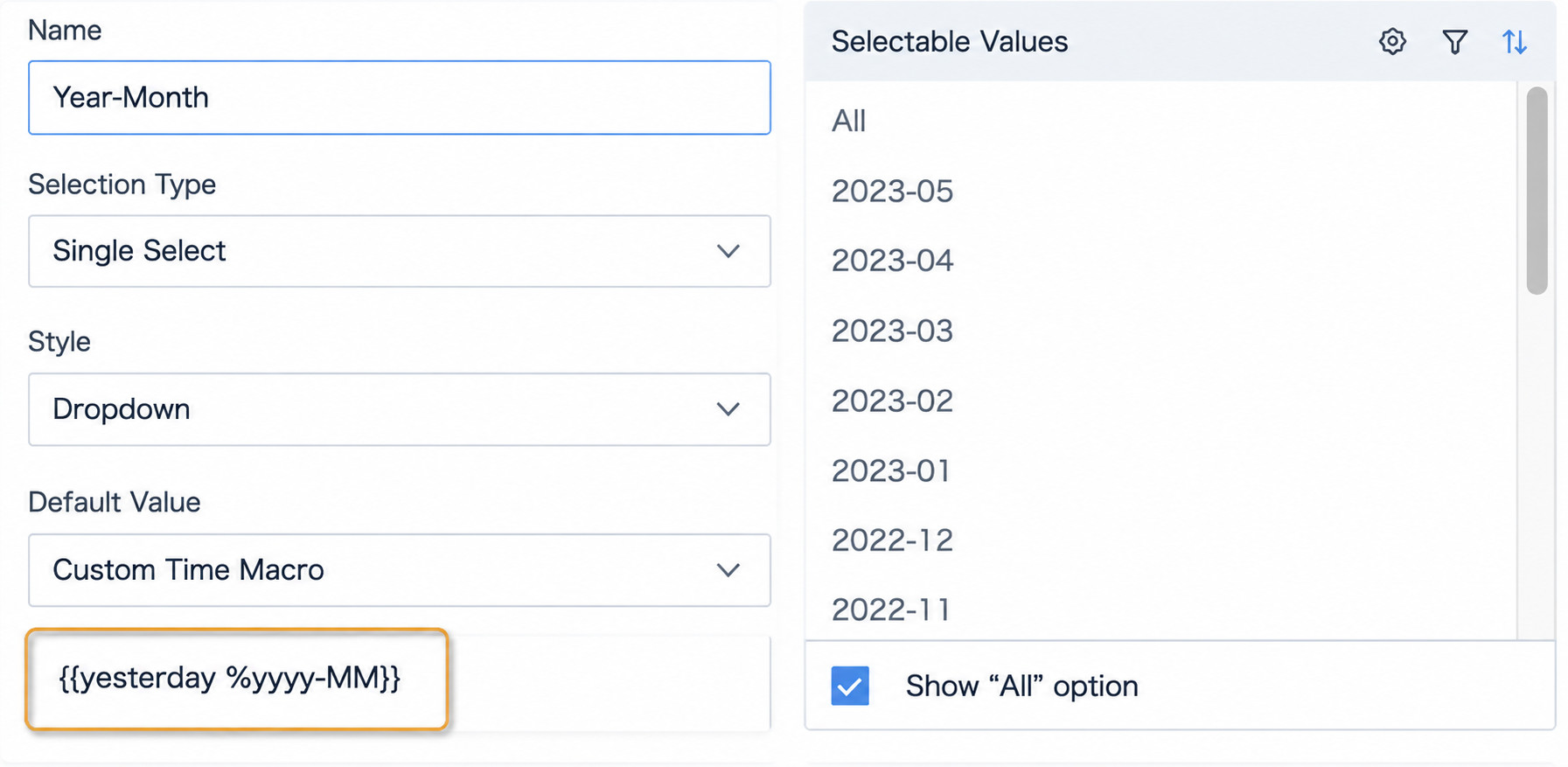
If the visualization chart only needs to display data for the current month and exclude today's data, and does not need a filter to control time period display, you can filter the date field on the card editing page and select a quick date range, such as This Month to Yesterday. This can also display data from the previous month on the first day of the month. Other periods work similarly.
References: Using Time Macros Spark Date Functions and Applications