Dashboard Background Settings
Final Effect Examples
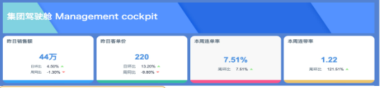
-
Desktop
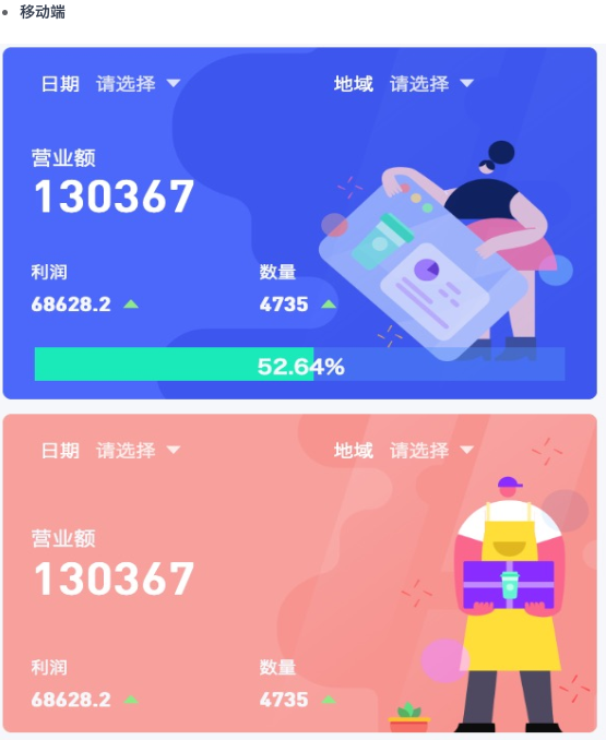
-
Mobile
These two view effects are mainly implemented by adjusting the dashboard background color. How can this be implemented?
Operation Steps
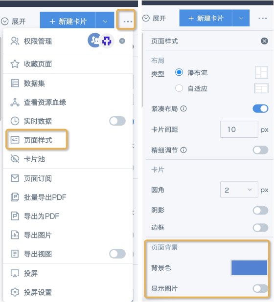
Entry points for setting background colors in Guandata BI:
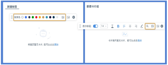
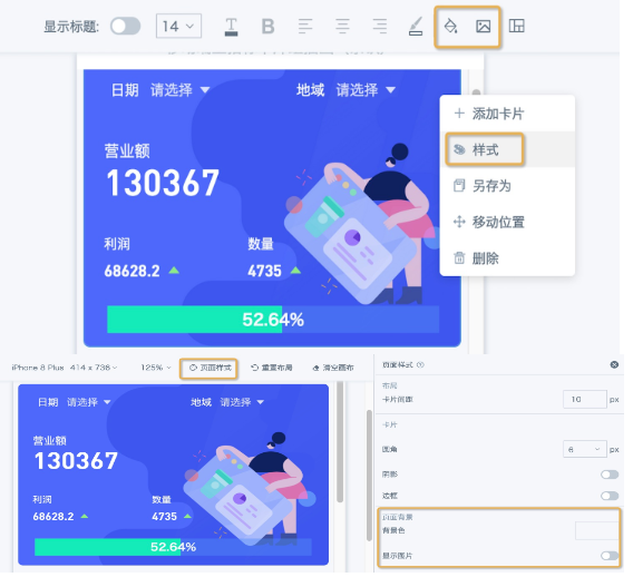
1. Dashboard page: In the menu bar in the upper-right corner of the page, choose Page Style — Page Background. You can set the background color and background image. When both background color and background image are used, the image is displayed first, and the background color is shown in areas not covered by the image.
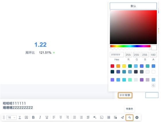
2. Card: On the right side of the editing page, choose Card Settings — Card Background. Only background color is supported, and transparent background color is supported by setting the A value in RGBA to 0. Text cards and table cards currently do not support transparent color settings.
3. Tab components and card group components: Background color and background image can be configured in the menu bar style, and the settings take effect for all cards inside the component. That is, cards placed in tabs and card groups do not need to have transparent card background colors configured separately; they directly display the component background.
In this example, both desktop and mobile effects are implemented with card group components. Key implementation points:
A. The title bar "Group Cockpit" looks like a text card, but it is actually a card group. Because text cards themselves do not support background images, a card group is used here. Set a background image for the card group, add a text card, configure the text card style, and drag it to the required position.
B. The four KPI cards below are actually four independent card groups. Different background images are uploaded for each card group, and one KPI card is added inside each card group.
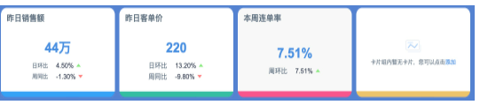
C. Because card groups cannot cover the entire dashboard page, areas outside the card groups still display the default theme color, such as Ibis White or Moonlight Blue. If only the card group background color is configured, the overall page may sometimes look inconsistent. Therefore, we recommend setting a solid background color in the same color family for the dashboard at the same time.
D. Tabs and card groups created on desktop cannot be directly synchronized to mobile. The mobile layout page only supports selecting cards from desktop. Therefore, you need to add a card group or page header component from Page Components on mobile, and reset a background more suitable for mobile in Style. Click Page Style at the top to set the background and other styles for the entire page.
Notes
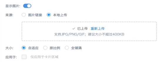
1. Background images support image links and local image uploads. Supported formats are jpg, png, and gif. For local uploads, we recommend a size no larger than 400 KB. The actual upper limit is 1 MB, and uploads fail if the file exceeds 1 MB. You can set the image display mode and application area as needed. The display effect of image links is easily affected by network conditions and cross-domain restrictions, so local upload is generally recommended.
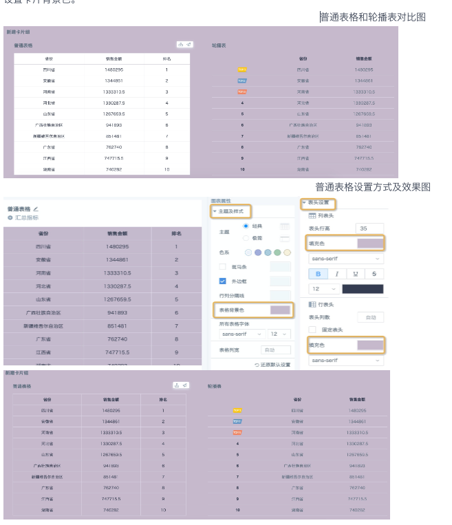
2. Transparent color settings on table cards themselves do not currently take effect, and component background colors do not take effect for most tables. Currently, only carousel tables support setting transparent colors separately for headers and tables, allowing the component or page background color to show through completely. Therefore, for table cards other than carousel tables, we recommend setting the header fill color and table fill color on the card editing page to the same color as the component or page background, or to a color in the same color family. If the table card is placed directly on the page, you also need to set the card background color.