Chart Types
Overview
Charts provide a flexible and intuitive way to present data and are one of the core carriers of business insights. They make abstract and complex data easier to understand and support analysis from multiple angles and levels.
Choosing the right chart type helps users communicate information more accurately and efficiently. Guandata BI provides a wide range of built-in chart types. Based on the current interface shown in the screenshots, the supported chart types include:
Single Column,Grouped Bar,Stacked Bar,Grouped Bar and Line,Grouped Bar and Symbol,100% Stacked Bar,Grouped Stacked Bar,Stacked Bar and Line,Stacked Bar and Symbol,Bullet,Waterfall,ParetoSingle Bar,Grouped Bar,Stacked Bar,100% Stacked Bar,Grouped Stacked Bar,BulletLine,Multi-Line,Stacked Area,Percentage Stacked AreaPie,Rising Sun,Treemap,Funnel,Horizontal FunnelChina Normal Map,China Bubble Map,China Symbol Map,Migration Map,Heat Map,Baidu Map Widget,World MapSingle Value,KPI Card,Progress Bar,Circular Progress Bar,Multi-Circular Progress Bar,Liquid Fill Gauge,Filled,Trend IndicatorBubble,Scatter PlotHeat Map,Item View,Word Cloud,Box Plot,Two-dimensional Sankey Diagram,Multi-dimensional Sankey Diagram,Calendar View,Dumbbell plot,RadarEtone Indoor Map,Feng Indoor Map,Planimetric Map
Basic Charts
Single Column
Single Column charts are suitable for two-dimensional datasets. They are typically used to show changes over time or comparisons across categories. Categories are displayed horizontally and values vertically, making them suitable for highlighting changes under different conditions in small to medium-sized datasets.
For example, when the finance team needs to compare revenue across provinces, it can use a column chart to show revenue differences and identify growth trends or seasonality.
a. In the chart type panel, select Single Column. The recommended field combination is 1 Dimension + 1 Measure.
b. Follow the charting guidance and drag the required dimension and measure fields into the chart area.
Single Bar
Single Bar charts are also suitable for two-dimensional datasets and are typically used to compare values across categories. They are especially useful when category names are longer and need more horizontal display space.
For example, in market research, a team can use a bar chart to compare monthly sales across different products or business units.
a. In the chart type panel, select Single Bar. The recommended field combination is 1 Dimension + 1 Measure.
b. Follow the charting guidance and drag the required dimension and measure fields into the chart area.
Line
Line charts are suitable for showing changes over continuous time periods and are especially useful when you want to observe trends and emphasize time order.
For example, in sales trend analysis, a line chart can show changes in product sales across different time periods so teams can quickly identify growth or decline trends.
a. In the chart type panel, select Line. The recommended field combination is 1 Dimension + 1 Measure.
b. Follow the charting guidance and drag the required dimension and measure fields into the chart area.
If rankings need to be displayed in descending value order, for example when a smaller numeric value means a higher rank, you can use reversed line chart settings. After dragging a measure into the line chart, configure it in Chart - Chart Properties > Axis.
- In
X Axis, enableAxis fixed at topto display the X axis at the top. - In
Y Axis, enableReverse scale valuesto display values from large to small from bottom to top.
An area chart is derived from a line chart. In the chart properties panel on the lower right, enable Show filled area under Graphic Display. You can choose either a solid or gradient fill. For more details, see Chart - Chart Property.
Pie
Pie charts show the size of each part and its proportion of the whole.
For example, in market share analysis, a team can use a pie chart to show the share of a brand across provinces.
a. In the chart type panel, select Pie. The recommended field combination is 1 Dimension + 1 Measure or 0 Dimensions + Multiple Measures.
b. Follow the charting guidance and drag the required fields into the chart area.
Pie charts also support additional features such as displaying only the top N categories and grouping the remaining categories into Others, which helps users identify key segments more quickly.
- For pie charts with one dimension, detailed configuration is available in
Chart - Chart Properties > Pie. - If you need to sort and merge categories based on values, drag a measure into the
Sortarea. - After enabling
Merge into Others, drill-down, linkage, and jump actions on values grouped intoOthersare no longer available.
Funnel
Funnel charts are suitable for process analysis when the business workflow is standardized, the cycle is long, and the process includes multiple stages. By comparing data across funnel stages, users can quickly identify where problems occur.
For example, during sales conversion analysis, a funnel chart can show the transition from potential customers to closed deals and highlight stages with lower conversion rates.
a. In the chart type panel, select Funnel. The recommended field combination is 1 Dimension + 1 Measure or 0 Dimensions + Multiple Measures.
b. Follow the charting guidance and drag the required fields into the chart area.
Grouped Bar
Grouped Bar charts are suitable for displaying data from different groups within the same category, or different categories within the same group.
For example, in a sales scenario, a grouped chart can show monthly revenue by province within the same quarter.
Stacked Bar
Stacked Bar charts are commonly used to compare totals across groups while also showing the relative contribution of each series within each group.
For example, a stacked chart can compare traffic obtained from different channels across provinces while also showing the daily total traffic.
Grouped Bar and Line
Grouped Bar and Line is a dual-axis chart. Dual-axis charts have two Y axes and are commonly used to combine columns and lines in a single view. They are suitable when two metrics differ greatly in scale or when users need to compare trends and period-over-period performance together.
For example, if you need to display monthly order amount together with average gross margin, the two metrics can be shown in the same card by using a dual-axis chart because their units and scales are very different.
Waterfall
Waterfall charts combine absolute and relative values and are suitable for showing how a total changes across several stages or contributing factors. They are commonly used in profit-and-loss analysis and bill-detail analysis.
For example, in profit analysis, a waterfall chart can show how initial funds are affected by each income or expense item and how they eventually lead to the final profit.
Radar
Radar charts, also known as spider charts, are used to display multivariate data on a two-dimensional plane. They are suitable for comparing relative values across multiple variables or showing the performance of a single subject across multiple dimensions.
For example, HR teams can use a radar chart to evaluate employee performance across different capabilities or performance indicators.
Scatter Plot
Scatter Plot charts show the approximate relationship between an independent variable on the X axis and a dependent variable on the Y axis. The more data points the chart contains, the more meaningful the comparison usually becomes.
For example, business analysts can use a scatter plot to examine the relationship between ad spending and sales, or between customer satisfaction and service quality.
a. In the chart type panel, select Scatter Plot. The recommended field combination is 1 Dimension + 2 Measures.
b. Follow the charting guidance and drag the required fields into the chart area.
Bubble
Bubble charts are derived from scatter plots. In addition to the X and Y axes, they add a third variable to represent bubble size, allowing more information to be displayed in a single chart.
For example, social science researchers can use a bubble chart to analyze average income, education level, and population size across cities.
Table
Table is one of the basic chart types supported by Guandata BI. For details, see Table Type.
Treemap
Treemap charts use nested rectangles to represent data. The area or color depth of each rectangle reflects the size or density of the data and helps describe relative proportions within hierarchical data.
For example, in financial analysis, a treemap can show how much each department contributes to the total budget.
China Normal Map
Maps are suitable for category comparison across regions and for analyses related to spatial attributes. They use different colors or intensities to represent value size and data distribution, providing intuitive geographic visualization.
For example, health departments can use China Normal Map to display the number of confirmed cases in each province and city and support precise prevention and resource allocation.
When the Color field in a map card is auxiliary, configure the map color as shown below.
When the Dimension field in a map card is auxiliary, configure the map color as shown below.
Single Value
Single Value cards are suitable for displaying commonly used KPIs, progress completion, and period-over-period indicators. This chart type directly displays the value of the selected field and is commonly used for metrics such as user count, click-through rate, and conversion rate.
For example, a sales team can use a single value card to monitor sales amount, order count, or customer count in real time.
a. Select Single Value under Metric & Progress.
b. Follow the guidance on the page and drag the required measure into the chart area.
c. In the chart area, you can configure field descriptions. Field descriptions can be synchronized from the input dataset. This capability is disabled by default. For instructions, see System Setting.
d. In the chart properties panel, configure the card size, labels, icons, and other display options.
KPI Card
Guandata BI also supports KPI Card. Like Single Value, it is used to display values directly, but it can show multiple measures for comparison in the same card.
For example, a KPI card can display current sales and last year's sales for the same period at the same time.
a. Select KPI Card under Metric & Progress.
b. Follow the guidance on the page and drag the required measures into the chart area.
c. In the chart area, you can configure field descriptions. Field descriptions can be synchronized from the input dataset. This capability is disabled by default. For instructions, see System Setting.
d. In the chart properties panel, configure the card size, labels, icons, and other display options.
Progress Bar
Progress Bar, Circular Progress Bar, and Liquid Fill Gauge are all used to display progress and are configured in a similar way.
a. Select a chart type under Metric & Progress, such as Progress Bar.
b. Follow the guidance on the page and drag the required measure into the chart area.
c. In the chart properties panel, configure the size, labels, colors, and related display options.
Trend Indicator
Trend Indicator is suitable for business scenarios where users need to focus on one core metric while also viewing its period-over-period values and historical trend. It combines multiple pieces of card information into a single chart, reducing chart-building time and lowering the analysis threshold.
Terminology
- Primary metric: a numeric field used as the main metric to analyze, such as
Order Quantity,Sales Amount, orDelivery Quantity. - Comparison metric: a numeric field used to compare with the primary metric, such as
Month-over-Month,Year-over-Year, or another metric value.
Chart Configuration
Configure dimensions and fields | Dimension | Affects the X-axis time and automatically generated comparison metrics. |
Measure | Affects the number of primary metrics. When you add or remove measure fields, the number of comparison metric boxes below changes accordingly. Note: click the configuration icon on the right side of the measure (primary metric) to configure the default value type, including aggregated data, the latest-date data, and current-period data. | |
Configure comparison metrics | Automatic mode | Automatically calculates year-over-year and month-over-month values based on the dimension. |
Add mode | Lets you choose any measure as the comparison metric. | |
Style adjustment | Supports adjusting the line color, icon, and other display properties for each primary metric. | |
Supports switching the trend display mode between line, column, and area styles, and between single-trend and split-trend views. | ||
Other Chart Types
Word Cloud
Word Cloud visually emphasizes keywords that appear more frequently by displaying them in a larger or more prominent form.
a. In the chart type panel, select Other Types. The recommended field combination is 1 Dimension + 1 Measure.
b. Follow the charting guidance and drag the required fields into the chart area.
Multi-dimensional Sankey Diagram
Multi-dimensional Sankey Diagram is a special type of flow diagram in which the width of each branch represents the amount of flow. It is commonly used in energy, materials, and financial analysis.
a. In the chart type panel, select Multi-dimensional Sankey Diagram under Other Types. The recommended field combination is at least 2 Dimensions + 1 Measure.
b. Follow the charting guidance and drag the required fields into the chart area.
Box Plot
Box Plot, also called a box-and-whisker plot, is a statistical chart used to show the distribution of a dataset. It displays the maximum, minimum, median, and upper and lower quartiles.
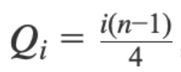
The Box Plot in Guandata BI uses the N-1 calculation method. The formula for position is shown in the figure below , where i = 1, 2, 3 and n is the number of items in the sequence.
a. In the chart type panel, select Other Types. The recommended field combination is 2 Dimensions + 1 Measure. When only one dimension is used, it corresponds to only one value. The second dimension is used to expand the number of rows so that multiple values can be displayed based on the specified field.
b. Follow the charting guidance and drag the required fields into the chart area.
In the example below, the service count of store B4 is 81, which exceeds the maximum and can therefore be identified as an outlier.
Dumbbell plot
Dumbbell plot is a useful visualization for comparing two values within multiple groups, or for showing changes in the same group before and after external influence.
Core capabilities:
- Color setting: the color of the horizontal line is determined by the difference between
Metric 2andMetric 1, which can be understood as the gap from the expected value. - Single color: display the line based on positive and negative values. When the value is
0, the two points overlap into one point. - Segmented colors: display the line color based on custom thresholds.
Note:
- Invalid values such as empty values,
null, or text are not plotted. Only valid data points are drawn.- When the pointer is on a point, the tooltip and data label display only the data for that point.
- If both points are invalid, neither the data label nor the tooltip is displayed.
Visualization Extensions - Custom Chart
If the built-in chart types provided by Guandata BI still do not meet your business requirements, you can create custom charts for your own scenarios and extend the available visualization types.
Heat Map
Heat Map uses color variation to show data distribution and density. Usually, a color gradient is used to represent value changes. Darker or brighter colors indicate larger values or higher density.
For example, in retail and sales analysis, a retailer can use a heat map to show sales density across stores, regions, or time periods and identify peak and low-traffic areas.