Custom List View
Overview
Custom List View is a visualization component provided by Guandata for mobile product detail displays. With Custom List View, users can drag and drop fields to quickly build clear and polished mobile pages by arranging product details based on specific rules.
Operation Steps
Creating a Custom List View Card
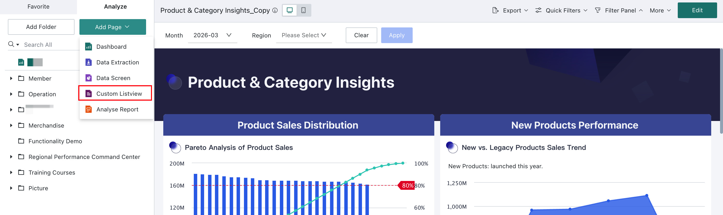
Custom List View must be created from the Add Page entry in the Dashboard instead of by creating a new card.
On the Dashboard page, hover over Add Page and select Custom List View.
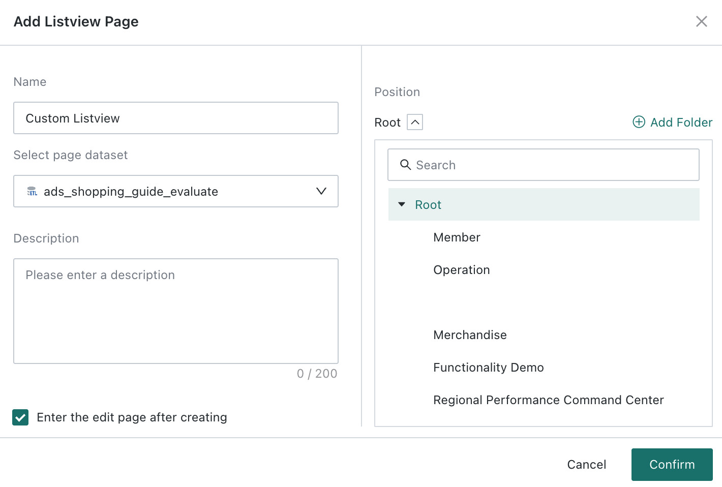
In the creation dialog, enter a name, select the page data table and save location, optionally enable Open the Custom List View editing page after creation, and then click OK to enter the editing page.
The following sections describe the workflow in the order of style selection, layout settings, data field settings, and list property settings.
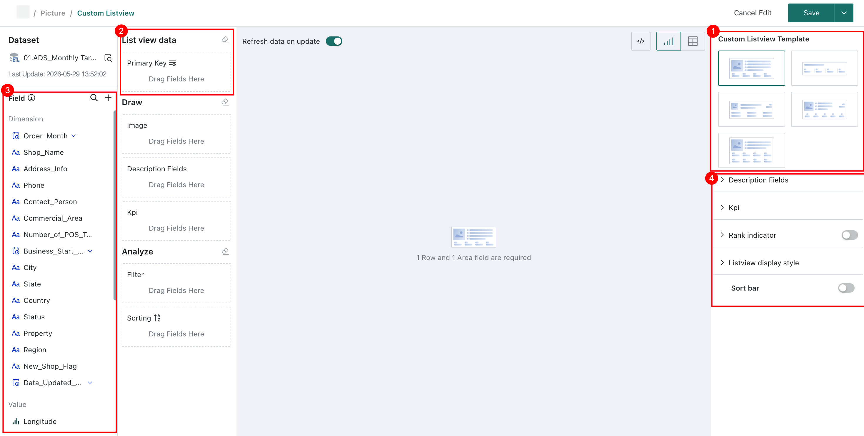
Selecting a Style Template
After entering the editing page, first select a style template. There are 5 basic styles to choose from, and hovering over a style will show a legend.
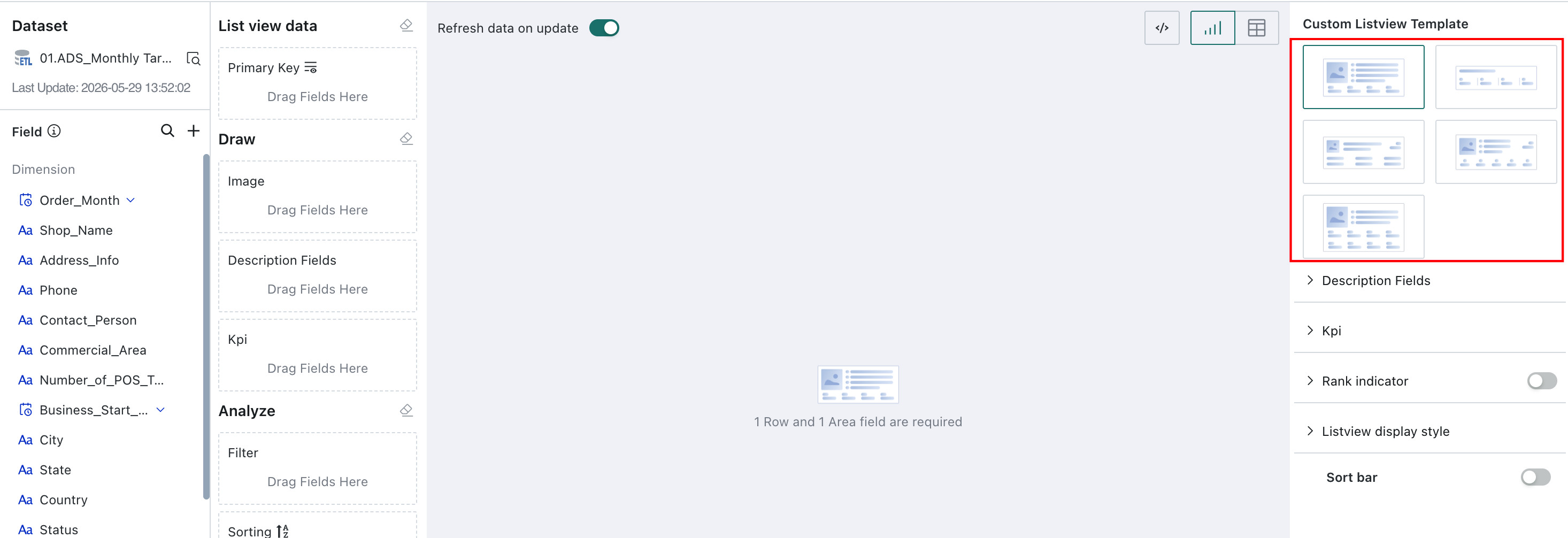
Once the template is determined, the maximum number of fields that can be dragged into each template area is also fixed, along with the corresponding display style. For templates that contain image areas, dragging a field into the image area automatically sets the field to Display as Image.
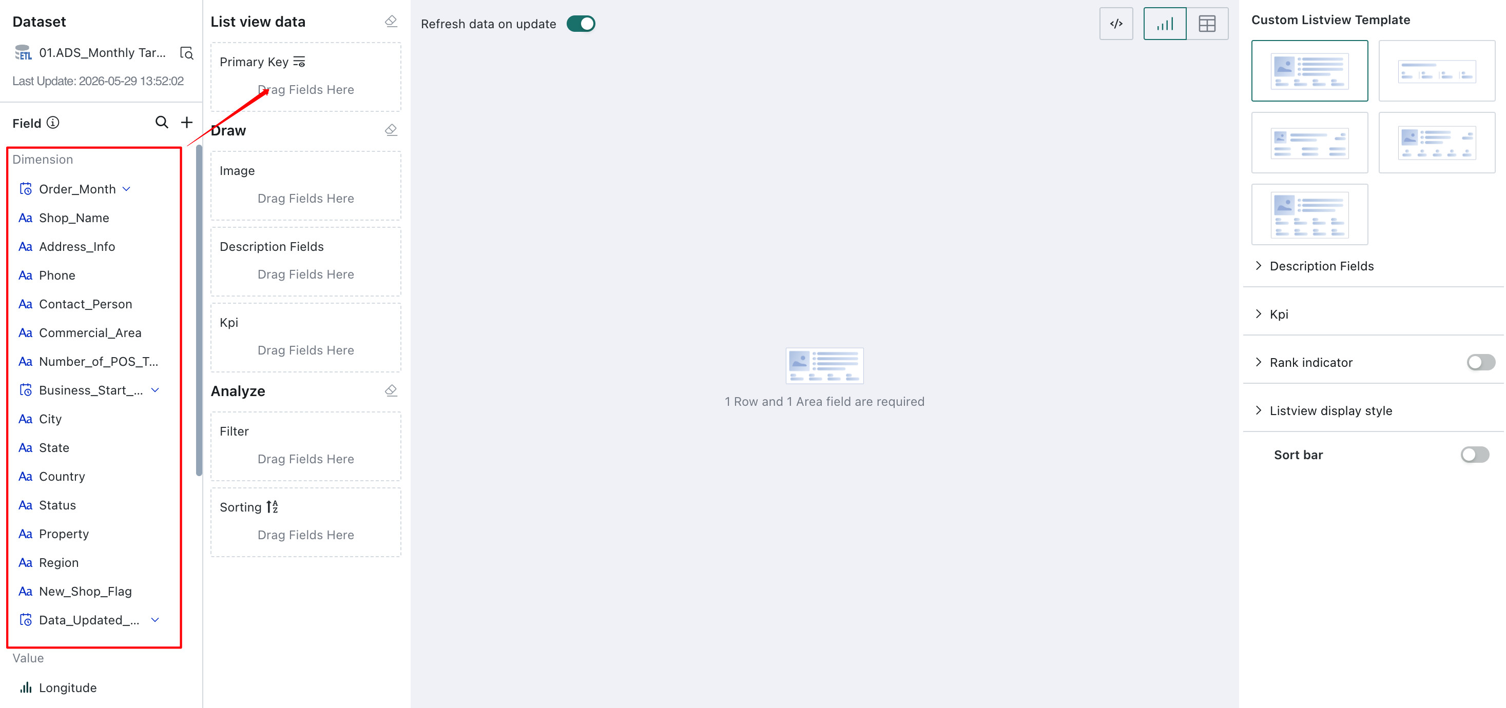
Selecting the List Aggregation Primary Key
The Custom List View component is essentially a two-dimensional table. First determine the aggregation primary key, which is equivalent to the Dimension in a table. Other fields are then processed and displayed based on that primary key. Multiple fields can be dragged into the aggregation primary key area. If no aggregation primary key is selected, fields dragged into other areas do not take effect.
Selecting Field Information
Select the fields to be displayed in each area of the template. After dragging fields in, click a field to support various settings:
-
Text fields support aggregation method, advanced calculation, data format, conditional formatting,
Display as, and alias.The default aggregation method is
No Processing. When the aggregation method is changed toCountorDistinct Count, theDisplay assetting is hidden or does not take effect. -
Date fields support aggregation method, advanced calculation, data format, conditional formatting, and alias.
The default aggregation method is
No Processing. -
Numeric fields support aggregation method, advanced calculation, data format, conditional formatting, and alias.
The default aggregation method is
Sum.
Note: If a field is set to
Display as Imageand the setting takes effect, clicking the image opens the zoomed view, the same behavior used in the current table component.
Setting Chart Properties
List property settings include 5 items:
(1) Description field: Set the field name display, font color, and size;
(2) Metrics: Set the alignment, font color, and font size of metrics;
(3) Serial number badge: Set whether to display; if displayed, you can choose from crown, medal, and mini types;
(4) List display style: Choose card display or divider display;
(5) Sort bar: Set whether to display. When enabled, the fields in the left-side sorting editor are automatically displayed at the top of the Custom List View card for quick sorting.
Custom List View page and card usage reminders:
a. The Custom List View page supports editing. Its page filter bar also supports creating filters and filter groups.
b. The data for the Custom List View page, including the Custom List View card and filter cards, all comes from the same Dataset.
c. The Custom List View card supports linkage and Jump.
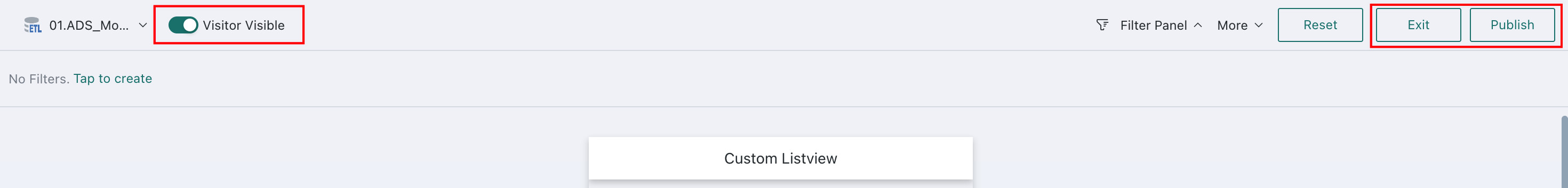
Publishing
- After the Custom List View is ready, click
Publishin the upper-right corner to publish it online for users to view. - Custom List View edits are saved in real time. If the page is not ready to publish yet, click
Exitin the upper-right corner to return to the online page. - If the Custom List View is intended for business users, you must also turn on the
Visitor Visibleswitch after publishing. - When
On, authorized visitor users can view and use the published Custom List View. - When
Off, visitors cannot view this Custom List View.