Chart - Chart Property
Overview
After charting is complete, you can further optimize the visual effect of a chart through Chart Property, such as configuring theme colors, adjusting axes, and setting data labels. You can find these settings in the Chart Property area on the right side of the card editing page.
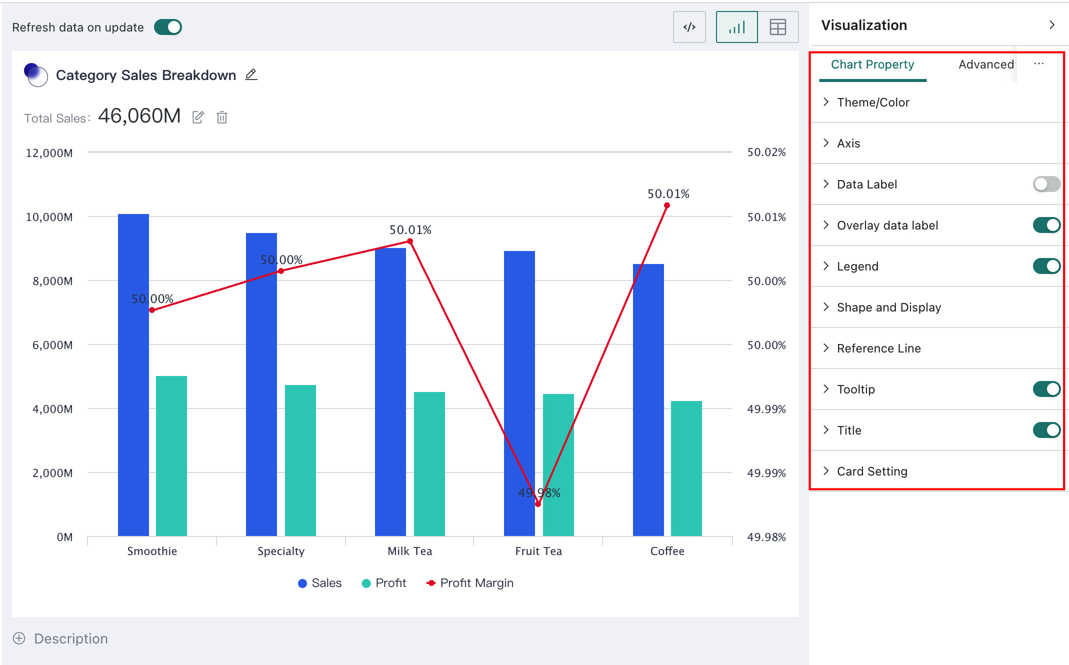
Chart property settings are divided here into General Configuration and Chart-Specific Configuration. General configuration is common to most chart types, such as Default Parameter Values and Theme / Color. Chart-specific configuration is unique to certain chart types, such as Pie Setting and Center Text for pie charts, or Waterfall settings for waterfall charts. The following sections explain these options in detail.
General Configuration
Users can configure common chart settings in the Chart Property area. These are shared by many chart types, such as theme colors, axes, data labels, and legends.
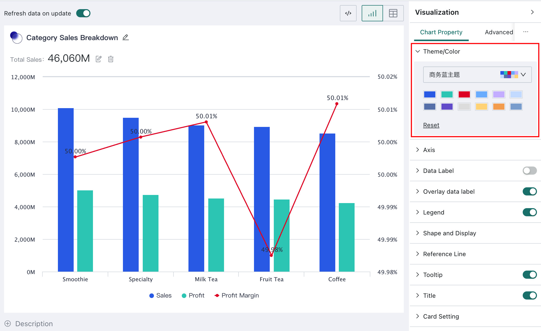
Theme / Color
On the card editing page, if you want the chart to be more intuitive and visually clear, choose Theme / Color in Chart Property to apply automatic coloring.
When choosing colors, you can either switch directly to a preset theme or define your own custom color combination. For more about custom colors, see Logo and Appearance.
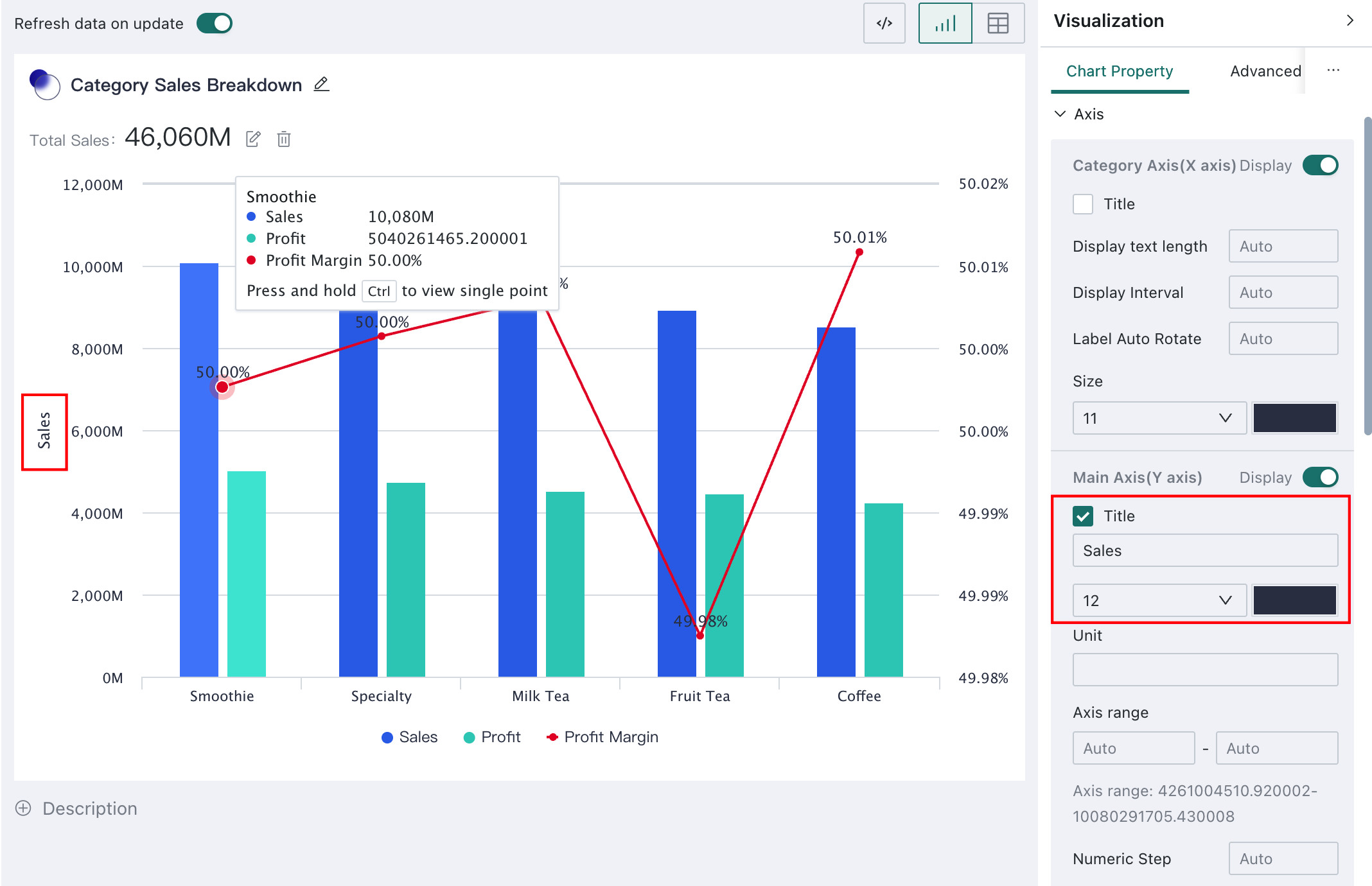
Axes
Axes are the reference lines used to position data points in a chart. By configuring axis properties, you can improve chart readability and strengthen information delivery.
In Chart Property on the card editing page, you can configure axes for column charts, bar charts, line and area charts, bubble charts, scatter charts, and other chart types that use axes.
Axis settings are divided into three categories:
- Category Axis (X-Axis)
- Primary Value Axis (Y-Axis)
- Mini Axis
The primary value axis can also extend to a secondary value axis.
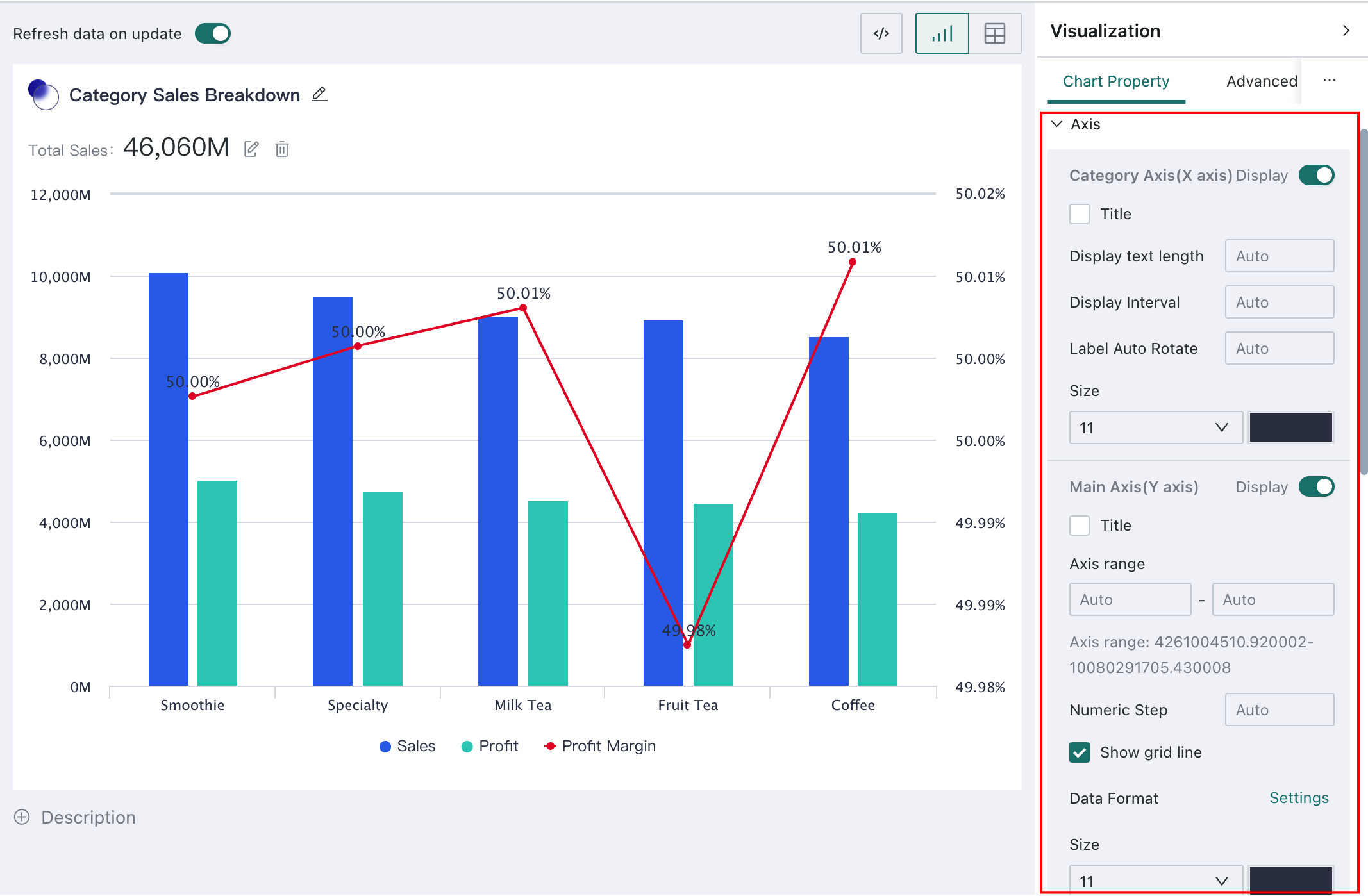
After selecting titles for the category axis and the primary value axis and entering the title text and units, the chart updates accordingly.
In addition, except for radar charts, all charts with axes support displaying a mini axis:
Fixed Value Axis Range: after enabling it, the card displays the user-specified data range by defaultFixed on the Right: after enabling it, the card displays the latest data by default, that is, the range on the far right of the mini axis
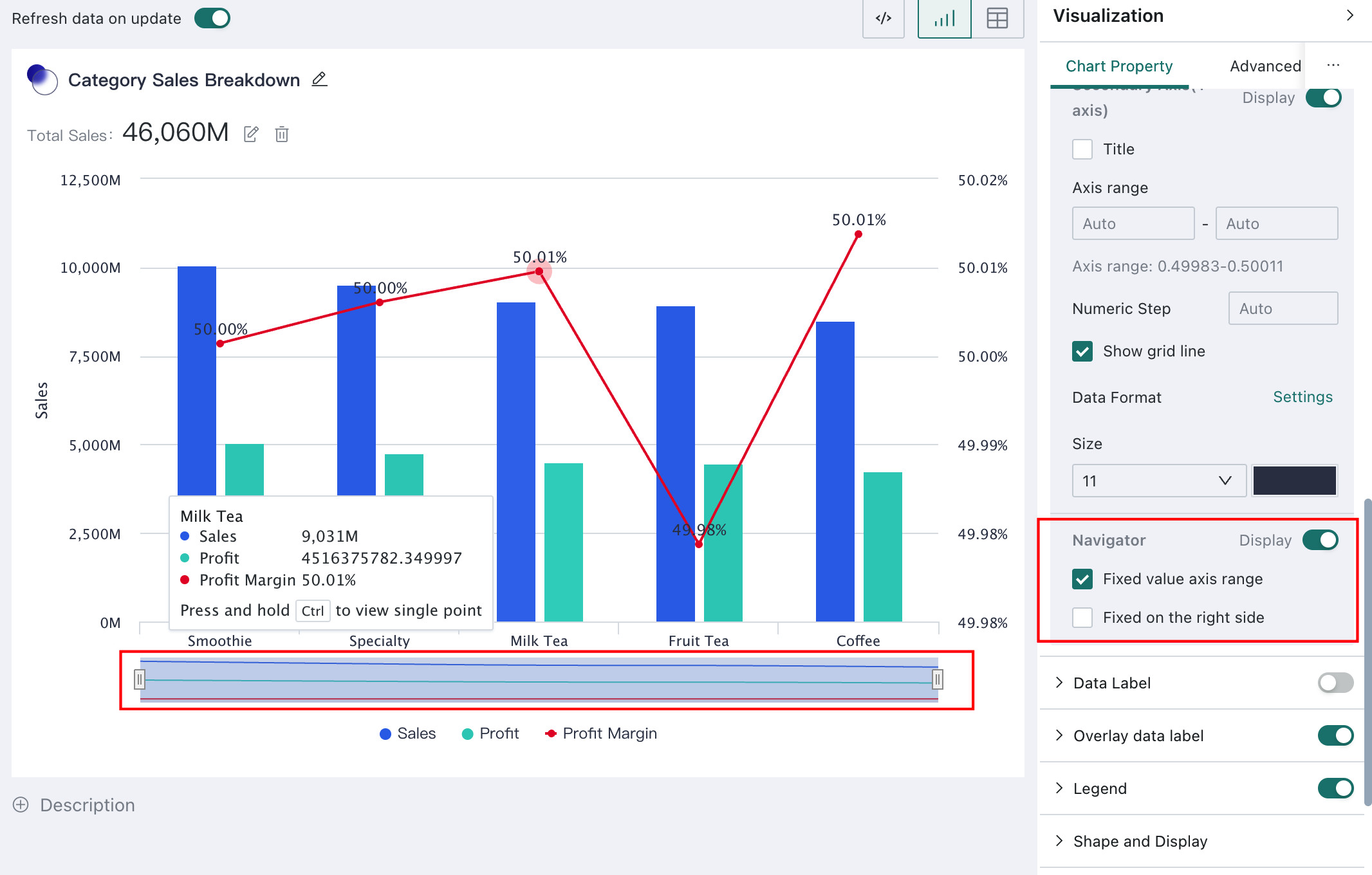
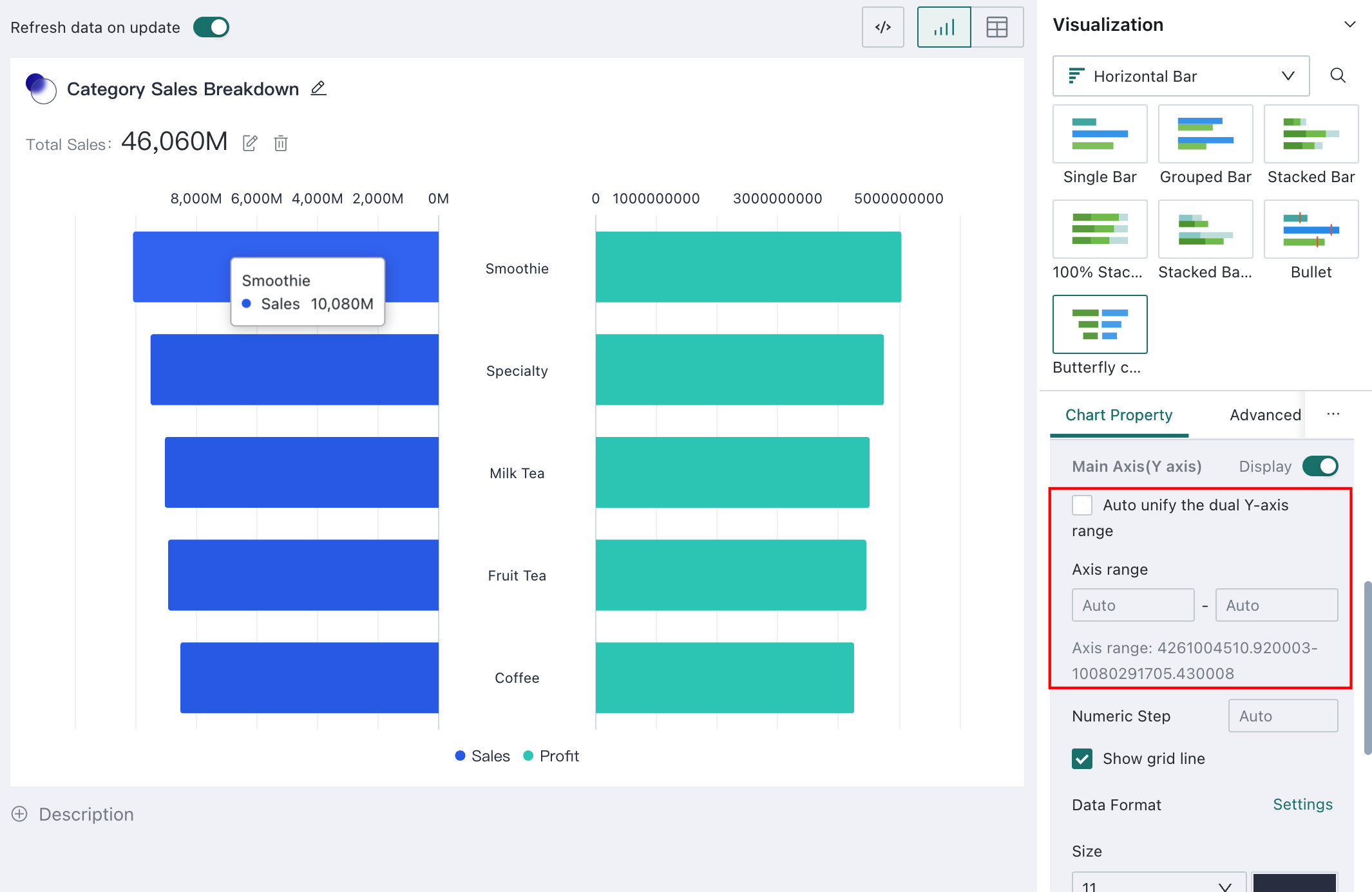
For butterfly charts, the axis settings support automatically unifying the dual Y-axis range so that two indicators under the same dimension can be compared more consistently.
Data Labels
Data labels are text or marks used to display exact values or other related information for data points in a chart. When configured appropriately, they help users understand chart data more directly.
In Chart Property, you can configure label content, font style, position, whether an outline is shown, and whether overlap is allowed.
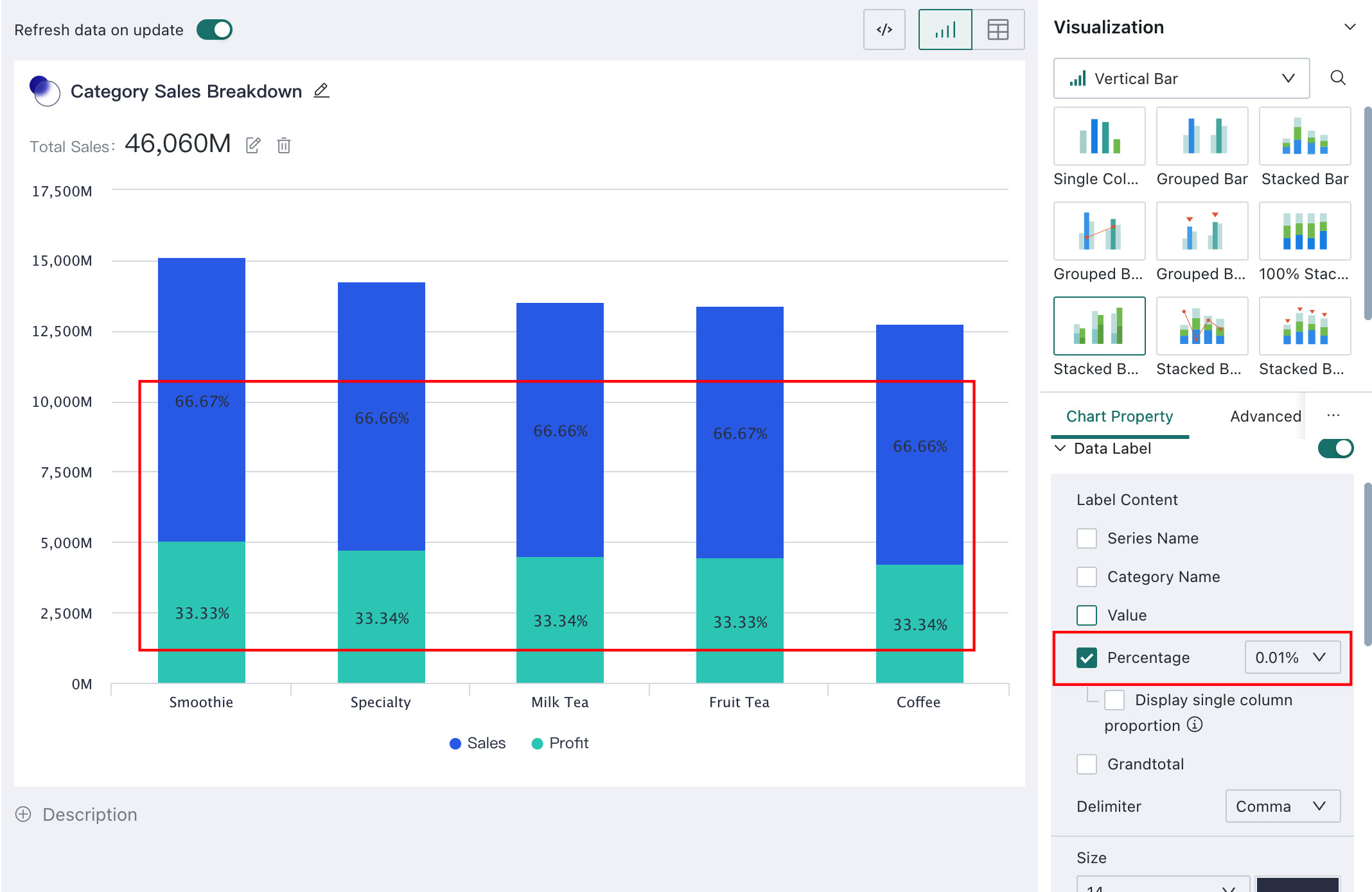
For stacked charts and grouped stacked charts, label content also supports percentage display.
Legend
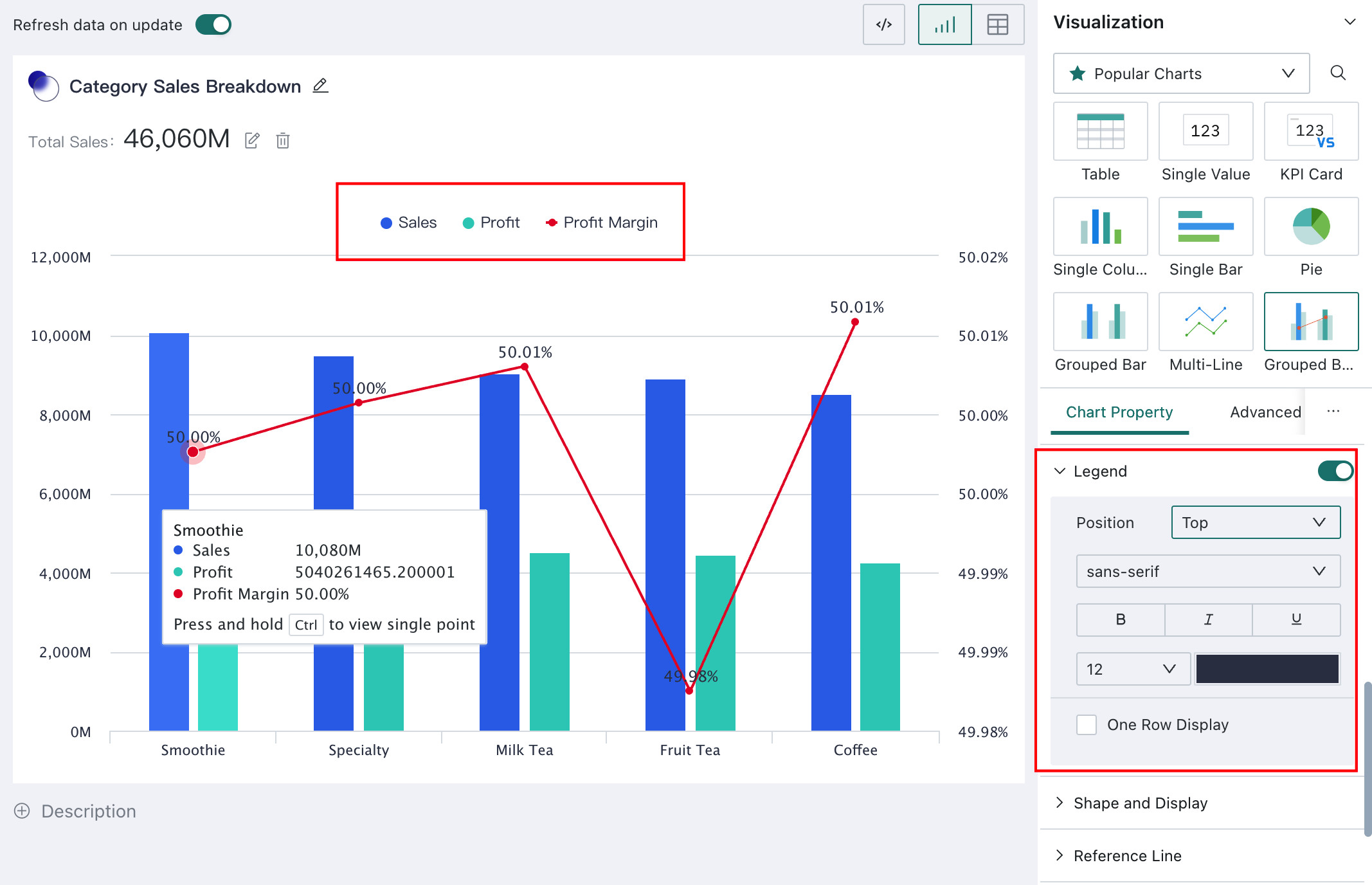
A legend is used to distinguish different data series or categories in a chart through color or shape. A well-designed legend improves the visual appearance of the chart and helps information communication.
Turn on Display under Legend to show the chart legend.
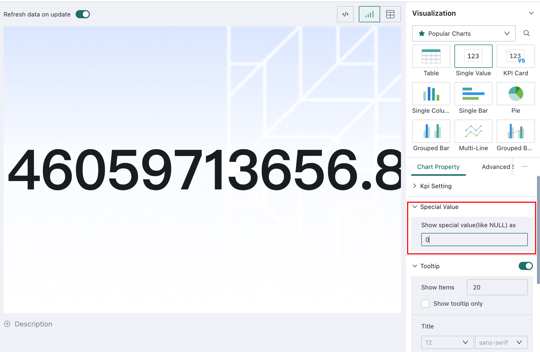
Special Values
Special values are used to unify the display of values such as null, empty strings, and the text "null". If users find such values in chart data and do not want them shown directly, they can configure them under Special Values in Chart Property.
Enter the value you want to display so that all recognized special values in the chart are replaced uniformly, for example replacing them all with 0.
This feature is supported only for tables, maps, and metric cards. For maps, special values are displayed as 0 by default when enabled.
Reference Lines
Reference lines are lines used to highlight fixed values or statistical calculation results in a chart. They can be fixed values, such as a 100% target, or calculated values such as average, maximum, or minimum based on a measure field. Appropriate reference lines improve readability.
- In
Chart Property, chooseReference Linesto add reference lines to the chart. - Click
+ Addto add multiple reference lines. Click the color box to customize the color. - Click the edit button on the right side of a reference line to edit it, or click the delete button to remove it.
For example, if you add an average sales amount reference line and click Confirm, a line representing the average sales amount appears in the chart.
If a configured reference line exceeds the maximum value of the X-axis or Y-axis, the line is still displayed, and the axis range is adjusted automatically.
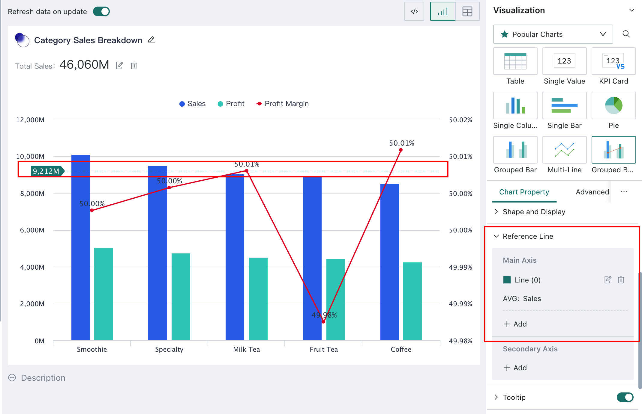
When configuring a reference line, you can choose Fixed Value, Chart Field, or Other Field.
Fixed Value: displays a numeric reference line based on the configured fixed valueChart Field: when calculating a reference line from a field in the chart, aggregation such as average, maximum, or minimum is computed at thecurrent dimension granularityOther Field: when calculating a reference line from another field, aggregation is computed based on thefull detail dataset
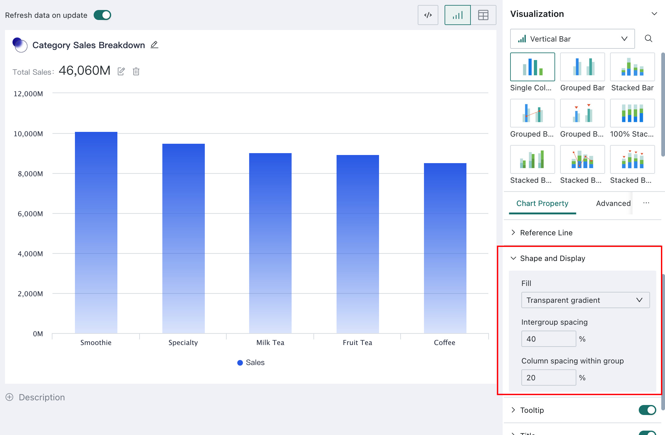
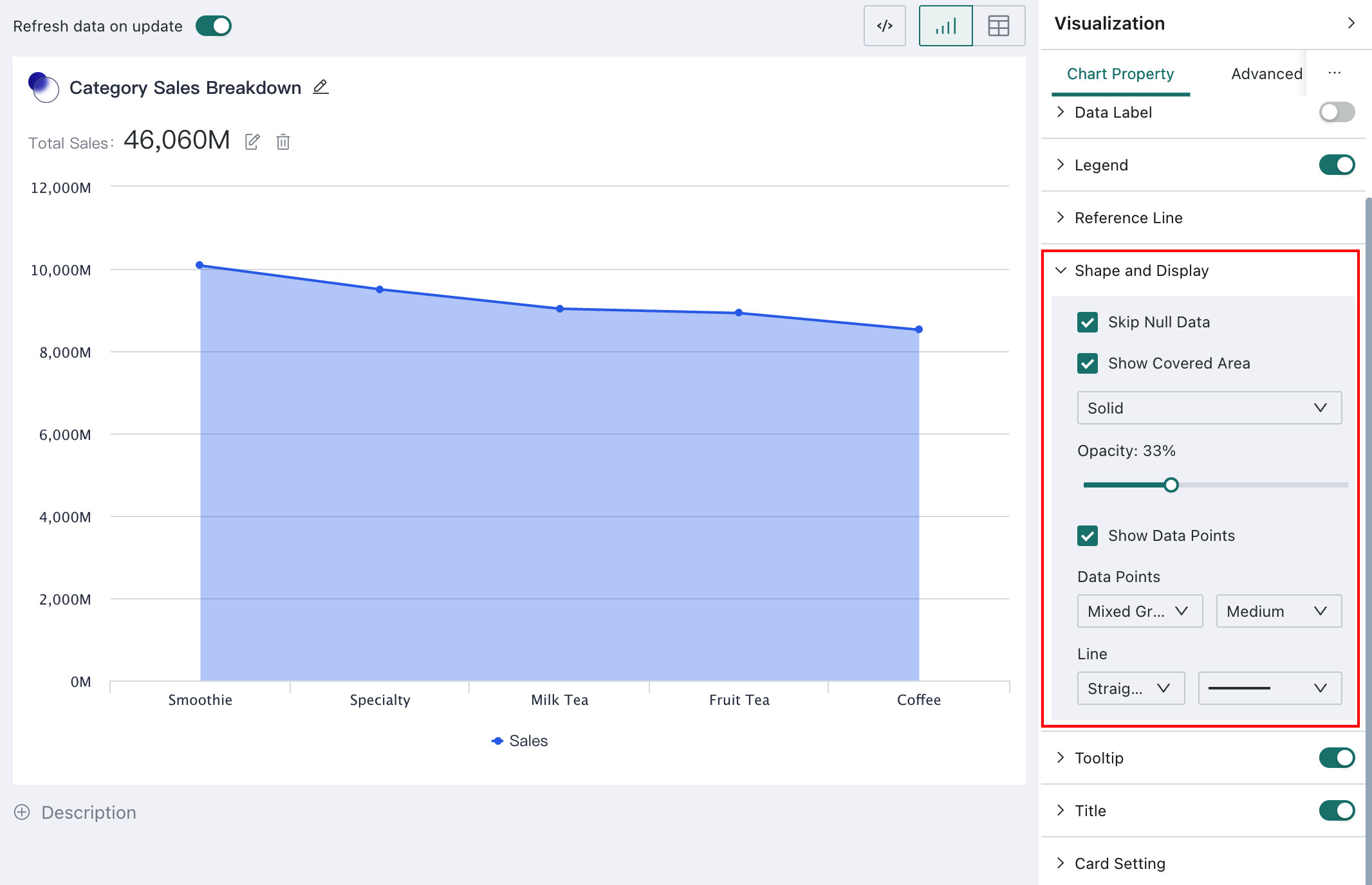
Shape Display
Shape Display controls the presentation of data in charts such as column charts, bar charts, line charts, and radar charts. It includes configuration for solid fills, transparent gradients, color gradients, and chart-specific display styles, helping users recognize key information more quickly.
- For column charts and bar charts,
Shape Displaysupports:Fill: solid color, transparent gradient, or multicolor gradientGap Between Groups: controls spacing between groupsGap Between Bars Within a Group: controls spacing within the same group
- For line charts,
Shape Displaysupports:Break at Null Values: the line breaks where null values occurShow Covered Area: controls whether the area below the line is filled, and whether the fill is solid or gradient; in solid mode, color saturation can also be configuredShow Data Points: controls whether data points are shown and how they are styledLine: controls whether the line is straight or curved, and its thickness
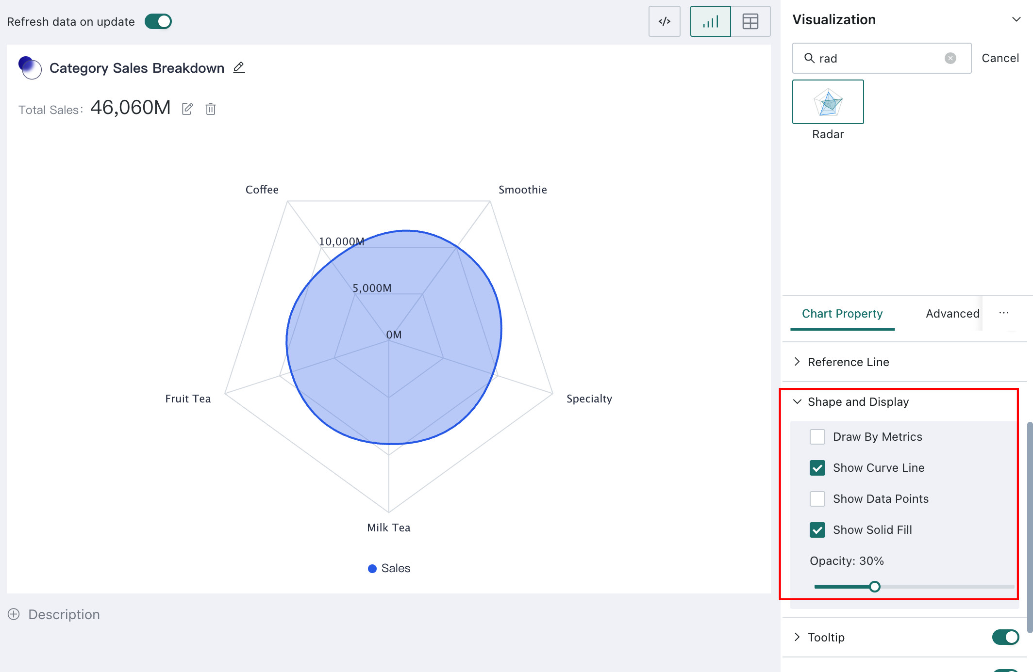
- For radar charts,
Shape Displaysupports:Arrange by Measure: when enabled, fields in the measure area become the axes; by default, fields in the dimension area are usedDisplay as Curve: controls whether the radar chart is shown as curves instead of straight linesShow Data Points: controls whether point markers are shownShow Fill Color and Adjust Saturation: controls whether fill color is shown and lets you adjust saturation
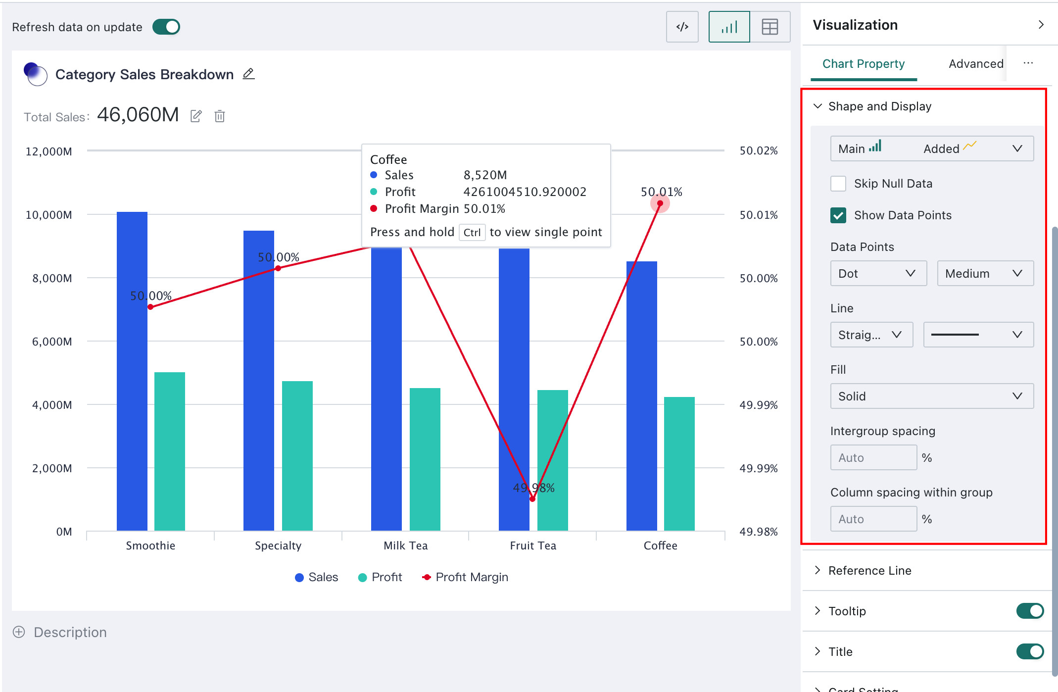
- For grouped column + line charts, most
Shape Displayoptions are the same as for column charts and line charts. A unique option is:Primary Shape - Overlay Shape: swaps field data between the primary and overlay shapes
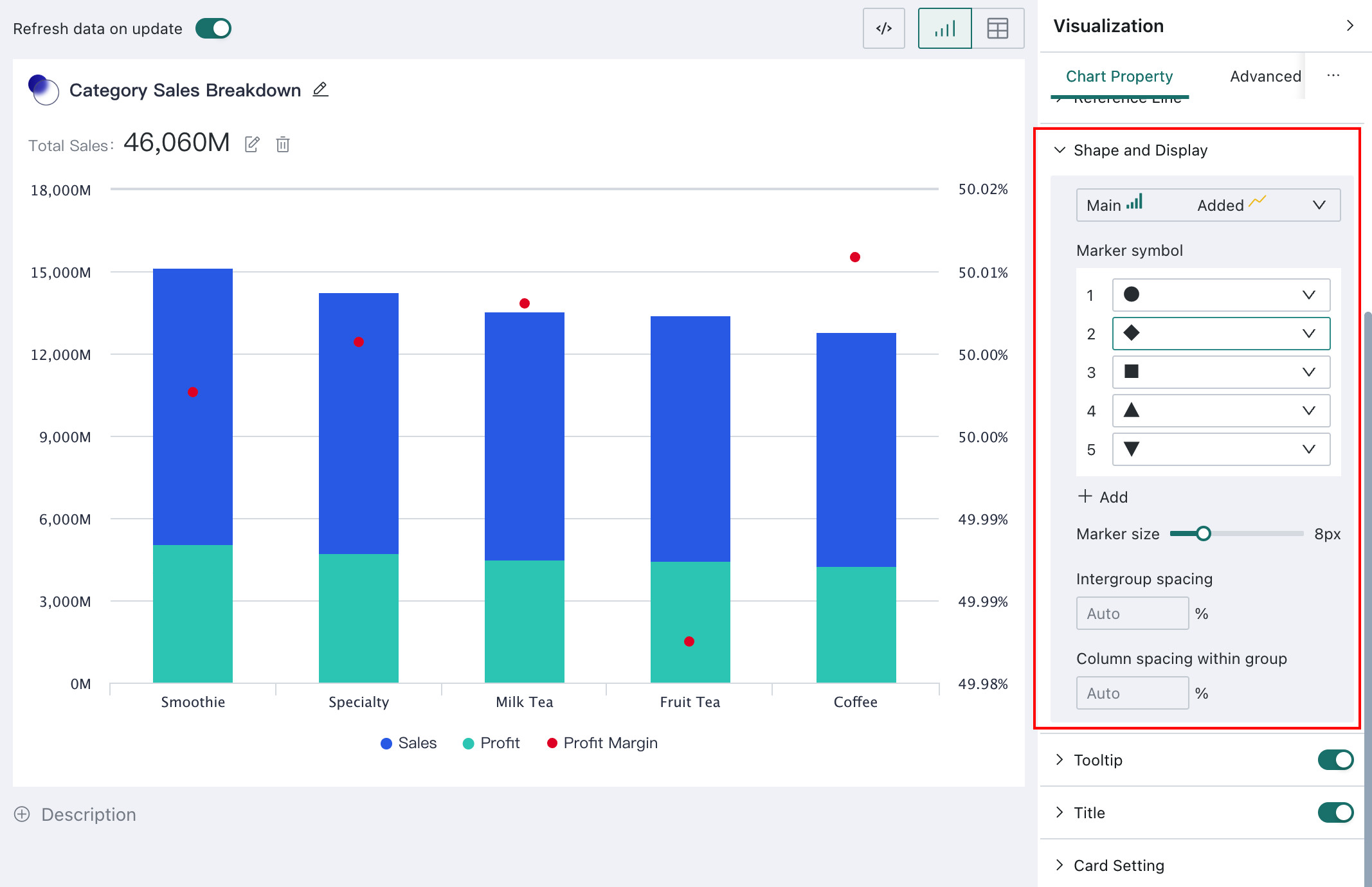
- For grouped column + symbol charts and stacked column + symbol charts, most
Shape Displayoptions are similar to those of column charts. Their unique options include:Primary Shape - Overlay Shape: swaps field data between the primary and overlay shapesSymbol Style: chooses built-in icons or custom imagesSymbol Size: controls symbol display size
Tooltip
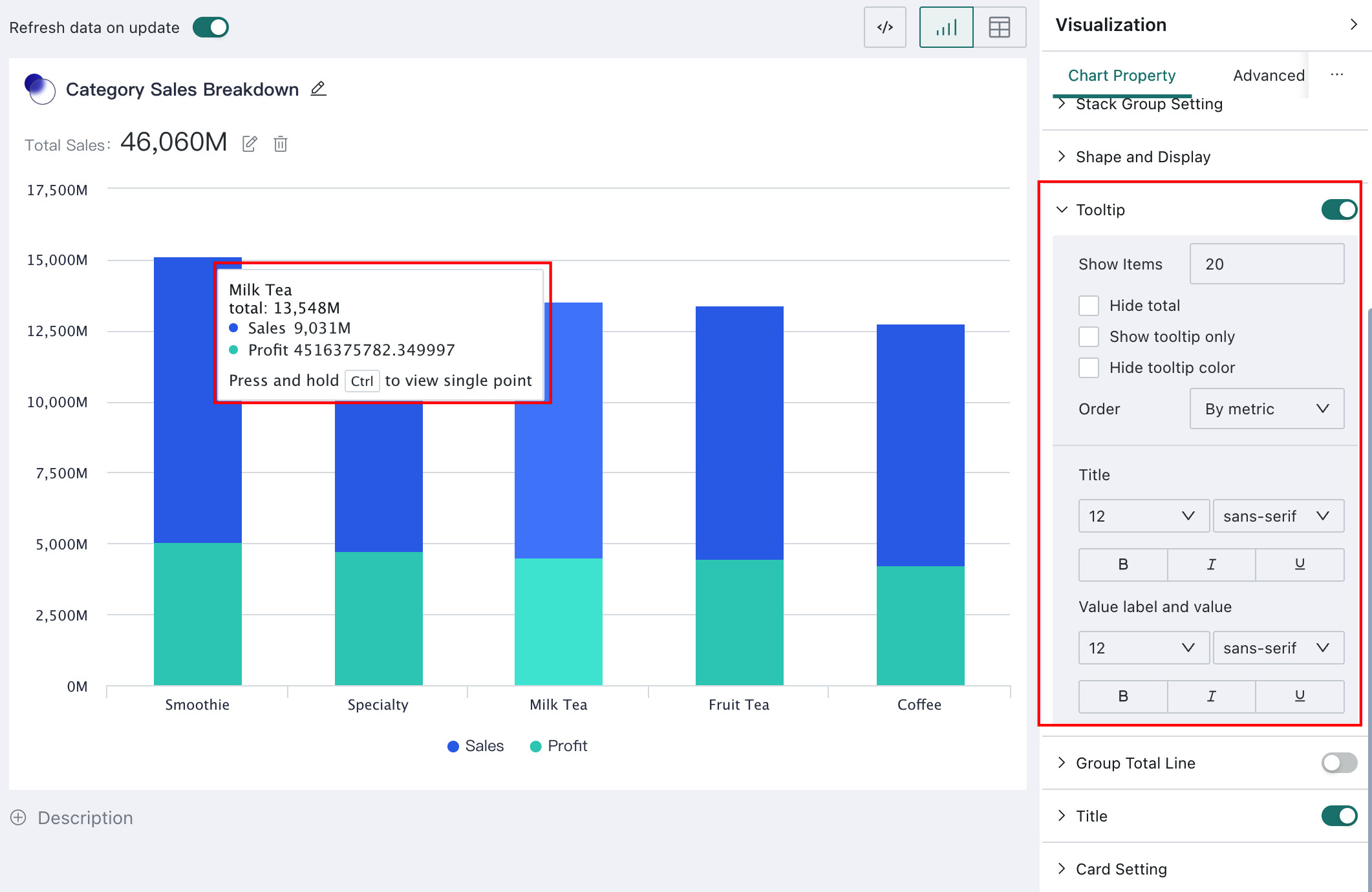
When the mouse hovers over a chart, a floating tooltip appears to show the values for that dimension. This helps users inspect specific values while reading the chart. Configure it under Tooltip in Chart Property.
When tooltip display is enabled, you can configure how many items are shown, whether only the tooltip is displayed, whether tooltip colors are hidden, and settings for titles, value labels, and numeric information.
For grouped charts such as grouped column charts, grouped column + line charts, grouped column + symbol charts, and stacked charts such as stacked charts, percentage stacked charts, and grouped stacked charts, you can also configure whether to Hide Totals and the Display Order.
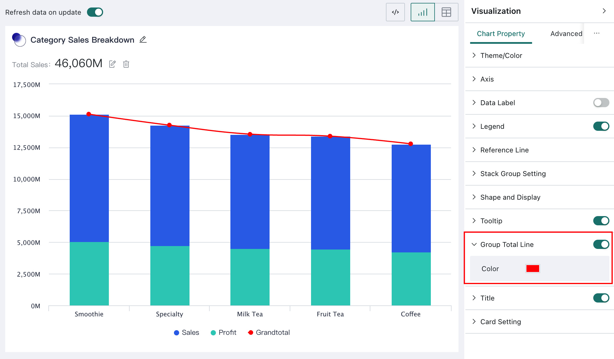
Group Cumulative Line
Stacked charts and grouped charts support Group Cumulative Line. This feature automatically calculates the total value within each group and shows the trend of those totals through a line, helping users analyze the overall trend more comprehensively.
Users can decide whether to show the group cumulative line and can also configure its color in Chart Property.
Card Title
Card Title helps users quickly understand the analytical topic and data content of a chart.
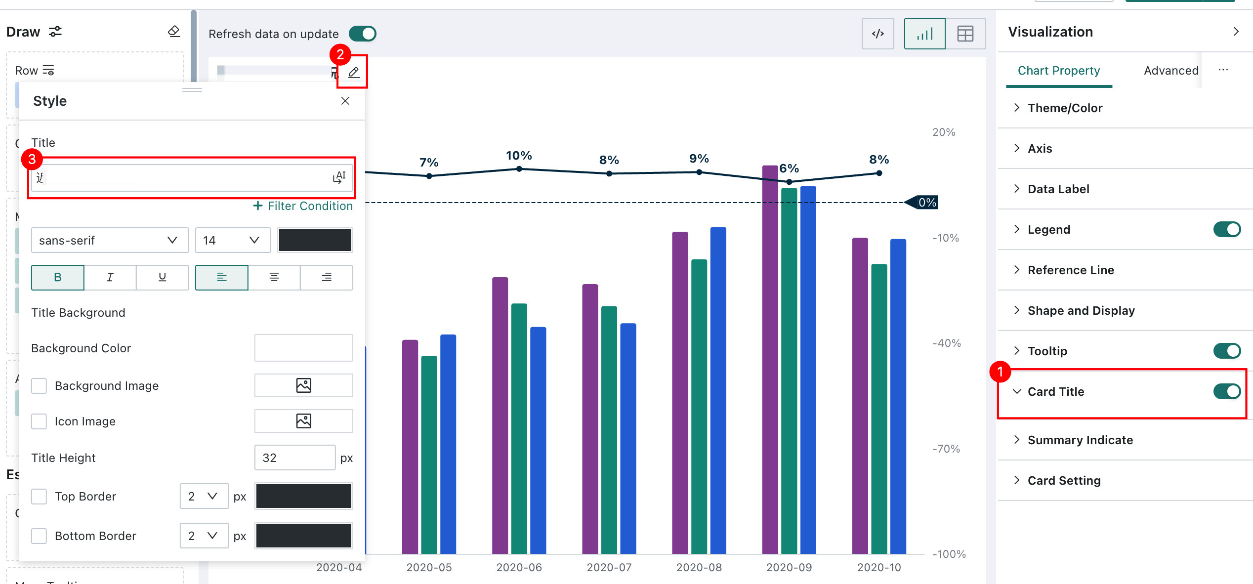
For mobile charts, you need to switch to the mobile layout and add the card separately. For details, see Mobile Layout.
Card Title also supports filter conditions. After you click + Filter Condition, you can select a field or parameter from the dataset from the drop-down list. You can also search by field or parameter name. Once the selected field or parameter is linked to the corresponding filter in the card, the title dynamically displays the corresponding field value or parameter value according to the active filter condition.
Card Settings
With Card Settings, users can customize the appearance of a card so that the chart better matches business needs and visual preferences.
Supported options include:
Summary Metric: configures the style of summary metrics in the cardCard Background: configures the card background color, background image, and whether the card follows the themeCard Padding: configures the distance between the content and the top, bottom, left, and right edges of the cardContent Spacing: controls how compact the content layout is, with options such asModerate,Compact, andLoose
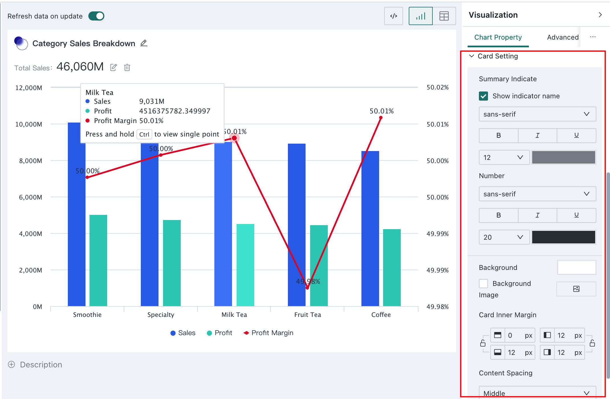
Chart-Specific Configuration
Chart-specific configuration consists of settings unique to particular chart types, such as Pie Setting and Center Text for pie charts, or Waterfall settings for waterfall charts. The following sections are therefore organized by chart type.
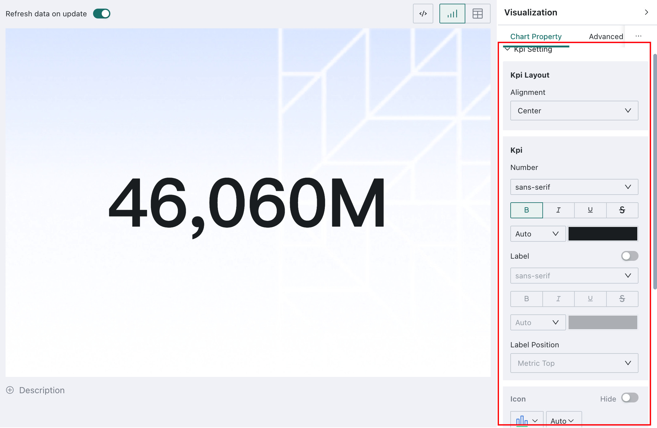
Single Value
Single Value cards are generally used to present key business metrics. Guandata BI allows users to customize the display of metric cards so they better fit business needs and visual preferences.
In Chart Property > Kpi Setting, you can configure:
Alignment: left-align or center-align labels and valuesValue: value style settingsLabelandLabel Position: style and position settings for labelsIcon: whether to display an icon, and if so, its style and position
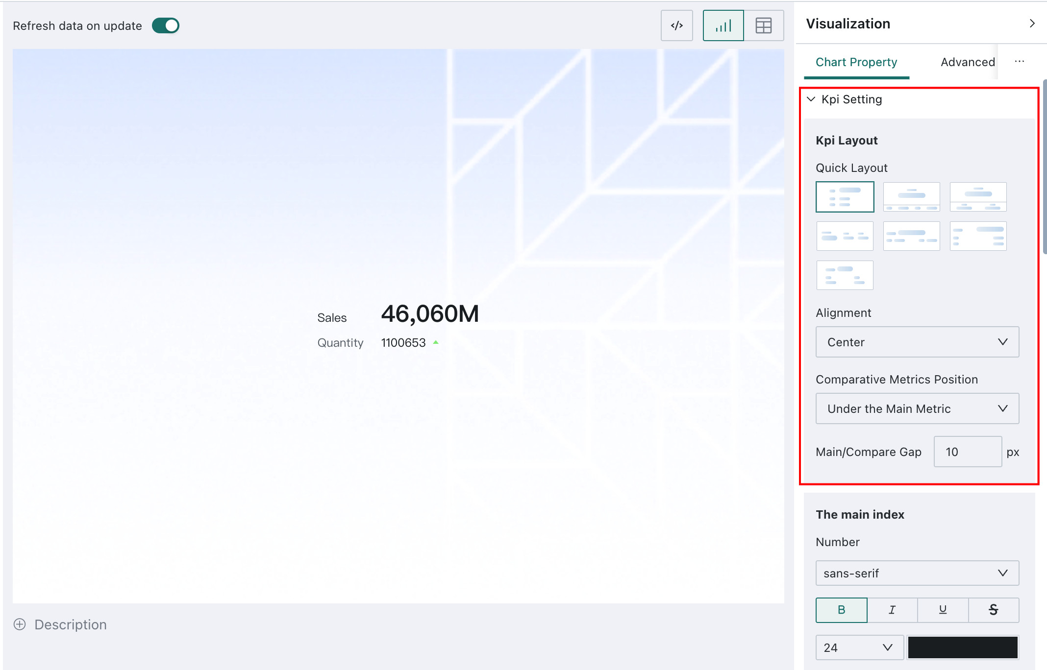
KPI Card
Kpi Layout
Reasonable layout and alignment make data easier to read and compare.
In Chart Property > Kpi Setting, you can configure the layout type, alignment, comparison metric layout, and spacing between the comparison metric and the primary metric for a KPI Card.
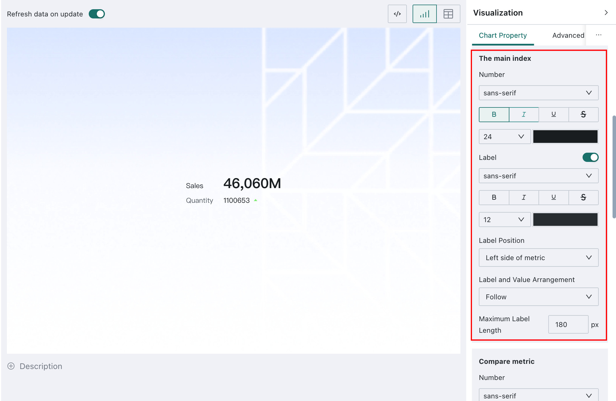
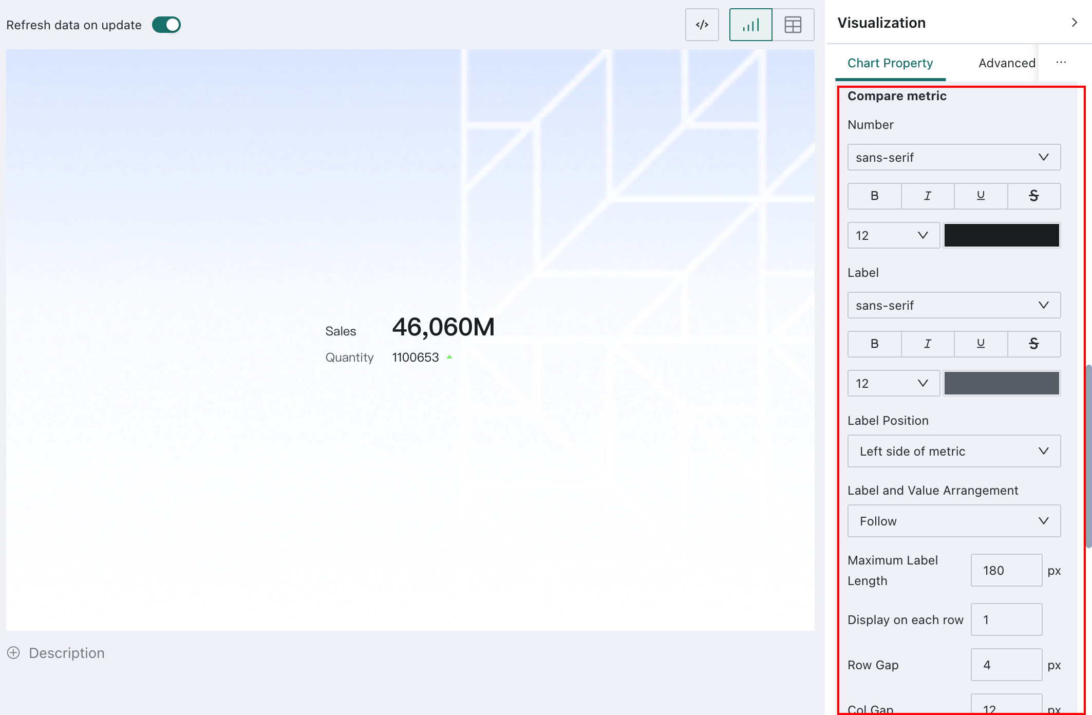
Primary Metric / Comparison Metric
KPI Card usually includes a primary metric and a comparison metric. Guandata BI allows users to configure their styles separately so that key information stands out more clearly and is easier to understand.
In the KPI Card property area, you can configure the primary metric and comparison metric:
Value: value style settingsLabel: label style, position, and maximum label lengthComparison Metric Style: whether to display the comparison metric icon, and its style
Pie
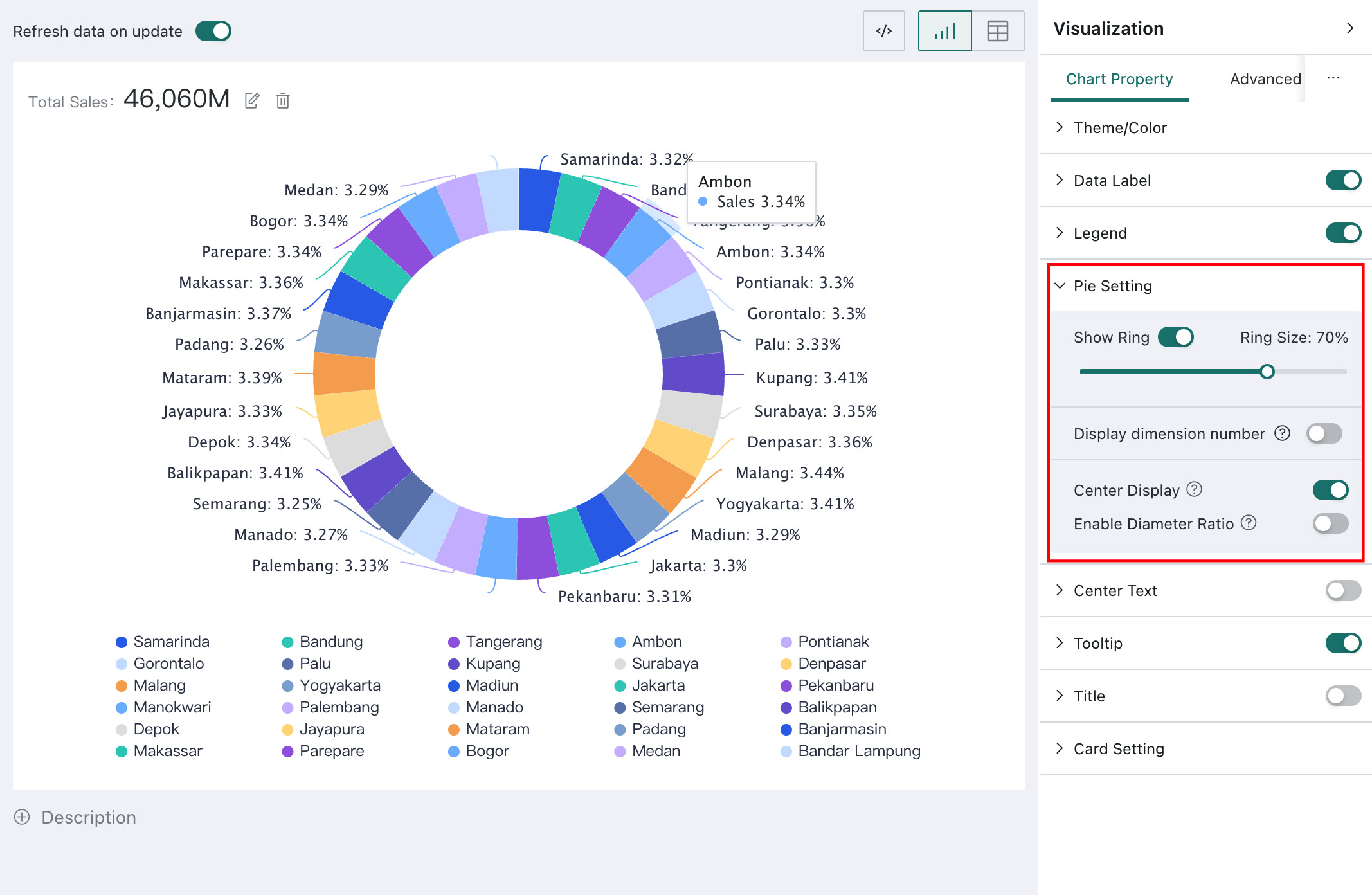
Pie Setting
Pie Setting allows users to customize the content and appearance of a pie chart so that it better meets data display and visual design requirements.
Supported settings include:
Show Ring: converts the pie chart into a donut chartRing Size: configures the hollow diameterDisplay dimension number: displays a specified number of dimension values and merges the rest intoOthers; if you need to sort by value size, drag the corresponding measure field intoSortCentered Display: centers the chart within the graphic content area, excluding the legend and title text areaEnable Diameter Ratio: configures the pie diameter relative to the graphic content area
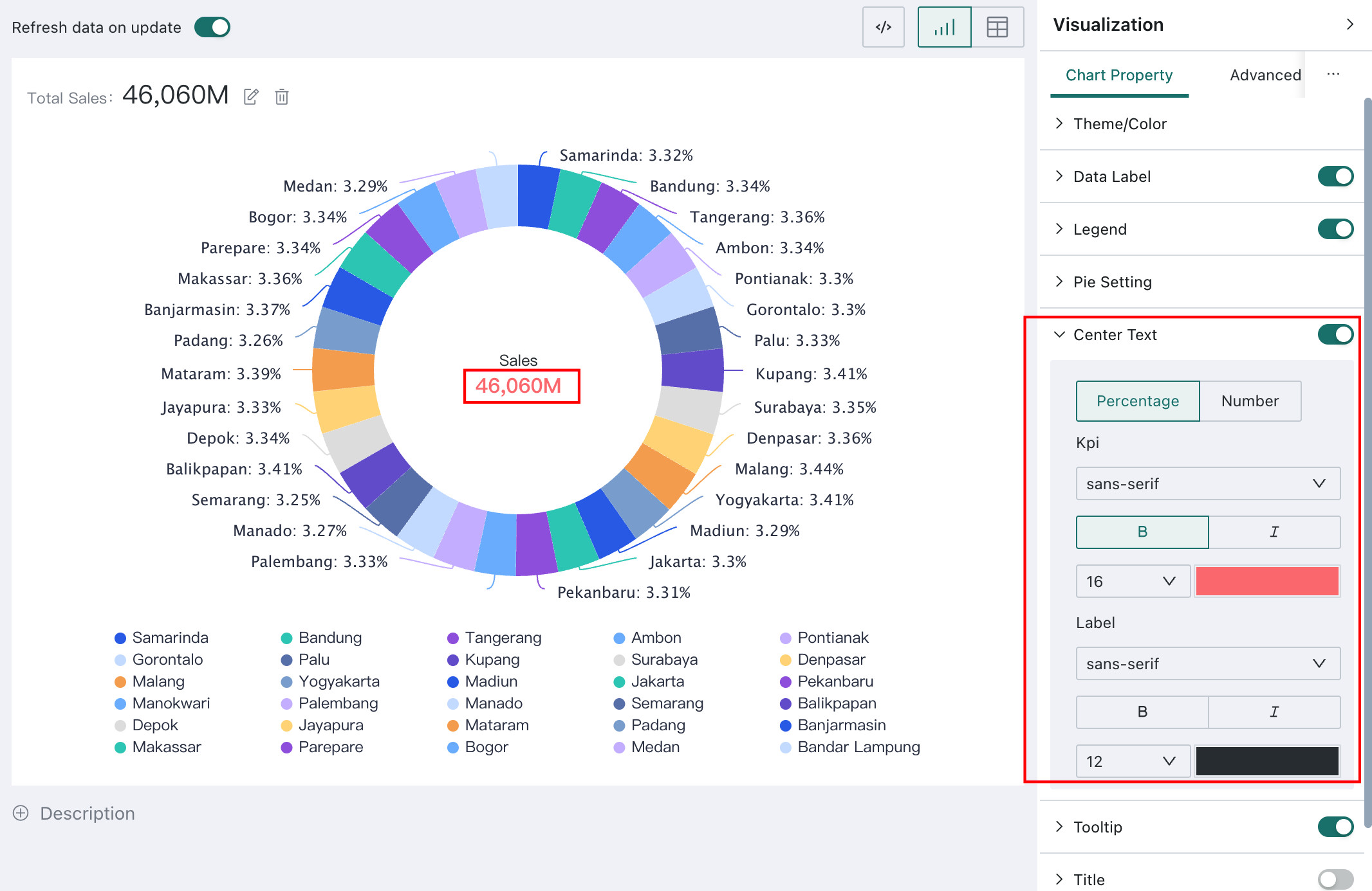
Center Text
Center Text can be used to highlight the value or percentage of a specific dimension category in the center of a pie chart. In addition to showing a specific value, it also allows users to adjust the style of the metric value and dimension label, including font, color, and size.
When the mouse hovers over a dimension, the center text automatically displays the value of that dimension. In the default state, it displays the aggregated value across all dimensions.
For example, in the chart below, when the mouse hovers over Fujian Province, the center text shows the sales volume of Fujian Province. In the default state, it shows the total sales volume across all provinces.
Waterfall
Waterfall settings
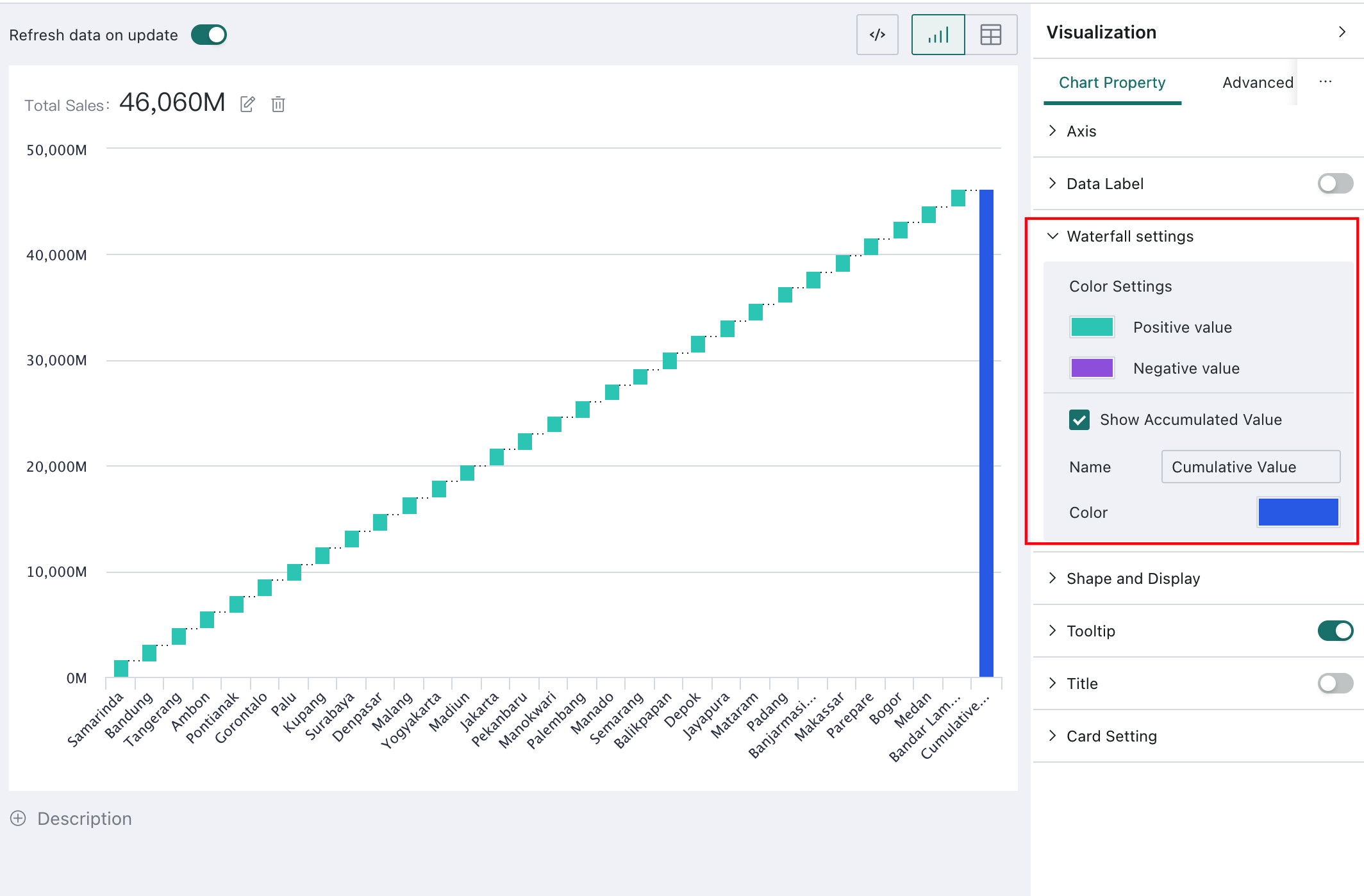
A waterfall chart is a visual tool for intuitively showing how data changes over a sequence of steps. It uses a series of ordered bars to show how an initial value changes through multiple positive and negative increments or decrements and finally reaches a result. Each bar represents one change, either positive or negative, and the cumulative sequence clearly reveals the path and result of the change.
To improve readability, the waterfall chart can use different colors to distinguish Positive value (incremental data) from Negative value (decremental data). In addition, Show Accumulated Value and its related Name and Color settings help users better understand the overall trend and final result.
Treemap
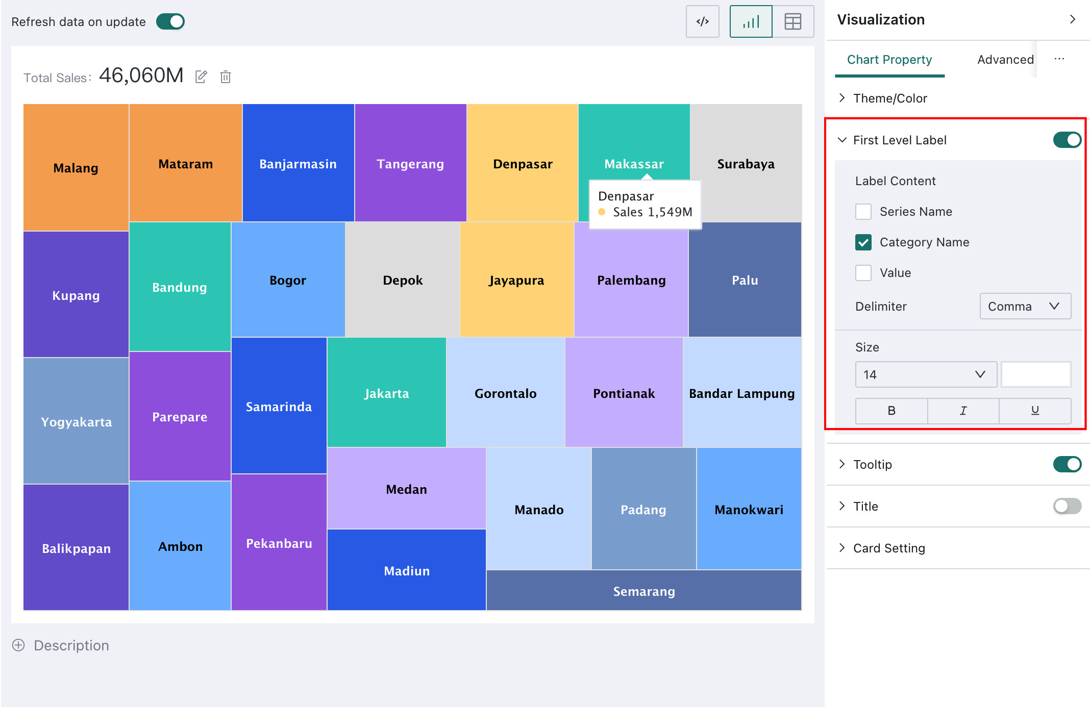
First-Level Data Labels
Treemaps are mainly used to show the composition and proportion of hierarchical data. If users want to display specific values in a treemap, they can add first-level data labels under First-Level Data Labels in Chart Property and configure their content and style.
- When a treemap contains two dimension fields, a
Second-Level Data Labelsoption appears in the chart property area. Its configuration is the same asFirst-Level Data Labels. - A treemap can contain at most two dimension fields.
Funnel
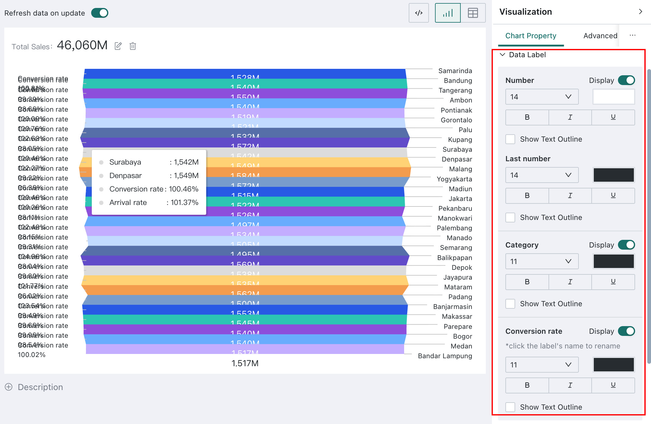
Funnel charts support custom label font size and color, and allow users to control whether label text and values are displayed.
Path: Funnel > Chart Property > Data Labels.
You can configure funnel chart label content item by item, including Value, Final Value, Category, and Conversion Rate. If needed, users can assign different font colors to different parts of the labels based on the overall style and background color so that the data content is displayed more clearly.
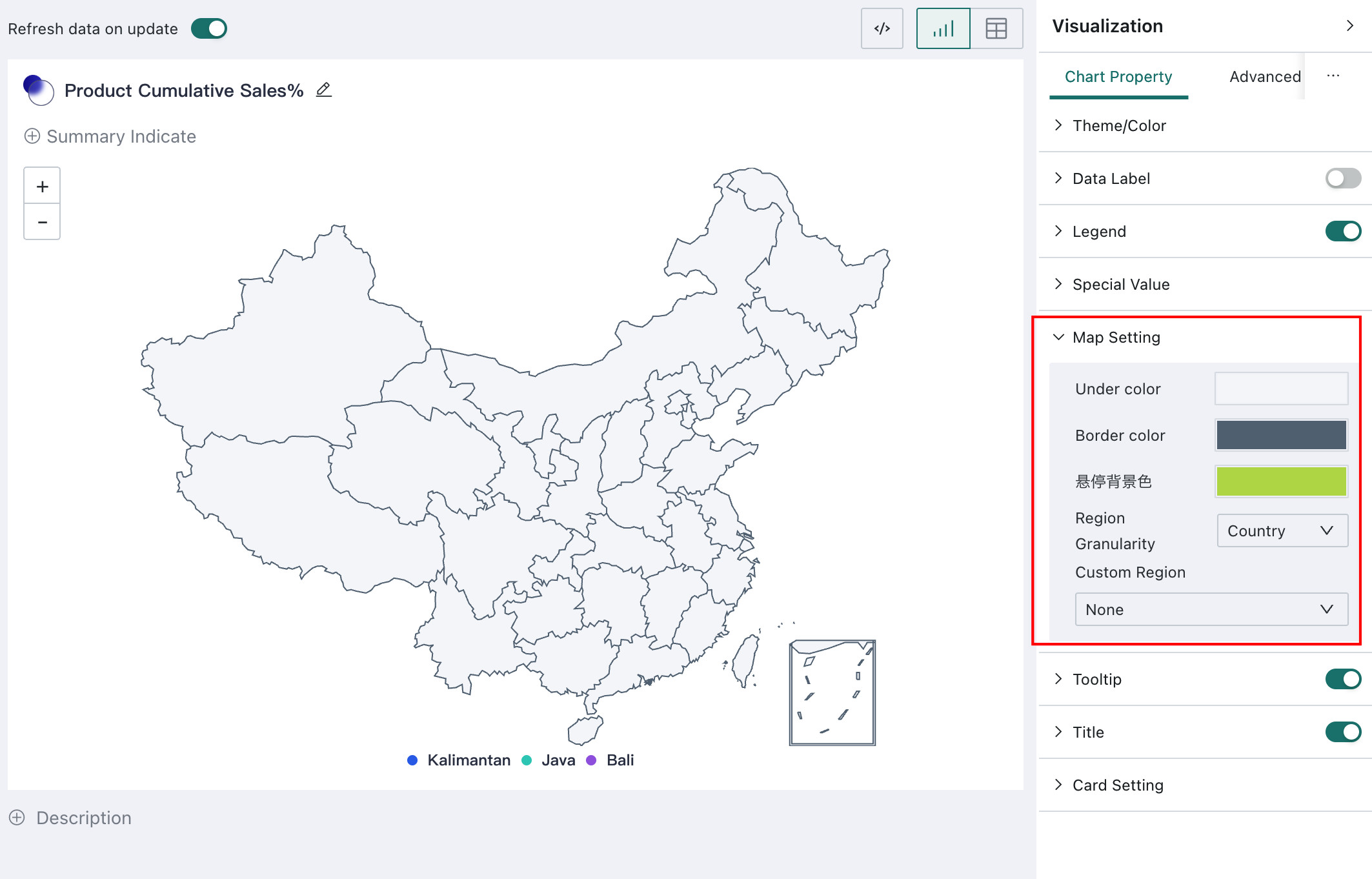
China Administrative Map
Map Setting
Maps are generally used to compare data performance across different regions. They display regional values using different fills, and appropriate color settings and map display ranges help improve both visual quality and readability.
Under Map Setting in Chart Property, you can configure:
Under color: map base colorBorder color: map border color- Hover background color
Region Granularity: country-level, upgraded outline, actual outline, and automatic display rangesCustom Region: supports custom regional partitioning. For details, see Region Map.
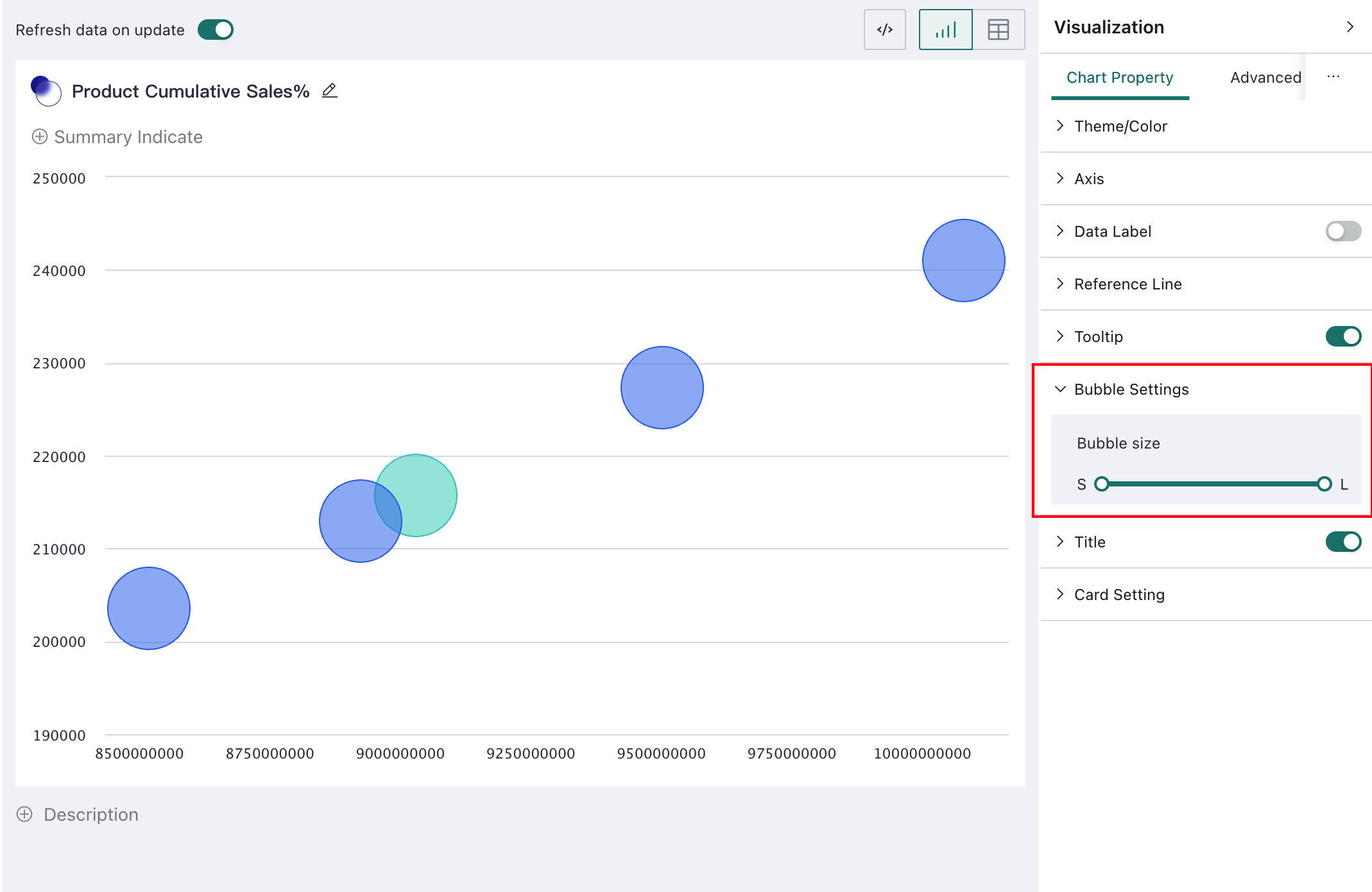
Bubble
Bubble Settings
Bubble charts combine position, size, and color to display rich information in a single chart. Appropriate bubble size settings make data points distribute more reasonably and improve overall readability.
Users can configure Bubble size under Bubble Settings in Chart Property.
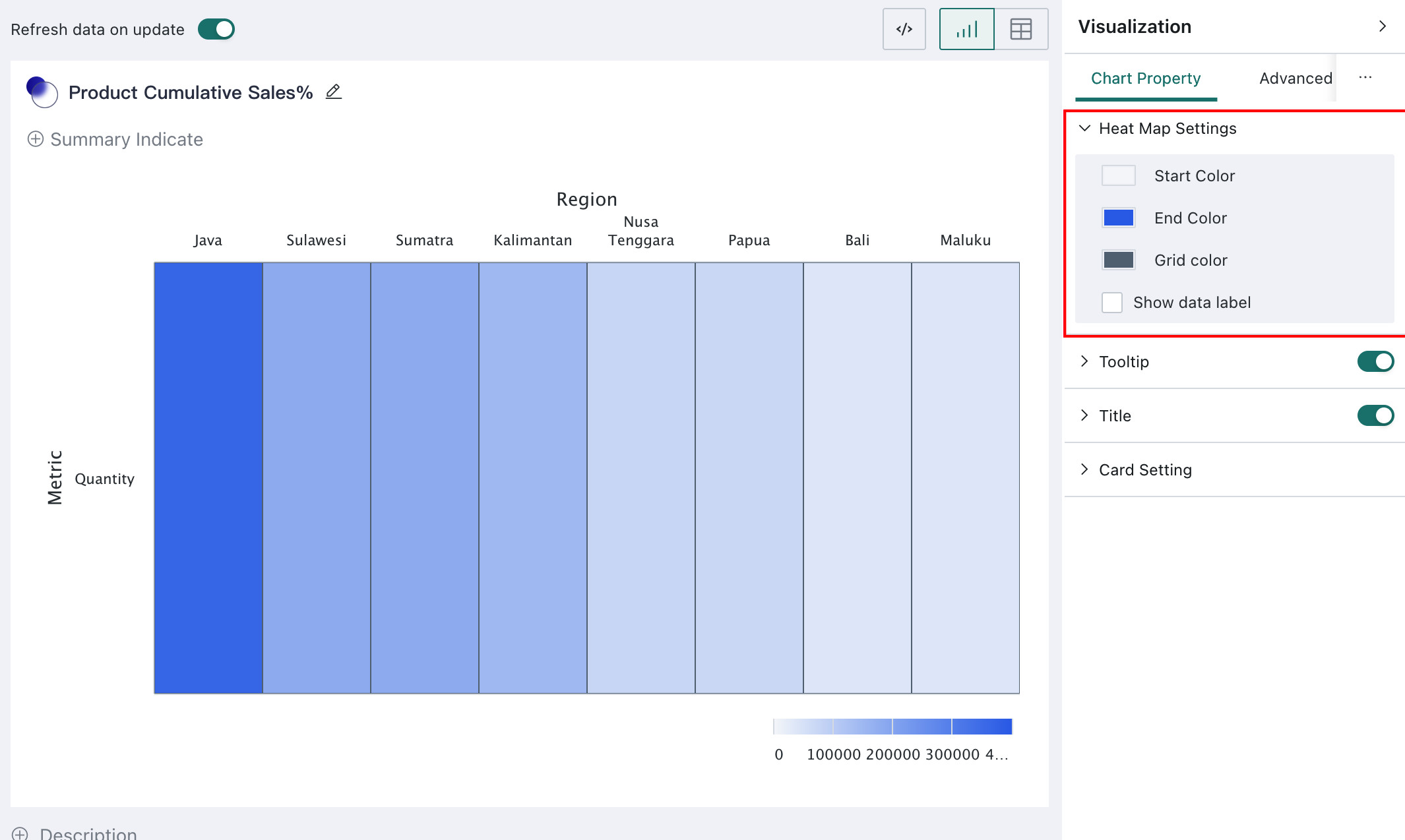
Heat Map
Heat Map Settings
Heat maps use color depth to represent data density or frequency distribution. Reasonable color settings help improve heat map readability.
Under Heat Map Settings in Chart Property, users can configure Start Color, End Color, Grid color, and whether to enable Show data label.
Analysis-Specific Configuration
Separating
If Separating is configured in the chart analysis area on the left, related Separating settings become available in the chart property configuration.
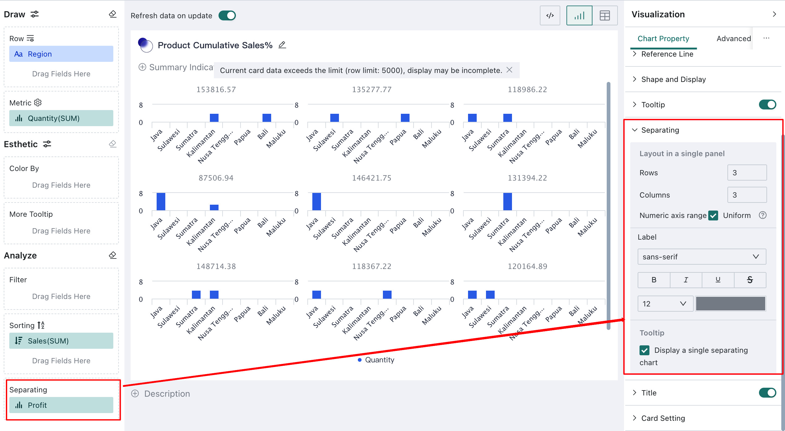
Layout in a single panel: configures the number ofRowsandColumnsof separating charts shown on one screenNumeric axis range: controls whether the value axis range is unified. IfUniformis enabled, all separating charts use the same axis range. If not, each separating chart determines its own axis range based on its own data.Label: configures label font, style, font size, and related propertiesDisplay a single separating chart: when enabled, hovering over a data point displays the tooltip content for the corresponding separating chart