Card Management
Overview
After creating various cards, users often need to perform management operations such as modifying, deleting, and moving cards to make the overall dashboard page more reasonable and aesthetically pleasing. This article will introduce card management operations in desktop layout and mobile layout respectively.
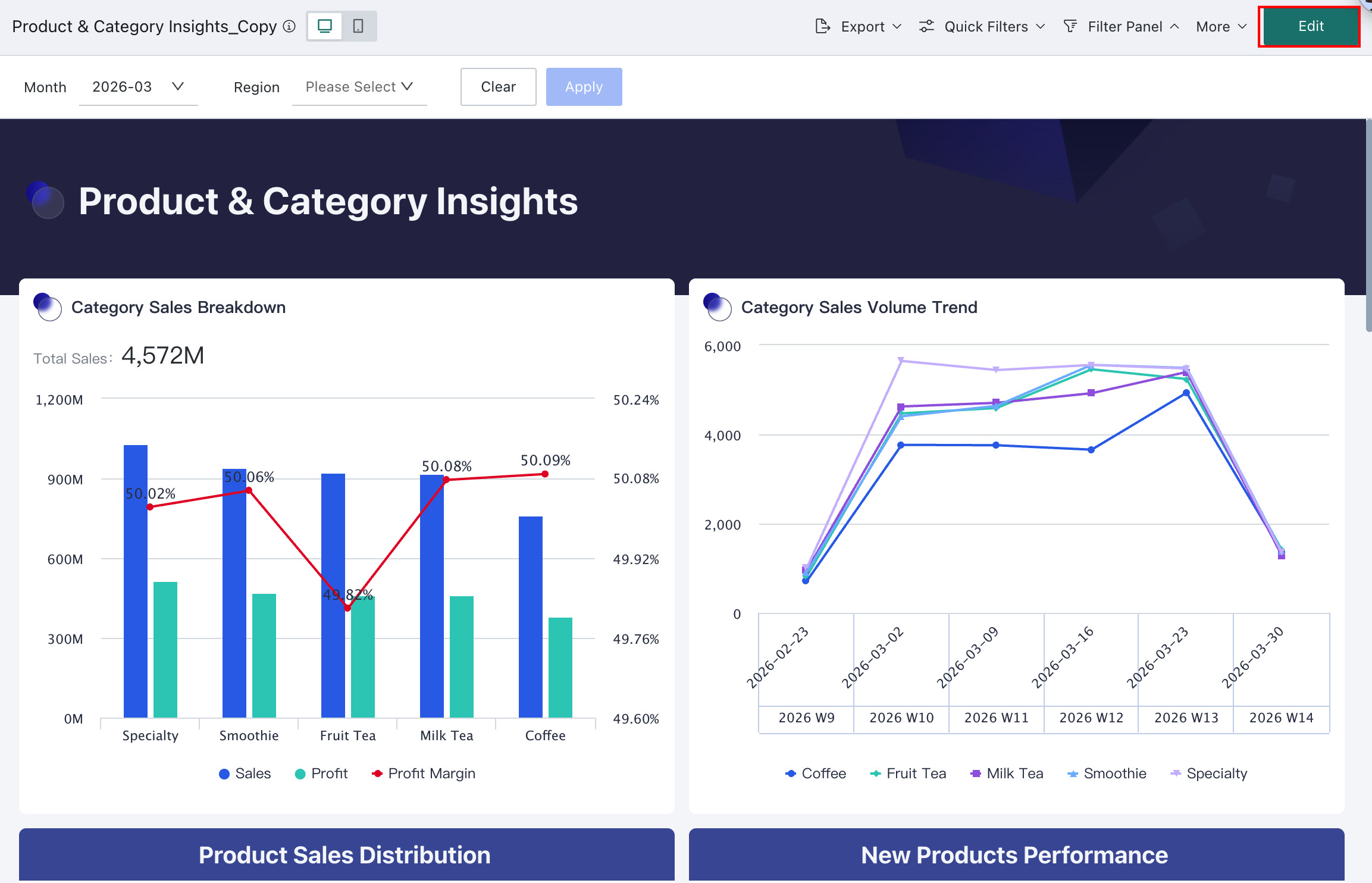
Since version 7.2 distinguishes between online and draft states of dashboards, some operations need to enter the dashboard editing page to be configured, such as: format painter, card order adjustment, title style, default interaction, prompt information, move to, set as anchor, delete, card group management, header sorting, and column width adjustment.
Desktop
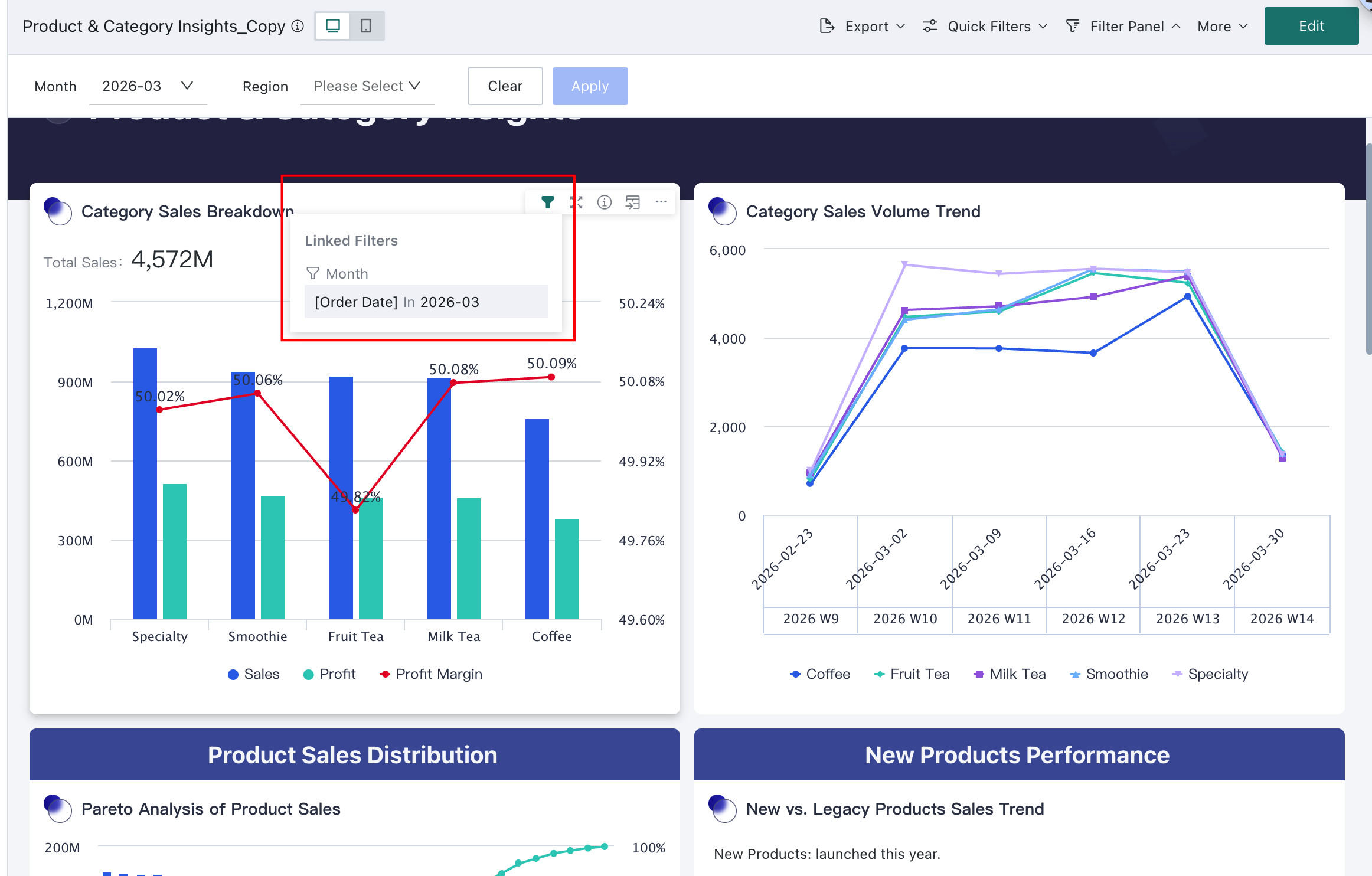
View Linked Conditions
After initiating linkage, users can view the current card's linked conditions through this function when viewing card data, and quickly locate the card that initiated the linkage. Clear linkage effects and data display can assist users in obtaining key data more efficiently, enabling them to focus on data conclusions for further data analysis.
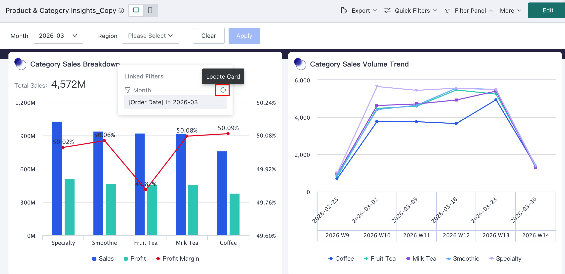
When users perform filtering and linkage operations through filters and cards on the dashboard page, click the Linked Conditions icon to view specific information, including the card that initiated the linkage and the parameter conditions passed by each card.
If you need to view the specific information of the card that initiated the linkage one by one, you can hover the mouse over the card name position in the linked conditions and click the locate icon to automatically locate the card that initiated the linkage. If the card is in the page filter bar or layout, the card will be highlighted and flickered (only PC supports the locate function); but if the card is in the card pool, locating is not supported.
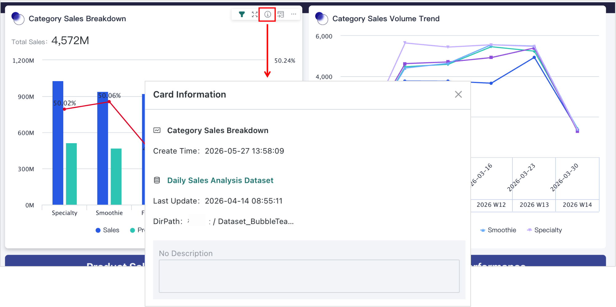
Card Information
By viewing card information, users can view and modify the card's name and description information. In addition, they can also view the card's source dataset and its path.
On the dashboard page, move the pointer to the upper-right corner of the card and click the Card Information icon. The Card Information dialog will then appear.
Show Data
If users want to view detailed data in visual charts during analysis, they can use the Show Data function to switch the card from chart mode to data mode and present it in table form.
On the dashboard page, click Show Data in the upper-right corner action bar of the card to switch the card from chart mode to data mode. Click Show Chart in the upper-right corner of the card to switch back to chart mode.
In addition to the dashboard page, users can also perform the above operations on the card editing page and card detail page. For details, please refer to Chart Analysis Preview, Go to Details.
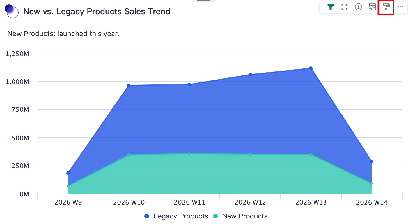
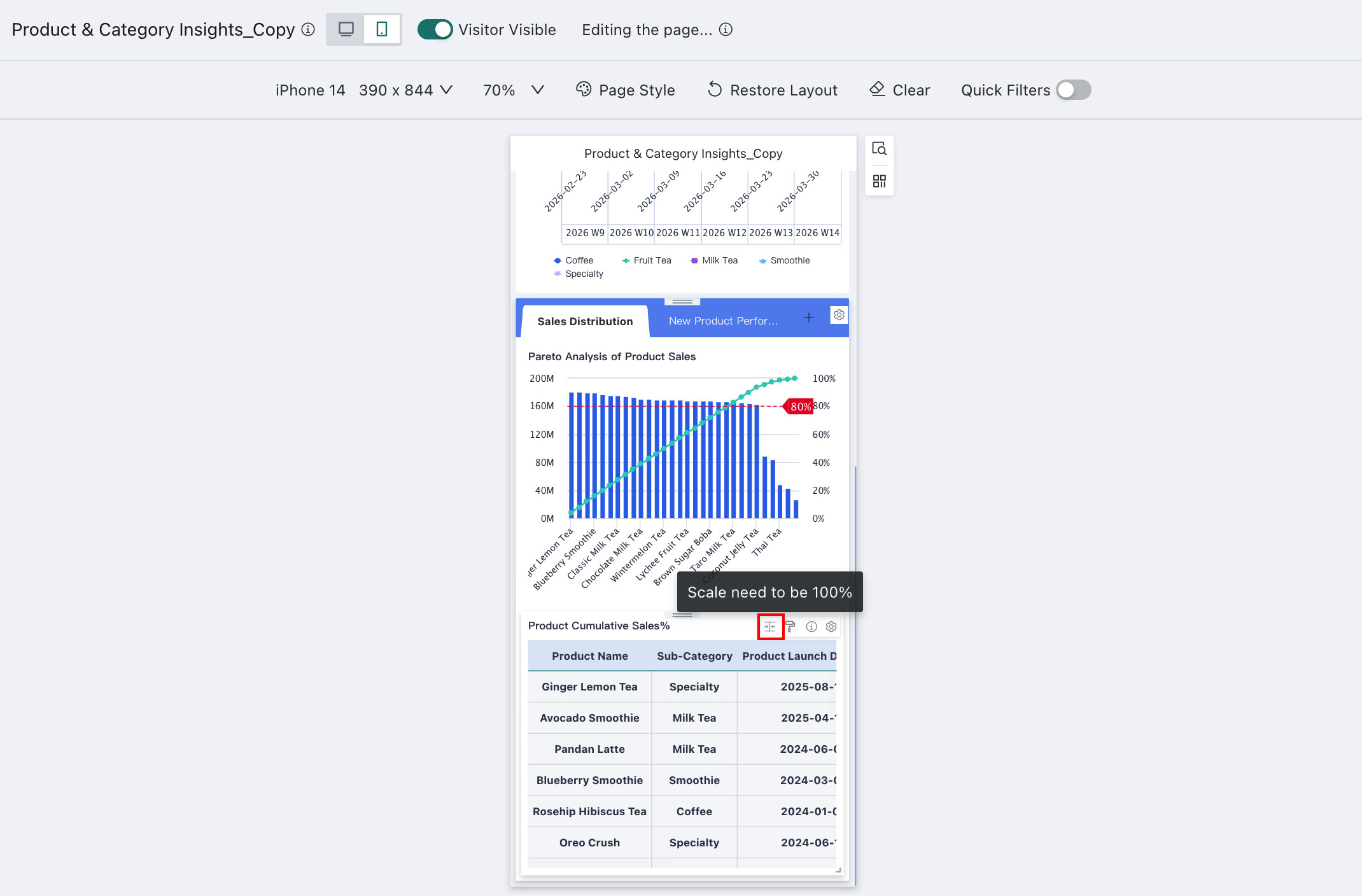
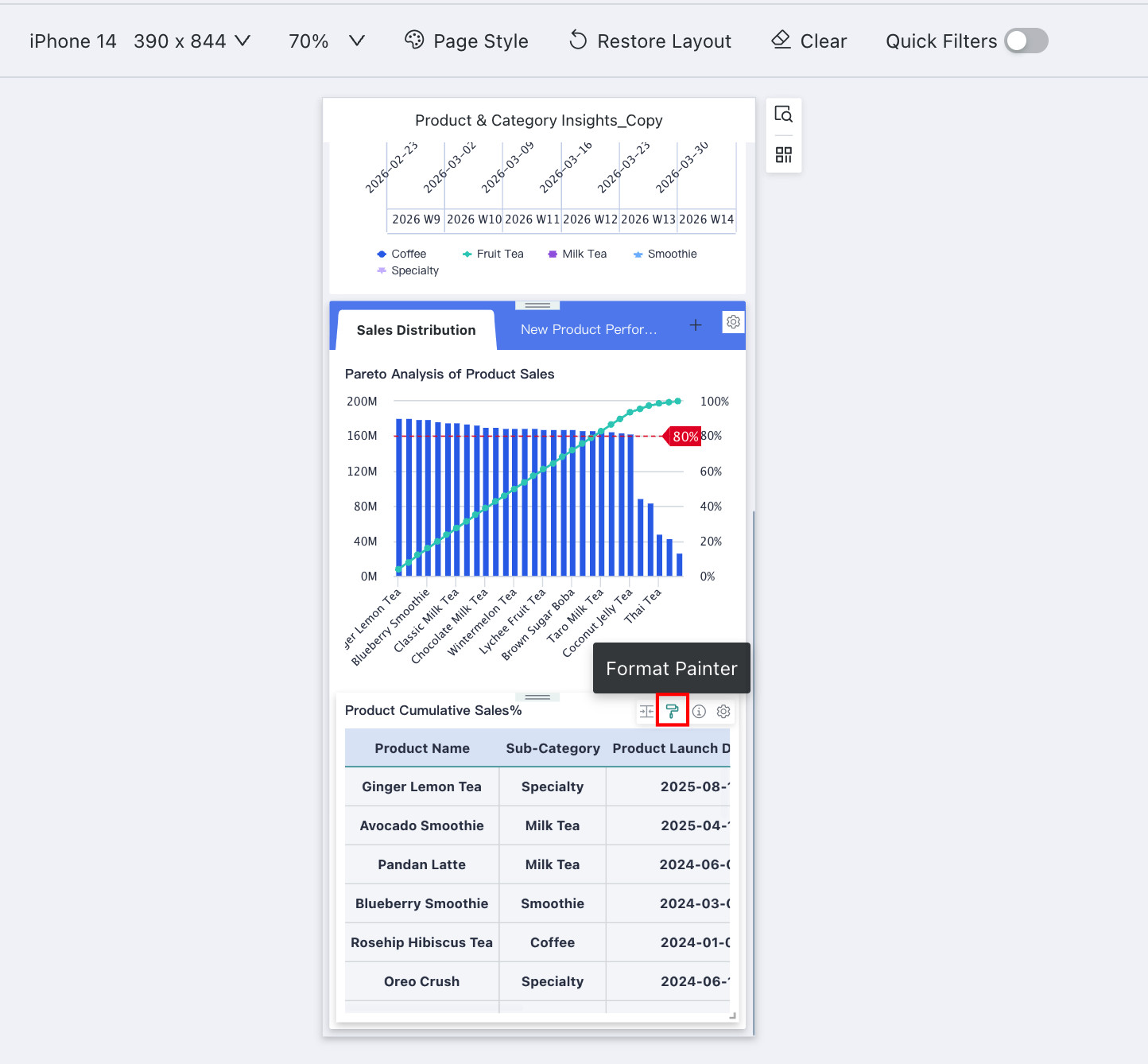
Format Painter
This operation needs to be configured in the dashboard editing page.
Guandata BI supports the format painter function, which can quickly synchronize the chart properties of a card to "same type" cards on the current page/other pages.
Select card A, click Format Painter in the upper-right corner action bar of card A to enter Format Painter mode, then click another same-type chart card B to apply the chart properties of card A to card B.
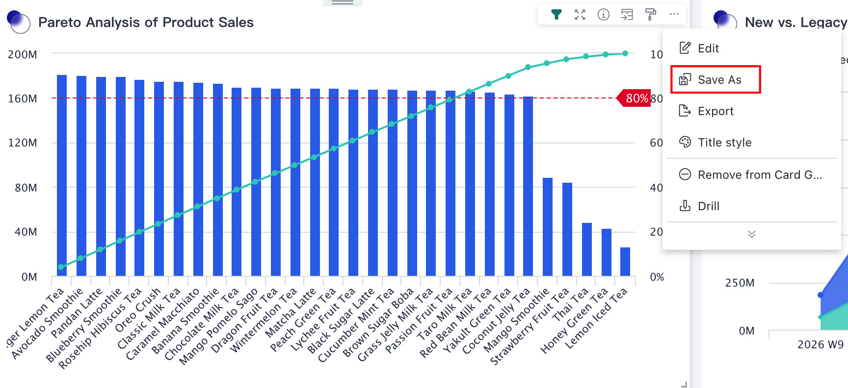
Save As
If users want to copy a card to another specified page, they can do so through Save As.
Click the ... button in the upper-right corner of any card, select Save As in the pop-up menu, rename the card, select the target page, and click Confirm to copy the card to the corresponding page.
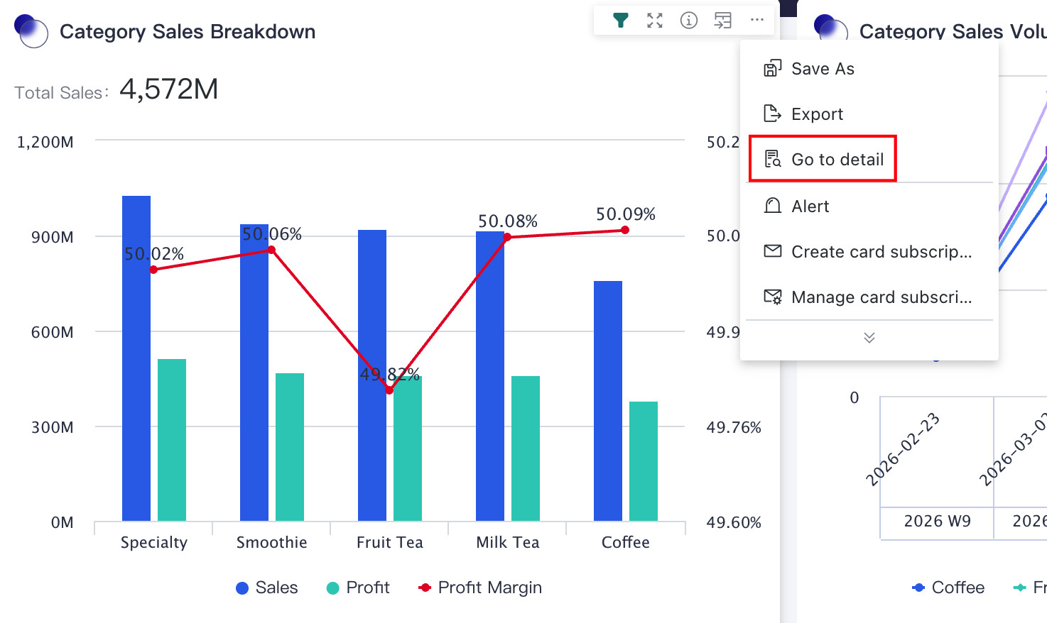
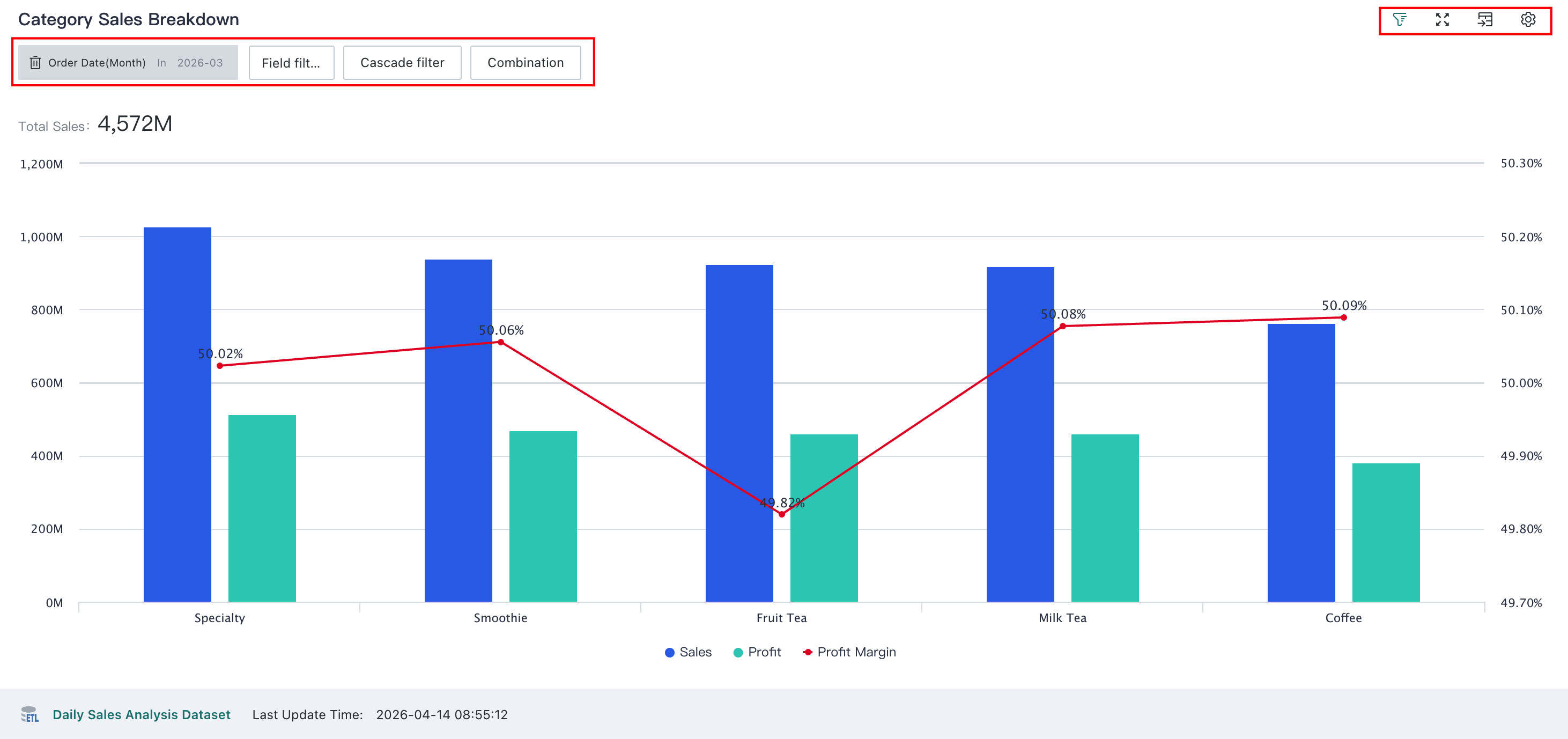
Go to Details
In addition to the dashboard page, users can also go to the card detail page to focus on single card data analysis, such as configuring filters, full-screen display of cards, etc.
- On the dashboard page, click the
...button in the upper-right corner of any card, and selectGo to Detailsin the drop-down menu to jump to the detail page of that card.
- On the card detail page, users can filter according to analysis scenarios, supporting three types of filtering: field filtering, cascade filtering, and combined conditions. For detailed configuration procedures, please refer to Card Detail Page Filter. In addition to filtering, you can also full-screen display cards, switch chart/data views, and other operations on the card detail page.
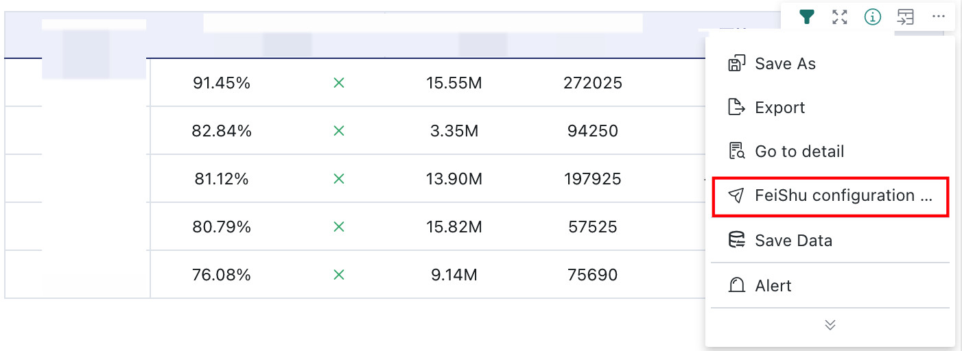
Feishu Integration Link
One-click access to the card's Feishu integration link, embedding the card into Feishu Cloud Documents through the integration link. For details, please refer to Embed BI Visualization Charts into Feishu Cloud Documents.
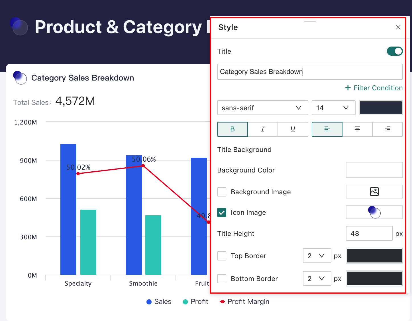
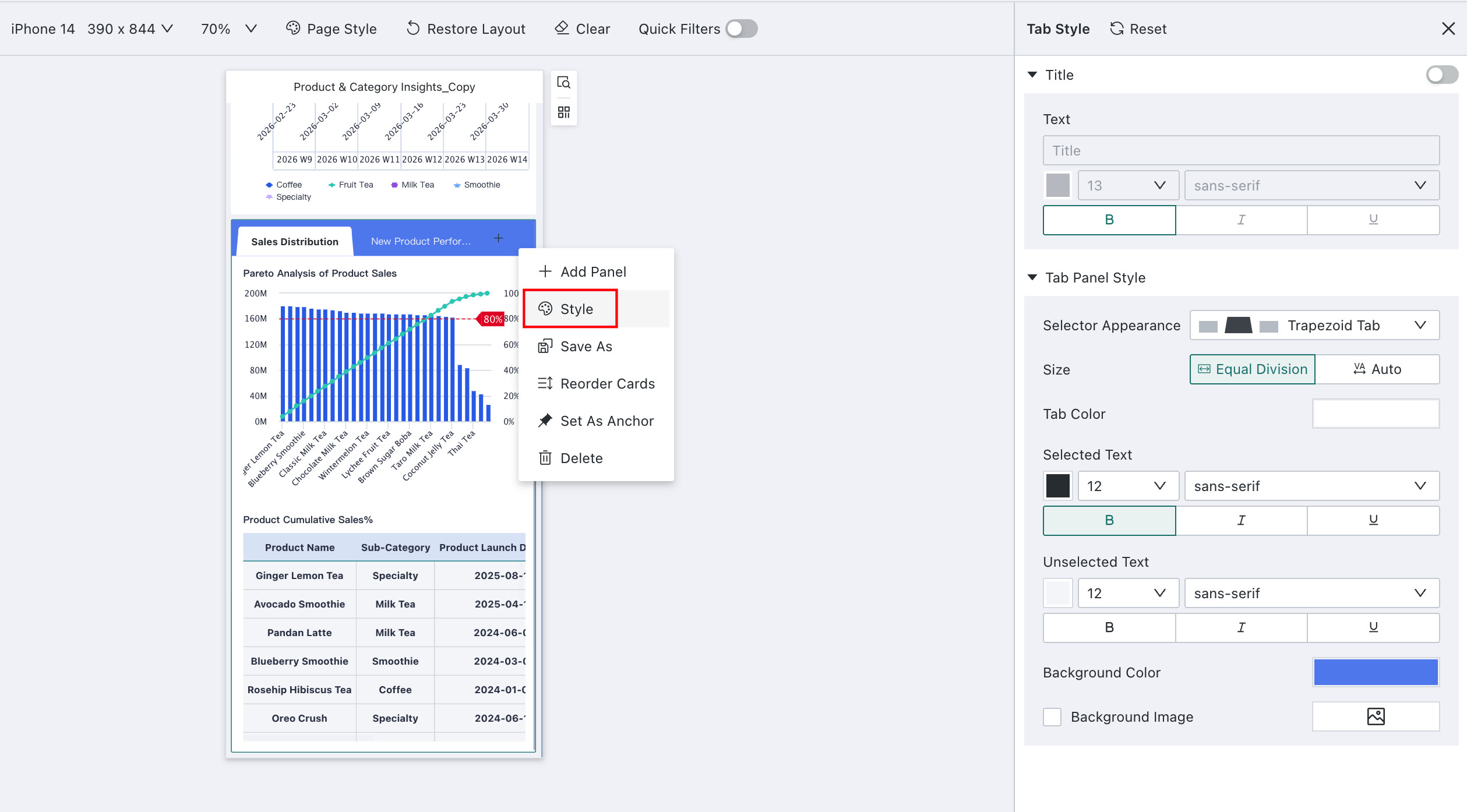
Title Style
This operation needs to be configured in the dashboard editing page.
You can quickly adjust the title style of cards in the dashboard interface.
Select any card on the dashboard page, click ... in the upper-right corner of the card, and select Title Style in the drop-down menu. The style adjustment window then opens, where users can adjust the card title content, text style, and title background.
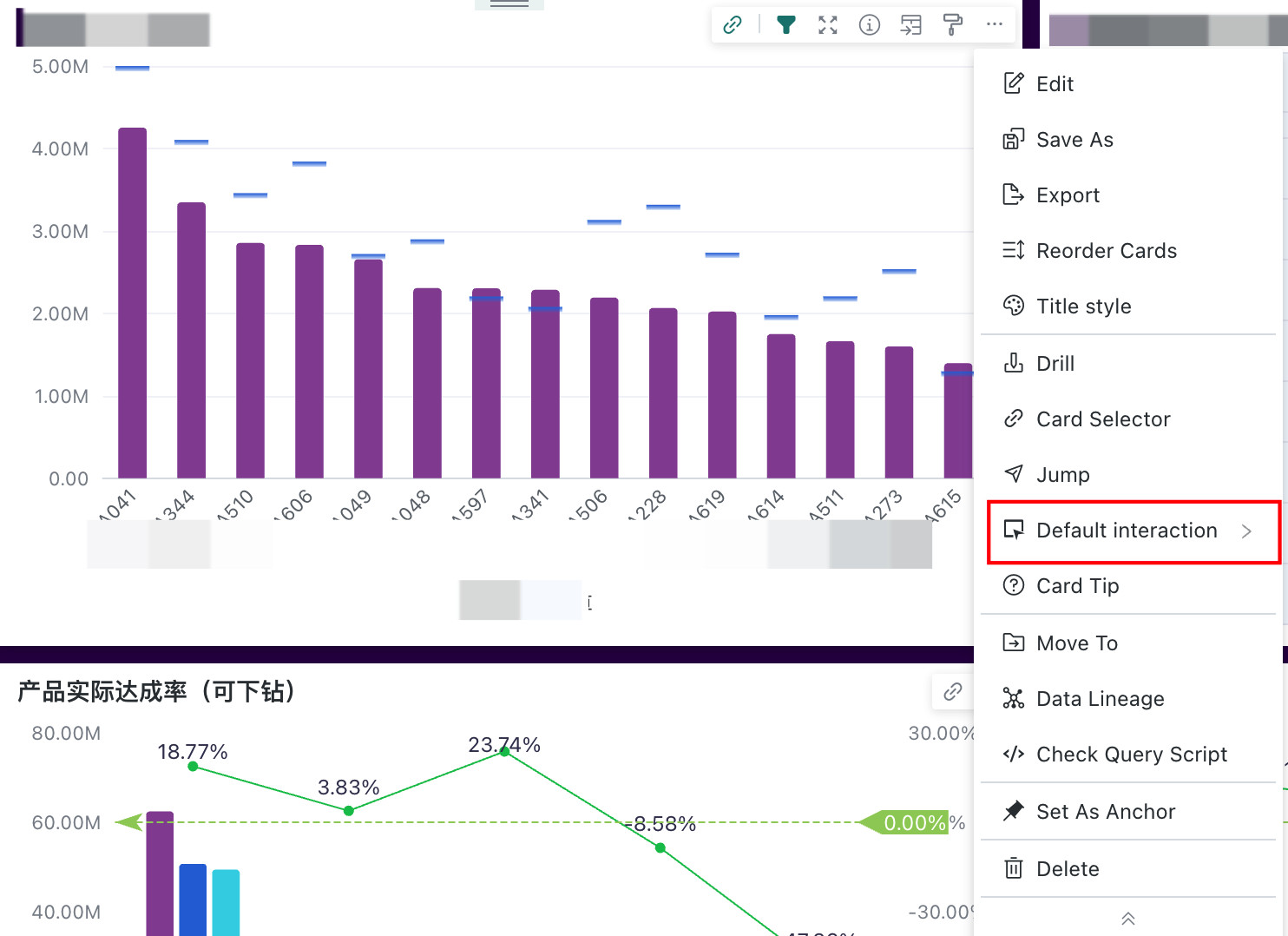
Default Interaction
This operation needs to be configured in the dashboard editing page.
In slightly complex analysis scenarios, it is often necessary to configure certain interactive functions for cards to meet different analysis needs, such as configuring jump, linkage, drill-down, etc. These interactions usually need to be executed after the user explicitly triggers them.
But to improve operational efficiency and user experience, Guandata BI allows users to set a default interaction action. When this default interaction action is clicked on the chart, the user does not need to select the triggered interaction, but executes the default interaction set by the system. For details, please refer to Default Interaction.
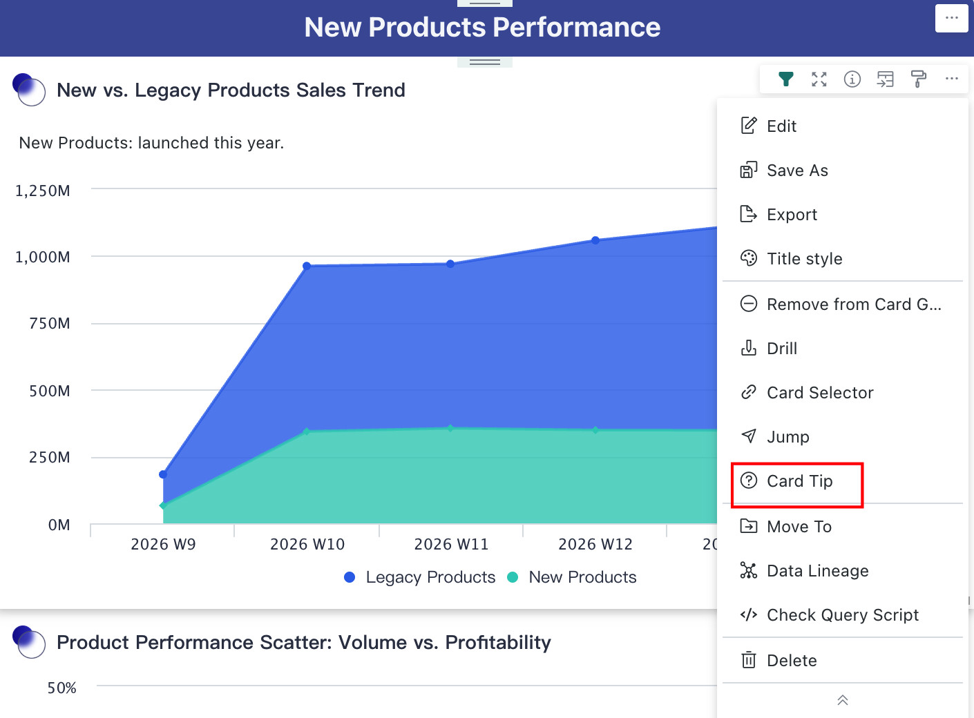
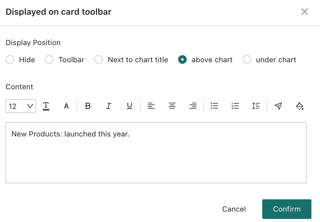
Prompt Information
This operation needs to be configured in the dashboard editing page.
The prompt information function of cards can help you express card chart information more accurately and clearly.
Prompt information is not displayed by default. You can click the ... button in the upper-right corner of the card, select Prompt Information, and then configure the rich text content and display position.
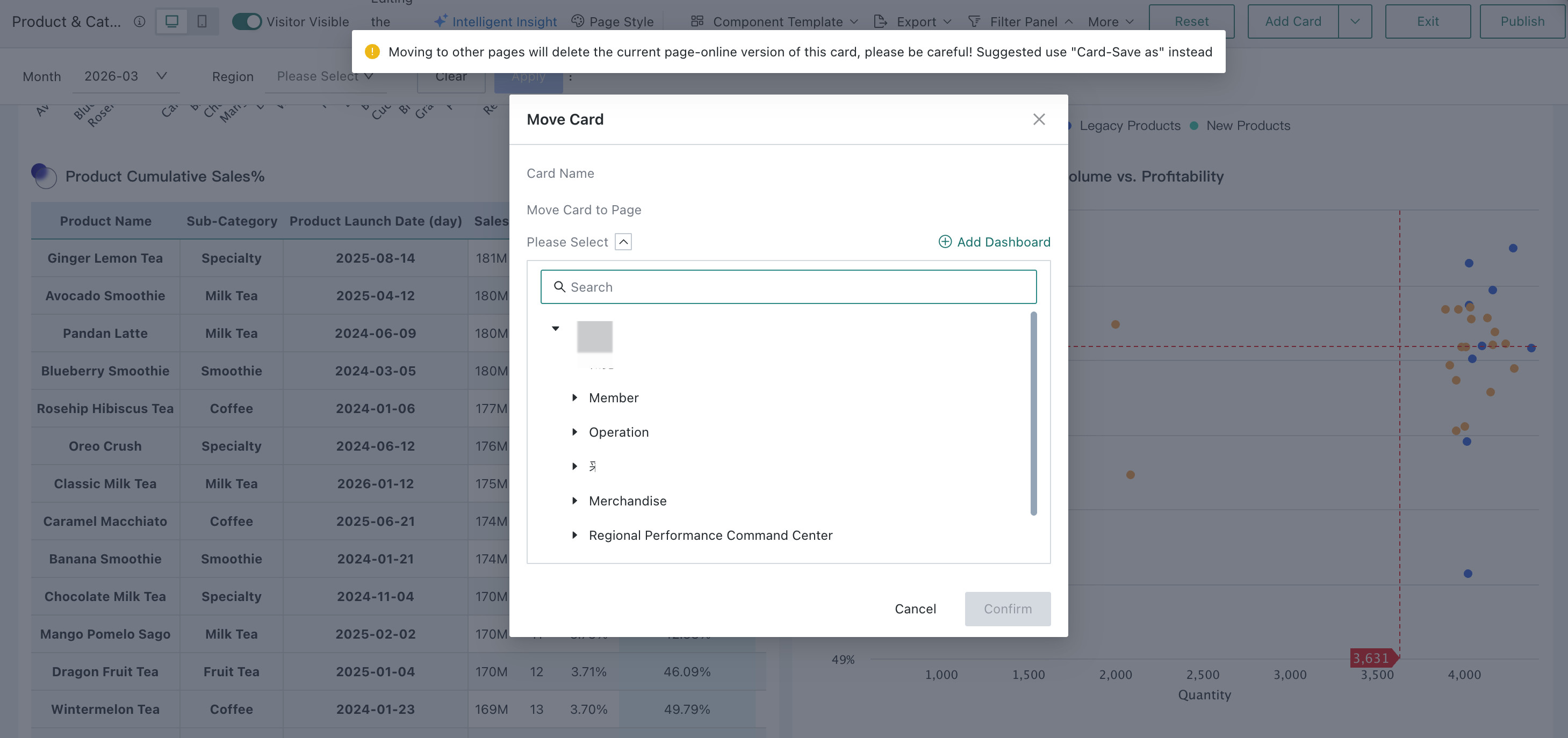
Move To
This operation needs to be configured in the dashboard editing page.
By using the Move To function, users can move cards in the dashboard to other pages.
On the dashboard page, click the ... button in the upper-right corner of the card, select Move To in the drop-down menu, and then select the target page in the pop-up move configuration window to move the card to that page.
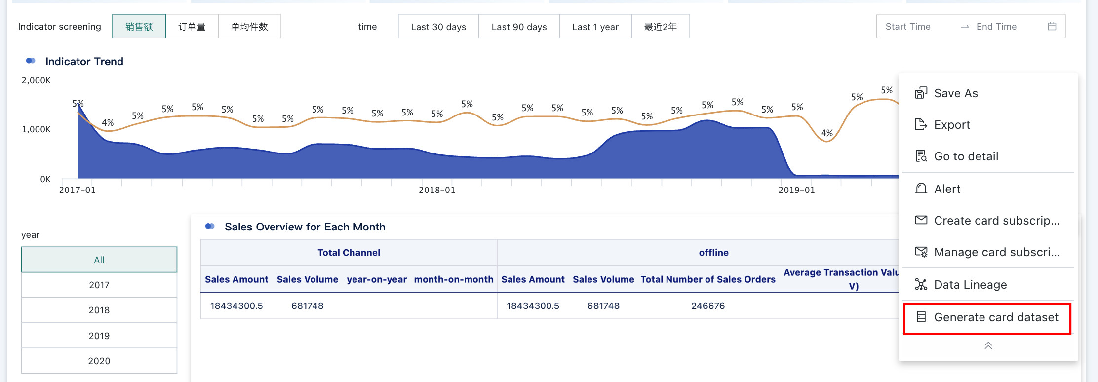
Generate Card Dataset
Guandata BI supports users to quickly create a card dataset from the data generated by the card.
Click the ... button in the upper-right corner of the card, select Generate Card Dataset in the drop-down menu, fill in the dataset name and storage path in the pop-up window, and save the generated card dataset to the corresponding directory. For more descriptions about card datasets, please refer to Card Dataset.
Data Lineage
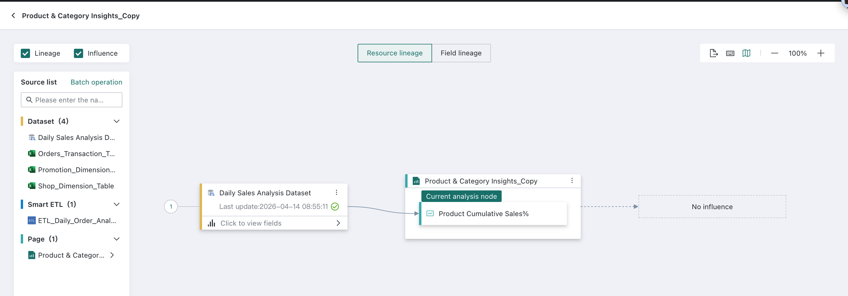
Take the current card as the "current analysis object", view the card's resource lineage and field lineage, and quickly understand the upstream and downstream dependency of resources.
-
Click the
...button in the upper-right corner of the card, selectData Lineagein the drop-down menu, and open theResource Lineagepage to view the upstream and downstream lineage relationships of the card.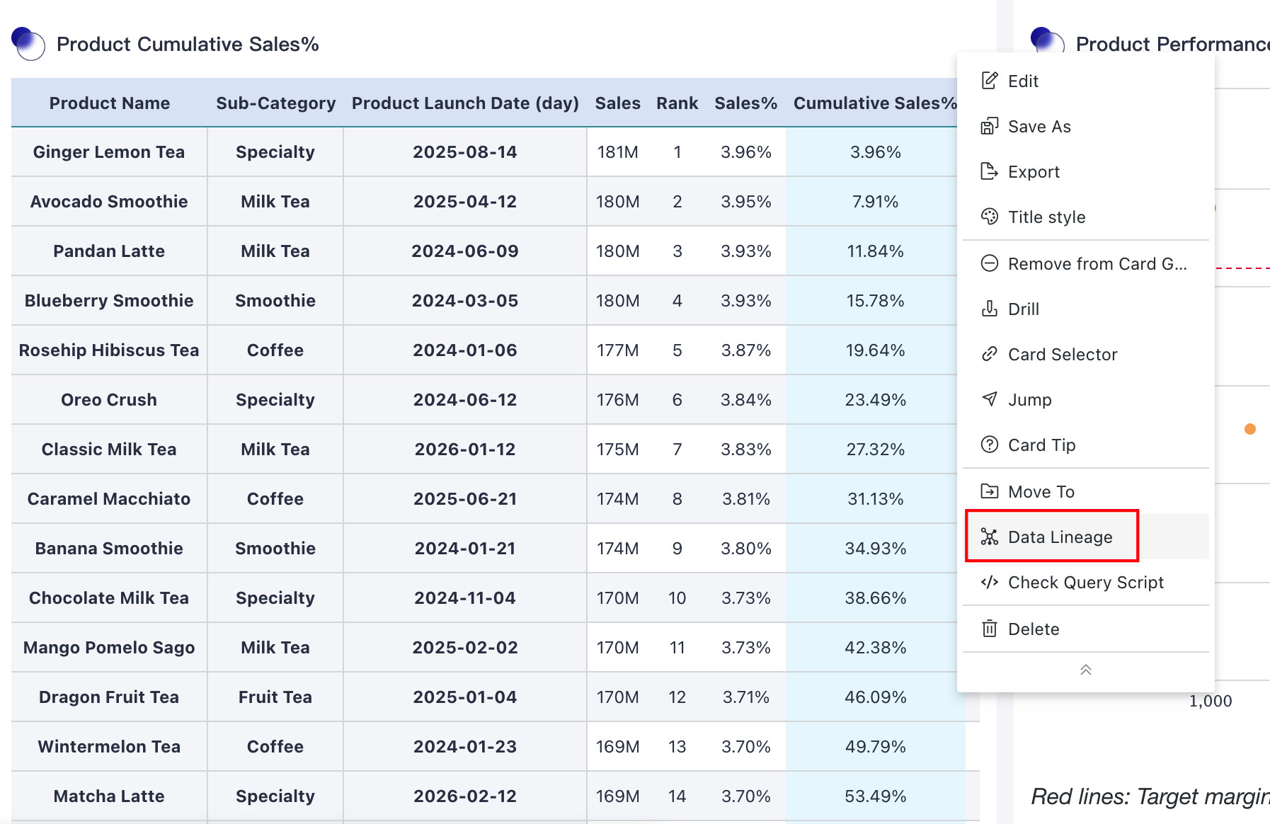
 Note
NoteMove the mouse over the target field in the dataset and click the
View Field Lineageicon after the corresponding field, as marked by the blue box in the figure above, to view all related pages and cards for that field. -
If you need to view field lineage, switch to the
Field Lineagetab to view the source of fields in the card with the current card as the analysis object. You can select the field you want to analyze in the field list on the left.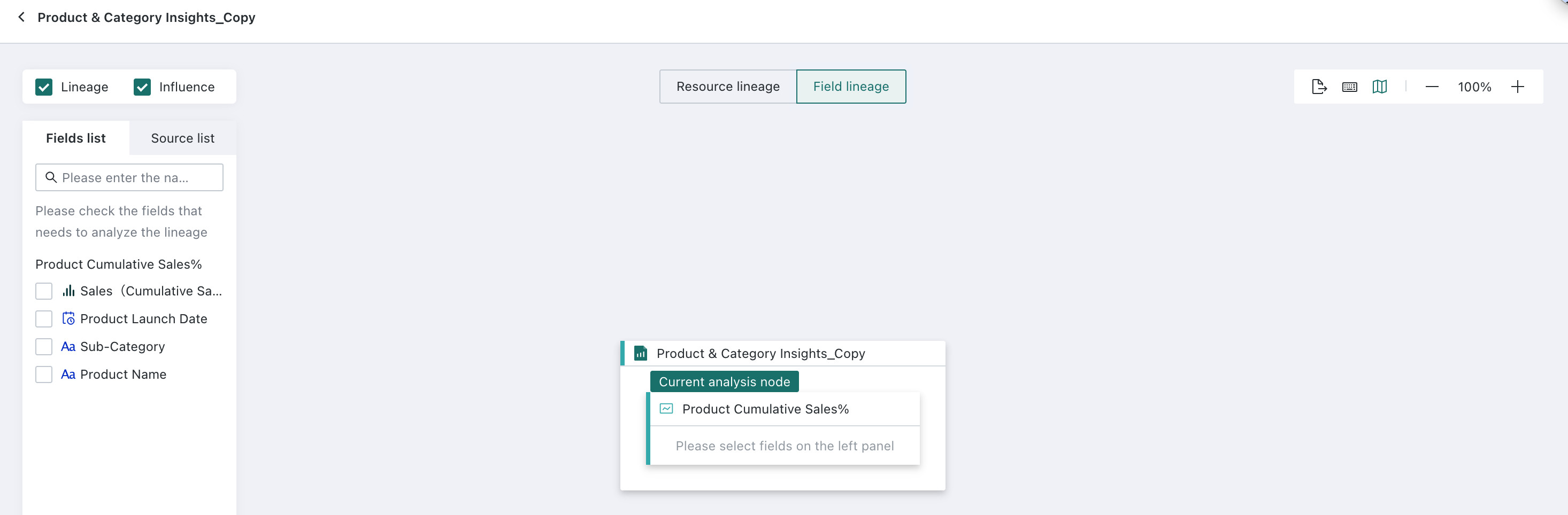
For more instructions on resource lineage, see Resource Lineage.
Query Script
A query statement refers to instructions or commands used to retrieve specific data from a database or dataset, which can help technical personnel or data analysts understand the calculation logic of BI cards.
On the dashboard page, click ... in the upper-right corner of the card, and then click Query Script in the drop-down menu to open the query statement window.
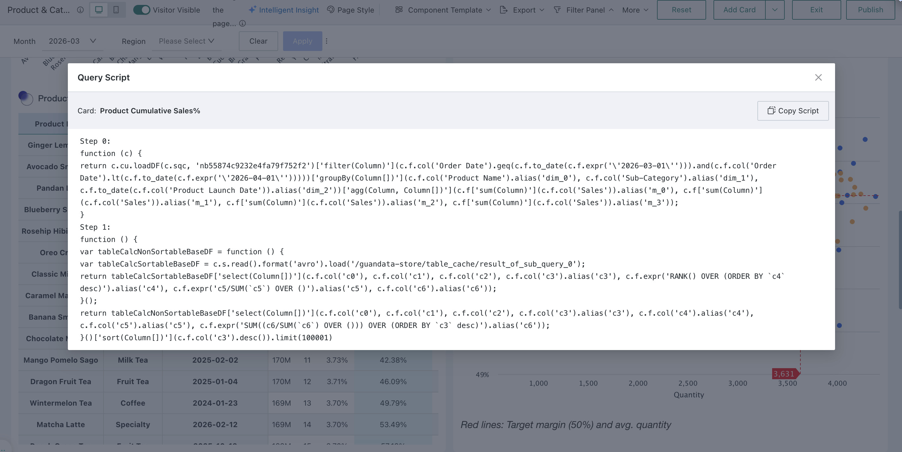
In addition to the dashboard page, users can also view query statements on the card editing page. For details, please refer to Query Statement.
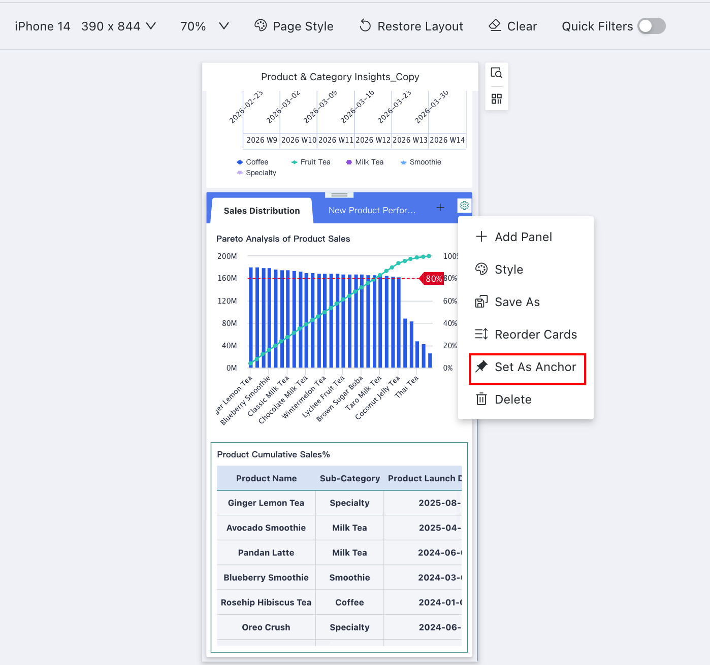
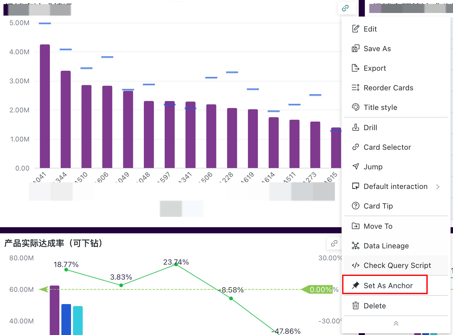
Set as Anchor
This operation needs to be configured in the dashboard editing page.
When the dashboard contains a large number of cards, to improve the efficiency of browsing information and analyzing data, users can set key cards as anchors. Through anchor links, users can quickly locate the key analysis parts of the page.
For specific anchor configuration procedures, please refer to Anchor Settings.
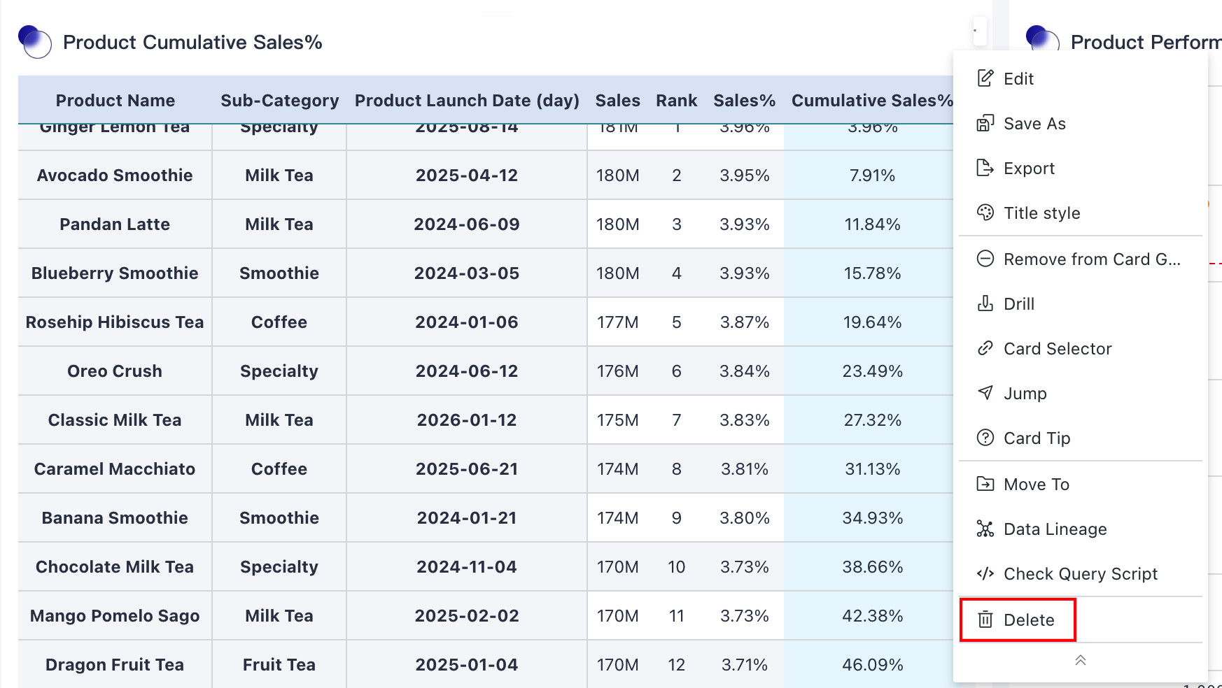
Delete
This operation needs to be configured in the dashboard editing page.
Guandata BI supports deleting cards on the dashboard. Click ... in the upper-right corner of the card and select Delete in the drop-down menu. You can choose to permanently delete the card or move it to the card pool. Permanently deleted cards cannot be recovered, while cards moved to the card pool can be restored from there.
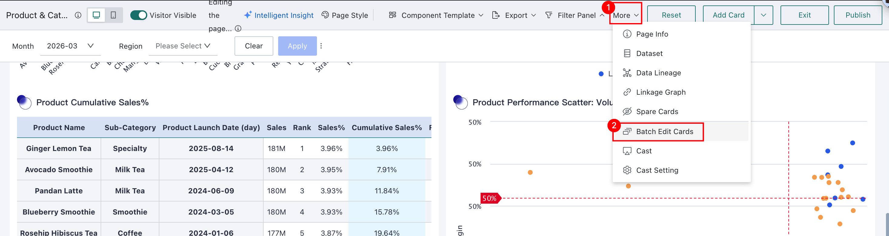
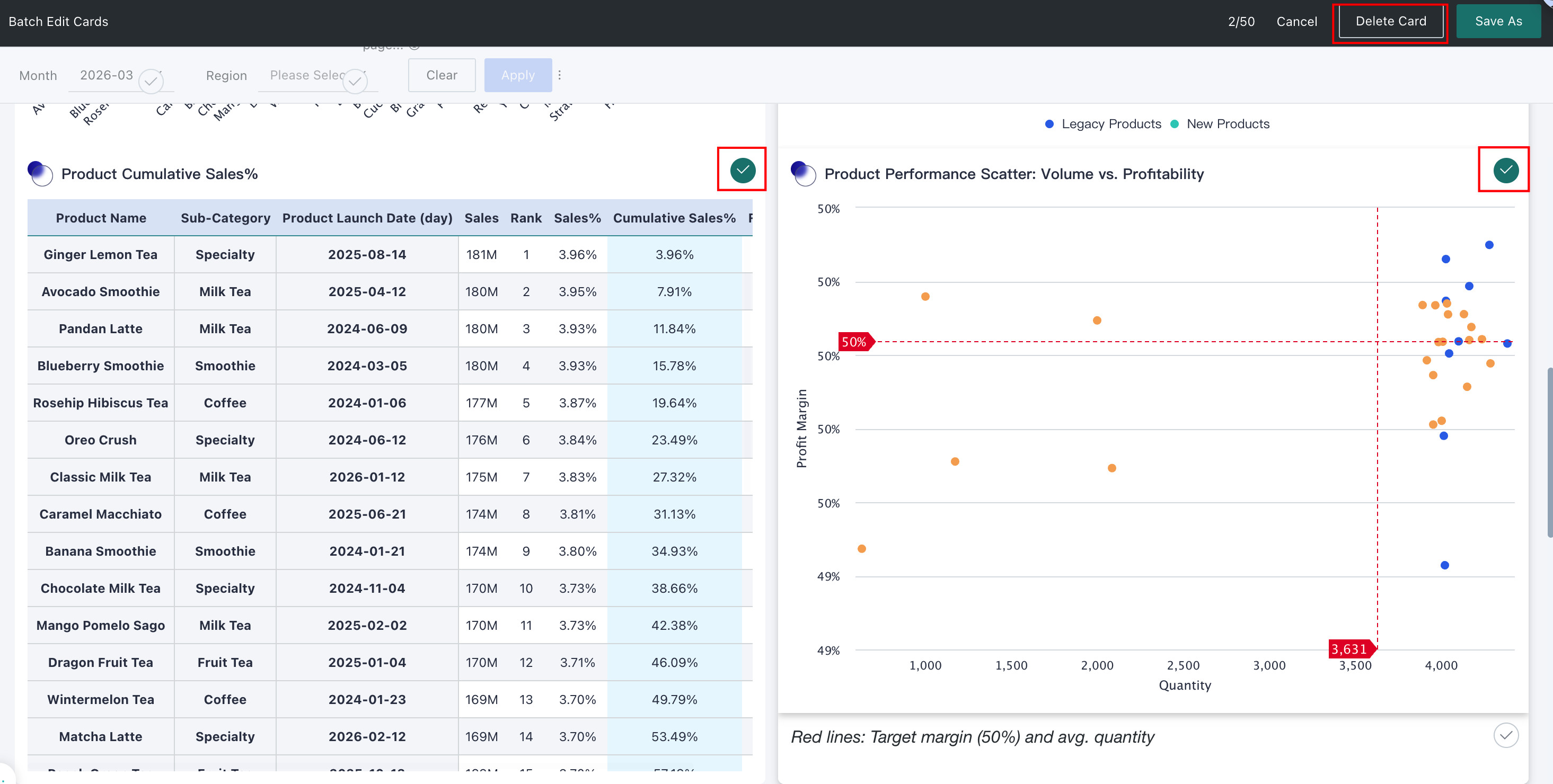
If you need to batch delete cards, on the dashboard editing page, click More > Batch Edit Cards, select the cards to delete, and then click Delete Cards in the upper-right corner.
Card Group Management
This operation needs to be configured in the dashboard editing page.
In addition to managing single cards, users can also assemble multiple cards into a page component for unified display and management. For details, please refer to Page Components.
Header Sorting
- This operation needs to be configured in the dashboard editing page.
- If there are merged cells in the table, this function takes effect within the group.
In the dashboard page, table cards support clicking the header to achieve quick data sorting.
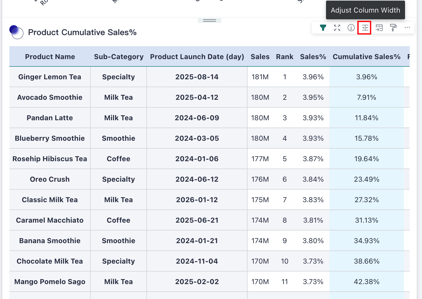
Adjust Column Width
- This operation needs to be configured in the dashboard editing page.
- This operation needs to be performed in the adaptive mode of the dashboard.
On the dashboard page, you can adjust table column width. Click Adjust Column Width in the upper-right corner of the card to enter the column-width editing interface. After editing, click Save.
In addition, you can also directly drag the column width of the table on the card for temporary adjustment. However, this adjustment cannot be saved, and after refreshing the page, the table column width will return to its original state.
In addition to the dashboard page, users can also adjust table column width on the card editing page. For details, please refer to Chart Analysis Preview.
Mobile
Add/Remove Cards
Spare Cards refers to the card pool in the desktop layout. Users can add cards from this area to the page or remove cards from the page to Spare Cards.
-
When switching to mobile layout for the first time, cards from the desktop layout are displayed in order by default. If you need to add cards, select
Spare Cardsfrom the menu on the right and check the cards you want to add to the layout page.
-
If you want to remove a card from the page, click
Remove from Pagefrom the settings menu in the upper-right corner of the card. This operation does not delete the card. It only moves the card toSpare Cards.
Adjust Column Width
In addition to the desktop, users can also adjust column width for table cards in the mobile layout. The operation steps are the same as the desktop. See above for details.
Format Painter
As on desktop, users can adjust card styles through Format Painter in the mobile layout. For specific configuration steps, see the desktop section above.
Style
In addition to supporting card style settings in chart properties on the desktop card editing page, Guandata BI also supports configuring Style in the mobile layout.
Click the settings button in the upper-right corner of the card, select Style, and the style configuration panel appears on the right. Because card types differ, the available style configuration options also differ. Configure them according to your needs. For detailed instructions, see Chart - Chart Property.
Mobile style settings will not be synchronized to the desktop.
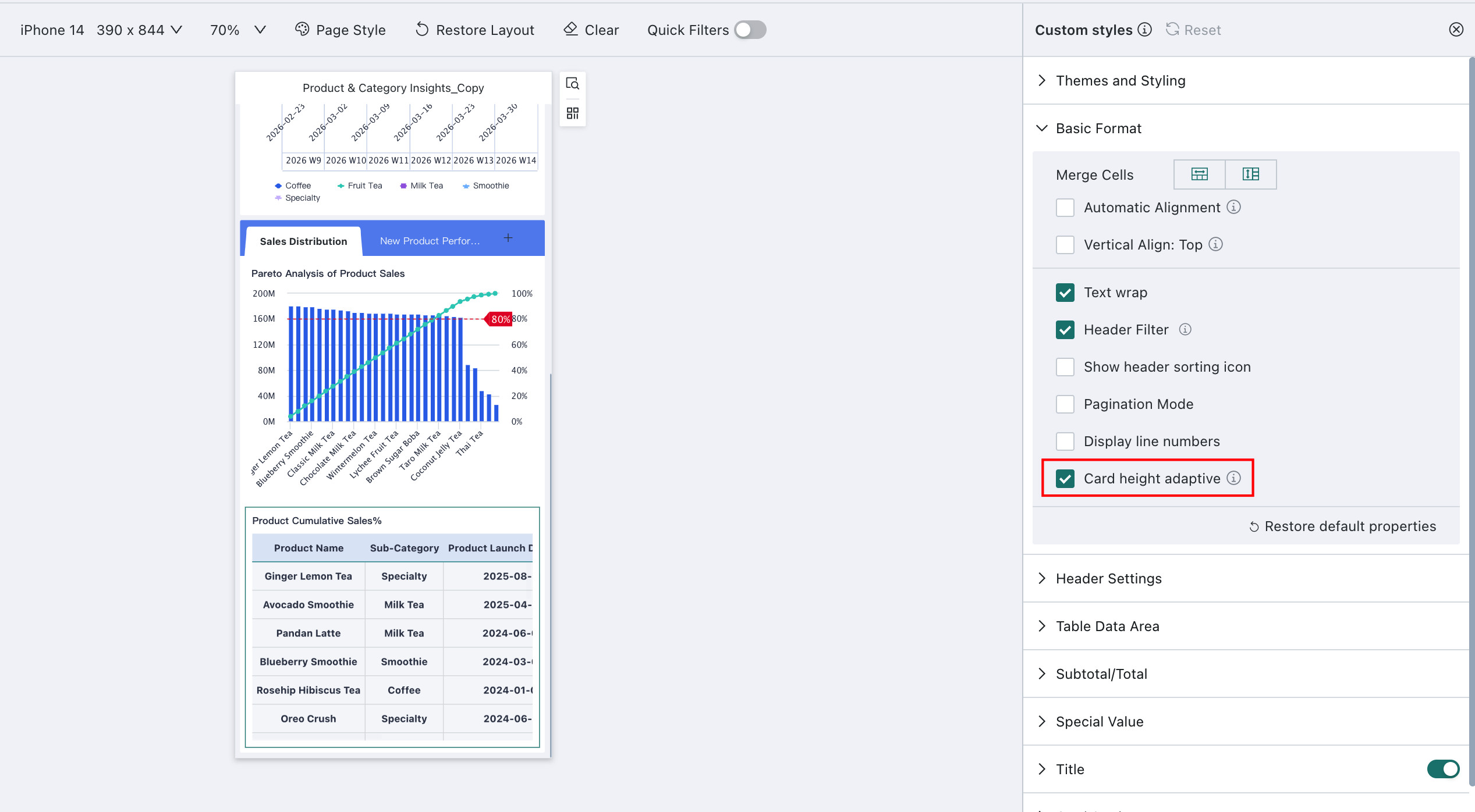
For table type cards, it supports setting adaptive card height based on content. When the table content height is less than the card set height, the card automatically adapts to the content height; when the content height exceeds the card height, the card height remains unchanged and scrolls to view.
Configuration Entry: Settings > Style > Basic Format > Card Height Adaptive (enabled by default)
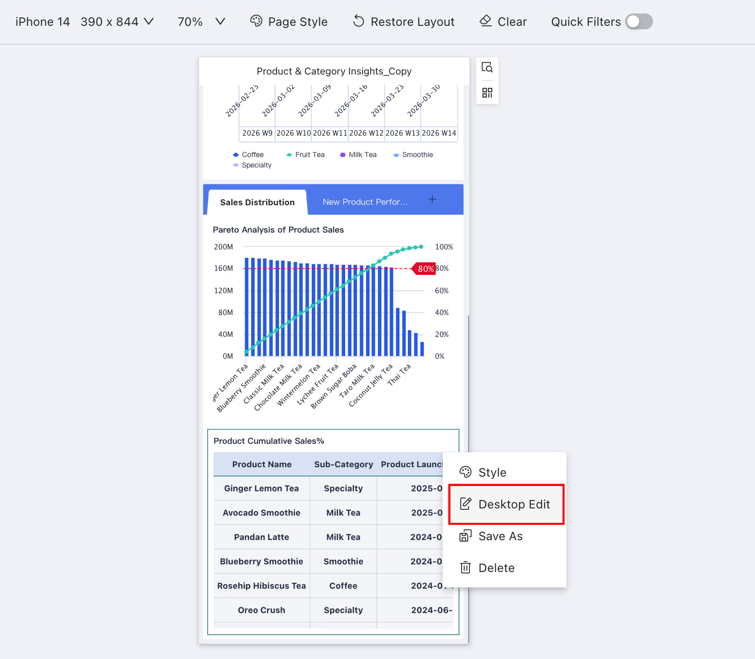
Desktop Edit
If you want to re-edit the card visually, click Desktop Edit from the settings menu in the upper-right corner to enter the visual editor.
For visual editing content, see Overview
In addition, you can also directly edit and replace external link cards and image cards. Move the mouse to the upper right corner of the external link card, click the edit button to re-edit. After editing, the mobile and PC content remains consistent.
Move the mouse to the upper right corner of the image card, click the edit button to re-upload the image, select the size mode, etc. After editing, the mobile and PC content remains consistent.
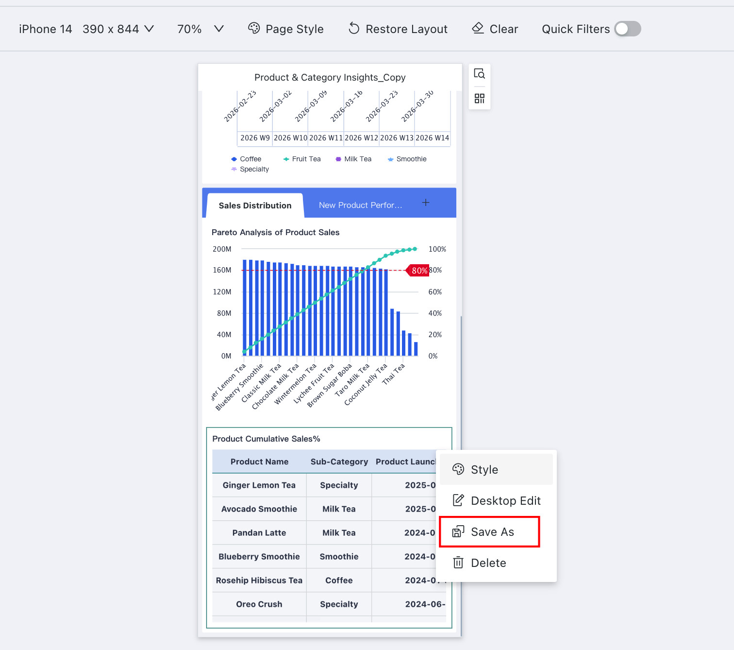
Save As
If you want to copy an identical card to another page, click Save As from the settings menu in the upper-right corner of the card, fill in the card name, and select the copy path.
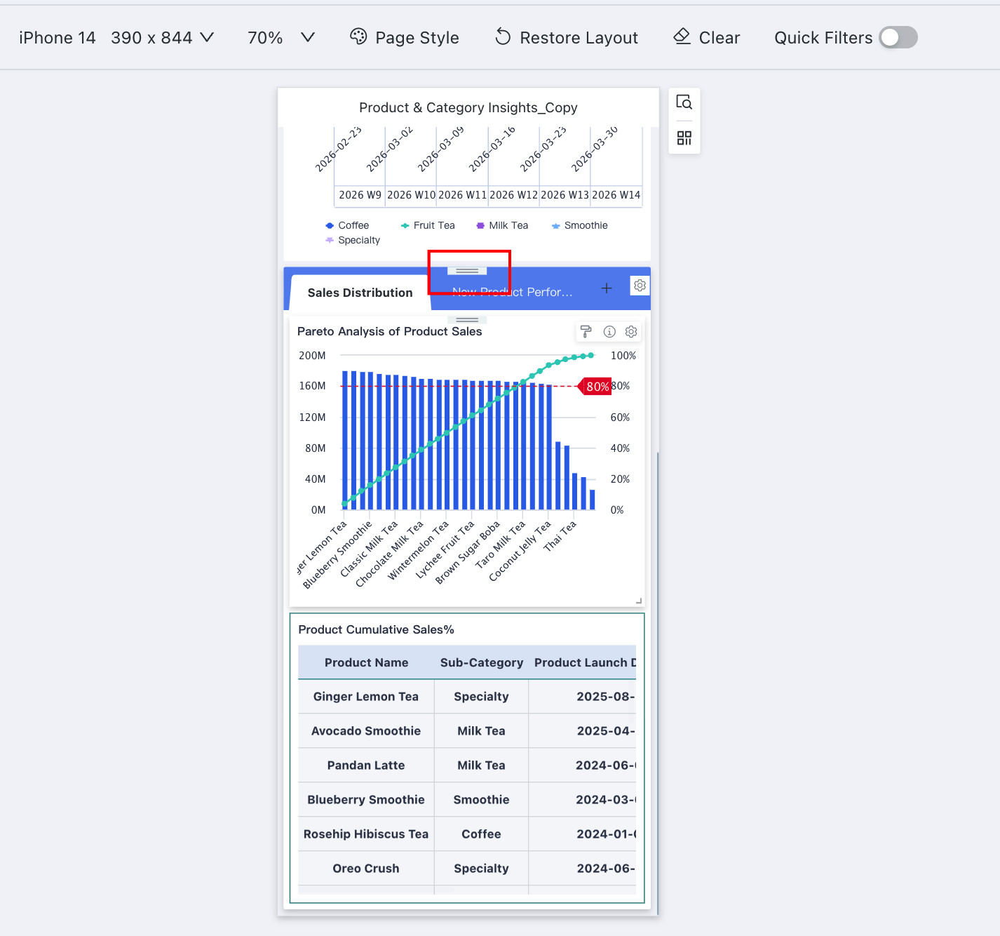
Card Order Adjustment
Users can move card positions through Card Order Adjustment. The operation steps are the same as on desktop. See above for details.
In addition to Card Order Adjustment, users can also press and hold the top of the card to drag and drop it to a specific position.
Set as Anchor
When using on mobile, open the anchor navigation to see the names of cards set as anchors, and click to quickly locate the anchor card.
Setting a card as an Anchor adds the specified card to the page navigation, allowing quick positioning when viewing on mobile. After the anchor is set, an anchor navigation icon appears on the right side of the page. For detailed instructions, see Anchor Settings.