Page Filter
Overview
This article provides an overview of the page-level filters supported by Guandata BI. You can find the supported filter types, features available to filters as independent cards, and usage instructions for the Filter Bar and filter groups.
Feature Description
Guandata BI provides 8 types of Page Filters (Select, Tree, Condition, Range, Date, Quick Date Range, Parameter, and Combination Condition). By using Page Filters, users can filter data through different interaction methods to present key analytical content, enabling rapid focus and efficient decision-making.
Application Scenarios
Page filters are mainly applied in the following scenarios:
- When viewing a Dashboard, users need to flexibly switch between data of interest;
- When a single filter needs to apply to multiple cards simultaneously;
Currently, all filter types only support filtering the detailed data of datasets.
Filter Card Features
As a type of card on the page, filters also have independent card features.
| Feature / Filter Position | Filter Bar | Canvas (Page Layout) |
|---|---|---|
| Edit | Enter the filter editing dialog to modify saved configuration items. | |
| Save As | Supports saving filter cards to other pages. When saved together with linked cards, the linkage relationship is retained (if saved separately one after another, the linkage relationship cannot be retained and needs to be reconfigured). Page - Batch Edit Cards supports batch selection of filter cards for Save As. |
|
| Recorder Cards | / | Supports selecting a card and moving the filter card to the front/back of the selected card (indicated by a blue line).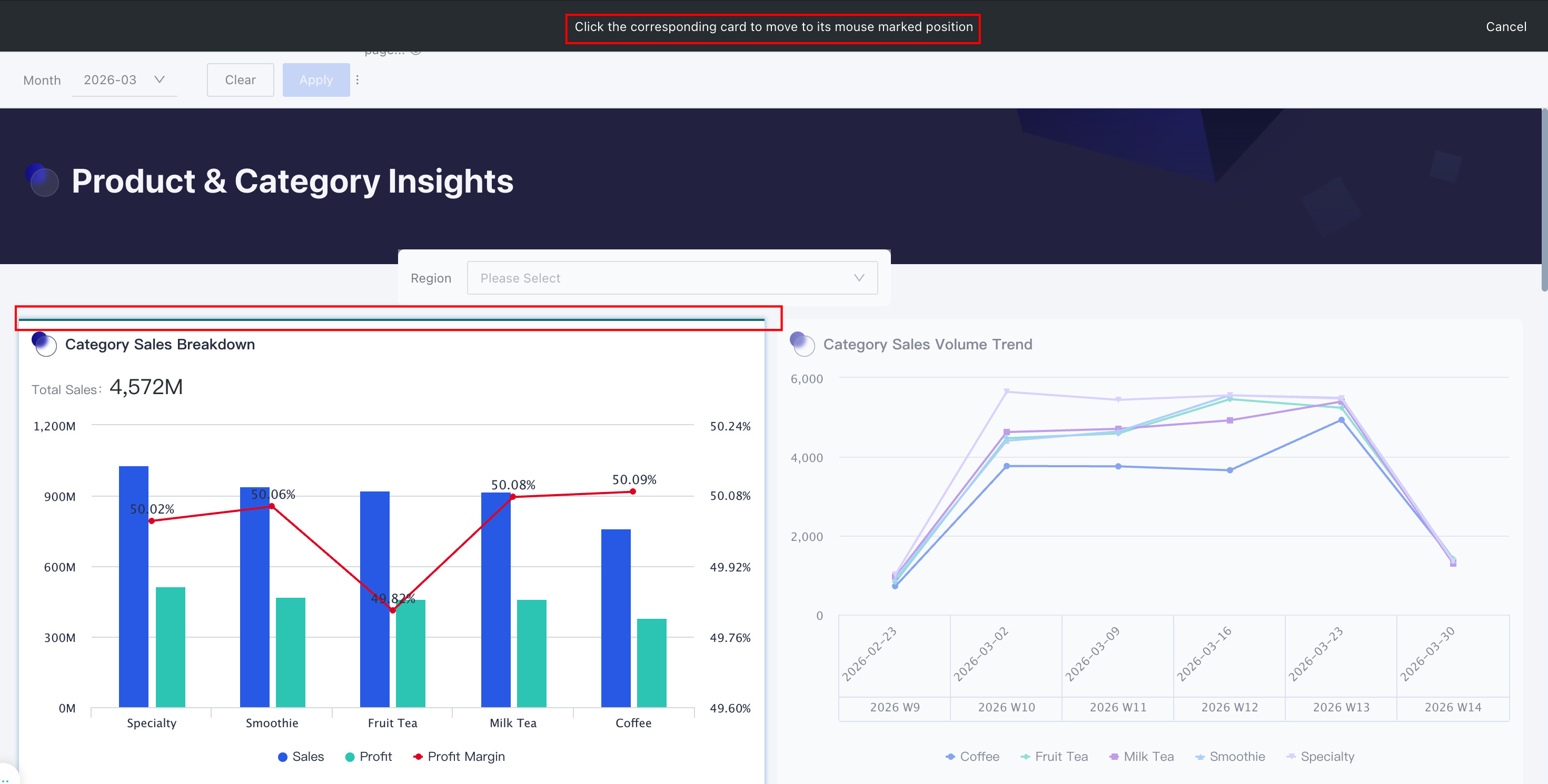 |
| Adjust Width | Can manually set the relative width of the filter in the Filter Bar. Only Select, Condition, and Range filter types are supported.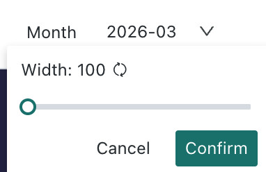 |
/ |
| Tooltip | Set tooltip for the filter, only supports "Next to Chart Title".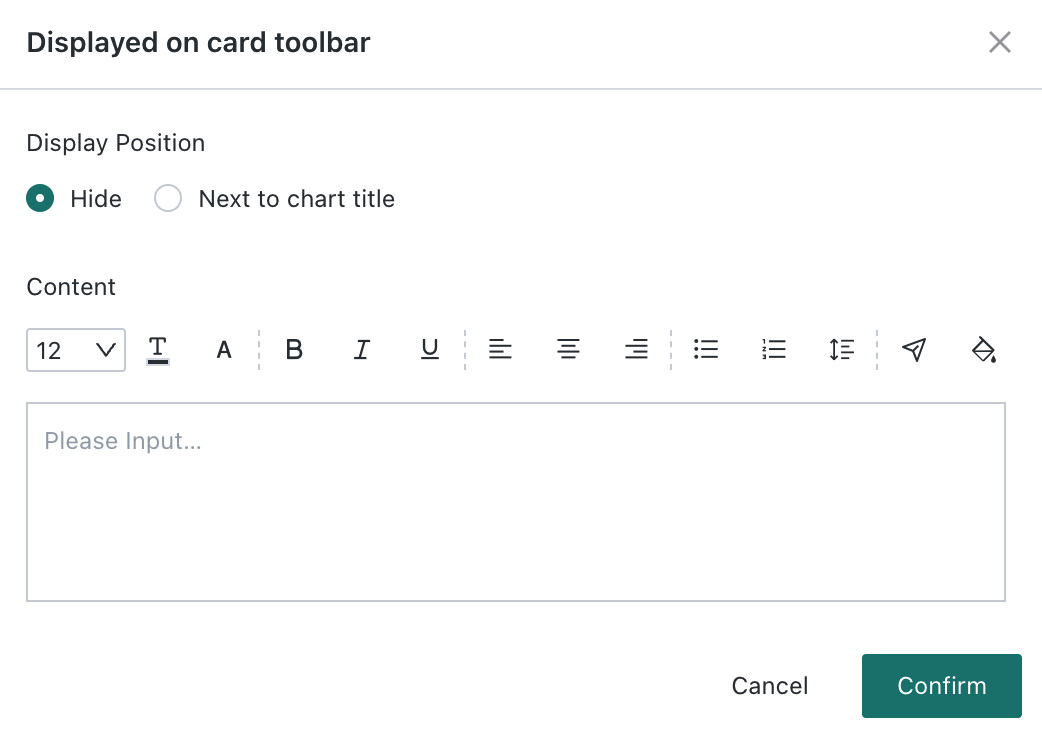 |
Set tooltip for the filter, supports "Toolbar" and "Next to Chart Title ". 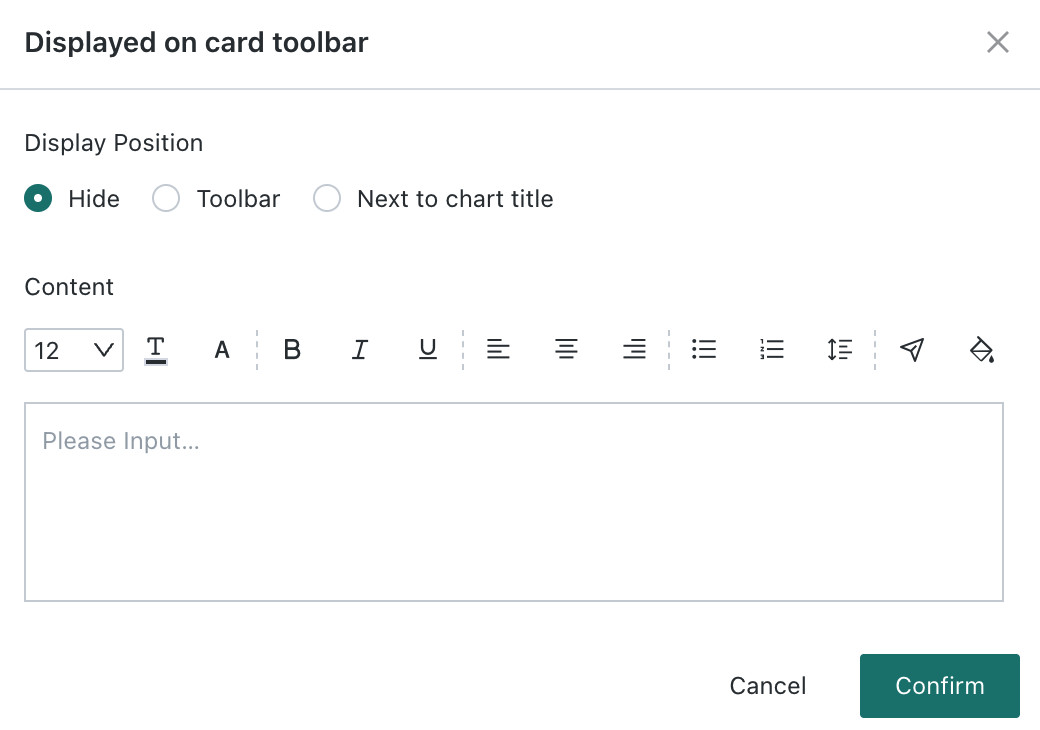 |
| Card Selector | Click Card Selector to enter the linkage configuration dialog to modify the linkage relationship between the filter and cards.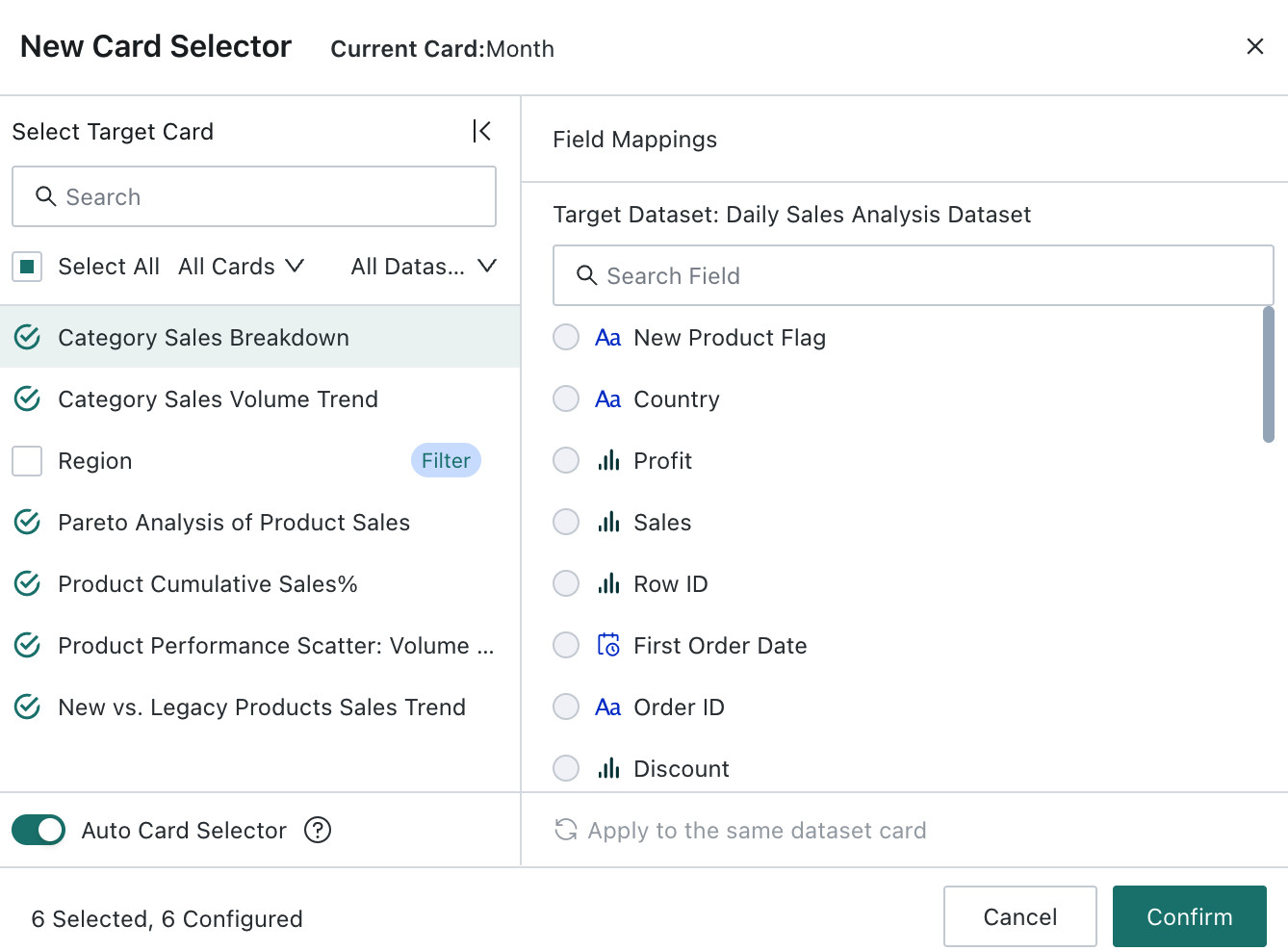 |
|
| Style | / | Different filter types have different configurable styles in the layout. Can switch styles and set whether to display the filter name and filter background color. |
| Move to Filter Bar | / | When the filter is in the layout, it can be moved to the Filter Bar. |
| Move to Canvas | When the filter is in the Filter Bar, it can be moved to the canvas. | / |
| Move To | / | Through Move To, the filter can be moved to other pages. |
| View Resource Lineage | / | Enter the resource lineage view of the filter card to see the filter's source path and downstream cards.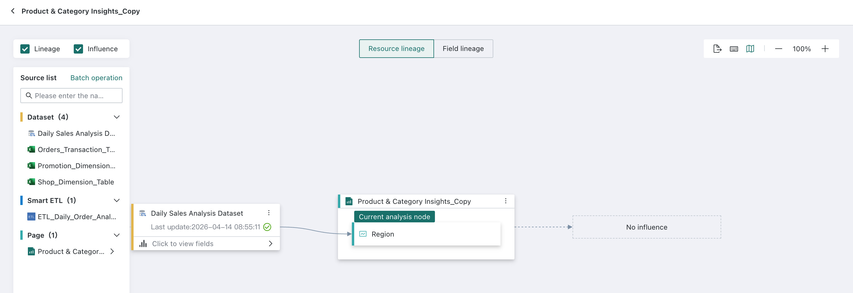 |
| View Query Statement | View the SQL statement corresponding to the filter's content, with one-click copy support.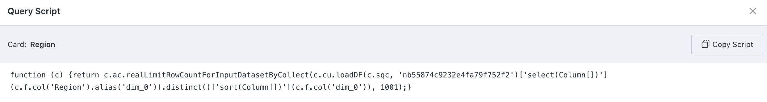 |
|
| Delete | When deleting a card, you can move it to the card pool or delete it permanently: Move to Card Pool: The linkage relationship with cards remains effective, and the card can be recovered from the page's card pool; Delete Permanently: Clears the linkage relationship with cards and cannot be recovered. Page - Batch Edit Cards supports batch selection of filter cards for deletion. |
|
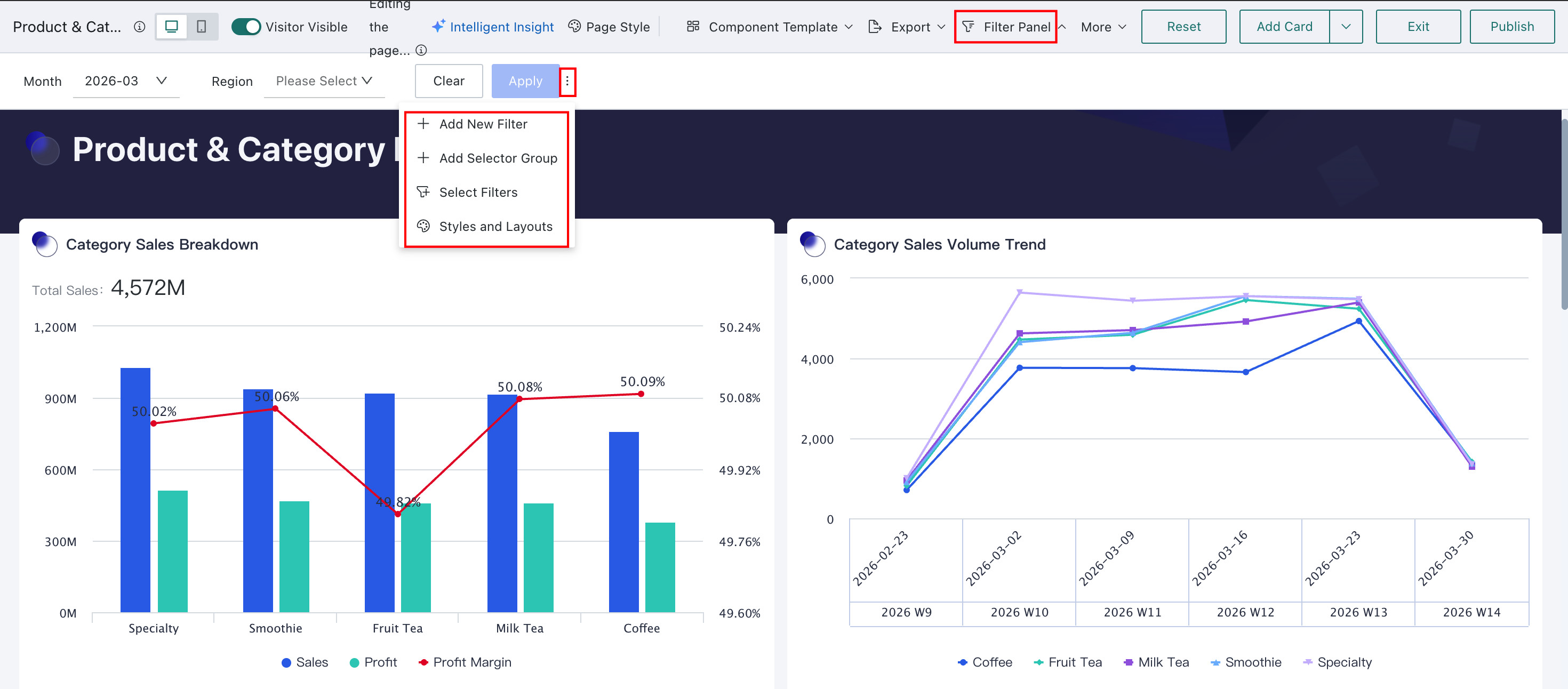
Filter Bar
The Filter Bar is a container located at the top of the page, specifically designed to hold filters. Placing page filters in the Filter Bar makes them easy to use, and they can be collapsed when not needed, saving space and improving dashboard information density.
The Filter Bar supports creating new filters, creating new filter groups, adding filters, and setting styles and layouts.
| Feature | Description |
|---|---|
| New Filter | An entry point for creating filters. After creation, the filter is displayed at the end of the Filter Bar. |
| New Filter Group | Group filters in the Filter Bar. |
| Add Filter | Add filters from the layout to display in the Filter Bar. By default, they are displayed at the end of the Filter Bar, and filters moved into the Filter Bar will revert to the default style. |
| Style | Supports setting the style and layout of the Filter Bar, including layout mode, filter spacing, filter name position, button color (query button color), and background color. Paragraph: Filters are laid out sequentially with adaptive width. Grid: Filters are tiled in a grid, with 24 columns per row, adjusting width by grid. 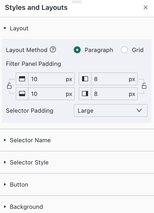 |
| Clear | One-click clearing of filter conditions in the Filter Bar. Requires clicking "Query" to take effect. |
| Query | After adding filters to the Filter Bar, supports one-click application. After application, card data will be queried according to the latest filter conditions. |
Filter Group
In the Filter Bar, related filters can be grouped together to help users quickly locate key filters during use.
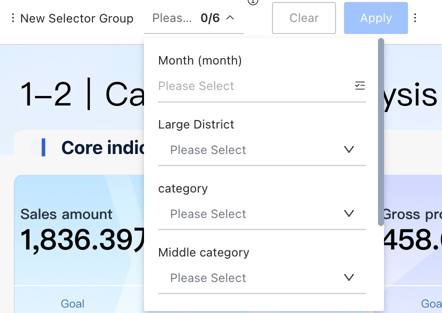
Filter groups support adding filters, renaming, adjusting the position of the filter group in the Filter Bar, and deletion.
| Feature | Description |
|---|---|
| Add Filter | Can add other filters from the Filter Bar into the filter group. Filters moved into the group can be moved out. |
| Rename | Modify the name of the filter group. |
| Card Position Adjustment | Can move the filter group's position in the Filter Bar (can be moved to the blue line position). |
| Delete | Deleting will remove the filter group and all filters within the group. |
Quick Query
Quick Query is a convenient and efficient data filtering tool. Users can save commonly used filter conditions to "Quick Query" for rapid switching between different query conditions. Through Quick Query, users can obtain data more efficiently without repeatedly setting filter conditions each time they access the page.
For example, users can save sales data for a specific time period or customer information for a specific region as Quick Query conditions. During daily viewing, simply click Quick Query and select one of the quick options to quickly access relevant data.
| Feature | Description |
|---|---|
| Save as Quick Query | To set up a Quick Query, first open the data dashboard that needs it. Set the required query conditions on the page, such as selecting a specific time period, region, or other filter conditions. After setting the query conditions, click Quick Query > "Save as Quick Query" button, and name the Quick Query in the pop-up dialog. After setup, you can search by name in Quick Query.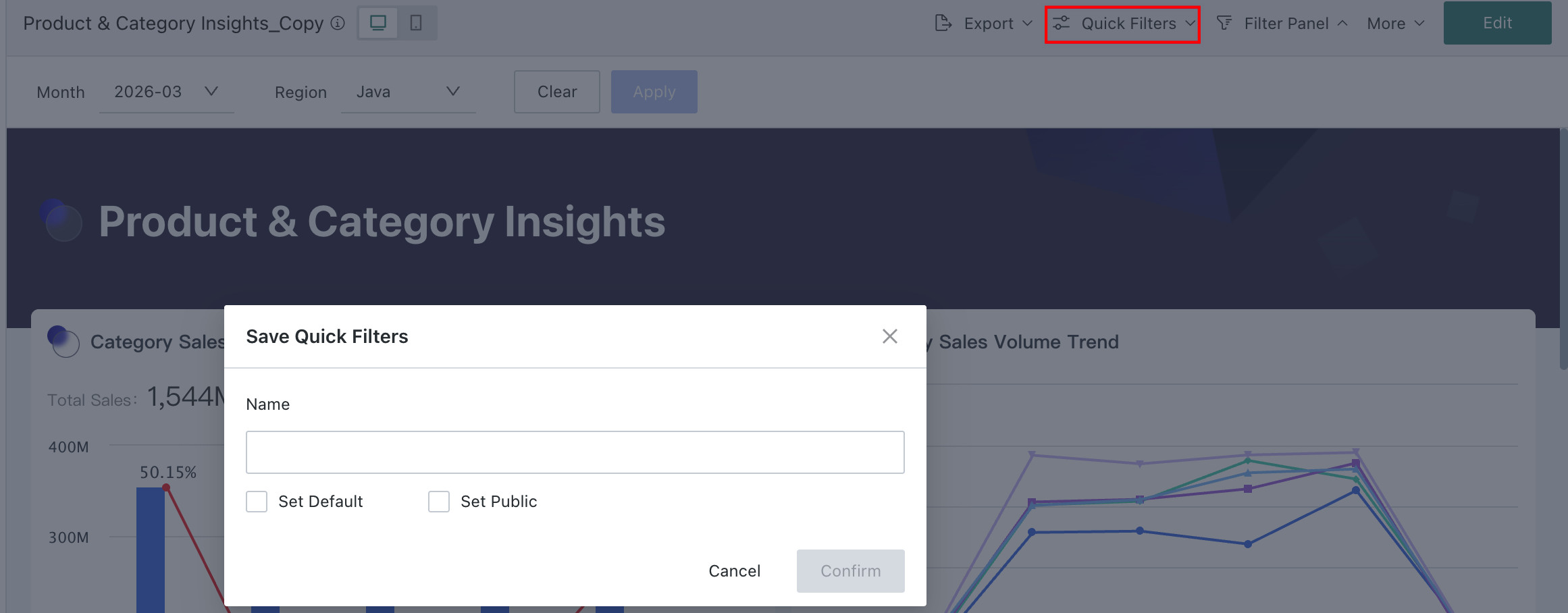 |
| Set as Default | The page's Quick Query can be set as the page's unique default query condition. After setting, all users entering the page will query according to the current Quick Query content. |
| Set as Public / Cancel Public | The page's Quick Query can also be publicly shared. Administrators and page users can set their created Quick Queries to "Public". After setting, all users with access to the page can use this public Quick Query. When the public Quick Query is no longer applicable, the owner can set it to "Cancel Public".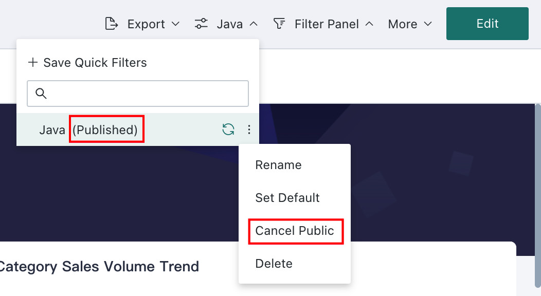 |
| Update This Quick Query to Current Page Filter Conditions | Can quickly apply the desired Quick Query. After application, page card data will be updated according to the latest filter conditions. |
| Delete | When a Quick Query is no longer applicable, it can be deleted. Deleted Quick Queries cannot be recovered. |
Filter Priority
Priority Order: Parameter Jump > Sync Filter > Quick Query > firstpick
The above rules apply when there is an overlap in any filter with cascading, tree, or linkage relationships. In such cases, all filters in that group will take effect according to the rules, and associated filters can only be set to empty, even with parameter jumps.
Example 1: first pick + Default Quick Query
- There is an A -> B -> C cascading filter, A is first pick, and the default Quick Query values save B and C values.
- Result: Quick Query B and C take effect, A is the value after linkage.
Example 2: first pick + Sync Filter
- There is an A-> B -> C cascading filter, AB is first pick, C is a routing parameter.
- Result: Routing parameter C takes effect, A and B are values after linkage.
Example 3: Sync Filter / Parameter Jump + Quick Query
- There is an A-> B linked to C, A-> B linked to C2 cascading filter, Quick Query is A, B, C, and the parameter is C2.
- Result: Parameter C2 takes effect, A and B are empty, and the Quick Query is invalid at this time.
Example 4: Mutual Linkage + Sync Filter
- There is Page 1, where A and B are mutually circularly linked, B has the first pick function enabled, B and Page 2's filter D are mutually sync filters, Page 2's C and D are mutually circularly linked. When switching from Page 1 to Page 2.
- Result: Page 2's D is consistent with B's value. Since it conflicts with C's value at this time, C's value is cleared.
Use Guide
Filter operations are generally the same. This article takes select filter as an example for introduction.
Overview
Feature Introduction
After setting up a Select Filter, users can filter the values of a specific field in the dataset.
Application Scenarios
During data analysis, if a user needs to focus on a specific product category, they can create a Select Filter, selecting the product category dimension field as the filter field. At the same time, they can control which related cards the filter condition applies to.
Operation Steps
Create a Select Filter
On a page, there are two entry points for creating a Select Filter: creating it from the Tap to create / Add entry in the filter bar, or creating a new card and selecting Filter.
-
Filter bar >
Tap to create/Add;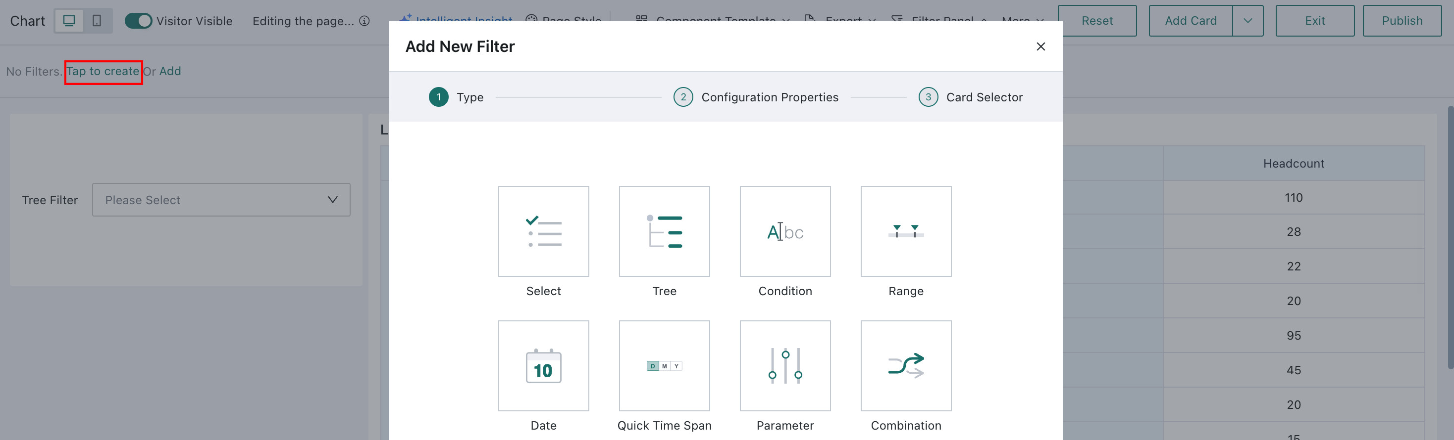
-
Page >
Add Card>Filter.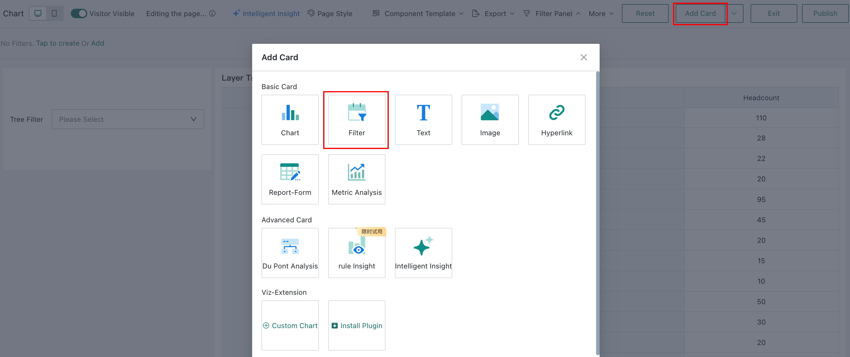
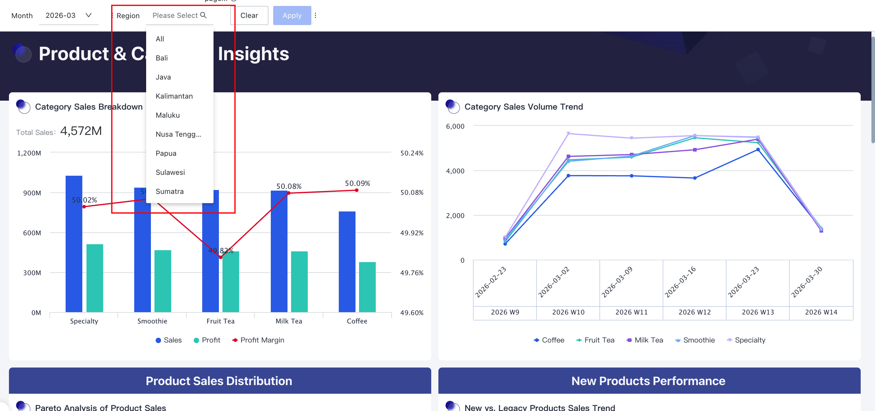
Select Select as the filter type to enter the Select Filter editing dialog.
Filter Property Configuration
When setting up a Select Filter, first select the source dataset, then select the field that consumers need to filter by.
- Supports setting whether the selection type is single-select or multi-select, then choosing a suitable style;
- Can optionally set the filter's default value, and also filter, sort, and configure geographic location for the option list.
| Operation | Description |
|---|---|
| Select Dataset | Can quickly select the current page's dataset, or search and select a new dataset. |
| Select Field | Select a field, taking a date field as an example. Set Date Option List Format: If the field is a date type, the default option list is in original value format. You can also set the date option list format to: Year, Quarter, Month, Week, or Day of Week for filtering; 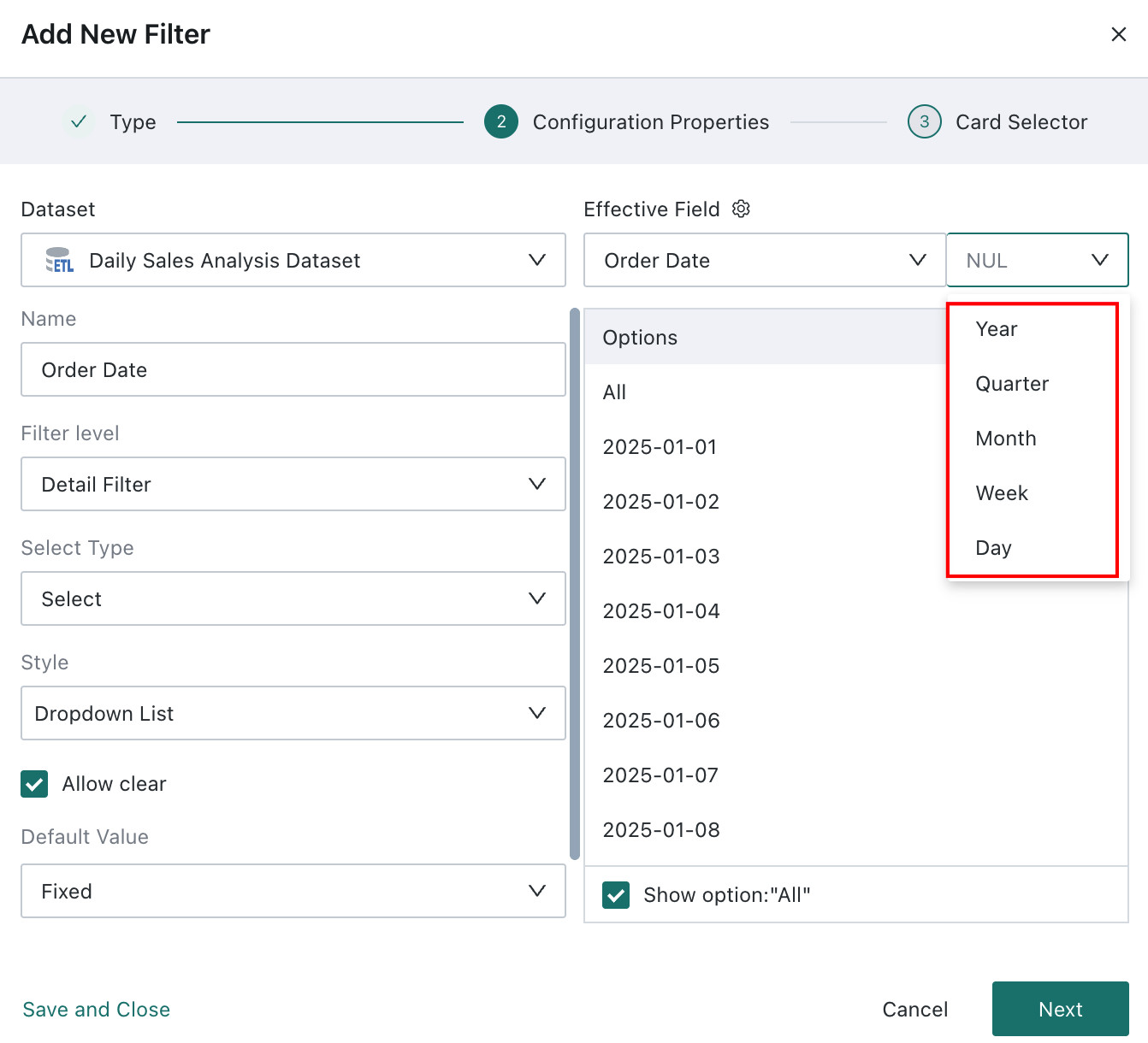 Display Field Applicable Scenarios: 1. The display field and linkage field have a one-to-one mapping, such as one province name corresponding to one province code; 2. When the display field and linkage field have a many-to-one relationship, such as one product code corresponding to multiple product names; the "linkage field" is mainly used by creators for data retrieval and dashboard linkage analysis, and needs to have uniqueness and clarity; if it affects end-user experience, the "display field" can be set to facilitate end-user viewing. After setting the "display field", users will see and select values from the display field's value list when using the filter on the page. 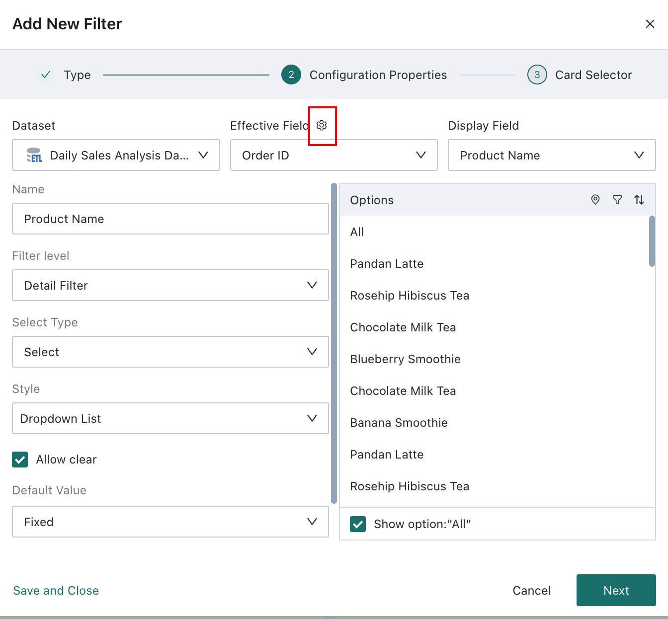 |
| Name | Defaults to the selected field name, can be modified. |
| Filter Level | Note: If the filter field is a dimension field and the filter level is Result Filter, the filter will only take effect when the filtered dimension field exists in the card's dimension/contrast/split area. |
| Selection Type | Default is single-select, can be switched to multi-select. Single-select: When using the filter, only one field value can be selected for filtering; Multi-select: When using the filter, multiple field values can be selected for filtering. Note: When multi-select is enabled, you can configure whether to display the "Exclude" button when selecting options. For filters using the exclude function, linkage parameters cannot take effect. |
| Style | When the Select Filter is in the Filter Bar, only the "Dropdown" style is supported; when the Select Filter is in the layout, it also supports "Dropdown", "Radio Button/Checkbox", and "Button Bar" styles, which can be set according to user habits. Note: After selecting options and using Exclude, the passed condition is "Does not include Option 1, Option 2"; when linking cards at this time, linkage parameters cannot be passed because parameters can only pass equal conditions. |
| Allow Clear | 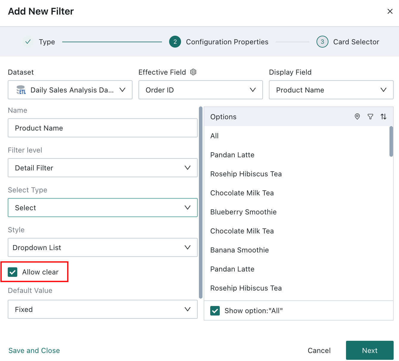 |
| Default Value | When a default value is set, users will filter and display data according to the default value after entering the page; supports Fixed Value, Custom Time Macro, Follow User Attribute, and First in List (first pick).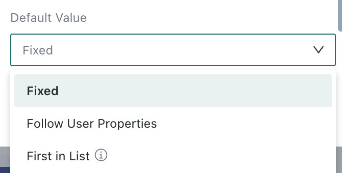 |
| Option List | Only randomly displays 200 options; supports geographic location configuration, filtering, and sorting functions: Geographic Location Configuration
Sort: Supports sorting the option list using the current field and other fields. |
If you need to edit the filter's properties again, find Edit in the filter card's toolbar to re-enter the filter property configuration dialog.
Set Linked Target Cards
When linking, you need to select the target card and the corresponding filter field. After setting, changes in the filter will link to change the data presented in the associated cards.
- Auto-link Cards: After enabling auto-link for the filter, it will automatically link to visualization cards with fields of the same name; auto-linked cards can be manually clicked to cancel the link;
- Apply to Same Dataset Cards: Click Apply to Same Dataset Cards to automatically link other cards in the same dataset with corresponding fields. Cards applied to the same dataset can be manually clicked to cancel the link.
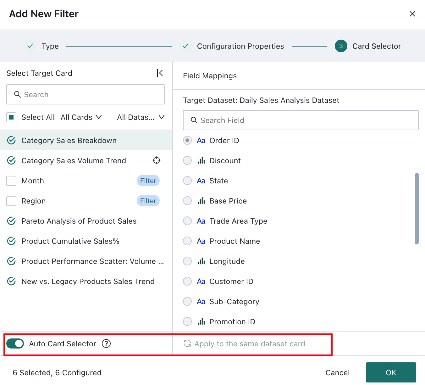
If you need to edit the filter's linkage relationship again, find Linkage in the filter card's toolbar to re-enter the linkage configuration dialog.
Using the Filter
Use
When users use it, the option limit is 1000; supports fuzzy search, batch paste, and viewing selected items.
- Fuzzy Search: Case-insensitive, but some direct-connect databases do not support case-insensitivity;
- Batch Paste: After one-click copying of options, you can automatically match the option list by name, reducing click steps.
View Filter Effect
After filtering, the filter will take effect on each linked card, and the card will present data filtered by the filter;
When browsing cards, users can hover over the small funnel icon in the card toolbar to view the current filter conditions.