Page Components
Overview
Feature Introduction
Page components are the basic building blocks of Dashboards and report pages. They help users organize information and display data in a clear and structured way. Both desktop and mobile layouts provide different component types optimized for their respective display and interaction patterns.
Desktop components focus on richer information density and more complex interactions, making them suitable for in-depth analysis. Mobile components emphasize simplicity, readability, and touch-friendly behavior so users can quickly access key metrics on the go.
These components can be freely combined to build data-visualization interfaces that match business needs and improve insight efficiency.
PC
| Component Name | Description |
|---|---|
| Tab | When you need to display multiple logically related analysis dimensions (e.g., region/product/time period) in the same space, tabs enable content layering through tab switching, saving space while maintaining information structure. Tabs support the following operations: Note: Card dimensions within tabs cannot change along with tab component size changes. |
| Card Group | Card groups are similar to tabs in that both serve as containers holding multiple cards. Unlike tabs, card dimensions within a card group can change along with the card group component size. |
| Filter Group | A container for filters, supporting multiple filter cards. |
| Subtitle | Subtitles can be used to partition dashboard content, helping users further optimize dashboard layout. |
Mobile
This document only covers basic components for mobile. For more information on mobile layout operations such as card pools and component templates, please refer to Mobile Layout.
Mobile basic components act as containers for different types of cards. Users can add them in the mobile layout to group cards by purpose or type. For example, placing multiple filters into one filter group helps users filter data more efficiently on smaller screens. Guandata BI currently provides 9 built-in mobile basic component types:
| Component Name | Description |
|---|---|
| Filter Group | A container for filters, supporting multiple filter cards |
| Tab | A container for tabs, supporting multiple tabs; each tab can hold multiple cards, and tabs can also be nested |
| Card Group | A container for cards, supporting multiple cards |
| Single Metric Group | A container for metric cards, supporting multiple metric cards |
| Comparison Metric Group | A container for comparison metric cards, supporting multiple comparison metric cards |
| Tiled Metric Group | A module for metric cards, supporting multiple metric cards; similar to the single metric group but with a more attractive appearance, built-in icons, and draggable sizing |
| Comparison Single Metric Group | A module for comparison metric cards, supporting multiple comparison metric cards; similar to the comparison metric group but with a more attractive appearance, built-in icons, and draggable sizing |
| Primary/Secondary Metric Group | A module for metric cards, supporting multiple metric cards, and allowing metric cards to be grouped into primary and secondary metric card sets |
| Header Component | A container placed in the page header, generally used for cards with summary or important data, supporting multiple cards and metric cards |
Applicable Scenarios
PC
| Component Name | Applicable Scenario | Example |
|---|---|---|
| Tab | When you need to display multiple related but independent data views in limited space | Data analysis for different business departments, comparison of the same metric across different time dimensions |
| Card Group | Displaying a set of related metrics or KPIs that need to be neatly arranged with visual consistency | Summary of key performance indicators in a sales dashboard |
| Filter Group | Combining multiple filter conditions that apply to the same data module or analysis theme to keep the interface clean and logically clear, ensuring unified chart filtering logic within that module | Filter groups corresponding to different modules such as "Sales Performance" and "Customer Analysis" |
| Subtitle | Adding explanatory text or area divisions to different parts of a dashboard | Distinguishing between different modules such as "Sales Performance" and "Customer Analysis" |
Mobile
| Component Name | Applicable Scenario | Example |
|---|---|---|
| Filter Group | When mobile needs to provide multi-condition filtering | Filter sales data by time, region, product category, and other dimensions |
| Tab | When mobile needs to switch between different data views but screen space is limited | Switching between "Overview", "Details", "Trends", and other views |
| Card Group | Displaying a set of related but independent metric cards on mobile | Summary of key metrics on the mobile dashboard homepage |
| Single Metric Group | Highlighting the most important single metric | Displaying core KPIs such as current sales, user count |
| Comparison Metric Group | When you need to intuitively compare two related metrics | Comparison of current vs. previous period sales, target vs. actual completion rate |
| Tiled Metric Group | Displaying values of multiple equally important metrics | Horizontal comparison of sales metrics across regions |
| Comparison Single Metric Group | When you need to intuitively compare a specific metric in two related metric cards | Comparison of current vs. previous period sales |
| Primary/Secondary Metric Group | Displaying a primary metric and its related auxiliary metrics | Displaying total sales (primary) and YoY growth rate (secondary) |
| Header Component | When the mobile page top needs to display a title, time range, or brief description | Dashboard title, data update time display |
Cross-Platform Component Sync Rules
- When you switch to the mobile layout for the first time, mobile automatically inherits the existing desktop components.
- Later changes to desktop components do not automatically sync to mobile. The two layouts become independent and can be adjusted separately.
- You can also create mobile-only page components. These do not sync back to the desktop layout.
Desktop
Adding Components
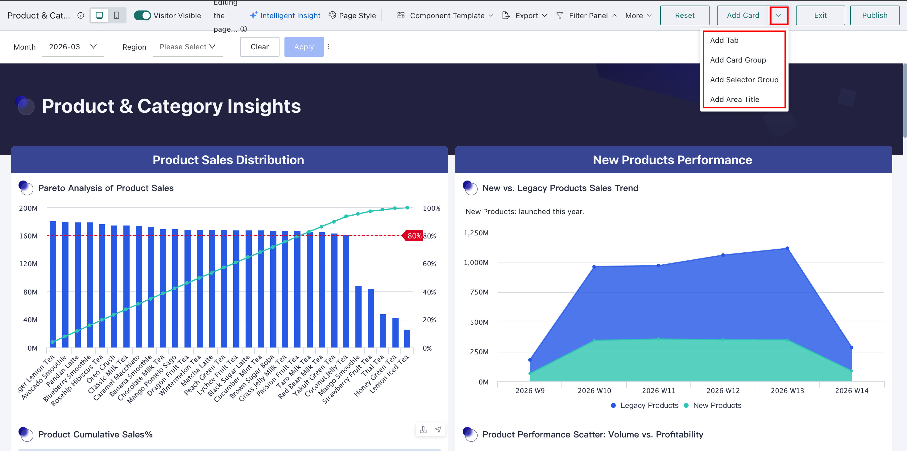
On the Dashboard edit page, click the dropdown to the right of New Card in the upper-right corner and choose the component you want to add.
Configuring Components
Desktop Tabs
-
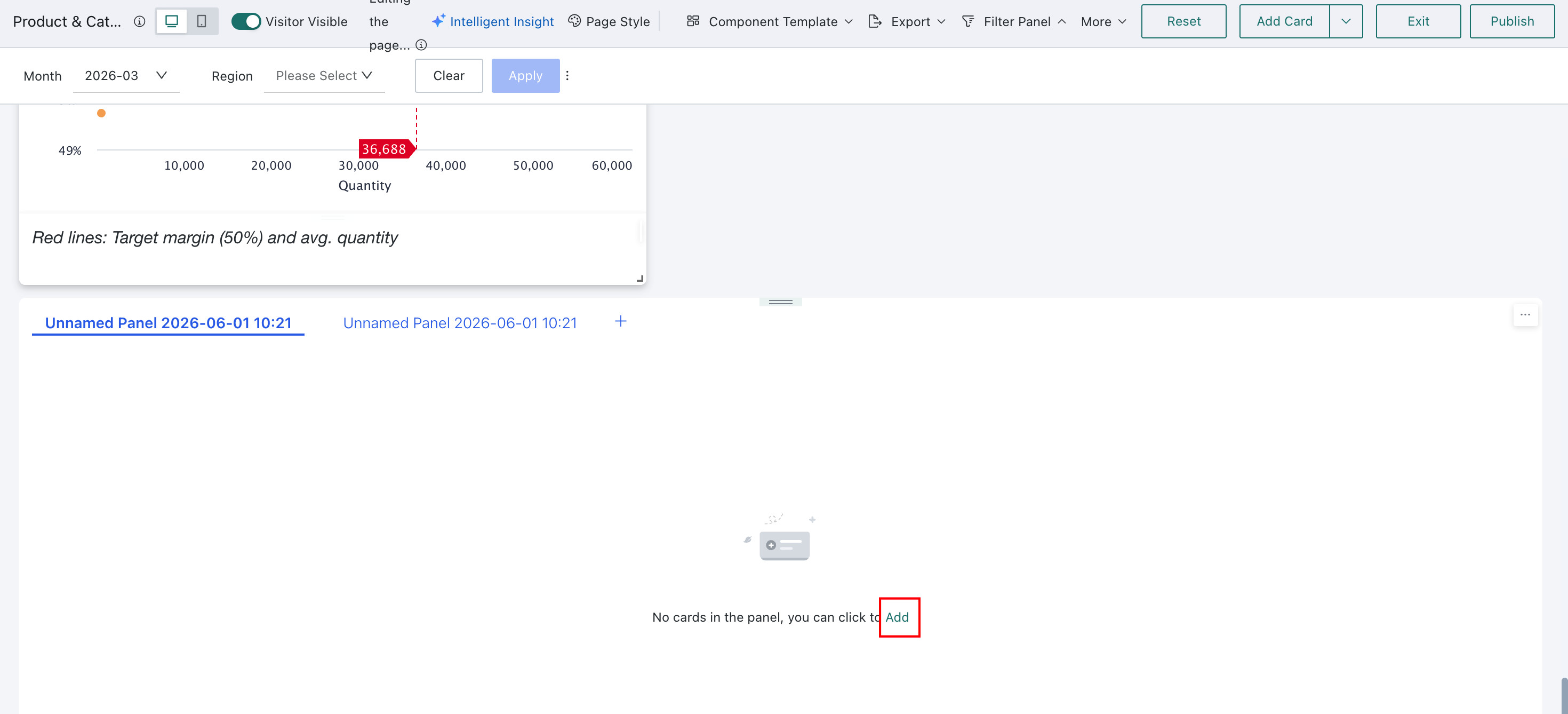
Click Add in a newly created blank tab. On the current Dashboard page, select the cards or tabs you want to add, then click Confirm. Two tabs are created by default, with the first one selected automatically.
-
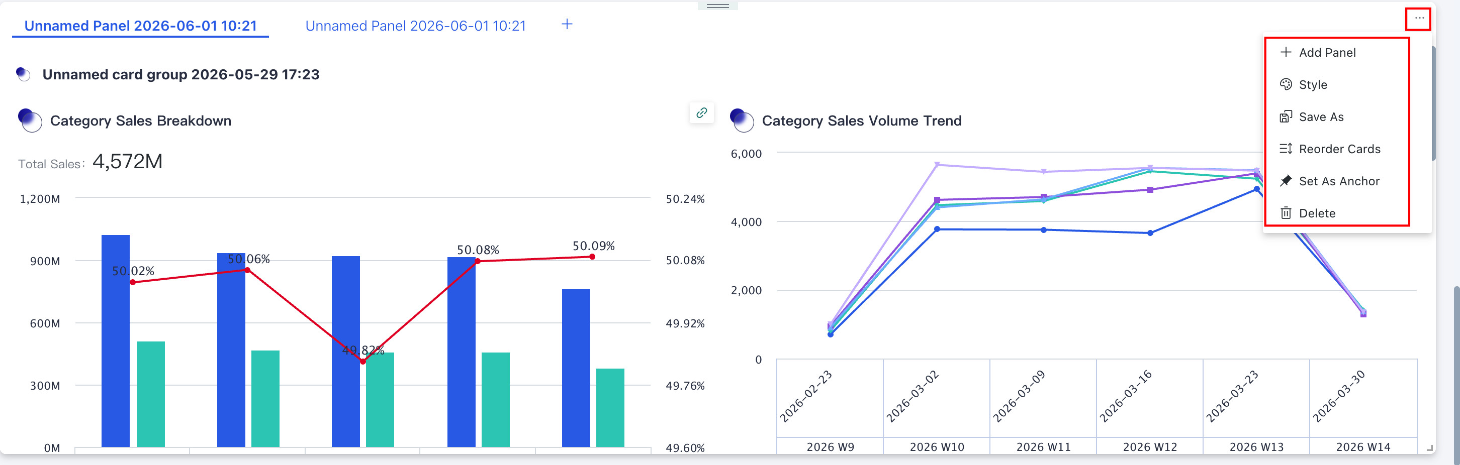
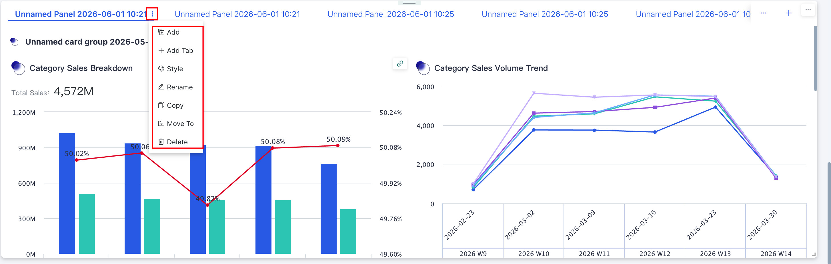
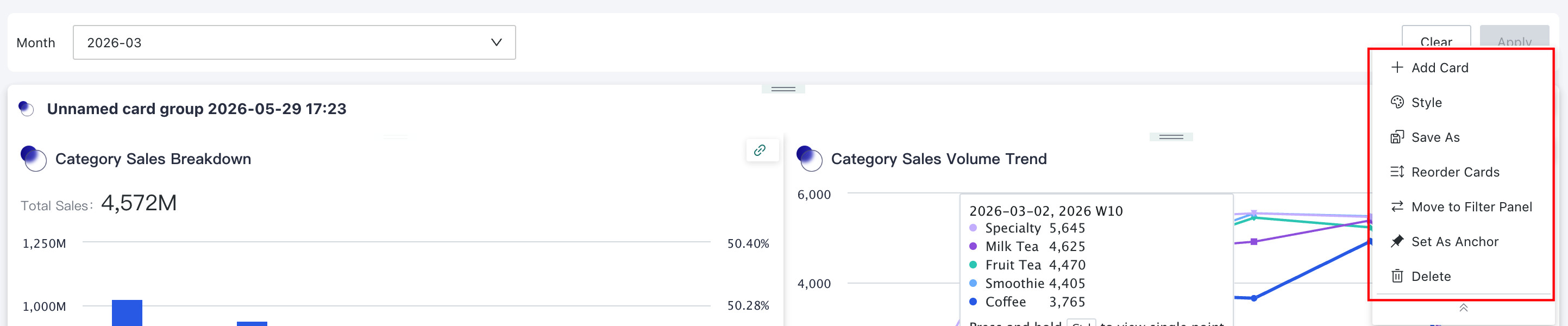
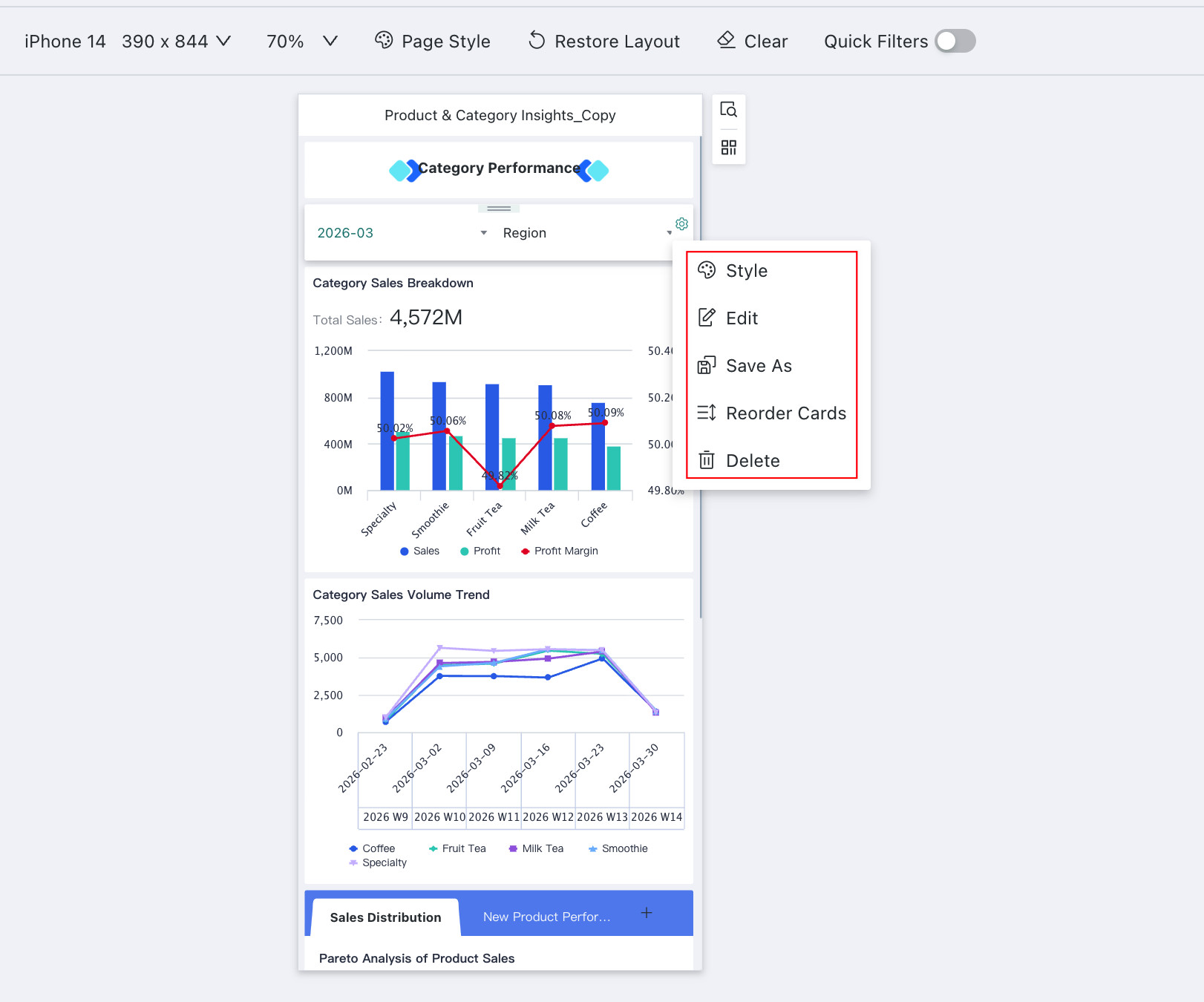
Click ... in the upper-right corner of the tab component to adjust the overall layout, style, and related settings.
| Operation | Description |
|---|---|
| New Tab | Add a new blank tab to the tab component for comparative analysis of data with commonalities across different tabs. Users can add new cards/tabs in the blank tab.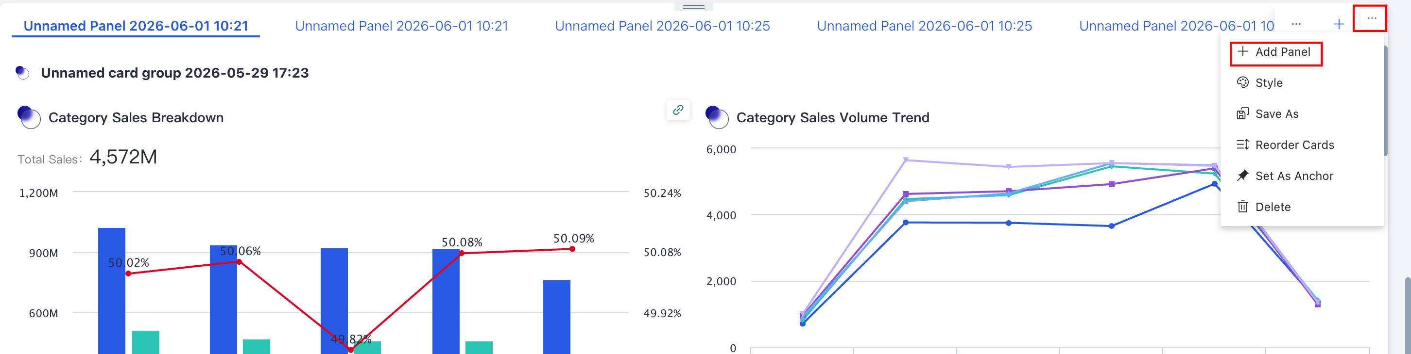 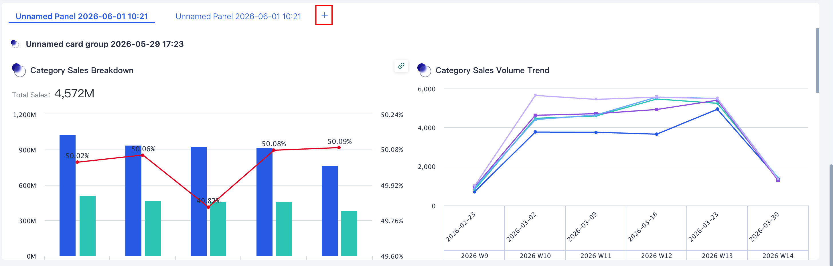 When tabs exceed the tab range, a dropdown marker appears on the right, showing all tabs in the current tab component in a dropdown list that can be scrolled through. 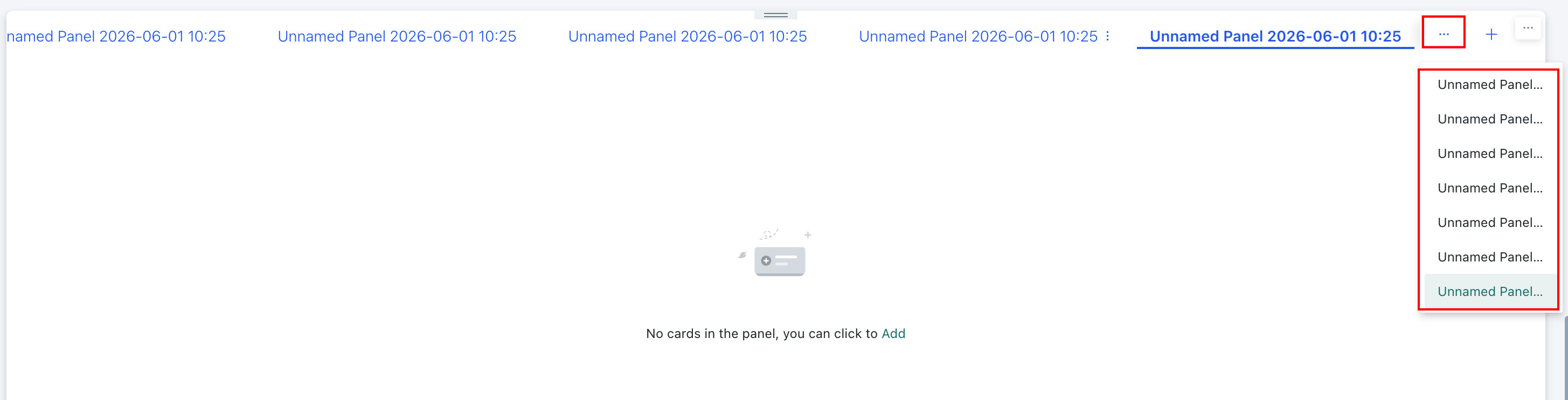 |
| Card Order Adjustment | Click "Card Order Adjustment", then click the corresponding card in the adjustment page to move the tab to the position previously occupied by the clicked card. |
| Style | Supports configuring the position, style, and background of the title, as well as adjusting the style, appearance, and background of all tabs. |
| Save As | Save a copy of this tab to the current dashboard page or another dashboard page you have permission for. |
| Delete | Delete all content in the tab. All elements will be broken down into cards and stored in the recycle bin or card pool. Note:After restoring from the recycle bin, only cards can be restored; tab restoration is not currently supported. |
| Set as Anchor | Sets the tab as an anchor so users can jump to it from the page navigation bar. For details, see Anchor Settings. |
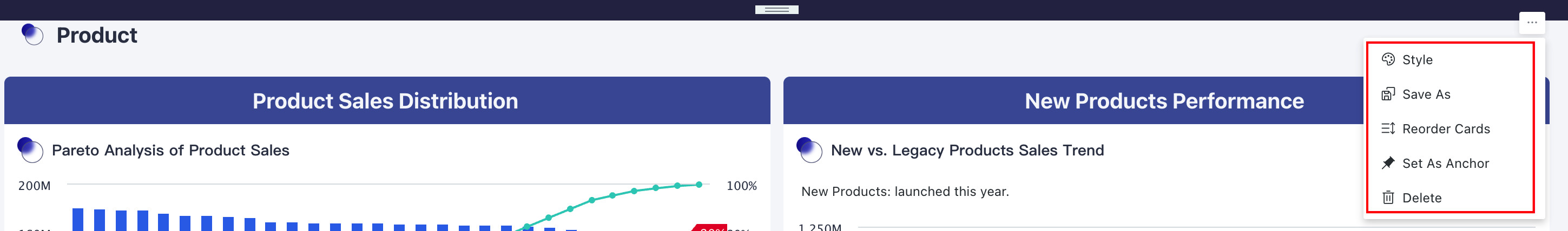
- Select one of the tabs, and click the "..." button to the right of the tab title to perform operations such as adding cards, adding sub-tabs, and style adjustment for that tab.
| Operation | Description |
|---|---|
| Add | Add cards/secondary tabs to the selected tab. |
| New Tab | Create a secondary tab for the selected tab to achieve tab nesting. |
| Style | Set the background color, background image, spacing, and divider for the selected tab content. |
| Rename | Rename the selected tab. |
| Copy | Copy the selected tab and save it to the same tab component. |
| Move To | Move the selected tab to another tab; the target can only be a top-level tab. |
| Delete | Delete the selected tab and all its content. All elements will be broken down into cards and stored in the recycle bin or card pool. Note: After restoring from the recycle bin, only cards can be restored; the original secondary tabs cannot be restored. |
-
If you added sub-tabs in step 2 or step 4 to achieve tab nesting, you can continue to configure the sub-tabs. Sub-tab operations are basically the same as tabs, with the following differences:
- Sub-tabs do not support "Card Order Adjustment" and "Set as Anchor".
- Sub-tabs support the "Remove Tab" operation; removed sub-tabs will be displayed as tabs on the page.
- Sub-tab tabs do not support "New Tab"; a maximum of two-level tab nesting is supported.
Desktop Card Group
-
Click the "Add" button in a newly created blank card group; the steps are the same as adding cards to a tab. In the current dashboard page, check the cards you want to add to the card group, then click Confirm to complete the addition.
-
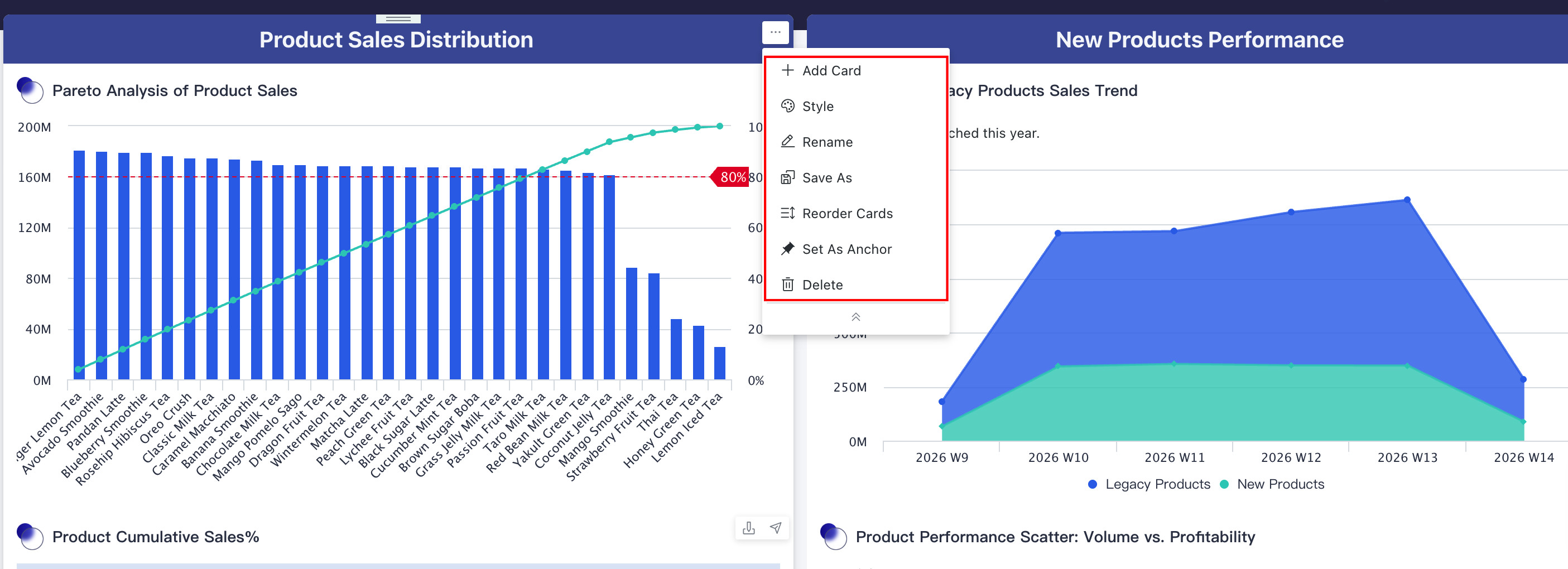
Click the "..." button in the upper right corner of the card group component to perform operations such as adding cards and style adjustment. The specific operation items are the same as tabs; see above for details.
-
At the same time, you can directly move a card group into a tab. The steps are as follows:
- Create the required cards on the page;
- Create a card group and place cards of the same theme into the same card group;
- Create a tab and place multiple card groups into the same tab.
- Card groups within tabs only support adding cards from the root layout of the current page. Similarly, card groups within tabs only support moving out to the root layout.
- Card groups within tabs do not support Save As.
- Mobile is not currently supported. When switching from PC to mobile, card groups within tabs will be moved to the card pool, while cards within tabs will be retained in the tabs.
Desktop Filter Group
Click the "Add" button in a newly created blank filter group. In the current dashboard page, check the filters you want to add to the filter group, then click "OK" to complete the addition.
Filters in the filter bar cannot be added to filter groups in the page layout. If you need to add them, please move the filters to the canvas first.
Click the "..." button in the upper right corner of the filter group to perform layout optimization, style adjustment, and other operations on the filter group as a whole. The specific operation items are similar to Tabs.
Desktop Subtitle
Click the "..." button in the upper right corner of the subtitle to perform operations such as naming, style adjustment, and layout optimization. The specific operation items are similar to tabs; see above for details.
Adjusting Components
After component configuration is complete, you can click the

Mobile
Adding Components
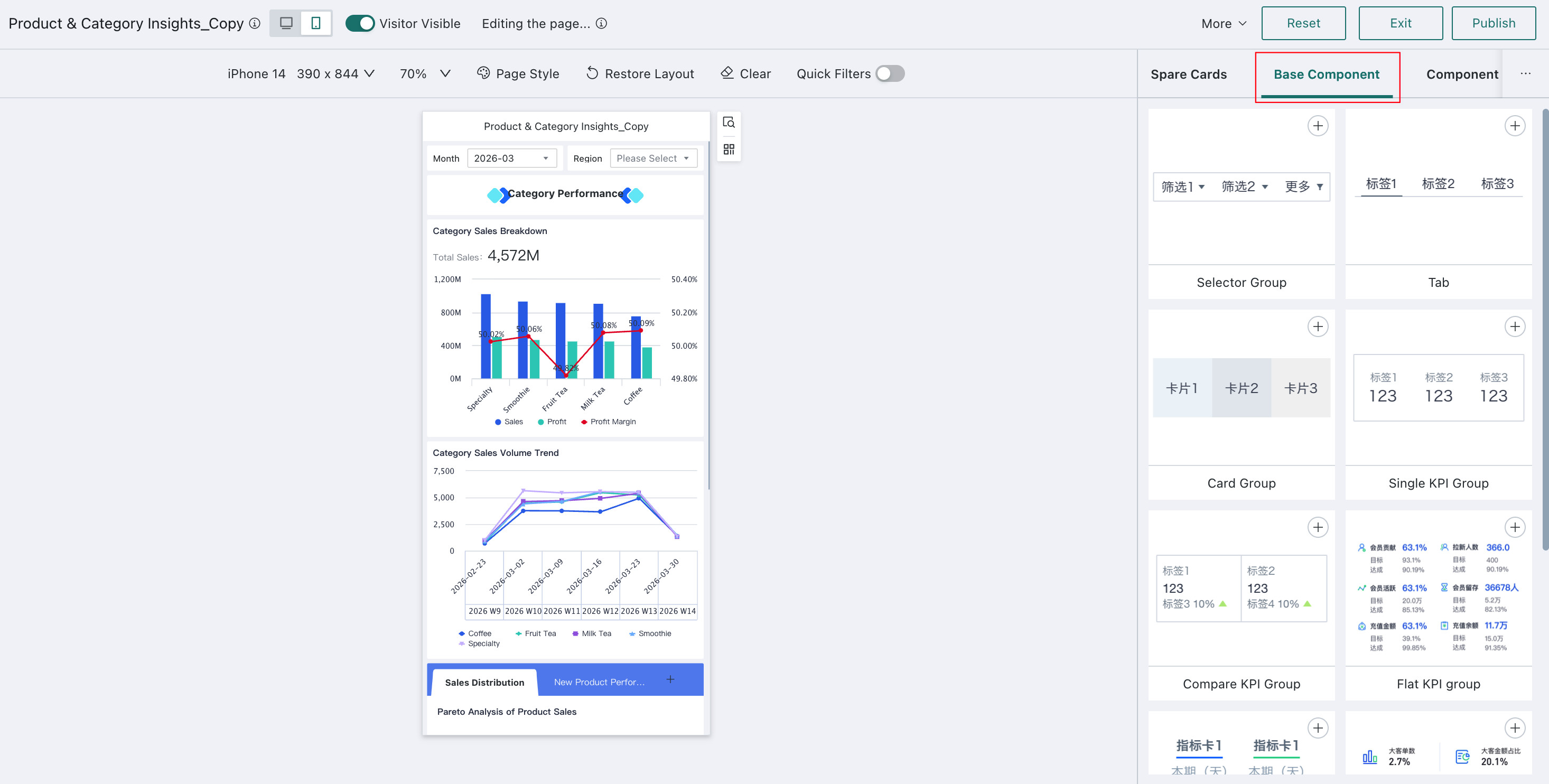
On the dashboard edit page, after switching the dashboard to mobile layout, click "Basic Components" in the right menu bar, then click the "+" in the upper right corner of the component to add it to the layout page.
Configuring Components
Mobile Filter Group
-
Click the "Add" button in the page layout to jump to the edit box. Check the required filters and click "OK". You can see that the selected filters are now displayed in the filter group.
-
Click the "Settings" button on the right side of the filter group to perform layout optimization, style adjustment, and other operations on the filter group as a whole.
| Operation | Description |
|---|---|
| Style | Supports unified style configuration for filters within the filter group to achieve visual consistency. |
| Edit | Add/remove filters for the filter group. |
| Save As | Filter groups support quick reuse through Save As. |
| Card Order Adjustment | When adjusting the order of the filter group, click the corresponding card to move the component to the position marked by the cursor. |
| Delete | Delete the filter group. The filters within the group will be broken down into cards and stored in the recycle bin or card pool. |
Mobile Tabs
Mobile tab operations are basically the same as PC. Please refer to PC Tabs for details. Tabs support adding filter groups and card groups internally.
Mobile Card Groups
Mobile card group operations are basically the same as PC. Please refer to PC Card Groups for details.
Mobile Metric Groups
The relevant configurations that can be set for each metric card will vary. Follow the page prompts to operate.
Among them, the tiled metric group operation is slightly different. If you add a tiled metric group to the page, click the card in the layout, and a style configuration panel will be displayed on the right for the following configurations:
- Metrics per row: The number of metric cards that can be displayed per row. Due to mobile page size limitations, only 2 or 3 can be set;
- Primary metric layout: You can choose the alignment method for primary metrics within the group;
- Comparison metric display: Set the number of comparison metric cards by selecting a number;
- Group metric cards: Click "Edit" to modify existing content; drag the "three horizontal lines" button in front of the icon to move positions within the group; click the icon dropdown to switch icon styles; click the "trash" button to delete the metric card;
- Primary/Comparison metric cards: You can personalize the font style within the metric cards.
Mobile Header Component
Header component configuration is similar to the filter group. The first step is to add cards/metric cards, and the second step is to click "Settings" to perform layout optimization, style adjustment, and other operations on the header component as a whole. The settings interface may differ slightly; refer to the actual page.
Adjusting Components
Mobile component adjustment operations are consistent with PC. Please refer to PC Adjusting Components for details.