Page Style (Theme)
Overview
When creating analysis dashboards, to improve the dashboard's aesthetics and information delivery effectiveness, users need to perform design beautification and style adjustments on the dashboard.
Guandata BI provides the "Theme Skinning" feature, which helps users easily create high-quality visual dashboards at low cost and low difficulty. This feature enables one-click dashboard skinning, meeting users' high requirements for aesthetics and UI details. From global styles to component and card styles, every element can be flexibly adjusted, improving data consumption satisfaction.
User Guide
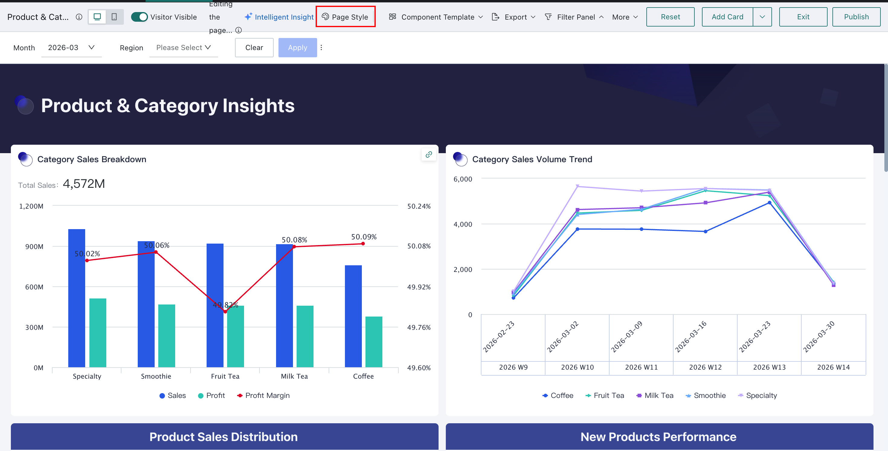
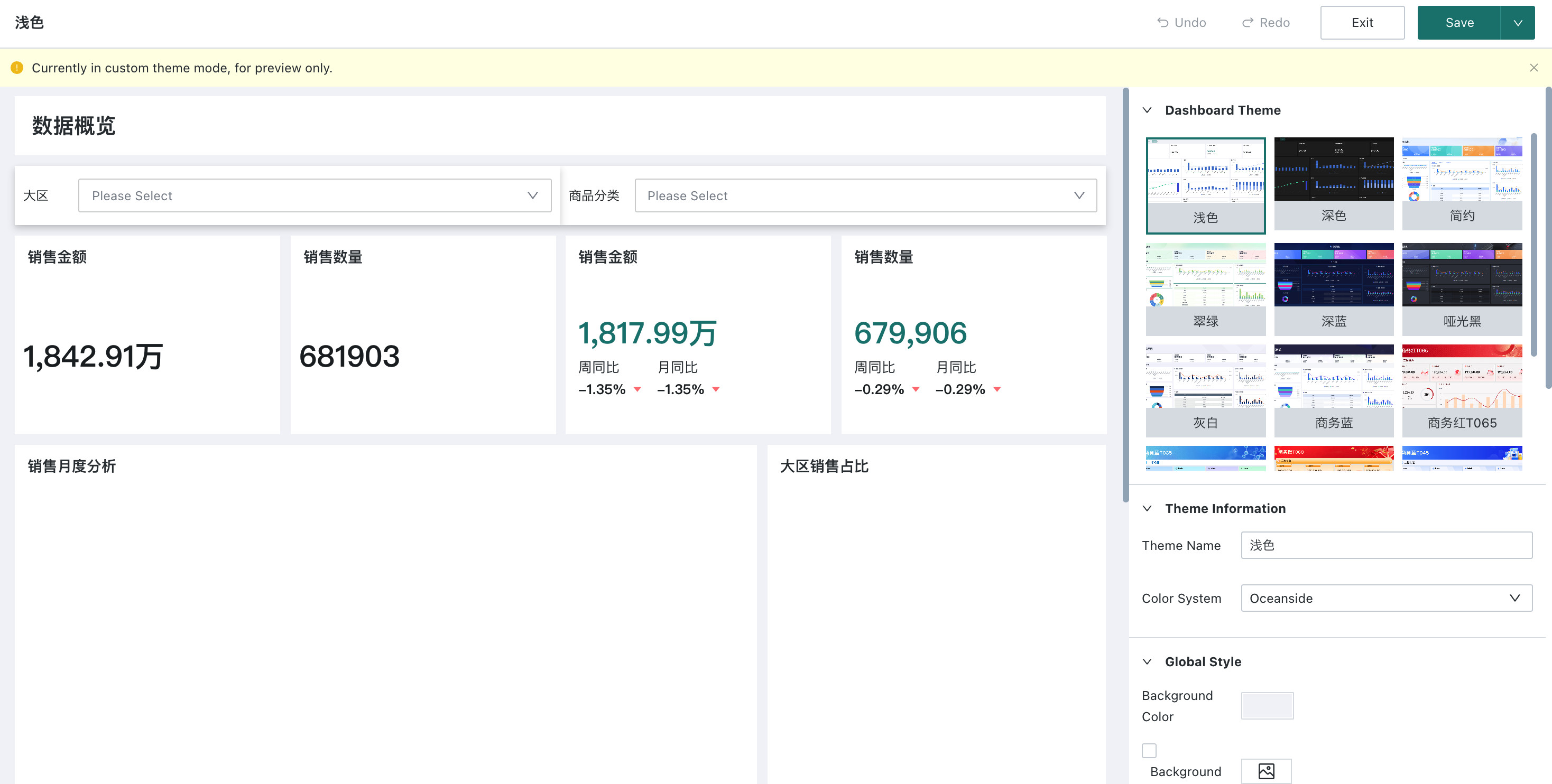
On the Dashboard Edit page, click "Page Style" to enter the page style editing state, where you can apply a theme with one click on the right side.
Users can select a theme to adjust the Dashboard's style and UI style with one click. You can also fine-tune the Dashboard style on this basis. The specific configuration process will be explained in detail below.
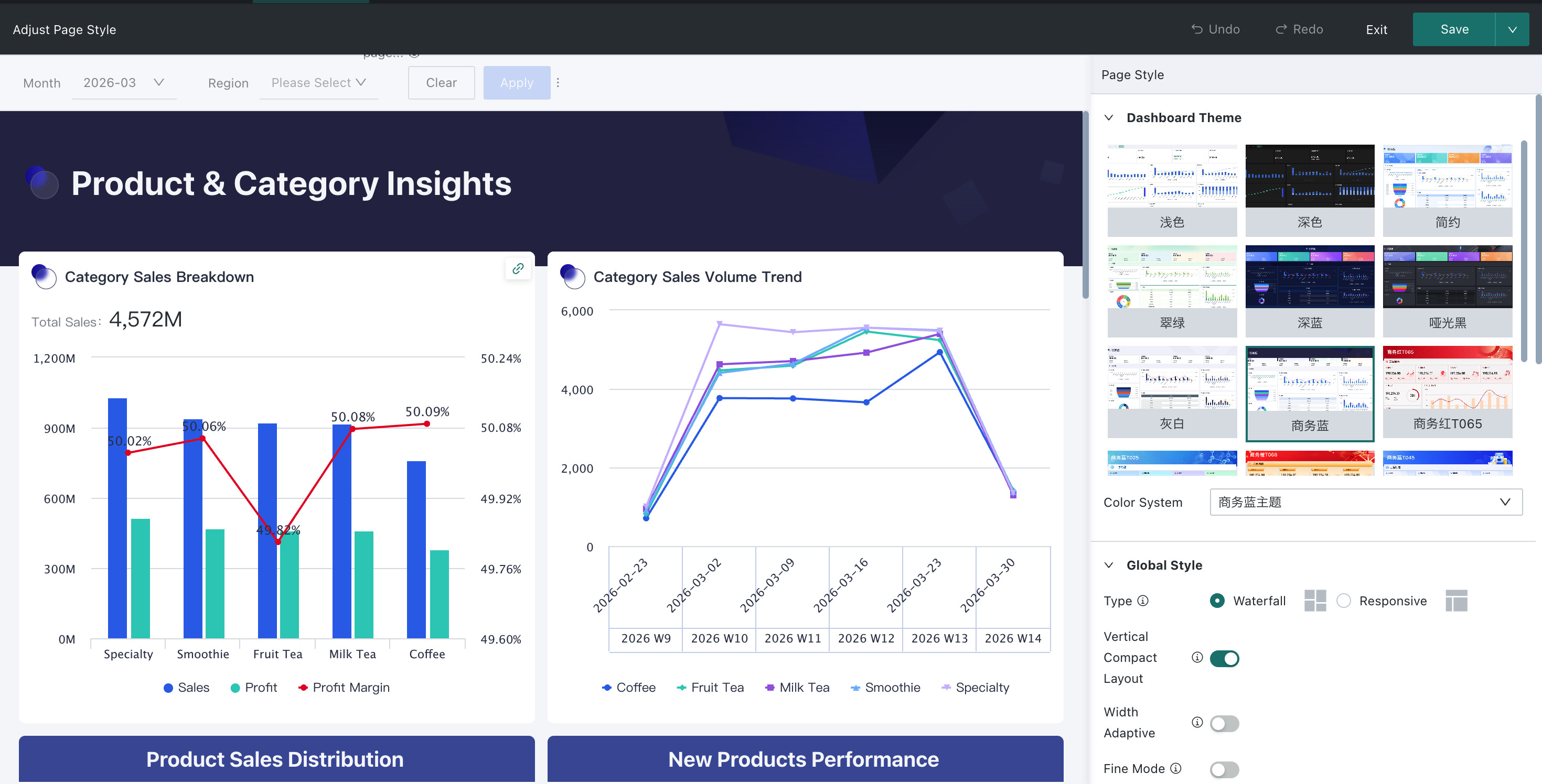
In the theme editing state, if you want to enable fine adjustment, you need to save the current edits first, and then enable it.
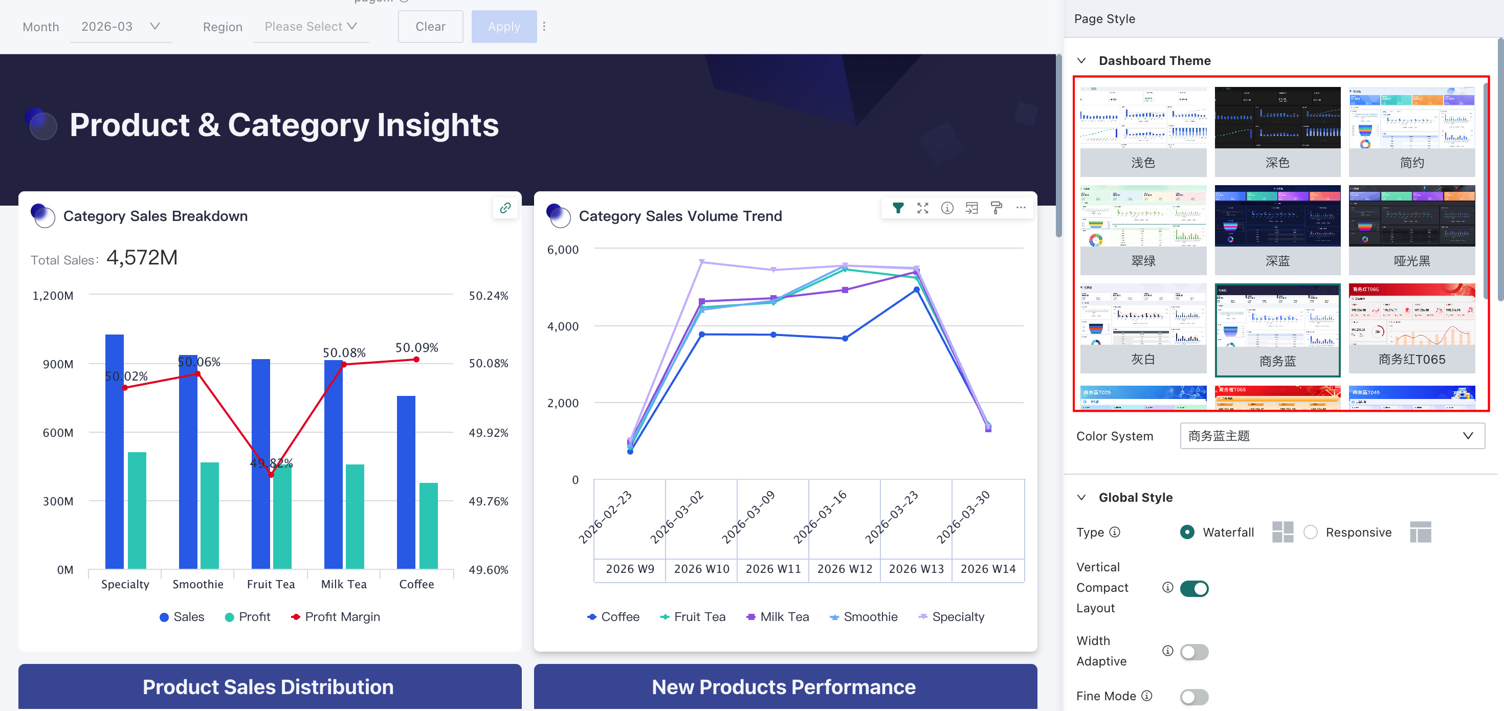
Dashboard Theme
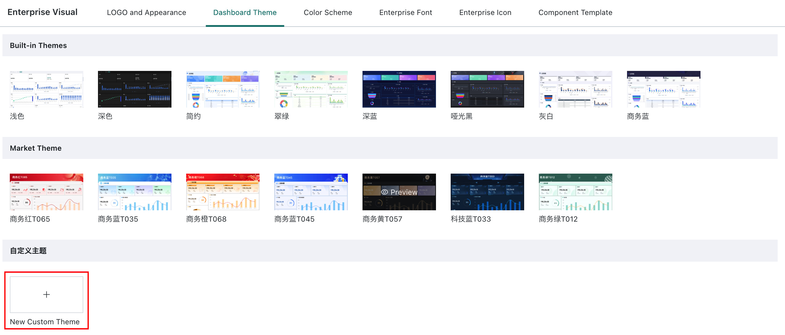
Guandata BI's "Theme Skinning" feature allows producers to switch styles and themes according to enterprise UI style or dashboard analysis content through preset page theme templates. In addition to the built-in 6 theme templates, users can also download more themes from the cloud marketplace or customize themes.
Built-in Themes
Guandata BI has built-in 6 themes: "Minimalist", "Emerald", "Deep Blue", "Matte Black", "Gray White", and "Business Blue". Administrators/page owners can switch themes here. At the same time, you can also change the chart color scheme with one click. The chart color scheme selection depends on the color schemes in the Guandata BI enterprise visual library. Administrators can define and add more color schemes in admin settings for enterprise users to choose from. Guandata BI provides a variety of color schemes. For details, please refer to Basic Color Matching Methods.
Custom Theme
To meet enterprise brand visual consistency needs, administrators can create custom Dashboard themes in the Admin Center by configuring color schemes, font styles, layout parameters, etc., to create data visualization interfaces that match the enterprise brand style.
Create Custom Theme
-
Log in to Guandata BI, and enter the "Admin Center > Enterprise Configuration > Enterprise Visual > Dashboard Theme" page.
-
Click the "New Custom Theme" button to enter the theme editing page.
-
Supports selecting a theme template, which can be updated on an existing theme template.
-
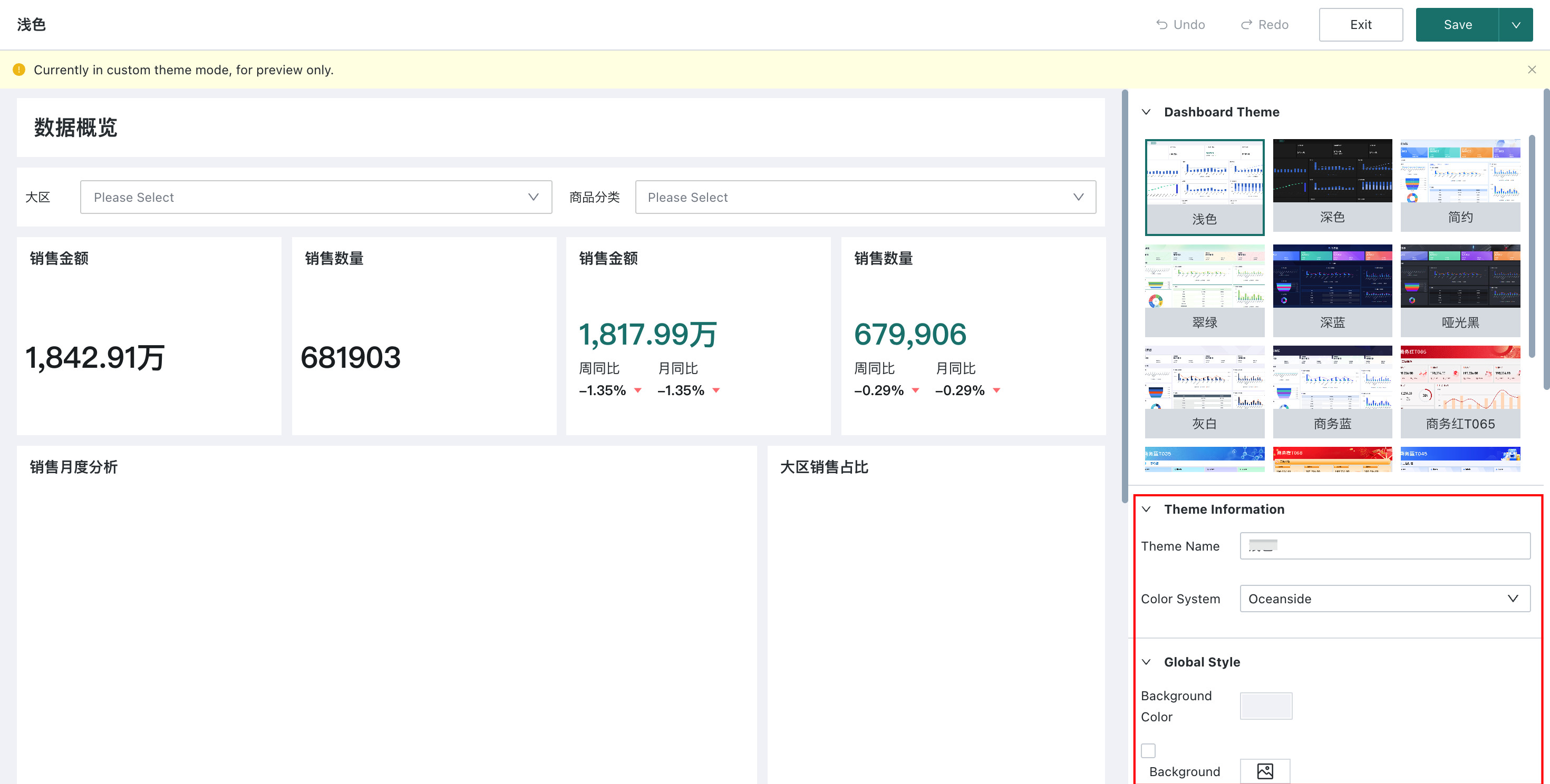
Configure custom theme information in the configuration area below.
| Configuration Item | Description |
|---|---|
| Theme Info | Configure theme name and color scheme. The theme name is used for identification in the theme list; the color scheme can be selected from the dropdown of already configured color schemes in the enterprise visual library. |
| Global Style | Configure the overall appearance and layout of the Dashboard, including background color, background image, card spacing, card border, card corner radius, card shadow, and other parameters. |
| Dashboard Component Style | Configure the layout component styles in the Dashboard, including text styles, background color, background height, etc. for Dashboard titles, tabs, card groups, sub-titles, and other components. |
| Card | Configure card style and card title. Card style includes background color, background image, border, card inner spacing, content spacing, etc.; card title includes title font size, background, area height, top and bottom borders, etc. |
| Chart Properties | Perform targeted style configuration for different chart types, including general charts, metric cards, comparison metric cards, tables, and filters. |
- During configuration, the preview area on the left will display the theme effect in real time.
- After confirming the theme effect, click the "Save/Save and Exit" button in the upper-right corner to complete the custom theme creation.
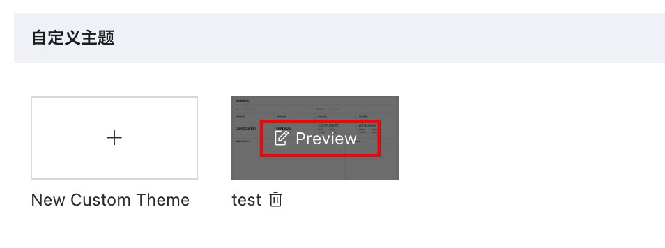
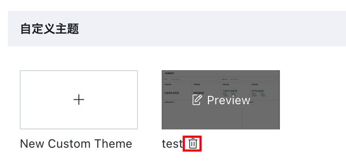
Manage Custom Themes
Administrators can perform full lifecycle management of custom themes on the "Admin Center > Resource Management > Enterprise Visual > Dashboard Theme" page:
-
Edit Theme: Click the "Edit" button on the theme card to modify all configuration items of the theme. When editing a published theme, Dashboards that have already applied this theme will automatically sync and update their styles.
-
Delete Theme: For custom themes that are no longer in use, administrators can click the "Delete" button to remove them. Before deletion, the system will prompt which Dashboards are currently using this theme. After confirmation, these Dashboards will automatically revert to the default theme.
Apply Custom Theme
After a custom theme is published, data analysts can use it on the Dashboard editing page:
- Enter the Dashboard editing page, and click "Page Style" to enter the style editing state.
- In the "Dashboard Theme" panel on the right, in addition to system built-in themes and cloud marketplace themes, enterprise custom themes are also visible.
- Click the theme card to apply it with one click. After application, all styles of the Dashboard will be automatically adjusted according to the theme configuration.
- After applying the theme, you can still fine-tune the "Color Scheme", "Global Style", "Dashboard Component Style", "Card", and "Chart Properties" configuration items to meet personalized needs.
It is recommended that administrators first sort out the enterprise brand visual specifications (such as brand colors, standard fonts, spacing specifications, etc.) before creating custom themes, and refer to the following principles:
- Maintain color contrast to ensure text is clearly readable (recommended contrast ratio between text and background is no less than 4.5:1)
- Control the number of colors to avoid visual clutter from too many colors (recommended 1-2 primary colors, 2-3 auxiliary colors)
- Consider font compatibility, prioritize system fonts or uploaded web-safe fonts
- Keep layout parameters consistent, it is recommended that Dashboards within the same enterprise use the same card spacing and corner radius settings
Global Style
Global style refers to the unified settings for the overall appearance and layout of the Dashboard in Guandata BI. By configuring the global layout, users can adjust the Dashboard's page layout, card spacing, background color, and other attributes, making the Dashboard display more beautiful, neat, and aligned with usage needs.
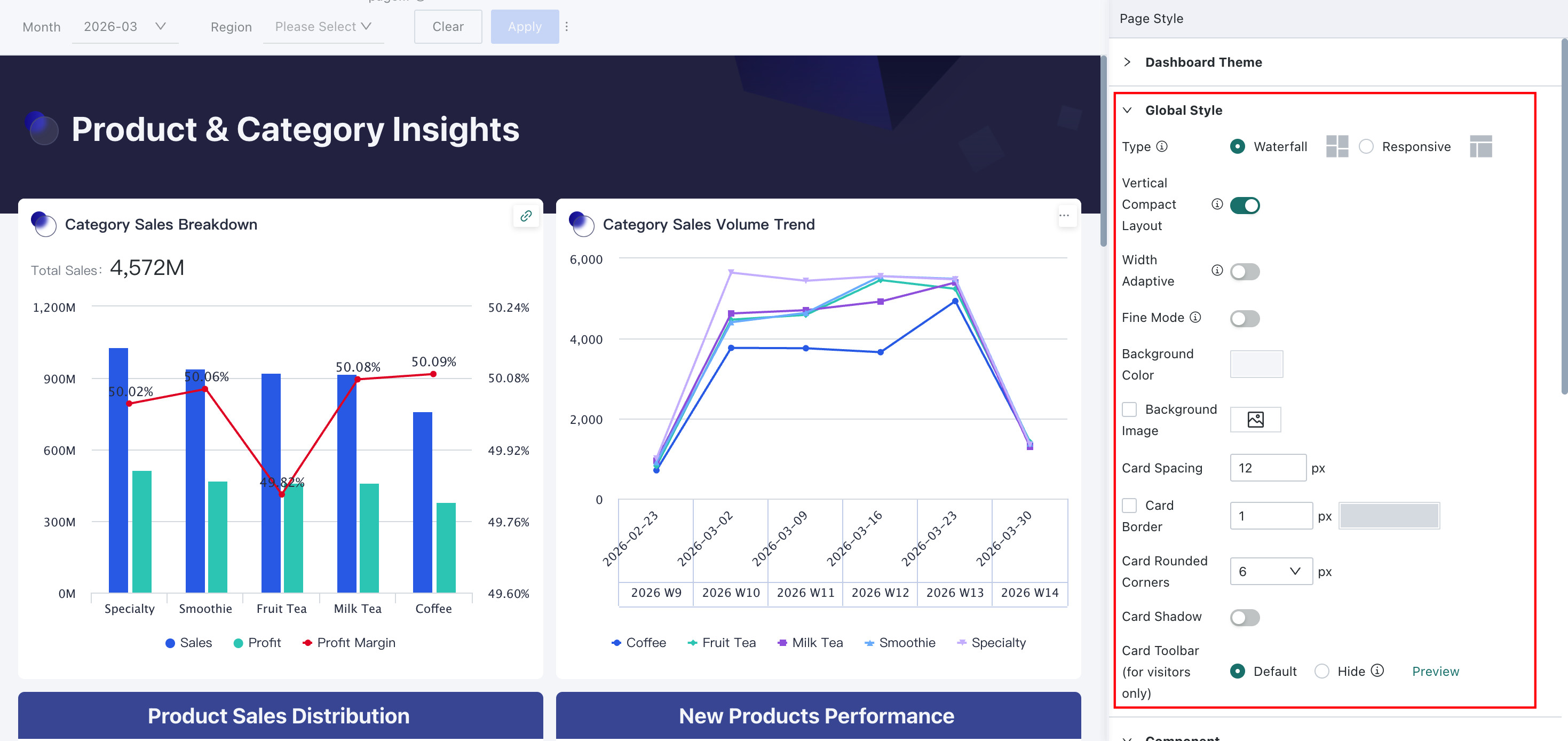
The following are the global style configuration items and their descriptions:
| Configuration Item | Description |
| Layout Type | In this section, users can set the page layout for the entire Dashboard, cards, and card groups; supports waterfall and adaptive two layout modes. Waterfall: traditional page layout mode, suitable for pages with more vertical expansion content; Adaptive: Dashboard content can adapt to the browser window size, suitable for single-page complete display with compact content. |
| Compact Layout | After enabling compact layout, the positions of each card (group) will automatically move up and arrange tightly and uniformly; after disabling, users can freely move and place cards (groups) as needed. |
| Width Adaptation | After enabling proportional scaling, users can select default width or custom width. The system will scale the page proportionally according to the ratio of the set width to the screen width. Note: Proportional scaling is only available under the waterfall layout type. |
| Fine Adjustment | By default, users can only adjust card sizes according to the framework provided by the system. After enabling the fine adjustment switch, the unit height and unit width will become smaller, making card stretching more precise. Users can adjust card sizes more precisely according to their needs, but the switch cannot be turned off after enabling. Note: In the theme editing state, enabling fine adjustment will automatically save the current edits. |
| Background Color | Click the box to directly set the background color. Click the "Default" button to revert to the system default color with one click; click the star icon in the lower-right corner to view and apply various color schemes provided by the system. |
| Background Image | Turn on the "Show Image" switch, and click the "Select Image" or "Replace" button to upload an image. Supports entering an image link or local upload; supports adaptive, original ratio, and full cover three display modes. |
| Card Spacing | Users can adjust the distance between cards (groups) and cards (groups) across the entire page by setting the spacing value. |
| Card Toolbar | Card toolbar icons are displayed on the Dashboard by default. You can hide icons by enabling the "Hide" button of the card toolbar. Users can set icons to be fully or partially hidden as needed, and support previewing the setting effect. After setting, it only takes effect for visitors. The visibility of the card toolbar for mobile and desktop needs to be set separately. |
Dashboard Component Style
Dashboard component style refers to the unified adjustment of layout components in the Dashboard in Guandata BI. Currently, it supports configuring the text style of "Dashboard Title" and "Sub-title", as well as the background color, icon image, background height, bottom margin, and top distance of the component background.
- Dashboard Title: When set to display, the Dashboard title content will be shown at the top;
- Sub-title: Sub-title components can be added in the new card section. Multiple sub-titles can be added to the page simultaneously to partition the Dashboard content. Sub-titles support configuring top distance to adjust the relative distance from the upper content (top distance).
Card
Users can uniformly configure card styles to maintain visual consistency among cards in the Dashboard. Supported configurations include "Card Style" and "Card Title".
- Card Style: Users can adjust card styles by setting card background color and background image, enabling/disabling border, border color and size, card corner radius, enabling/disabling shadow.
- Card Title: Can uniformly adjust the title content of all cards in the Dashboard, including the height of the title area and the configuration of top and bottom borders.
Card title configuration does not include metric cards and comparison metric cards. Styles can be adjusted separately in Chart Properties - Metric Card/Comparison Metric Card.
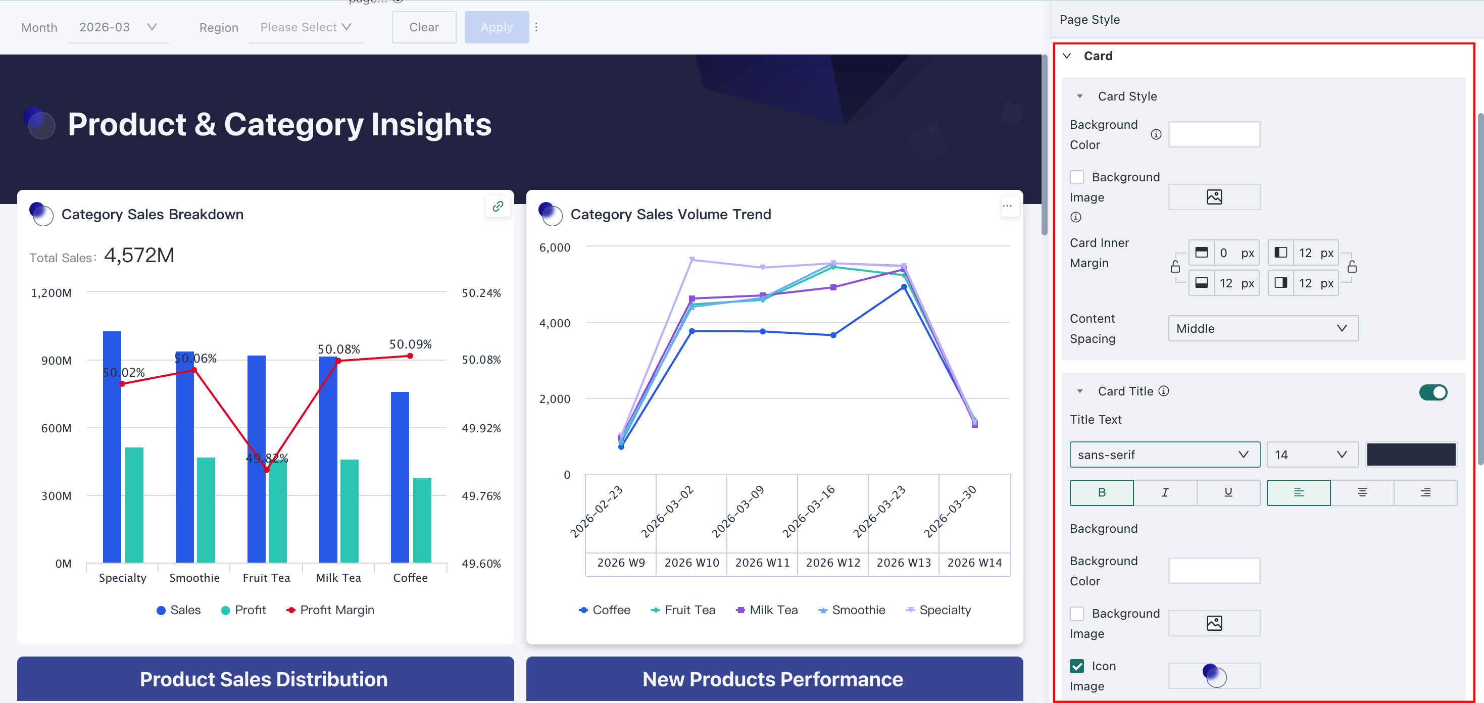
Chart Properties
In the "Card" configuration panel, users can uniformly configure the styles of most cards. For some special cards, including: "Metric Card", "Comparison Metric Card", and "Table", Guandata BI supports users to make more targeted unified adjustments in "Chart Properties".
-
Metric Card: Can uniformly adjust the style of single metric card type cards in the Dashboard. Specific configuration items include: metric and label styles, metric card background, and metric card title.
-
Comparison Metric Card: Can uniformly adjust the style of comparison metric card type cards in the Dashboard. In addition to comparison metric styles, other configuration items are the same as single metric cards.
-
Table: Can uniformly adjust the style of table type cards in the Dashboard. Specific configuration items include: table theme, scroll bar, colors and font styles for each part of the table.
NoteGeneral table style settings do not include the carousel list, which needs to be set in the carousel list editing.
Best Practices
Use with Component Templates
Guandata BI's component templates are designed to meet the common dashboard layout and style needs of different industries, containing professional UI design specifications and industry business scenario attributes. This makes it convenient for users to organize beautification design ideas. With just two steps: ① Download from the marketplace, ② Apply and replace data, users can quickly complete the rapid construction of beautiful dashboards.
The one-click skinning feature of dashboard themes is the icing on the cake. On the basis of the above steps, it can further quickly adjust the overall color scheme or detailed styles. The perfect combination of these two brings greater aesthetics to data display and brings greater improvement to users' work efficiency.
Accumulate as Page Templates for Enterprise-wide Sharing
To unify the visual style of dashboards within the enterprise, users can use unified page templates. When creating new dashboards, applying them with one click ensures each time
When creating dashboards, the following problems are often encountered:
- The diverse styles of dashboards within the enterprise affect the uniformity of brand visuals;
- When creating new dashboards, it is difficult to reuse previously made dashboards, resulting in new dashboard creation needing to start from scratch, with low efficiency.
To address the above problems, Guandata BI provides the "Page Template" feature. Administrators only need to create dashboards that conform to the enterprise visual system, with the support of theme skinning capabilities, and convert them into "Page Templates" with one click. By accumulating them in the enterprise visual library — Component (Page) Templates, enterprise-wide unified management of enterprise visual standards can be achieved.
Leveraging the high reusability of component templates, producers only need to select the most suitable page template according to the business scenario to easily build beautiful dashboards that conform to enterprise visual standards, further meeting enterprise personalization and brand requirements.