Data Visualization Wall
Overview
This module is an add-on feature. If you would like a trial, please contact your Guandata sales representative or Customer Success Manager.
Data Visualization Wall presents analytical results in a highly visual format so business users and decision-makers can monitor enterprise data in real time, understand key signals more intuitively, and make faster decisions. It is designed to support digital operations with a more immersive and direct data-consumption experience.
Data Visualization Wall Value
Zero-Code Development, Drag-and-Drop Free Layout
Data Visualization Wall uses drag-and-drop editing, supports relative layout, and adapts to screen width.
Omni-Channel Data Integration, Real-Time Data Engine
- Aggregates and displays data from multiple business domains across the enterprise, helping teams make better use of data assets and improve decision-making.
- Supports direct connections to dozens of mainstream relational databases, enabling near real-time refresh at the second level.
Rich Component Styles, Beautiful Visualization Charts
- Nearly 100 chart types, including column charts, dual-axis charts, funnel charts, Pareto charts, administrative maps, indoor maps, migration maps, and more.
- Built on the BI analysis platform and equipped with built-in Data Visualization Wall templates, allowing teams to create polished management cockpits quickly.
- Includes professional animated visualization components for most large-screen display scenarios, while also supporting interactive analysis features such as Drill and Card Selector.
Data Visualization Wall Application Scenarios
Based on usage scenarios, Data Visualization Wall can serve both internal and external display needs. Internal screens help teams monitor real-time regional and store information, while external screens can be shared with partners, franchisees, or other outside audiences.
Event Monitoring
When the marketing team runs a promotion campaign, management can monitor foot traffic, sales, and inventory in real time through the Data Visualization Wall, then adjust campaign strategy quickly. For example, a promotion can be changed from buy-two-get-one-free to buy-one-get-one-free based on current inventory conditions.
Meeting Review
Executives often need a fast overview of business performance and operational changes. Data Visualization Wall can present key indicators clearly during executive reviews, business meetings, and milestone checkpoints, encouraging managers to look at, use, and interpret data more effectively.
Communicating Business Results
In office lobbies, culture corridors, or showroom spaces, Guandata's Data Visualization Wall can showcase business performance to franchisees, auditors, partners, or visitors and help communicate the brand's capabilities at a glance.
Data Visualization Wall Creation Process
Creating a New Data Visualization Wall
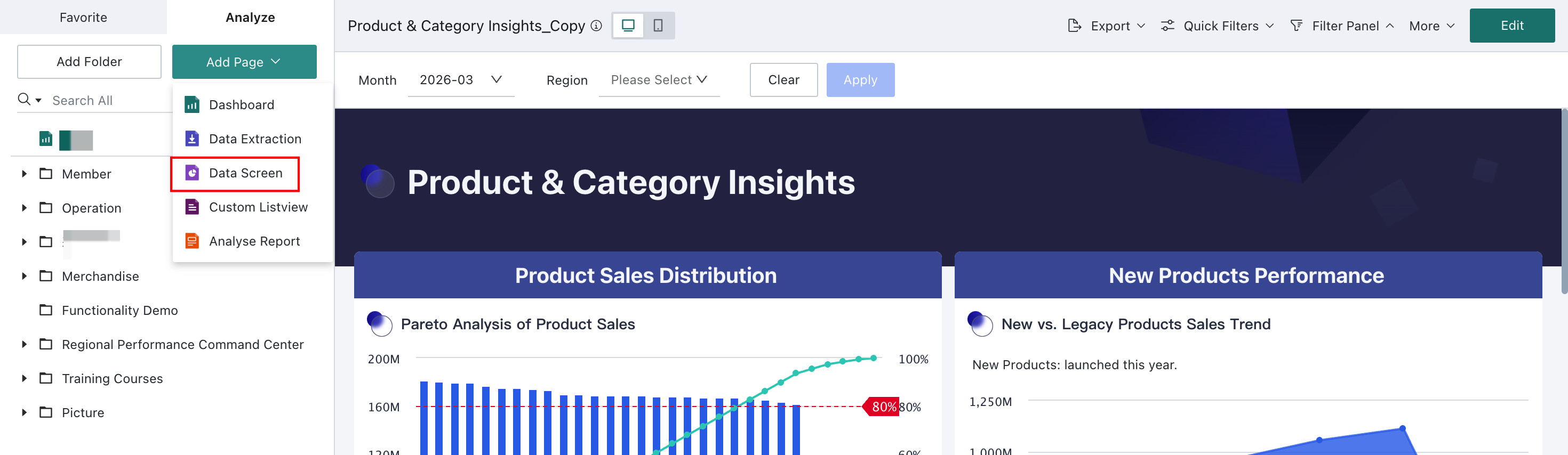
On the Dashboard page, hover over Add Page and select Data Visualization Wall from the dropdown menu.
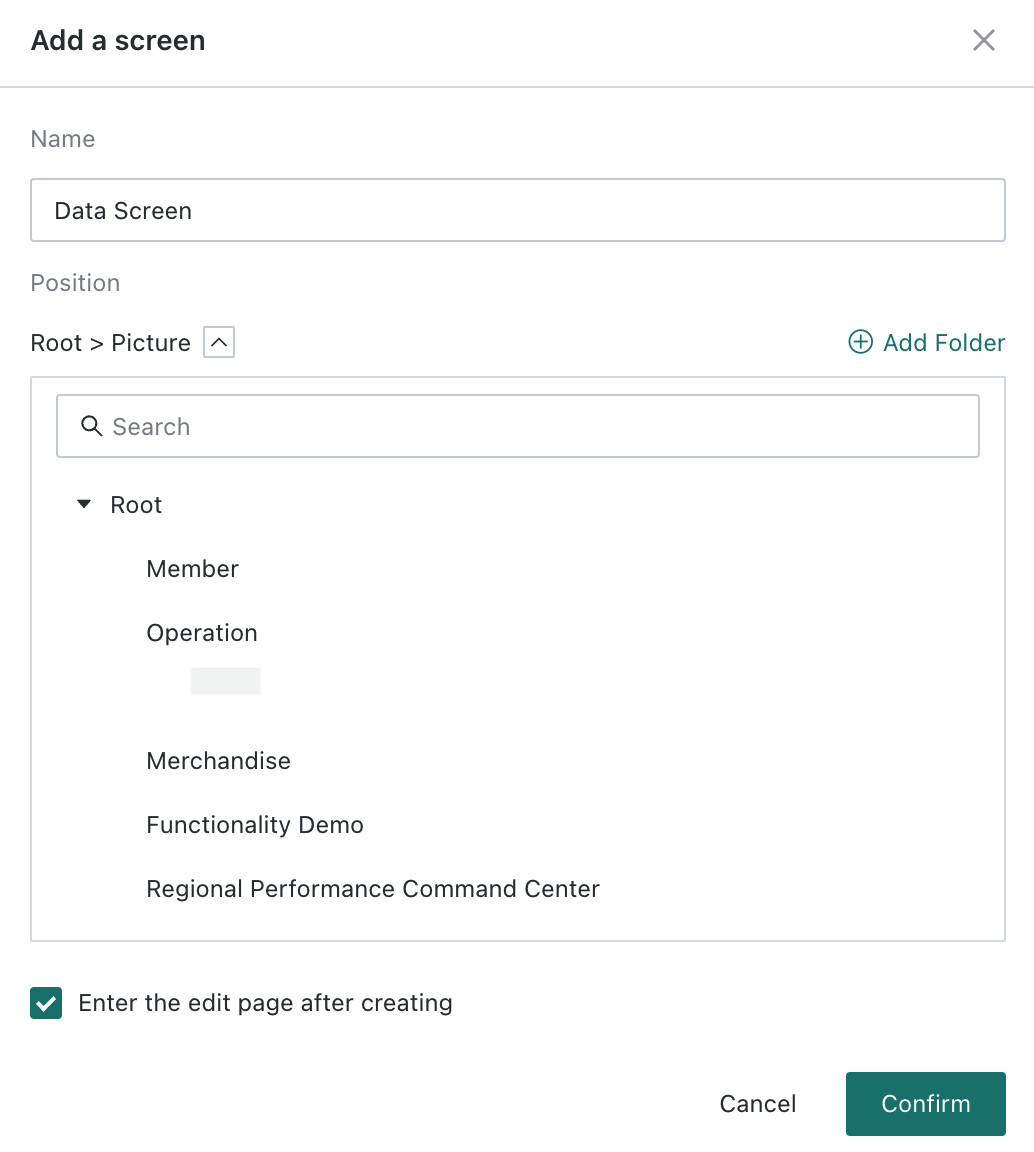
In the creation dialog, enter a name, choose the save location, optionally enable Open new page after creation, and click OK.
Selecting a Template
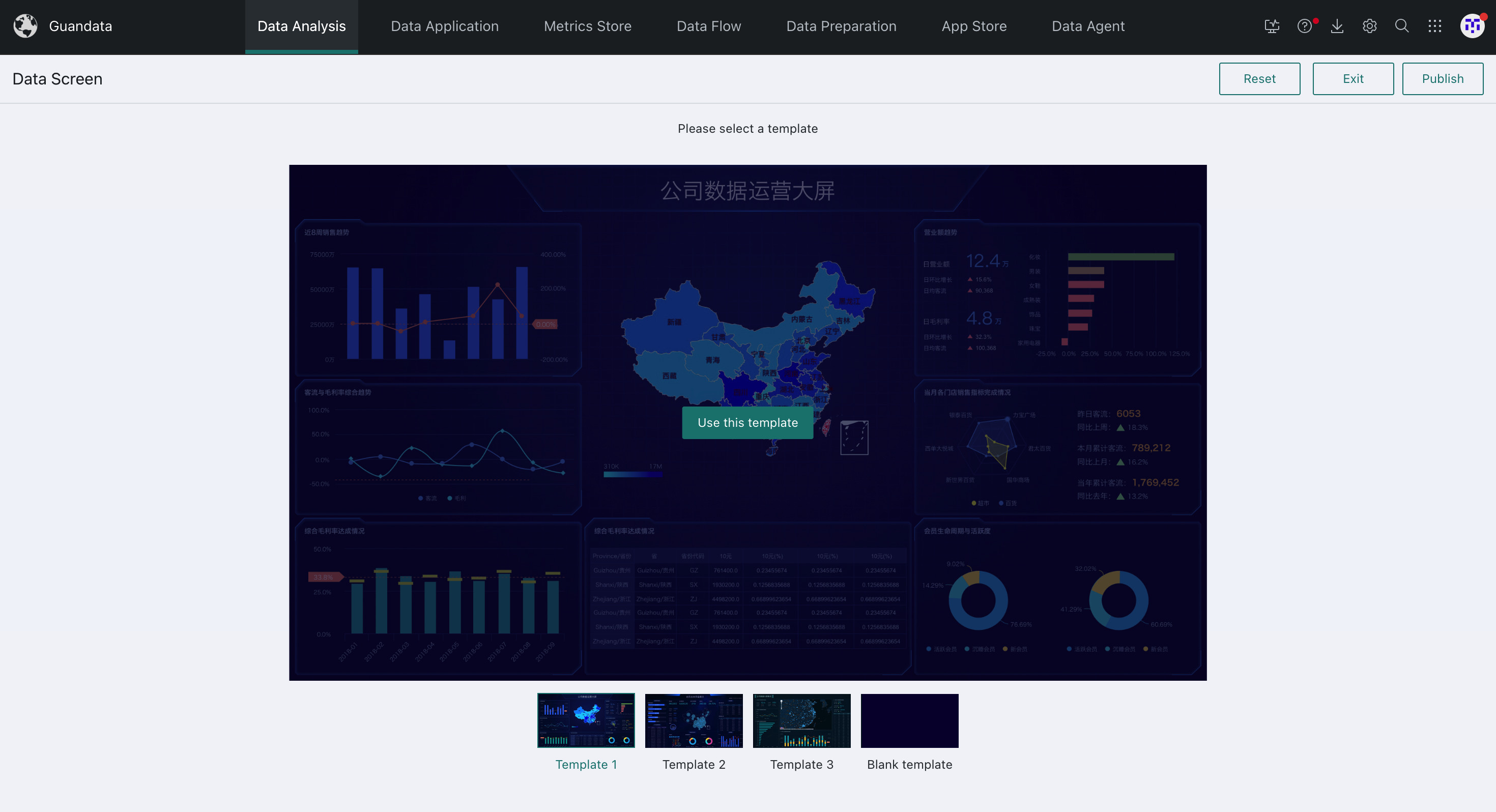
The BI system provides three built-in style templates and one blank template by default.
Choose your preferred template and click Use This Template. The selected template is then applied to the page.
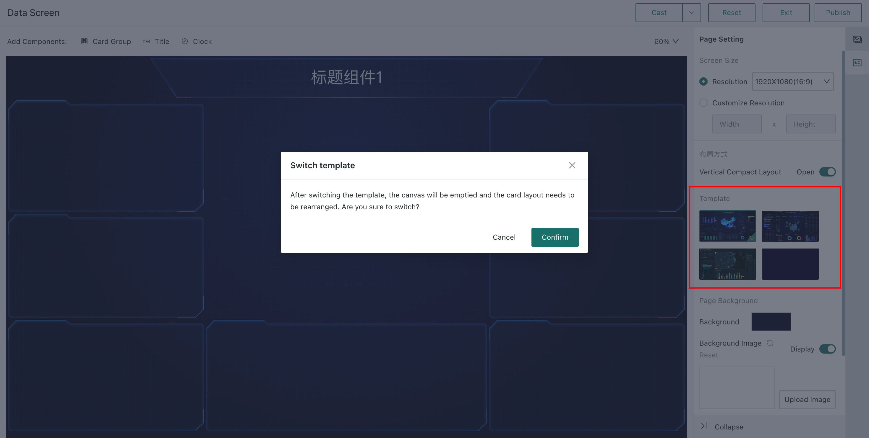
If you want to switch templates later, open the editor and change the template from Page Settings > Template Style on the right.
Adding Components: Title Groups and Card Groups
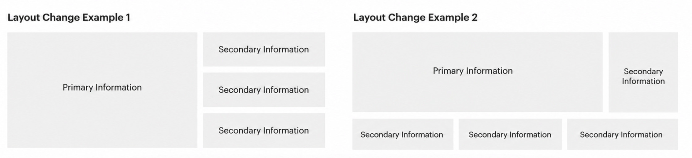
First decide on the overall information layout, then drag Card Groups and Title Groups into place. A common best practice is to place the most important information in the center and arrange secondary information around it.
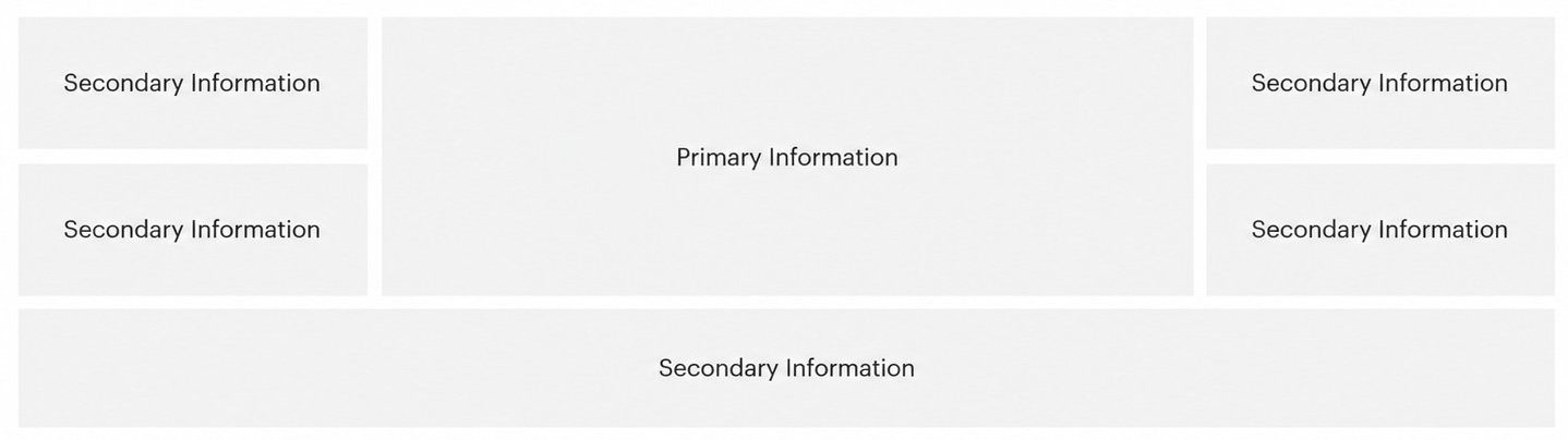
You can then fine-tune the placement of secondary information above, below, left, or right as needed. The key principle is that the main information should always remain large, prominent, and visually dominant.
Adding Cards, Titles, and Clocks
Adding Elements
Click Card Group, Title, or Clock to add an element. The element appears below the screen canvas.
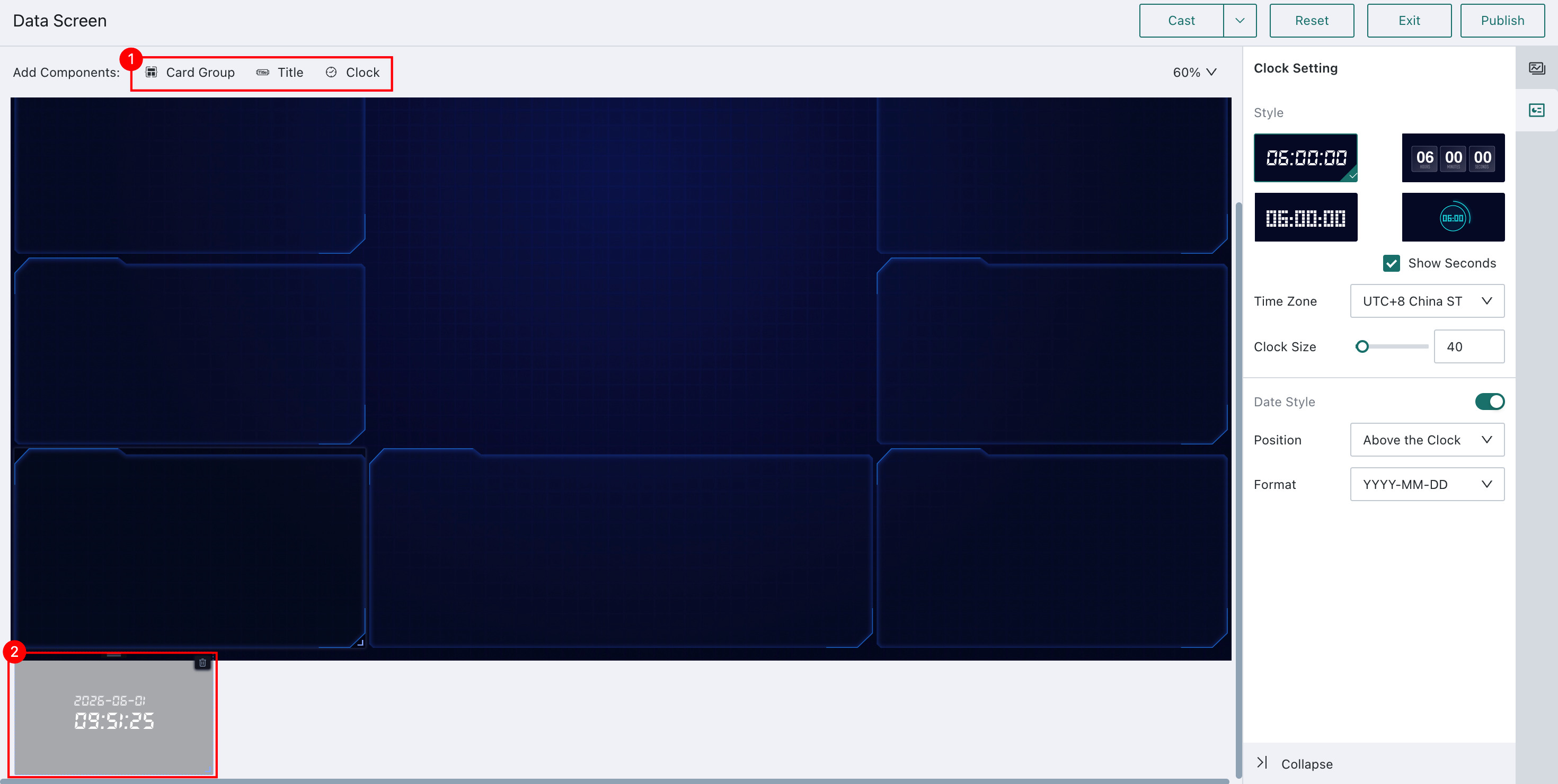
Drag the element to the desired position. To delete it, click the Trash button in the element's upper-right corner.
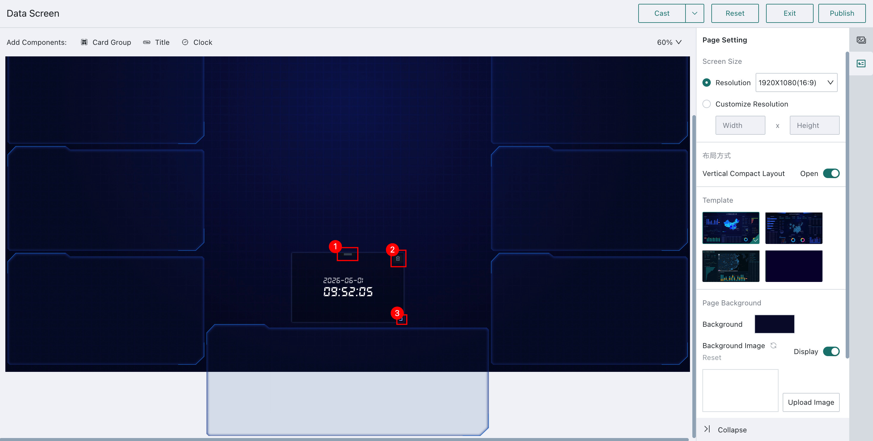
- drag to adjust position
- delete
- drag to resize
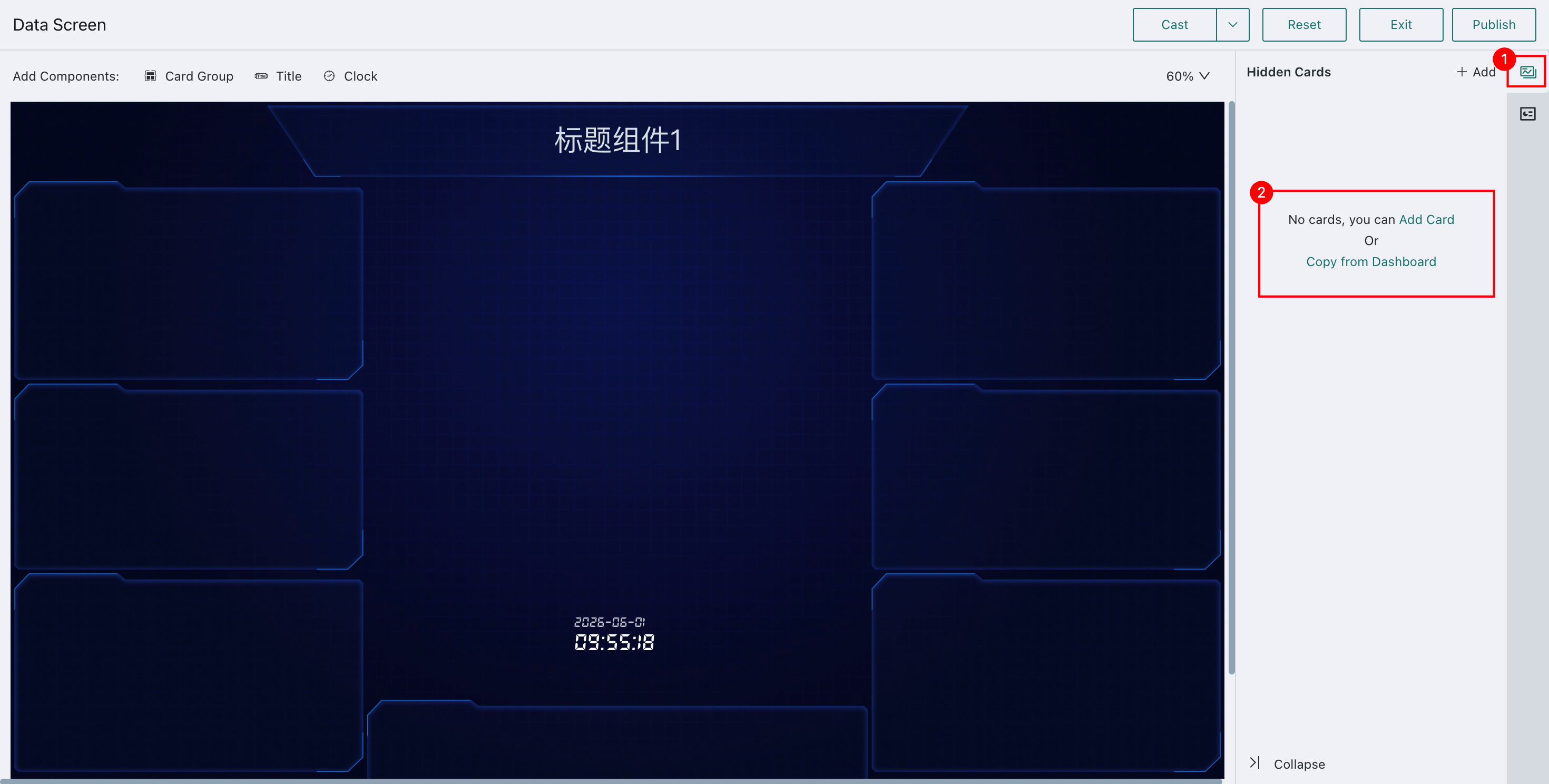
Adding Cards to Card Groups
Click Card Pool on the right side of the page. Cards can be added in two ways: create a new one from scratch or copy one from an existing Dashboard.
For details on creating a new card, see the Visualization Chart Documentation in the Help Center. The section below focuses on copying cards from an existing Dashboard.
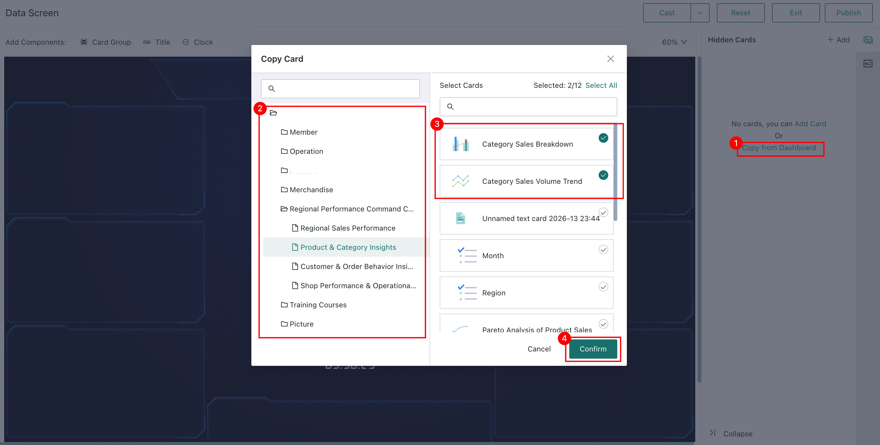
Click Copy Cards from Dashboard, choose the source Dashboard on the left, select the cards you want on the right, and then click OK.
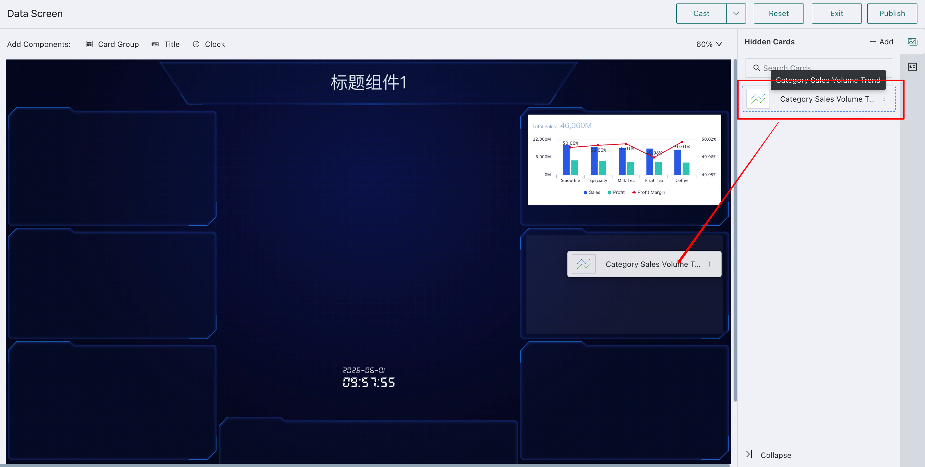
Open the card pool, choose a card, and drag it directly into the target Card Group on the left.
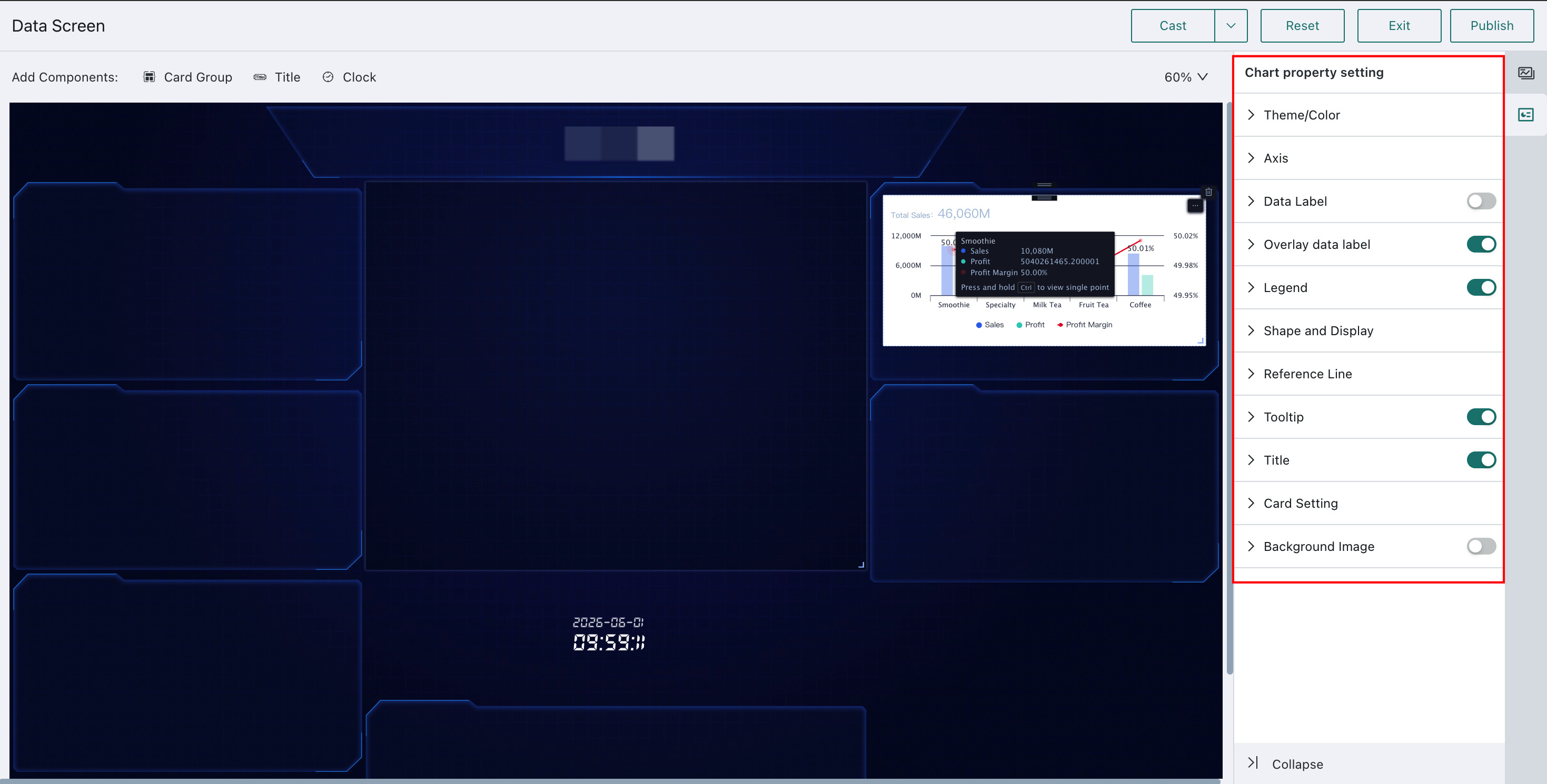
Click a card inside a Card Group, and the property panel on the right automatically switches to that card's chart settings. These settings are the same as those in the regular card editor. See Chart - Chart Properties and Table - Chart Properties.
For table cards, you can configure carousel mode and carousel timing so the scrolling speed fits the amount of data being displayed.
- Row carousel: Default speed is 30px/s, can be modified with scroll wheel, range: 1-200
- Page carousel: Default stay is 15s, can be modified with scroll wheel, range: 1-200
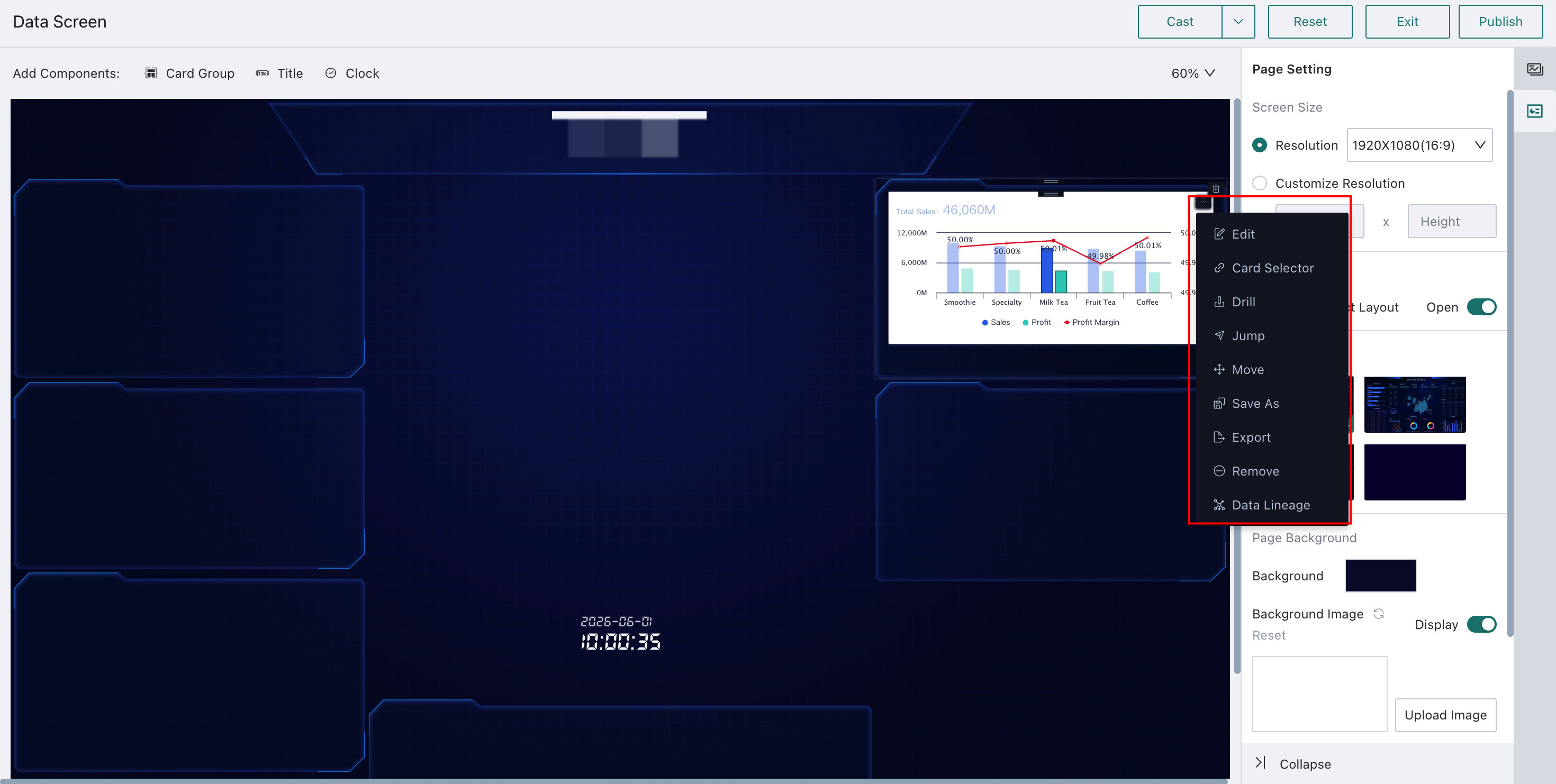
Hover over a card and a settings button appears in the upper-right corner. From there, you can edit the card, configure Card Selector, Drill, Jump, move the card, and more. For those interaction settings, see Drill, Card Selector, and Jump.
Adjusting Style and Layout
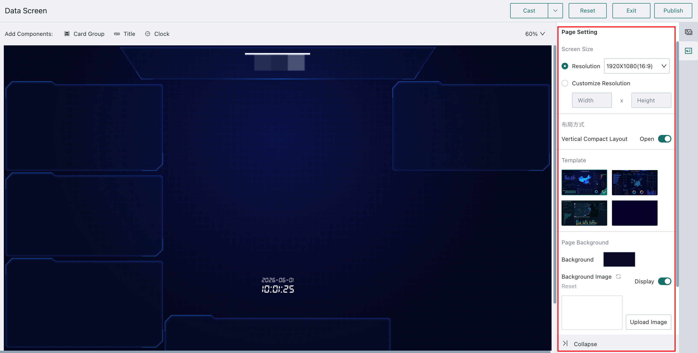
Page Settings
On the edit page, click a blank area of the screen rather than a Card Group or Title Group. The Page Settings panel then appears on the right, where you can configure page layout, template style, background color, and related options.
Screen Size:Resolution: Three resolutions are available:1920*1080 (16:9),1920*1200 (16:10), and1920*1440 (4:3).Custom Resolution: Because the screen is usually displayed on fixed hardware, enter the actual screen size whenever possible for a more accurate preview. When the screen size changes, the existing card width and layout adapt automatically, while the height may still require manual adjustment.
Layout Method: You can choose whether to enableCompact Layout. When enabled, cards and groups automatically move upward into a tighter, more unified layout. When disabled, they can be placed freely.Template Style: Select another template to switch the page style.Page Background: Set a background color or upload a background image.Card Loading: Configure whether loading placeholders are shown and how many seconds to delay card display.
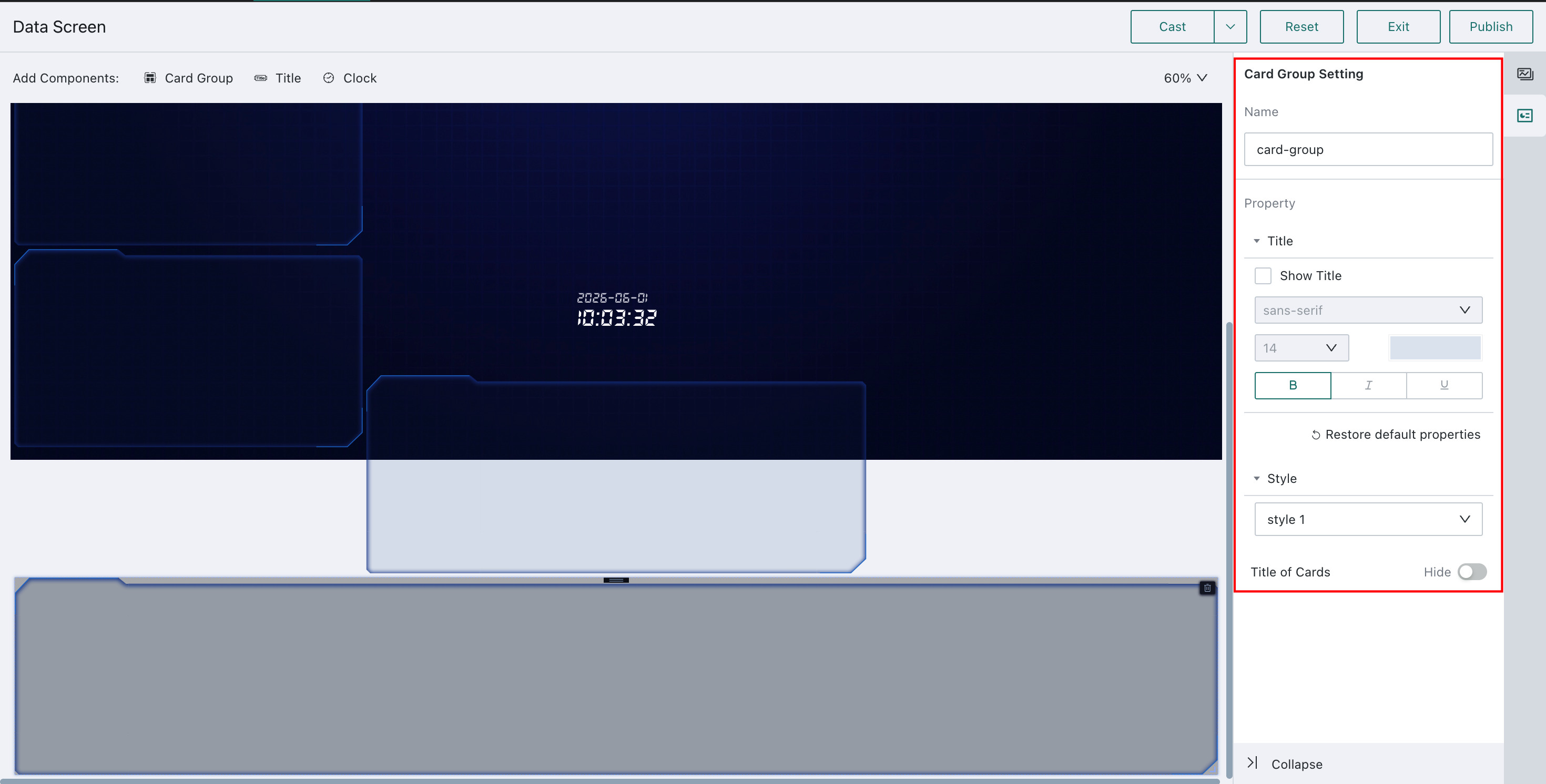
Card Group Settings
On the edit page, click a Card Group and the Card Group Settings panel appears on the right. Use it to edit the group's name, title, style, and related settings.
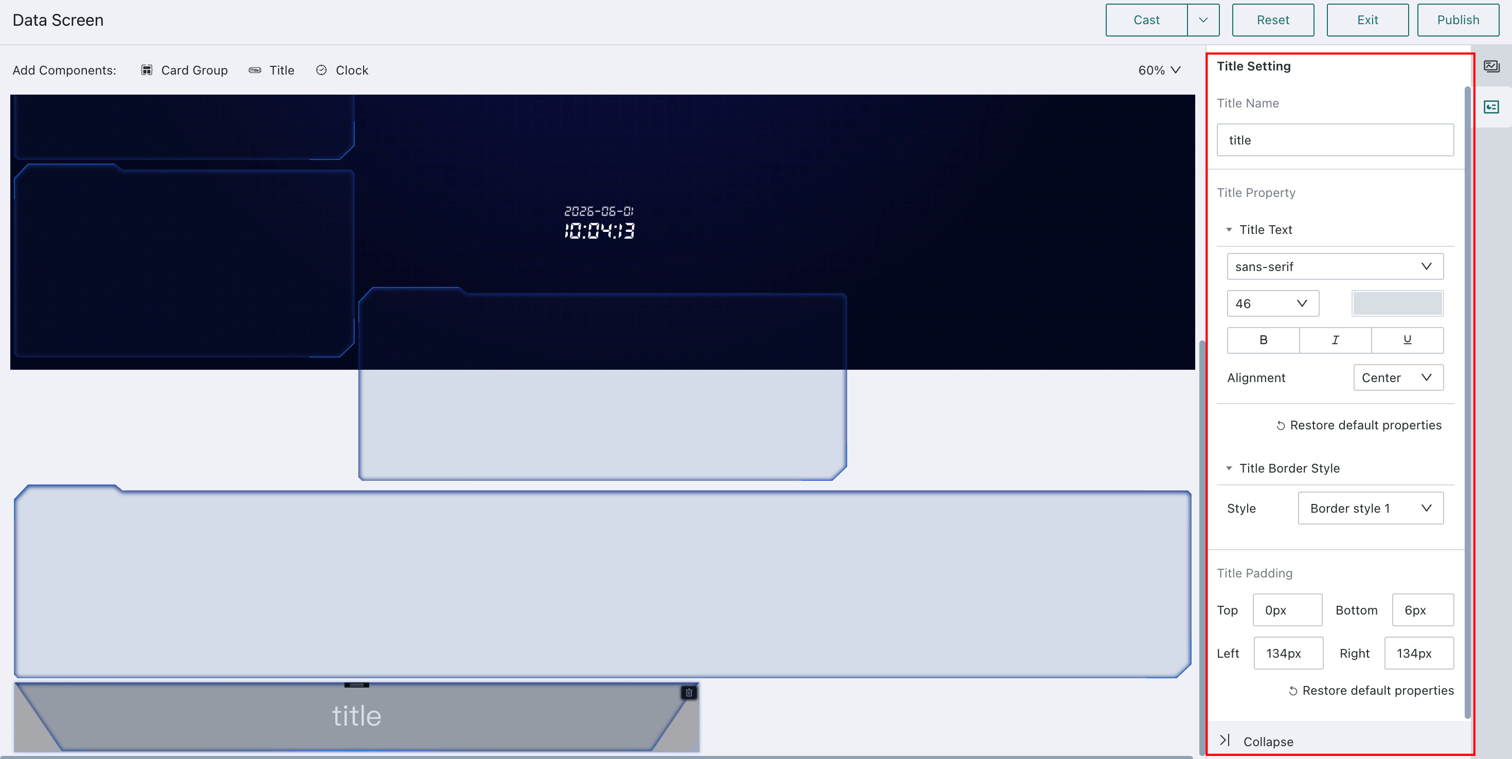
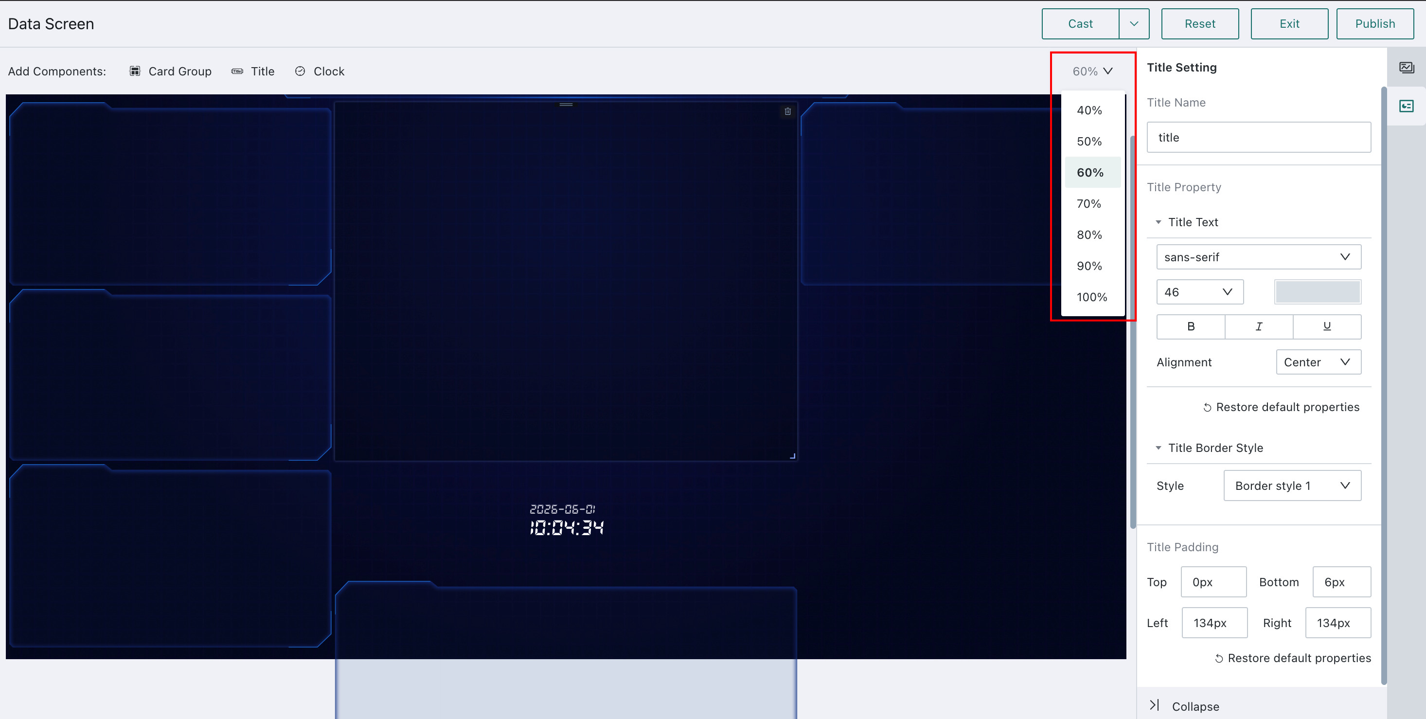
Title Component Settings
On the edit page, click a Title component and the Title Component Settings panel appears on the right. Use it to edit the component's name, title, style, padding, and related settings.
Other Settings
Adjust the display scale of the screen by clicking the percentage in the upper-right corner and choosing the desired zoom level.
Publishing
- After the Data Visualization Wall is ready, click
Publishin the upper-right corner to make it available online. - Edits are saved in real time. If the page is not ready to be published yet, click
Exitin the upper-right corner to return to the online page.
Font Download
In component property settings and chart properties, you can choose the display font to improve the visual style of the screen. A font only takes effect if it is installed on the computer currently being used. In addition to system default fonts, Guandata also provides several free commercial fonts for download:
PangMen ZhengDao Title Font 2.0 Enhanced
Data Visualization Wall Related Resources
Screen Management: For Data Visualization Wall permission settings and management, see Page Management
FAQ: If you encounter issues while using Data Visualization Wall, see Data Visualization Wall FAQ.
Tip: See How to Set Auto Refresh for Dashboard / Data Visualization Wall.
Video Tutorials: For more guidance on using Data Visualization Wall, visit the Guandata Video Tutorial Website