Standard User Getting Started Guide
Overview
This guide is written for first-time business users, analysts, and similar standard users of Guandata BI. Through a complete sales analysis reporting case, it introduces the full workflow from data integration and cleansing to Dashboard creation, interactive analysis, and report sharing, making professional visual reporting easier even without a technical background.
Sales Analysis Report Workflow
This guide builds a Dashboard for a chain supermarket marketing manager. The report includes a nationwide sales map, category share analysis, store detail views, and brand rankings. The overall analysis covers:
- Overall sales analysis: sales amount, sales volume, seasonality, product lines, and price structure.
- Regional analysis: regional distribution, key regions, unusual trends, and regional product performance.
- Product line analysis: product structure, key products, and product-region cross analysis.
- Price structure analysis: price bands, price-product relationships, and price-region relationships.
The production flow includes five major steps:
- Data integration and preparation
- Dashboard creation
- Interactive analysis setup
- Permission management and sharing
- Report presentation
Data Integration and Preparation
Data integration and preparation are the starting point of a report. Required data can be selected from the source, fields can be extended with calculated fields, and Smart ETL can be used for additional cleansing. The processed dataset can then be reused when building the report.
Sign In
-
Open the browser and visit
app.guandata.com.
-
Enter the company domain, account, and password to log in.
NotesGoogle Chrome is recommended. If you forget your password, contact an administrator to reset it.
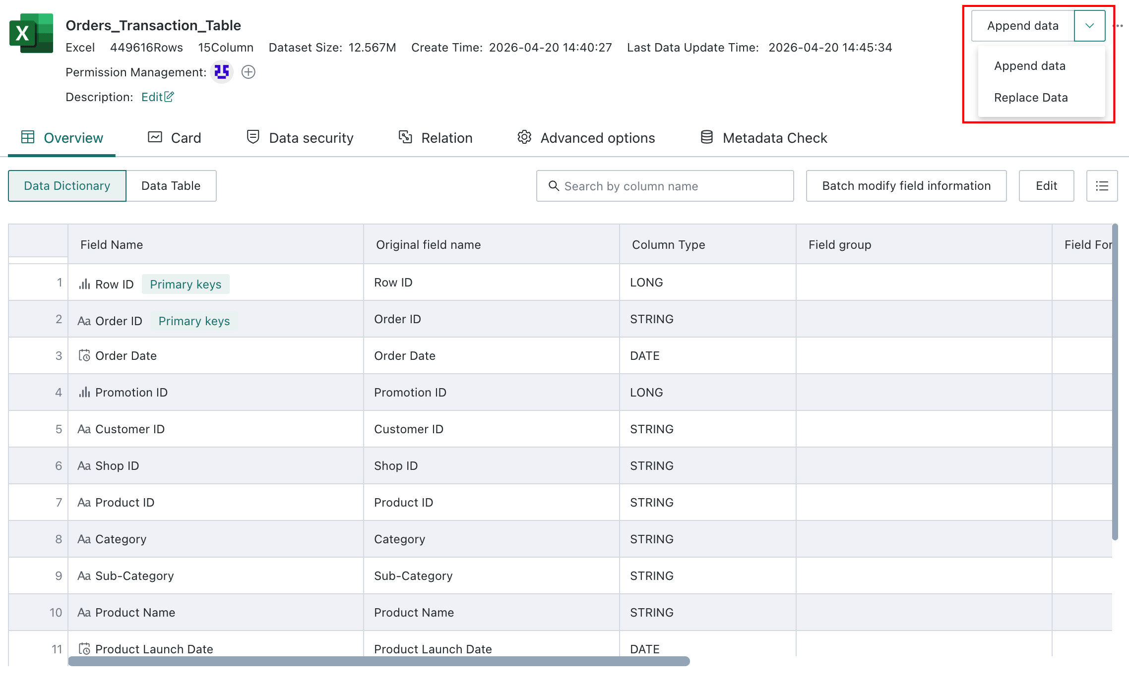
Upload a Dataset
-
On
Data Preparation > Dataset, clickAdd Dataset, chooseLocal File, upload the sample sales detail file, and set an appropriate dataset name and storage location.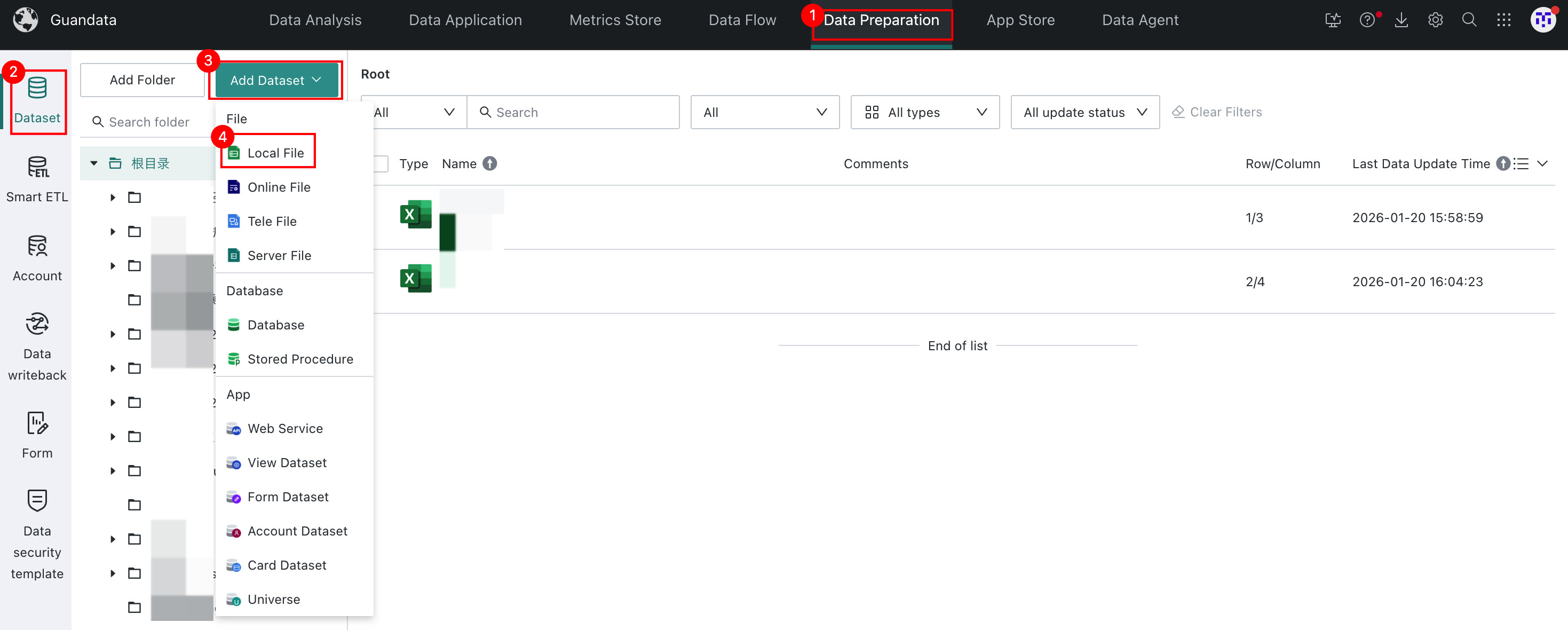
-
After creation, use the
Data Detailstab on the dataset overview page to confirm preview data, row count, column count, and other basic information.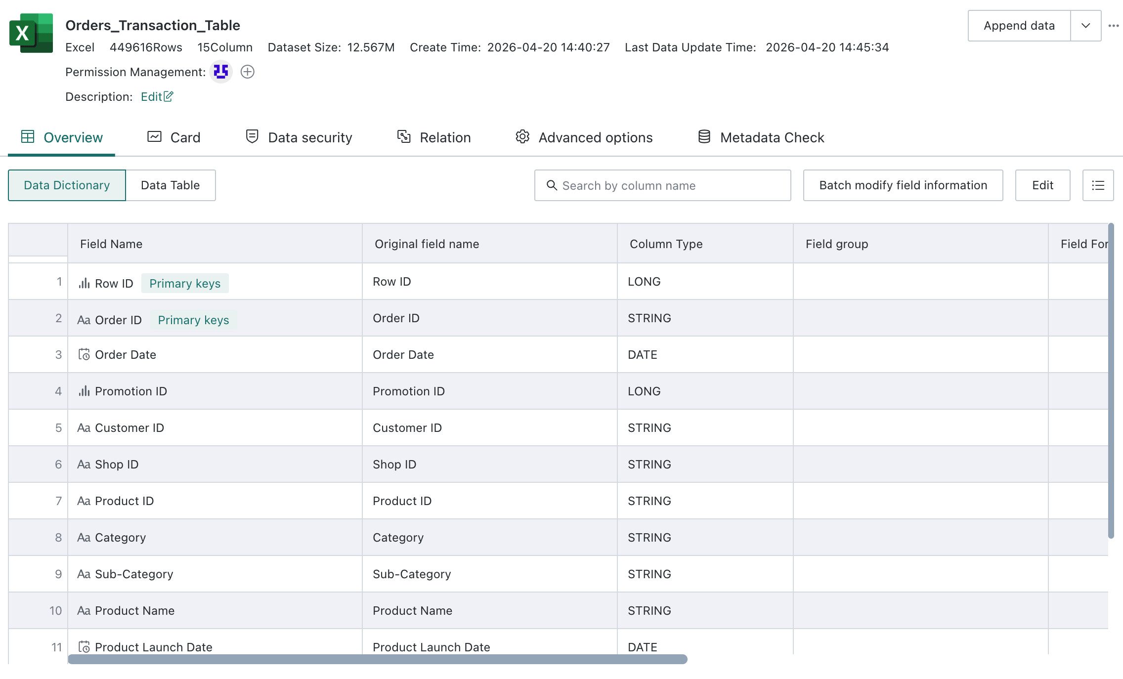
-
If needed, append or replace data from the upper-right corner.
Use Smart ETL to Clean Data
If the source data needs additional processing, such as trimming whitespace, merging tables, or filtering invalid data, Smart ETL can be used. In this example, whitespace trimming is used as a simple illustration.
-
Click
Add ETLon theSmart ETLpage and choose a suitable folder.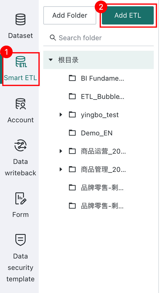
-
Drag the
Input Datasetoperator into the canvas and choose the uploaded file.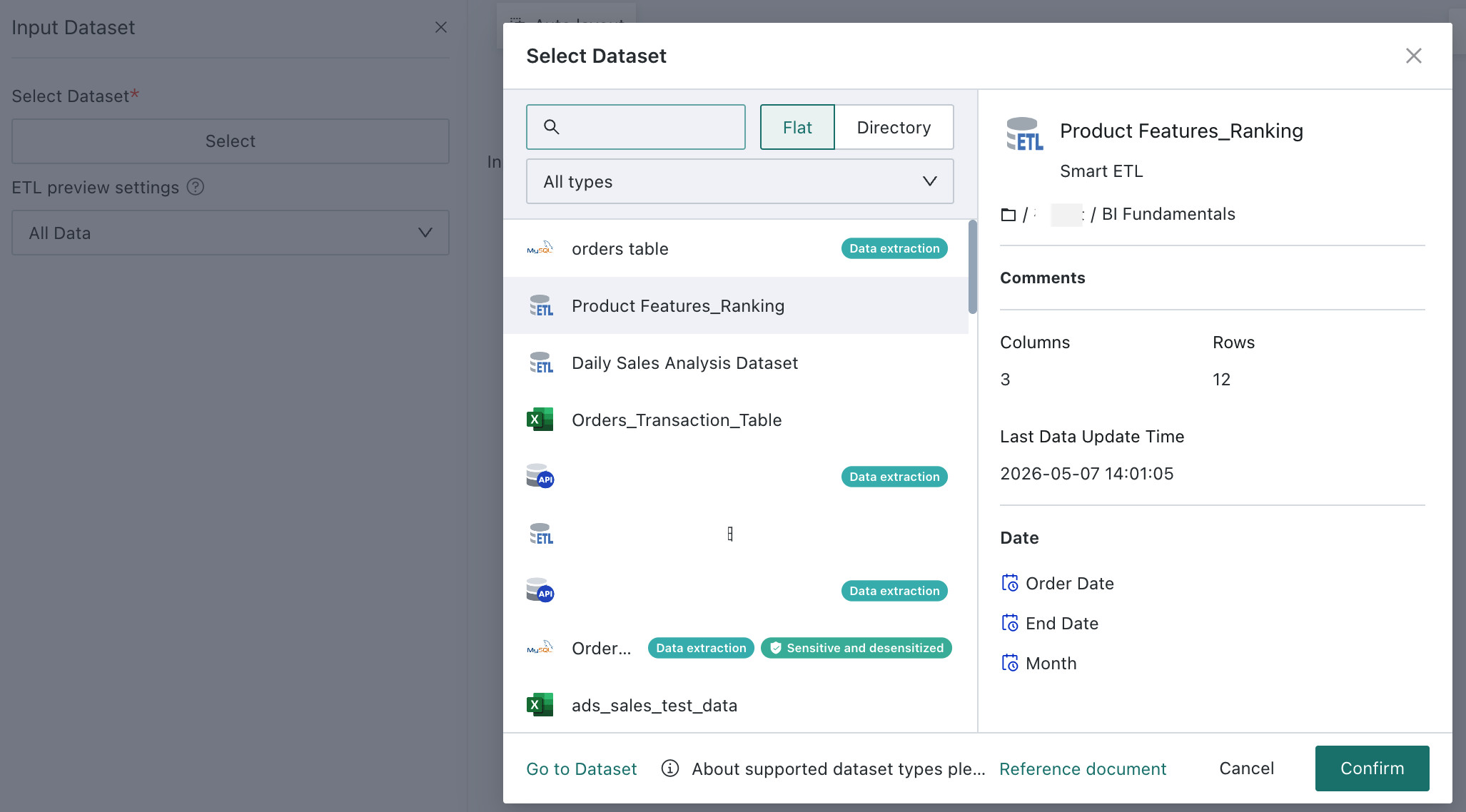
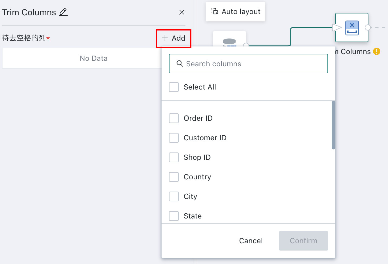
-
Drag a cleansing operator, such as trimming whitespace, and configure the target columns.
-
Drag the
Output Datasetoperator, fill in the output dataset name, and choose the storage location.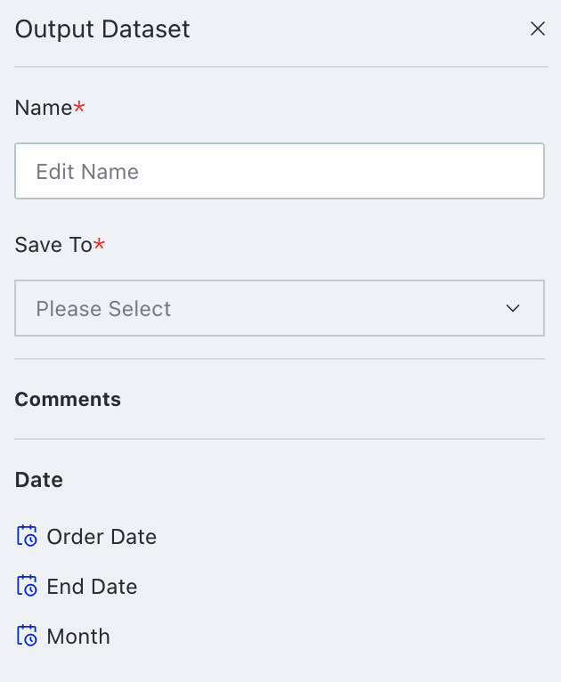
-
Click
Save, Run, and Exit.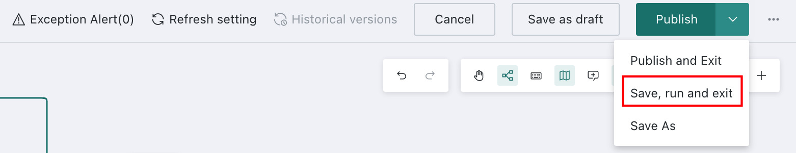
Create a Dashboard
For detailed operations, see Create Dashboard.
Understand Cards and Pages
- Card: The smallest analysis unit on a Page. A Card can be a table, a simple chart, a complex chart, text, a webpage, or an image.
- Page: The container for Cards. Users can create pages, group them in folders, and favorite important pages.
Build the Dashboard
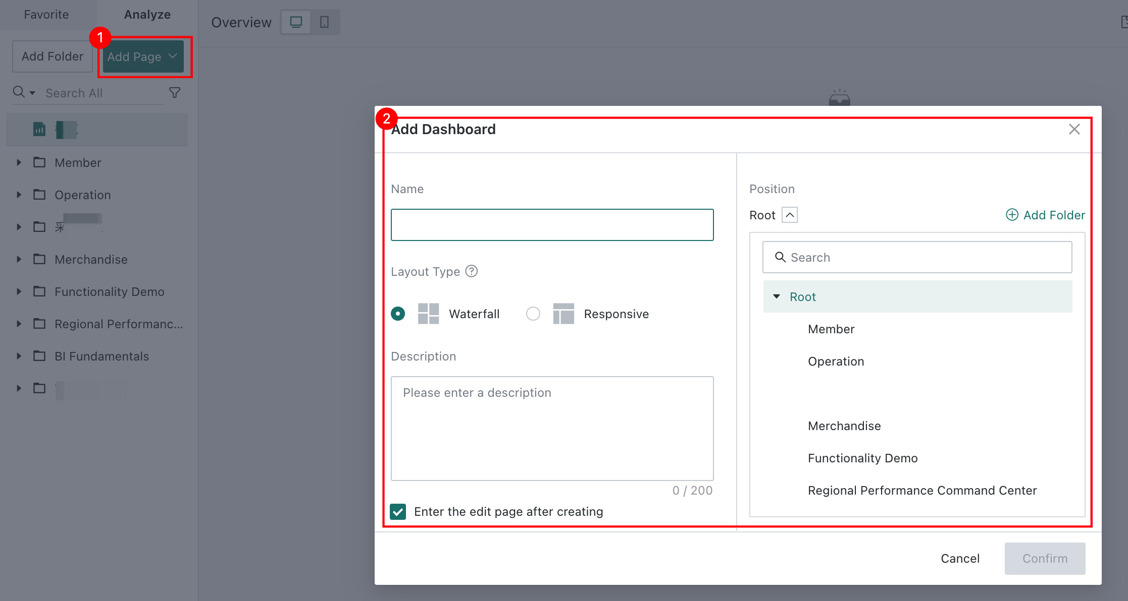
On the Data Analysis page, click Add Page > Dashboard, fill in the Dashboard information, and create a blank Dashboard.
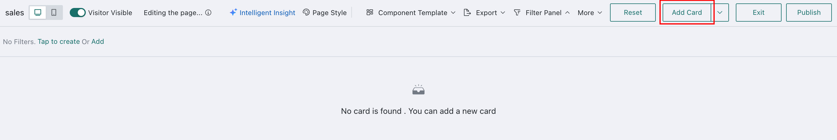
Then click Add Card to start adding content.
Adjust Layout and Beautify
- Drag Cards freely on the canvas to change their positions.
- Drag Card edges to resize them.
- Open
Page Styleto apply themes such as Business Yellow or Fresh Blue.
Set Up Interactive Analysis
When there is too much content to show on a single page, overview indicators can stay on a summary page, while detailed analysis can be distributed across other pages. This can be achieved through advanced Dashboard interactions such as Drill Down, Linked Interaction, Filters, and Navigation.
- Drill Down: Jump from one Card to another along a hierarchy, such as category levels or province-city-district levels.
- Linked Interaction: Use one chart as a filter for other charts, including cross-dataset interactions.
- Navigation: Jump from one page to another for more detailed analysis.
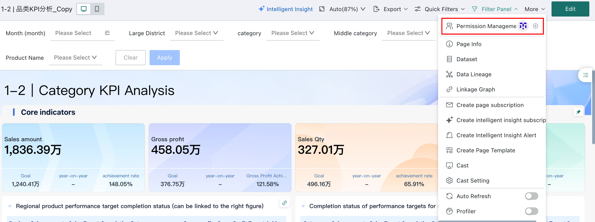
Permission Management and Sharing
After the Dashboard is complete, you can control who can view or edit it through permission settings.