
Overview

Introduction

Welcome to the Guandata BI getting started guide.

Thank you for choosing our product. We hope it brings greater insight and value to your work and business.

In this introductory case, we will walk you through how to use Guandata BI, from creating your first analysis report to performing basic analysis and then proactively exploring data in a flexible way.

After completing this course, even if you are new to data analysis, you will be able to independently complete a simple analysis within one hour and support decision-making with a low learning threshold.

The Case

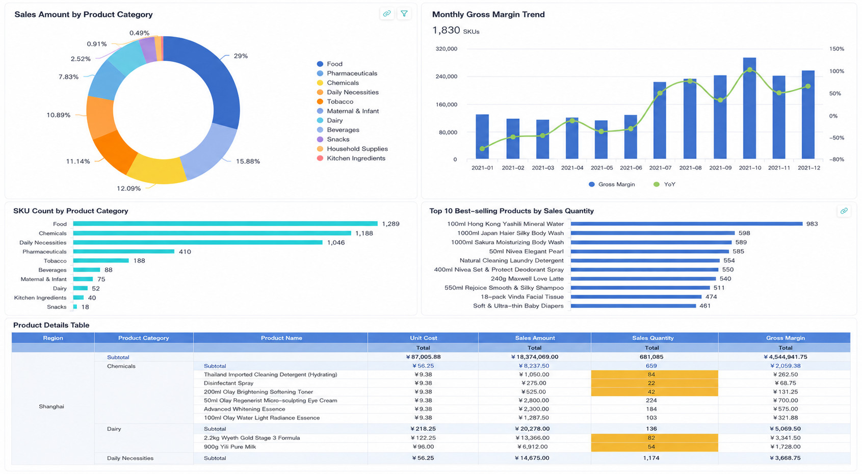
You are a data analyst at an e-commerce company. One day, you need to create a report on product sales across the country. The analysis includes best-selling product rankings, sales share by category, and detailed regional product sales tables. You also need to highlight products with unusually low sales volume in a specific region, as shown below:

How to Build It

This case uses the following dataset: First Analysis Case Dataset.zip

StepLearning Link

    1. Connect data sources: product, store, and retail information tables

Start Learning

The first step in data analysis is connecting different data sources to support downstream analysis.


    2. Process the data sources: merge and transform scattered data

Start Learning

Accurate data is the foundation of accurate analysis. Raw data is often scattered, inconsistent, or even incorrect, so data preprocessing is generally recommended to ensure analytical quality.


    3. Create visual charts: analyze data through charts

Start Learning

Use a rich set of chart types and drag-and-drop creation to build attractive charts and uncover the essence of problems.


    4. Create visual tables: analyze data through tabular views

Start Learning

In addition to charts, Guandata BI also provides multiple table types to help users observe data from different perspectives.


    5. Add data interactions: view sales details for a specific category

Start Learning

Create relationships between datasets and support linked queries and interactive analysis across multiple charts.


    6. Layout and beautification: make the dashboard more polished

Start Learning

Supports page layout improvement, style adjustment, and visual design enhancement for the overall dashboard page.


    7. Share with others: support collaboration and data consumption

Start Learning

Share dashboards with others for collaborative maintenance, common KPI tracking, and similar use cases.