Custom Filter Plugin Development Guide
Overview
Custom filters are used to extend the interaction patterns of filters and must be delivered as plugin code. Once the plugin registers a custom filter with BI through OpenSDK, that filter becomes available when users create a new filter in a Dashboard.
This article walks through the development process by using a multi-select table filter as the example case.
At present, custom filters support selection filters only.
Usage Guide
Guandata provides a custom filter plugin code template, which you can use as the base for extended development.
The overall development process is as follows:
- Write the basic component structure following the plugin code template
- Implement component rendering based on WebComponent and the Lit framework
- Load data using the methods and properties provided by BI
- After user interaction, submit the filter conditions in the specified format to BI
- Complete the configuration form Schema writing and apply the values filled in by the user in the configuration form
- Supplement operation details for the complete code
Development Case: Multi-Select Table Interactive Filter
This section demonstrates how to build a multi-select table filter by using the custom-filter plugin capability.
Features to Implement
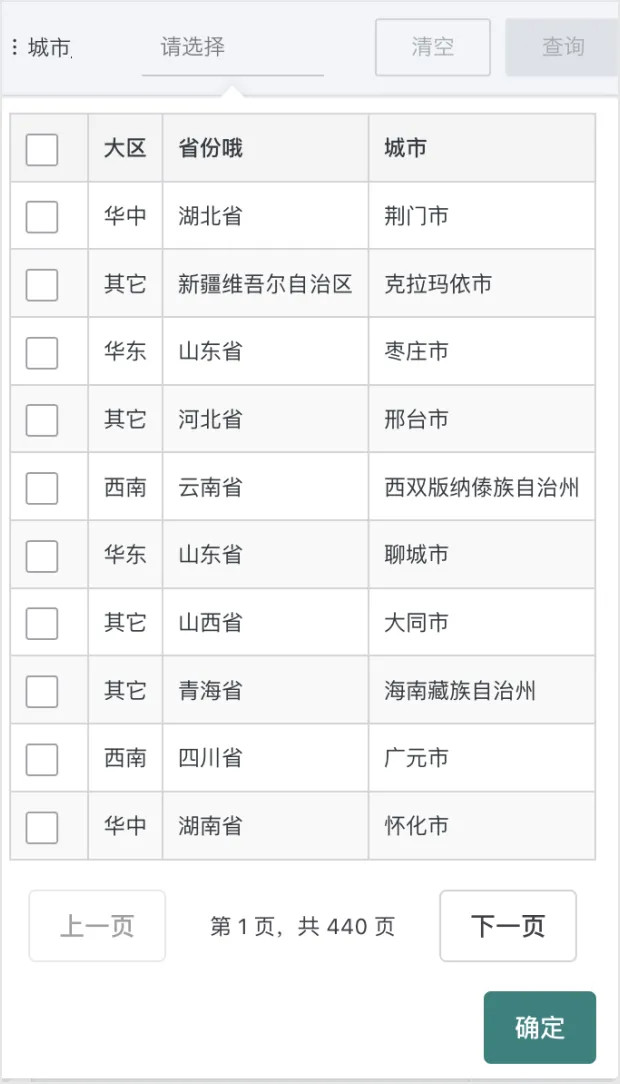
- Display all fields from Used Fields in a table and allow row-by-row multi-selection. The Linkage Fields of each selected row are combined into the final filter condition.
- Support pagination when the data volume is large. The number of rows per page can be configured by the user in the filter settings.
Filter Configuration
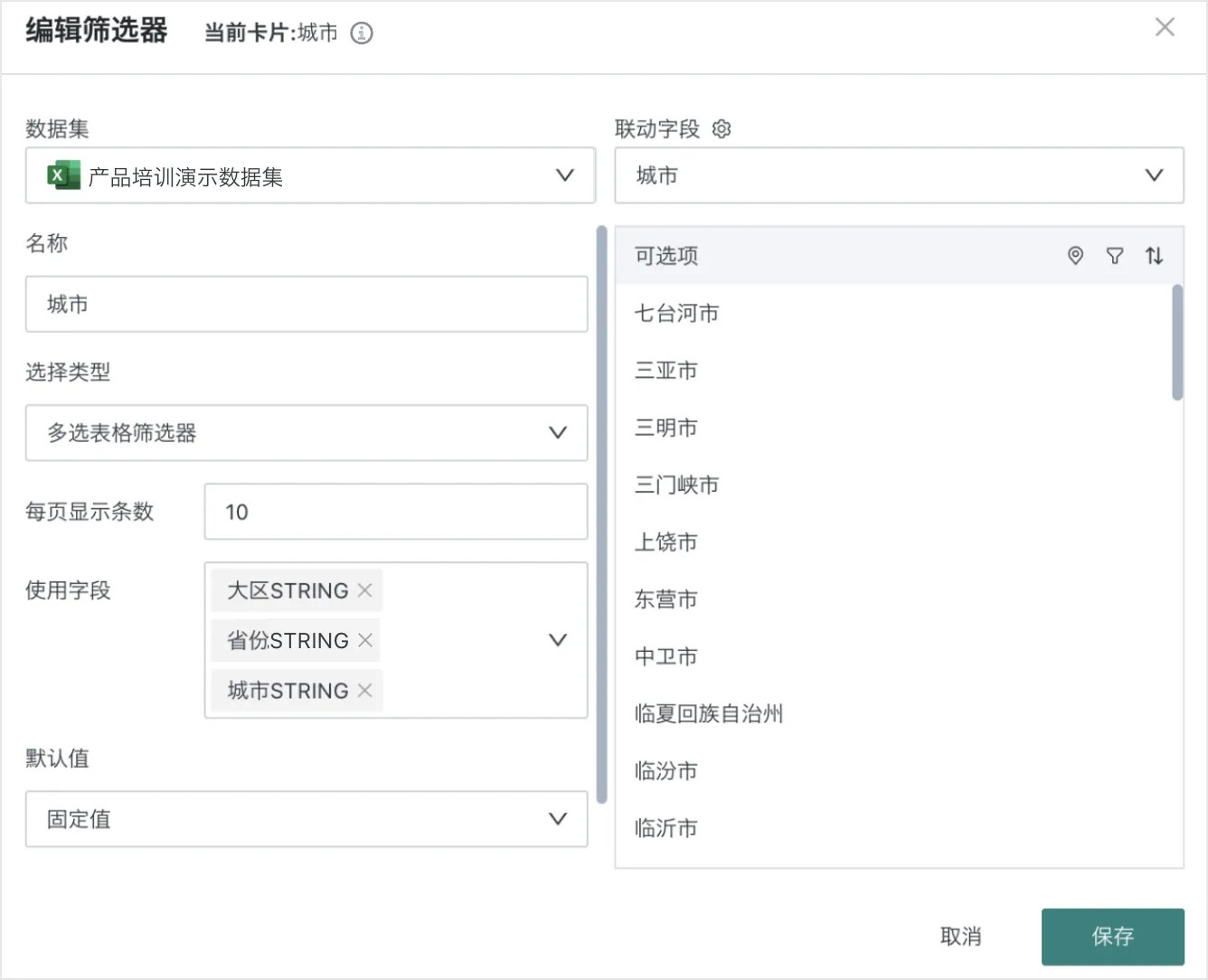
Filter Usage Effect
Code Example
Writing the Basic Component Structure
This section is based on the plugin code template and includes:
-
The filter component
MultiSelectTablebased on the Web Component and Lit framework; -
Loading required resources such as Lit and Shoelace, and registering the Web Component;
- Resource loading methods and registration timing can be adjusted as needed;
- Shoelace components have automatic on-demand loading.
<sl-element>will automatically send requests to fetch some code on first render. Normal use does not require attention, but it will not work inside other shadow roots, so the plugin needs to manually call thediscovermethod inshoelace-autoloader. For details, see here; - Pay attention to the timing of the
discovercall. If some Shoelace components only render when there is data, they may miss the initialdiscovertiming. During development, consider callingshoelaceAutoloader.discovermultiple times, or add an extradisplay: noneelement fordiscoverto use; - When Shoelace components load on demand, there may be a brief visual shift. You can add appropriate CSS styles to mask this. Refer to here;
-
Register the plugin with BI through Register a Custom Selector
GD.registerCustomSelector. Note the following when registering:- The
idandtagNamemust be unique within the system. Existing system-wideidandtagNamevalues can be retrieved through Get Custom SelectorsGD.getCustomSelectors; - The
tagNameshould also avoid duplicating element names that appear in Frontend Page Customization with Web Components, otherwise unintended effects may occur; - If the
idis modified, custom filter cards already created in dashboards may become invalid.
- The
const registerMultiSelectTable = async () => {
  // Load necessary resources
  await GD.asyncLoadScript(GD.getResourceUrl('lit'), { type: 'module' })
  await GD.asyncLoadScript(GD.getResourceUrl('shoelace'), { type: 'module' })
  await GD.asyncLoadScript(GD.getResourceUrl('shoelace-theme-light'), { tagName: 'link' })
  await GD.asyncLoadScript(GD.getResourceUrl('shoelace-theme-dark'), { tagName: 'link' })

  const { LitElement, html, css } = window.lit
  const { discover } = window.shoelaceAutoloader || {}

  // Define Web Component class
  class MultiSelectTable extends LitElement {
    static properties = {
      // Linkage fields; selection filters have only one linkage field
      linkColumns: { type: Array },
      // Display fields; only have values when display fields are set
      displayColumns: { type: Array },
      // All fields; all fields of this dataset
      allColumns: { type: Array },
      // Get detail table data
      fetchData: { type: Function },
      // Get optional value list for a single field
      fetchFieldValues: { type: Function },
      // Get optional value list for multiple fields
      fetchTreeValues: { type: Function },
      // Output filter value; type is selection filter, must be returned in selection filter format
      onConfirm: { type: Function },
      // Initial filter value; type is consistent with onConfirm parameters
      initialFilterValue: { type: Array },
      // Initial display field value; only has value when display fields are set
      initialDisplayValue: { type: Array },
      // Custom configuration
      customConfig: { type: Object },
      // Used fields
      columns: { type: Array },
      // Pagination properties
      pageSize: { type: Number },
      currentPage: { type: Number },
      total: { type: Number },
    };

    constructor() {
      super();
      // Initialize properties
      this.linkColumns = [];
      this.displayColumns = [];
      this.allColumns = [];
      this.fetchData = null;
      this.onConfirm = null;
      this.initialFilterValue = [];
      this.initialDisplayValue = [];
      this.pageSize = 10;
      this.currentPage = 1;
      this.total = 0;
      this.data = [];
      this.customConfig = {};
      this.columns = [];
      // Used to store selected data
      this._selectedData = new Map();
    }

    static styles = css`
            /* Basic style definitions */
            table {
                width: 100%;
                border-collapse: collapse;
            }
            /* ... */
        `;

    // Lifecycle method: first component update
    firstUpdated() {
      super.firstUpdated()
      // Load initial data
      this.refreshData()
      // Activate Shoelace components
      discover?.(this.shadowRoot)
    }

    // Component render method
    render() {
      // Render implementation will be added in subsequent steps
      return html``;
    }
  }

  // Register Web Component
  customElements.define('multi-select-table', MultiSelectTable);
}

// Configuration form definition
const configSchema = []

// Register plugin
GD.registerCustomSelector({
  id: 'multi-select-table-selector',
  title: 'Multi-Select Table Filter',
  tagName: 'multi-select-table',
  desc: 'A filter that displays data in a table and supports multi-selection',
    configFormSchema: configSchema,
    load: registerMultiSelectTable
})
Implementing Table Rendering
- When using the Lit framework, component rendering is handled by the
rendermethod, where the main part of table rendering is implemented; - Since Lit and Shoelace have already been referenced at the beginning of the code, you can use
html``template syntax,@sl-changeand other Lit syntax features, as well as<sl-checkbox>and other Shoelace components here.
render() {
    const totalPages = Math.ceil(this.total / this.pageSize);

    return html`
        <div>
            <table>
                <thead>
                <tr>
                    <th>
                        <sl-checkbox
                            ?checked="${this.isCurrentPageAllSelected()}"
                            @sl-change="${this.handleSelectAll}"
                        ></sl-checkbox>
                    </th>
                    ${this.columns.map((col) => html`
                        <th>${col.name}</th>
                    `)}
                </tr>
                </thead>
                <tbody>
                ${this.data.map((item, index) => {
                    const globalIndex = (this.currentPage - 1) * this.pageSize + index;
                    return html`
                        <tr>
                            <td>
                                <sl-checkbox
                                    ?checked="${this._selectedData.has(globalIndex)}"
                                    @sl-change="${(e) => this.handleCheckboxChange(e, item, globalIndex)}"
                                ></sl-checkbox>
                            </td>
                            ${this.columns.map((col, colIndex) => html`
                                <td>${item[colIndex]}</td>
                            `)}
                        </tr>
                    `;
                })}
                </tbody>
            </table>
            <div class="pagination">
                <sl-button
                    ?disabled="${this.currentPage === 1}"
                    @click="${() => this.handlePageChange(this.currentPage - 1)}"
                >Previous</sl-button>
                <span>Page ${this.currentPage} of ${totalPages}</span>
                <sl-button
                    ?disabled="${this.currentPage === totalPages}"
                    @click="${() => this.handlePageChange(this.currentPage + 1)}"
                >Next</sl-button>
            </div>
            <div class="actions">
                <sl-button variant="primary" @click="${this.handleSubmit}">OK</sl-button>
            </div>
        </div>
    `;
}
Implementing Data Loading
To obtain detail table data, you need to use the fetchData method to request data, then read properties such as all fields allColumns and initial linkage conditions initialFilterValue to write data into the component state.
Details of these accessible properties and methods in the component can be found here.
async refreshData() {
    if (!this.fetchData) return;

    try {
        const offset = (this.currentPage - 1) * this.pageSize;
        const result = await this.fetchData({
            limit: this.pageSize,
            offset: offset
        });

        // Update total data count
        this.total = result.rowCount || 0;

        // Map data columns
        const columnIndexMap = this.columns.map(targetCol =>
            result.columns.findIndex(col => col.fdId === targetCol.fdId)
        );

        // Reorganize data based on mapping
        this.data = result.data.map(row =>
            columnIndexMap.map(index => index >= 0 ? row[index] : '')
        );

        // Parse initialFilterValue and process initial values
        const linkedIndex = this.columns.findIndex(col => col.fdId === this.linkColumns[0].fdId);
        this.data.forEach((item, idx) => {
            if (this.initialFilterValue.includes(item[linkedIndex])) {
                this._selectedData.set(offset + idx, item);
            }
        });

        this.requestUpdate();
    } catch (error) {
        console.error('Failed to fetch data:', error);
    }
}
Handling Filter Condition Submission
Since the feature requires multi-row selection + multi-field support, the final generated filter condition format is quite complex. A section of code is needed here to handle the mutual format conversion between table selected data and the output data structure (combined filter format).
The onConfirm method will ultimately be used to submit the currently combined filter conditions.
// Handle submit button click
handleSubmit() {
    // Get data for all selected rows
    const selectedData = Array.from(this._selectedData.values()).map(selectedItem => {
        return this.linkColumns.map(col => {
            const colIndex = this.columns.findIndex(allCol => allCol.fdId === col.fdId);
            return colIndex >= 0 ? selectedItem[colIndex] : '';
        });
    });

    // Deduplicate data
    const uniqueSelectedData = /* data deduplication logic */;

    const filterValue = [];
    const displayValue = [];

    uniqueSelectedData.forEach(res => {
        filterValue.push(res[0])
        if (res.length === 2) {
            displayValue.push(res[1])
        }
    })

    // Call externally passed onConfirm
    if (this.onConfirm) {
        const otherState = this.displayColumns.length > 0 ? { displayValue } : {}
        this.onConfirm(filterValue, otherState);
    }
}

// Generate random ID (for filter conditions)
generateId(length = 6) {
    // ...
}
Completing Configuration Form Definition
- The usage method is consistent with Visualization Plugin Chart Configuration;
- Based on a convention-based configuration description, an interactive UI is produced for building target objects;
- Used in plugin development to generate plugin configurations, and can also be used to display some prompt information.
// Configuration form definition
const configSchema = [
    {
        fieldName: 'pageSize',
        label: 'Items per page',
        type: "NUMBER",
        defaultValue: 10,
        placeholder: 'Please enter the number of data items displayed per page',
        rules: [
            {
                required: true,
                message: 'Please enter the number of data items displayed per page'
            },
            {
                type: 'number',
                min: 1,
                max: 100,
                message: 'Items per page must be between 1 and 100'
            }
        ]
    },
    {
        type: 'FIELDS_SELECT',
        fieldName: 'tableFields',
        label: 'Used Fields',
        model: {
            single: false,
        }
    }
]
Extended Components
This extended component is only available in custom filters; it does not take effect in visualization plugins.
Dataset Field Select
You need to define type as FIELDS_SELECT. Other configurations refer to SELECT. The selected information will include name, fdId, and fdType.
const legoDefs = [
  {
    type: 'FIELDS_SELECT',
    fieldName: 'tFields',
    label: 'xxx Fields',
    model: {
      single: true, // Indicates single selection; if not defined, it is multi-selection.
    }
  }
]
The selected configuration will be passed in customConfig with the following structure:
const customConfig = {
  ...,
  tFields: [
    { name: 'Field Name', fdId: 'xxxx', fdType: 'xxx' },
    ...
  ]
}
Supplementing Operation Details, Outputting Complete Code
const registerMultiSelectTable = async () => {
    // Load necessary resources
    await GD.asyncLoadScript(GD.getResourceUrl('lit'), { type: 'module' })
    await GD.asyncLoadScript(GD.getResourceUrl('shoelace'), { type: 'module' })
    await GD.asyncLoadScript(GD.getResourceUrl('shoelace-theme-light'), { tagName: 'link' })
    await GD.asyncLoadScript(GD.getResourceUrl('shoelace-theme-dark'), { tagName: 'link' })

    const { LitElement, html, css } = window.lit
    const { discover } = window.shoelaceAutoloader || {}

    // Define Web Component class
    class MultiSelectTable extends LitElement {
        static properties = {
            // Linkage fields; selection filters have only one linkage field
            linkColumns: { type: Array },
            // Display fields; only have values when display fields are set
            displayColumns: { type: Array },
            // All fields; all fields of this dataset
            allColumns: { type: Array },
            // Get detail table data
            fetchData: { type: Function },
            // Get optional value list for a single field
            fetchFieldValues: { type: Function },
            // Get optional value list for multiple fields
            fetchTreeValues: { type: Function },
            // Output filter value; type is selection filter, must be returned in selection filter format
            onConfirm: { type: Function },
            // Initial filter value; type is consistent with onConfirm parameters
            initialFilterValue: { type: Array },
            // Initial display field value; only has value when display fields are set
            initialDisplayValue: { type: Array },
            // Custom configuration
            customConfig: { type: Object },
            // Used fields
            columns: { type: Array },
            // Pagination properties
            pageSize: { type: Number },
            currentPage: { type: Number },
            total: { type: Number },
        };

        constructor() {
            super();
            // Initialize properties
            this.linkColumns = [];
            this.displayColumns = [];
            this.allColumns = [];
            this.fetchData = null;
            this.fetchFieldValues = null;
            this.fetchTreeValues = null;
            this.onConfirm = null;
            this.initialFilterValue = [];
            this.initialDisplayValue = [];
            this.customConfig = {};
            this.pageSize = 10;
            this.currentPage = 1;
            this.total = 0;
            this.data = [];
            this.columns = [];
            // Used to store selected data
            this._selectedData = new Map();
            this._filterConditions = null;
            this._checkedIndices = new Set();
        }

        static styles = css`
            :host {
                display: block;
                font-family: var(--sl-font-sans);
            }

            table {
                width: 100%;
                border-collapse: collapse;
                margin-bottom: 16px;
            }

            th, td {
                padding: 8px;
                text-align: left;
                border: 1px solid var(--sl-color-neutral-300);
            }

            th {
                background-color: var(--sl-color-neutral-100);
                font-weight: var(--sl-font-weight-semibold);
            }

            tr:nth-child(even) {
                background-color: var(--sl-color-neutral-50);
            }

            .pagination {
                display: flex;
                justify-content: center;
                align-items: center;
                margin-top: 16px;
                gap: 8px;
            }

            .pagination-info {
                margin: 0 16px;
                color: var(--sl-color-neutral-700);
            }

            .actions {
                display: flex;
                justify-content: flex-end;
                margin-top: 16px;
            }

            sl-checkbox {
                --sl-input-border-color: var(--sl-color-neutral-400);
            }

            sl-button::part(base) {
                cursor: pointer;
            }
        `;

        // Lifecycle method: first component update
        firstUpdated() {
            super.firstUpdated();

            // Set page size
            if (this.customConfig && this.customConfig.pageSize) {
                this.pageSize = this.customConfig.pageSize;
            }

            // Load initial data
            this.refreshData();

            // Activate Shoelace components
            discover?.(this.shadowRoot);
        }

        async refreshData() {
            if (!this.fetchData) return;

            try {
                const offset = (this.currentPage - 1) * this.pageSize;
                const result = await this.fetchData({
                    limit: this.pageSize,
                    offset: offset
                });

                // Update total data count
                this.total = result.rowCount || 0;

                // Map data columns
                const columnIndexMap = this.columns.map(targetCol =>
                    result.columns.findIndex(col => col.fdId === targetCol.fdId)
                );

                // Reorganize data based on mapping
                this.data = result.data.map(row =>
                    columnIndexMap.map(index => index >= 0 ? row[index] : '')
                );

                const linkedIndex = this.columns.findIndex(col => col.fdId === this.linkColumns[0].fdId);
                this.data.forEach((item, idx) => {
                    if (this.initialFilterValue.includes(item[linkedIndex])) {
                        this._selectedData.set(offset + idx, item);
                    }
                });

                this.requestUpdate();
            } catch (error) {
                console.error('Failed to fetch data:', error);
            }
        }

        // Check if current page is all selected
        isCurrentPageAllSelected() {
            if (!this.data.length) return false;
            const start = (this.currentPage - 1) * this.pageSize;
            return this.data.every((_, index) => this._selectedData.has(start + index));
        }

        // Handle select all/deselect all
        handleSelectAll(e) {
            const start = (this.currentPage - 1) * this.pageSize;
            if (e.target.checked) {
                // Select all data on current page
                this.data.forEach((item, index) => {
                    this._selectedData.set(start + index, item);
                });
            } else {
                // Deselect all data on current page
                this.data.forEach((_, index) => {
                    this._selectedData.delete(start + index);
                });
            }
            this.requestUpdate();
        }

        // Handle single checkbox change
        handleCheckboxChange(e, item, globalIndex) {
            if (e.target.checked) {
                this._selectedData.set(globalIndex, item);
            } else {
                this._selectedData.delete(globalIndex);
            }
            this.requestUpdate();
        }

        // Handle page change
        async handlePageChange(newPage) {
            this.currentPage = newPage;
            await this.refreshData();
        }

        // Handle submit button click
        handleSubmit() {
            // Get data for all selected rows
            const selectedData = Array.from(this._selectedData.values()).map(selectedItem => {
                return this.linkColumns.map(col => {
                    const colIndex = this.columns.findIndex(allCol => allCol.fdId === col.fdId);
                    return colIndex >= 0 ? selectedItem[colIndex] : '';
                });
            });

            // Deduplicate data
            const uniqueSelectedData = selectedData.filter((item, index) => {
                const stringifiedItem = JSON.stringify(item);
                return selectedData.findIndex(elem => JSON.stringify(elem) === stringifiedItem) === index;
            });

            const filterValue = [];
            const displayValue = [];

            uniqueSelectedData.forEach(res => {
                filterValue.push(res[0])
                if (res.length === 2) {
                    displayValue.push(res[1])
                }
            })

            // Call externally passed onConfirm
            if (this.onConfirm) {
                const otherState = this.displayColumns.length > 0 ? { displayValue } : {}
                this.onConfirm(filterValue, otherState);
            }
        }

        // Generate random ID (for filter conditions)
        generateId(length = 6) {
            const chars = 'ABCDEFGHIJKLMNOPQRSTUVWXYZabcdefghijklmnopqrstuvwxyz';
            let result = '';
            for (let i = 0; i < length; i++) {
                result += chars.charAt(Math.floor(Math.random() * chars.length));
            }
            return result;
        }

        // Component render method
        render() {
            const totalPages = Math.ceil(this.total / this.pageSize);

            return html`
                <div>
                    <table>
                        <thead>
                        <tr>
                            <th>
                                <sl-checkbox
                                    ?checked="${this.isCurrentPageAllSelected()}"
                                    @sl-change="${this.handleSelectAll}"
                                ></sl-checkbox>
                            </th>
                            ${this.columns.map((col) => html`
                                <th>${col.name}</th>
                            `)}
                        </tr>
                        </thead>
                        <tbody>
                        ${this.data.map((item, index) => {
                            const globalIndex = (this.currentPage - 1) * this.pageSize + index;
                            return html`
                                <tr>
                                    <td>
                                        <sl-checkbox
                                            ?checked="${this._selectedData.has(globalIndex)}"
                                            @sl-change="${(e) => this.handleCheckboxChange(e, item, globalIndex)}"
                                        ></sl-checkbox>
                                    </td>
                                    ${this.columns.map((col, colIndex) => html`
                                        <td>${item[colIndex]}</td>
                                    `)}
                                </tr>
                            `;
                        })}
                        </tbody>
                    </table>
                    <div class="pagination">
                        <sl-button
                            ?disabled="${this.currentPage === 1}"
                            @click="${() => this.handlePageChange(this.currentPage - 1)}"
                        >Previous</sl-button>
                        <span class="pagination-info">Page ${this.currentPage} of ${totalPages}</span>
                        <sl-button
                            ?disabled="${this.currentPage === totalPages || totalPages === 0}"
                            @click="${() => this.handlePageChange(this.currentPage + 1)}"
                        >Next</sl-button>
                    </div>
                    <div class="actions">
                        <sl-button variant="primary" @click="${this.handleSubmit}">OK</sl-button>
                    </div>
                </div>
            `;
        }
    }

    // Register Web Component
    customElements.define('multi-select-table', MultiSelectTable);
}

// Configuration form definition
const configSchema = [
    {
        fieldName: 'pageSize',
        label: 'Items per page',
        type: "NUMBER",
        defaultValue: 10,
        placeholder: 'Please enter the number of data items displayed per page',
        rules: [
            {
                required: true,
                message: 'Please enter the number of data items displayed per page'
            },
            {
                type: 'number',
                min: 1,
                max: 100,
                message: 'Items per page must be between 1 and 100'
            }
        ]
    },
    {
        type: 'FIELDS_SELECT',
        fieldName: 'tableFields',
        label: 'Used Fields',
        model: {
            single: false,
        }
    }
]

// Register plugin
GD.registerCustomSelector({
    id: 'multi-select-table-selector',
    title: 'Multi-Select Table Filter',
    tagName: 'multi-select-table',
    desc: 'A filter that displays data in a table and supports multi-selection, with configurable page size',
    configFormSchema: configSchema,
    load: registerMultiSelectTable
})
Reference Materials
Plugin Code Template
const registerCustomSelector = async () => {
    // Load resources provided by the BI platform
    await GD.asyncLoadScript(GD.getResourceUrl('lit'), { type: 'module' })
    await GD.asyncLoadScript(GD.getResourceUrl('shoelace'), { type: 'module' })
    await GD.asyncLoadScript(GD.getResourceUrl('shoelace-theme-light'), { tagName: 'link' })
    await GD.asyncLoadScript(GD.getResourceUrl('shoelace-theme-dark'), { tagName: 'link' })

    const { LitElement, html, css } = window.lit
    const { discover } = window.shoelaceAutoloader || {}

    // Define Web Component class CustomSelectorComponent
    class CustomSelectorComponent extends LitElement {
        static properties = {
            // Linkage fields
            linkColumns: { type: Array },
            // Display fields
            displayColumns: { type: Array },
            // All fields
            allColumns: { type: Array },
            // Get detail table data
            fetchData: { type: Function },
            // Get optional value list for a single field
            fetchFieldValues: { type: Function },
            // Get optional value list for multiple fields
            fetchTreeValues: { type: Function },
            // Output filter value; type is selection filter, must be returned in selection filter format
            onConfirm: { type: Function },
            // Initial filter value; type is consistent with onConfirm parameters
            initialFilterValue: { type: Array },
            // Initial display value
            initialDisplayValue: { type: Array },
        };

        constructor() {
            super();
            this.linkColumns = [];
            this.displayColumns = [];
            this.allColumns = [];
            this.fetchData = null;
            this.onConfirm = null;
            this.initialFilterValue = [];
            this.initialDisplayValue = [];
        }

        static styles = css`
            .custom-selector-container {
                width: 100%;
                height: 100%;
            }
        `;

        firstUpdated() {
            super.firstUpdated()
            // If using shoelace components, need to call autoloader.discover method to trigger automatic loading of shoelace components
            discover?.(this.shadowRoot)

        }

        render() {
            return html`
                <div class="custom-selector-container">
                    Custom Filter
                </div>
            `;
        }
    }

    // Register Web Component to current page
    customElements.define('define-your-tagName', CustomSelectorComponent);
}

// Used to display text descriptions and fill custom configurations
const legoDefs = [
    // Configuration format reference https://guandata.yuque.com/guandataweb/dsebtl/iefgq3
]

// Register Web Component and custom configuration form to BI platform
GD.registerCustomSelector({
    id: 'unique-id',
    title: 'Plugin Title Display',
    tagName: 'define-your-tagName',
    desc: 'Plugin function description',
    configFormSchema: legoDefs,
    load: registerCustomSelector
})
WebComponent
- Using Custom Elements - MDN Documentation;
- The implementation principle of custom filters is to first define a Web Component via
customElements.definein the plugin code, and then render it into the corresponding filter card by the BI platform.
Lit
- Lit Framework Official Documentation;
- Web Component development framework that greatly improves the development experience;
- The BI platform provides v3.2.1 with some modifications and adaptations. It needs to be introduced via
GD.asyncLoadScriptandGD.getResourceUrl('lit'); - Note that the BI platform plugin code does not support Decorator syntax because this syntax requires TypeScript or Babel to work; there are no restrictions on other syntax.
await GD.asyncLoadScript(GD.getResourceUrl('lit'),{type:'module'})
Shoelace
- Shoelace Component Library Official Documentation;
- A Web Component library similar to Ant Design;
- BI provides version 2.19.1 with style adjustments and built-in support for platform color schemes (blue-green) as well as light and dark themes. Introduce it through Asynchronously Load Scripts
GD.asyncLoadScriptand Get Resource URLsGD.getResourceUrl('shoelace').
// Even if not using autoloader.discover, it should be referenced with type: module
await GD.asyncLoadScript(GD.getResourceUrl('shoelace'), { type: 'module' })
// Both light and dark styles need to be introduced
await GD.asyncLoadScript(GD.getResourceUrl('shoelace-theme-light'), { tagName: 'link' })
await GD.asyncLoadScript(GD.getResourceUrl('shoelace-theme-dark'), { tagName: 'link' })
Accessible Data and Functions
class CustomSelectorComponent extends LitElement {
    static properties = {
        // Linkage fields
        linkColumns: { type: Array },
        // Display fields
        displayColumns: { type: Array },
        // All fields
        allColumns: { type: Array },
        // Get detail table data
        fetchData: { type: Function },
        // Get optional value list for a single field
        fetchFieldValues: { type: Function },
        // Get optional value list for multiple fields
        fetchTreeValues: { type: Function },
        // Output filter value; type is selection filter, must be returned in selection filter format
        onConfirm: { type: Function },
        // Initial filter value; type is consistent with onConfirm parameters
        initialFilterValue: { type: Array },
        // Initial display value
        initialDisplayValue: { type: Array },
        // Custom configuration
        customConfig: { type: Object },
    };

    // ...
}
Properties
These properties are passed as HTML element attributes in the form of JSON strings and can be seen directly in the HTML.
If the custom element uses the Lit framework, the component does not need to handle JSON string issues internally; directly accessing this.customConfig will give the normal JSON structure.
Custom Settings customConfig
User-filled custom settings content, in JSON format.
The configFormSchema content during component registration will generate a form for the user to fill in, and the filled results are obtained from here.
All Fields allColumns
All fields of the dataset referenced by this filter;
allColumns is only provided for plugin consumption and does not affect BI functions such as linkage, being linked, etc.
Example
{
    allColumns: [
        {
            "fdId": "cbe5217f06de44f0f908232a",
            "name": "Province",
            "fdType": "STRING",
            "metaType": "DIM",
            "isAggregated": false,
            "calculationType": "normal",
            "level": "dataset",
            "annotation": "",
            "dsId": "k5fa308879b364e5bb628f56"
        },
        {/* ... */}
    ]
}
Linkage Fields linkColumns
The Linkage Fields set when creating or editing the filter. Selection filters have only one linkage field.
Linkage fields linkColumns must be a subset of all fields allColumns.
Linkage fields function similarly to the linkage fields of other filters. When a custom filter links to other cards, an association needs to be set for each linkage field.
When a custom filter submits linkage conditions, they also need to match the linkage fields linkColumns.
Example
{
    linkColumns: [
        {
            "fdId": "cbe5217f06de44f0f908232a",
            "name": "Province",
            "fdType": "STRING",
            "metaType": "DIM",
            "isAggregated": false,
            "calculationType": "normal",
            "level": "dataset",
            "annotation": "",
            "dsId": "k5fa308879b364e5bb628f56"
        },
        {/* ... */}
    ]
}
Display Fields displayColumns
The Display Fields set when creating or editing the filter. Empty if not set.
Display fields have a one-to-one correspondence with linkage fields and are used to display linkage values. For example: if the linkage field is province code with an actual value of "1001", the corresponding display field is province with a corresponding display value of Zhejiang.
{
    linkColumns: [
        {
            "fdId": "cbe5217f06de44f0f908232a",
            "name": "Province",
            "fdType": "STRING",
            "metaType": "DIM",
            "isAggregated": false,
            "calculationType": "normal",
            "level": "dataset",
            "annotation": "",
            "dsId": "k5fa308879b364e5bb628f56"
        },
        {/* ... */}
    ]
}
Initial Linkage Conditions initialFilterValue
The linkage value when the filter component is initialized, coming from the first parameter output of the filter component's previous onConfirm.
Format is a string array.
Initial Display Conditions initialDisplayValue
The display value when the filter component is initialized. Empty if display fields are not set, coming from the displayValue in the second parameter of the filter component's previous onConfirm.
Format is a string array.
Mobile Rendering isMobile
Whether it is from mobile, boolean type.
Methods
These methods are written into element properties via JavaScript and can be called directly, such as this.fetchData().
Get Detail Data fetchData
Function Description
Used to get dataset detail data.
Usage Instructions
// Parameter example
// filters and treeFilters format same as BI web,
// basically column info + filterType + filterValue
const params = {
    offset: 0,
    limit: 20,
    filters: [
        {
            fdId: 'dafd2c41b99b44068901b19c',
            name: 'Product Name',
            fdType: 'STRING',
            dsId: 's39796a0f96b145e0ab48dc2',
            filterType: 'IN',
            filterValue: ['Yili Yogurt']
        }
    ],
    treeFilters: [
        {
            cdId: 'w5e7e168010b64315a052118',
            filterType: 'IN',
            fields: [
                {
                    fdId: 'bf4121c487a164c02bd81ee8',
                    name: 'Store',
                    fdType: 'STRING',
                    dsId: 's39796a0f96b145e0ab48dc2'
                },
                {
                    fdId: 'dafd2c41b99b44068901b19c',
                    name: 'Product Name',
                    fdType: 'STRING',
                    dsId: 's39796a0f96b145e0ab48dc2'
                }
            ],
            values: [
                [
                    'Store No.1',
                    'Lay\'s Chips'
                ]
            ],
            displayValue: [
                [
                    'Store No.1',
                    'Lay\'s Chips'
                ]
            ]
        }
    ]
}

const response = await this.fetchData(params)

// Return value example
response = {
    "columns": [
        {
            "name": "ID",
            "fdType": "LONG",
            "dsId": "k5fa308879b364e5bb628f56",
            "fdId": "s946dbdd2bd644fff93c709c",
            "metaType": "METRIC",

        },
        {
            "name": "Province",
            "fdType": "STRING",
            "dsId": "k5fa308879b364e5bb628f56",
            "fdId": "cbe5217f06de44f0f908232a",
            "metaType": "DIM",
        },
        /* ... */
    ],
    "data": [
        // Each element in data represents a row in the detail table, array length same as columns, empty values filled with null
        [ null, "Sichuan Province", "510000", "Chengdu", "50g Japanese Cherry Blossom Moisturizing Cream" ],
        [ null, "Zhejiang Province", "330000", "Jiaxing", "50ml L\'Oreal Deep Whitening Cream*Day Cream" ],
        /* ... */
    ],
    "rowCount": 4395, // Total row count, not data length
}
Notes
- Returned data is detail data, aggregation is not supported;
- The interface is paginated; pagination state needs to be maintained manually, with a single page limit not exceeding 20,000 rows;
- When the filter is linked by external filters, the parameters passed to fetchData will be merged with external filter conditions and take effect together.
- filters will be merged with filters in external filter conditions;
- treeFilters will override treeFilters in external filter conditions.
Get Optional Values for Specified Field fetchFieldValues
Function Description
Get the value list of a specified field, which can be used to implement a single-field filter inside a custom filter.
Usage Instructions
// Parameter example
const params = {
    "fieldQuery": {
        "name": "Province",
        "fdType": "STRING",
        "dsId": "k5fa308879b364e5bb628f56",
        "fdId": "cbe5217f06de44f0f908232a",
        // ...
        // The above is a single column field
        "limit": 50,
        "offset": 0,
        "search": "" // Used for text search, same as BI selection filter

    }
}

const response = await this.fetchFieldValues(params)

// Return value example
response = {
    "offset": 0,
    "limit": 50,
    "count": 4340,
    "result": [
        { "value": "Sichuan Province" },
        { "value": "Hubei Province" },
        { "value": "Zhejiang Province" },
        /* ... */
    ]
}
Get Optional Values for Multiple Fields fetchTreeValues
Function Description
Get the value list of multiple specified fields, which can be used to implement a multi-field tree filter inside a custom filter.
Usage Instructions
// Parameter example
const params = {
    "limit": 50,
    "offest": 0,
    "fieldQuerySeq": [
        {
            "name": "Province",
            "fdType": "STRING",
            "fdId": "cbe5217f06de44f0f908232a",
            "dsId": "k5fa308879b364e5bb628f56",
            // ...
            // The above is a single column field
        },
        {
            "name": "City",
            "fdType": "STRING",
            "fdId": "k31522e65c9ba4fac9e223d7",
            "dsId": "k5fa308879b364e5bb628f56"
            // ...
            // The above is a single column field
        }
    ],
    "filters": [], // Same as fetchData filters
    "search": "", // Used for text search, same as BI tree filter
}

const response = await this.fetchTreeValues(params)

// Return value example
response = {
    "offset": 0,
    "limit": 50,
    "count": 4340,
    "result": [
        {
            "key": "Shanghai_0",
            "children": [
                {
                    "key": "Municipal Districts_1",
                    "displayValue": "Municipal Districts"
                }
            ],
            "displayValue": "Shanghai"
        },
        {
            "key": "Sichuan Province_0",
            "children": [
                {
                    "key": "Leshan City_1",
                    "displayValue": "Leshan City"
                },
                {
                    "key": "Liangshan Yi Autonomous Prefecture_1",
                    "displayValue": "Liangshan Yi Autonomous Prefecture"
                },
                {
                    "key": "Yibin City_1",
                    "displayValue": "Yibin City"
                },
                {
                    "key": "Garze Tibetan Autonomous Prefecture_1",
                    "displayValue": "Garze Tibetan Autonomous Prefecture"
                },
                // ...
            ],
            "displayValue": "Sichuan Province"
        },
        // ...
    ]
}
Trigger Linkage onConfirm
Function Description
Submit filter conditions; type requirement is ICombinationFilter, same as combined filter (details visible in the initialFilterValue section);
If the custom filter is rendered in a Popover, the submit operation will close the Popover.
Usage Instructions
const filterValue: string[] = [/* ... */]
const displayValue: string[] = [/* ... */]

this.onConfirm(filterValue, { displayValue })
// No return value
Notes
- If using a submit button, the submit button needs to be drawn in the plugin itself;
- External operations such as clicking the mask to close the Popover will not trigger onConfirm submission.