Creating Self-service Data Retrieval
Overview
Feature Entry
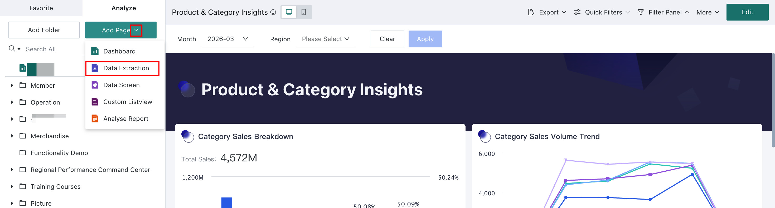
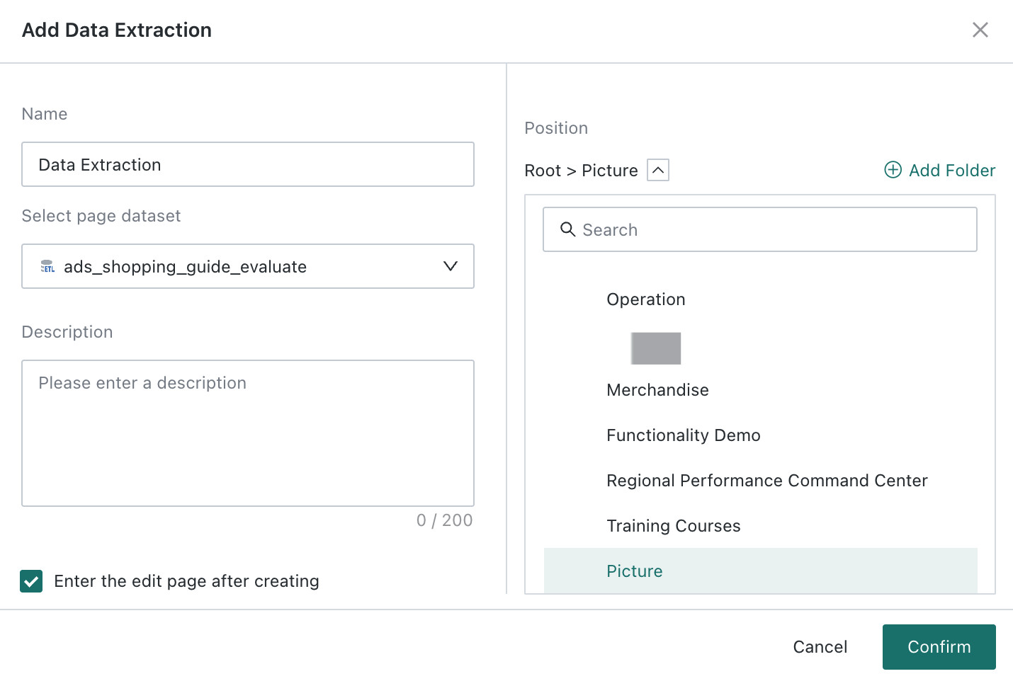
In the data analysis interface, click Add Page in the analysis tree on the left and select Data Extraction. Enter a page name, choose the dataset and save path, optionally select Open the Self-service Data Retrieval editor after creation, and click OK to start editing.
Interface Introduction
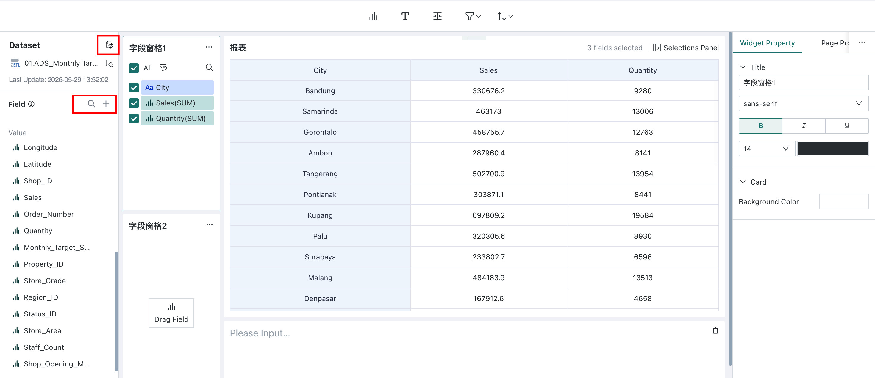
During creation and editing, Self-service Data Retrieval provides four working areas: the dataset area, drawing area, preview area, and control/page property panel. Together, these areas provide flexible configuration options for building a retrieval page that fits your business needs and analysis goals.
The table below summarizes the purpose of each area. Detailed configuration steps are provided in the following sections.
| Operation Area | Description |
|---|---|
| Dataset Area | The starting point of Self-service Data Retrieval. Use it to select or preview datasets, and create new fields based on existing ones when needed. For details, see Create a Calculated Field. |
| Drawing Area | The core area for building Self-service Data Retrieval. You can add and configure controls such as field panes and text panes, adjust their layout and style, and configure sorting and filtering. |
| Preview Area | Displays the final report result so you can verify the data, layout, and visual presentation before publishing. |
| Control/Page Property Configuration | Used to refine Widget Property and page properties so the report is easier to read and visually cleaner. |
Data Area
The dataset area supports dataset switching, dataset preview, creating calculated fields, creating grouped fields, and similar operations. Its behavior is similar to the dataset area in the Dashboard chart editor. For reference, see Switch Dataset.
To make analysis more flexible, you can create calculated fields based on existing fields. For reference, see Create a Calculated Field.
If you need to group dimension members or numeric values, you can create grouped fields based on existing fields. For reference, see Create a Grouped Field.
Drawing Area
Pane controls and field configuration are the core of Self-service Data Retrieval. In this area, you can add and configure controls such as field panes and text panes, then adjust their layout and style to build a retrieval page that is both practical and visually clear.
Each pane is a configurable control. Field panes support rule configuration, field formatting for dimensions and measures, and pane merge/split operations.
The pane control creation entry and pane control configuration entry are shown in the figure below:
Field Pane
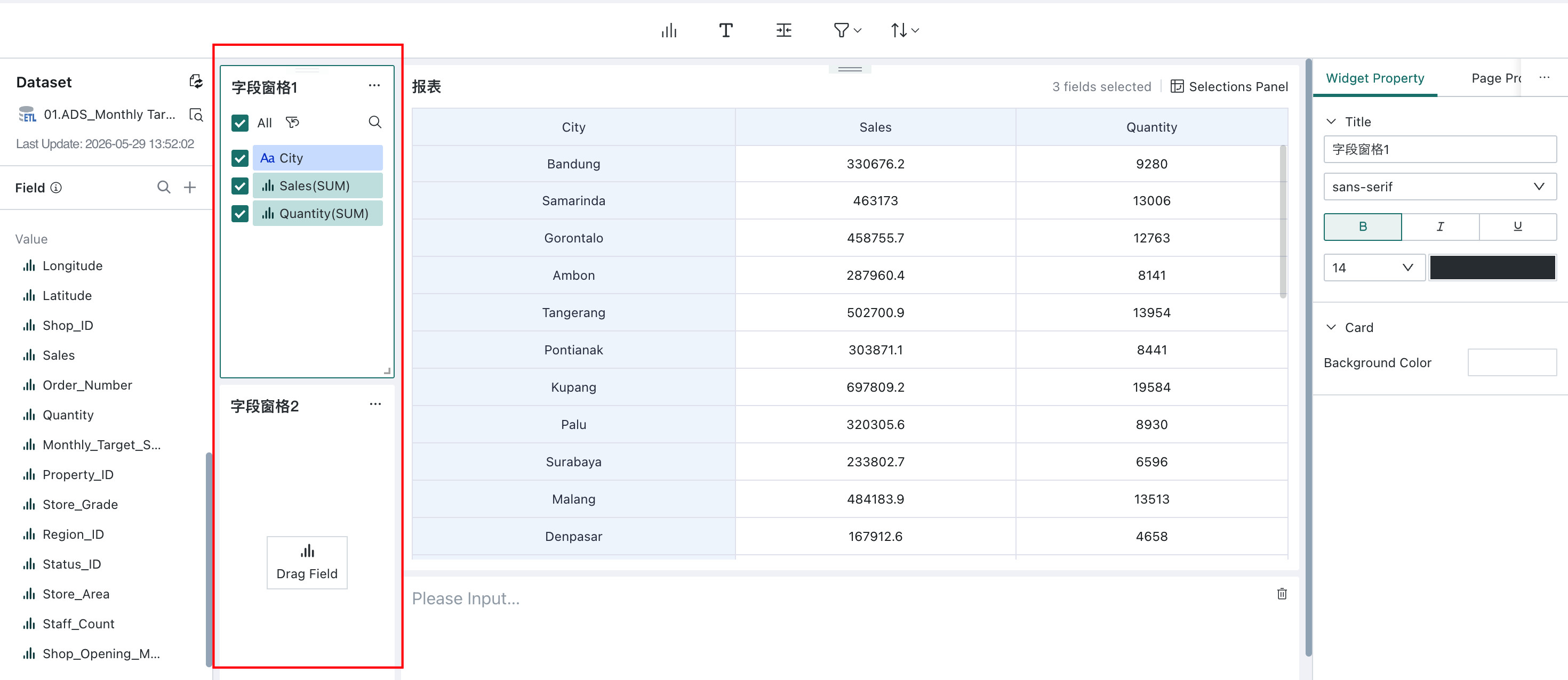
When you enter the editor, two field panes are shown by default. You can create and manage additional field panes as needed.
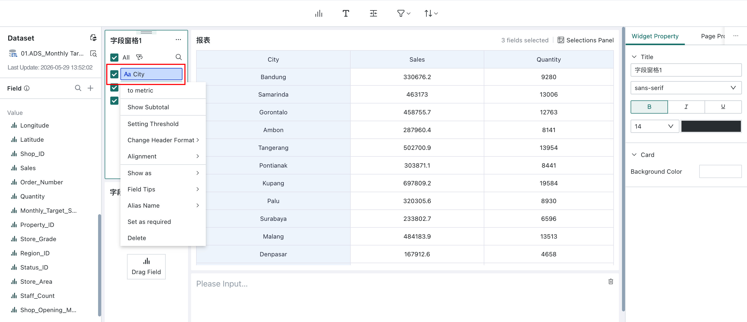
Field panes are used to select and configure data fields. First drag fields from the Dataset Area into a Field Pane, then manage them there by adjusting field order, editing aliases, setting conditional formats, and configuring numeric formats. These settings directly affect how the report is displayed.
Guandata BI supports both Select All and Invert Selection. Click Select All to select every field in the pane. After fields are selected, click the invert icon next to Select All to clear the current selection and select all unselected fields instead.
Pane Configuration
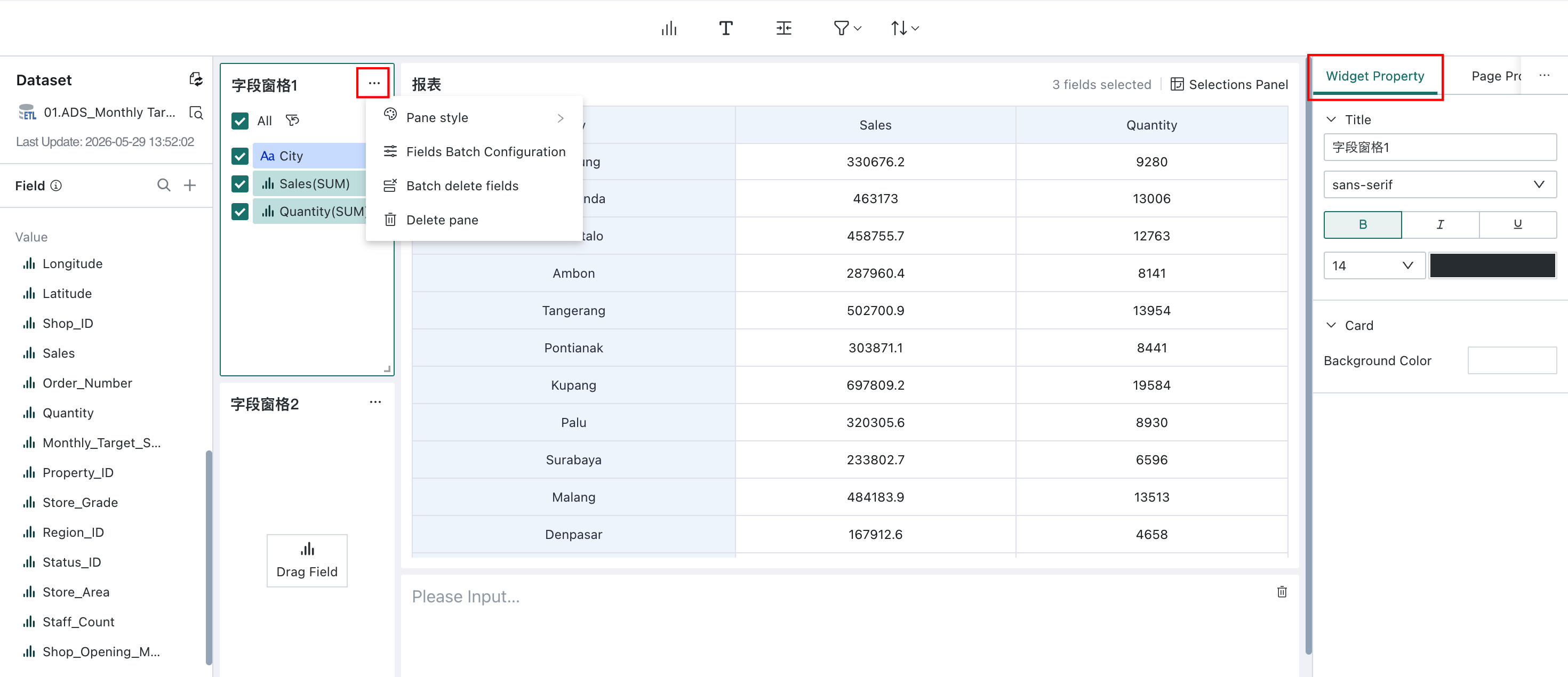
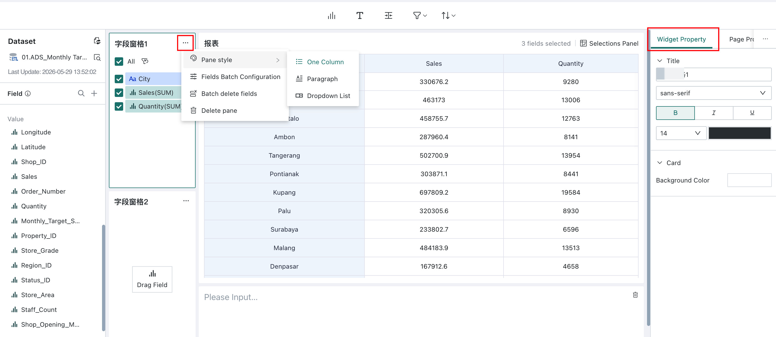
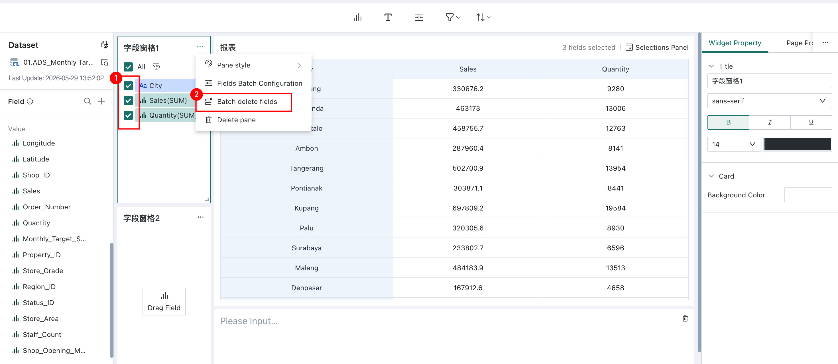
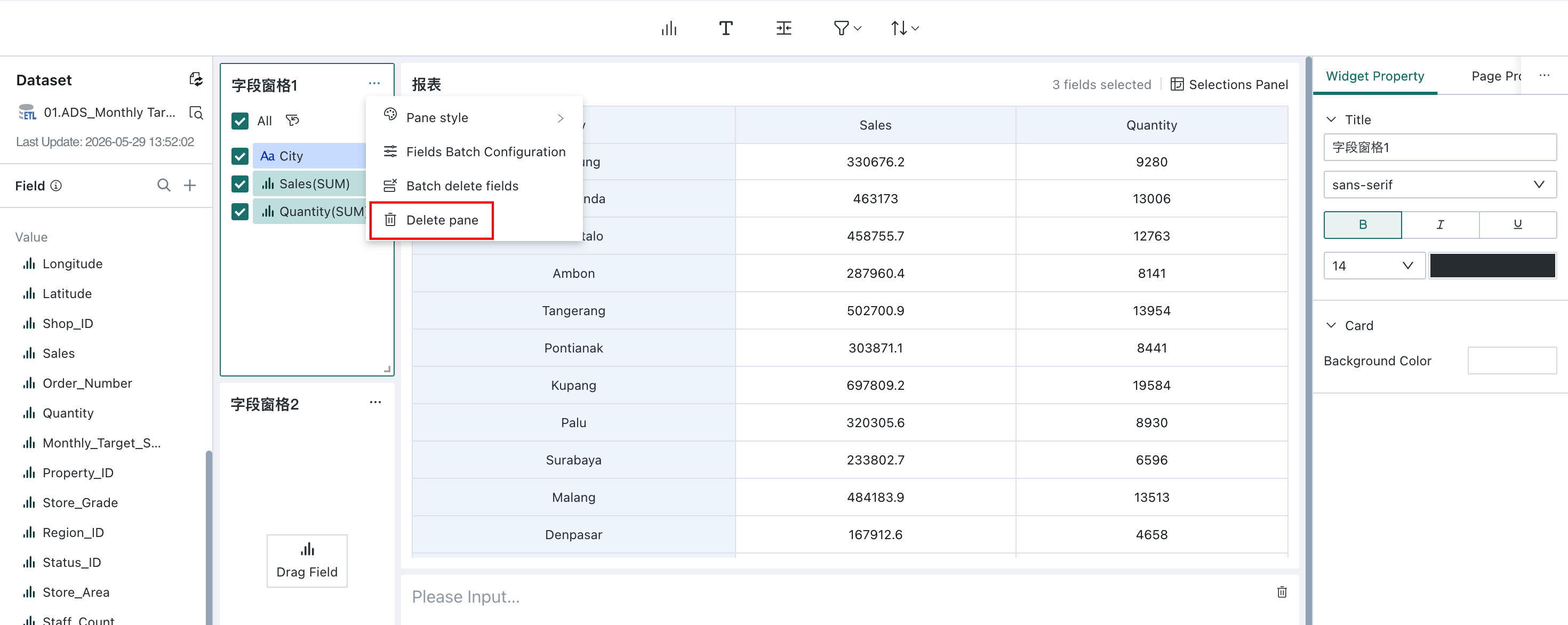
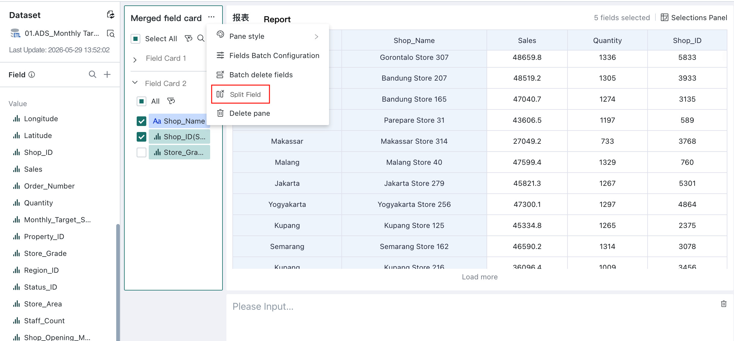
Click ... in the upper-right corner of a field pane to configure the pane as a whole, including pane style, batch field settings, batch deletion, and pane deletion.
-
Pane Style
Use
Pane Styleto choose how fields are displayed in the pane. Supported styles include single-column, paragraph, and dropdown. -
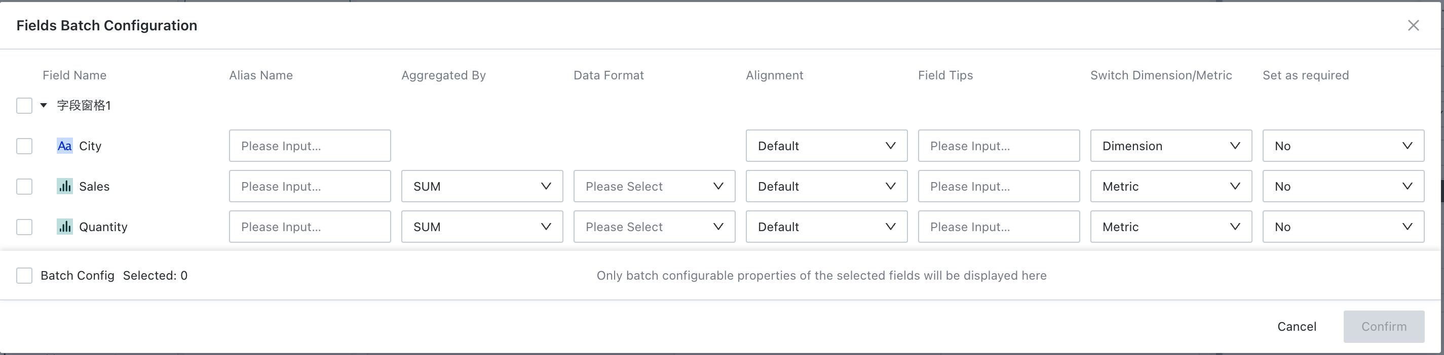
Batch Field Configuration
Use Batch Field Settings to select multiple fields at once and configure aliases, alignment, field descriptions, and dimension/measure conversion in the pop-up window.
Dimensions and measures can also be converted into one another here.
Note- The configuration items supported by numerical fields and dimension fields differ; numerical fields support configuring aggregation methods and data formats.
- In this batch configuration operation, only properties that can be batch-configured for the selected fields will be displayed.
-
Batch Delete Fields
If several fields in the pane need to be removed at the same time, click Batch Delete Fields.
-
Delete Pane
Click Delete Pane to remove the entire pane at once. This action cannot be undone.
Field Configuration
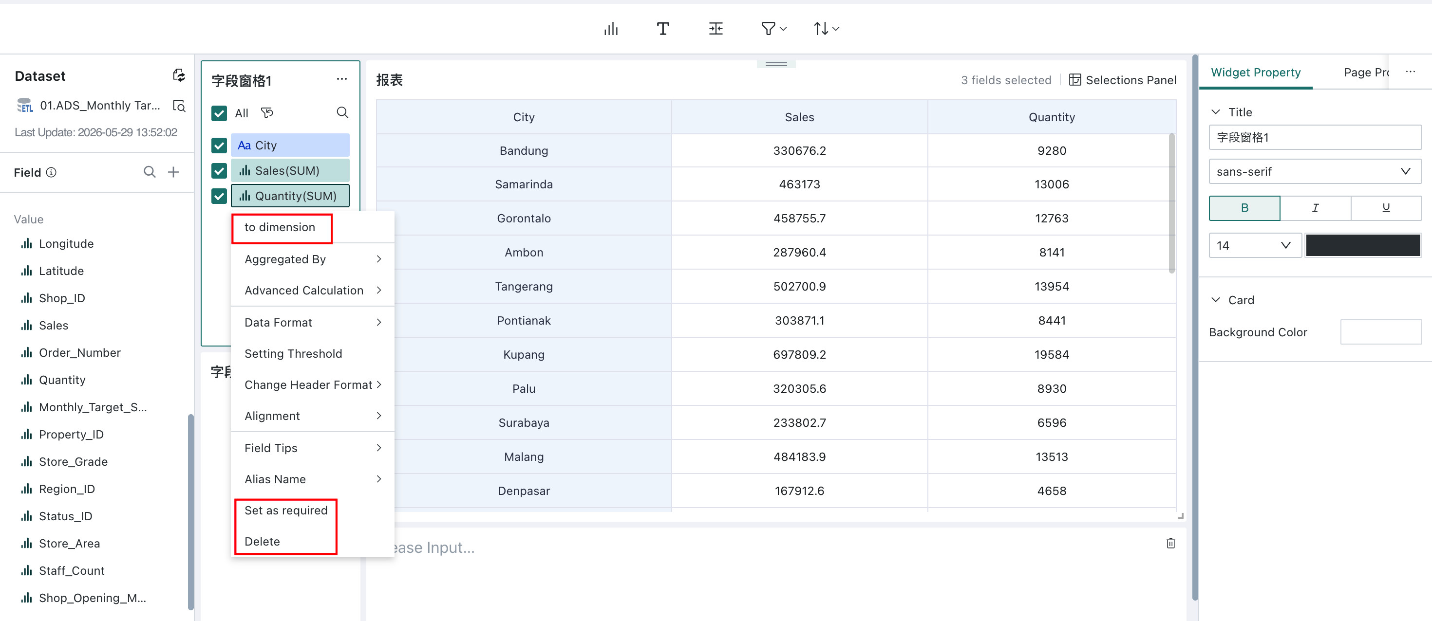
Besides pane-level settings, you can click any individual field for field-level configuration, including converting between dimension and measure, marking it as required, and deleting it.
- Convert to Measure / Convert to Dimension: Numeric fields and dimension fields can be converted into one another. The available settings vary by mode, but the configuration logic is the same as in the Dashboard card editor. For details, see Charting.
- Dimension Fields: Support displaying subtotals, setting conditional formats, editing header formats, alignment methods, displaying as images/hyperlinks/text, field descriptions, alias modifications, etc.;
- Numerical Fields: Support aggregation methods, subtotals/grand totals, advanced calculations, data formats, setting conditional formats, editing header formats, alignment methods, field descriptions, alias modifications, etc.
- Set as Required: Marks the current field as required, so end users cannot deselect it during retrieval.
- Delete: Delete the current field from the field pane.
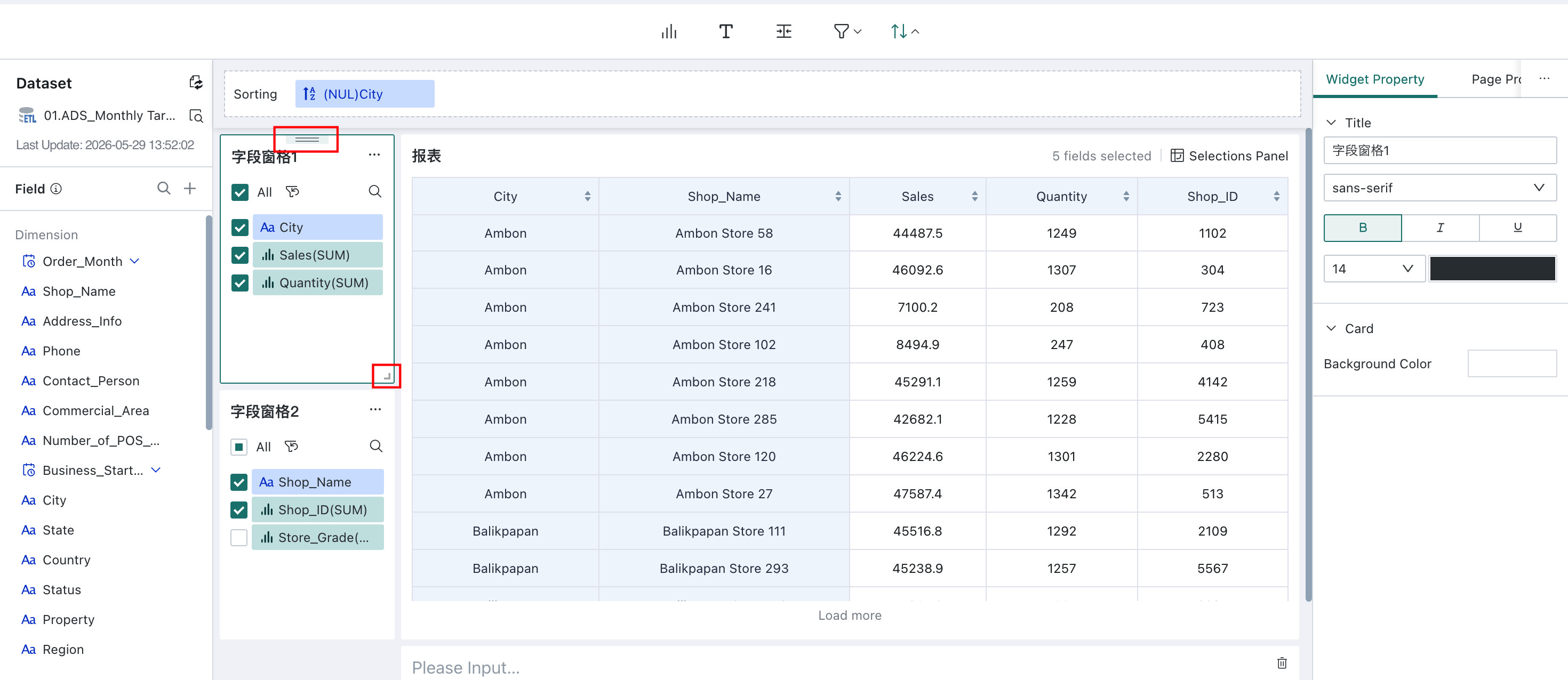
Widget Property
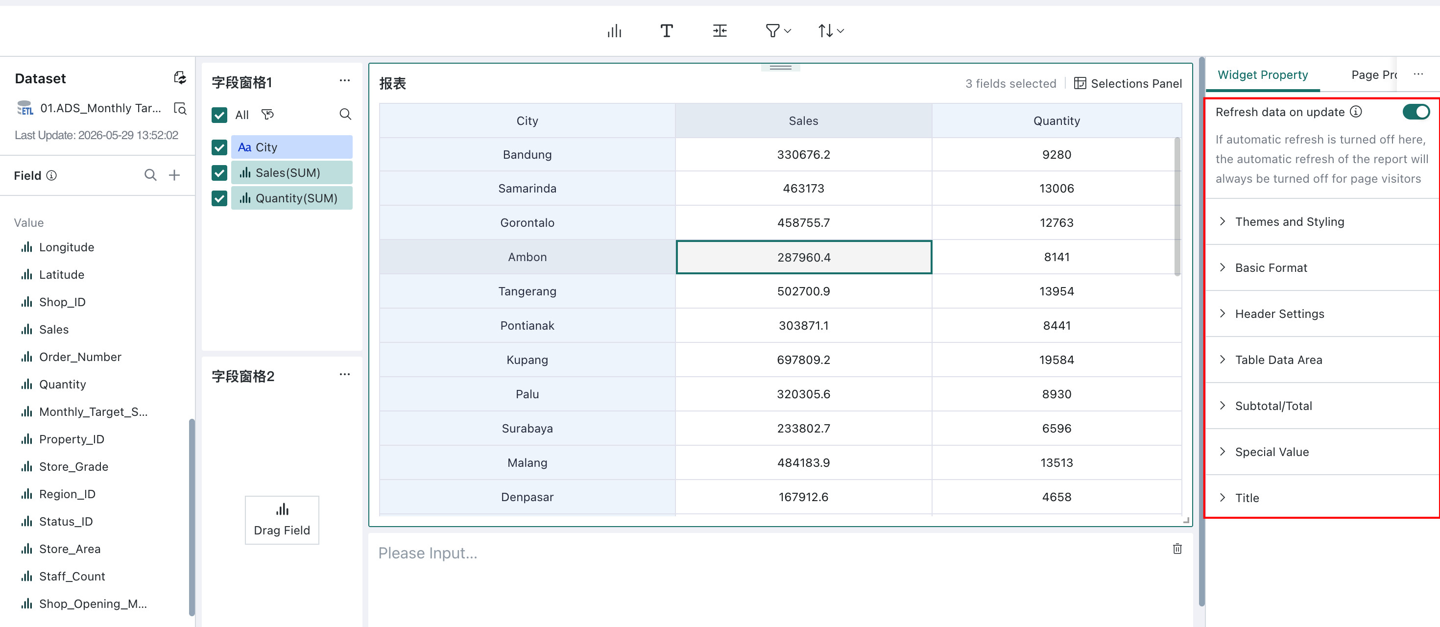
Click a field pane and use Widget Property on the right to configure styling options such as automatic refresh after changes, theme and style, basic formatting, header settings, subtotals/grand totals, special values, and titles.
Merge/Split
This feature lets you organize field panes in different ways. You can merge related field panes into one combined pane, making the layout cleaner and helping users find the fields they need more quickly in complex analysis scenarios.
Merging or splitting panes does not change how data is displayed in the preview area.
-
Merge Field Panes
Supports both merging all panes and merging selected panes.
- Merge All Field Panes: Merge all current field panes into one field pane.
- Merge Selected Field Panes: Select the target panes to merge.
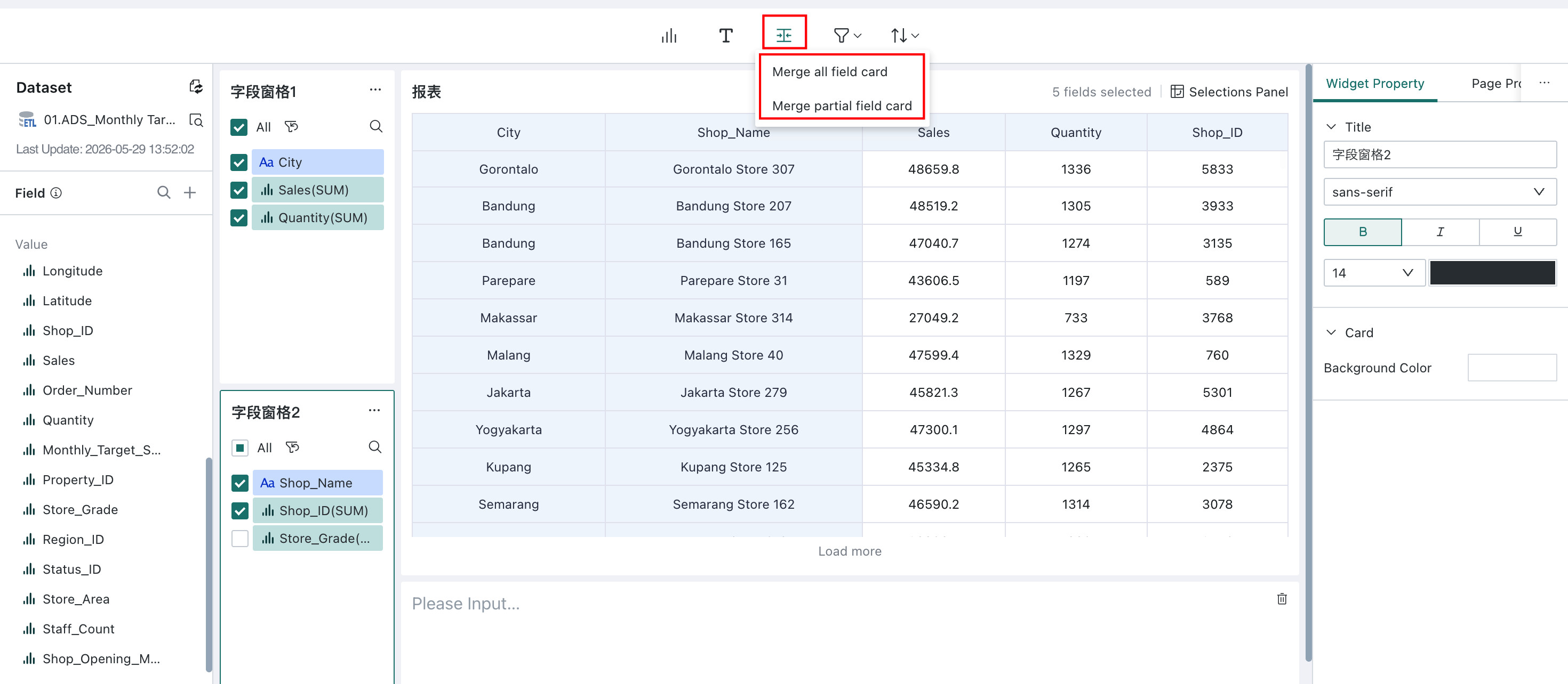
- Merging multiple single panes will generate a new merged pane with the default style of the merged pane; if a single pane is merged with a merged pane, the single pane will be added to the merged pane by default, and the merged pane style will be retained.
- After panes are merged, a default title such as Merged Field Pane is generated automatically. You can rename it.
- To add more field panes (groups) into a merged pane later, click New Group in the Widget Property and drag the required fields into that group.
- Split Field Panes
Splitting breaks an already merged field pane group back into multiple independent panes.
Click "Split Pane" in the configuration items of the merged field pane to achieve splitting.
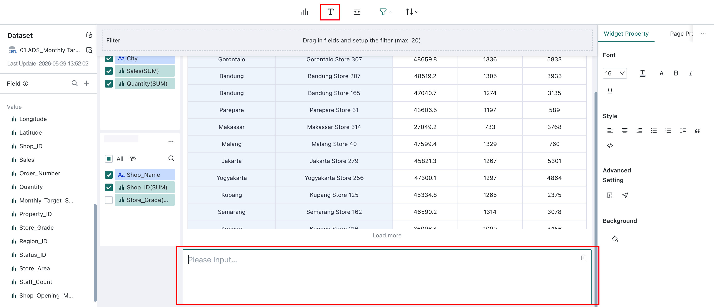
Text Pane
Text Input
Text panes let you insert custom text into the page, such as descriptions, titles, notes, or metric explanations.
Adding text panes improves readability and helps users understand the meaning and context behind the data more quickly.
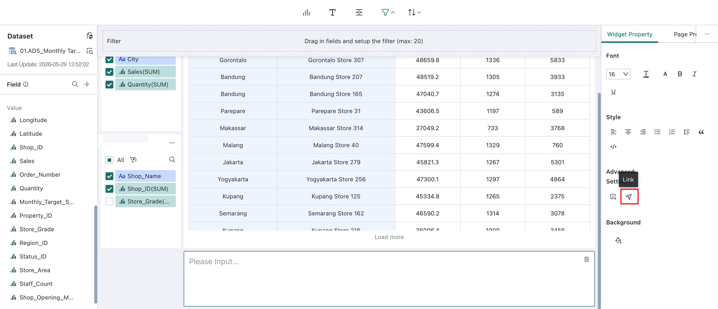
Widget Property
Text panes support text styling such as font, color, and size. They also support Jump and Insert Specific Properties.
-
Link: Select the text pane, click the Jump icon under Advanced Settings, and set the target page. After configuration, users can click the text to navigate to that page.
-
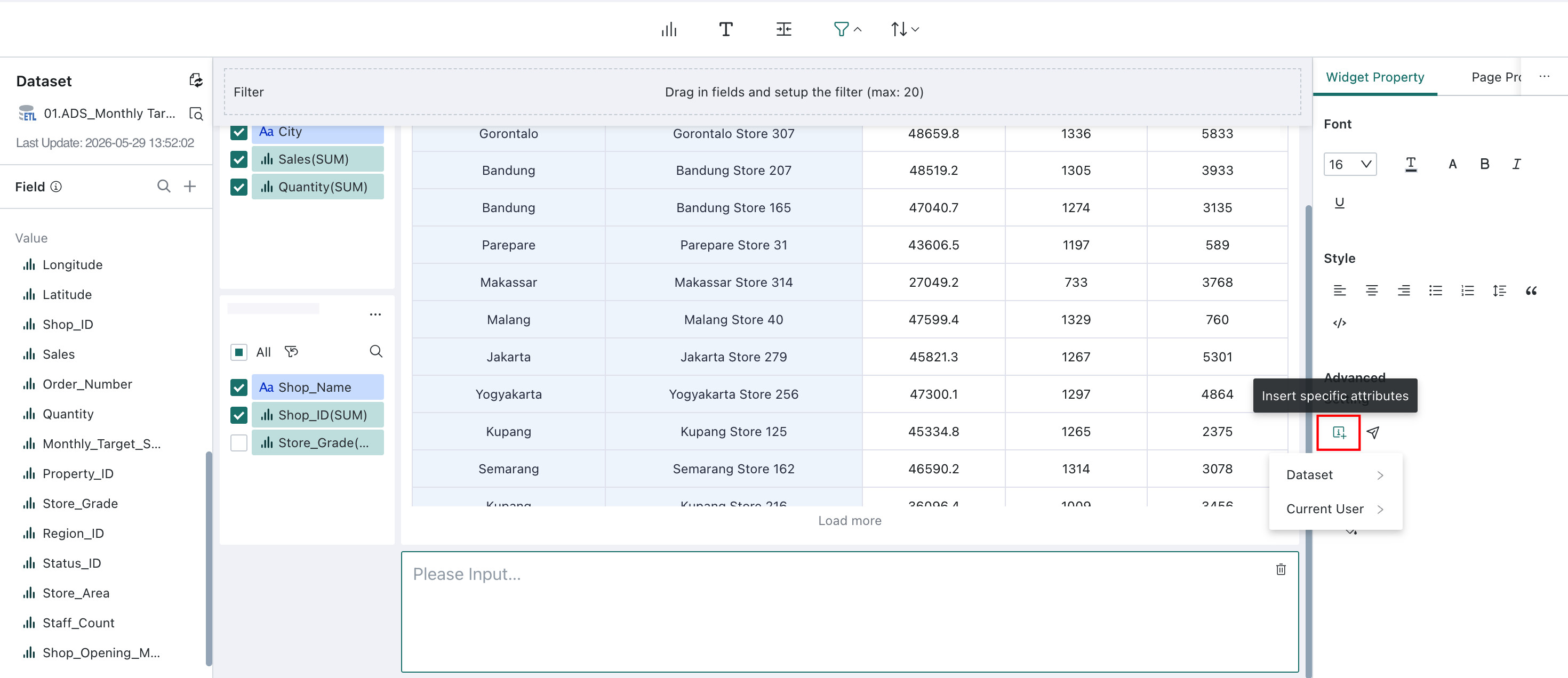
Insert Specific Properties: Select the text pane, click the Insert Specific Properties icon under Advanced Settings, and choose which property values to insert. The selected values are then displayed in the text pane, and you can insert multiple properties:
-
Dataset: update time, creation time
-
Current User: name, account, phone number, email, and other user attributes
-
Filter
Overview
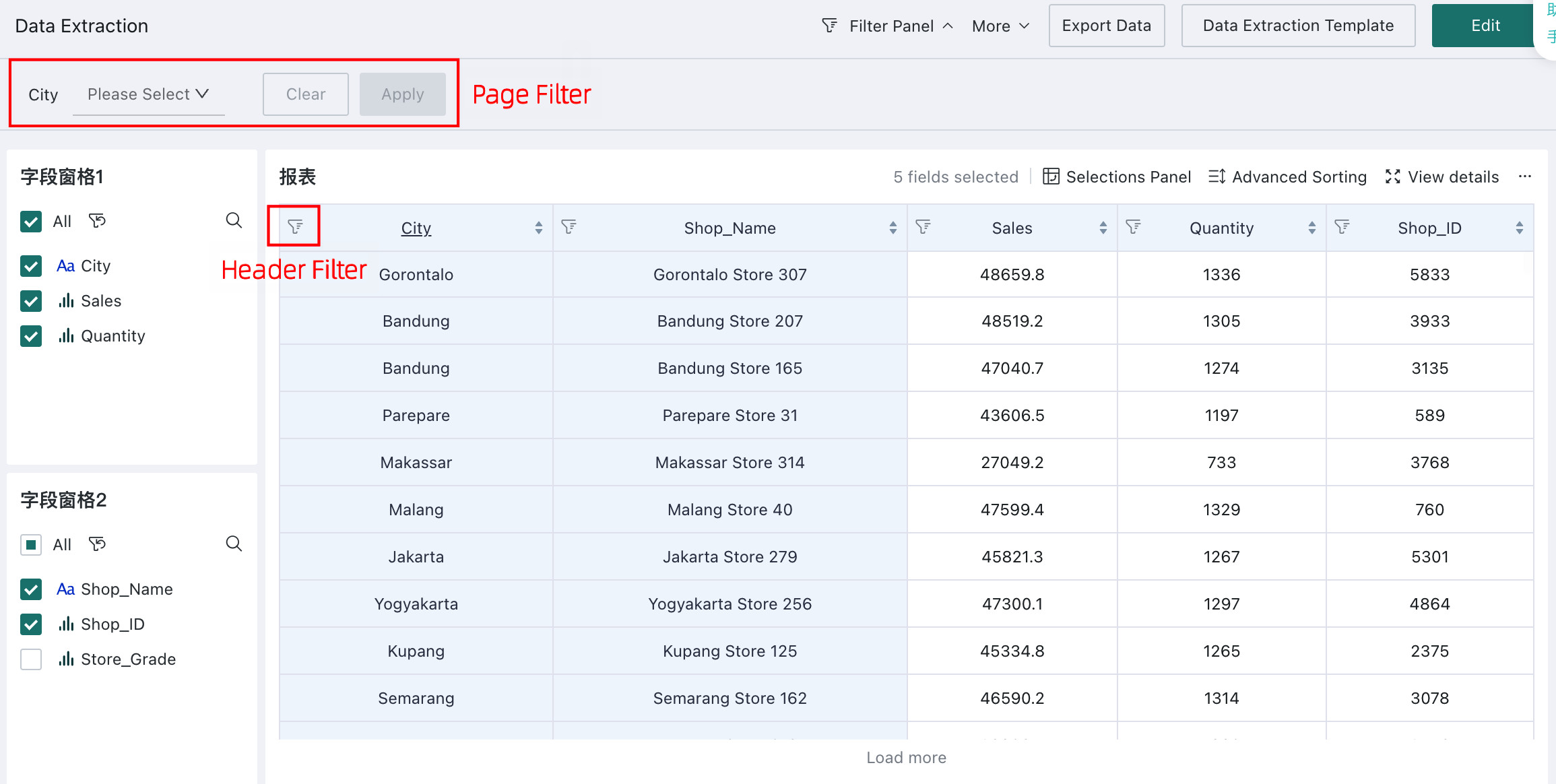
In Self-service Data Retrieval, filter conditions can be configured in three places: the pre-filter in the editor, page filters, and header filters on the online page. All three are based on detail-level filtering.
Data Filtering:
- Default Filter (Pre-filter): the default detail-level filter configured in the editor
- Page Filter: the page-level filter; if it conflicts with the editor settings, the page filter takes precedence
- Header Filter: filtering directly from table headers
Filter Priority:
- Page filters >= online header filters >= editor pre-filters.
- By default, the Self-service Data Retrieval page displays data based on the pre-filter configured in the editor.
- Page filters are user-triggered and override the default pre-filter conditions and results.
- Header filters are also user-triggered and further narrow the data that remains after page filters and pre-filters are applied.
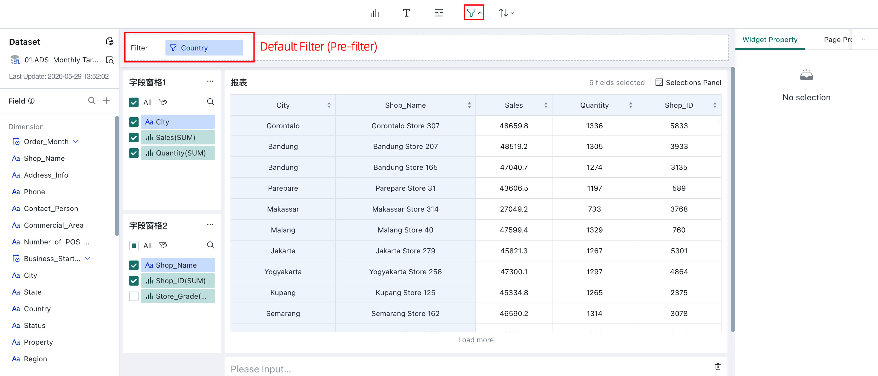
Default Filter (Pre-filter)
In the Self-service Data Retrieval editor, click Default Filter, drag fields from the dataset area into the filter bar, and configure the filter conditions.
When users subsequently open the Self-service Data Retrieval report page, data will be automatically filtered according to the preset default filter conditions in the editing page, displaying only data records that meet the current filter conditions.
- Up to 20 default filters can be configured.
- After configuration, these filter conditions are hidden during report preview and usage.
Page Filter
For details, see Filter.
Header Filter
For header filtering, dimension fields support switching between detail filtering and result filtering, while numeric fields support switching between aggregation filtering and result filtering. For details, see Header Filter.
Sort
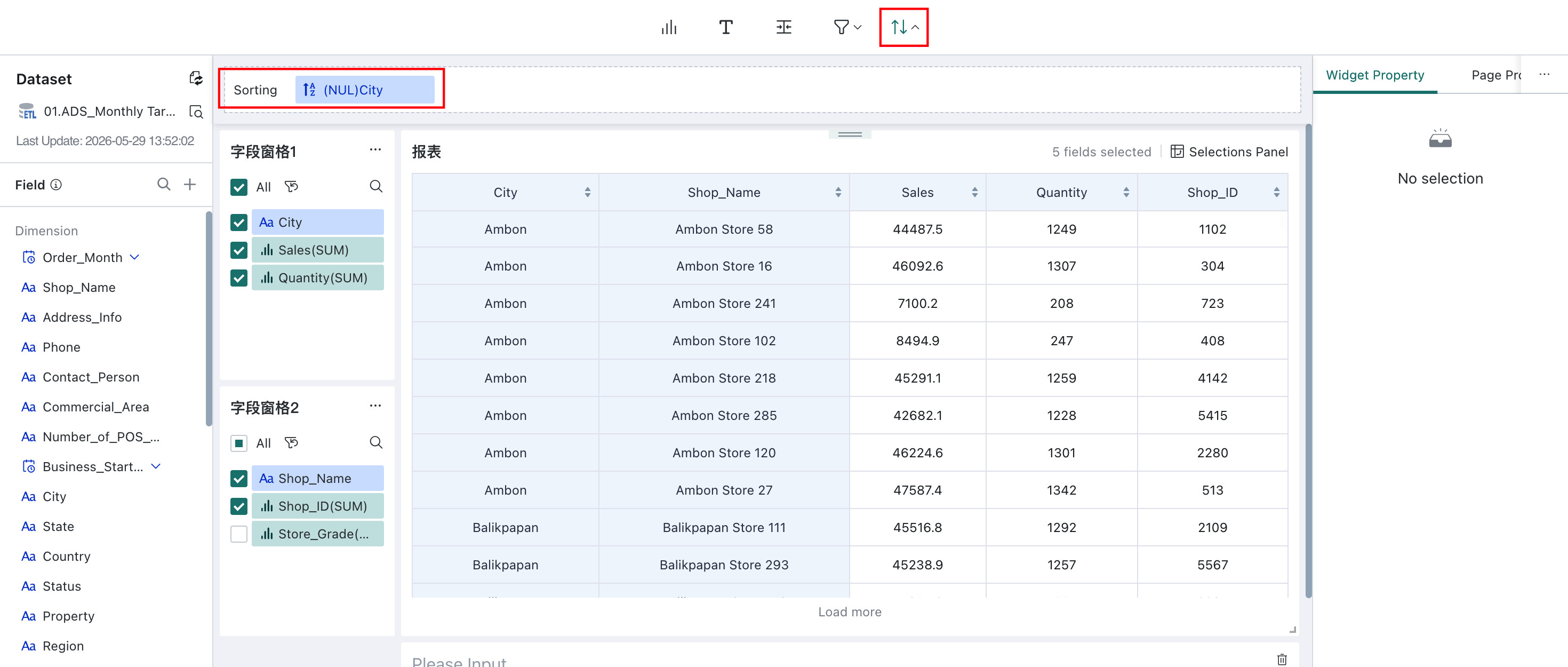
Default Sorting
The Self-service Data Retrieval editor supports default sorting, which is used to automatically sort query results based on the desired display order.
In the editor, click Default Sort and choose one or more fields from the dataset field list as the sort basis. For each selected field, you can specify ascending order, descending order, or custom sorting.
- You can add one or more sort fields, up to 20 in total.
- When multiple sort fields are configured, sorting is applied from top to bottom. If values in the first field are the same, the second field is used, and so on.
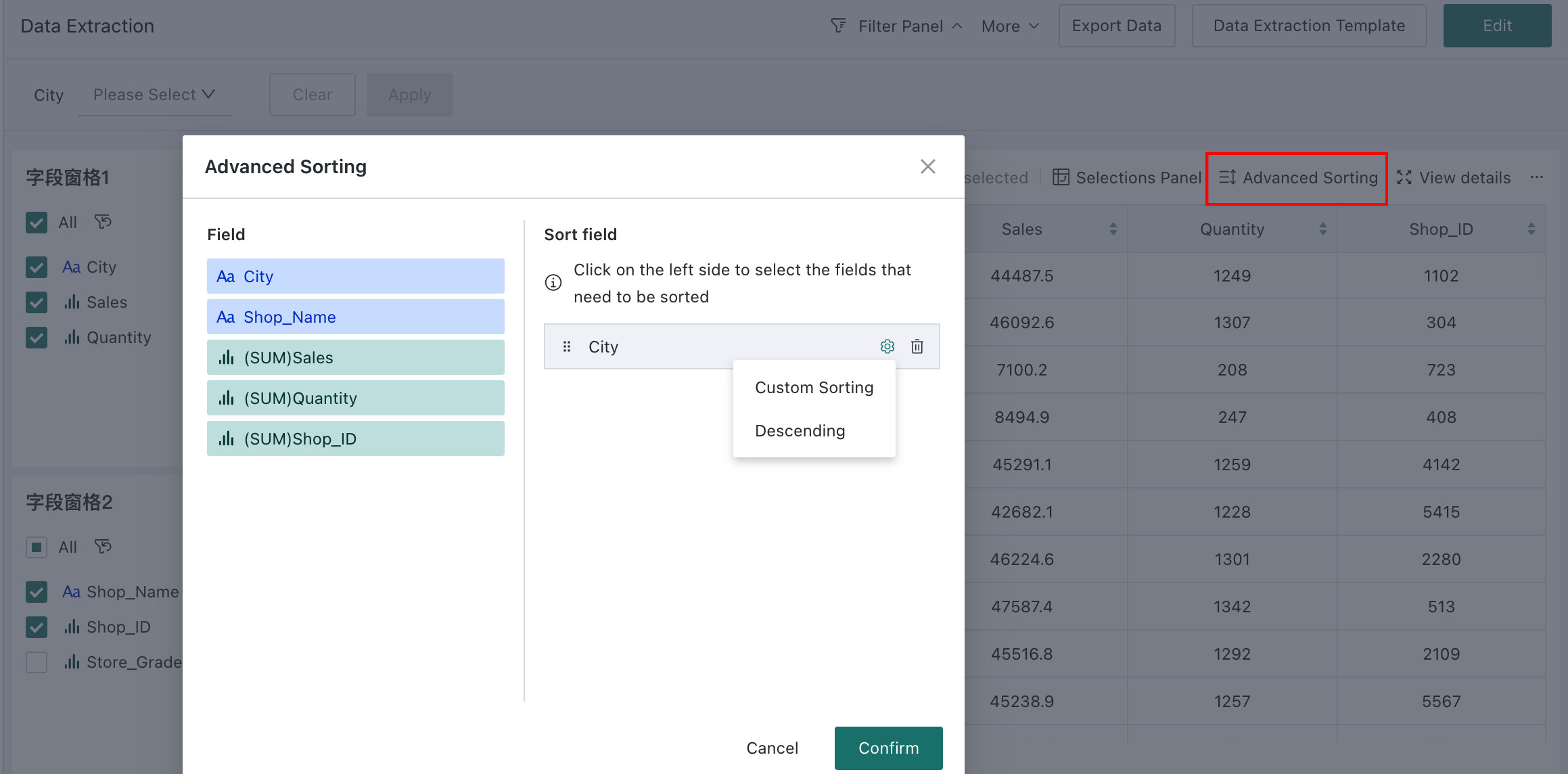
Advanced Sorting
Data query users can customize data sorting. Click the Advanced Sorting button, then click the left side in the pop-up window to add a sorting field. Self-service data queries support ascending, descending, and custom sorting by the selected field.
Preview Area
Field Configuration
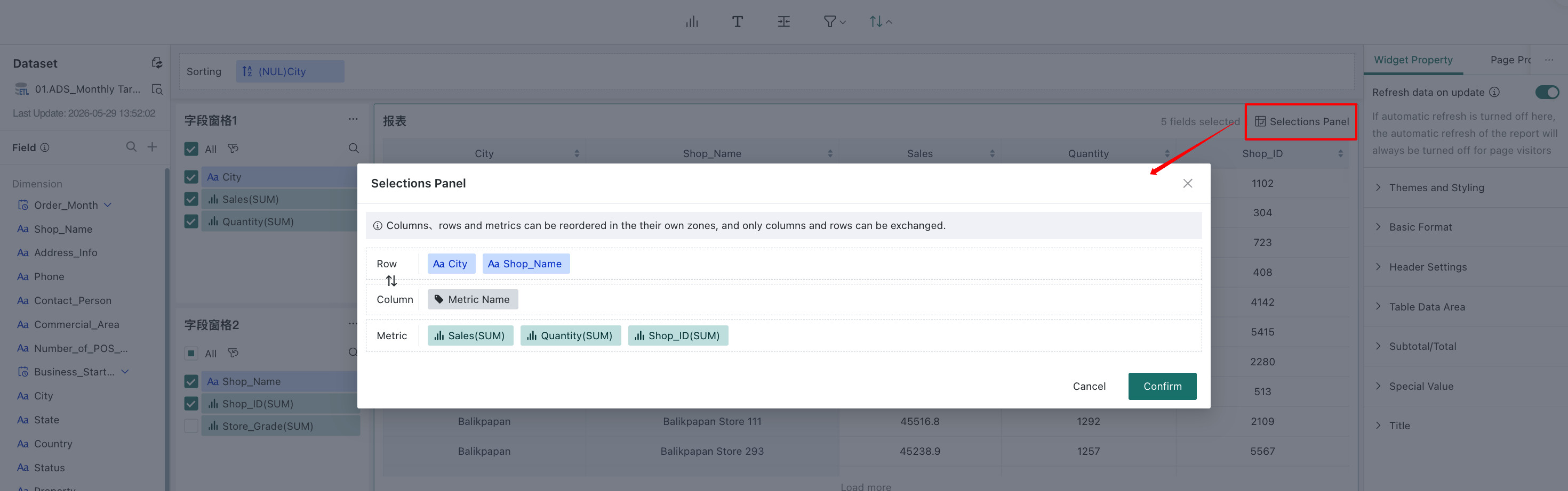
Field configuration determines how the data is displayed. The field configuration window shows the currently selected fields and lets you adjust them in bulk, including field order, row/column transposition, and column-dimension settings. The settings here define the default report layout.
For example, when analyzing sales data, if users care more about sales amount than sales volume, they can place sales amount first to surface key information more quickly.
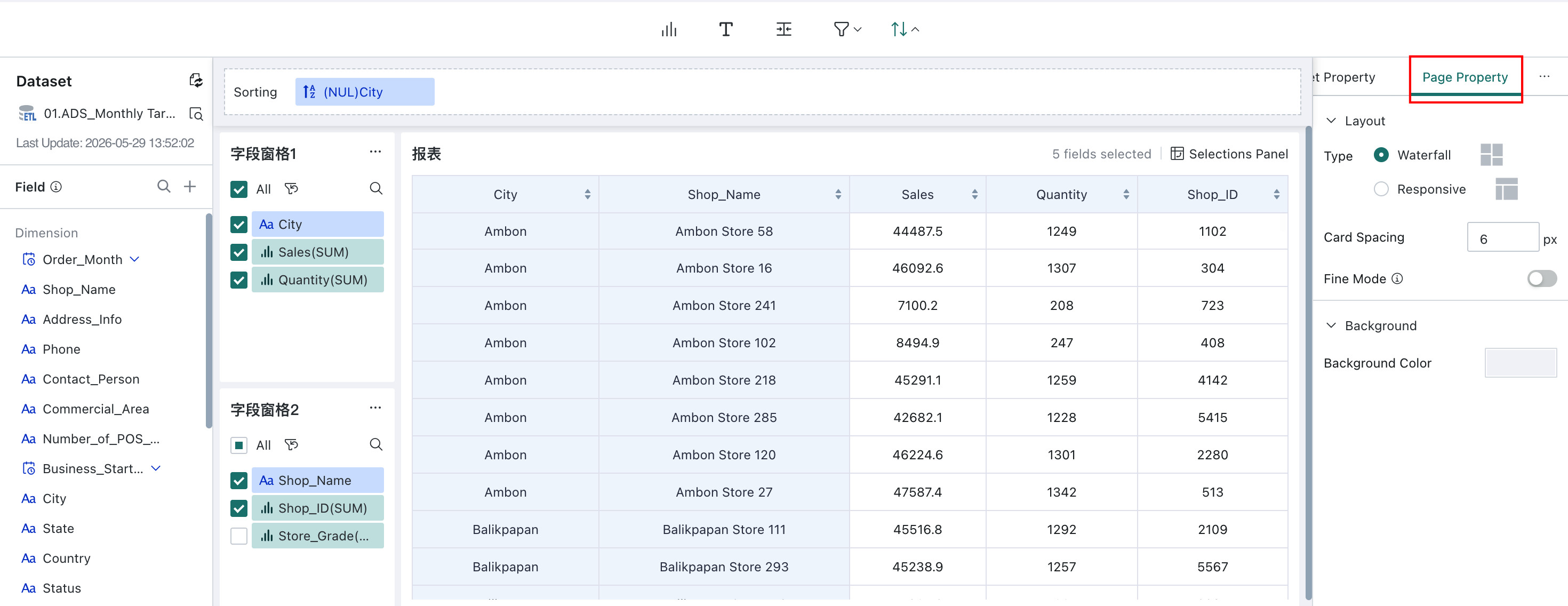
Widget Property
Widget Property help make the report clearer and easier to use. Main configuration items include automatic refresh after changes, theme and style, title, basic formatting, header settings, subtotals/grand totals, and special values.
The control property settings are similar to table configuration in Dashboard cards. For quick reference, see Chart Analysis Preview and Table - Chart Properties.
| Configuration Item | Description |
| Auto-refresh Data After Changes | When configuration changes such as field addition/deletion/modification, filtering, and sorting occur, Guandata BI supports users to choose between "Auto Refresh" or "Manual Refresh" modes to view data through "Auto-refresh Data After Changes." |
| Theme and Style | Supports configuring the theme and style of the data retrieval table: Theme and Color Scheme: Provides "Classic" and "Minimalist" themes, 5 color schemes; provides color configuration and display settings for the following attributes: zebra striping, outer border, row/column divider lines, table background color, selected highlight color. Table Font and Font Size: Supports setting font style and font size of text in the table; Table Column Width: Default is automatic, i.e., adaptive width according to current data content, also supports user-defined fixed column width. |
| Basic Format | Supports configuring cell merging, alignment, auto-wrap, table pagination, and display row numbers. |
| Header Settings | Supports separately configuring the display logic and header style (font style, background color, etc.) of row headers and column headers, facilitating user viewing. |
| Table Data | Supports configuring table row height, hover background color, font color of data in the table, etc. |
| Subtotals/Grand Totals | Supports setting whether to display subtotals and grand totals and their display positions, aliases for subtotals/grand totals, fill color, and font style, etc. |
| Special Values | Replace special values in data (such as null values, empty strings, text null, etc.) with other text. |
| Title | Supports setting page title and adjusting title font style. |
Page Properties
After the controls are built, use Page Properties to refine the page style and improve readability.
Page properties control the overall layout and style of the retrieval page, including layout type, spacing, fine-tuning, and background settings.
Its configuration is similar to Dashboard page styling. For quick reference, see Page Style.
In editing mode, you can also adjust the position and size of pane controls and report areas to create a more personalized layout and improve the viewing experience.
When the page reaches the desired result, save and publish it so other users can access and use it.