Selection Filter
1. Overview
1.1. Feature Introduction
After setting the selection filter, you can filter a specific field value of the dataset during use.
1.2. Application Scenarios
When analyzing data, if users need to focus on a certain product category, they can create a selection filter and select the product category dimension field as the filter field; at the same time, you can control which related cards the filter condition takes effect on.
2. Operation Steps
2.1. Create Selection Filter
There are two entry points for selection filters on the page: creating a new filter in the filter bar, and creating a new card and selecting the card type as a filter.
- Filter bar - New filter;
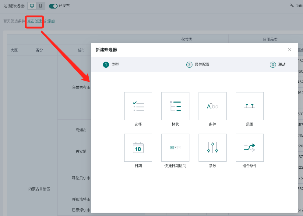
- Page - New card - Select new filter.
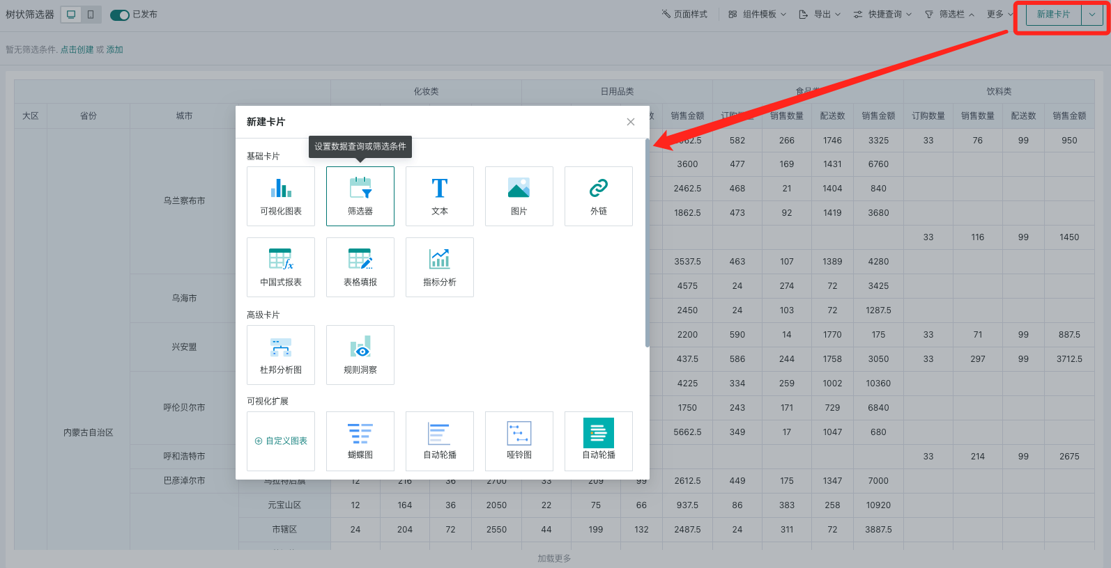
Select the filter type as "Selection" to enter the selection filter editing popup.
2.2. Filter Attribute Configuration
When setting the selection filter, first select the source dataset, then select the field to be filtered by the consumer.
-
Support setting the selection type as single or multiple, then select a suitable style;
-
You can set the default value of the filter, and also filter, sort, and configure the location for the options list.
| Operation | Description |
|---|---|
| Select Dataset | You can quickly select the current page's dataset or search for a new dataset. |
| Select Field | Select a field: Date option list format: If the field is of date type, the default option list is the original value format. You can also set the date option list format to: year, quarter, month, week, weekday for filtering;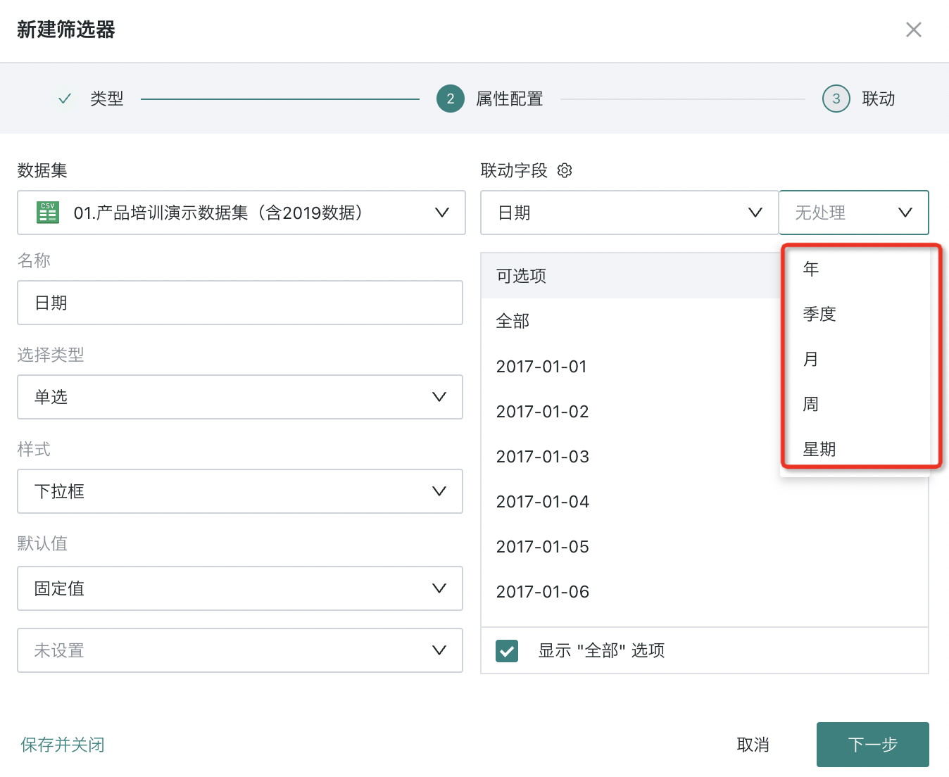 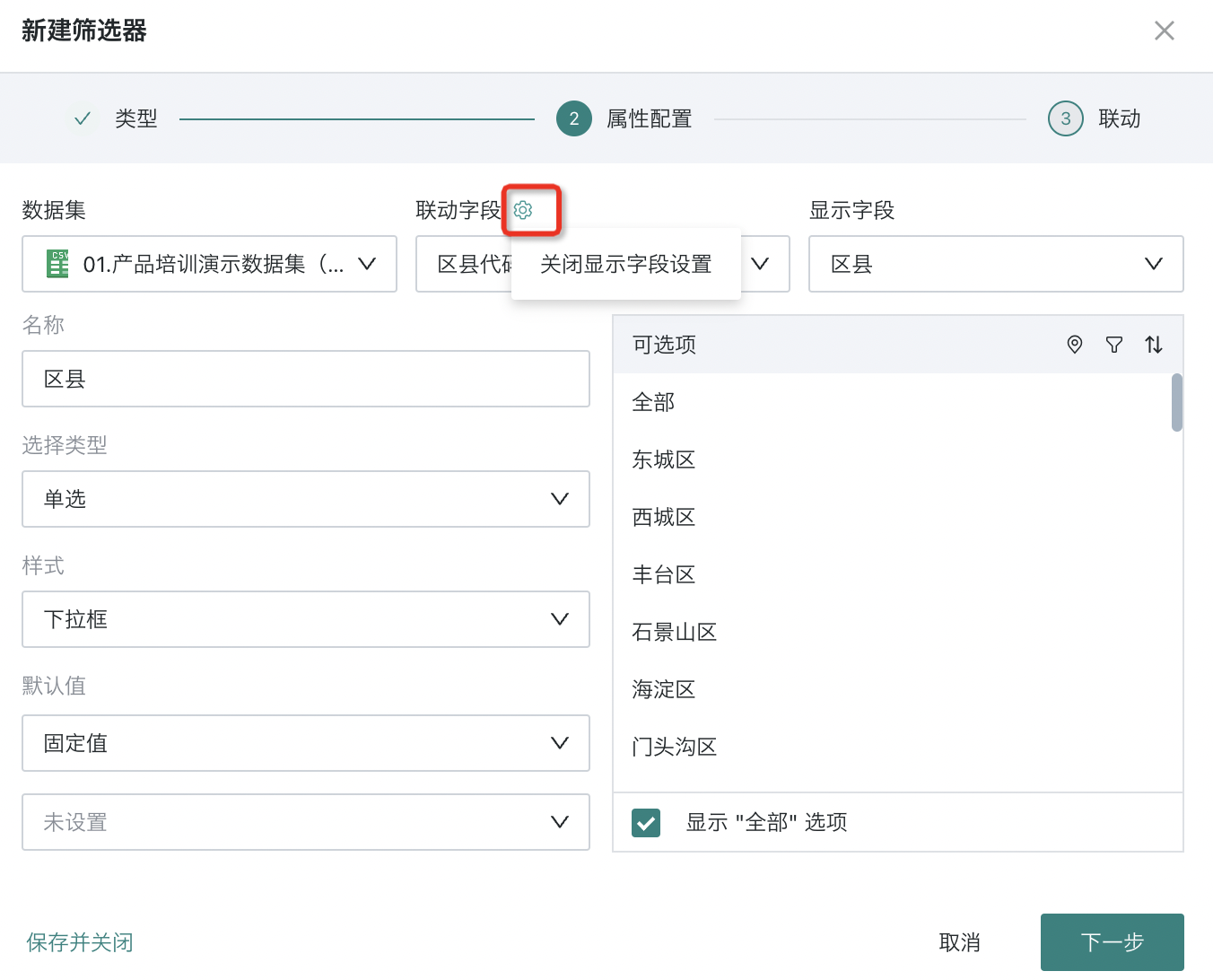 |
| Name | Defaults to the selected field name, can be modified. |
| Selection Type | Default is single selection, can be switched to multiple selection. Single selection: Only one field value can be selected for filtering; Multiple selection: Multiple field values can be selected for filtering. Note: For multiple selection, you can configure whether to display the "Exclude" button when selecting options. For filters using the exclude function, linkage parameters cannot take effect. |
| Style | When the selection filter is in the filter bar, only the "dropdown" style is supported; when the selection filter is in the layout, the style configuration also supports "dropdown", "radio/checkbox", and "button bar" styles, which can be set according to user habits. > Note: > After selecting options, using exclude, the condition passed is "not including option 1, option 2"; at this time, linkage cards cannot link parameters, because parameters can only pass equal conditions. Dropdown: 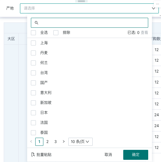 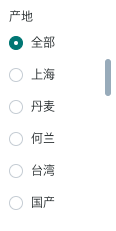 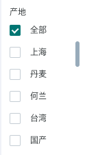  |
| Default Value | When a default value is set, users will see data filtered by the default value after entering the page; supports fixed value, custom time macro, follow user attribute, and first in the list (first pick).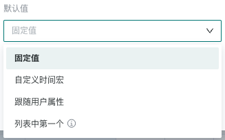 |
| Option List | Only 200 options are displayed randomly; supports location configuration, filtering, and sorting:
|
If you need to edit the filter's attributes again, you need to find the "Edit" function in the filter card's toolbar to re-enter the filter attribute configuration popup.
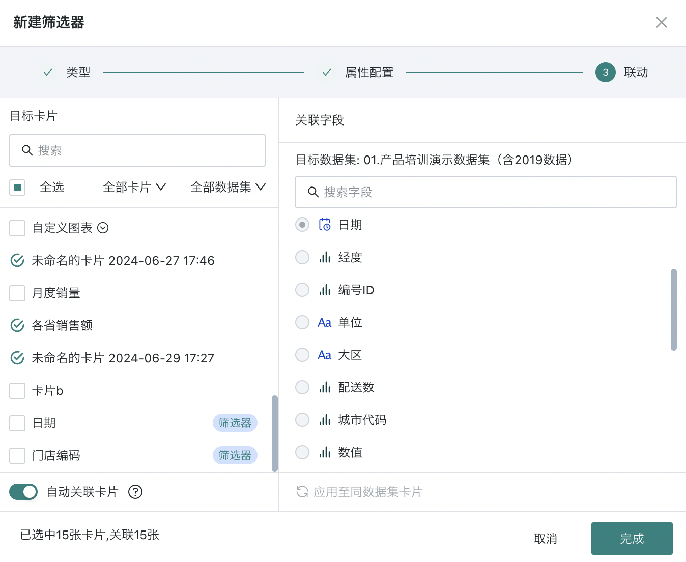
2.3. Set Linkage Target Card
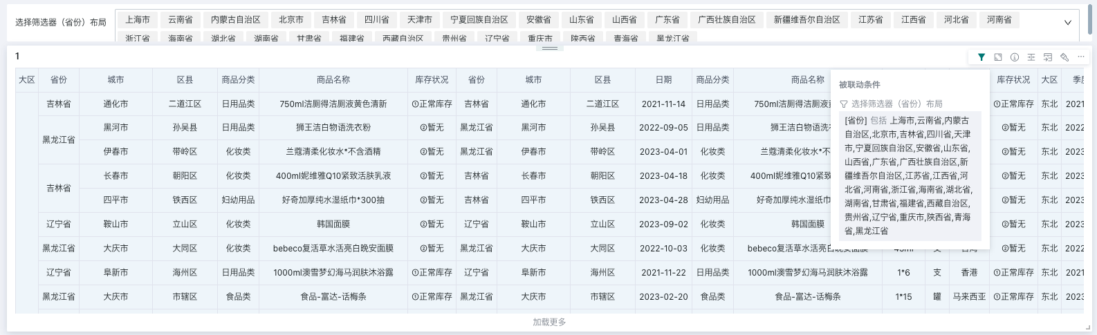
When linking, you need to select the target card and the corresponding filter field. After setting, changes in the filter will link and change the data presented by the associated card.
-
Auto-link card: After the filter enables auto-link, it will automatically link visualization cards with the same field name; auto-linked cards can be manually unlinked;
-
Apply to cards with the same dataset: Click to apply to cards with the same dataset, and it will automatically link other cards under the same dataset with the corresponding field. Cards applied to the same dataset can be manually unlinked.
If you need to edit the filter's linkage relationship again, you need to find the "Linkage" function in the filter card's toolbar to re-enter the filter linkage configuration popup.
2.4. Using the Filter
Usage
The maximum number of options for users is 1000; you can fuzzy search options, batch paste, and view selected.
-
Fuzzy search: Case insensitive, but some direct-connected databases do not support case insensitivity;
-
Batch paste: After copying the options with one click, you can automatically match the option list according to the name, reducing the number of clicks.
View Filter Effect
After filtering, the filter will take effect on each linked card, and the card will present the data after filtering;
When users browse the card, they can hover the mouse over the "small funnel" icon in the card toolbar to view the current filter conditions.