Create and Manage a Mobile Portal
Overview
Mobile Portal is the mobile version of Data Portal in the Guandata platform. With Mobile Portal, you can build a visually organized enterprise data portal.
This product module is a value-added module. To try it, contact your Guandata sales representative or customer success manager, usually the current service contact for your company.
Feature Entry
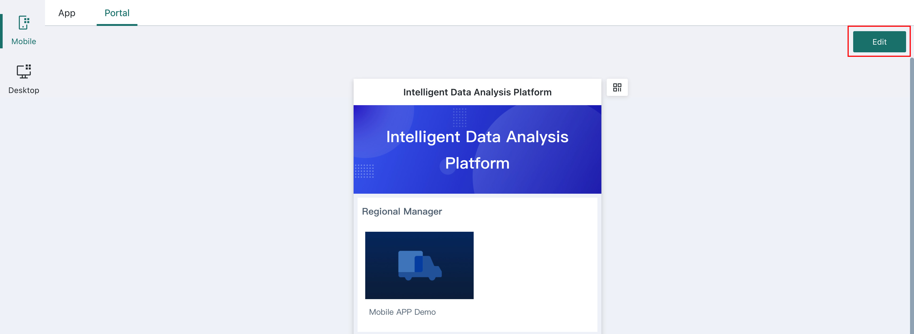
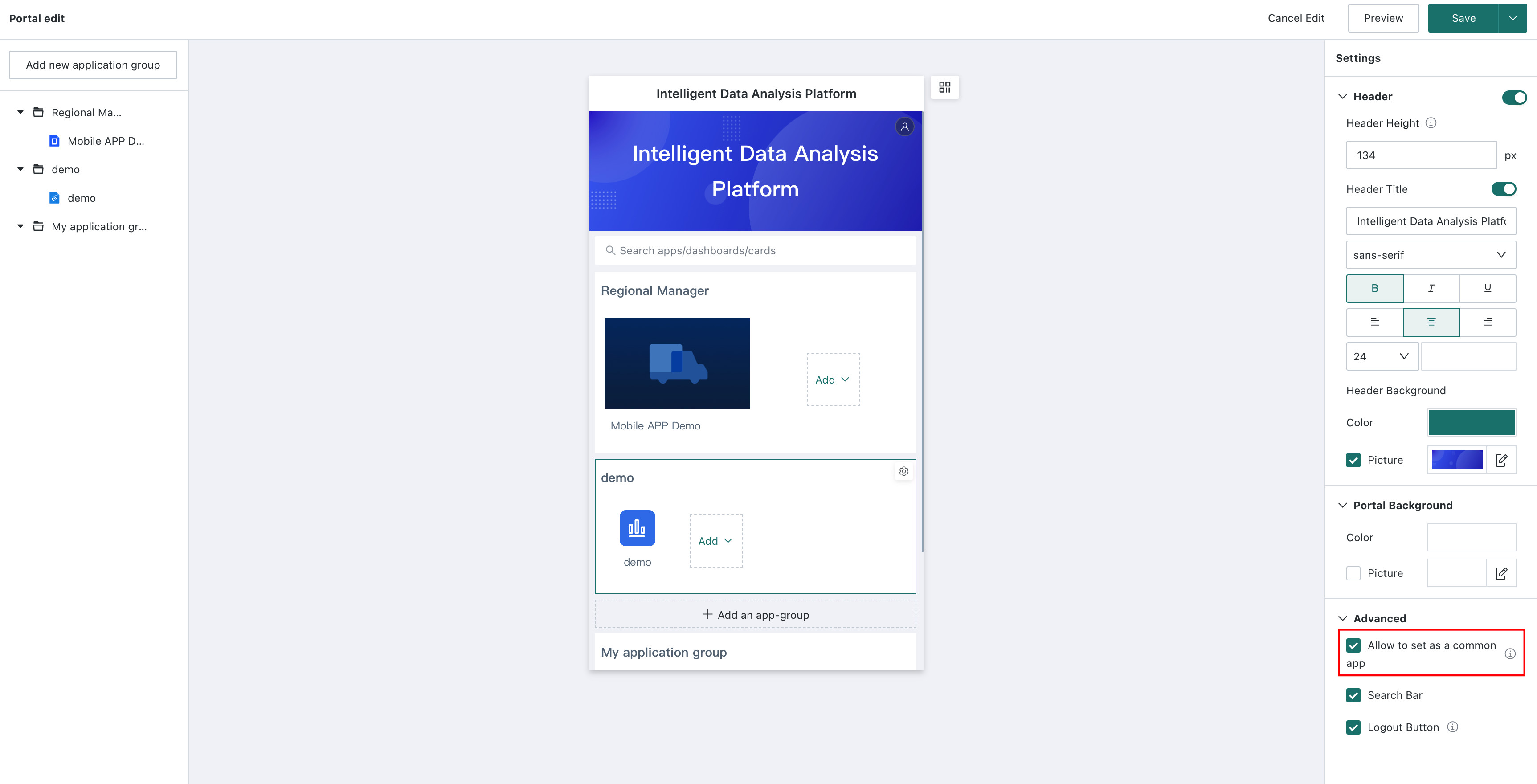
Go to Data Apps > Mobile > Portal and click Edit in the upper-right corner of the page to open the mobile portal editing page. Users can edit and manage the mobile portal on this page.
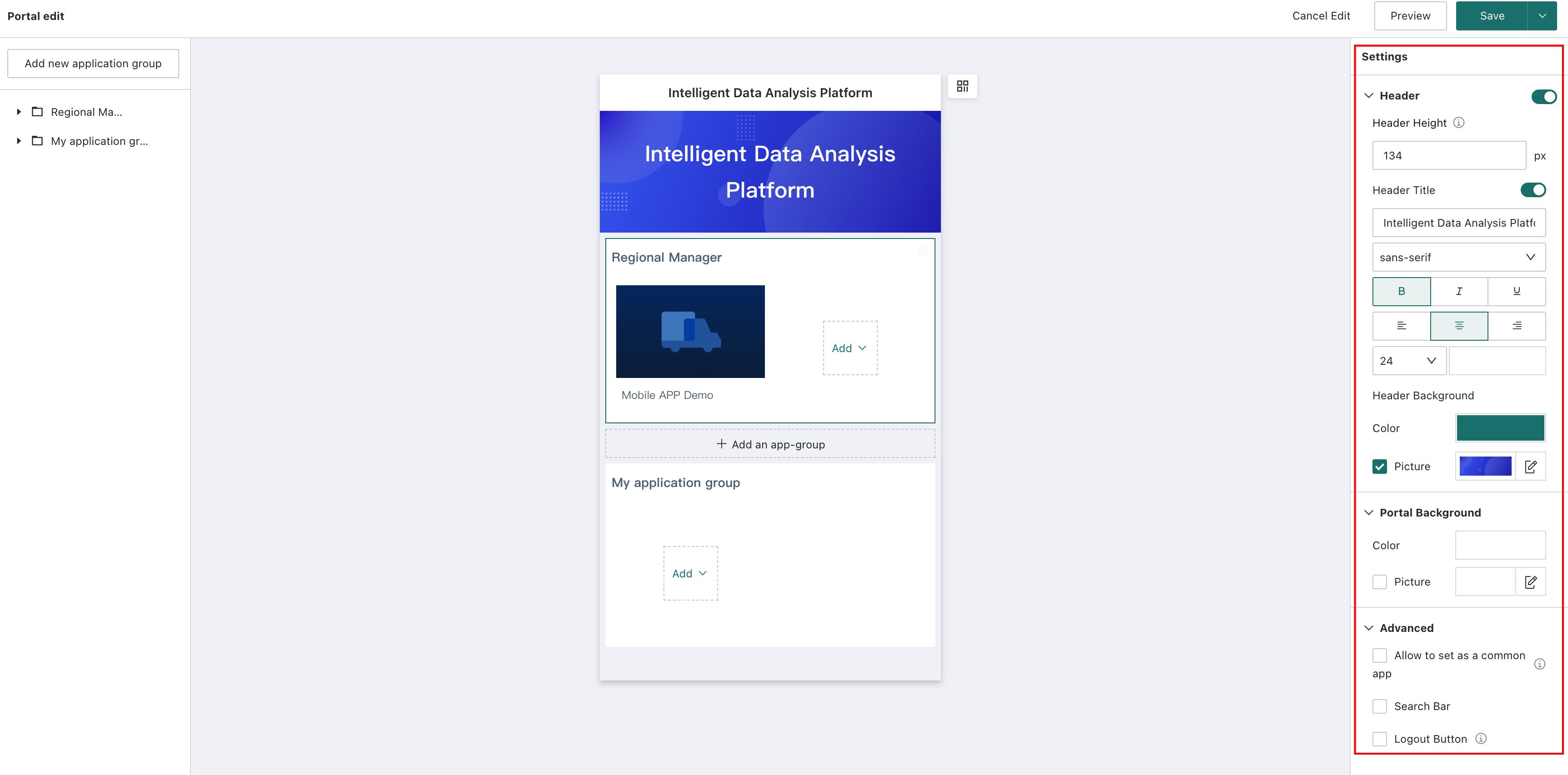
Portal Settings
- Header: Use the switch to control whether the header is displayed.
- Header height: Configure the app header height.
- Header title: Customize the title, including font, font size, color, and more. Use the switch to show or hide it.
- Header background: Select a solid color or image as the mobile portal header background.
- Portal background: Select a solid color or image as the mobile app portal background.
When the header is hidden, the logout button is displayed as a floating button.
Allow Favorites
After an administrator enables Allow Set as Favorite, the Favorites app group appears on the user-side portal page. For the configured effect, see Set Favorites.
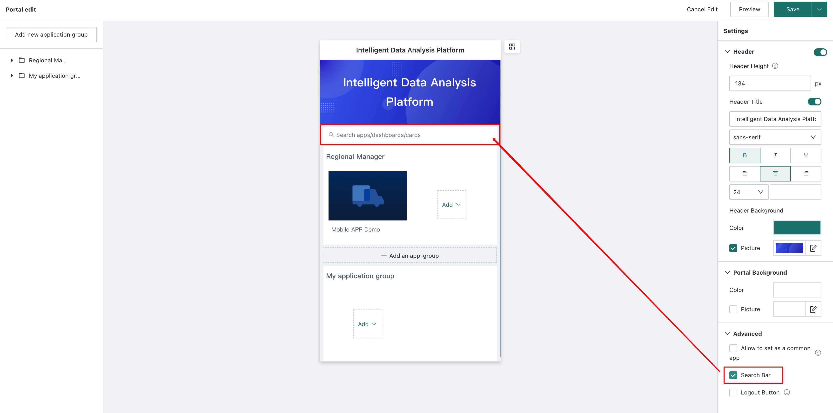
Search Bar
After an administrator enables the search bar button, users can see the search bar on the mobile page and search by app name.
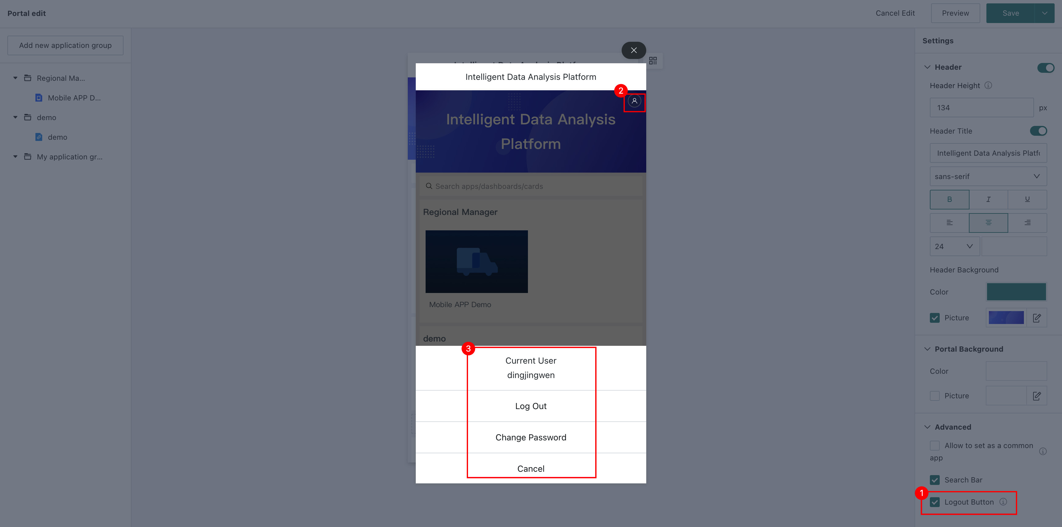
Logout Button
After enabled, users can log out or change their password when using the mobile portal.
App Group Management
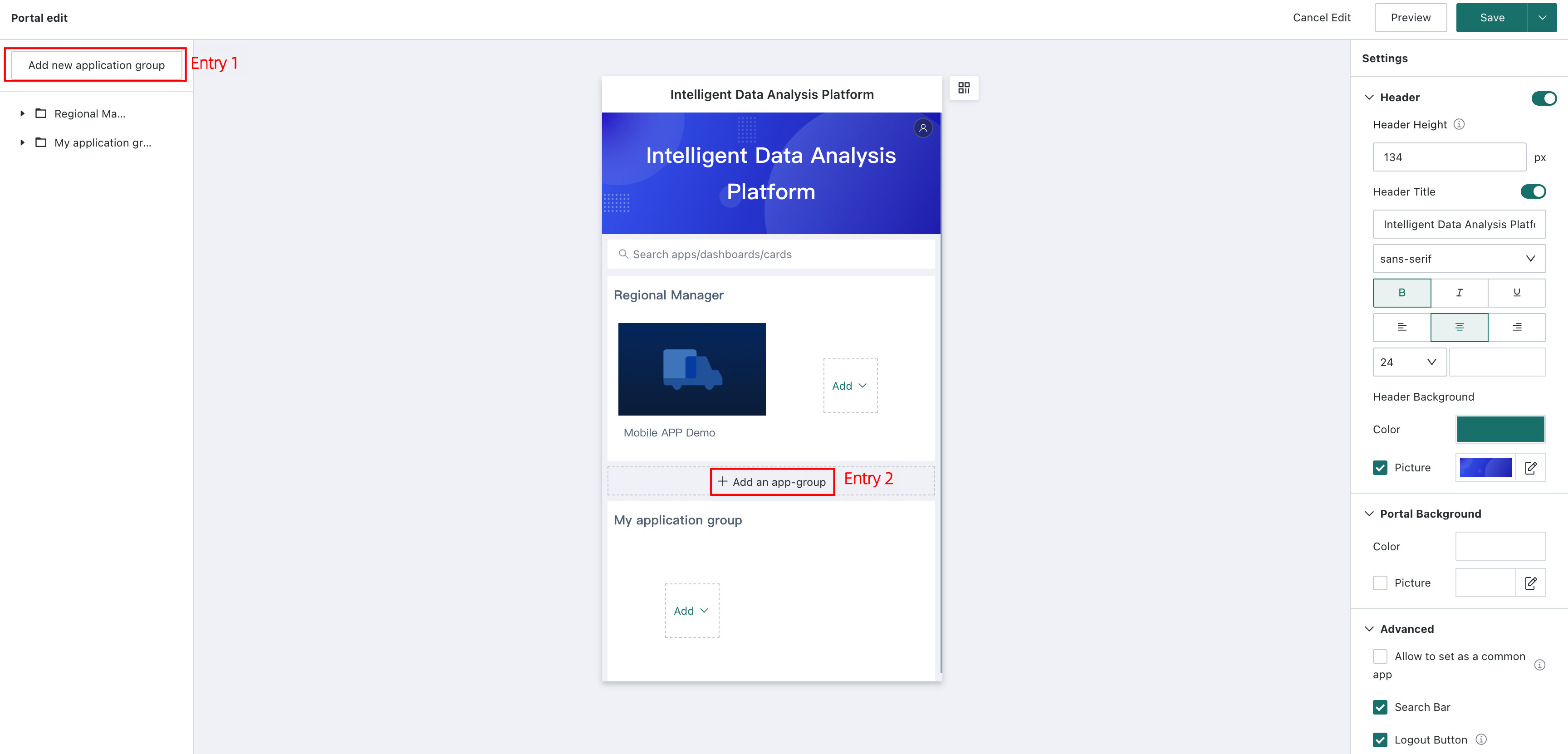
Create an App Group
Only administrators can create app groups.
App groups are the basic display units of the portal. Specific content (apps) is categorized and displayed inside app groups. You can create an app group from either of the following entries:
- Entry 1: Click
Add App Groupat the end of the page to add a new app group. - Entry 2: Click
Create App Groupin the upper-left corner of the page to add a new app group.
In addition to general app groups, editing users with permission to enter the portal can also edit their personal My App Group. The detailed operations are as follows:
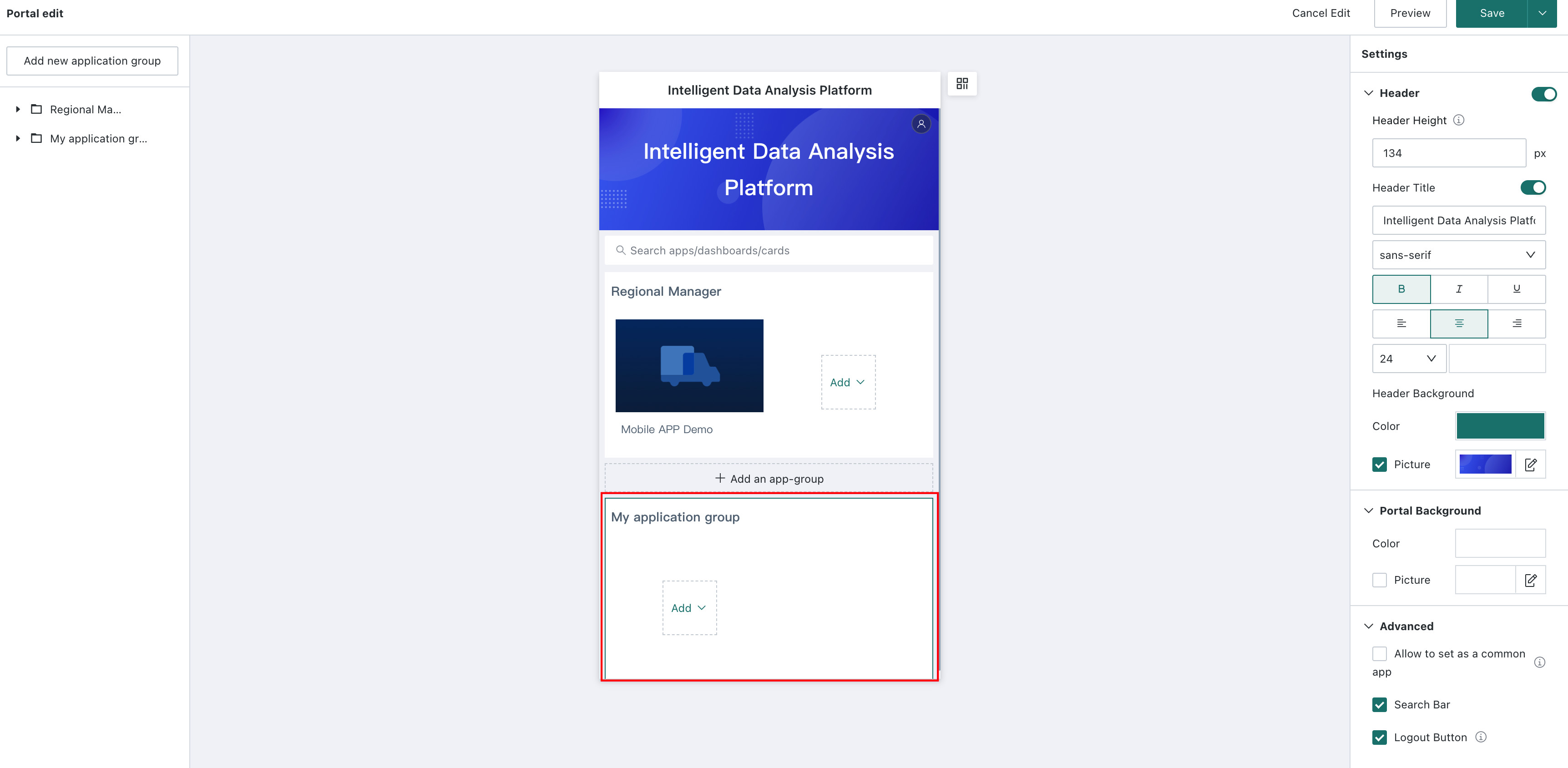
-
Administrator operation: Click
Management Centerin the upper-right corner of the first-level navigation bar, go toManagement Center > User Management > Roles, selectNormal User, and grantEditpermission forData Apps > Mobile Portal.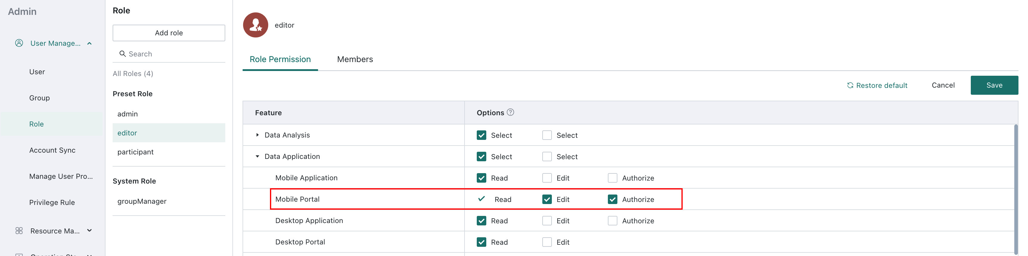
-
Editing user operation
-
Go to
Data Apps > Mobile > Portaland clickEditto enter the mobile portal editing page. -
Click
Portal Editin the upper-right corner to add apps toMy App Group.My App Groupis visible only to the individual user.
-
Set App Group Style
Click an app group. The app group menu bar appears on the right and supports multiple settings for the app group:
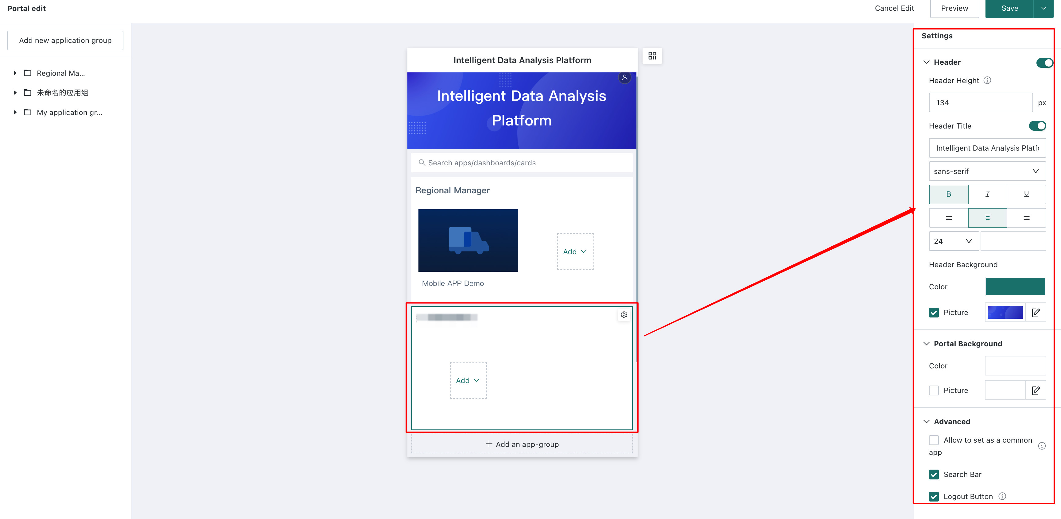
-
Name: Supports font style settings and show/hide control.
-
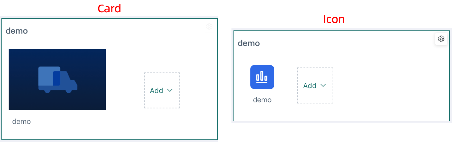
Style and layout: Select the style of apps in the group, including card style and icon style, as well as the layout of apps in the group.
App group collapse is also supported. Administrators can choose to enable this feature, which is disabled by default.
NoteAfter an administrator enables
App Group Collapsible, a small arrow appears on the right side of each category name on the user-side portal page. In the collapsed state, the page showsX apps collapsed. -
Background style: Supports using a solid color or image as the app group background.
Delete an App Group
Users can also delete app groups and apps in the portal as needed. The feature entry is shown below.
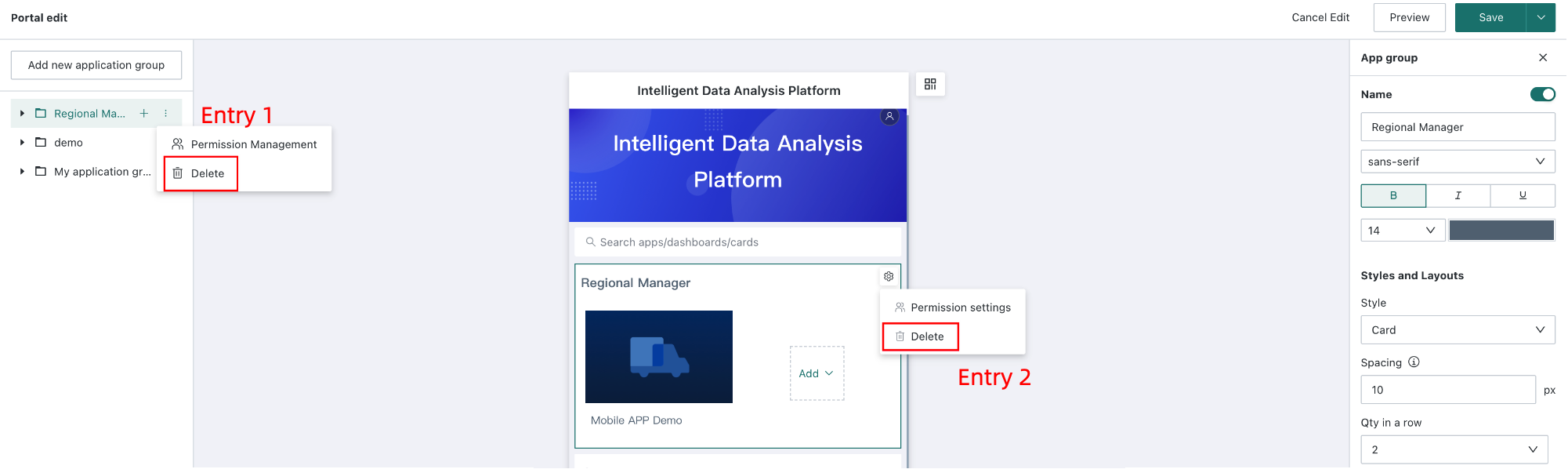
At least one app group must exist in the portal. Therefore, when only one app group remains in the portal, that app group cannot be deleted.
Manage App Group Permissions
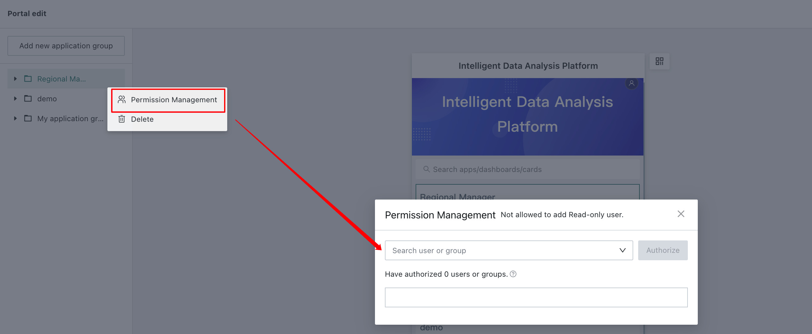
Click Settings in the upper-right corner of an app group and select Permission Management to configure permissions for that app group. Assigning management permissions to specific business users lets the right people manage app groups and reduces unnecessary costs caused by overly centralized management and maintenance.
- After clicking Permission Management, you can select users or user groups for authorization. Administrators are owners of all app groups by default. Read-only users cannot be authorized.
- Authorized normal users have portal edit permissions. They can also edit and maintain apps for which they have permissions in the current app group, configure permissions, and add or delete owners, but they cannot maintain the portal structure.
App Management
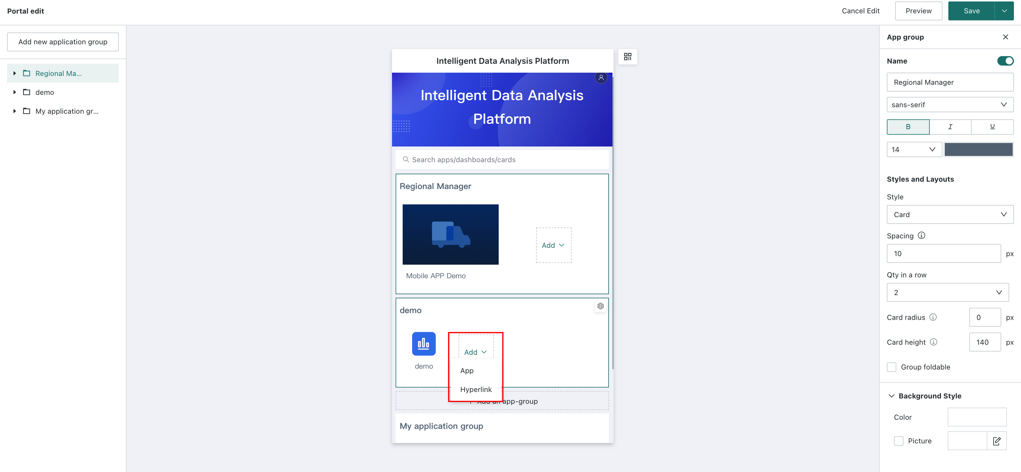
Add a Lightweight App or External Link
Click Add at the end of an app group to add a lightweight app or external link.
Set App Style
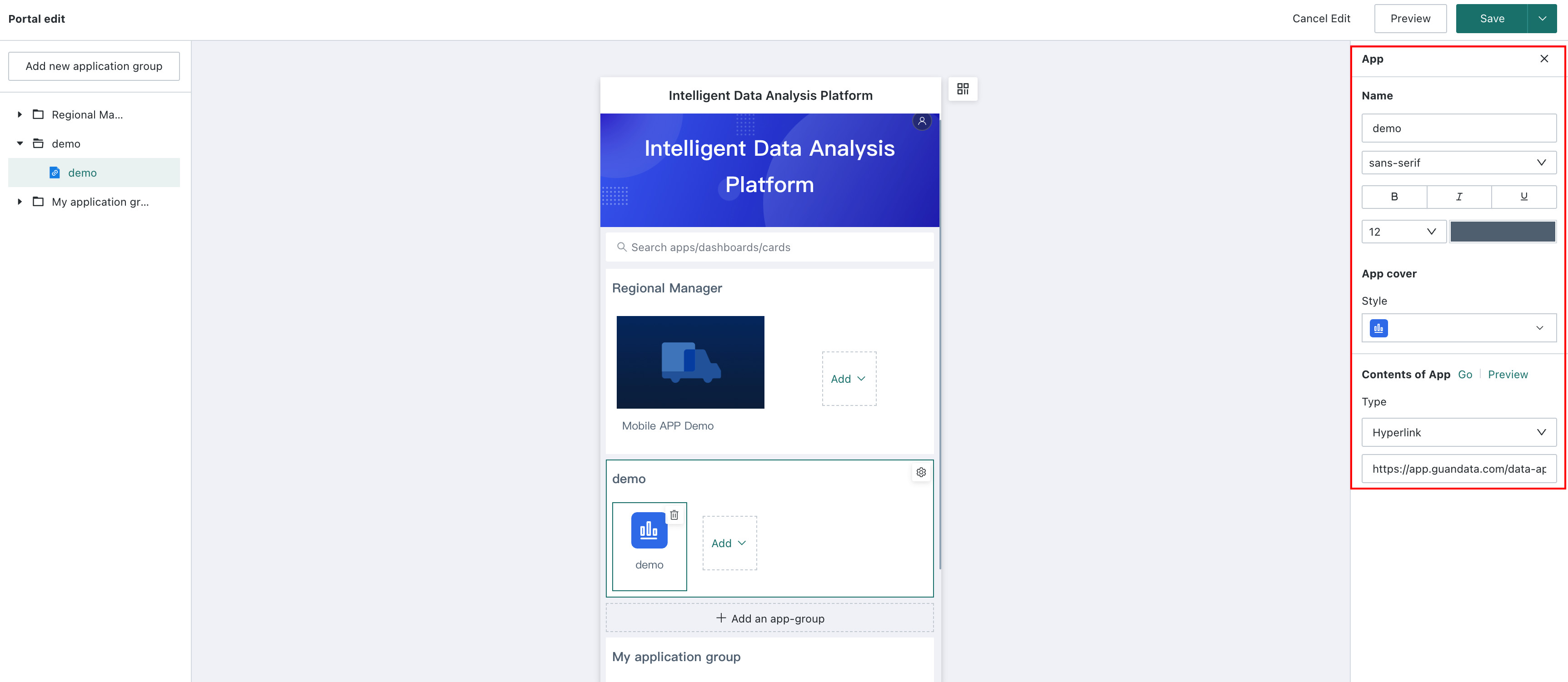
Users can configure the app name, app cover, layout, app content, and more. Click the app to modify. The app menu bar appears on the right and supports multiple settings:
- Name: By default, this is the name of the added app and can be modified. When the app group style is card style, the app name can be shown or hidden. When the app group style is icon style, the app name is shown by default.
- App cover: Available types are affected by the app group style. When the app group switches styles, the covers of apps in the group automatically switch to the first system preset pattern under the new style. In addition, when the app group style is card style, custom cover image upload is supported
- Layout: When the app group style is card style, you can set the app icon width to a 1/2 or 2/2 layout.
- App content: Select either
Lightweight ApporExternal Linkas the app type, and add the lightweight app or external link URL. After configuration, clickGo Toto view the details page, or clickPreviewto view the mobile page.
App Sorting
In the directory tree on the left, you can drag to adjust the display order or group assignment of all apps in the portal.
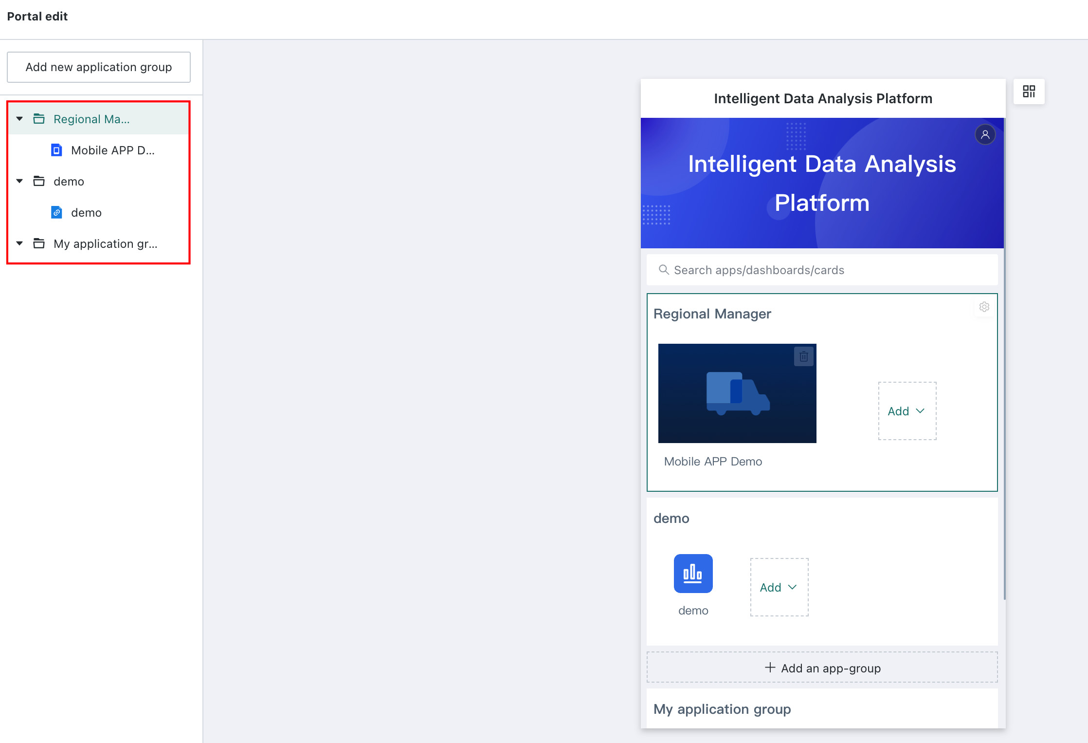
Locate Apps and App Groups
In the directory tree on the left, click an app group to quickly locate the corresponding app group and configure it on the right. Click an app in an app group to quickly locate the corresponding app and configure it on the right.
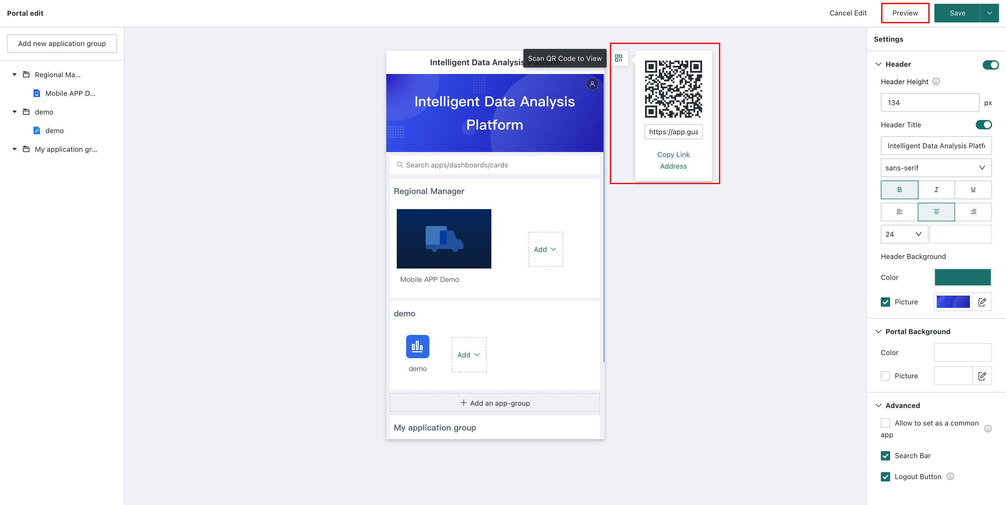
Mobile Portal Preview
After configuration is complete, click Preview in the upper-right corner of the portal to view the effect directly on the PC. You can also copy the link and QR code to view the effect on a mobile phone.
For end users browsing the portal, the apps visible in the portal are apps for which the user has visitor permission. For example, if an administrator adds 10 apps to the portal and user Zhang has visitor permission for only 5 lightweight apps, Zhang can see only those 5 apps when opening the mobile portal page.
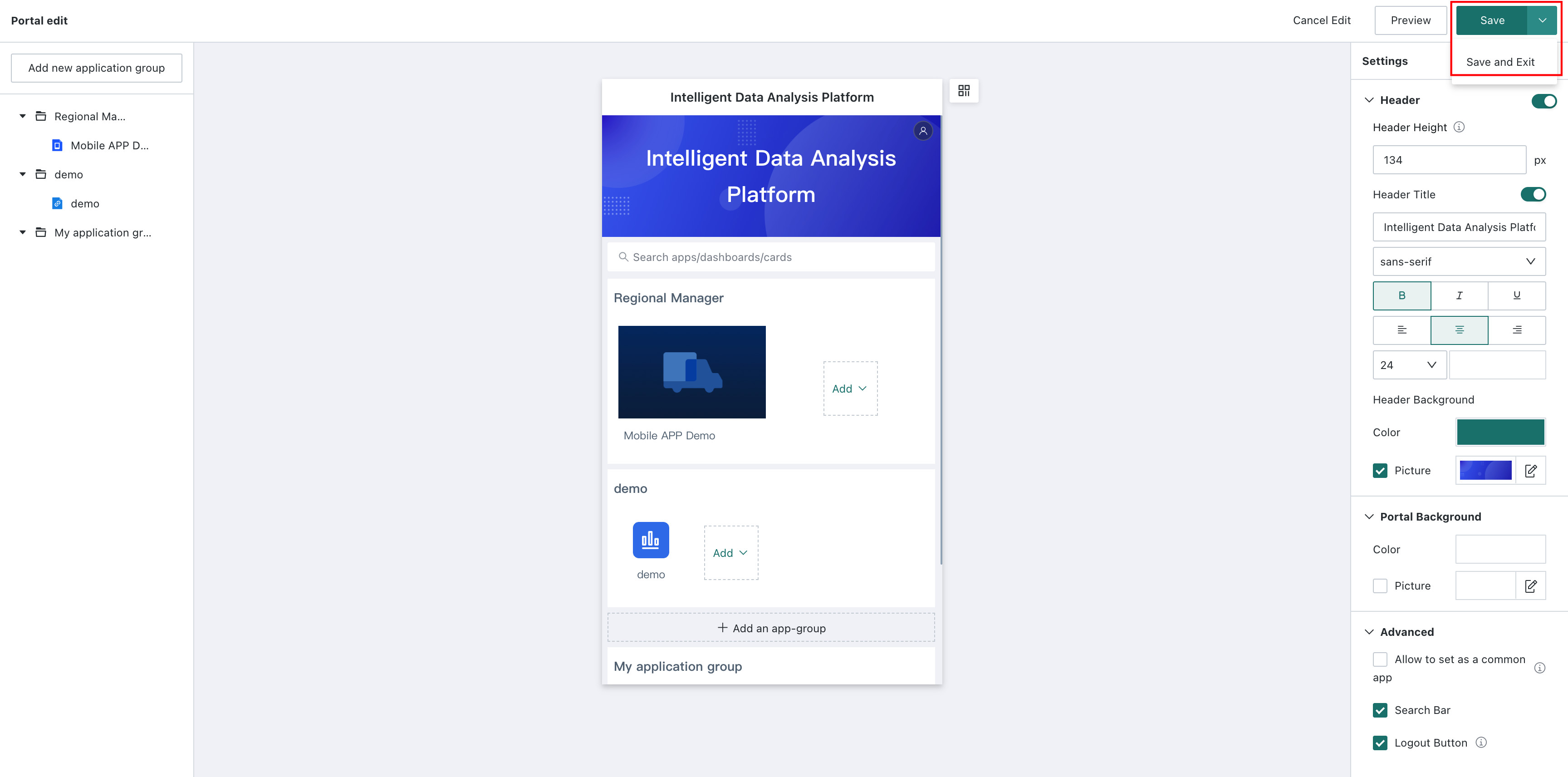
Click Save in the upper-right corner of the page to save the current mobile portal. You can also click Save and Exit in the drop-down list to save the mobile portal and exit the editing page directly.
Consumption and Usage
Resource Search
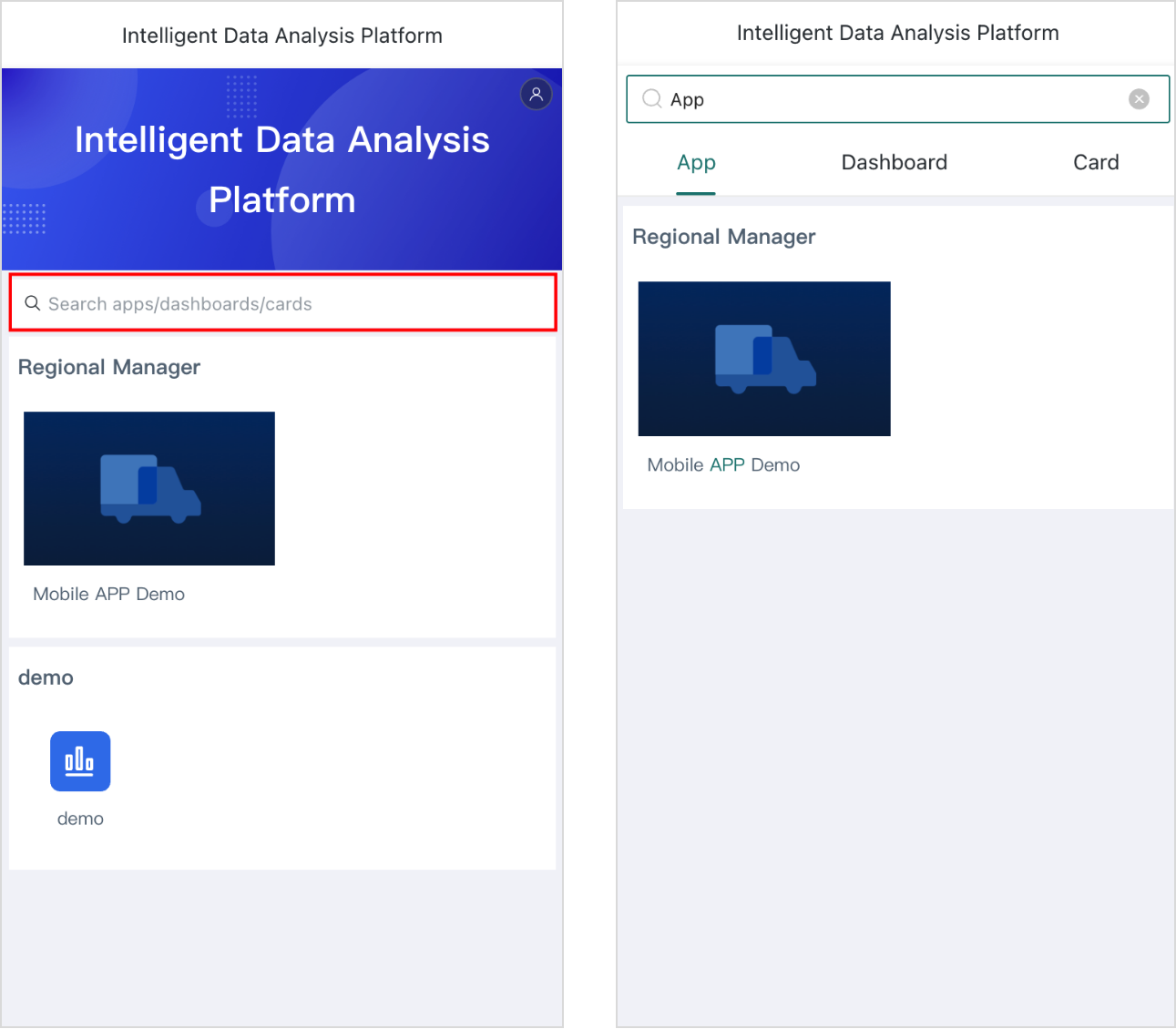
Guandata BI supports searching for apps, dashboards, and cards in the mobile portal.
Enter the mobile portal and type a search term in the mobile portal search bar to find corresponding resources. Search results are displayed in the order of portal apps.
- When the search type is card, filtering by
Visualization Typeis also supported. - If the same page appears in multiple apps, multiple records for that page are displayed.
- When searching for a specific card, opening the search result takes you to the dashboard page where the card is located.
This feature can be used only after an administrator enables Search Bar in Portal Settings.
Set Favorites
To use this feature, an editor must enable Allow Favorites in Portal Settings on the portal editing page. After it is enabled, the Favorites app group appears on the user-side portal page, and users can set favorite apps on mobile.
User workflow:
-
Click
Configure Appsin the Favorites group. Operation buttons appear in the upper-right corner of each app. -
Click
+or-to add an app to or remove an app fromFavorites.NoteA lightweight app that has already been added cannot be added again.