Create a Mobile App
Overview
Feature Description
With the rise of mobile office scenarios, Guandata extends intelligent analysis to mobile devices and enables users to quickly create mobile apps through no-code drag-and-drop operations. Enterprise members can monitor data anytime, anywhere on mobile devices, stay informed about first-hand business dynamics, and gain strong support for quickly locating and resolving problems.
Note: This product module is a value-added module. To try it, contact your Guandata sales representative or customer success manager, usually the current service contact for your company.
Use Cases
-
No-code development and convenient self-service
Drag-and-drop operations do not consume development resources. Business analysts can build what they need with ease. App-like navigation lowers the usage barrier.
-
Smooth and comfortable viewing experience
Users can move freely between analysis topics and find analysis pages efficiently.
-
Mobile portal
Manage multiple analysis scenarios and multiple mobile lightweight apps from one entry. The portal is visually organized and supports multiple style options.
-
Stay informed about business performance anytime
It can be embedded into DingTalk, WeCom, and existing enterprise mobile apps, allowing users to view business data, employee data, product inventory data, and more from their phones anytime, anywhere.
-
Monitor abnormal data in time
By setting alert rules and ranges, the system can push reminder messages or emails to the corresponding people when alert values are reached, enabling precise notifications for different users. Even when users are not on site, they can stay informed about changes, trace problems, and take action.
Prerequisites
Before building a mobile lightweight app, complete dashboard creation. Create dashboard pages through data analysis to provide the foundation for building the lightweight app.
Usage Guide
Create a Mobile App
-
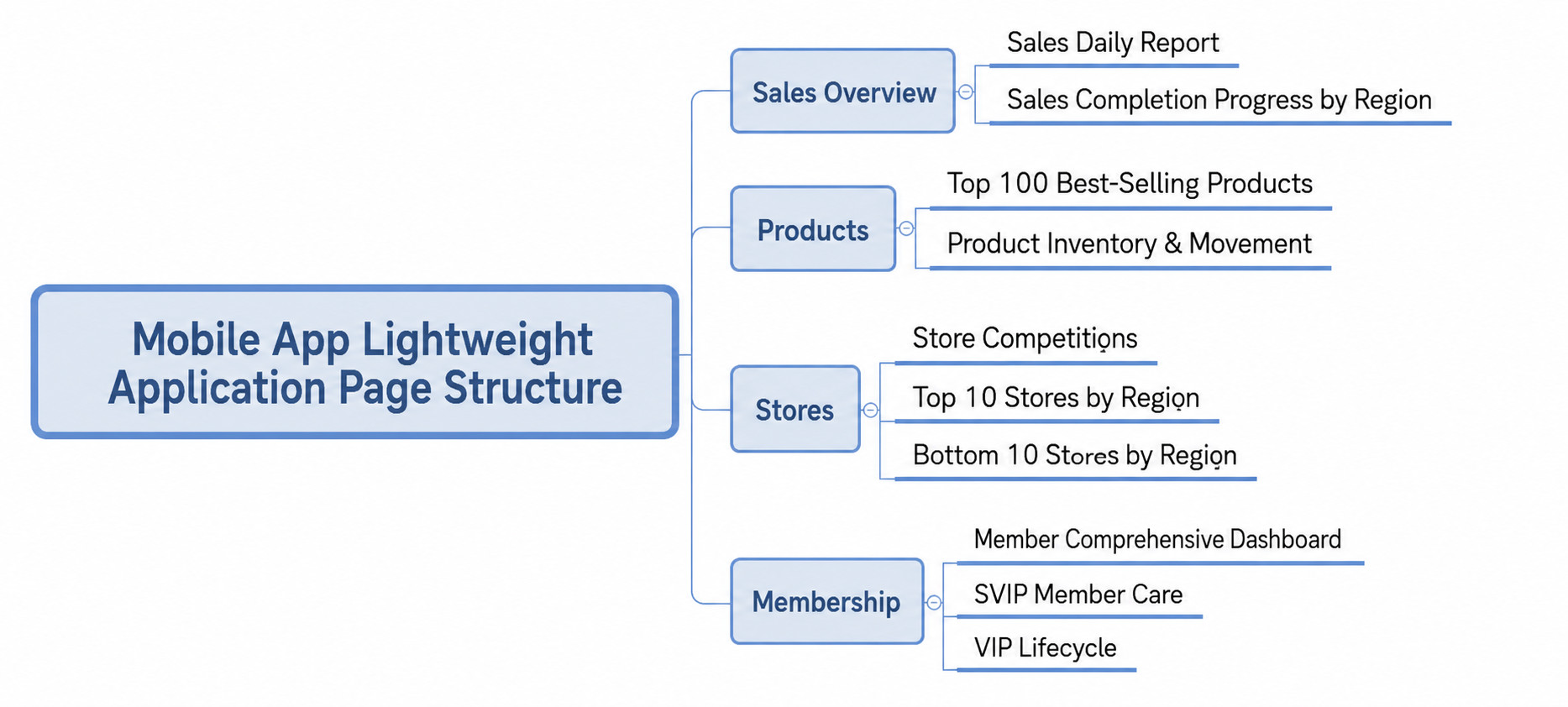
A lightweight app can contain multiple pages. For a lightweight app targeting a specific analysis scenario, the pages should be organically connected rather than simply stacked. Therefore, before creating a lightweight app, organize the structure of these pages, for example as follows.
-
After organizing the page structure, go to
Data Apps > Mobile > Apps, select the target directory in the directory tree, and clickCreate Mobile Appto create a lightweight app.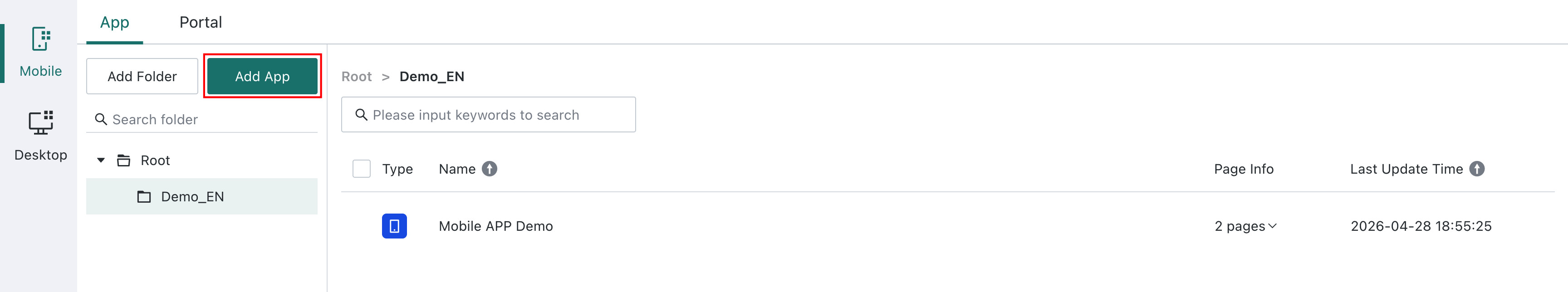
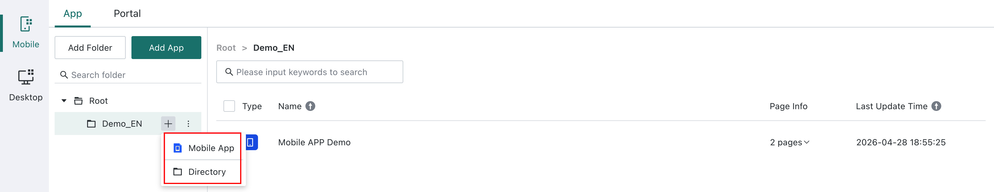
You can also quickly add a lightweight app from the target directory tree.
-
Build the app on the page.
According to the page structure organized above, this lightweight app has two levels. Therefore, in the mobile lightweight app, you can build it with one bottom navigation and one top navigation. For navigation node configuration, see the following sections.
The current lightweight app structure supports two viewing modes:
Directory TreeandOutline. In directory tree mode, relationships between multi-level pages are clearer. In outline mode, browsing multiple pages at the same level is more convenient. Users can choose the suitable viewing mode based on the actual lightweight app structure.Note- If the page structure has only one level, you can use only bottom navigation or only top navigation.
- It is not recommended to exceed three page levels in one app. Too many levels can make page content harder to understand and affect the interactive experience.
-
After the lightweight app is basically built, click
Previewin the upper-right corner of the page to view the completed lightweight app on your computer.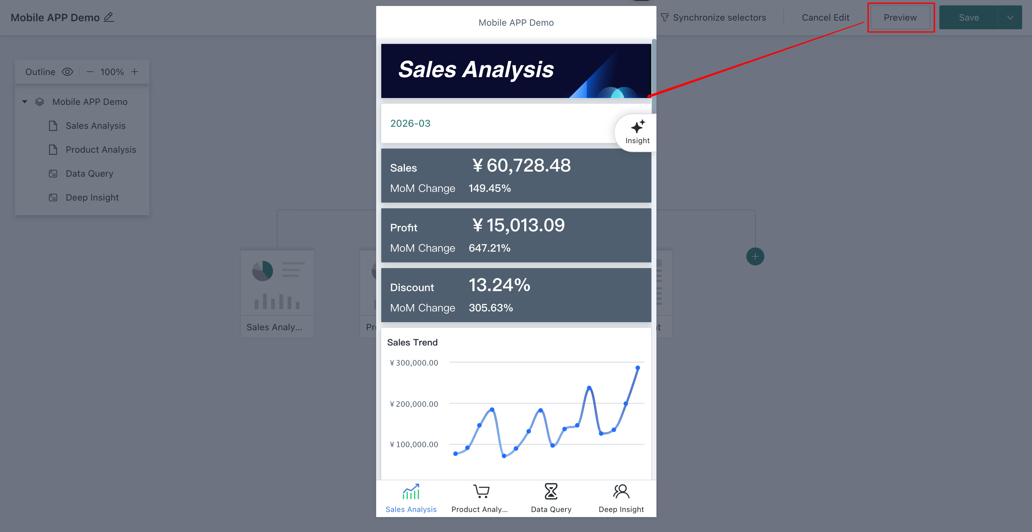
-
After creating and configuring the mobile app, click
Savein the upper-right corner to save the current mobile app. You can also clickSave and Exitin the drop-down list to save the mobile app and exit the editing page directly.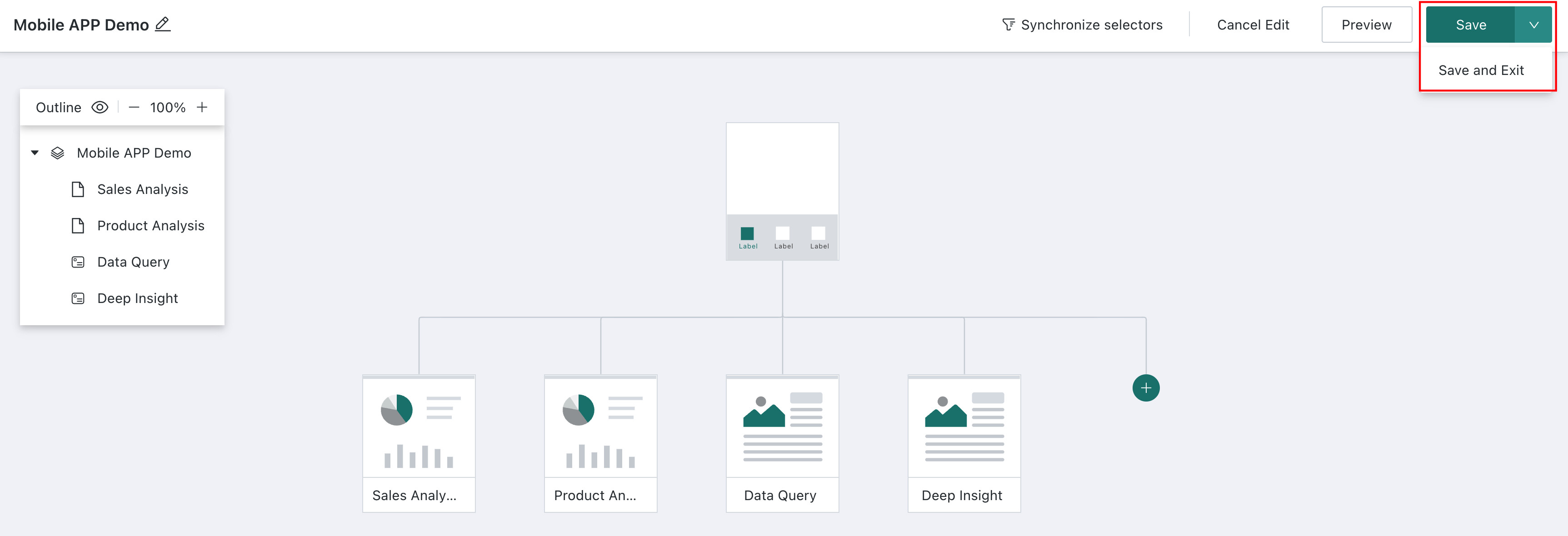
Add Nodes and Configure Properties
Navigation Node
-
Click
Add Navigation Nodeto create navigation.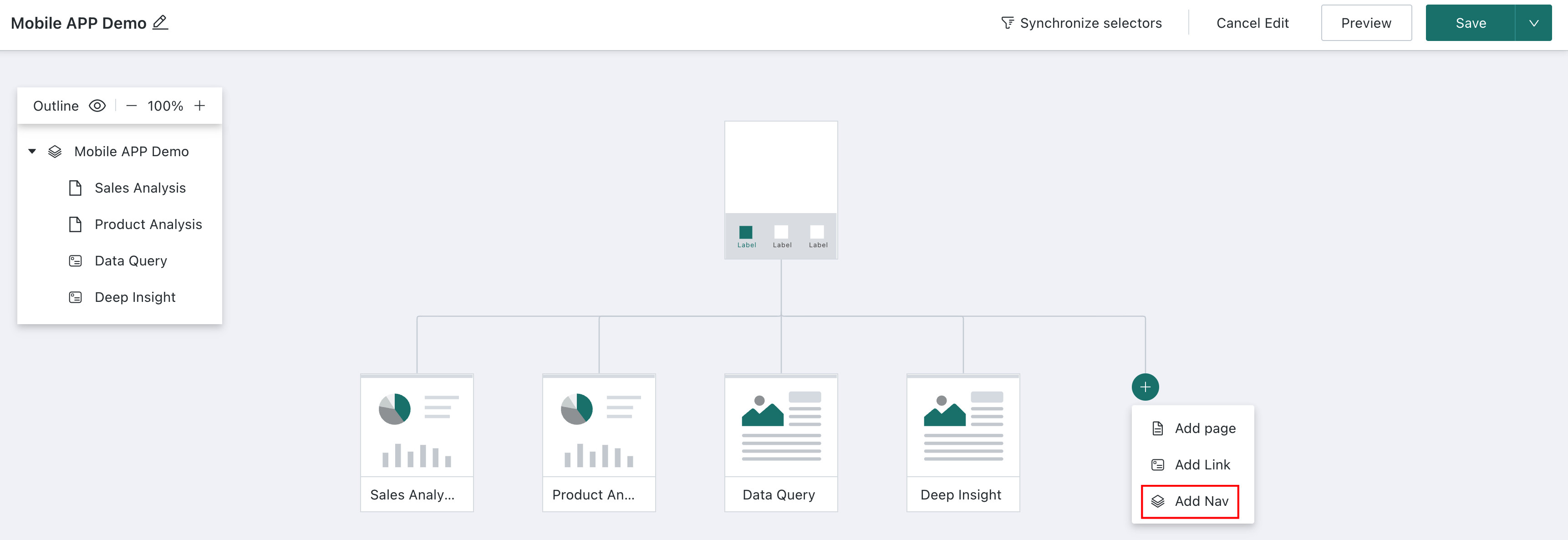
-
Hover over any navigation node except the top navigation node, and click the
Renameicon to modify the node name.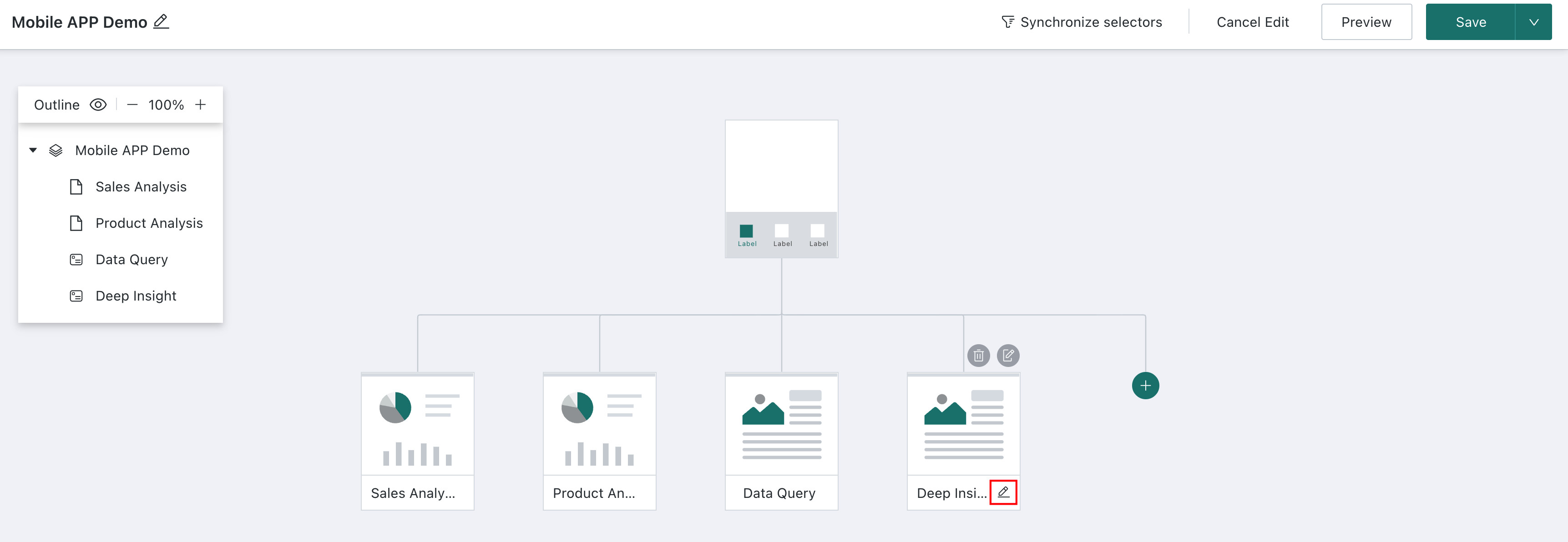
-
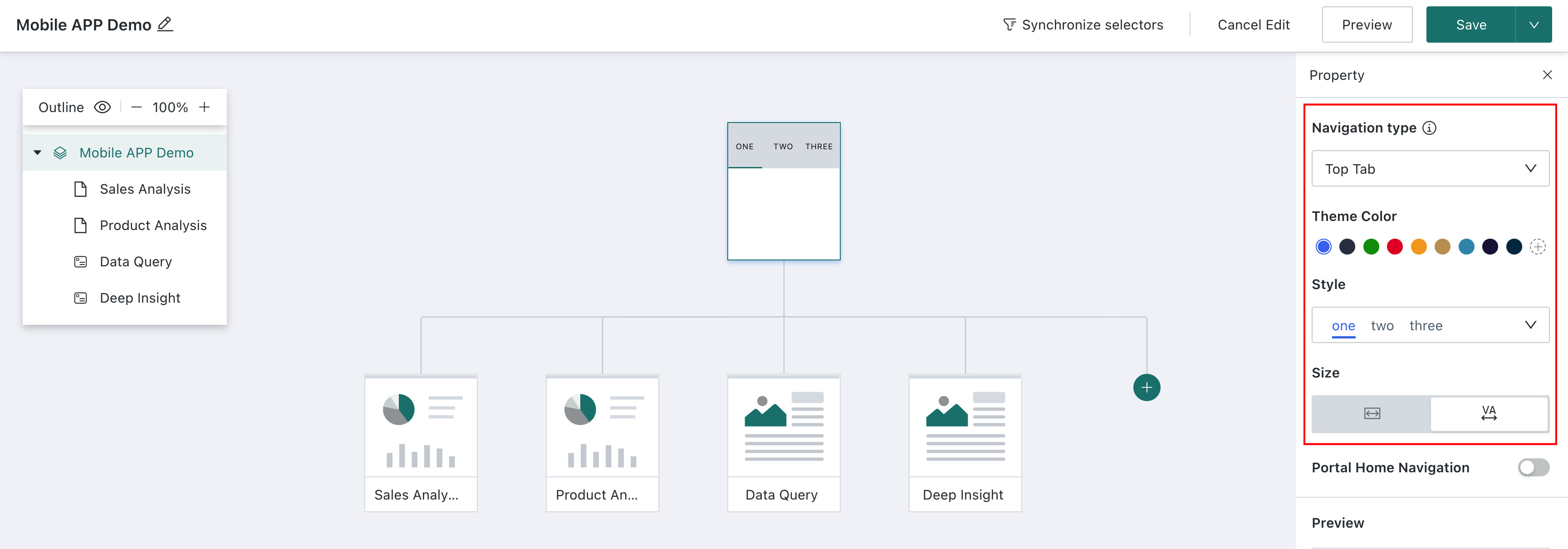
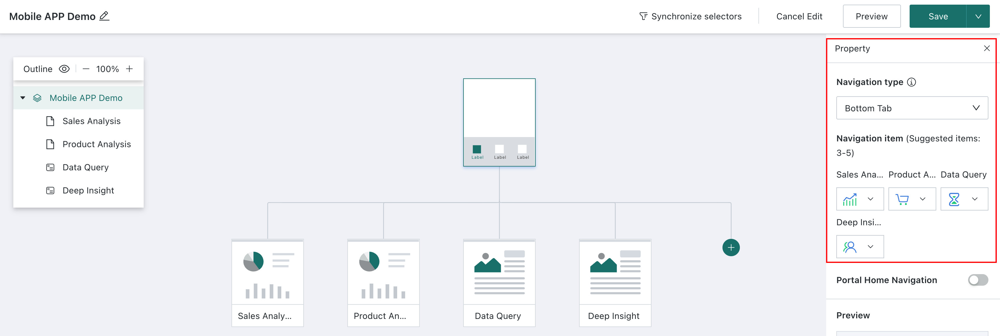
Click any navigation node on the canvas, or click the node in the outline directory. The navigation node property configuration window appears on the right side of the page, where you can set the navigation type, style, portal homepage navigation, and other properties for the navigation node. In the
Previewarea at the bottom of the configuration window, users can preview the display effect of the navigation node in real time.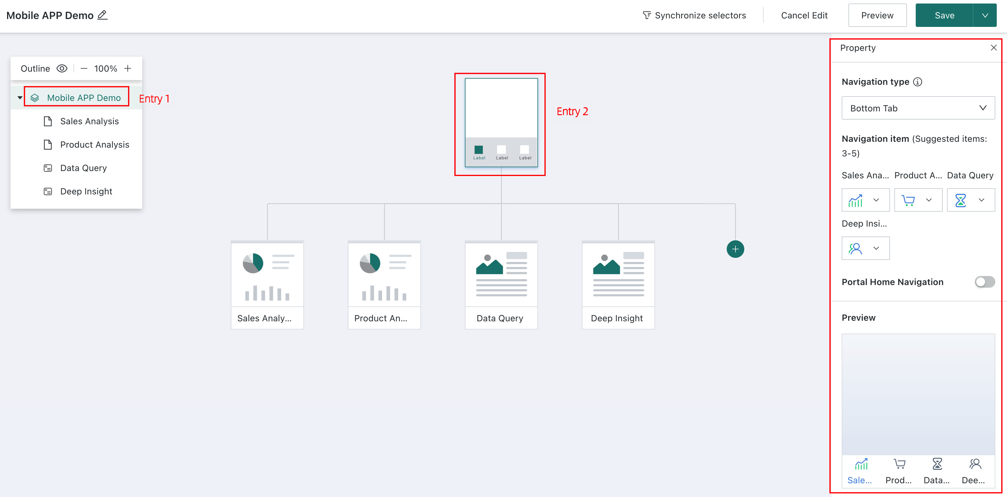
-
Different navigation types have different property configuration items. The following describes two navigation types:
Note- To ensure the best display effect, when the first-level navigation uses
Top Tabs, the second-level navigation style can only beTop Tabs. - If the second-level navigation needs to switch styles, select
Bottom Menufor the first-level navigation.
- Top style: You can set the theme color, tab style, and option size. First-level navigation can also be configured to show or hide
Portal Homepage Navigation.
- Bottom style: First-level navigation can set specific navigation item icons and configure whether to show
Portal Homepage Navigation.
- To ensure the best display effect, when the first-level navigation uses
-
Enable
Portal Homepage Navigationto add a path button on the first-level navigation page for returning to the portal homepage. Click the button to jump directly from the current page to the mobile portal homepage.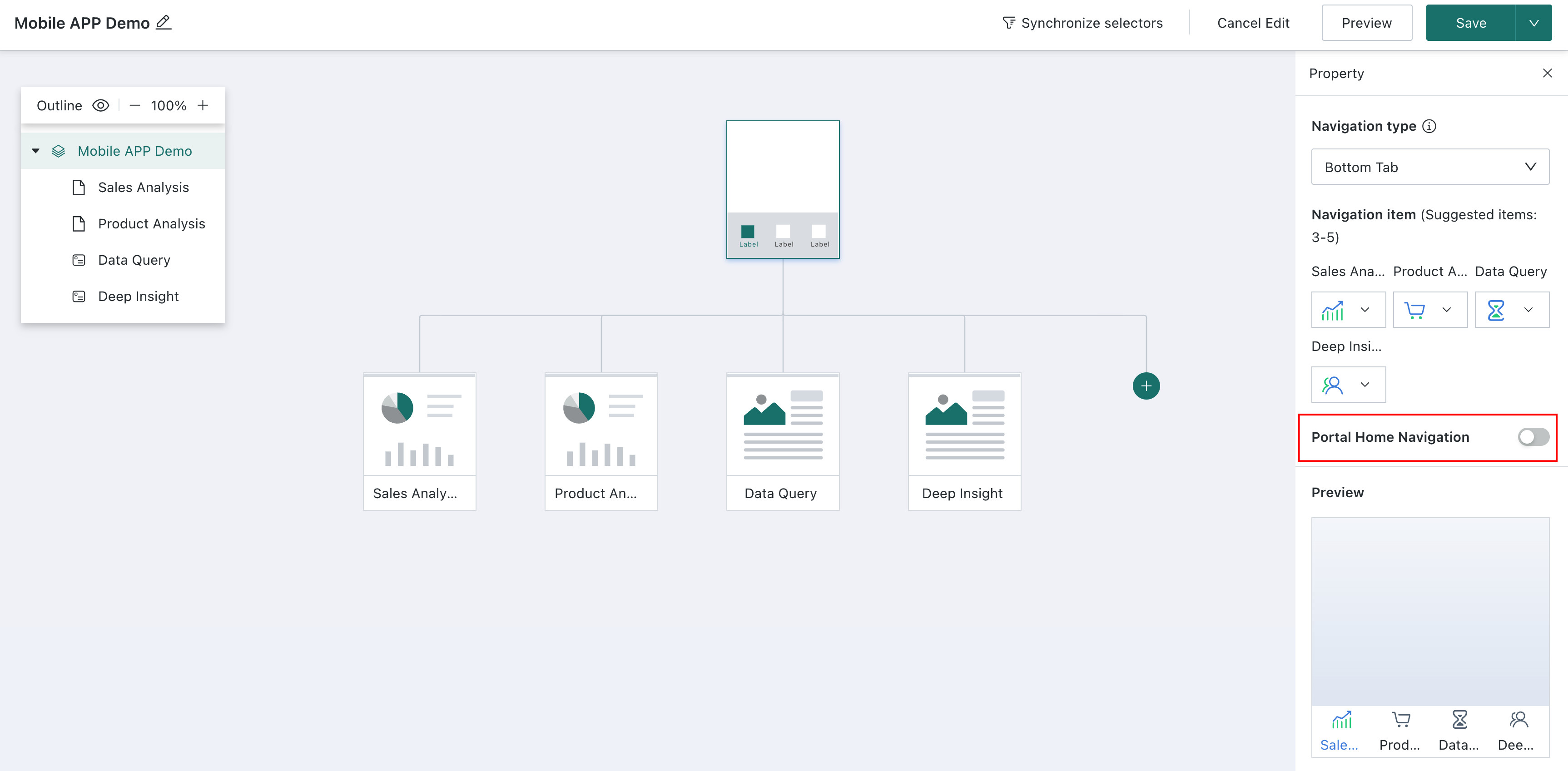
Page Node
-
Click
Add Page Nodeto fill each navigation with second-level page content.
To ensure the best display effect, the following limits are recommended for navigation styles and levels:
- When the first-level navigation style is top, the second-level navigation style only supports top. When the first-level navigation style is bottom, the second-level navigation style can be either top or bottom.
- When the second-level navigation style is top, third-level navigation cannot be added. When the second-level navigation style is bottom, third-level navigation can be added.
NoteBy default, the navigation tab name is the added page name. If the page name is too long, you can modify and optimize the name on the corresponding node for a more concise and display-friendly result.
-
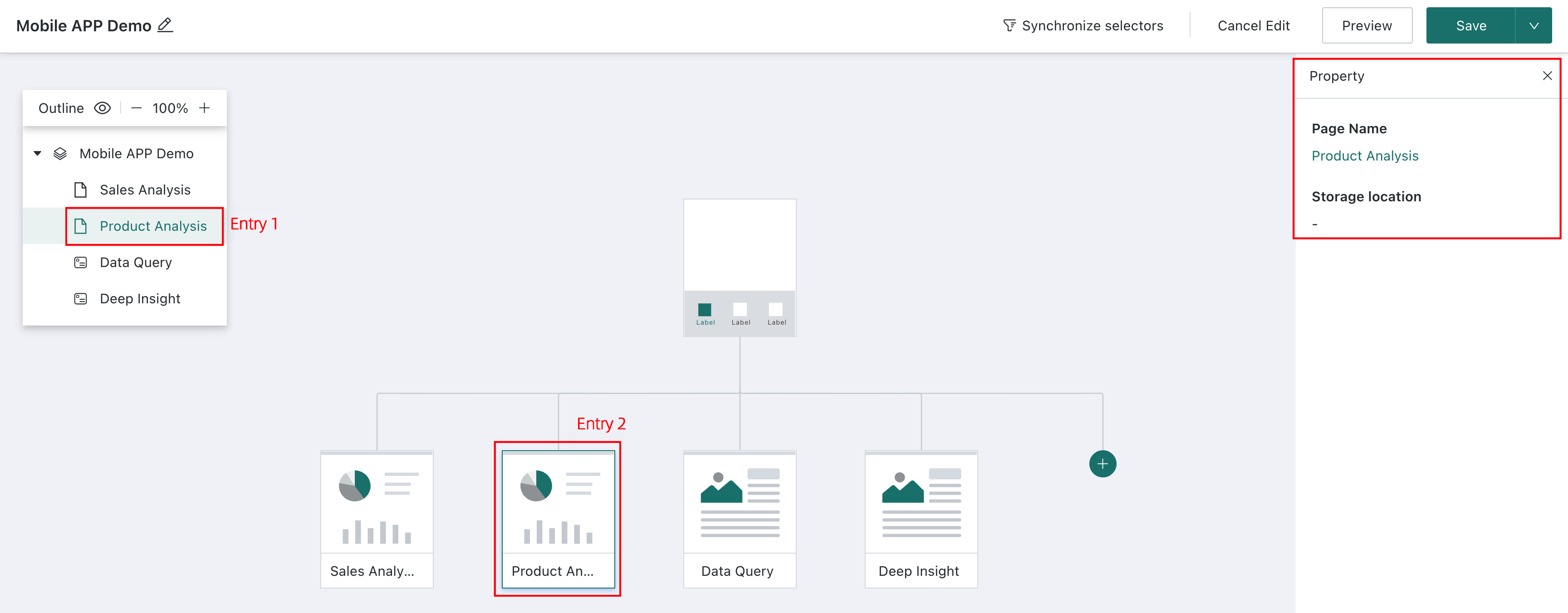
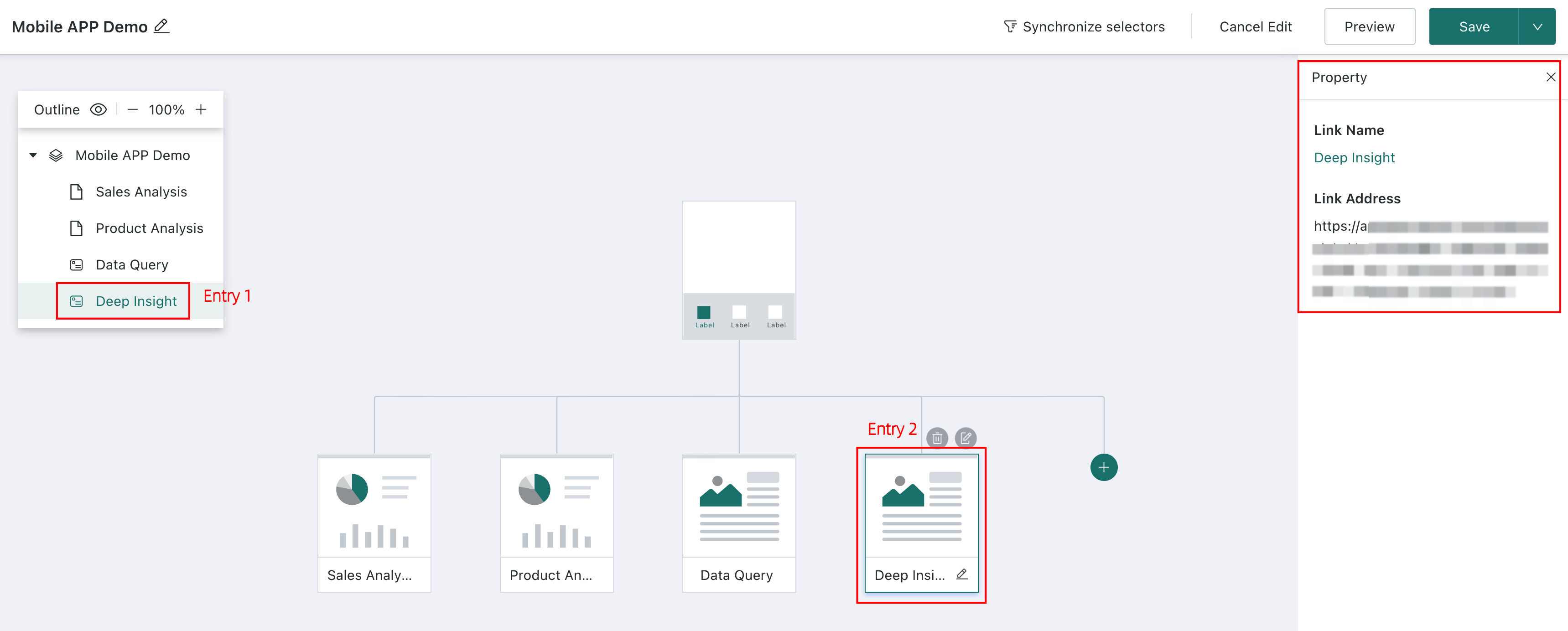
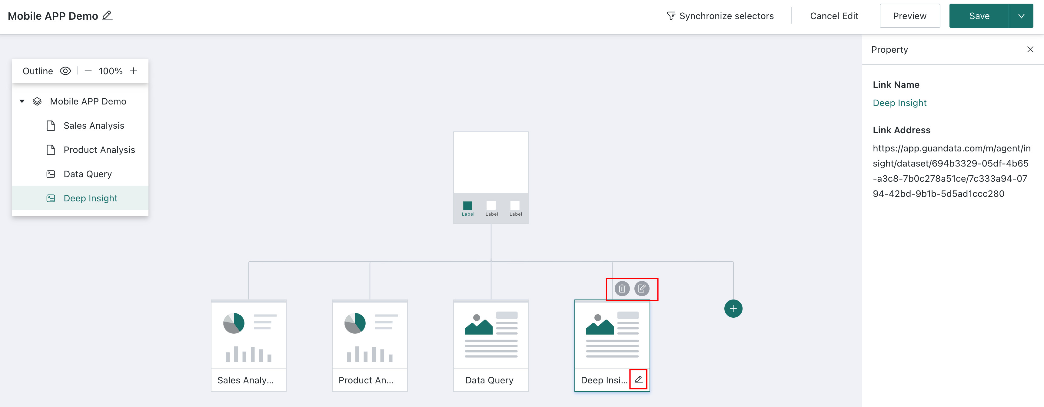
To view a page node's name and storage location, click the node on the canvas or in the outline directory. The information appears in the property window on the right side of the page. In the property window, you can also click the page node name to jump directly to the dashboard page for that node.
External Link Node
-
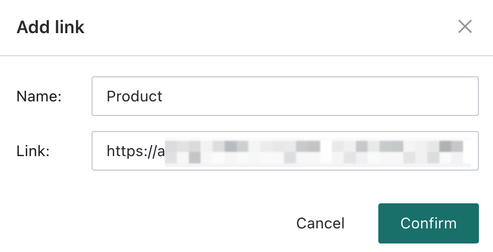
Click
Add External Link Node, enter the external link name and URL, and clickOK.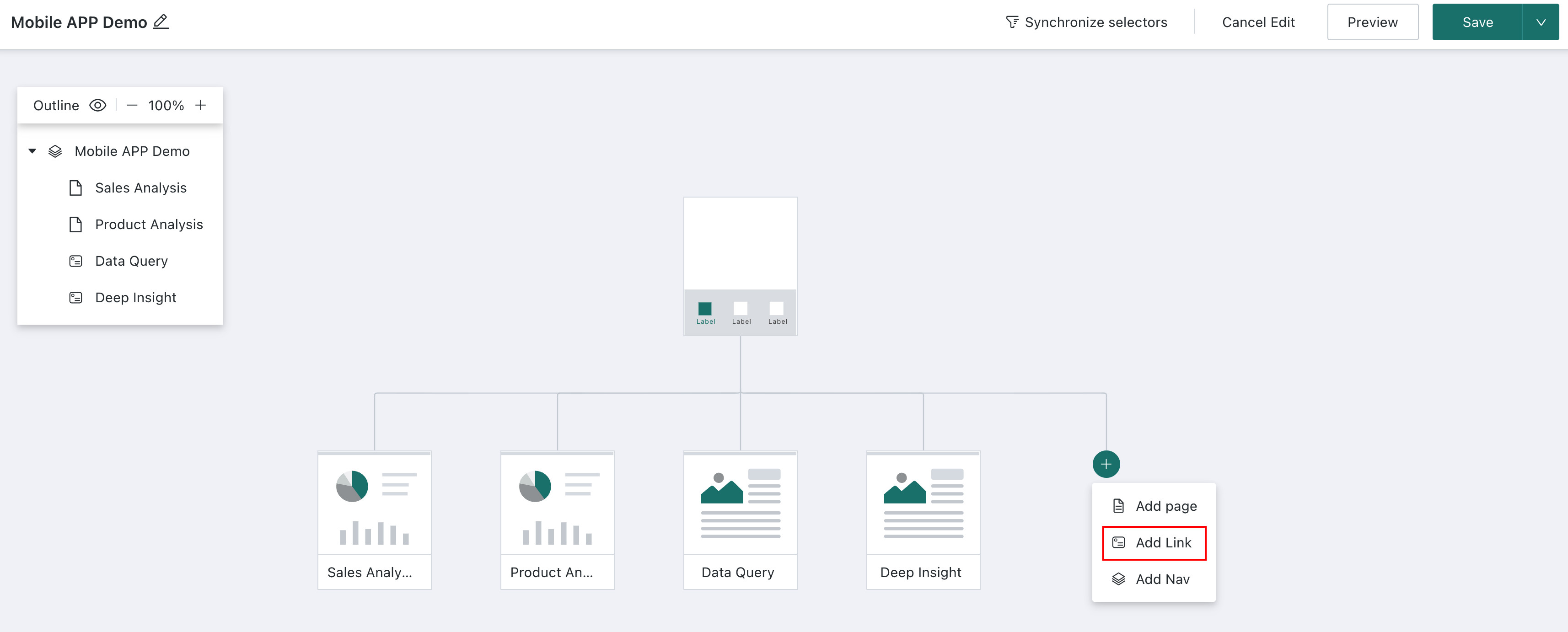
-
Click the node in the outline or canvas to view external link details in the property window on the right side of the page. You can also click the external link node name here to jump directly to the external link URL.
-
Move the mouse over the node to edit the node name and link, or delete the node.
Synchronized Filters
Synchronized filters keep filter conditions in related pages synchronized. When users switch between dashboards, each dashboard keeps the same data viewing dimensions and shares the filtered data results.
Create a Synchronized Filter
Click Synchronized Filter. The Synchronized Filter Configuration page appears on the right. Click Create.
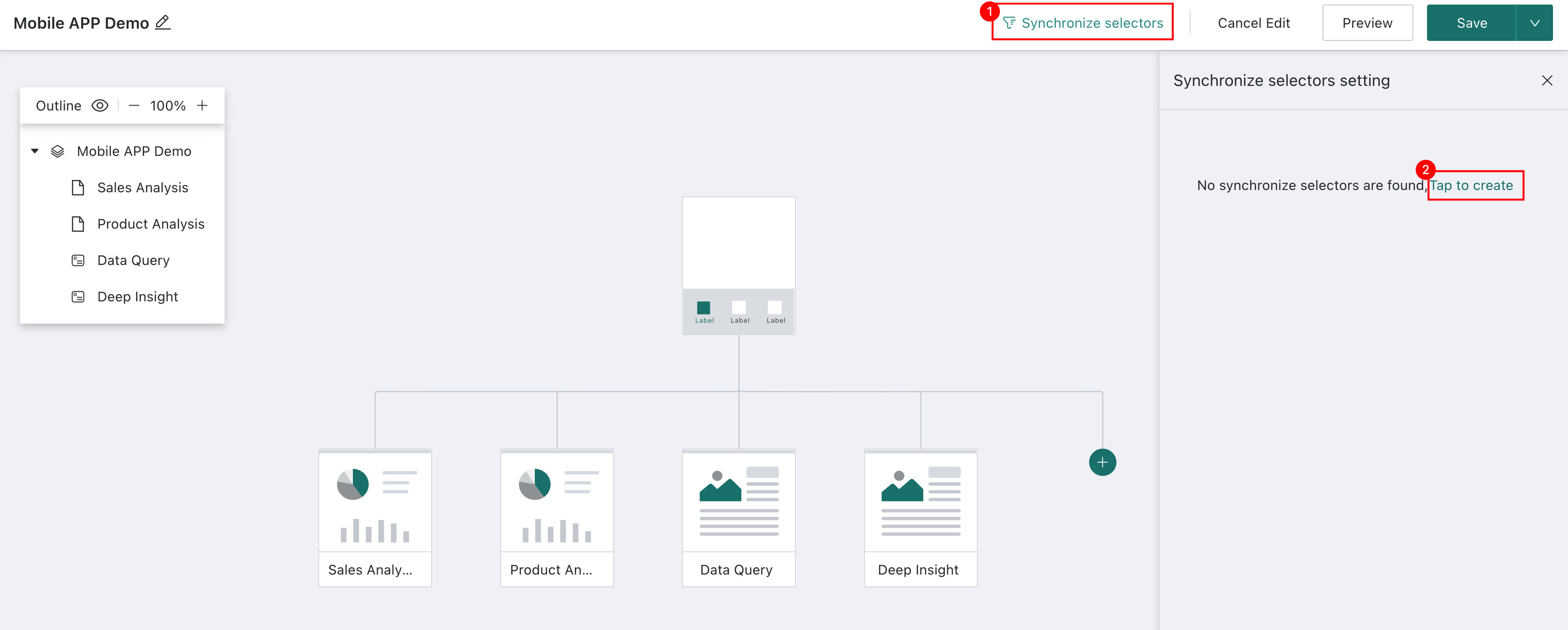
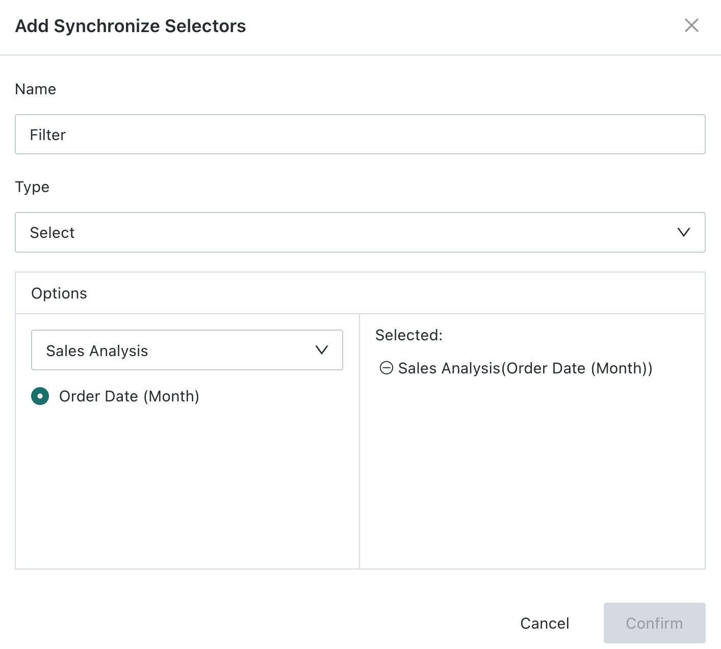
Enter the filter name, select the filter type, select the pages to synchronize, select filters of the same type, and click OK to save.
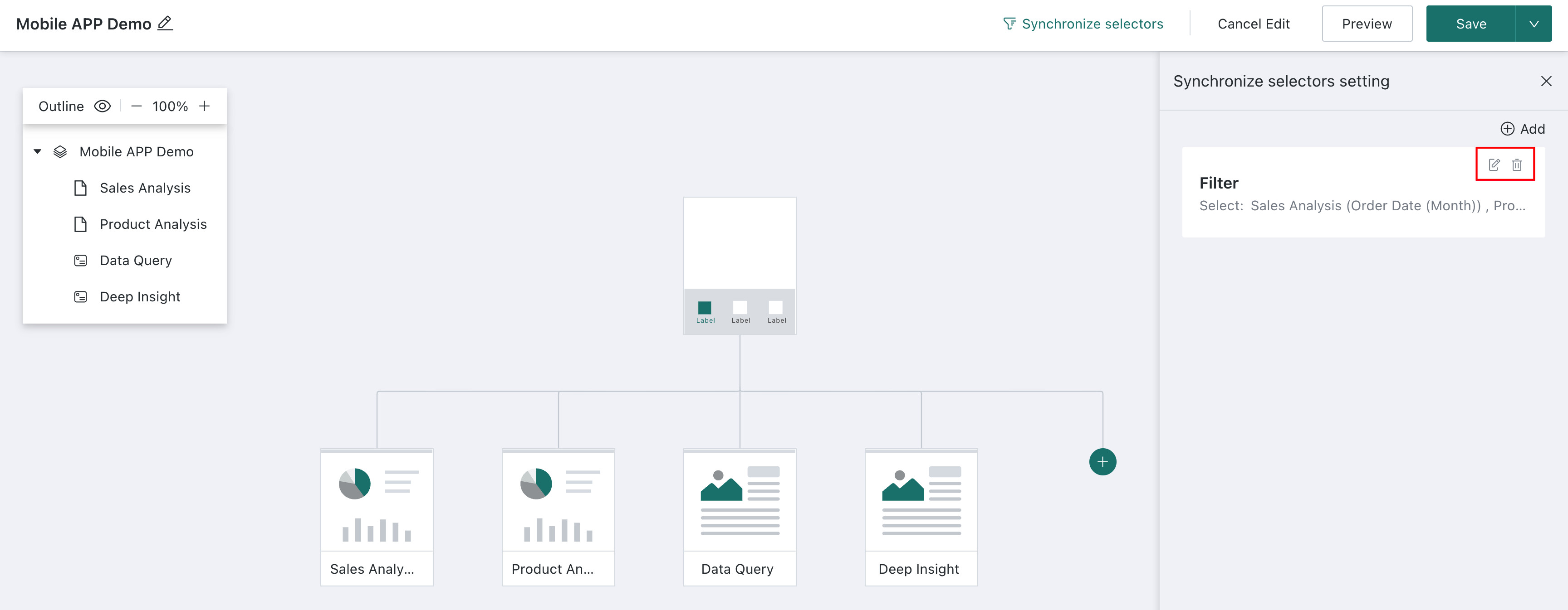
Manage Synchronized Filters
Click Modify or Delete in the upper-right corner of an existing filter to edit or delete that synchronized filter.
FAQs
- If you encounter problems while using mobile lightweight apps, see Mobile Lightweight App FAQ.
- For more help with mobile lightweight apps, visit the Guandata video tutorial website.