Create and Manage a Desktop Portal
Overview
Feature Introduction
Data Portal is a data app management feature provided by Guandata, including desktop and mobile portals. With Data Portal, you can classify and group data analysis apps by department, business topic, and other categories. It creates an intuitive data viewing experience for data consumers, especially enterprise managers, and helps managers quickly understand business performance. This article introduces the desktop portal. For mobile portals, see Create and Manage a Mobile Portal.
This product module is a value-added module. To try it, contact your Guandata sales representative or customer success manager, usually the current service contact for your company.
Use Cases
-
Build a unified enterprise data portal
Organically integrate data apps from different departments and business topics, configure a unified app style, make the portal homepage more structured, and improve the data viewing experience for enterprise members. You can also add links to other systems in the portal, using Guandata BI Data Portal as the unified enterprise portal entry.
-
Personalized experience for different users
Data app permissions are divided into owners and visitors. Permission settings enable a personalized portal experience, helping different users focus on data relevant to them and making internal enterprise management more orderly.
-
Build an operations management cockpit
When an enterprise has multiple business lines and many functional departments, it can organically integrate core metrics, numerous data apps, and multiple systems to build a management cockpit that covers the full business operation chain. Senior managers can then understand business status or performance levels across different organizational levels and departments more intuitively.
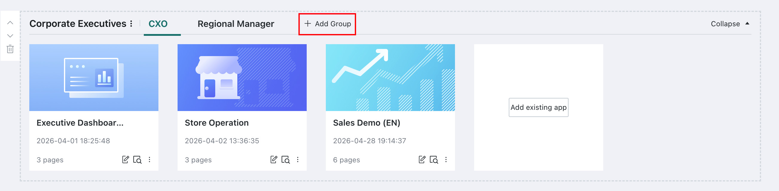
Feature Entry
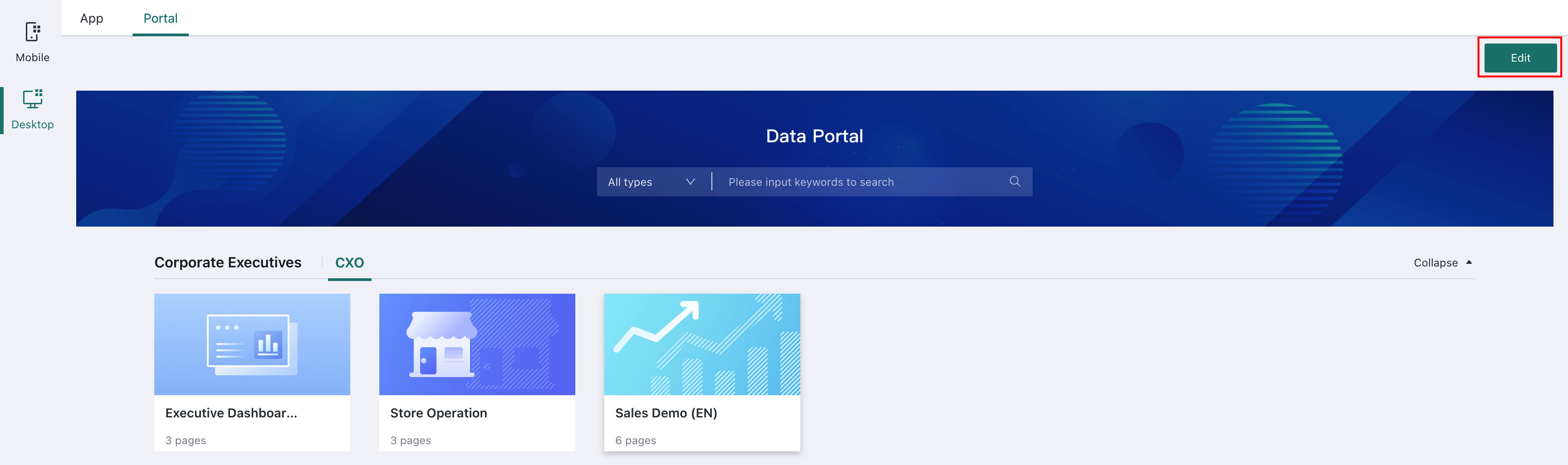
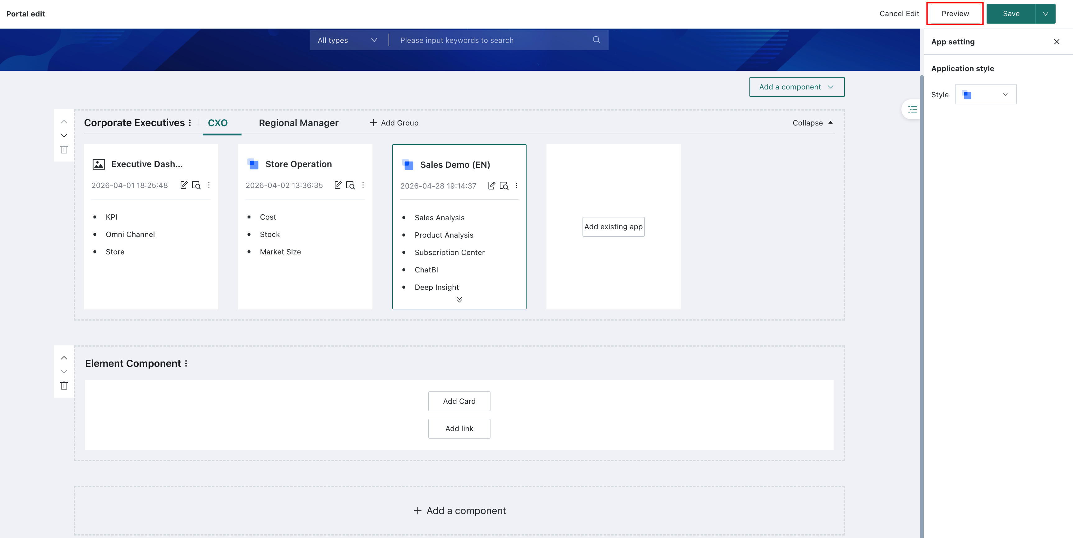
Go to Data Apps > Desktop > Portal and click Edit in the upper-right corner of the page to open the desktop portal editing page. Users can edit and manage the desktop portal on this page.
Portal Settings
After entering the portal editing page, move the mouse to the upper-right corner of the page header and click Portal Settings to configure the desktop portal style:
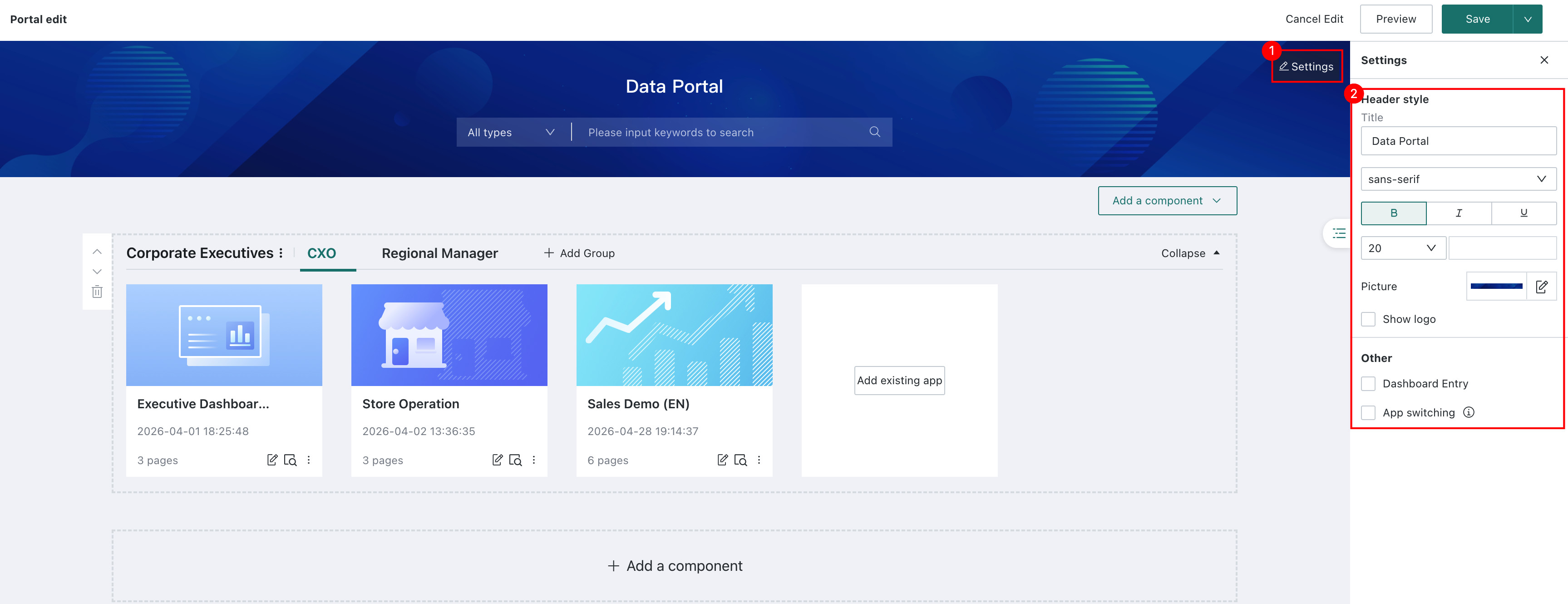
| Parameter | Description |
|---|---|
| Title | Customize the title and set its font, font size, color, and more. |
| Image | The portal header cover supports three setup methods: preset background, local upload, and gradient fill. You can upload an image with enterprise branding as the portal header cover. |
| Show logo | After selected, the logo is displayed on the left side of the portal header. Administrators can configure the related logo on Management Center > Resource Management > Enterprise Visual. |
| Hide Dashboard entry only for read-only users | After enabled, read-only users cannot see the Dashboard entry when viewing Data Portal. 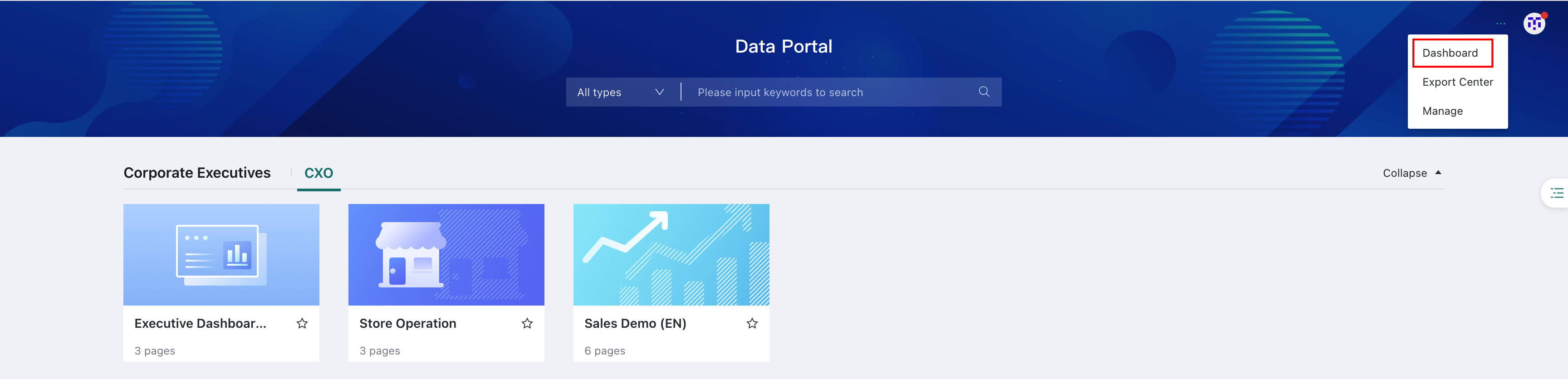 |
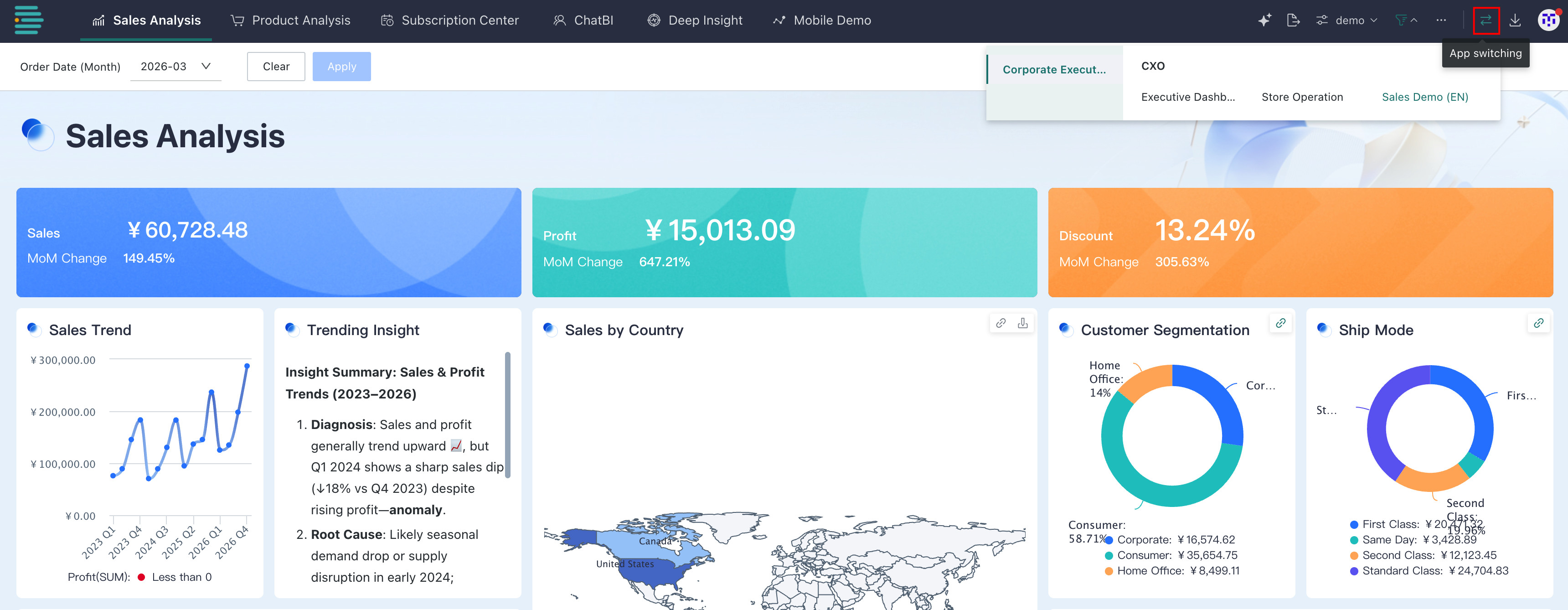
| Quick app switching | After enabled, a quick switch entry between apps is added to the app navigation bar. 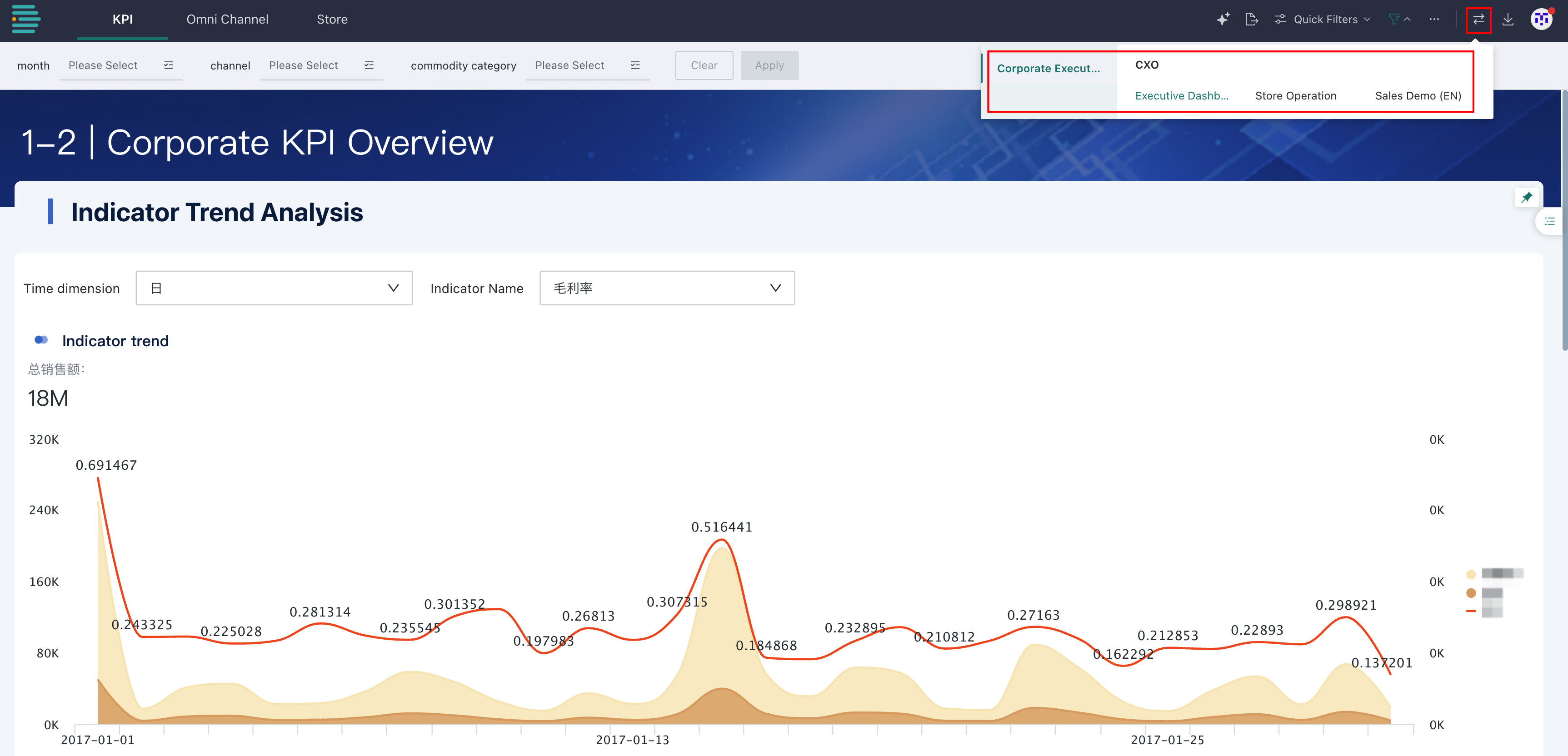 |
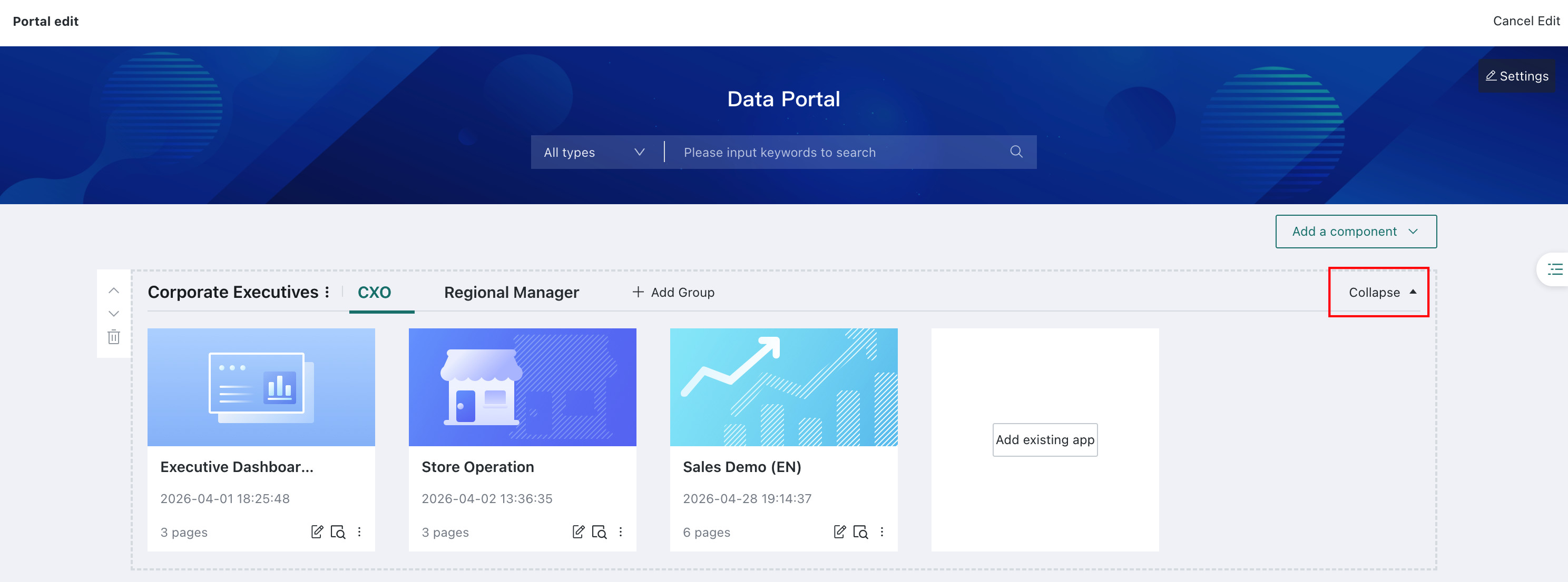
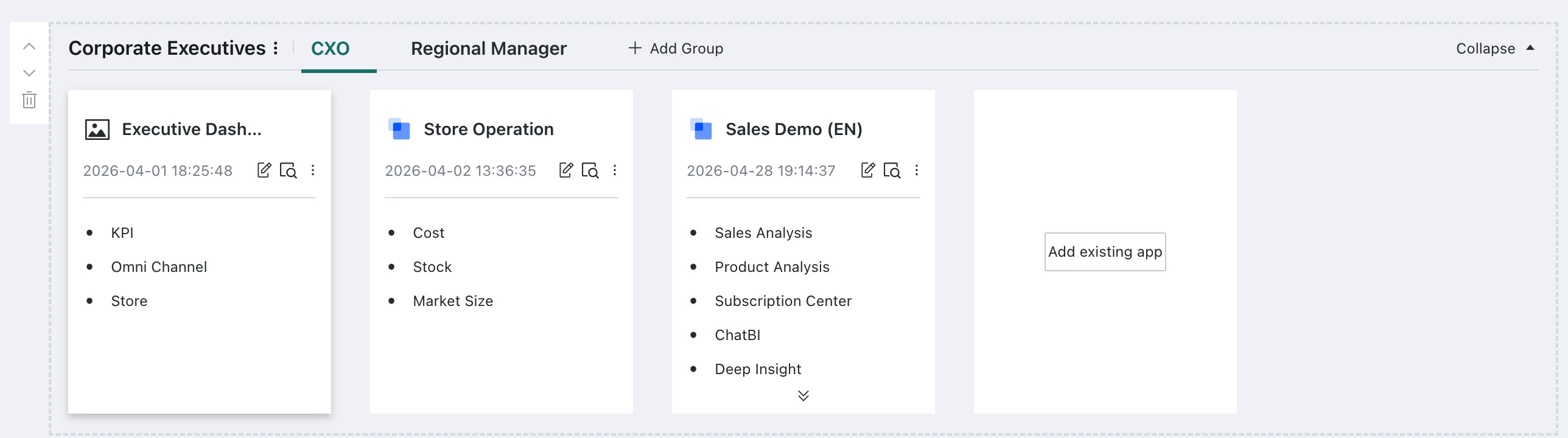
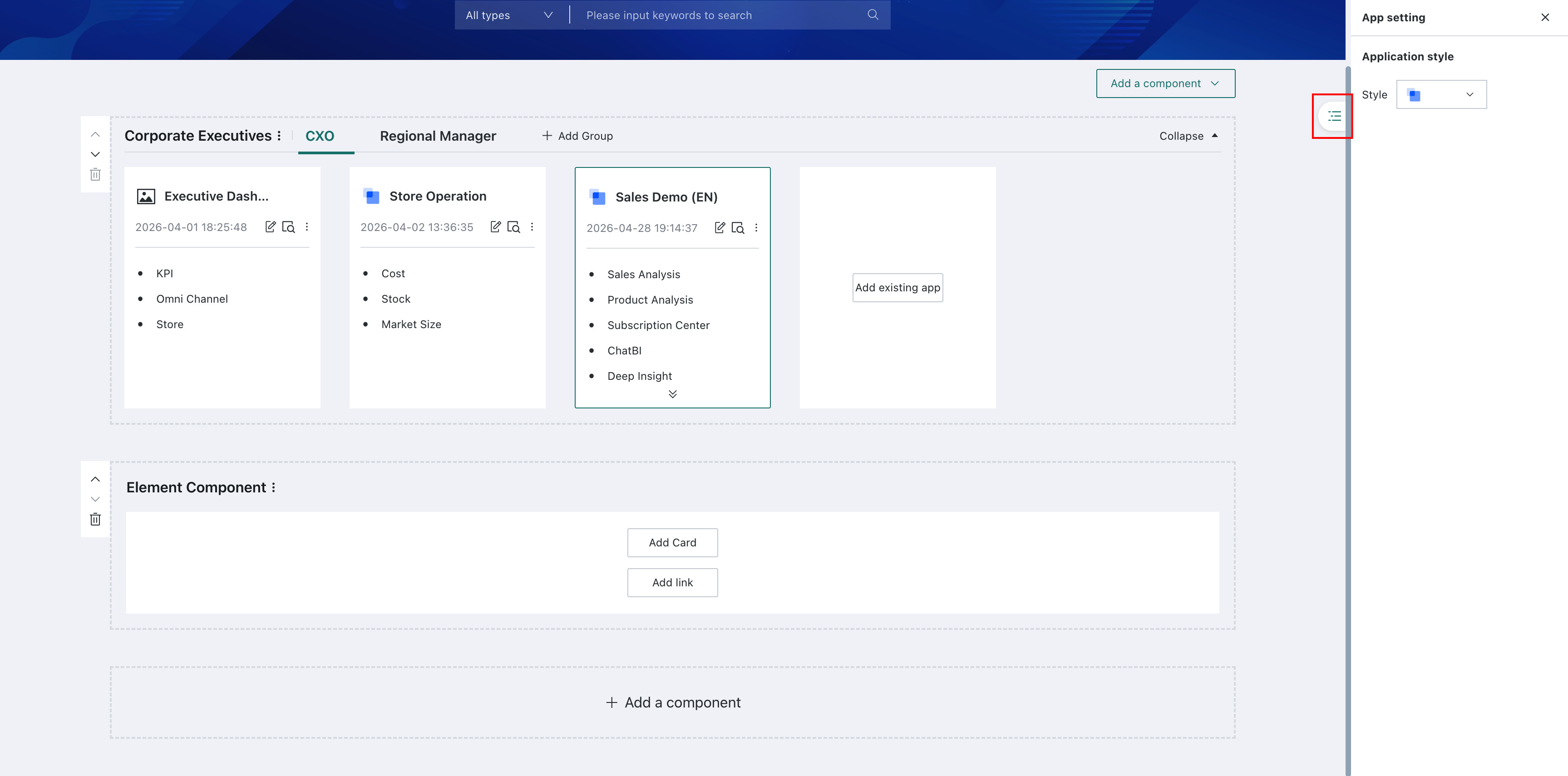
Add Apps and Groups
### Add an App ComponentEntry 1: On the desktop portal editing page, click Add Component and select App Component from the drop-down list. By default, it is added to the bottom of the portal.
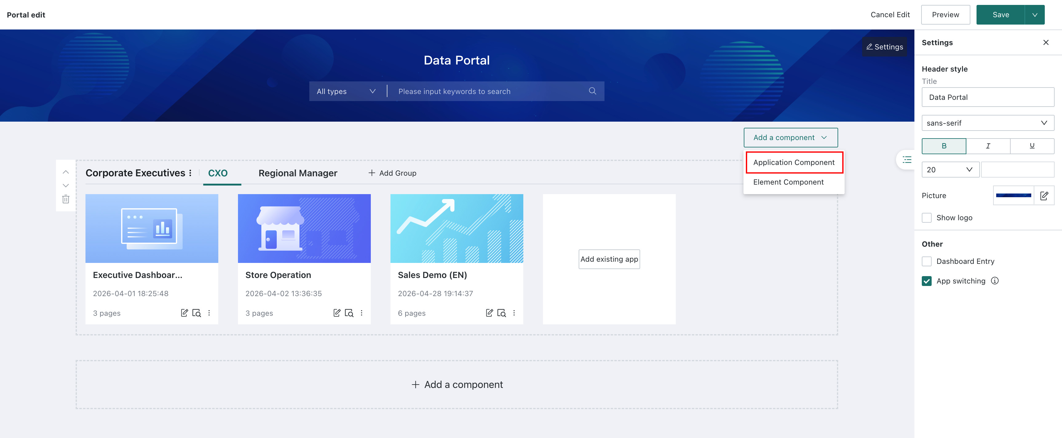
Entry 2: At the bottom of the desktop portal editing page, click + Add Component, then select App Component to add an app component.
Related configuration
-
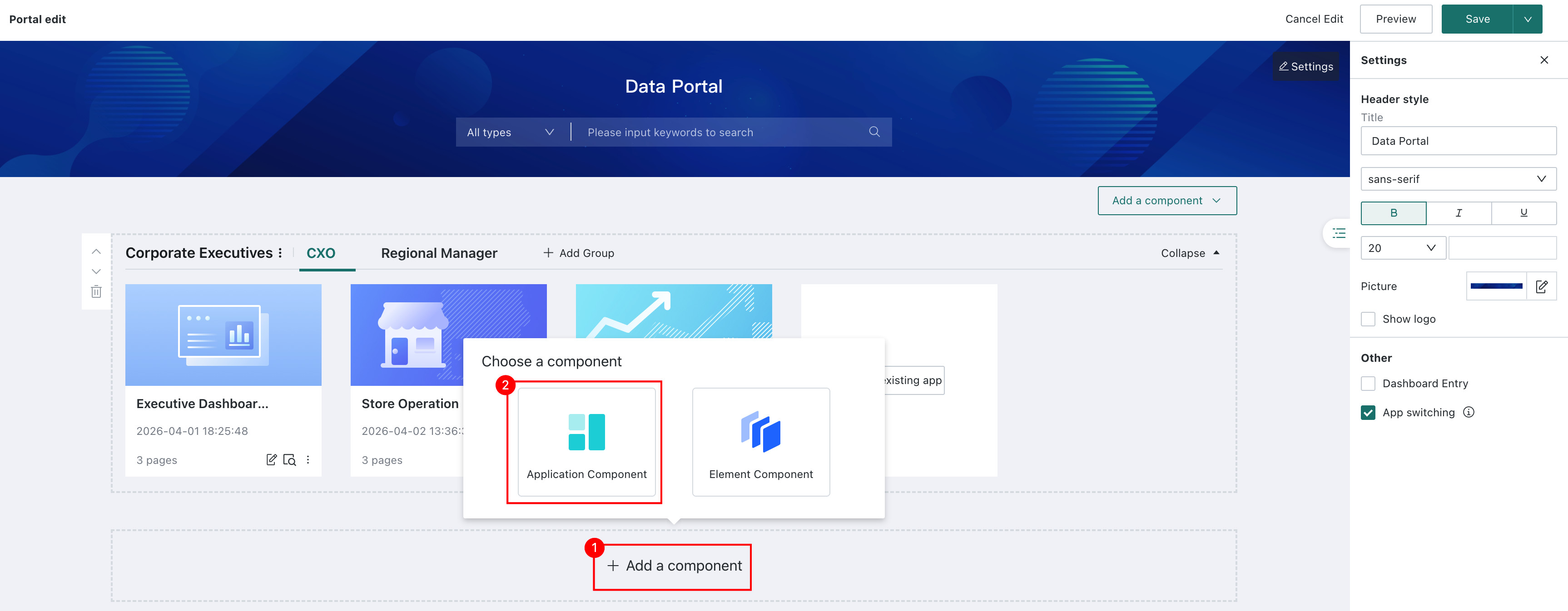
Adjust the app component name and order: You can edit the component name, move the component up or down, and delete the component.
-
Collapse app components: If there are multiple app components, you can collapse some components to make it easier to arrange the overall portal.
NoteElement components cannot be collapsed.
-
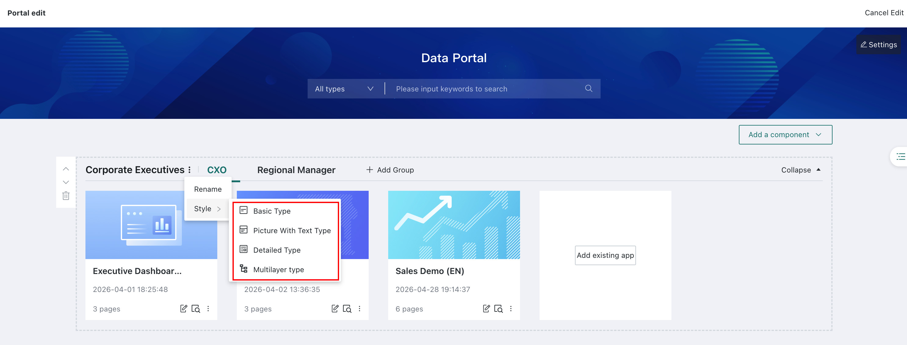
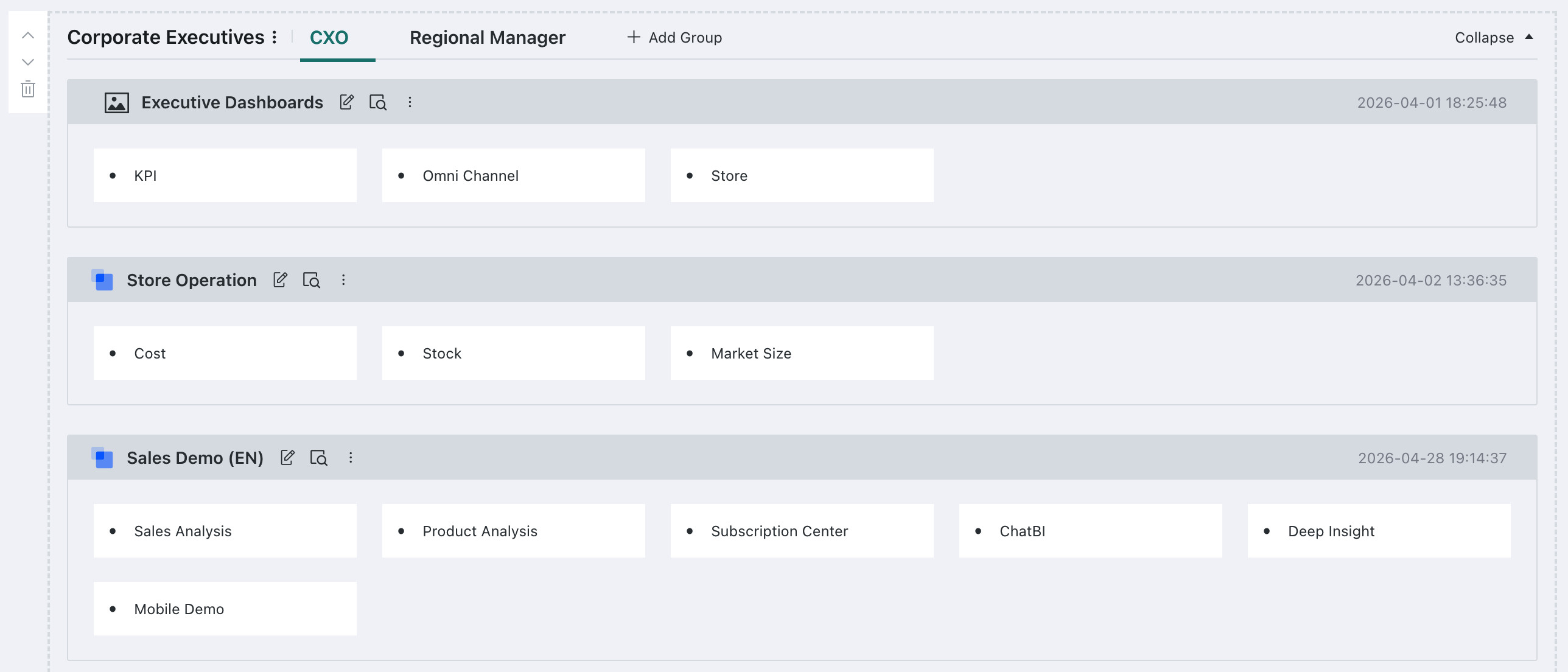
Style settings: Different app display styles are supported, including basic style, image-and-text style, detail style, and multi-level style.
-
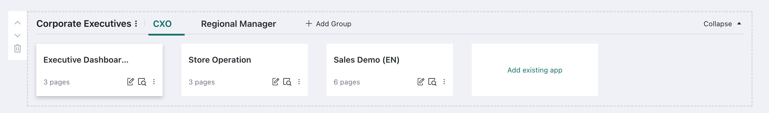
Basic style: Displays the app name and number of pages in a tiled layout.
-
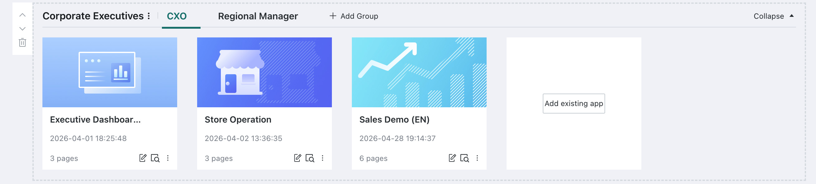
Image-and-text style: Displays the app cover, app name, update time, and number of pages.
-
Detail style: Displays the app icon, app name, update time, number of pages, and page names.
All pages in the app are also displayed in a tiled layout, and users can click directly to open the page they want to access.
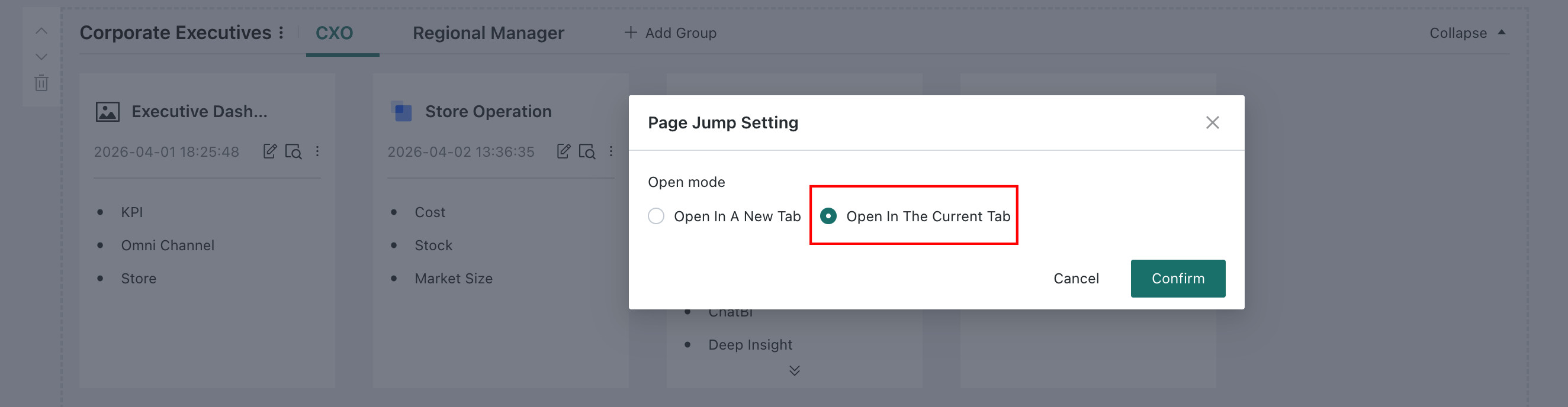
Set the jump opening method: When users click to open the page they want to access, the default method is
Open in new tab. Users can set the access method toOpen in current tabfromMenu Bar > Page Jump.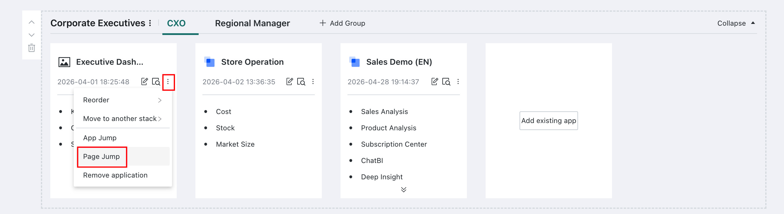
-
Multi-level style: Displays the app icon, app name, update time, and page names.
All pages in the app are also displayed in a tiled layout, and users can click directly to open the page they want to access.
-
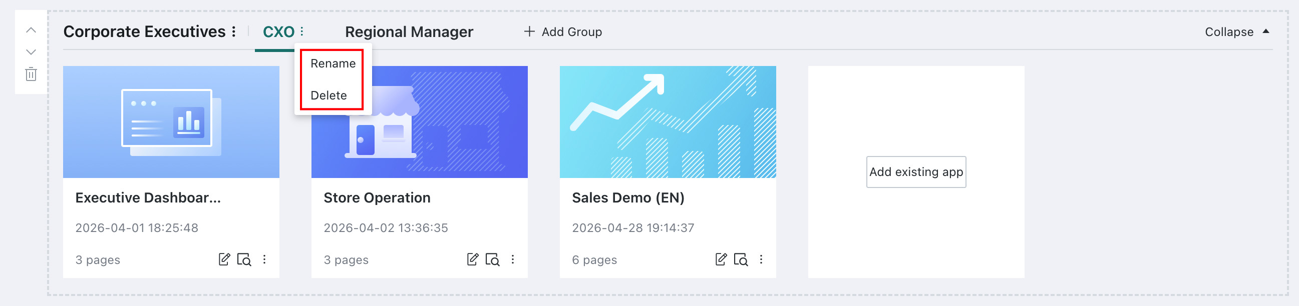
Add a Group
Users can add groups in an app component to classify apps by hierarchy and optimize the app layout in the desktop portal.
In any app component, click Add Group to add a group. Users can add existing apps to each group. If multiple groups are needed, click again to add other blank groups.
If the desktop portal originally has apps but no groups, after you click + Add Group, all existing apps are automatically added to the first group.
Related configuration
You can rename and delete newly added groups. After a group is deleted, all apps in that group are moved to the first group.
The default group cannot be deleted.
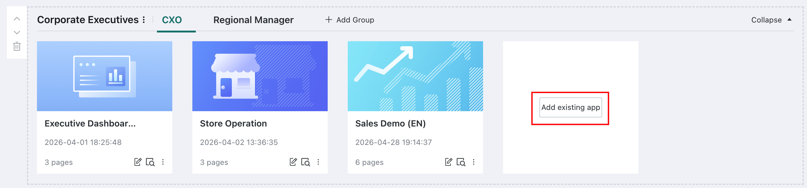
Add an Existing App
Select an app component to add existing apps to it.
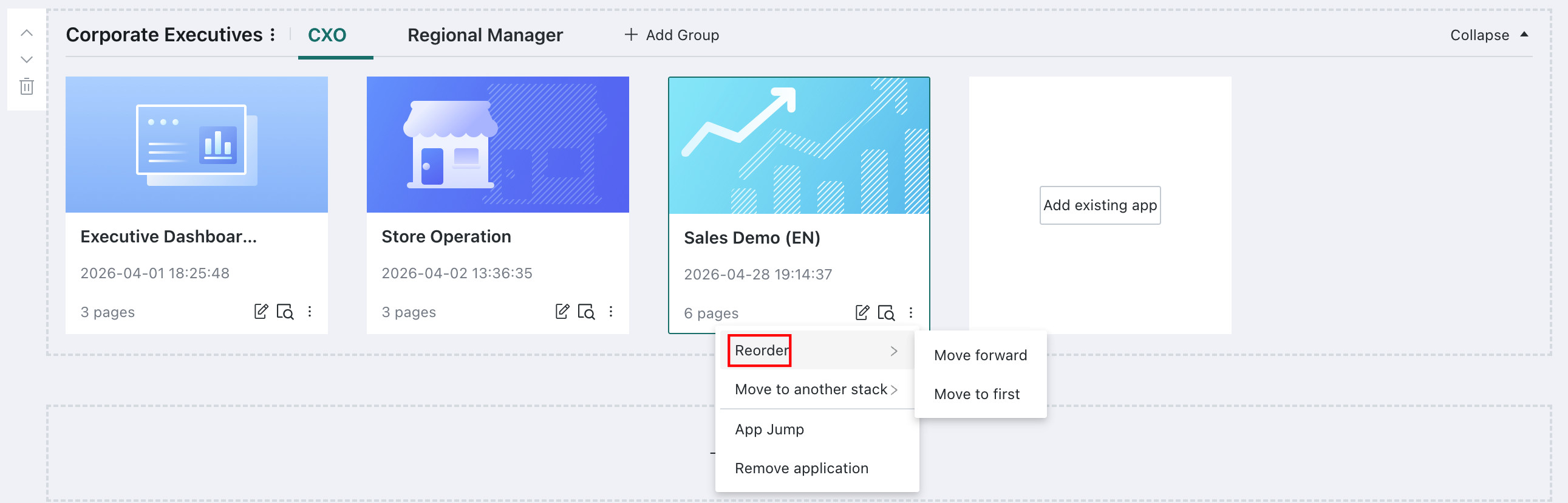
Related configuration
-
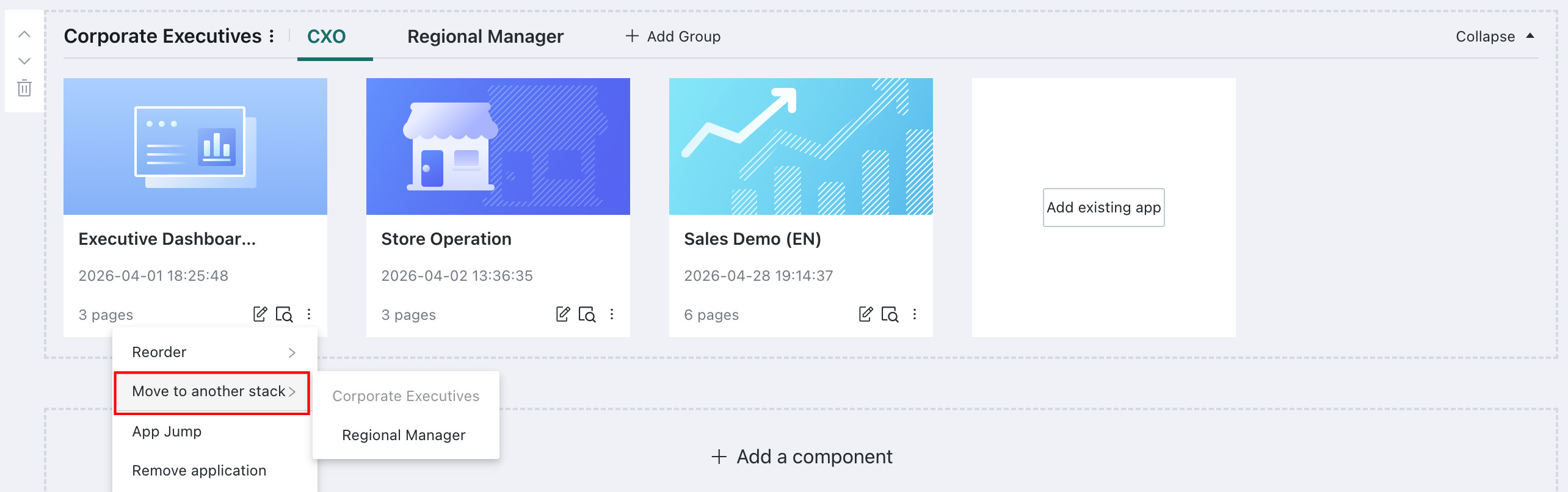
Adjust order: Use the menu bar in the lower-right corner of an app to adjust the app order in the component.
-
Move apps in an app component: After groups are created, apps in a group can be moved to other groups inside or outside the component.
-
Set the app jump opening method: When users click to open the app they want to access, the default method is
Open in new tab. Users can set the access method toOpen in current tabfromMenu Bar > App Jump. -
Set the page jump opening method: For data apps using
Detail StyleorMulti-level Style,Page Jumpcan be configured. When users click to open the page they want to access, the default method isOpen in new tab. Users can set the access method toOpen in current tabfromMenu Bar > Page Jump.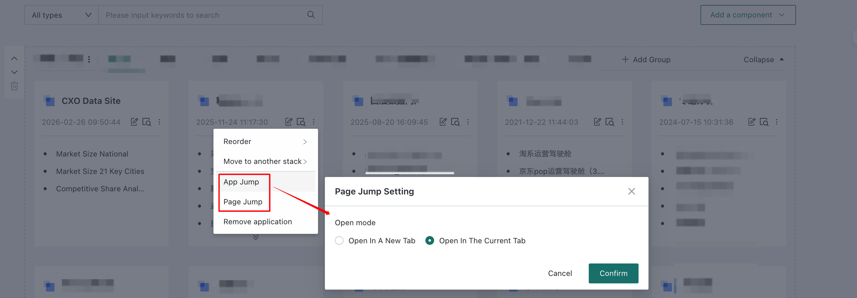
-
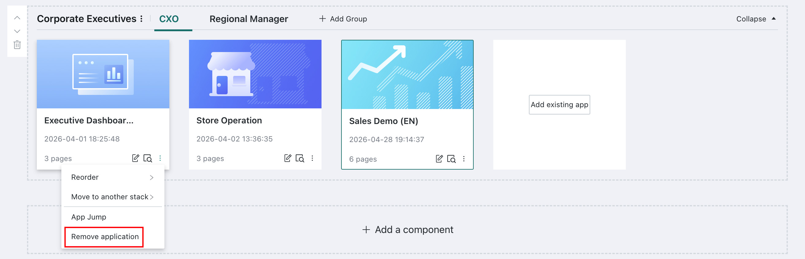
Remove app: Users can remove an app from an app component as needed. After removal, the app can no longer be accessed from the portal.
-
App icon settings:
-
When the style is image-and-text style, click an app and customize the cover in the
App Configurationmenu bar on the right.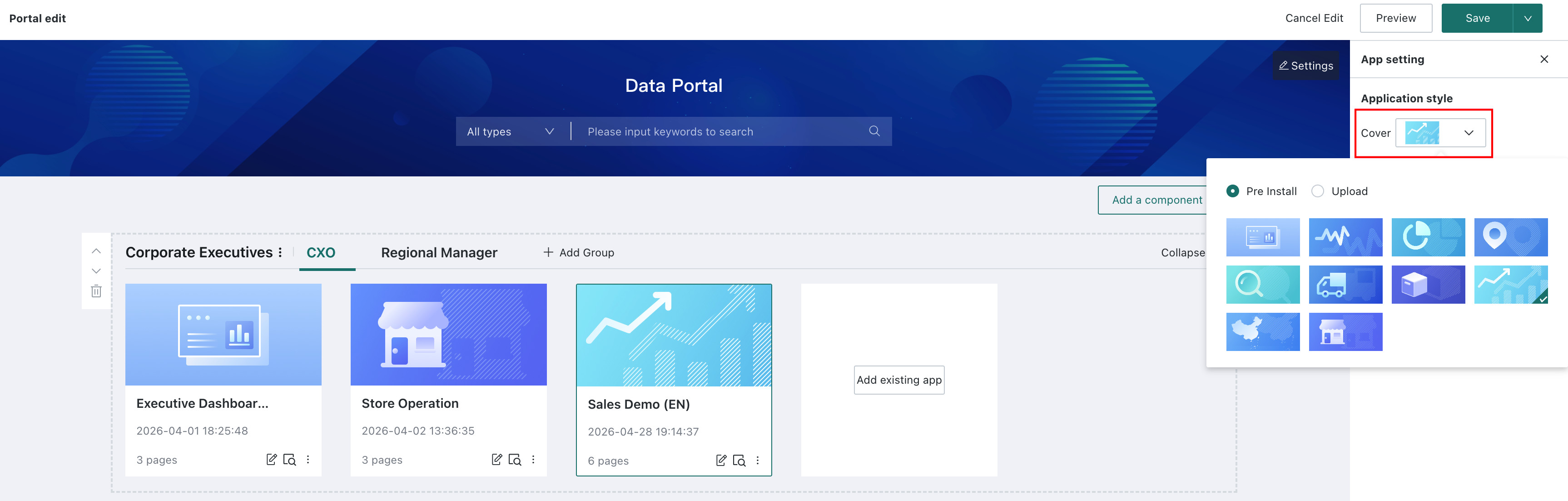
-
When the style is detail style or multi-level style, click an app and customize the icon style in the
App Configurationmenu bar on the right.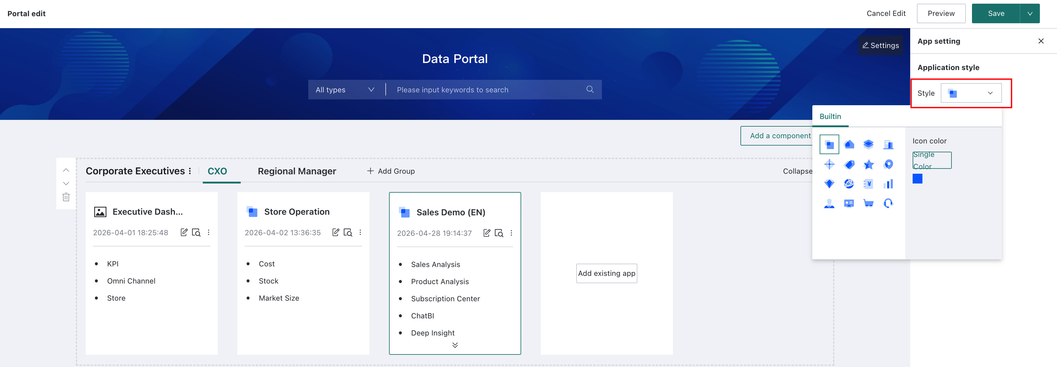
In addition to using the rich built-in icon styles provided by Guandata, administrators can also upload enterprise-owned icons. On
Management Center - Enterprise Configuration - Enterprise Visual - Enterprise Icons, clickCreateto upload an icon. For details about uploading icons, see Enterprise Visual.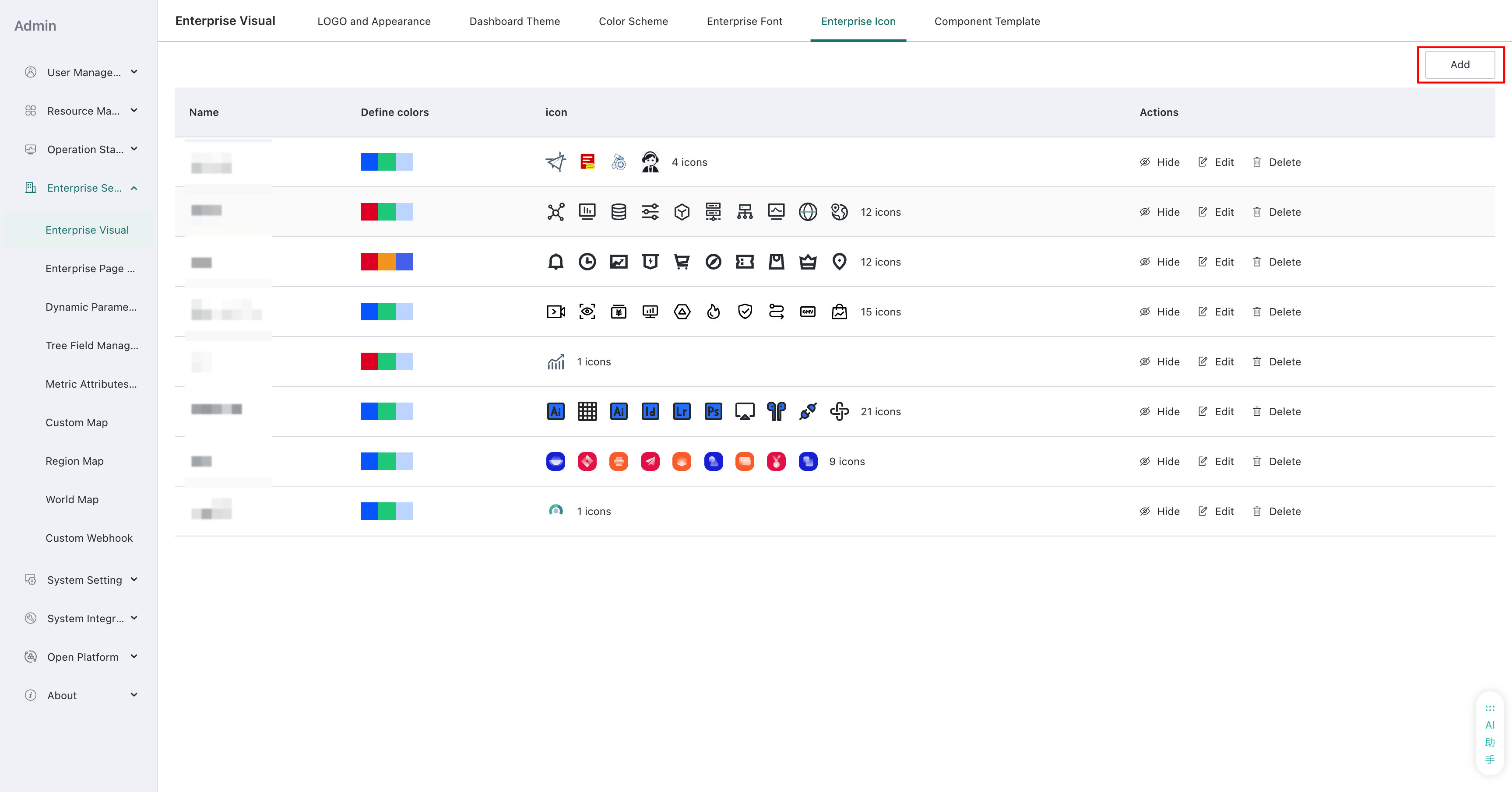
-
Add an Element Component
-
There are two entries for adding an element component:
- Entry 1: On the desktop portal editing page, click
Add Componentand selectElement Componentfrom the drop-down list. By default, it is added to the last position on the page.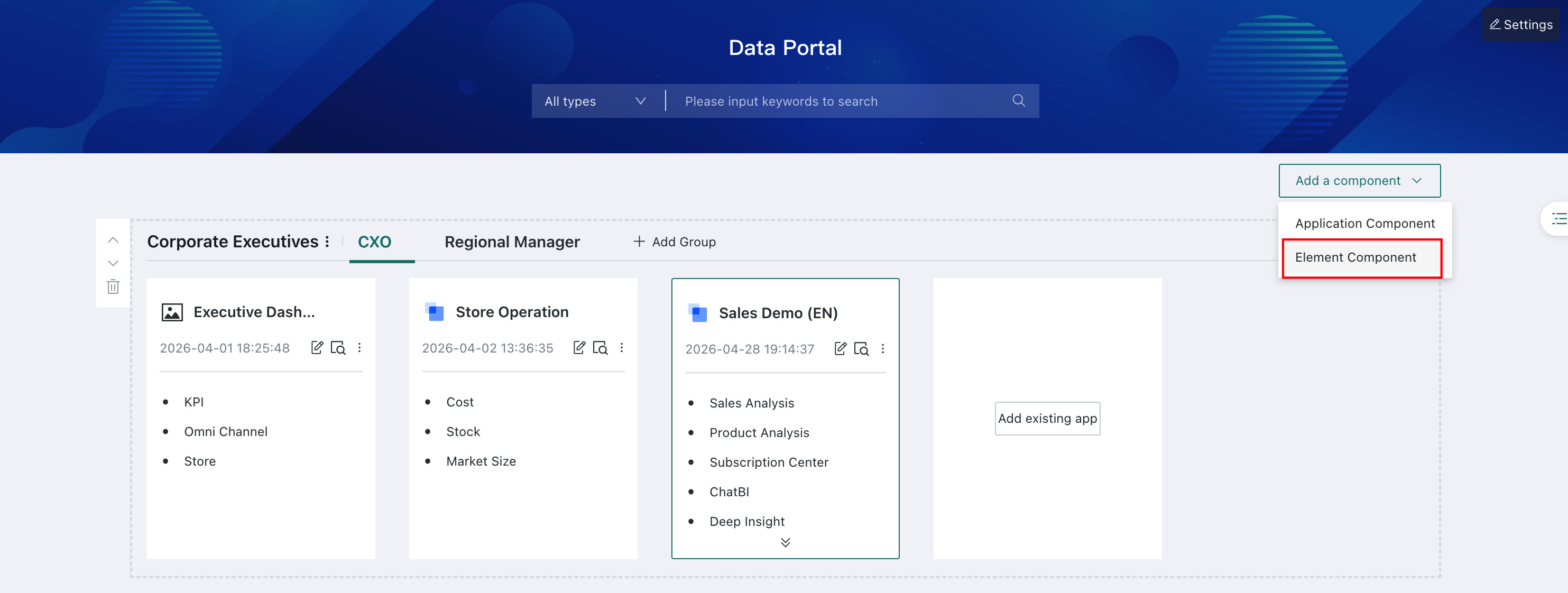
- Entry 2: At the bottom of the desktop portal editing page, click
+ Add Component, then selectElement Componentto add an element component.
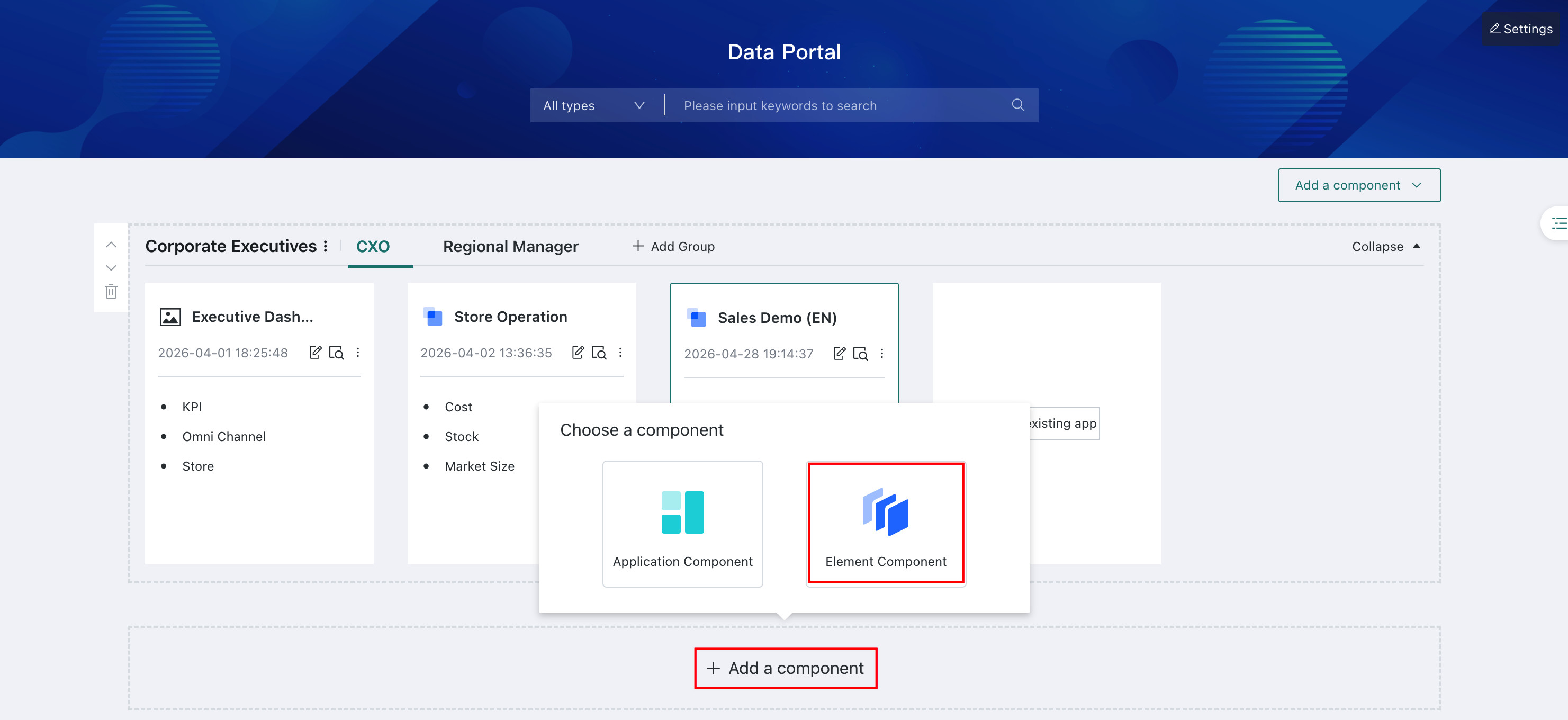
- Entry 1: On the desktop portal editing page, click
-
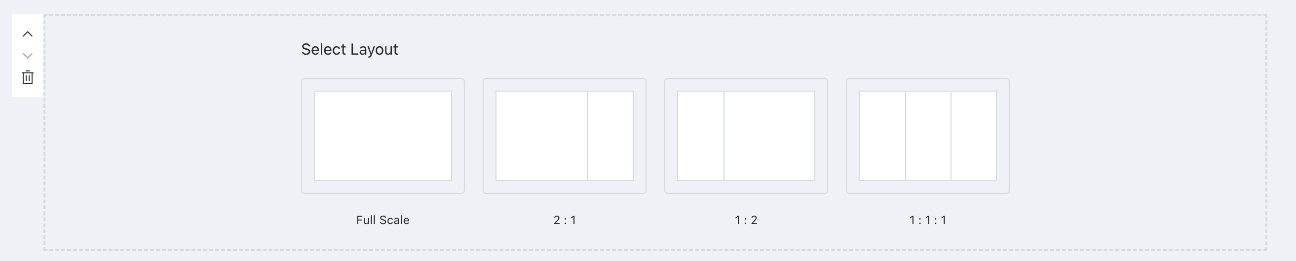
Select a layout: horizontal full-width layout, horizontal 2:1 layout, horizontal 1:2 layout, or horizontal three-column equal-width layout.
-
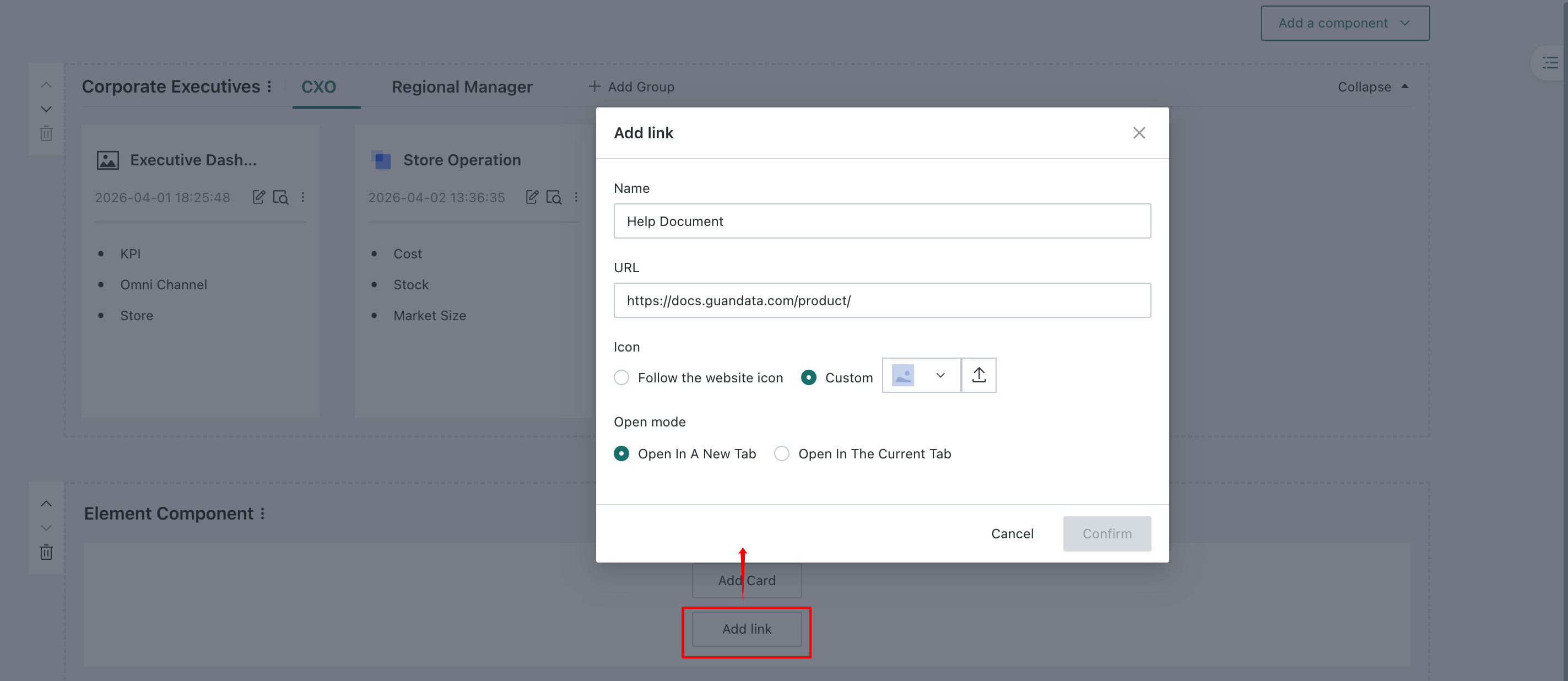
Add cards or external links.
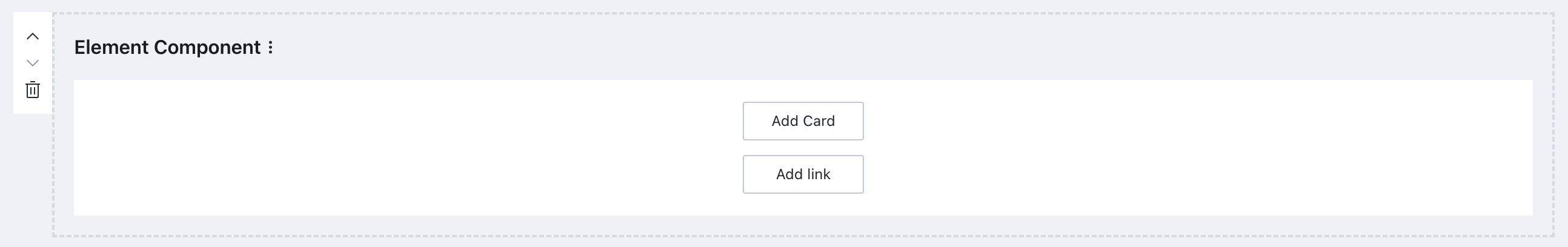
External links support icon settings:
- Follow website icon: This is the default option. It automatically uses the linked website's favicon as the icon for the external link entry.
- Custom: Upload an image as the icon for the external link entry.
-
The portal page directly displays dashboard cards or external links, and supports dragging to adjust card height.
Anchor Directory
When there are many app components and element components, you can use the anchor directory on the right side of the page to quickly find and locate content. The directory is collapsed by default and expands automatically when the mouse moves over it.
You can click the Pin button in the upper-right corner of the directory to pin it.

Desktop Portal Preview
After creating and configuring the desktop portal, click Save in the upper-right corner of the page to save the current desktop portal.
On the editing page, click Preview in the upper-right corner to view the current portal configuration effect.
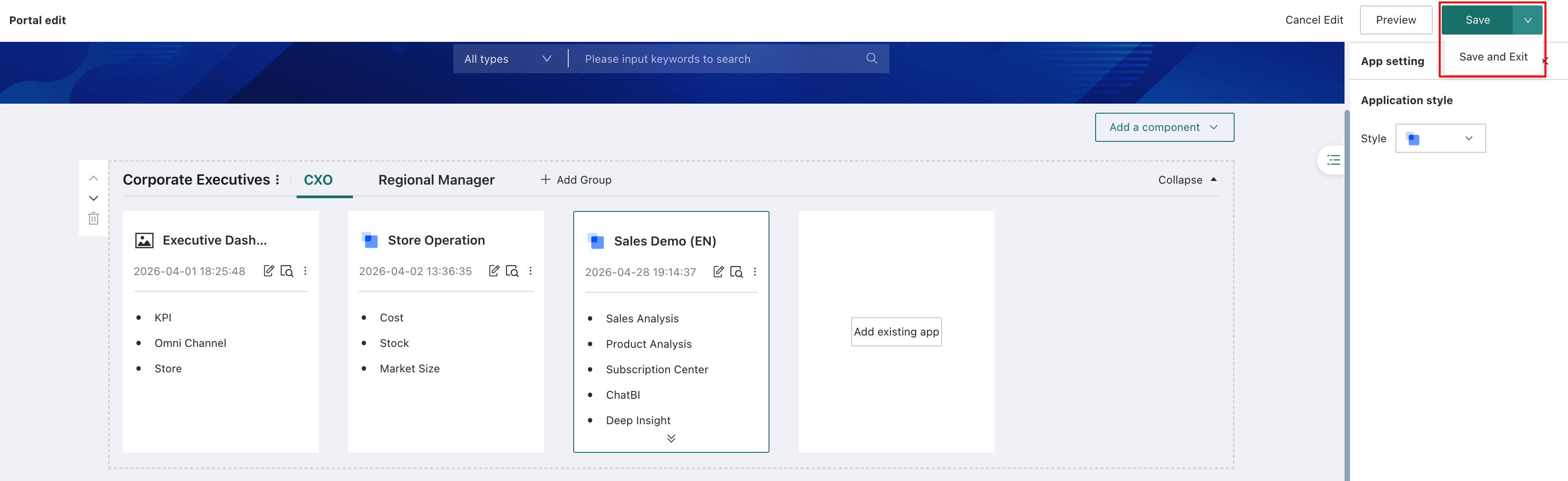
Click Save and Exit in the drop-down list to save the desktop portal and exit the editing page directly.
Consumption and Usage
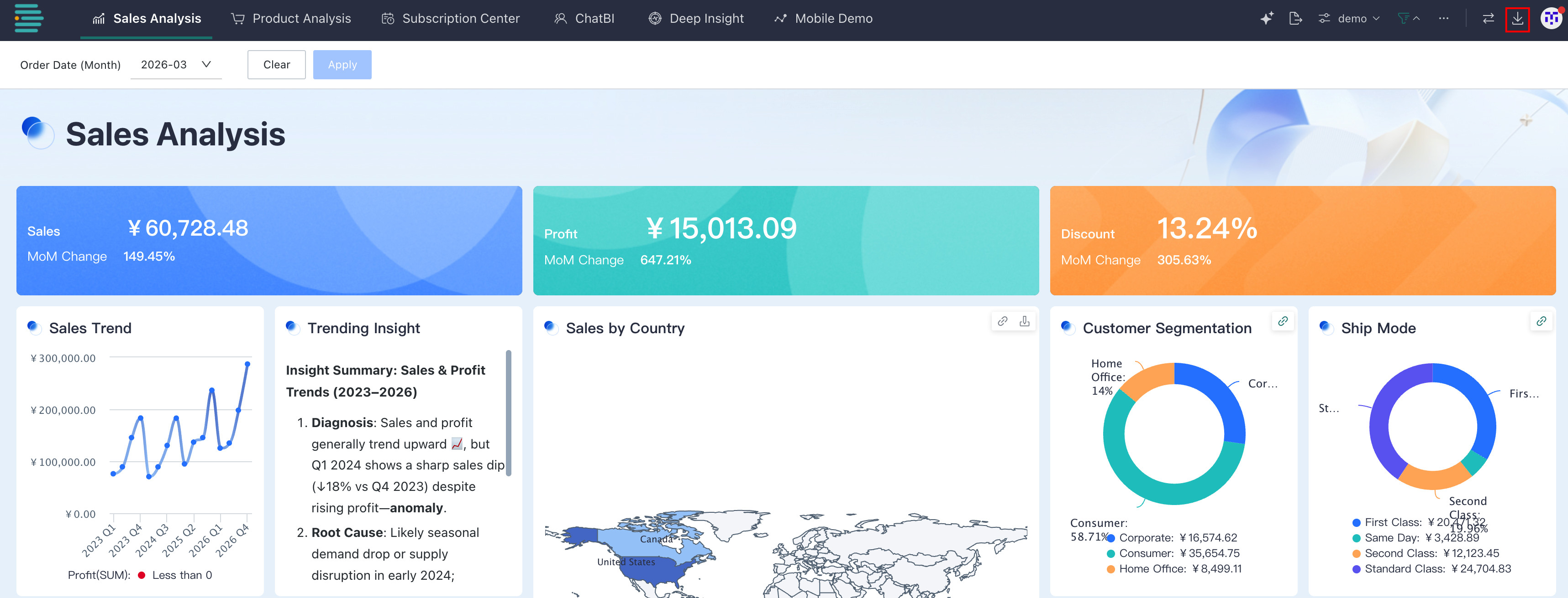
On any page in the BI platform, click the `Data Portal` icon to enter the portal page.
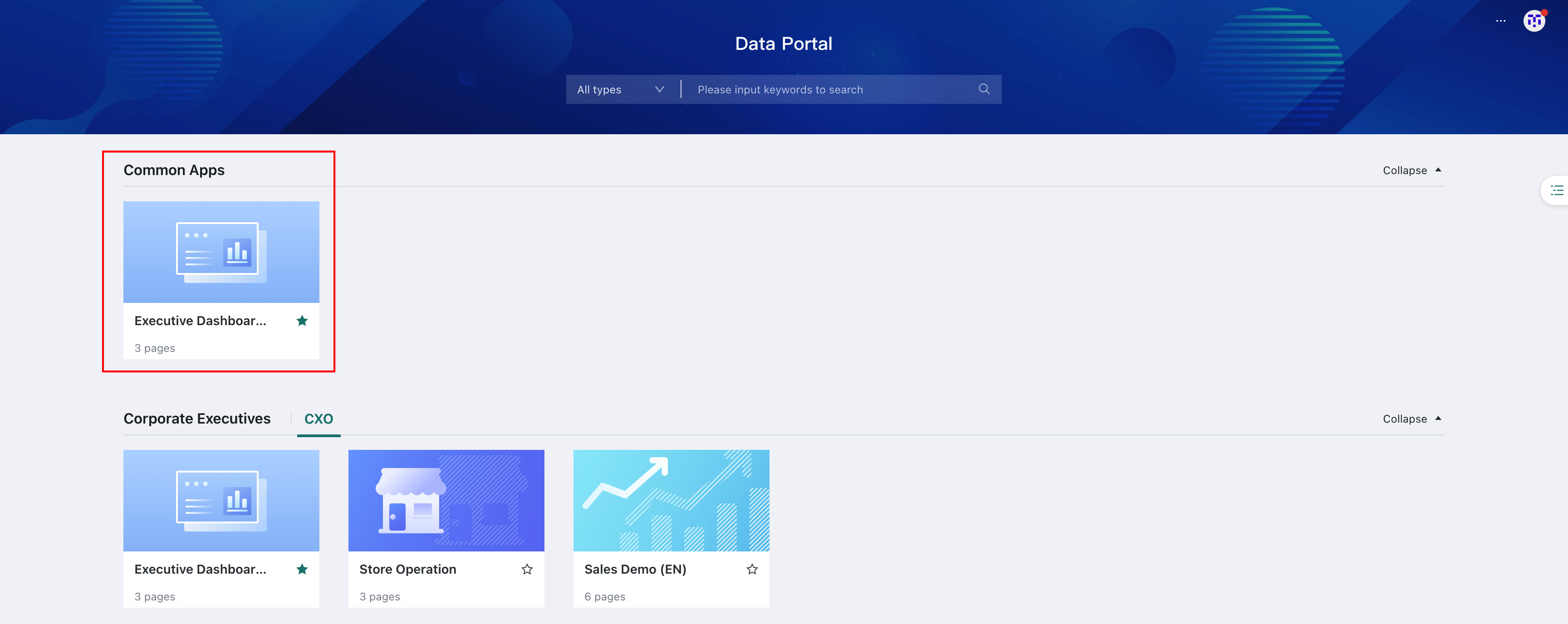
The portal homepage is divided into the feature configuration area, search area, and data app area. Details are as follows:
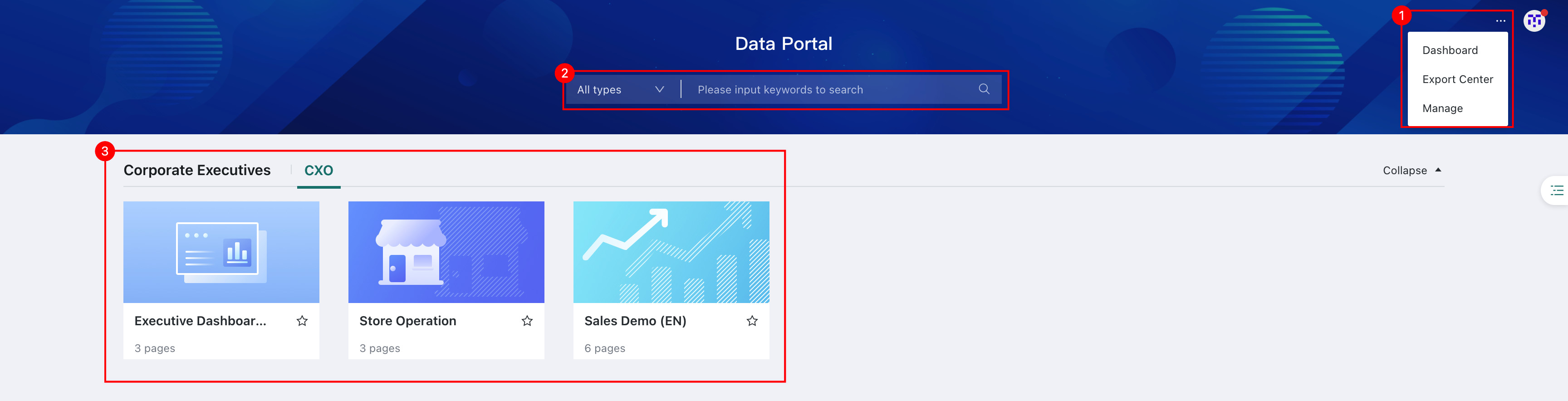
| No. | Description |
|---|---|
| 1 | Data Portal feature entry. Click ... in the upper-right corner to expand the menu and quickly access Dashboard, Export Center, and the Guandata BI Web Data Portal App Management System editing page, making it easy to switch between core operation modules. |
| 2 | Resource search bar. After users enter keywords in the desktop Data Portal search bar, clicking the search button or pressing Enter matches apps or pages by name.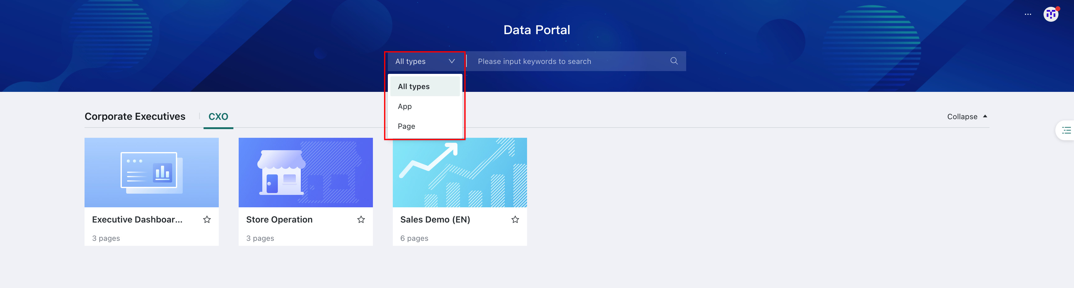 |
| 3 | Data app area, which displays core data apps and visual charts. |
Add to Favorites
There is a star favorite button on the app icon. Read-only users, users with data user edit permissions, and administrators can all click the star to add the app to their favorites.
This button is not available in editing mode.
Favorite apps are pinned to the Favorites group at the top. Apps in the Favorites group are always displayed in image style, and a Favorites group is also added to the top of the directory on the right. If there are no favorite apps, the Favorites group is not displayed by default.
Data App Details Page
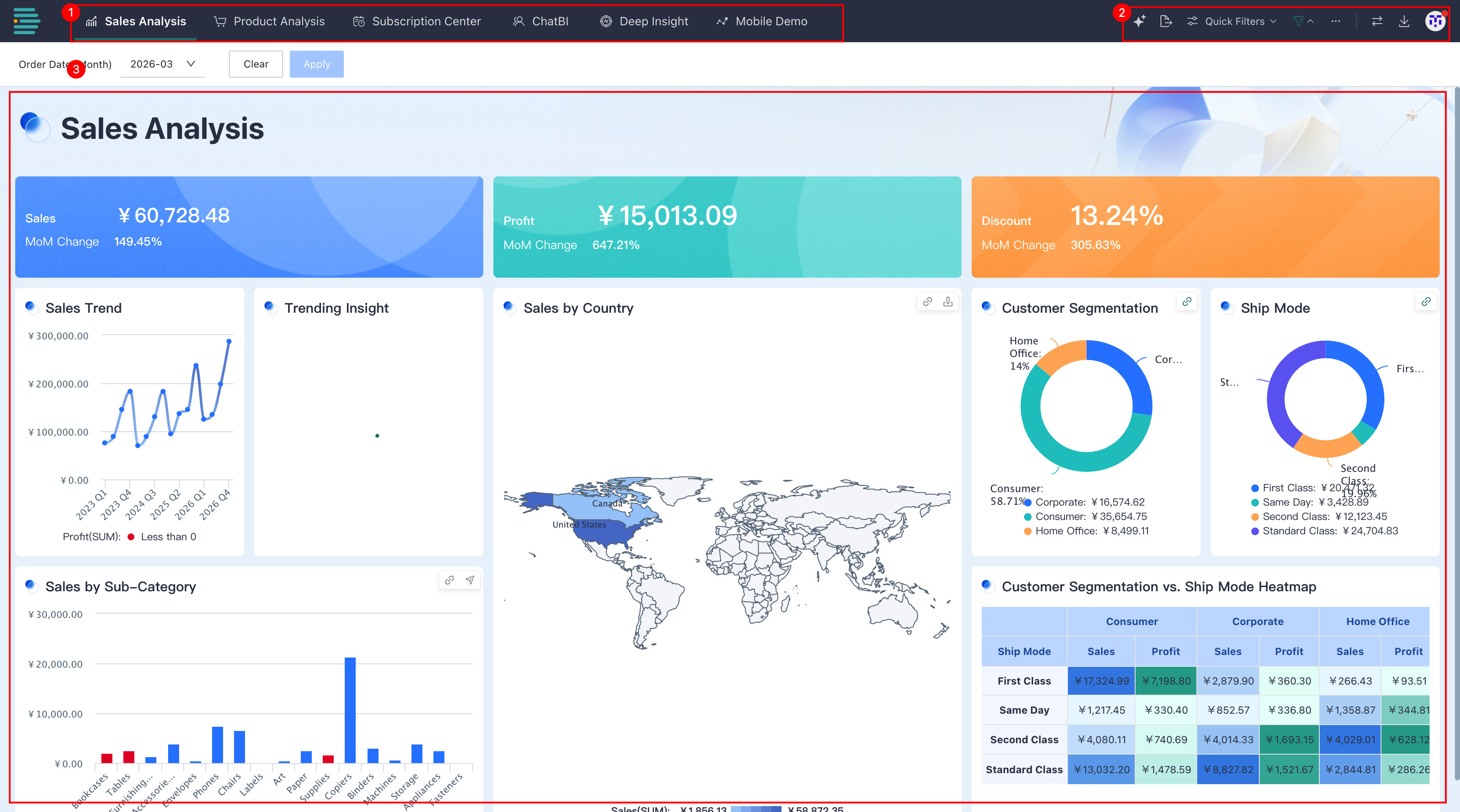
| No. | Description |
|---|---|
| 1 | Navigation area, listing apps by multiple roles or themes. It supports quick switching between business perspectives, making it easy for users to view data apps from different dimensions and roles as needed and browse linked data across scenarios. |
| 2 | Operation area, supporting export, quick query, app switching, and more. For details, see Data App Feature Operations. |
| 3 | Core data area, which visually displays detailed data for the selected app. |
Data App Feature Operations
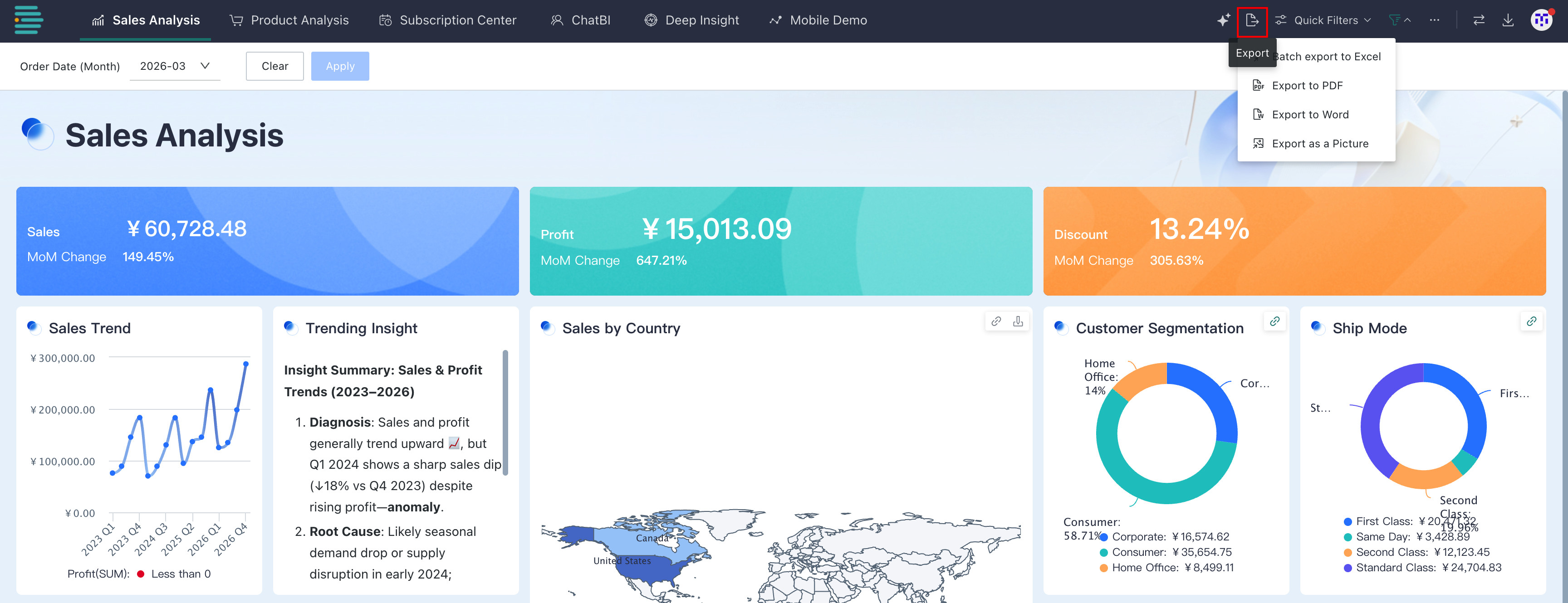
Export
Click Export. Multiple export methods are supported. For detailed operations, see Export.
The export feature requires Export permission for the page. If the export button is not displayed, contact an administrator to add export permission. For administrator operations, see Modify Resource Permissions.
Quick Query
-
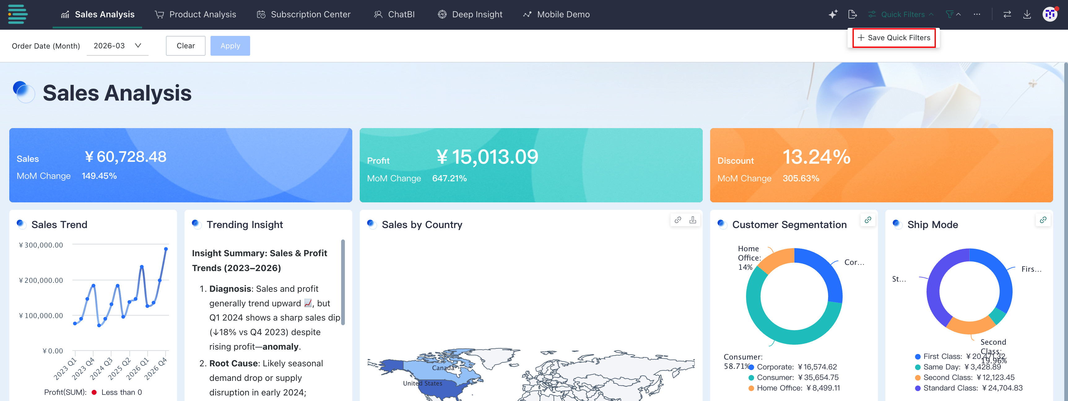
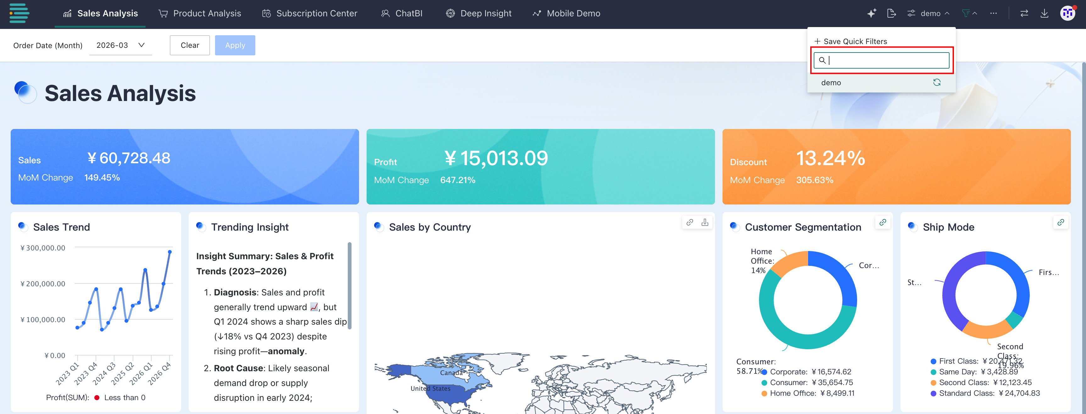
Save a quick query
ClickQuick Query > Save as Quick Queryto save the filter conditions currently set on the page as a custom query template. Enter a name to save it to the list. You can call it directly later to avoid repeatedly setting filter conditions.
-
Search quick queries
Enter keywords in the search box of the quick query list to quickly locate saved query templates. This is useful when many query templates exist and precise lookup is needed.
-
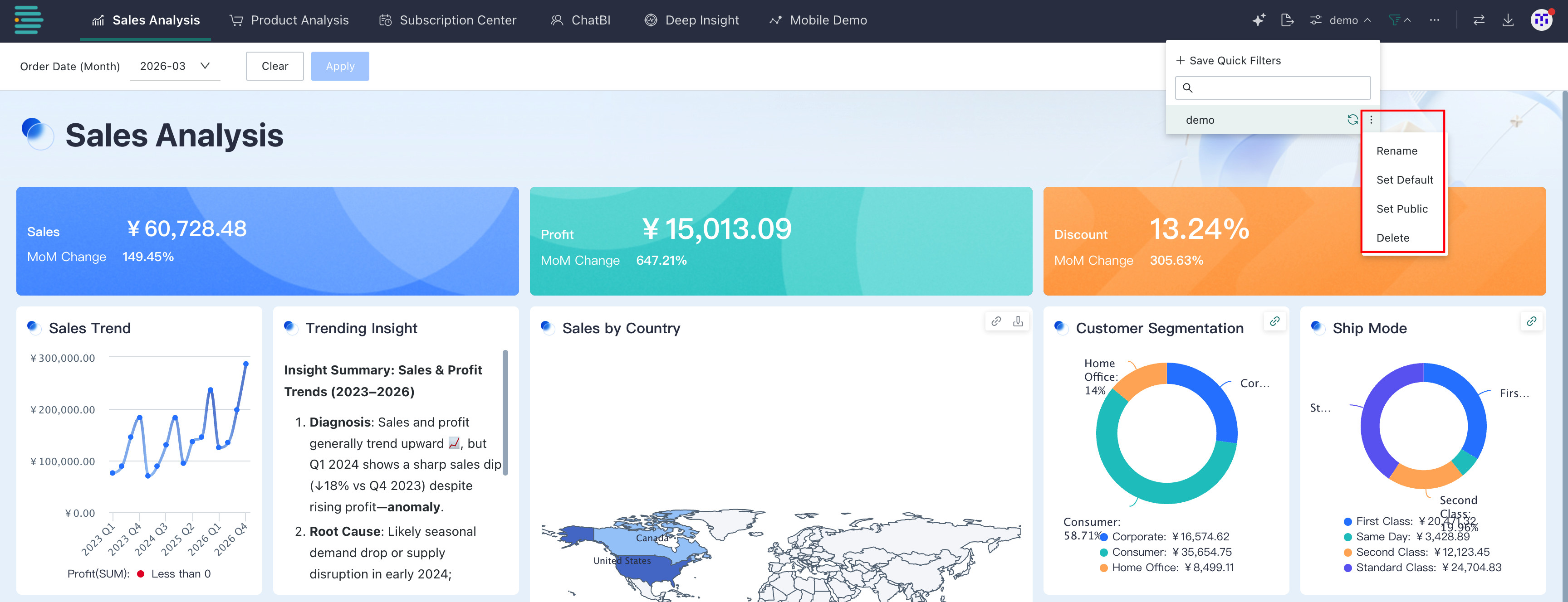
Manage quick queries
-
Click the refresh button to update this quick query to the page's current filter conditions.
-
Hover over a saved query template and click the three dots on the right to expand the management menu:
- Rename: Modify the quick query template name to adapt to scenario changes, such as updating the name after adjusting filter logic.
- Set as default: Set this query template as the quick query loaded by default on the page, so filter conditions are automatically applied when the page opens.
- Set as public: Share this quick query so members with permission to access the page can use it, improving team reuse efficiency.
- Delete: Remove query templates that are no longer needed, clear invalid or redundant content, and keep the list concise.
-
Filter Bar
The filter bar control is used to flexibly manage the display status of filter conditions.
Click the filter funnel button to switch between Show Filter Bar and Hide Filter Bar:
This feature button is available only when the page has filter conditions.
- Show Filter Bar: The page displays all configured filter conditions, making it easy for users to adjust filter rules at any time and obtain data from different dimensions.
- Hide Filter Bar: Filter conditions are collapsed and hidden, allowing the page to focus on the visualization content of the data app itself. This reduces interface distraction and is suitable for scenarios focused on data browsing rather than condition adjustment.
More
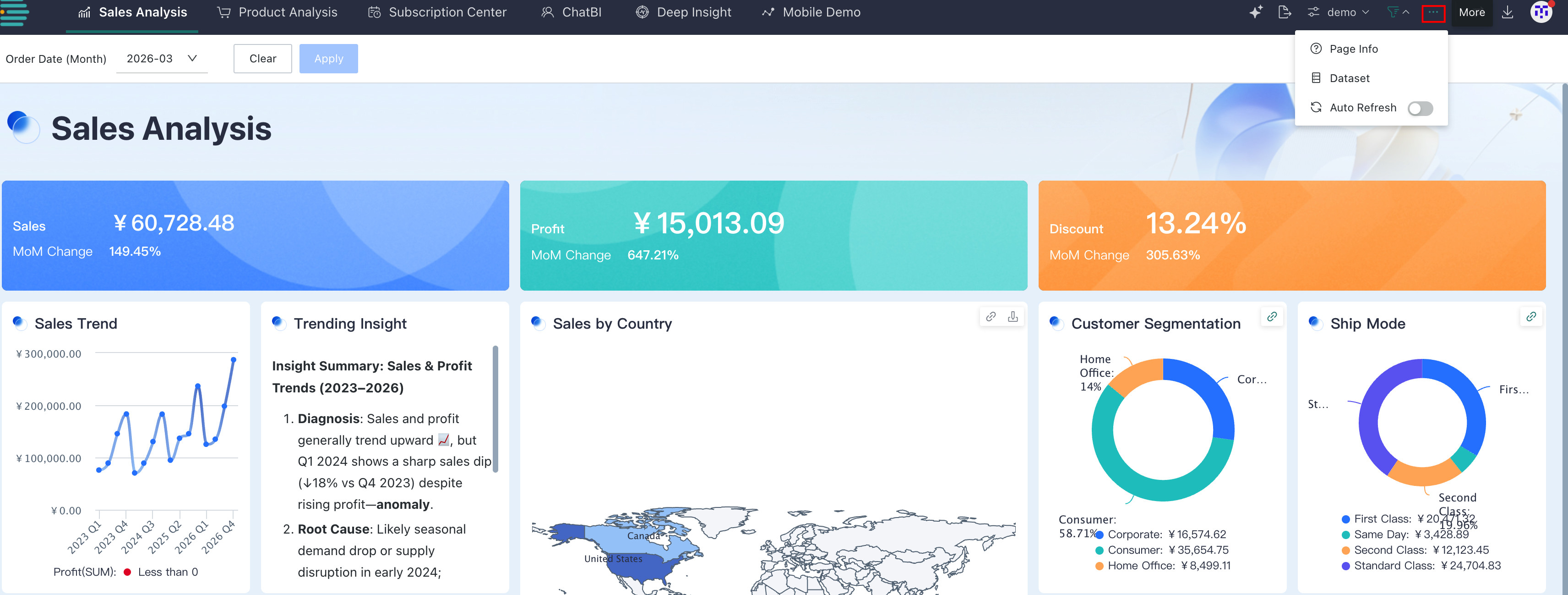
Click ... to open a drop-down menu with the following features:
-
Page information: Click to view the description of the current page, helping users understand the page background and related information.
-
Dataset: View details about the datasets that support data display on the current page, including dataset name, type, data update time, and more. This helps trace data sources and confirm the data scope.
NoteDataset information is display-only and does not support navigation.
-
Auto refresh: Use the switch to control whether auto refresh is enabled for the page. After enabled, the page automatically retrieves the latest data and updates the display at the frequency set by the administrator. This is suitable for scenarios that require real-time monitoring of data changes. When disabled, users need to refresh manually to obtain new data. For how to configure the auto refresh frequency, see Auto Refresh.
Switch Apps
Click to open the app selection panel. You can directly select and enter another app without returning to the portal page, simplifying cross-app navigation.
Export Center
Click to enter the Export Center page, where you can centrally manage data export tasks and view export results.