Create a Desktop App
Overview
Data apps are organized combinations of analysis pages. They provide integrated navigation for pages across different analysis dimensions and topics, creating an intuitive data viewing experience for data consumers, especially enterprise managers, and helping managers quickly understand business performance. This article introduces how to create a desktop app.
Create a Desktop App
Create a Desktop App
-
On the
Data Apps > Desktop > Appspage, select the target directory in the directory tree and clickCreate Desktop App.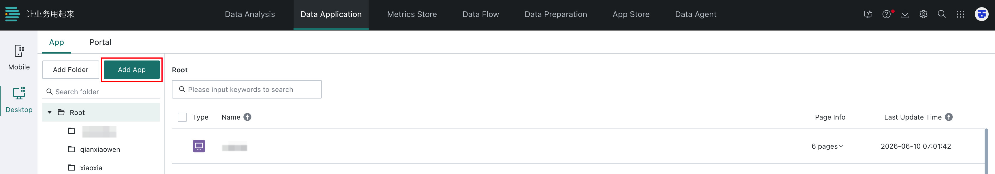
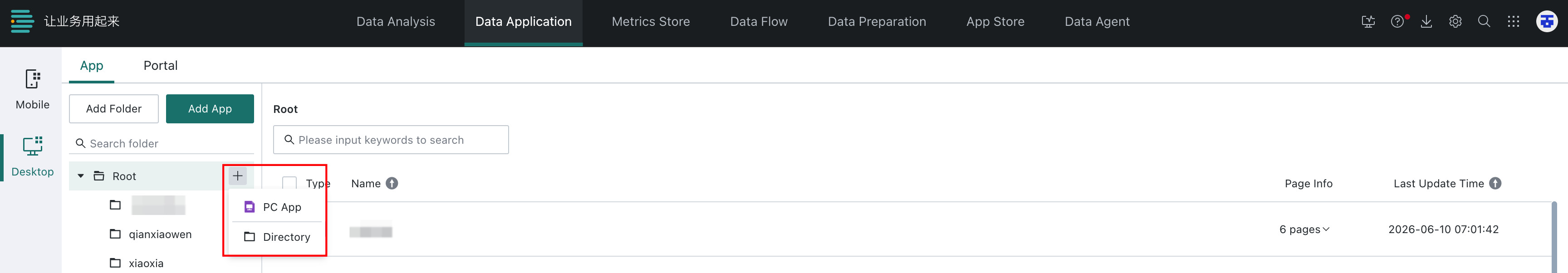
You can also quickly add a desktop app from the target directory tree.
-
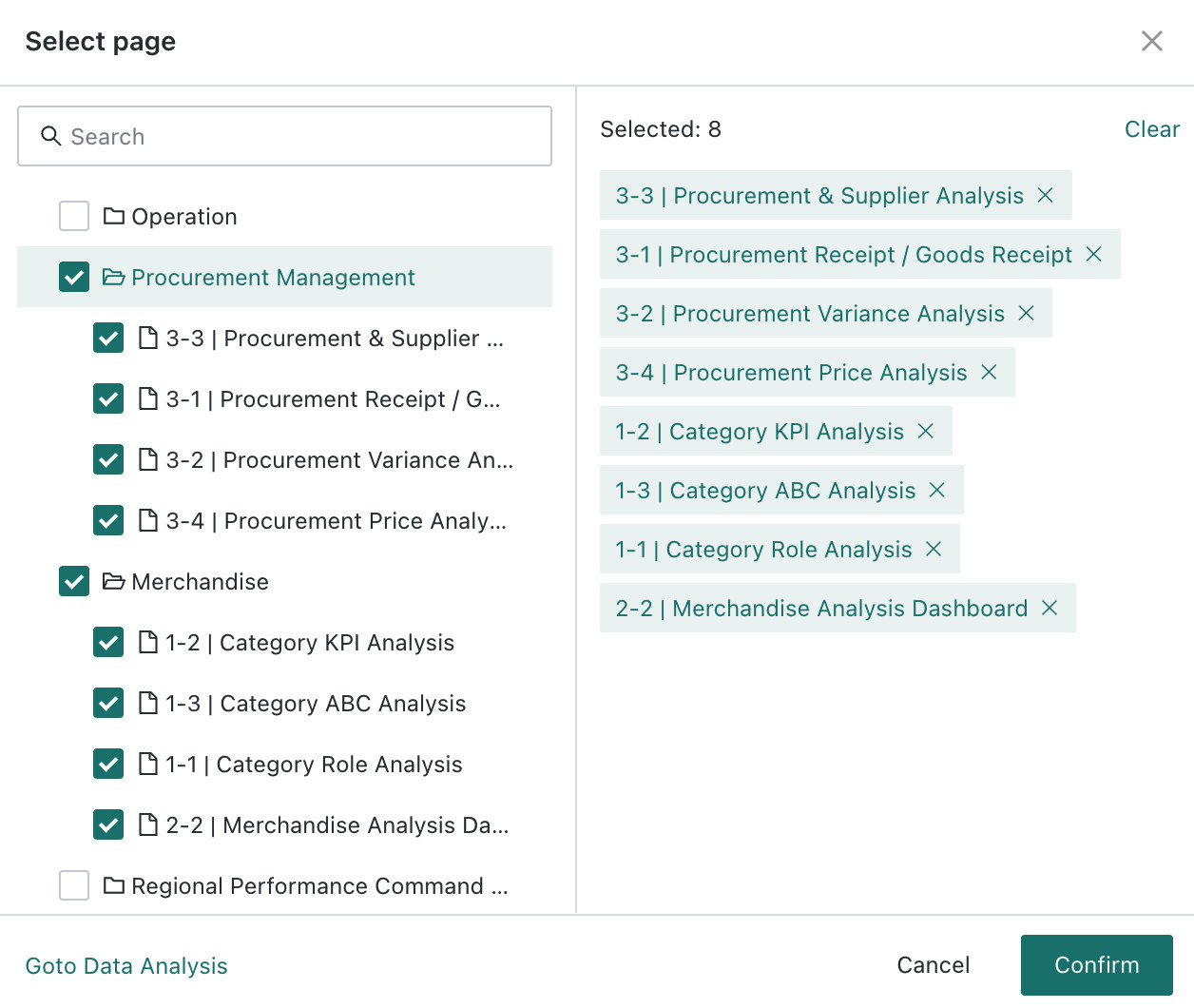
Select the pages to add to the app. After the pages are added, the desktop app editing page opens.
NoteCurrently, desktop apps support adding Dashboard, Self-service Data Retrieval, and Data Visualization Wall pages.
-
After entering the desktop app editing page, click
Add Page/External Linkin the upper-left corner to continue adding pages (Dashboard/Data Visualization Wall/Self-service Data Retrieval) or external links.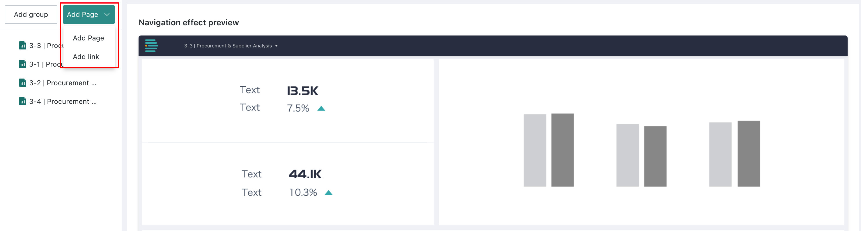
-
Configured Dashboard, Self-service Data Retrieval, Data Visualization Wall, and external link pages are displayed according to the navigation configuration. You can rename them, jump to pages, view page information, delete them, and more. After creating and configuring the desktop app, click
Savein the upper-right corner to save the current desktop app. You can also clickSave and Exitin the drop-down menu to save the desktop app and exit the editing page.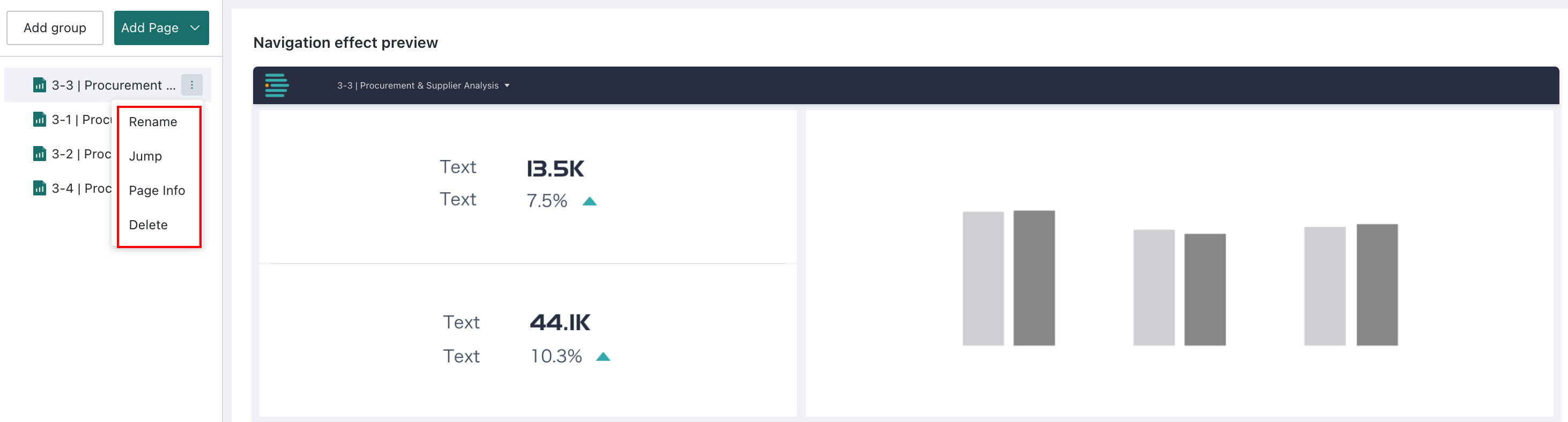
Pages and Navigation
After creating an app, users need to sort and group the pages in the app according to a hierarchy. The page structure directly affects the navigation layout and presentation. With proper page grouping and ordering, you can create a clear and organized navigation structure that helps users quickly find the information or features they need.
Page Structure
Guandata BI supports adjusting the page structure by changing page order and page grouping.
-
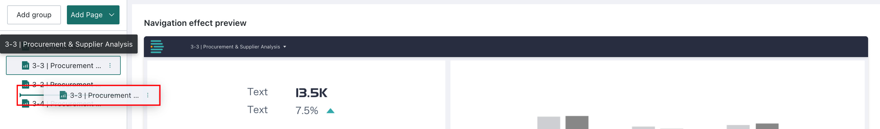
Adjust page order: Hold the mouse button on a page and drag it directly to the desired position.
-
Group pages: Click
Create Group. A group folder appears at the bottom of the directory, and you can drag pages directly into the folder.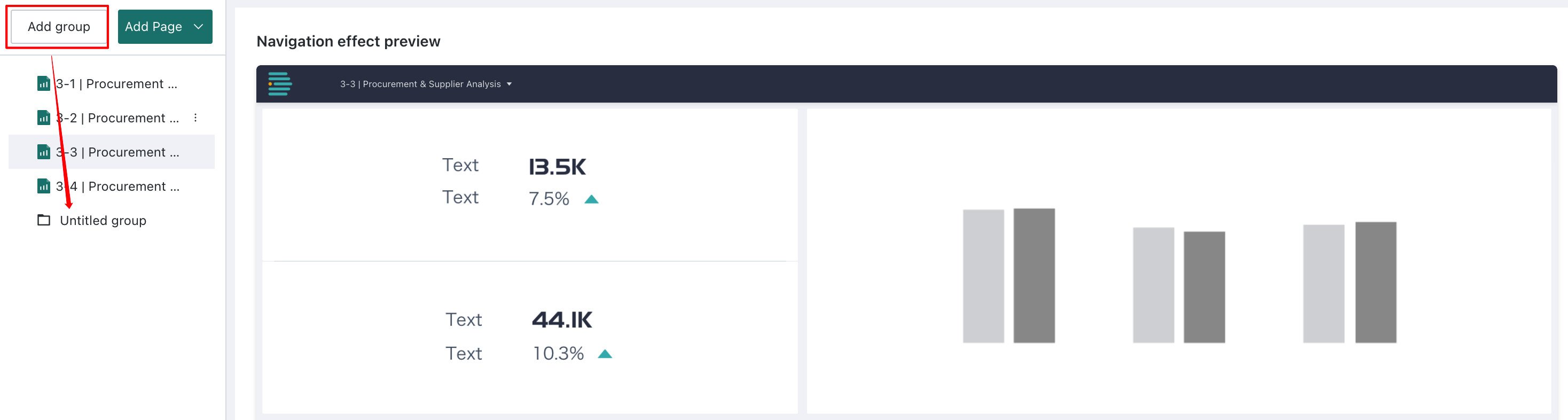
Click
+on the right side of a group folder to add lower-level groups. Up to four levels of groups are supported.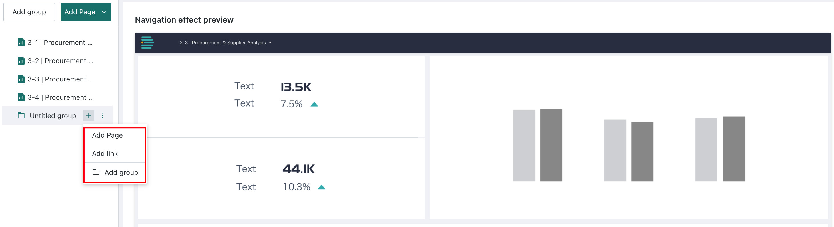
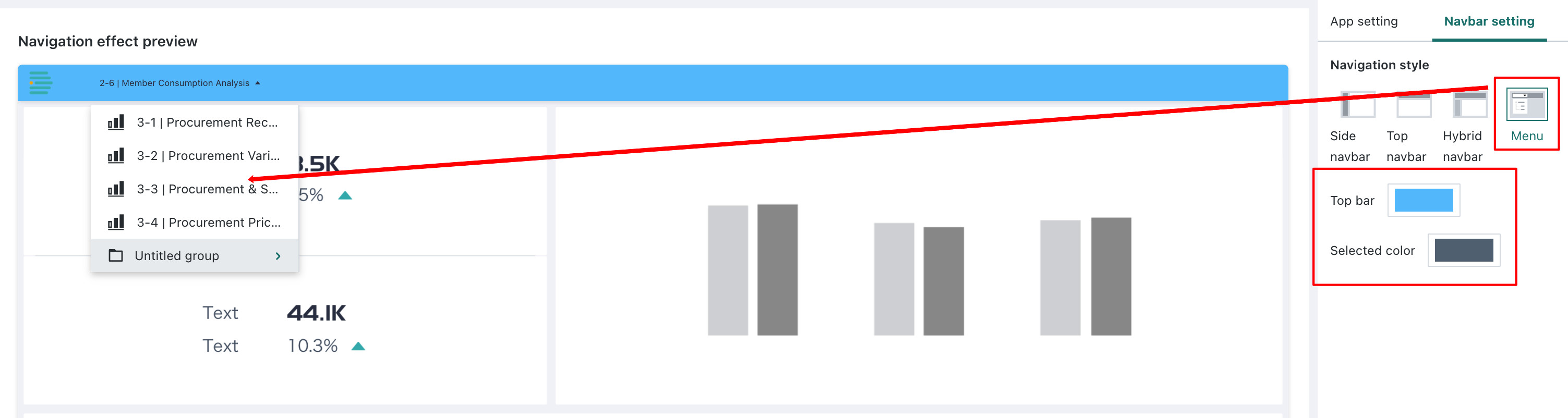
Navigation Style
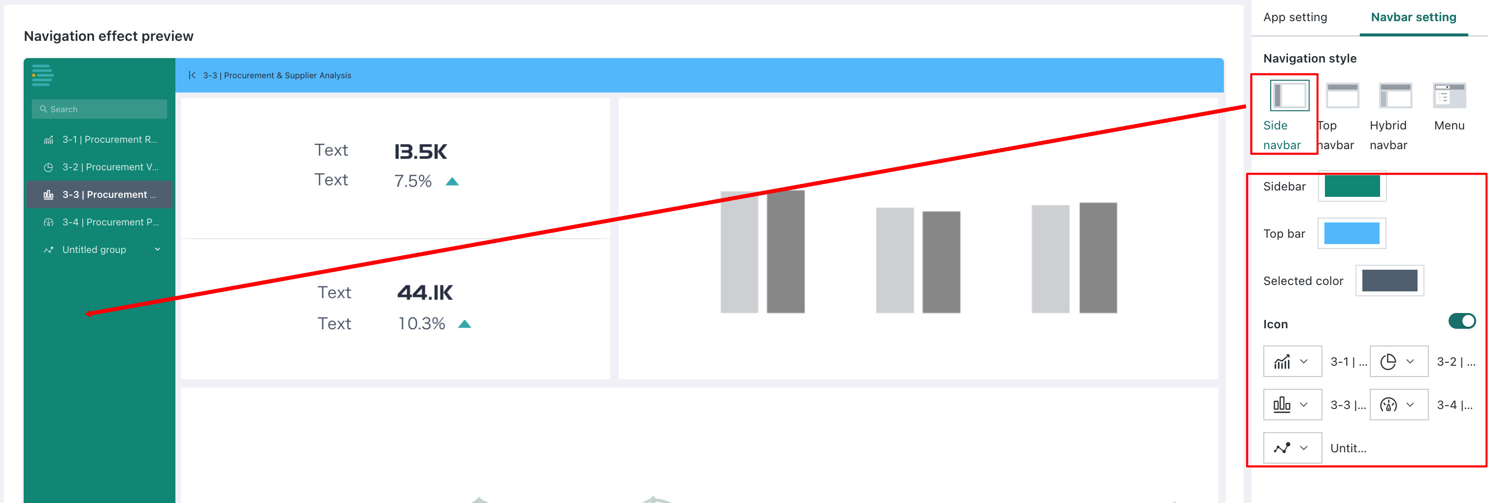
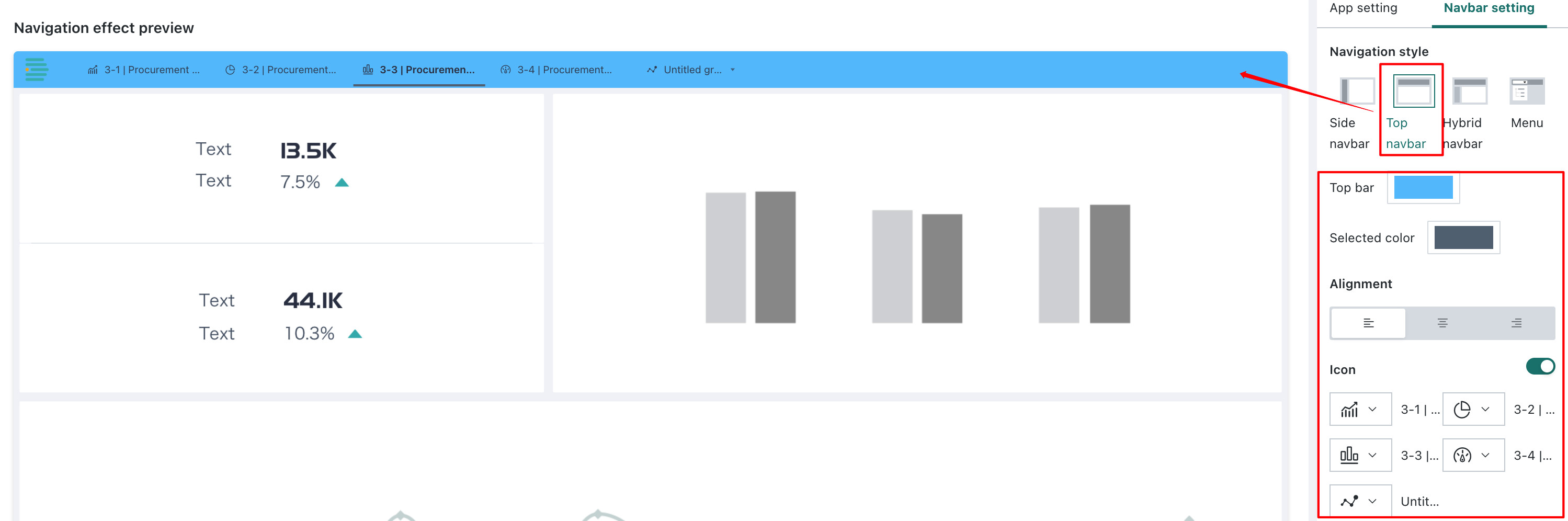
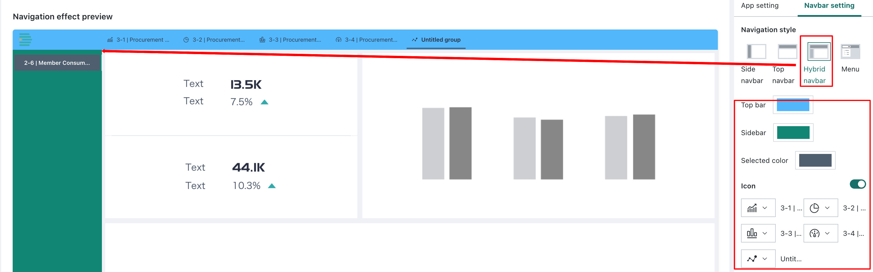
Navigation settings: In the navigation settings area on the right, you can select one of four navigation modes (side navigation, top navigation, hybrid navigation, or directory tree), and configure colors and icons. You can then preview the current navigation effect in the navigation preview area.
-
Side navigation: After selecting the side navigation option, side navigation can be collapsed and expanded. You can configure the sidebar color, top bar color, and accent color in the navigation area, and set icons for pages and groups in the navigation.
-
Top navigation: After selecting the top navigation option, top navigation supports multi-level structures. You can configure the top bar color and accent color in the navigation area, and set the alignment and icons for pages and groups in the navigation.
-
Hybrid navigation: After selecting the hybrid navigation option, top navigation corresponds to the first-level directory and supports switching, while side navigation corresponds to the second-level directory and supports switching, collapse, and expansion. You can configure the top bar color, sidebar color, and accent color in the navigation area, and set icons for pages and groups in the navigation.
-
Directory tree: After selecting the directory tree option, the directory tree is located in the upper-left corner of the interface and supports multi-level structures. You can configure the top bar color and accent color in the navigation area.
Preview
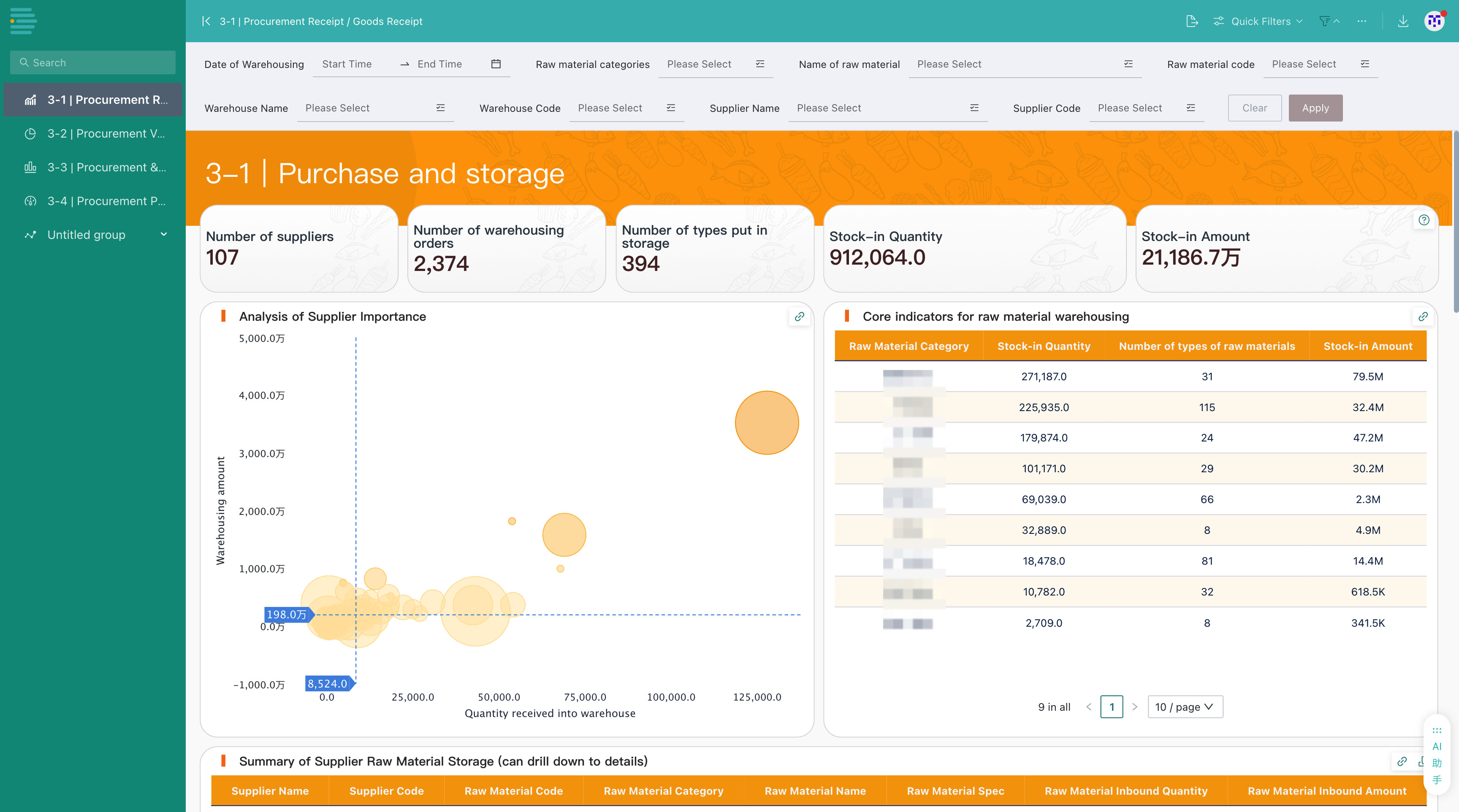
On the desktop app editing page, click Preview in the upper-right corner to open the desktop app preview page.
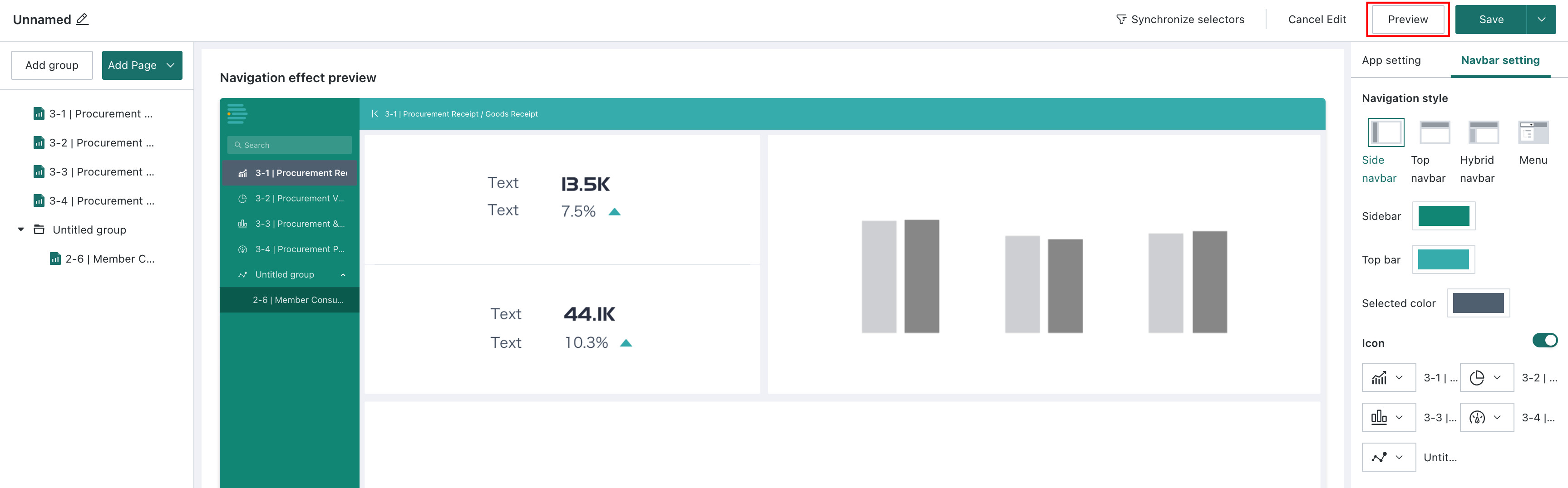
The effect is as follows:
App Feature Settings
App Configuration
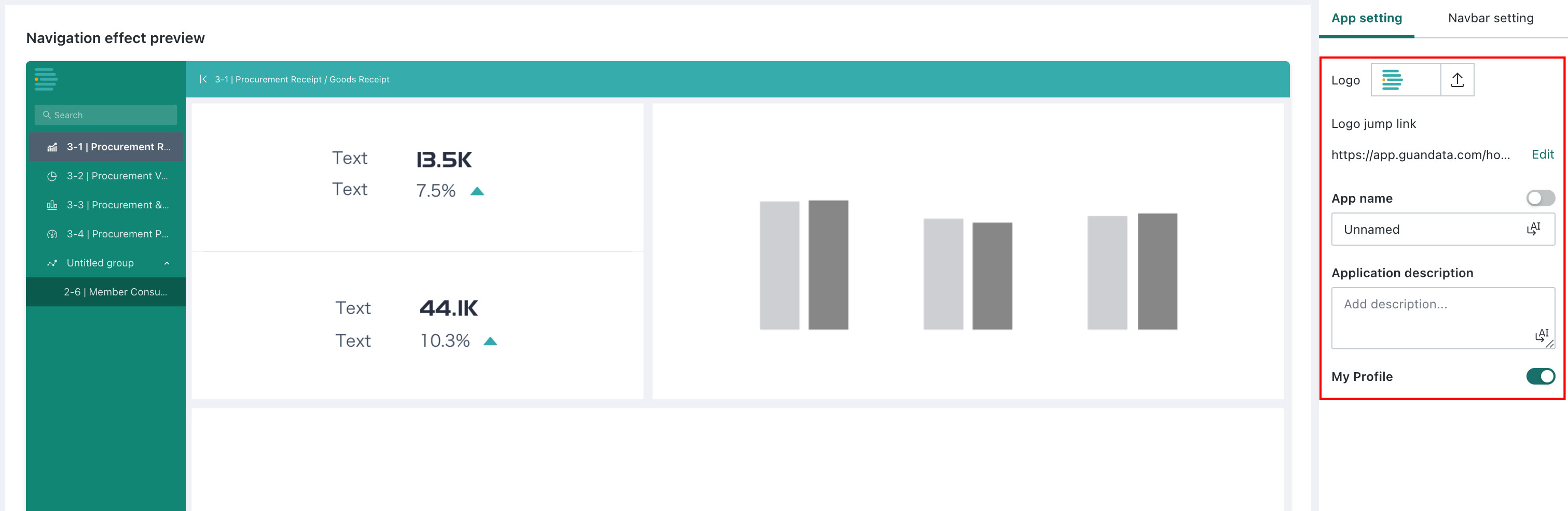
You can configure the desktop app style in App Configuration on the right. Configuration items include:
- Logo and jump link: Set the desktop app logo and modify the desktop app jump link. Clicking the logo jumps to that link.
- App name: Set the desktop app name.
- Description: Add a description to the app. After it is added, the description can be viewed in the portal.
- Personal Center: After this is enabled, the
Personal Centerentry is displayed on the desktop app preview page.
Synchronized Filters
Synchronized filters keep filter conditions in related pages synchronized. When users switch between dashboards, each dashboard keeps the same data viewing dimensions and shares the filtered data results.
Create a Synchronized Filter
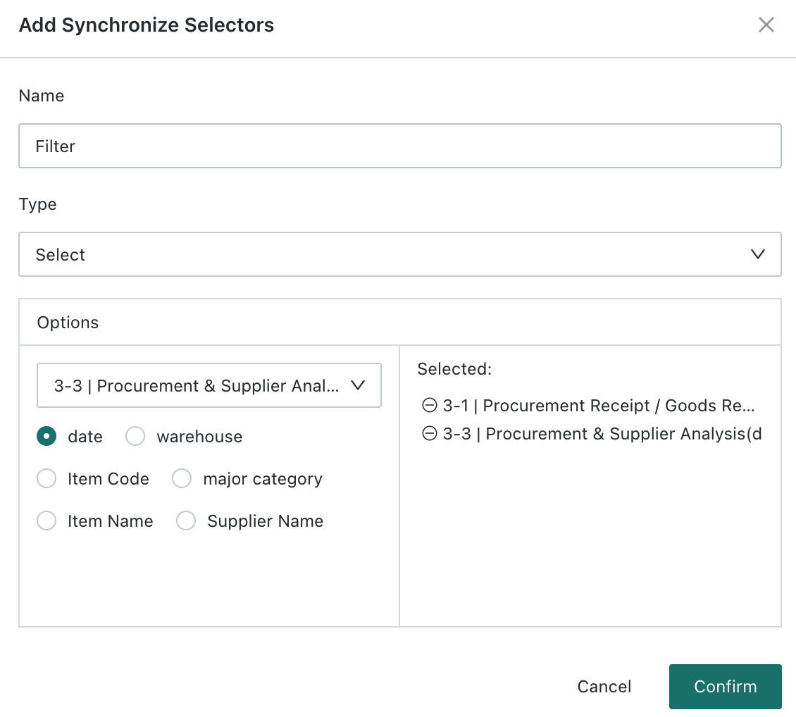
Click Synchronized Filter. The Synchronized Filter Configuration page appears on the right. Click Create.
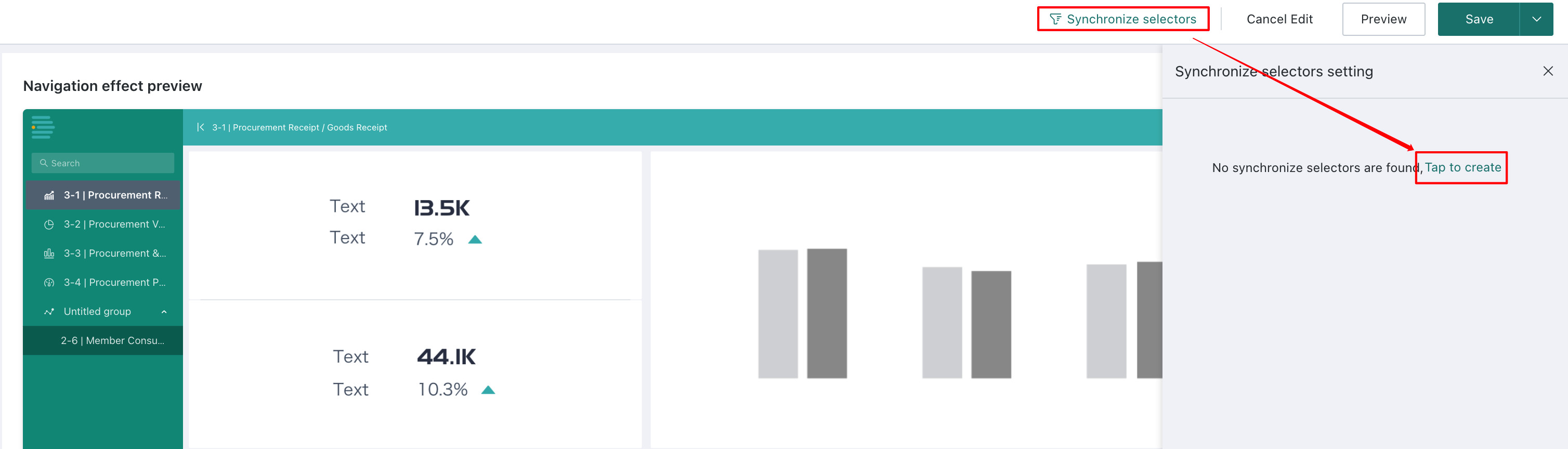
Enter the filter name, select the filter type, select the pages to synchronize, select filters of the same type, and click OK to save.
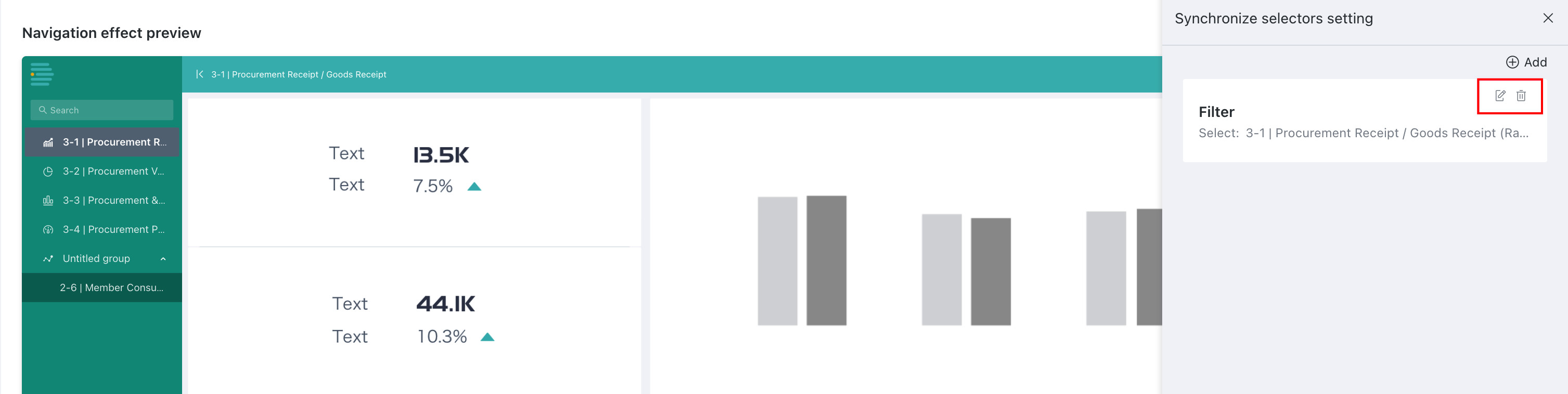
Manage Synchronized Filters
Click Modify or Delete in the upper-right corner of an existing filter to edit or delete that synchronized filter.
App Operations
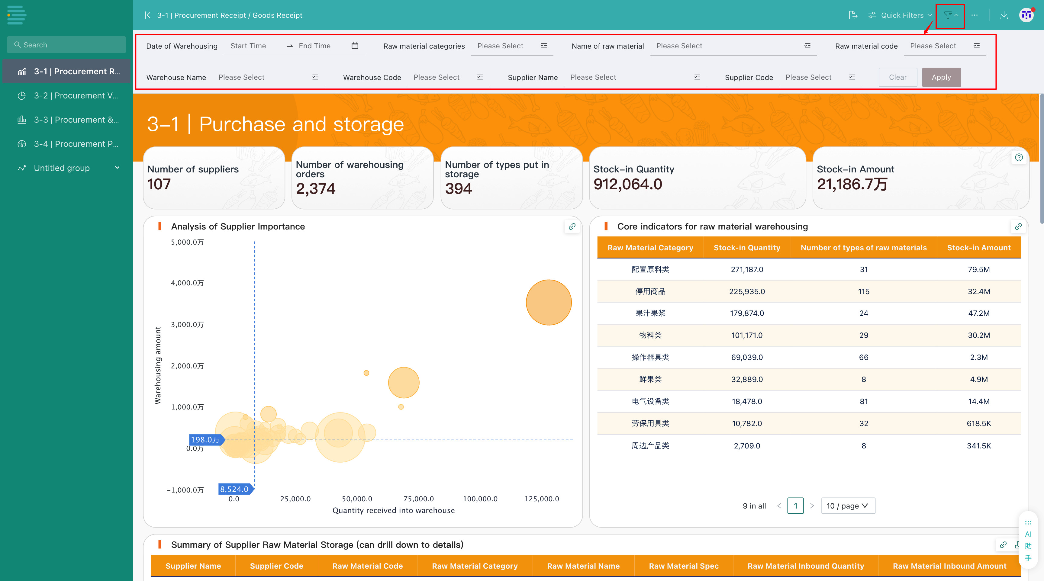
Filter Bar
If the original Dashboard or Self-service Data Retrieval page has a filter bar configured, this feature can continue to be used in the desktop app. For detailed filter bar configuration instructions, see Filter Bar.
Quick Query
In the desktop app, click Quick Query to configure and save query conditions. Later, you only need to select existing query conditions to run a query with the same conditions. The quick query configuration logic for desktop apps is similar to that for dashboards. For reference, see Quick Query.
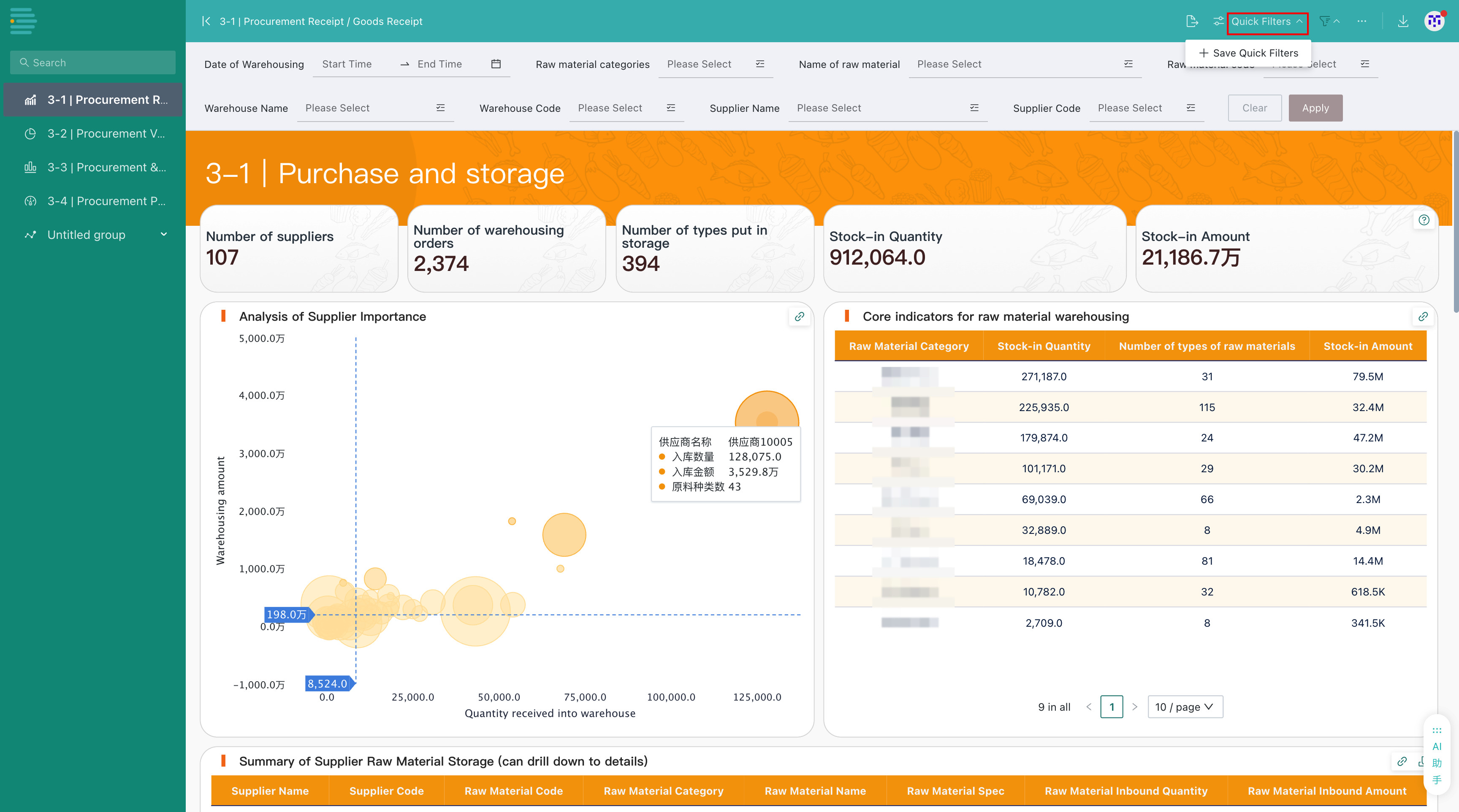
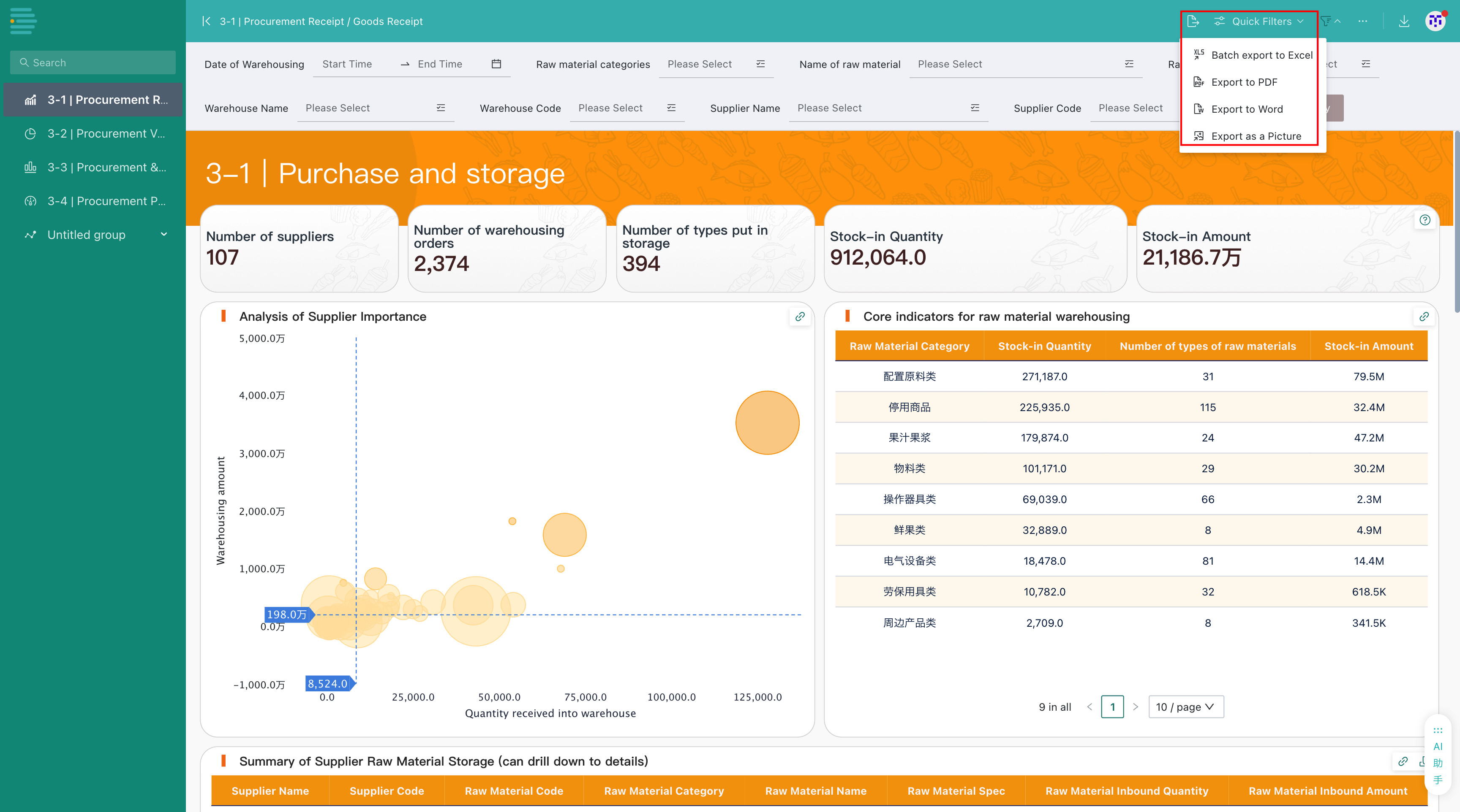
Export
In a desktop app, you can batch export pages to Excel, or export them as PDF, Word, or images.
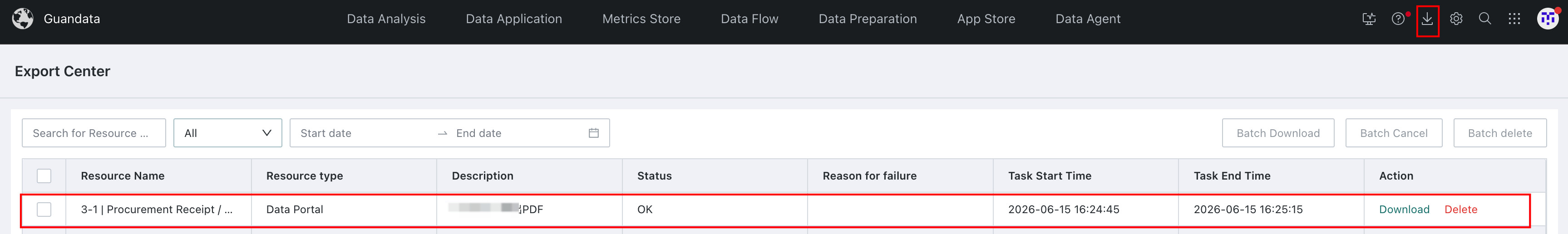
For tasks converted to offline export, you can view export records on the Export Center page. For details about export, see Dashboard Export.
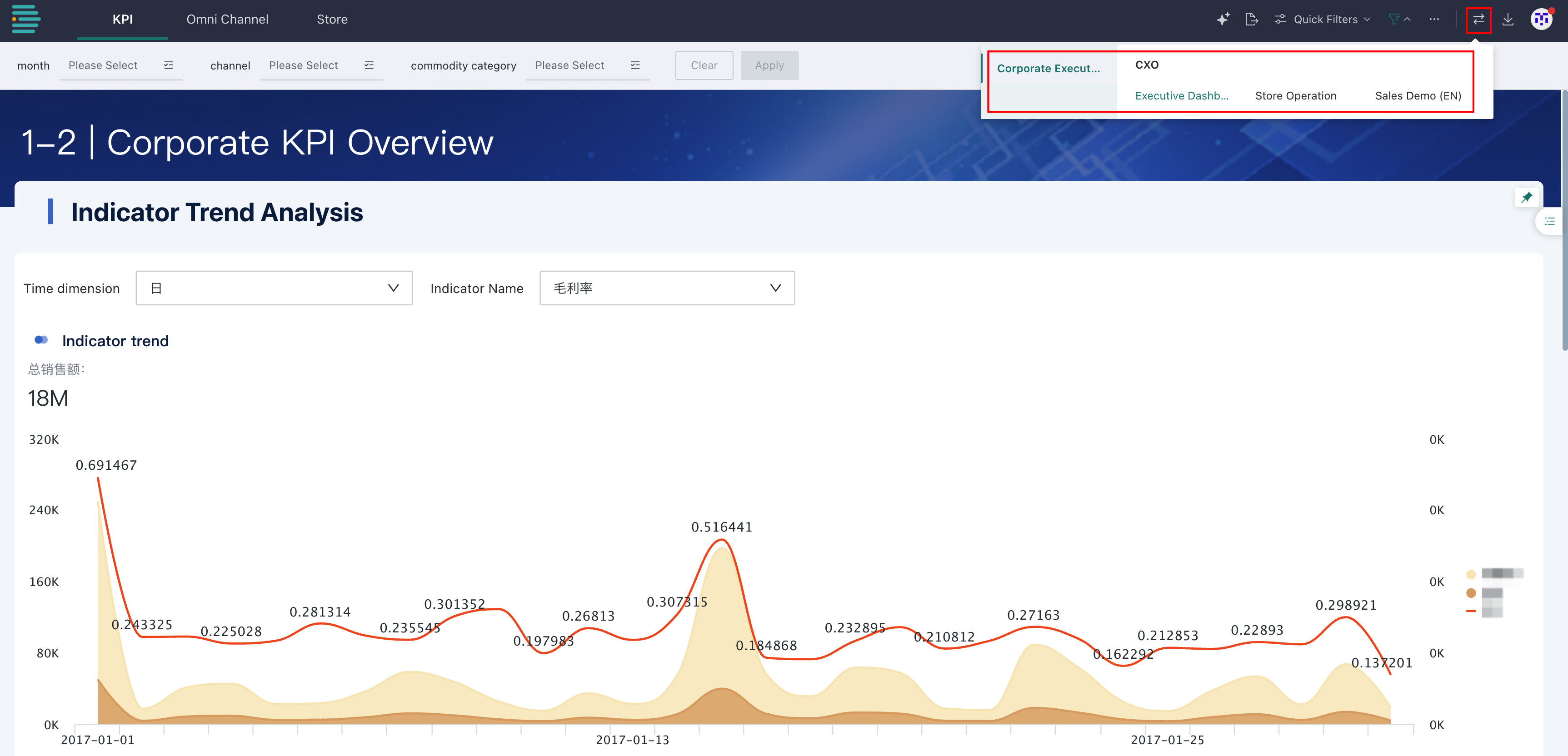
Switch Apps
Click Switch Apps in the upper-right corner of the preview page to switch directly to other apps in the portal.