Practical Cases
Overview
When building charts for specific business scenarios, you may find that the standard charts in Guandata BI are not sufficient. In that case, you can build a special chart through the Custom Chart feature. If the chart needs to be reused, it can then be packaged as a visualization plugin and installed into BI.
This article explains that packaging process and the related configuration steps.
Usage Guide
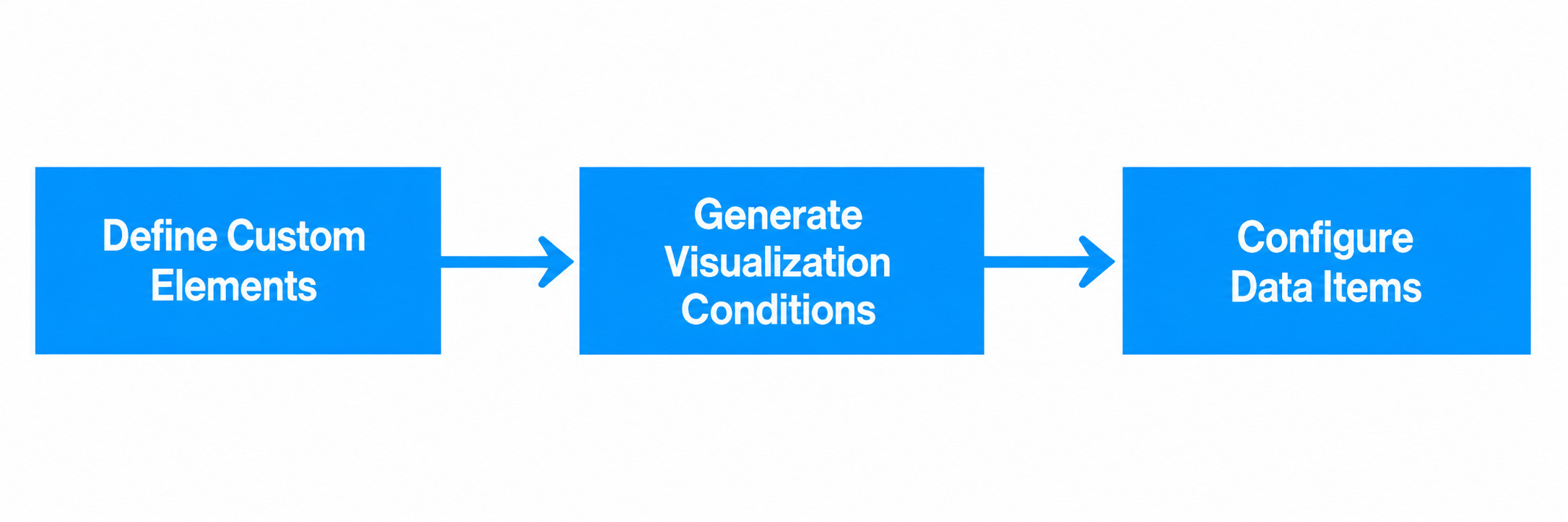
The creation process for visualization plugins is generally divided into the following three steps:
-
Generate Custom Chart: Create personalized display styles through the custom chart function in the Guandata BI platform. For specific steps, please refer to Custom Chart.
-
Generate Visualization Plugin: Generate visualization plugins in JSON file format according to the format defined by Guandata BI. For specific steps, please refer to Generate Visualization Plugin below.
-
Encapsulate Chart Configuration Items: Design front-end interface configuration item display effects and encapsulate chart configuration items. This article will focus on this.
Generate Custom Chart
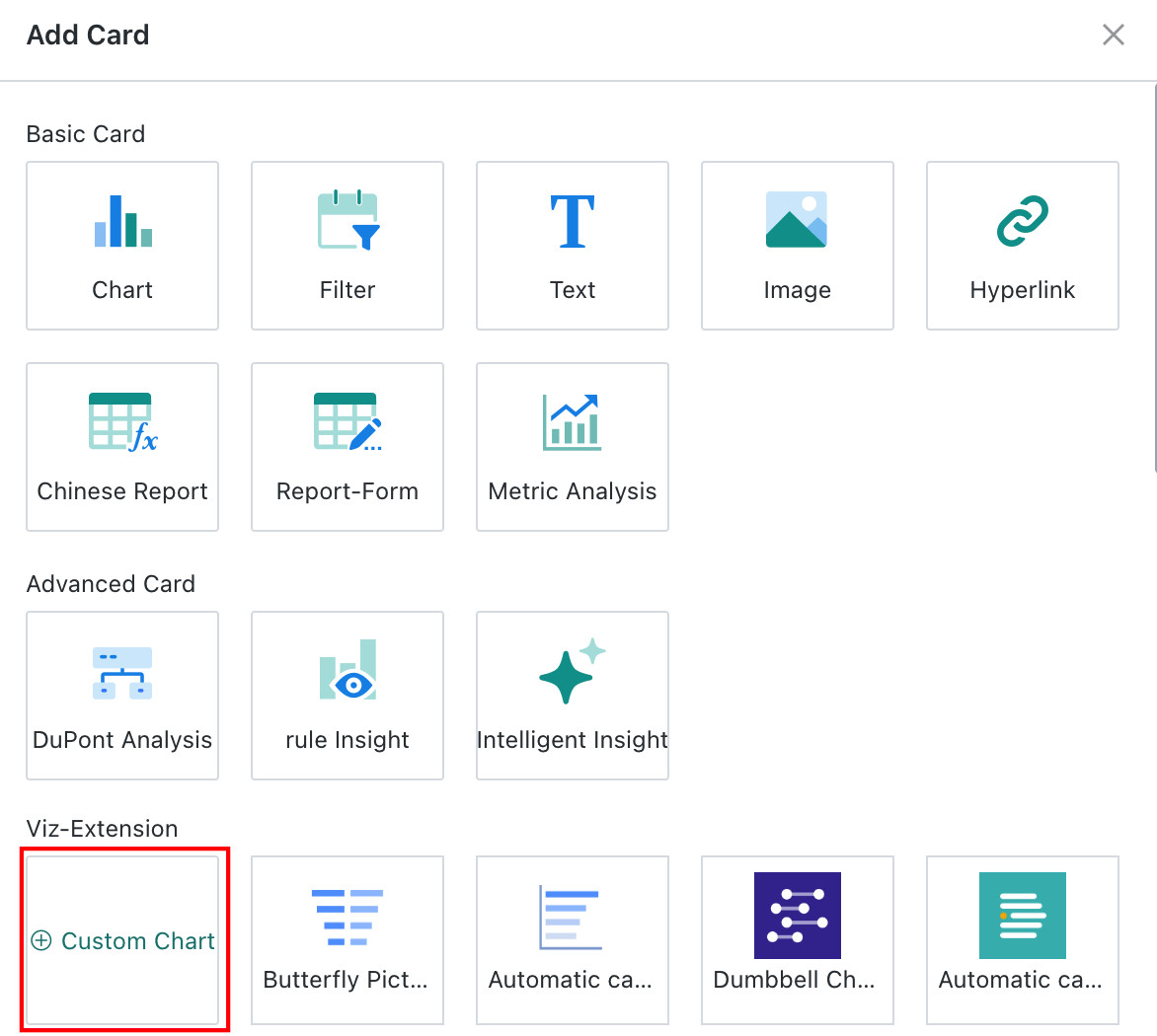
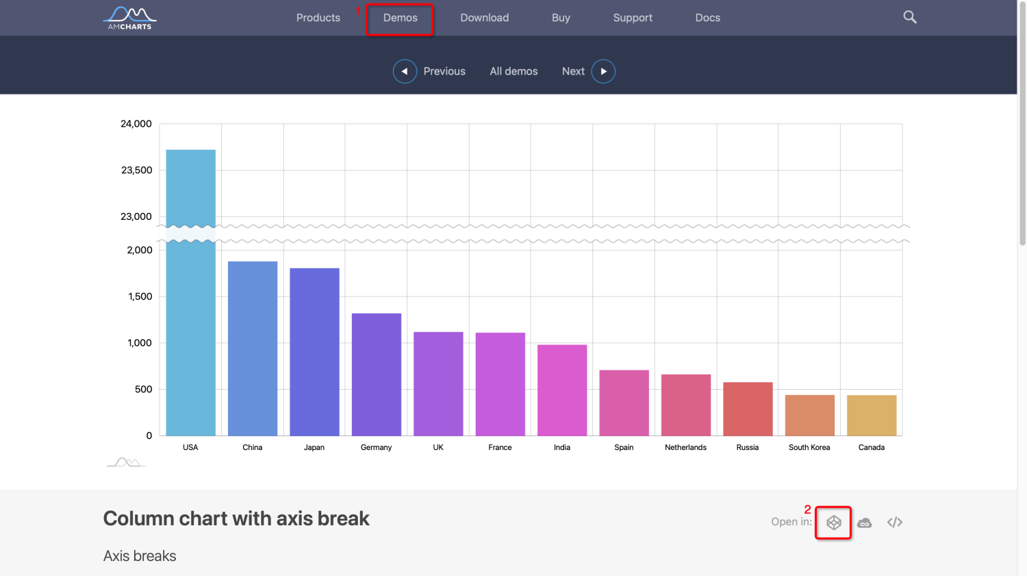
Feature Entry
Dashboard > New Card > Custom Chart.
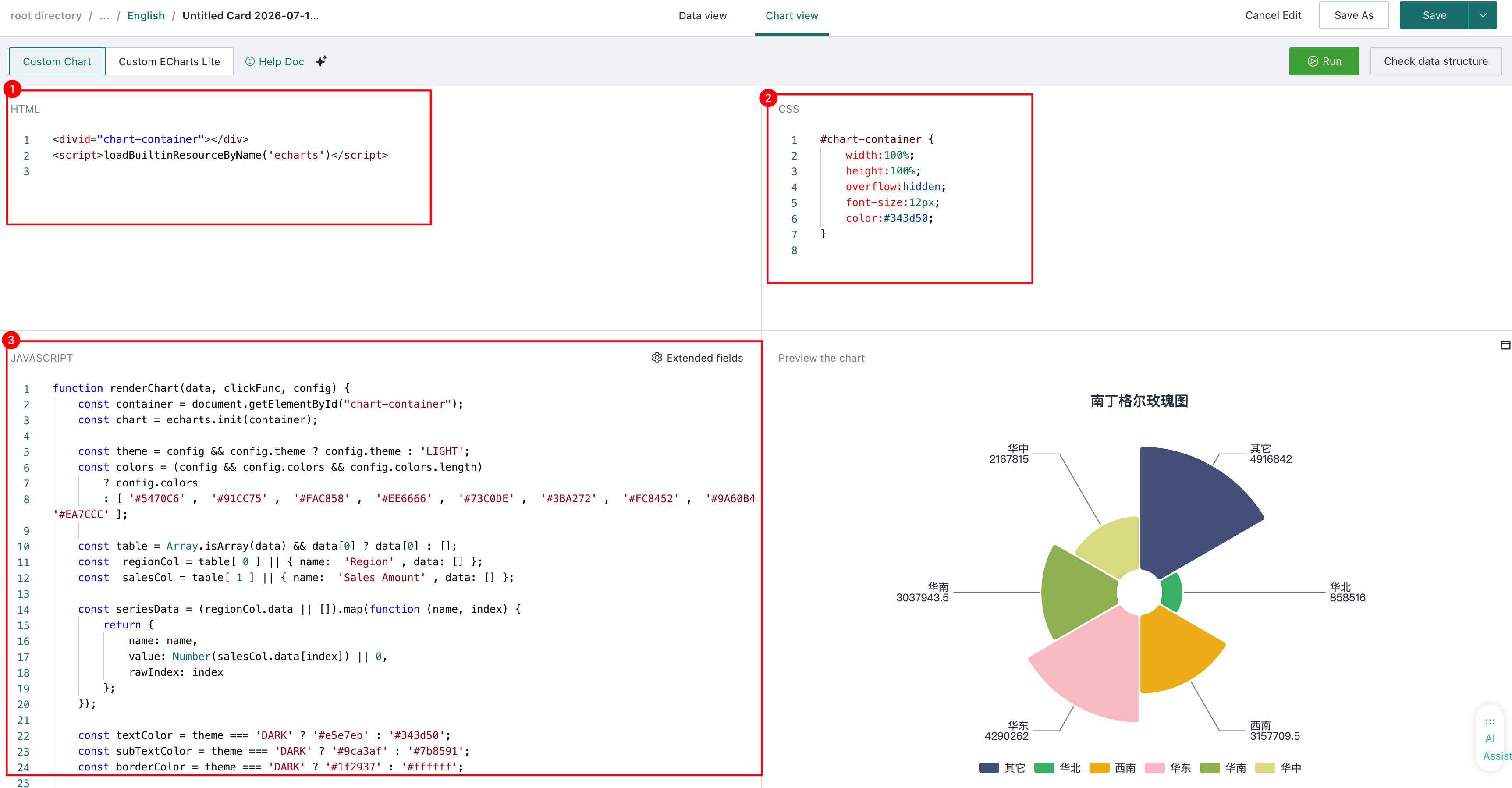
Editing Area
The editing area is divided into the following three parts:
-
Chart Library Reference and Container Definition (HTML): Mainly used to define the chart rendering container and the chart libraries to be referenced during chart rendering.
-
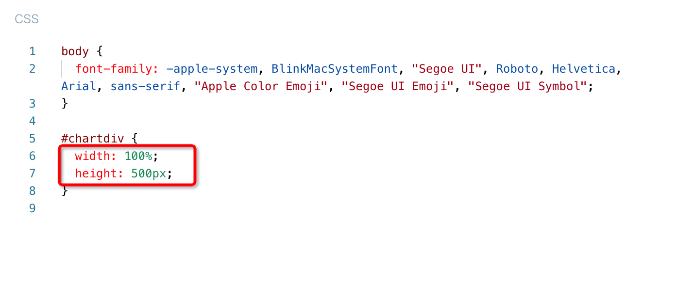
Main Style Settings (CSS): Static style settings. Generally, no additional modifications are needed. Container adaptability can be set here. For example, when referencing Amcharts charts, the height of the container chartdiv in its CSS defaults to 500px. You can modify it to 95% to achieve custom charts that adapt in height as the card size is adjusted.
-
Chart Rendering Logic (JAVASCRIPT): Chart data access and how to render are defined here.
Drawing Example
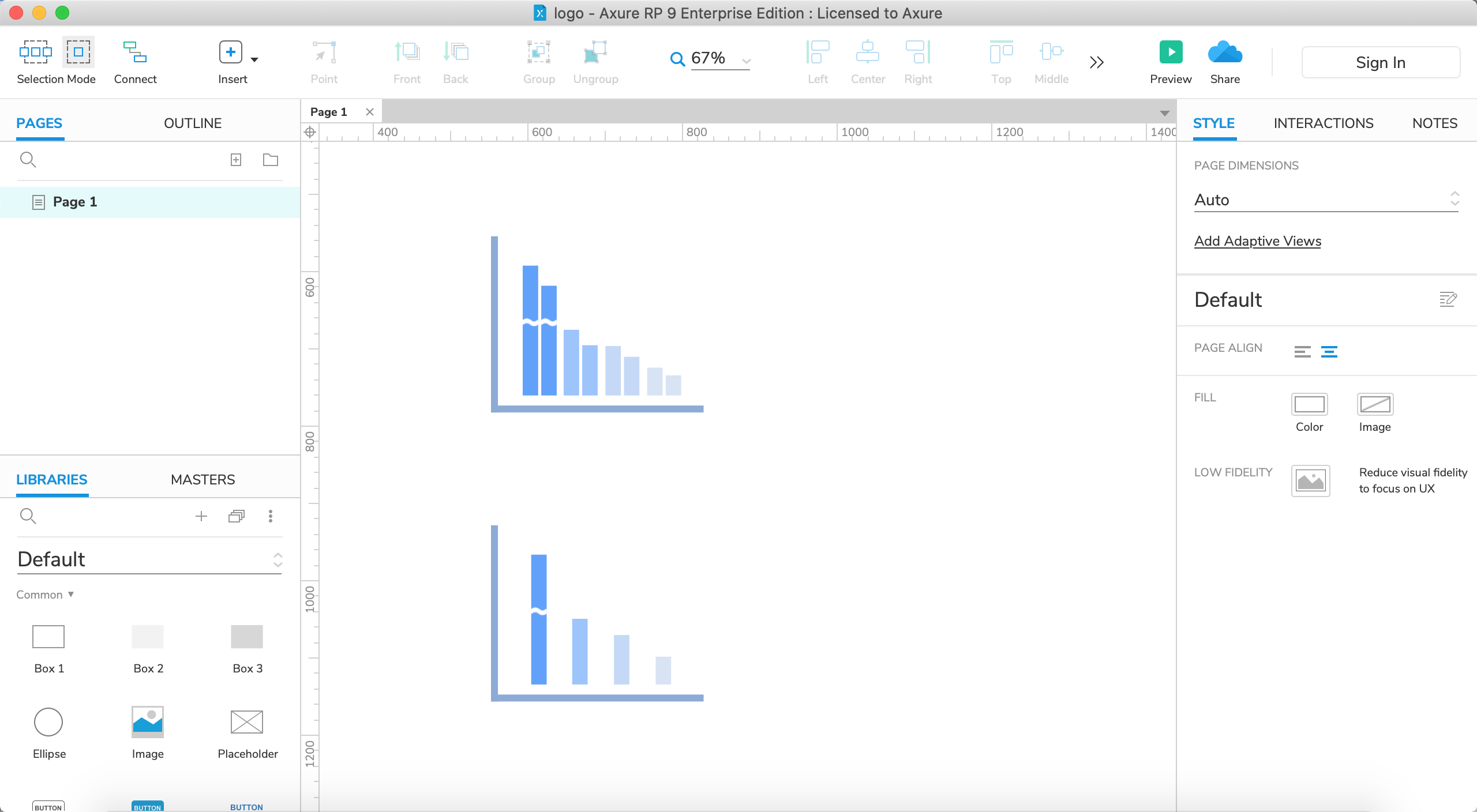
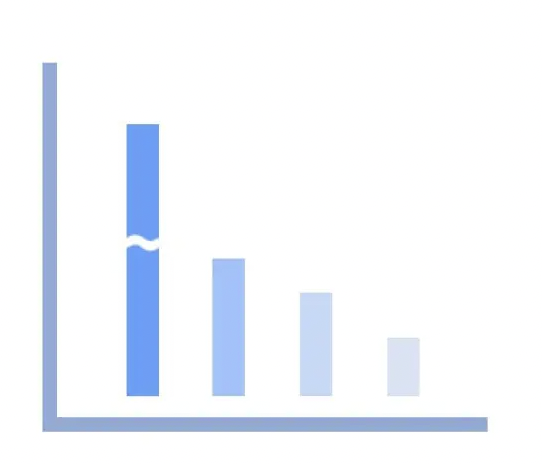
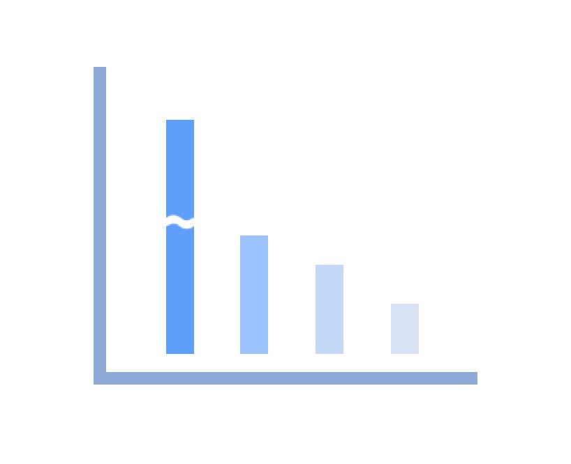
Below, we use Amcharts' column break chart as an example to explain how to generate a custom chart.
Amcharts is a chart component development and extension tool service provider, unrelated to Guandata BI products and services. It provides three chart components: JavaScript/HTML5 Charts, Javascript/HTML5 Stock Chart, and JavaScript Maps. If you need to use its products or services, please understand its product or service related prices and other matters on your own.
Step1. Chart Copy
- First, we select the column break chart from Amcharts official website Demos, and choose to open it in CodePen mode;
- In CodePen mode, copy the HTML, CSS, and JS content to the corresponding areas of Guandata Custom Chart;
-
Do not directly replace the content in the Custom Chart JAVASCRIPT with JS content. It needs to be pasted between "/* - - -- Custom Code Start - - -- /" and "/ - - -- Custom Code End - - -- */" under function renderChart
-
If it is an intranet environment, you also need to replace the chart library reference address in HTML with an intranet offline chart library address
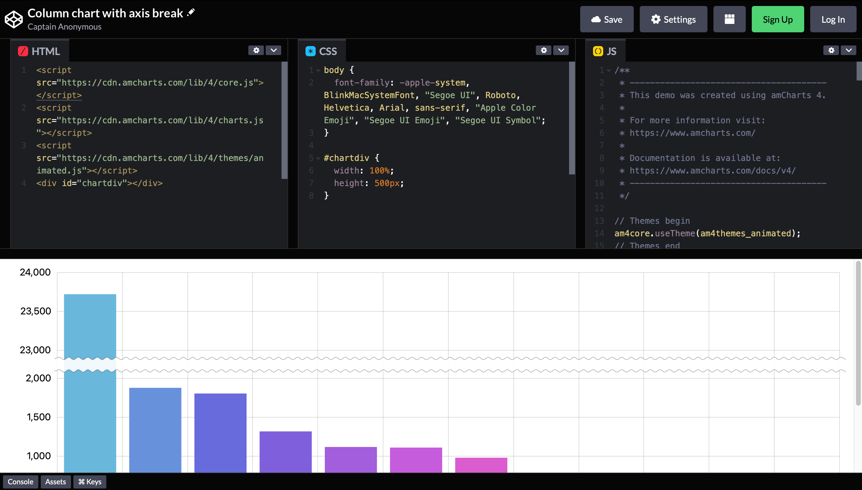
After the above operations are completed, the chart copy is complete.
Step2. Data Access
Next, we need to access Guandata BI data into the custom chart for rendering.
1. Prepare data in the "Data View".
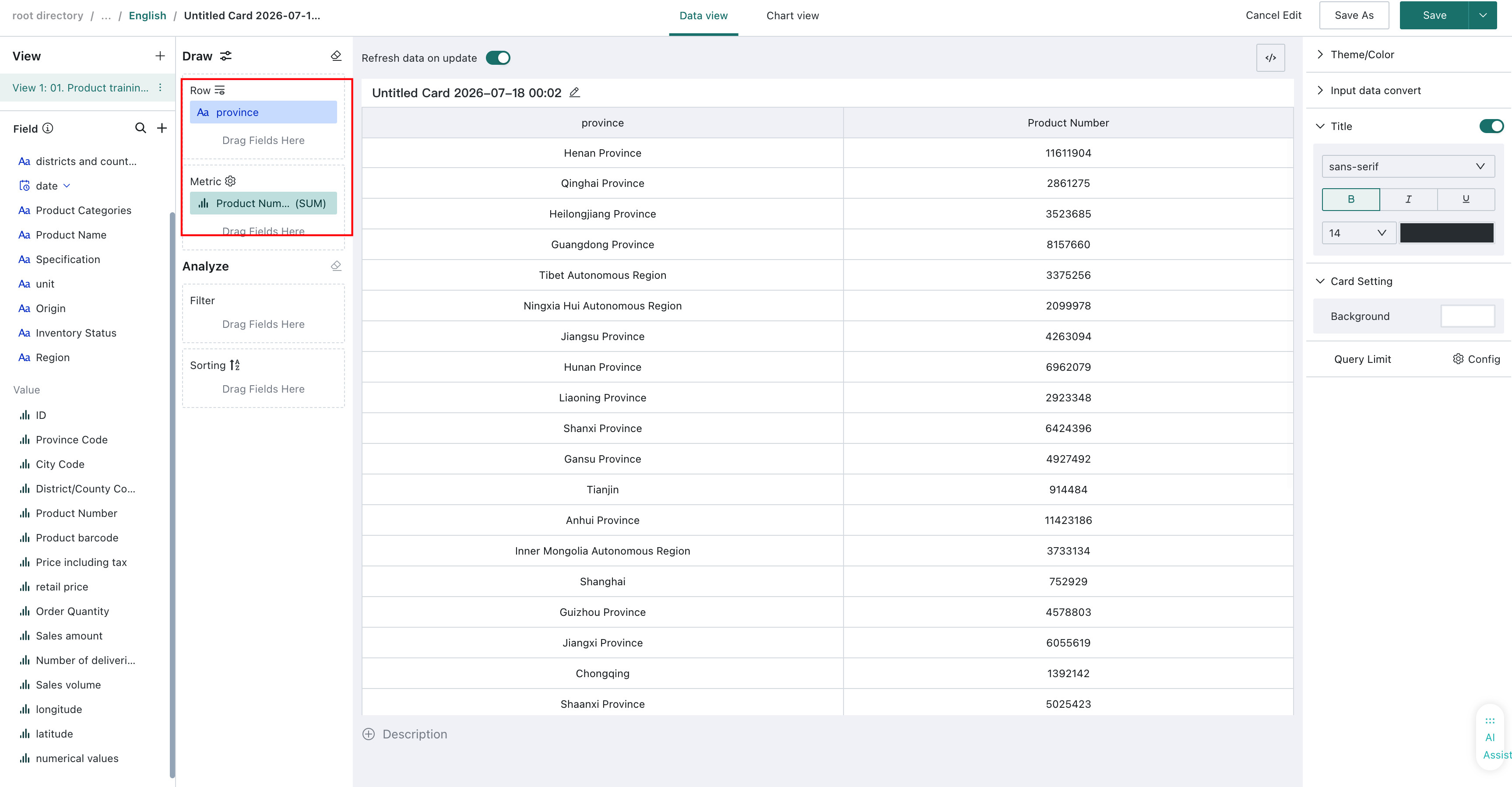
2. In the "Chart View", you can preview the data passed from the "Data View" through "View View Data Structure" in the upper right corner. The sample data provided in the Demo is shown below. We need to replace the data in the chart.data array with our prepared data.
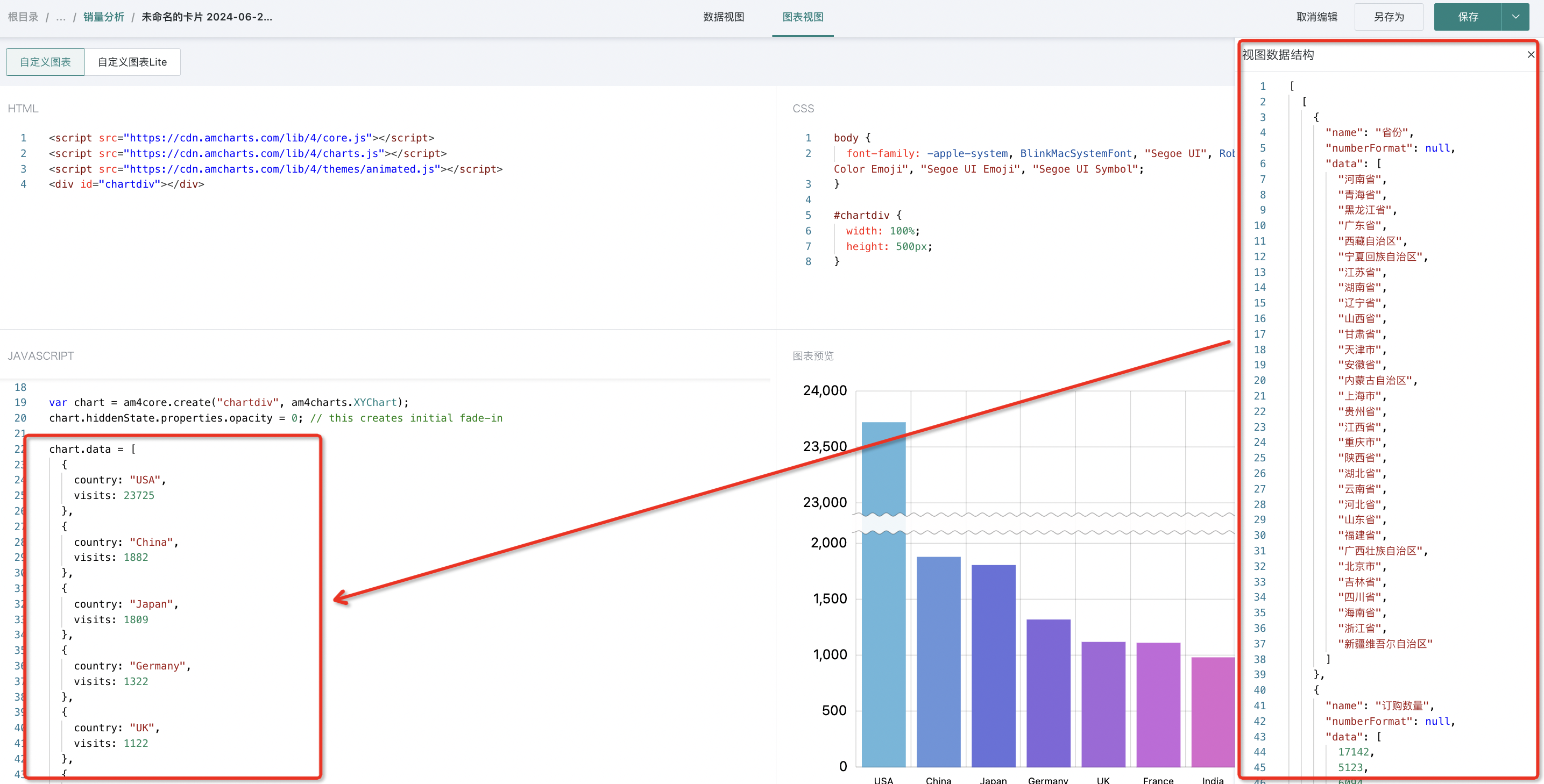
As shown below, feed the data from the BI system into chart.data.
At this point, we have completed data access.
Step3. Custom Modification
Finally, you can customize and adjust different chart configuration items according to different chart library configuration modification tutorials.
- Chart style modification
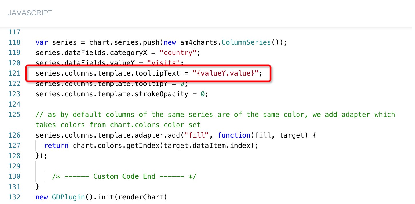
- Chart tooltip display content settings
Generate Visualization Plugin
After creating a custom chart, to facilitate reuse, we can package it as a visualization plugin.
File Format
Visualization plugins are JSON files stored in a predefined format, as shown below:
- Visualization Plugin JSON File Template
{
    "name": "", // Visualization plugin name, custom
    "version": "", // Visualization plugin template, custom
    "author": "", // Visualization plugin author, custom
    "description": "", // Visualization plugin description, custom
    "logo": "", // Visualization plugin icon, base64 format
    "css": "", // Same as custom chart
    "html": "", // Same as custom chart
    "subType": "PLUGIN", // Type is plugin, no need to modify
    "libs": [], // Reference js dependencies
    "script": "" // Same as custom chart
}
- Visualization Plugin JSON File Example
{
    "name": "Column Break Chart",
    "version": "V1.0",
    "author": "Guandata > wangping",
    "description": "Clustered Column Break Chart",
    "logo": "data:image/jpeg;base64,/9j/4AAQSkZJRgABAQAASABIAAD/....../gAooooAKKKKACiiigAooooA//Z",
    "css": "body \n    {\n  font > family:  > apple > system, BlinkMacSystemFont, \"Segoe UI\", Roboto, Helvetica, Arial, sans > serif, \"Apple Color Emoji\", \"Segoe UI Emoji\", \"Segoe UI Symbol\";\n}\n\n#chartdiv {\n  width: 100%;\n  height: 95%;\n}\n\n#container table {\n    border > collapse: collapse;\n    border > color: #E4E7F0;\n}\n\n#container table th {\n    padding: 4px 0;\n}\n\n#container table td {\n    min > width: 120px;\n    padding: 4px 0;\n    text > align: center;\n}\n",
    "html": "\n\n\n",
    "subType": "PLUGIN",
    "libs": [],
    "script": "function renderChart(data, clickFunc, config) {\n  /* -  -  --  Custom Code Start -  -  --  */\n\n  am4core.ready(function () {\n    // Themes begin\n    am4core.useTheme(am4themes_animated);\n    // Themes end\n\n    var chart = am4core.create(\"chartdiv\", am4charts.XYChart);\n    chart.hiddenState.properties.opacity = 0; // this creates initial fade > in\n    chart.colors.step = 2;\n    function createSeries(value, name) {\n      var series = chart.series.push(new am4charts.ColumnSeries());\n      series.dataFields.categoryX = 'Cat';\n      series.dataFields.valueY = value;\n      series.name = name;\n      series.columns.template.tooltipText = \"{categoryX} {name} : {valueY.value}\";\n      series.columns.template.tooltipY = 0;\n      series.columns.template.strokeOpacity = 0;\n  \n      // as by default columns of the same series are of the same color, we add adapter which takes colors from chart.colors color set\n      series.columns.template.adapter.add(\"fill\", function (fill, target) {\n        return chart.colors.getIndex(target.dataItem.index);\n      });\n  \n      return series;\n    }\n    chart.data = [];\n    data[0][0].data.forEach((v,i) => chart.data.push({\"Cat\":v,\"Value1\": data[0][1].data[i]}));\n\n    let index;\n    ValueList = [];\n    for(index in chart.data) {\n    ValueList.push(chart.data[index].Value1)\n\n    }\n    maxValue = Math.ceil(Math.max.apply(null,ValueList));\n    console.log(maxValue);\n/*\n    chart.data = [\n      {\n        country: \"USA\",\n        visits: 23725,\n        data1: 12340,\n      },\n      {\n        country: \"China\",\n        visits: 1882,\n        data1: 1230,\n      },\n      {\n        country: \"Japan\",\n        visits: 1809,\n        data1: 1230,\n      }\n    ];\n  */\n    // var categoryAxis = chart.xAxes.push(new am4charts.CategoryAxis());\n    // categoryAxis.renderer.grid.template.location = 0;\n    // categoryAxis.dataFields.category = \"country\";\n    // categoryAxis.renderer.minGridDistance = 40;\n    // categoryAxis.fontSize = 11;\n\n    var xAxis = chart.xAxes.push(new am4charts.CategoryAxis())\n    xAxis.dataFields.category = 'Cat'\n    xAxis.renderer.cellStartLocation = 0.1\n    xAxis.renderer.cellEndLocation = 0.9\n    xAxis.renderer.grid.template.location = 0;\n\n\n    var valueAxis = chart.yAxes.push(new am4charts.ValueAxis());\n    valueAxis.min = 0;\n    valueAxis.max = maxValue;\n    valueAxis.strictMinMax = true;\n    valueAxis.renderer.minGridDistance = 30;\n    // axis break\n    var axisBreak = valueAxis.axisBreaks.create();\n    axisBreak.startValue = maxValue * 0.3;\n    axisBreak.endValue = maxValue * 0.9;\n    //axisBreak.breakSize = 0.005;\n\n    // fixed axis break\n    var d =\n      (axisBreak.endValue  >  axisBreak.startValue) /\n      (valueAxis.max  >  valueAxis.min);\n    axisBreak.breakSize = (0.05 * (1  >  d)) / d; // 0.05 means that the break will take 5% of the total value axis height\n\n    // make break expand on hover\n    var hoverState = axisBreak.states.create(\"hover\");\n    hoverState.properties.breakSize = 1;\n    hoverState.properties.opacity = 0.1;\n    hoverState.transitionDuration = 1500;\n\n    axisBreak.defaultState.transitionDuration = 1000;\n    createSeries('Value1', 'Value1');\n  }); // end am4core.ready()\n\n  /* -  -  --  Custom Code End -  -  --  */\n}\nnew GDPlugin().init(renderChart);\n"
}
Custom Chart Content Reference
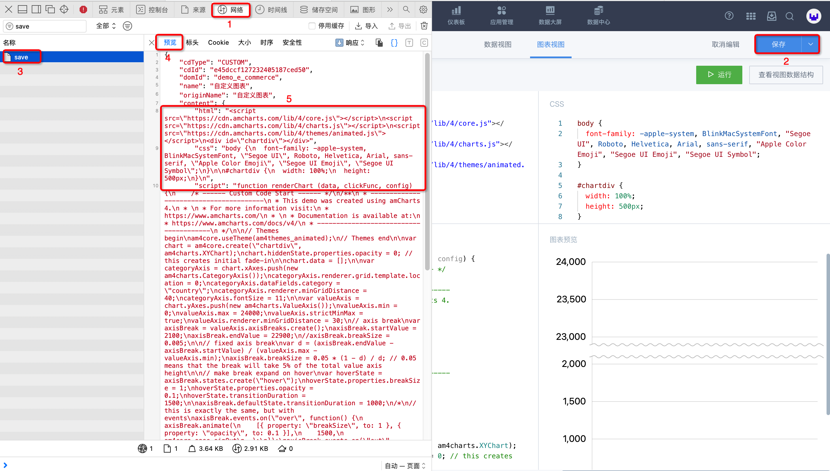
Obtain custom chart content through the interface return information in the Chrome browser console.
Specific operations: F12/Right-click and select "Inspect" to open the console > Switch to the "Network" tab > Click "Save" in the custom chart editing interface > Select "save" interface from the interface list > Select "Preview" tab > Copy content under html, css, and script > Paste into the corresponding areas of the visualization plugin JSON file
Logo Generation and Conversion
-
Download from the internet (recommended: https://www.iconfont.cn/) or create your own (recommended: Axure RP9 tool) a Logo icon.
-
To adapt to Guandata's two different color themes, you need to replace the solid color background of the created icon with a transparent background. You can use tools like Meitu Xiuxiu to achieve the desired effect.
-
After replacing with a transparent background, convert the Logo image to Base64 format encoding (recommended https://c.runoob.com/front > end/59/).
-
Finally, paste the converted Base64 encoding into the corresponding area of the visualization plugin JSON file to generate the visualization plugin.

Visualization Plugin Installation and Application
After the above steps, our visualization plugin is built. Next, we need to import the visualization plugin into the Guandata BI platform.
-
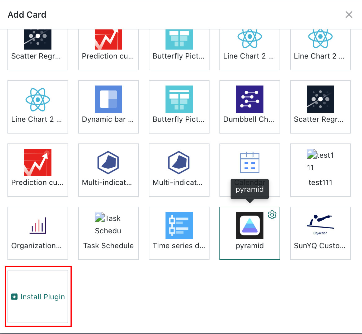
In the Dashboard, click "New Card", scroll the popup to the bottom, and click "Install Plugin". Select the previously generated visualization plugin JSON file, and the plugin will be imported and installed. The new plugin will be displayed at the end of the current card list.
-
Click the plugin, just like a normal card, select the analysis dataset, enter the card editing interface, and drag data according to the interface instructions to complete the visualization display.
Encapsulate Chart Configuration Items
In the above, we introduced how to generate visualization plugins, and through installation and application of these plugins, we can quickly achieve desired visualization effects. However, this implementation method still has certain limitations. For example, the interface lacks the ability to directly customize chart configuration items, which means that when we want to modify colors, label display, legend styles, etc., we need to go back to the JSON file for code modification, and then update the plugin.
To solve this problem, we need to create interfaces and apply them during rendering for some commonly used configuration items.
Chart Configuration Item Creation
Built-in rendering component types are as follows:
-
STRING // Text input box
-
SELECT // Dropdown selector
-
NUMBER // Number input box
-
BOOLEAN // Switch
-
DIVIDER // Divider (for beautification)
-
MODEL // Flexible Model definition
-
GROUP // Group
If you want to display interface creation and chart configuration items, you need to add "chartConfigurations" in the visualization plugin JSON file. The content template in "chartConfigurations" is as follows:
- Visualization Plugin JSON File Template Adding "chartConfigurations"
{
    "name": "", // Visualization plugin name, custom
    "version": "", // Visualization plugin template, custom
    "author": "", // Visualization plugin author, custom
    "description": "", // Visualization plugin description, custom
    "logo": "", // Visualization plugin icon, base64 format
    "css": "", // Same as custom chart
    "html": "", // Same as custom chart
    "subType": "PLUGIN", // Type is plugin, no need to modify
    "libs": [], // Reference js dependencies
    "script": "" // Same as custom chart
    "chartConfigurations": [
        {
            "fieldName": "", // Required, component name, used as the name passed in config during chart drawing
            "label": "", // Required, front-end interface display name
            "type": "", // Required, rendering component type
            "defaultValue": "", // Optional, default value
            	"dependsOnMap": {}, // Optional, dependency
            	/*
            	Example
            	"dependsOnMap": {
            	  	"Configuration item fieldName1": [ true ]
            	  },
            	  */
            "model": {} // Optional, model
            	/*
            	Example
            	"model": {
            	  	"modelType": "SELECT",
            	  	"labels": [ "Data label outside", "Inside center" ],
            	  	"values": [ "outside", "center" ],
            	  	"size": "small"
            	  }
            	  */
        },
        {
            Configuration item 2
        },
      	...
    ]
}
Using the column break chart mentioned above as an example, we add chartConfigurations in the visualization plugin JSON file and build two configuration items "startValue" and "endValue" to define the start and end values of the truncation interval. As shown below:
- Visualization Plugin JSON File Template Adding "chartConfigurations" Example
{
    "name": "Column Break Chart",
    "version": "V1.1",
    "author": "Guandata > wangping",
    "description": "Clustered Column Break Chart",
    "logo": "data:image/png;base64,iVBORw0KGgoAAAANSU....../g+iCTPPrp+uQAAAAABJRU5ErkJggg==",
    "css": "body {\n  font > family:  > apple > system, BlinkMacSystemFont, \"Segoe UI\", Roboto, Helvetica, Arial, sans > serif, \"Apple Color Emoji\", \"Segoe UI Emoji\", \"Segoe UI Symbol\";\n}\n\n#chartdiv {\n  width: 100%;\n  height: 95%;\n}\n\n#container table {\n    border > collapse: collapse;\n    border > color: #E4E7F0;\n}\n\n#container table th {\n    padding: 4px 0;\n}\n\n#container table td {\n    min > width: 120px;\n    padding: 4px 0;\n    text > align: center;\n}\n",
    "html": "\n\n\n",
    "subType": "PLUGIN",
    "libs": [],
    "chartConfigurations":[{"fieldName":"startValue","label":"Break Start","type":"NUMBER","model":{"size":"small"}},{"fieldName":"endValue","label":"Break End","type":"NUMBER","model":{"size":"small"}}],
    "script": "const DEDAULT_COLORS = ['#2f7ed8', '#f28f43', '#1aadce', '#492970', '#f28f43', '#77a1e5', '#c42525', '#a6c96a']\nconst DEFALUT_THEME = 'LIGHT'\nfunction renderChart(data, clickFunc, config) {\n  /* -  -  --  Custom Code Start -  -  --  */\n  if (!data || data[0].length < 2) {\n\t\treturn void(document.getElementById(\"chartdiv\")\n\t\t\t.innerHTML = \"\nNeed 2 columns of data (1 dimension, 1 measure) \nFirst column is dimension\nSecond column is measure\")\n\t}\n  const {\n\t\ttheme: i = DEFALUT_THEME,\n\t\tcolors: s = DEDAULT_COLORS,\n\t\tcustomOptions: o = {}\n\t} = config || {}, n = \"LIGHT\" !== i, {\n\t\tstartValue: a,\n\t\tendValue: l\n\t} = o;\n\n\n  am4core.ready(function () {\n    // Themes begin\n    am4core.useTheme(am4themes_animated);\n    // Themes end\n\n    var chart = am4core.create(\"chartdiv\", am4charts.XYChart);\n    chart.hiddenState.properties.opacity = 0; // this creates initial fade > in\n    chart.colors.step = 2;\n    function createSeries(value, name) {\n\n//change theme colors\n    s.forEach((v)=>\n      {chart.colors.list.push(am4core.color(v))}\n    );\n\nconsole.log(am4core.color(s[0]));\n      var series = chart.series.push(new am4charts.ColumnSeries());\n      series.dataFields.categoryX = 'Cat';\n      series.dataFields.valueY = value;\n      series.name = name;\n      series.columns.template.tooltipText = \"{categoryX} {name} : {valueY.value}\";\n      series.columns.template.tooltipY = 0;\n      series.columns.template.strokeOpacity = 0;\n  \n      // as by default columns of the same series are of the same color, we add adapter which takes colors from chart.colors color set\n      series.columns.template.adapter.add(\"fill\", function (fill, target) {\n        return chart.colors.getIndex(target.dataItem.index);\n      });\n  \n      return series;\n    }\n    chart.data = [];\n    value1Name = data[0][1].name;\n    data[0][0].data.forEach((v,i) => chart.data.push({\"Cat\":v,[value1Name]: data[0][1].data[i]}));\n\n    ValueList = [];\n    data[0][0].data.forEach((v,i) => ValueList.push(data[0][1].data[i]));\n    maxValue = Math.ceil(Math.max.apply(null,ValueList));\n/*\n    chart.data = [\n      {\n        country: \"USA\",\n        visits: 23725,\n        data1: 12340,\n      },\n      {\n        country: \"China\",\n        visits: 1882,\n        data1: 1230,\n      },\n      {\n        country: \"Japan\",\n        visits: 1809,\n        data1: 1230,\n      }\n    ];\n  */\n    // var categoryAxis = chart.xAxes.push(new am4charts.CategoryAxis());\n    // categoryAxis.renderer.grid.template.location = 0;\n    // categoryAxis.dataFields.category = \"country\";\n    // categoryAxis.renderer.minGridDistance = 40;\n    // categoryAxis.fontSize = 11;\n\n    var xAxis = chart.xAxes.push(new am4charts.CategoryAxis())\n    xAxis.dataFields.category = 'Cat'\n    xAxis.renderer.cellStartLocation = 0.1\n    xAxis.renderer.cellEndLocation = 0.9\n    xAxis.renderer.grid.template.location = 0;\n\n\n    var valueAxis = chart.yAxes.push(new am4charts.ValueAxis());\n    valueAxis.min = 0;\n    valueAxis.max = maxValue;\n    valueAxis.strictMinMax = true;\n    valueAxis.renderer.minGridDistance = 30;\n    // axis break\n    var axisBreak = valueAxis.axisBreaks.create();\n    axisBreak.startValue = a || maxValue * 0.3;\n    axisBreak.endValue = l || maxValue * 0.9;\n    //axisBreak.breakSize = 0.005;\n\n    // fixed axis break\n    var d =\n      (axisBreak.endValue  >  axisBreak.startValue) /\n      (valueAxis.max  >  valueAxis.min);\n    axisBreak.breakSize = (0.05 * (1  >  d)) / d; // 0.05 means that the break will take 5% of the total value axis height\n\n    // make break expand on hover\n    var hoverState = axisBreak.states.create(\"hover\");\n    hoverState.properties.breakSize = 1;\n    hoverState.properties.opacity = 0.1;\n    hoverState.transitionDuration = 1500;\n\n    axisBreak.defaultState.transitionDuration = 1000;\n    createSeries(value1Name, value1Name);\n  }); // end am4core.ready()\n\n  /* -  -  --  Custom Code End -  -  --  */\n}\nnew GDPlugin().init(renderChart);\n"
}
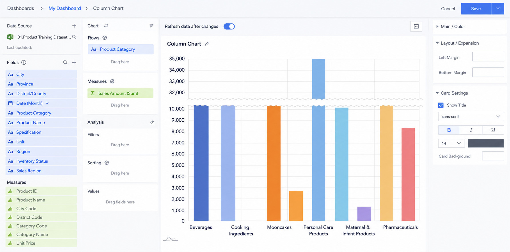
After adding chartConfigurations content to the JSON file, update the plugin. We will find that when creating charts through the visualization plugin, a "Configuration Extension" module has been added to the chart configuration area on the right, and the two configuration items "startValue" and "endValue" we just defined are displayed. At this point, we have completed the front-end interface preparation for chart configuration items.
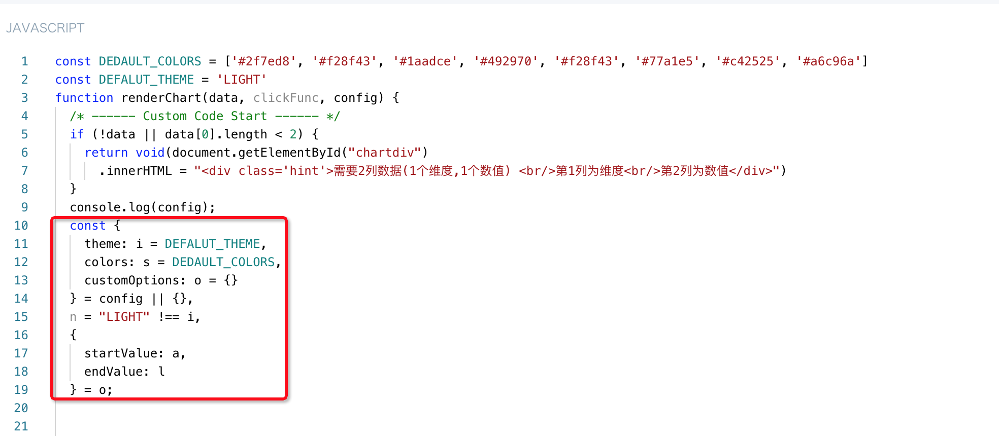
The renderChart function for drawing charts in the JS area has three parameters: data, clickFunc, and config.
-
data is the data array, responsible for passing our prepared data, as introduced above;
-
clickFunc is the interaction callback, passing user interaction event information;
-
config is the chart configuration, passing various configuration information of the chart.
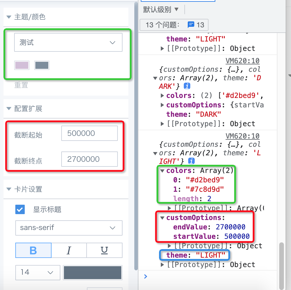
We output the content in config through the console and find that config passes the following content: colors, customOption, theme, and language (supported from version 5.6.0).
-
colors contains the color information corresponding to "Theme/Color";
-
customOption contains the information of the two custom configuration items "endValue" and "startValue";
-
theme contains theme information;
-
language contains the current system language (supported from version 5.6.0).
Configuration Item Access
From the config parameter, we can obtain colors, customOption, theme, and language (supported from version 5.6.0) information. We still use the column break chart as an example to explain the configuration for colors and customOption.
Step1. Extract chart configuration information from config and assign to variables
Step2. Apply variable values to chart rendering
Color Application
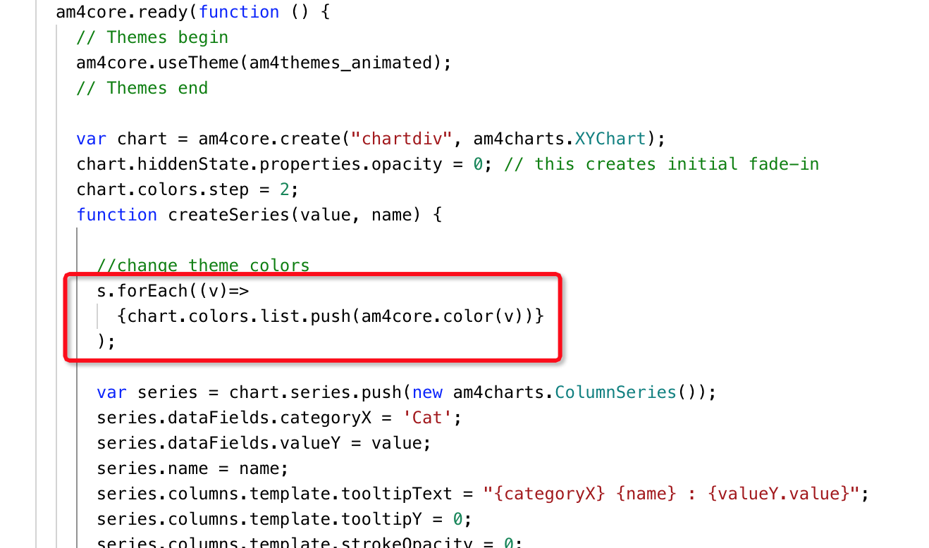
In Amcharts, when rendering charts, colors are taken from the system's preset chart.colors.list, and chart.colors.list stores objects generated through am4core.color($hex_color). Therefore, we pass the colors values from config into it one by one through loop traversal. As shown below:
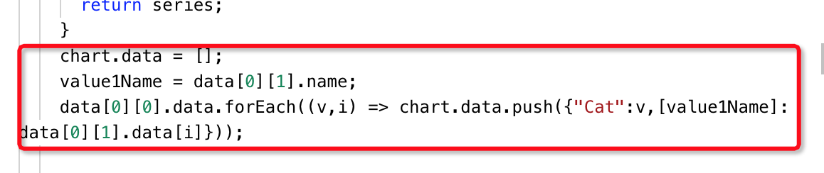
Custom Configuration Item Application
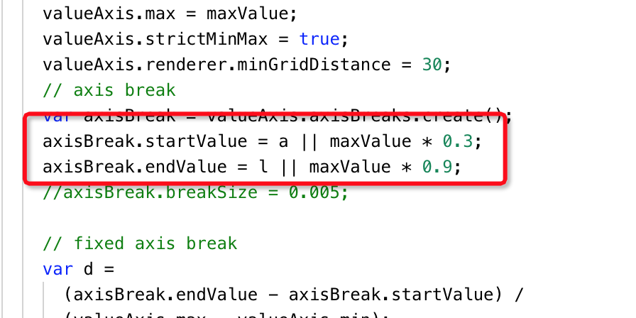
We previously defined two configuration items "startValue" and "endValue" for setting the truncation interval. Although an automated truncation interval processing was done according to 30% > 90% of the maximum value, in some cases manual adjustment of the truncation interval is still needed.
Therefore, an optimization is made here. When values are passed in for "startValue" and "endValue", the manually configured interval values are used. When "startValue" and "endValue" are empty, automatic truncation is done according to 30% > 90% of the maximum value. As shown below:
Step3. Display Effect Verification
At this point, we have completed all work. After saving the result as a JSON format file and updating the plugin, you can view and verify the final visualization plugin display effect.