Visualization Plugin Development Guide
Overview
Visualization plugins can greatly expand both Guandata BI's charting capabilities and the types of visual analysis available to users. This article introduces the basic development workflow for visualization plugins. If you already have some front-end development experience or familiarity with BI products, it will be easier to get started.
Usage Guide
Development Preparation
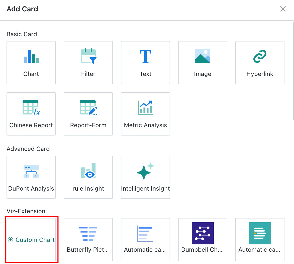
1. On the Dashboard page, click New Card in the upper-right corner, then choose Custom Chart from the popup.
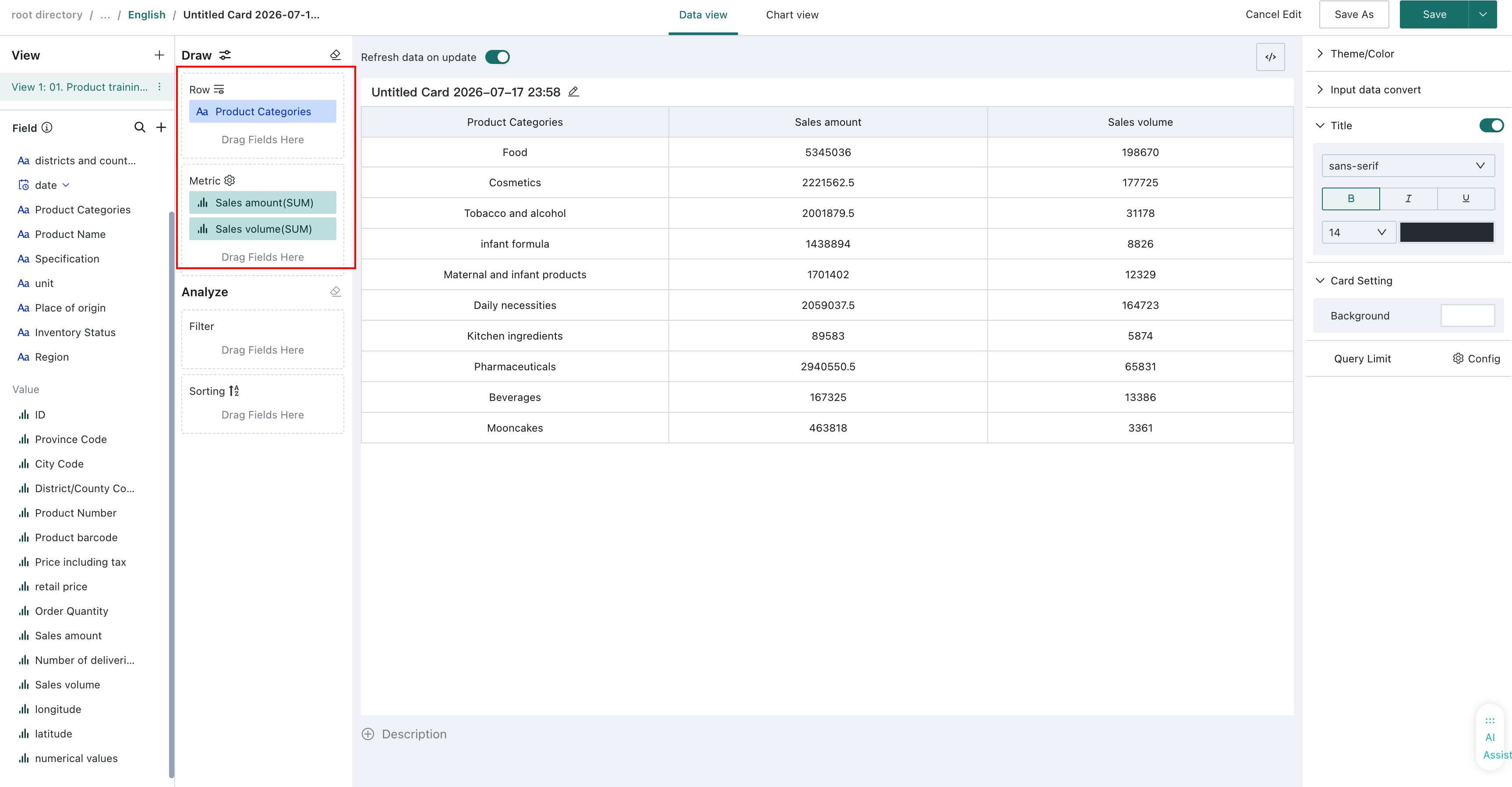
2. Select a dataset for the card and click OK to enter the card editor. Drag the relevant fields from the left field area into the charting area to prepare the data required for rendering.
3. Switch from Data View to Chart View by clicking the view switch at the top of the page.
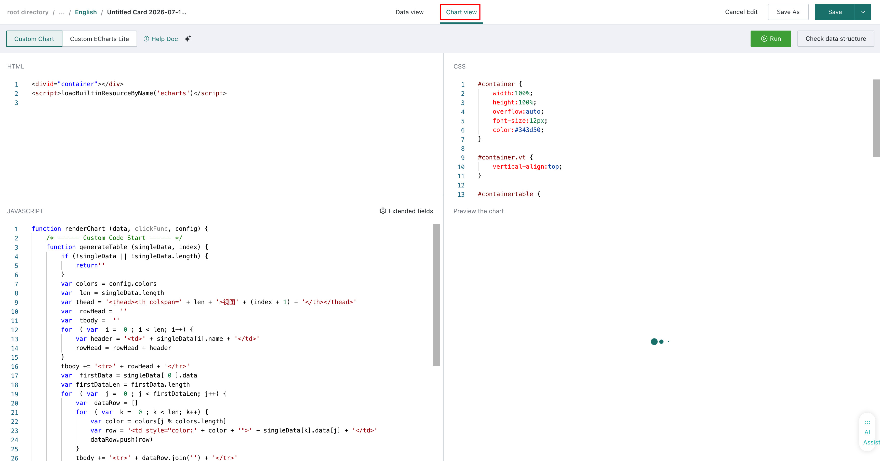
At this point, the preparation work is complete and development can begin.
Development Area Introduction
(1) Editing Area (from top to bottom, from left to right, refer to the figure below)
a. Run Button: Runs the current code and previews the result;
b. View Data Structure: Displays the unified data structure returned by the data view;
c. HTML Writing Area: Usually used to define the chart container and any external libraries referenced through CDN;

d. CSS Writing Area: Used for styling. SCSS, LESS, and other preprocessors are not supported; only native CSS is supported;
e. JavaScript Writing Area: See point (2) below;
f. Chart Preview Area: Displays the final rendered result. Every new custom card includes a default table preview so you can inspect data and configuration behaviors such as theme colors.
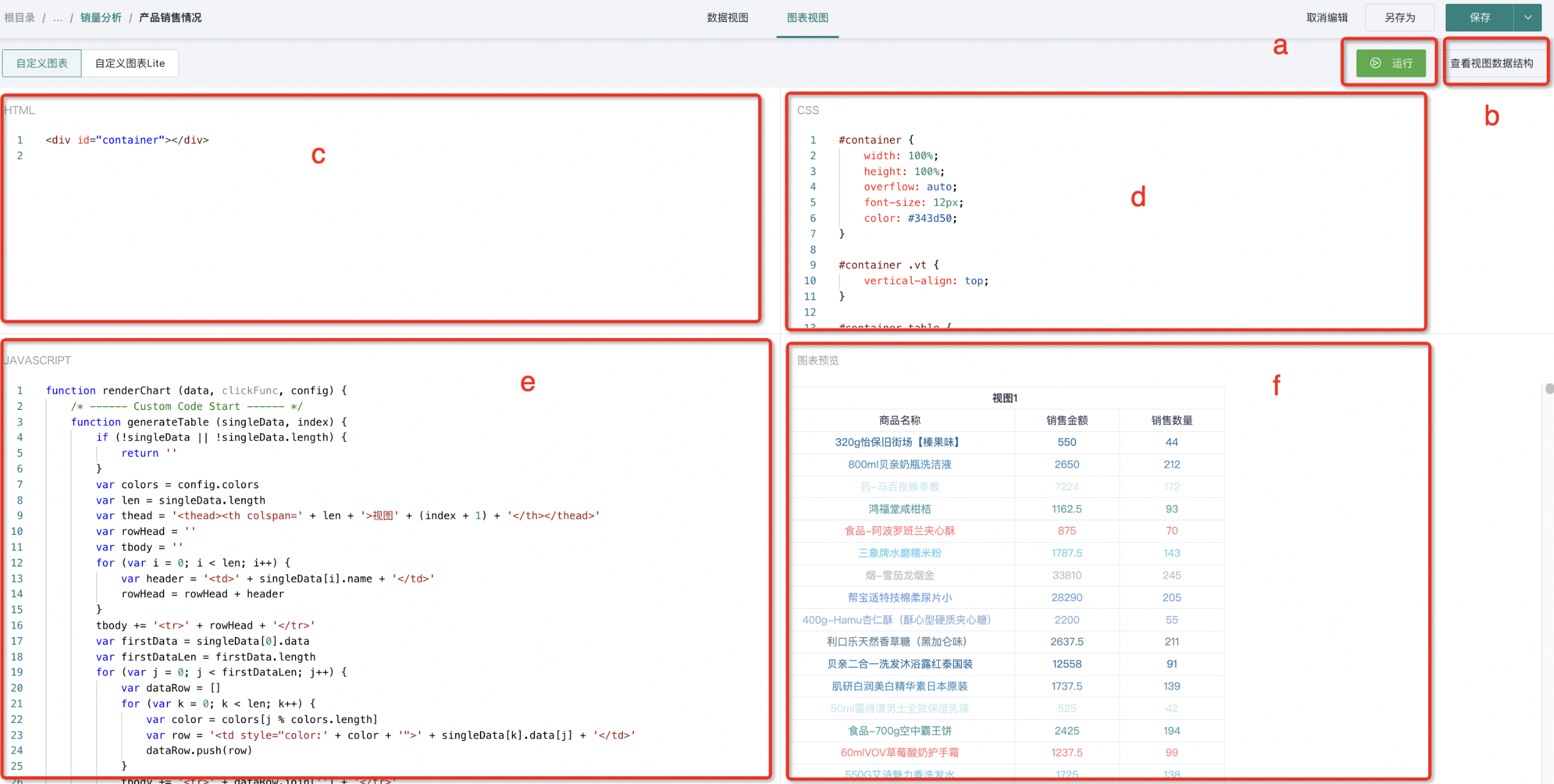
Areas c, d, e, and f in the canvas support dragging and maximizing.
(2) Key Area: Javascript Area
// Guandata's built-in rendering function, generally no need to modify
function renderChart (data, clickFunc, config) {
/* ------ Custom Code Start ------ */
// This is where your code goes
/* ------ Custom Code End ------ */
}
// Guandata's plugin code, used to control the final chart rendering
new GDPlugin().init(renderChart)
If you want to display a prompt in the chart area when the incoming parameters do not meet conditions, you can customize the prompt as follows:
function renderChart (data, clickFunc, config) {
    if(data[0].length === 0) {
        const dom = document.getElementById('container')
        dom.innerHTML = "Data is empty"
        return
    }
}
Rendering Function Parameters
(1) data: Data View data obtained by dragging fields, format as follows:
[
  // View 1 data
  [
    {
      "name": "Store Name",
      "numberFormat": null,
      "data": [
        "Guangdong Branch",
        "Fujian Branch",
        "Zhejiang Branch",
        "Jiangsu Branch",
        "Qinghai Branch",
        "Hunan Branch",
        "Shandong Branch"
      ]
    }
  ],
  // View 2 data
  [
    {
      "name": "Region",
      "numberFormat": null,
      "data": [
        "GD",
        "FJ",
        "ZJ",
        "JS",
        "QH",
        "HN",
        "SD"
      ]
    }
  ]
]
The overall data structure is an array. Each data view is one array element, and the fields dragged in Data View are represented one-to-one in that structure.
(2) clickFunc: Charts often need to support jump or linkage interactions. clickFunc is the click callback used for those interactions, and its parameter format is standardized as follows:
function clickFunc(data) {}
// data format:
{
	clickedItems: [ {
  	idx: [ 1, 2 ], // Column index path. e.g., third column of second view dataset [ 1, 2 ]
    colName: 'xxx', // Column name
    value: [ 'xxx', 'yyy' ], // Value format
  } ]
}
(3) config: External settings passed into the custom card, including the following values:
const { theme, colors, customOptions, language } = config
a. theme: // Theme, corresponding values are LIGHT and DARK, adapting to our platform's theme for better chart style adaptation.
b. colors: // Theme colors, configurable on the right side of the Data View, corresponding to an array, format as follows.
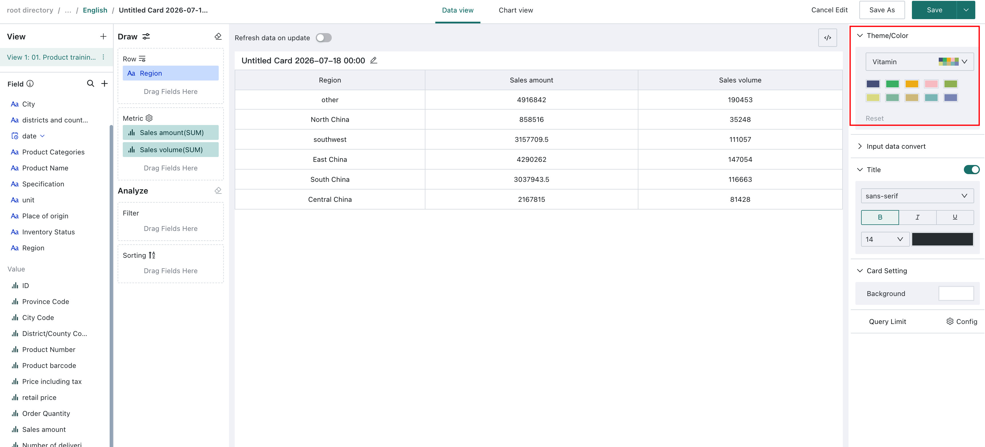
[
  "#4379CE",
  "#99B8F1",
  "#FADB37",
  "#FC8602",
  "#FFA748",
  "#72B5EB",
  "#78CDED",
  "#AC9AE2",
  "#FAC36F",
  "#FD7F7F",
]
c. customOptions: // Custom configuration settings. Since it's a plugin, it should have its own chart configuration, so we support custom chart configuration for easier chart settings after plugin installation.
// customOptions is an object, fields can be defined and used according to the chart
{
  showLabel: false,
  fontSize: 12,
}
d. language : Current system language, supported from 5.6.0.
Development Practice
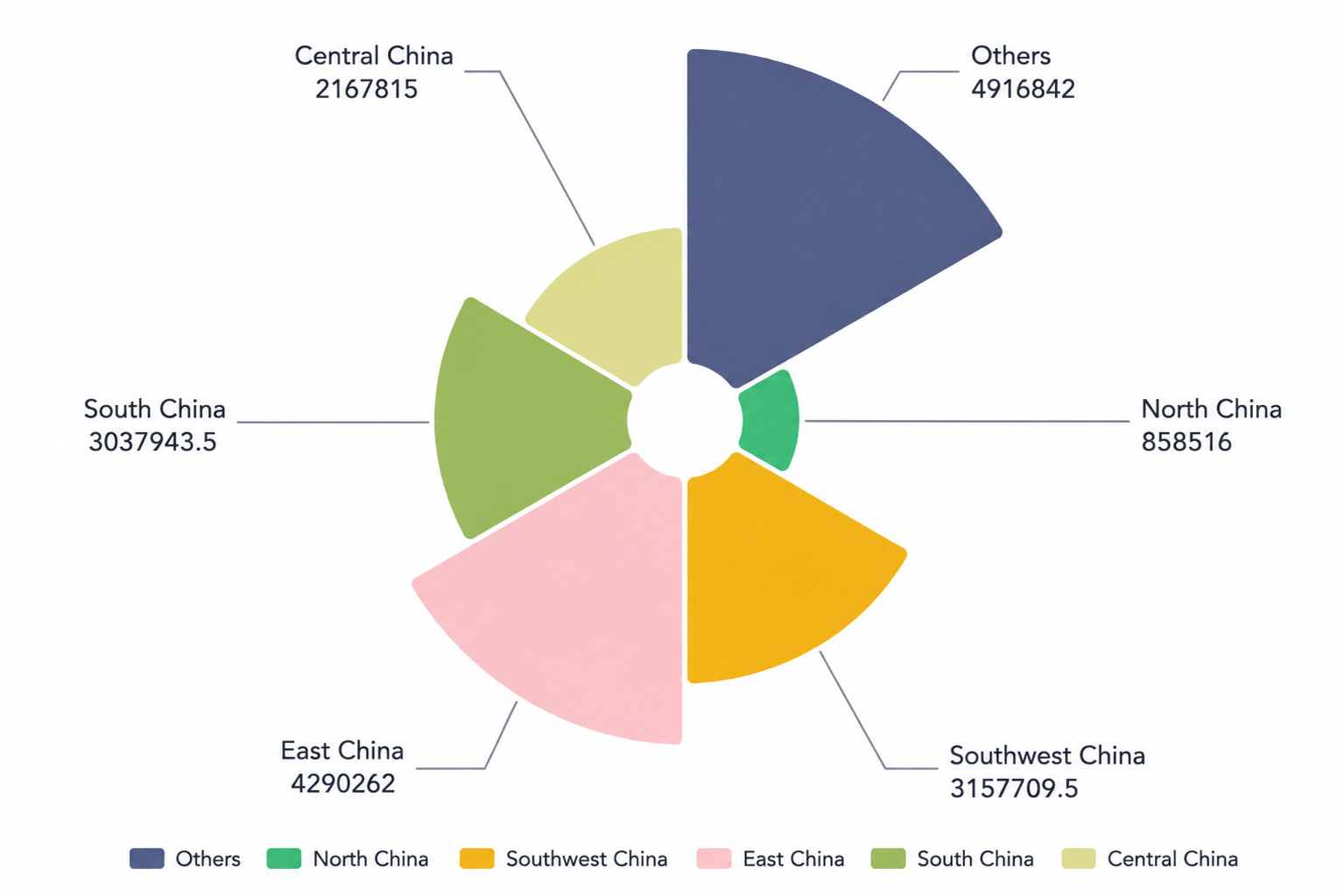
After the above overall introduction, we can start practicing. Taking drawing a simple eCharts chart as an example:
(1) HTML

(2) CSS
#container {
    width: 100%;
    height: 100%;
    overflow: hidden;
}
(3) Javascript
const myChart = echarts.init(document.getElementById('container'))
const customOptions = {
    showToolbox: true
}
function renderChart (data, clickFunc, config) {
    /* ------ Custom Code Start ------ */
    // Read configuration
    const { theme, colors } = config
    const isDarkTheme = theme === 'DARK'
    // Configuration uses default settings, to be integrated later
    const { showToolbox } = customOptions
    // Use data from view dataset 1
    const seriesData = data[0]
    const [ names, values ] = [ seriesData[0].data, seriesData[1].data ]
    const option = {
        legend: {
            top: 'bottom',
            textStyle: {
                color: isDarkTheme ? '#D1D8E3' : '#343D50',
            }
        },
        toolbox: {
            show: showToolbox,
            feature: {
                mark: { show: true },
                dataView: { show: true, readOnly: false },
                restore: { show: true },
                saveAsImage: { show: true }
            }
        },
        series: [
            {
                name: 'Nightingale Chart',
                type: 'pie',
                radius: [ 50, 250 ],
                center: [ '50%', '50%' ],
                roseType: 'area',
                itemStyle: {
                    borderRadius: 8
                },
                data: names.map((name, index) => ({
                    name,
                    value: values[index],
                })),
            }
        ],
        color: colors,
        label: {
            color: isDarkTheme ? '#D1D8E3' : '#343D50',
        },
    };
    myChart.setOption(option)
    myChart.on('click', function (params) {
        const { name, seriesIndex } = params
        clickFunc({
            clickedItems: [
                {
                    idx: [ 0, seriesIndex ],
                    colName: seriesData[0].name,
                    value: [ name ],
                }
            ]
    });
    myChart.resize()
    /* ------ Custom Code End ------ */
}
new GDPlugin().init(renderChart)
(4) Display
For more help on using visualization plugins, please visit the Guandata BI Video Tutorial Website.