Visualization Plugin Overview
Overview
Like custom charts, visualization plugins are visualization extensions developed on top of the Guandata Visualization SDK. On the Guandata platform, you can either build custom charts yourself or install existing plugins. While custom charts are flexible, they also require some front-end development skills.
To lower the barrier to advanced visualization, Guandata also provides a visualization marketplace so users can extend chart capabilities more quickly and conveniently.
Visualization Plugin Types
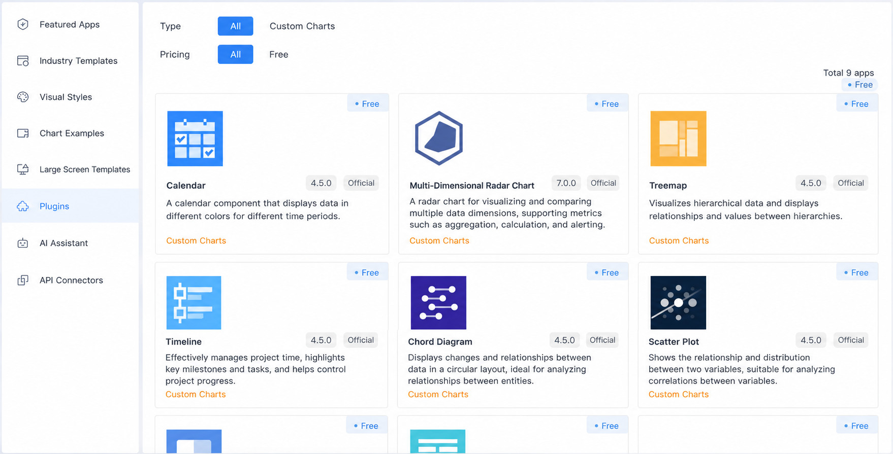
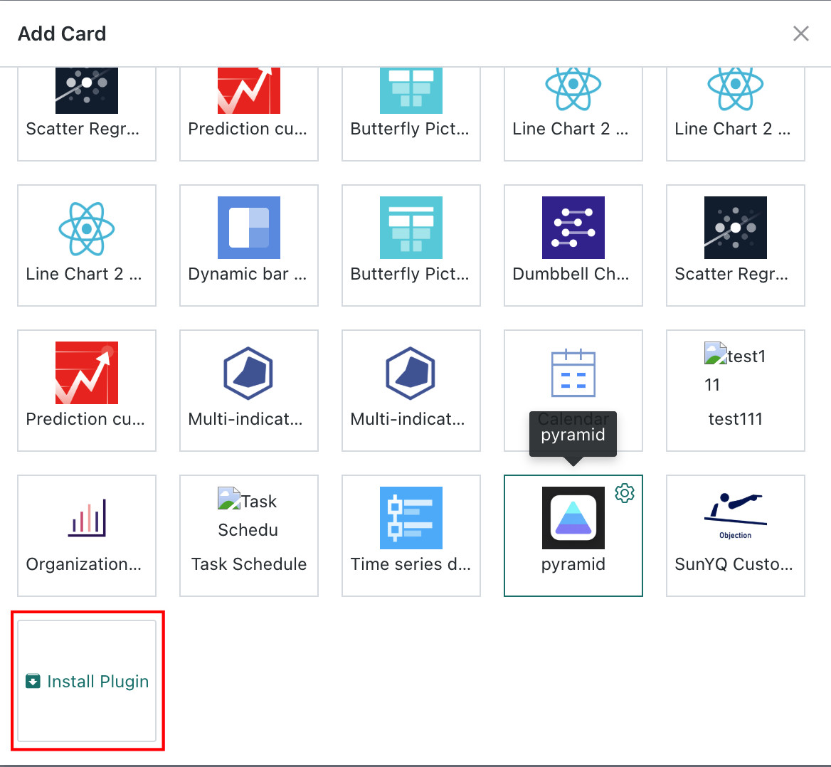
Users can search for visualization plugins in Cloud Market > Chart Library, then install them through Visualization Extensions > Install Plugin (administrator permissions required). Guandata BI currently provides 8 common visualization plugin types in the marketplace.
Treemap
Treemaps are suitable for hierarchical relationship data visualization. They represent data hierarchy through nested rectangles, where the area of each rectangle intuitively reflects the weight or value size of that level or node, allowing for an intuitive display of hierarchical and weight relationships.
For example, when analyzing provincial category orders, a treemap can display different provinces, different stores, different categories, and their hierarchical relationships. Through the size of the rectangles, you can intuitively see which provinces a certain category sells well in, thereby optimizing inventory management and sales strategies.
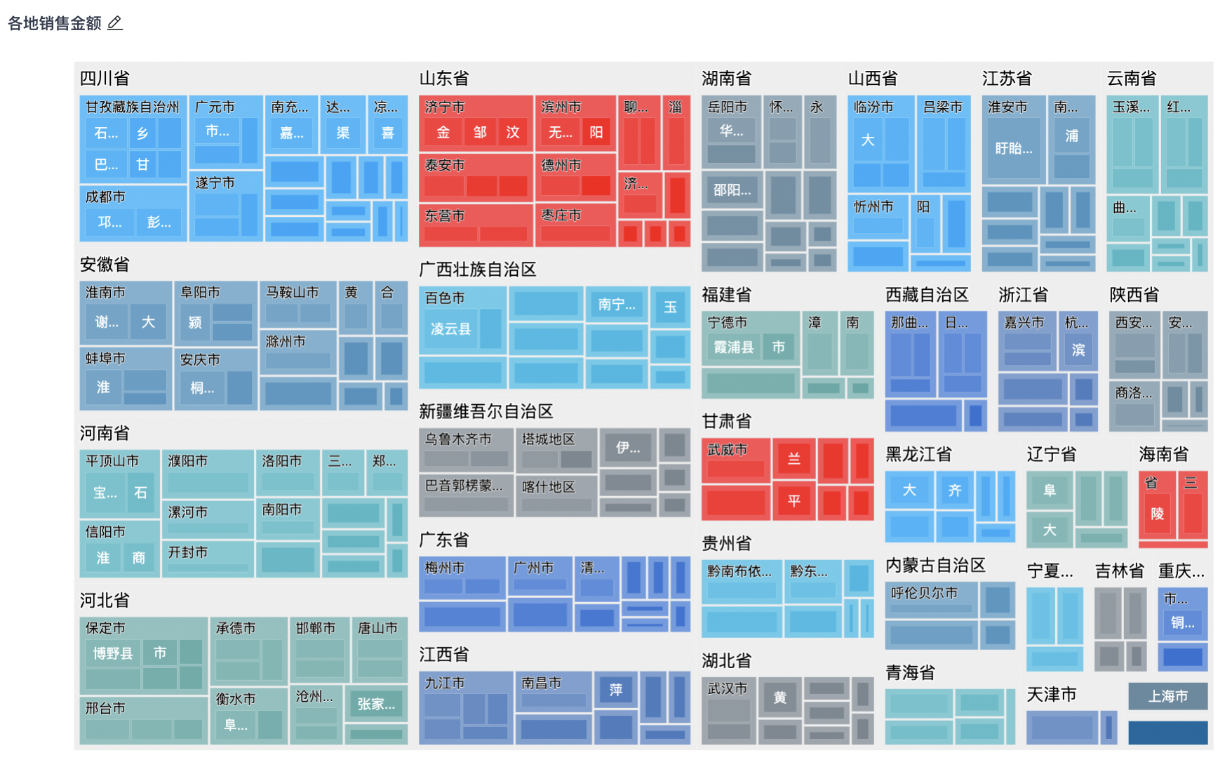
The treemap in the Cloud Market supports adding multiple (more than two) dimensions, while Guandata BI's built-in visualization chart - Treemap supports a maximum of only two dimensions.
Timeline Chart
Timeline charts display data point change trends through a time axis and are widely used to track, analyze, and understand various phenomena that change over time.
For example, in analysis dashboards, users can use timeline charts to display important development milestones or key process node controls for companies and projects.

Dynamic Bar Chart
A dynamic bar chart is a real-time, dynamic bar chart mainly used to display data changes over a period of time, dynamically showing data changes over time through playback.
For example, in sales analysis, using a dynamic bar chart to display "Annual Sales Changes", where the time axis can be months or quarters, and the bar height represents sales for that time period, allowing for a clear view of sales fluctuations and trends.
Butterfly Chart
A butterfly chart is a special type of bar chart that can intuitively compare the differences between two sets of data, mainly used to compare two sets of data with the same categories.
For example, in sales analysis, butterfly charts can be used to display the specific order quantities and sales quantities by province.
.jpeg)
Dumbbell Chart
A dumbbell chart is a dumbbell-shaped visualization graphic. Each data group consists of minimum and maximum values connected by a line, mainly used to represent the transition process of an indicator.
For example, in the following chart, a dumbbell chart can be used to display the profit margin changes of various products in 2014.
.jpeg)
Prediction Curve
A prediction curve is a visualization of prediction results. It is usually used to display the predicted trend of a variable over time, helping users intuitively understand prediction model results and identify possible trends.
For example, when predicting the stock market, prediction curves can display stock price change trends over time, helping investors make more informed investment decisions.
.jpeg)
Linear Regression
A linear regression chart can be used to represent the linear relationship between two measures. The drawing method is basically the same as a scatter plot, but it will draw a linear regression line on the scatter plot basis and provide the regression equation and coefficient of determination R2.
For example, in the marketing field, linear regression charts can be used to analyze market data, such as the relationship between advertising investment and sales, product price and sales volume, etc. Through linear regression charts, marketing personnel can understand the impact of different factors on sales and predict future sales trends based on the regression equation and R2 value.
.jpeg)
Calendar Chart
A calendar chart records time series data by date, displaying it in a calendar format on a two-dimensional graphic, while using different colors to represent different values of observed data. It can clearly reflect value distribution over a period of dates, helping analysts analyze certain data over time spans.
For example, in sales analysis, users can use calendar charts to display daily sales data, helping sales teams identify peak and trough sales periods.
.png)
Visualization Plugin Development
If you have certain front-end development capabilities and want to extend various visualization types, you can develop custom visualization plugins on the Guandata platform. For specific development guidelines, please refer to the Visualization Plugin Development Guide.