Table - Chart Property
Overview
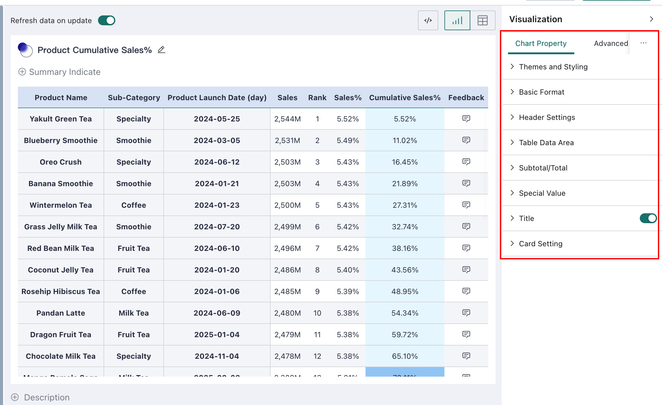
Guandata BI provides table-specific Chart Property for table-type charts, including Theme and Style, Basic Formatting, Header Settings, Table Data, Subtotals/Totals, and Special Values.
Theme and Style
Theme and style are used to design the overall look and feel of a table. The following configuration items are supported:
- Themes and color palettes
- Two themes are provided: Classic and Minimal
- Five color palettes are provided
- The following elements support color configuration and show/hide settings: zebra stripes, left and right outer borders of the table, row/column guide lines, table background color, and selection highlight color
- Table font and font size: supports configuring the font style and font size of table text
- Table column width: automatic by default, meaning the width adapts to the current content, but a fixed column width can also be configured manually
Basic Formatting
Different table types support slightly different capabilities under Basic Formatting, and restoring default settings is supported.
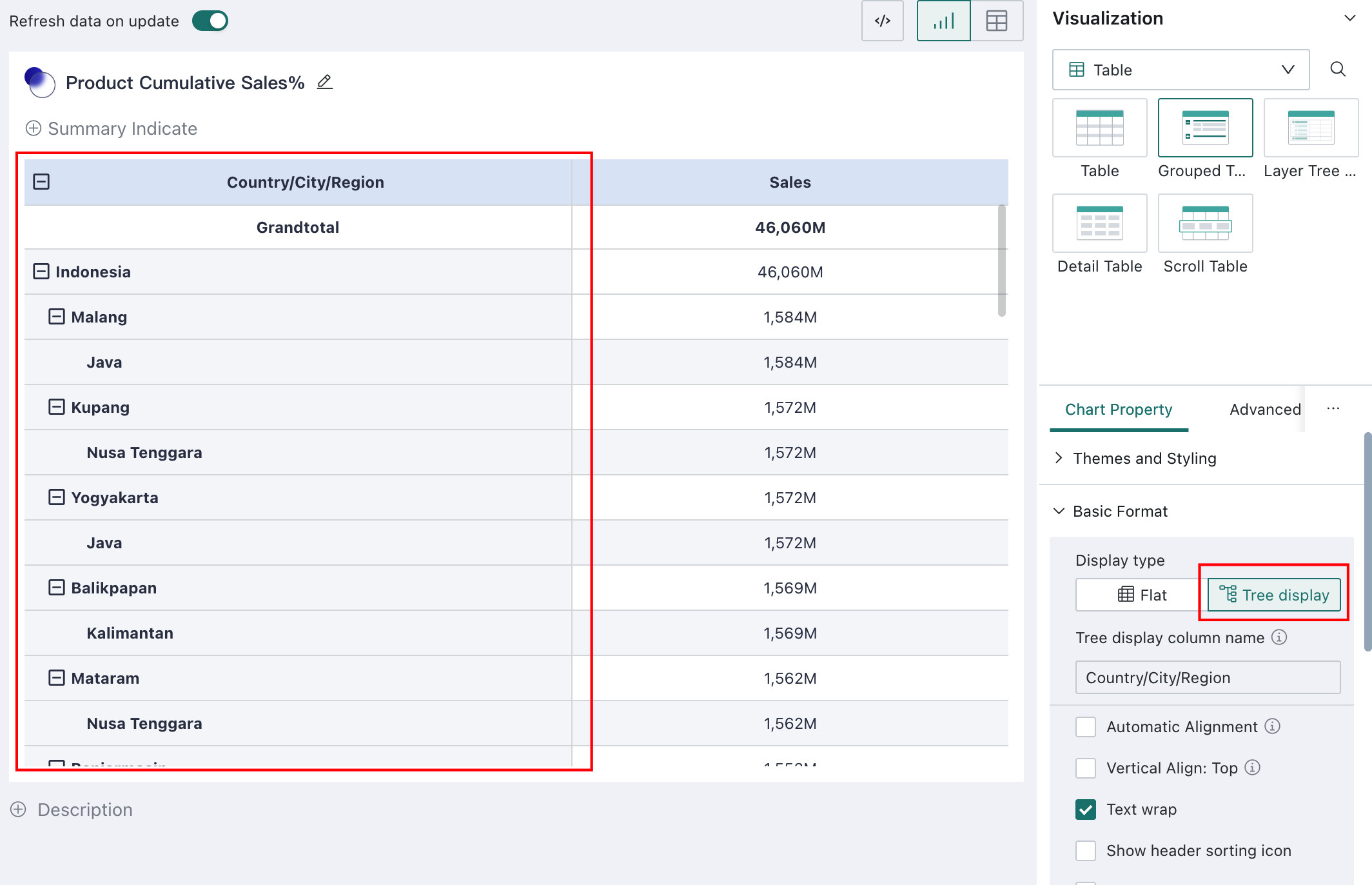
Display Mode
For grouped tables, the display mode can be configured as either Flat or Tree.
-
Flat: dimensions expand from left to right
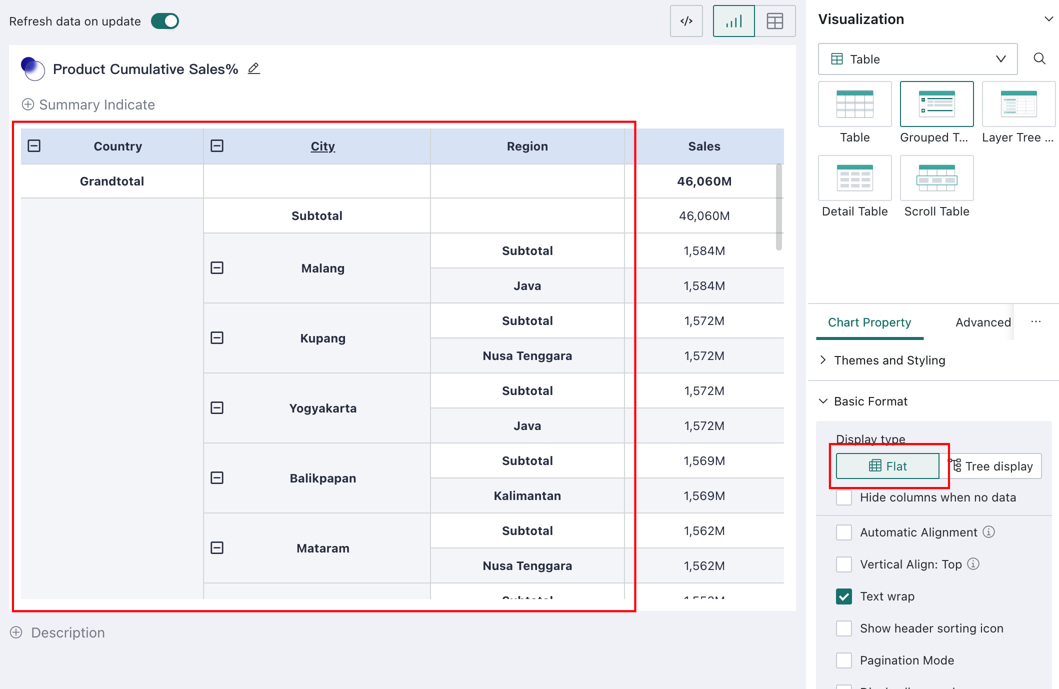
-
Tree: when multiple dimensions are used, horizontal space usage can be inefficient. Tree display improves card area utilization and makes it easier to view more data.
Custom column names are supported for the tree column.
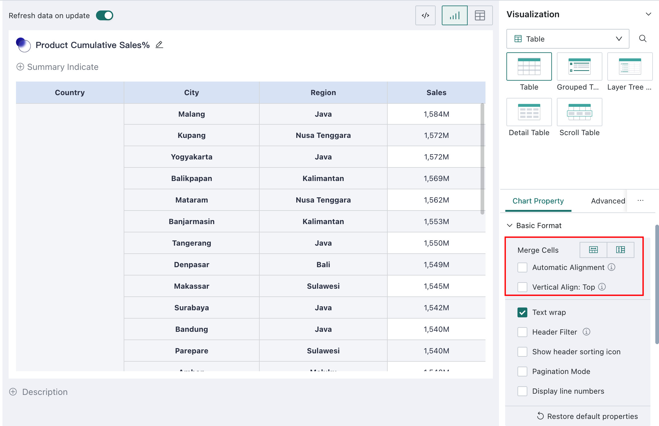
Merge Cells
Supported only for standard tables and detail tables. Since detail tables do not have compare dimensions, only horizontal merging is supported there.
When adjacent cells contain the same value, they can be merged into one cell. Both horizontal and vertical merging are supported, as shown below:
Alignment
Standard tables and grouped tables support Top Align and Auto Align. Carousel lists and detail tables support Auto Align only.
Alignment refers to the alignment of text and provides two options:
- Auto Align: dimension headers and table data are left-aligned, while measure headers and measure data are right-aligned
- Top Align: when merged cells exist, text is aligned to the top. In addition, while scrolling down, merged dimension cells can remain pinned at the top dynamically, as shown below
Auto Wrap
Supported by standard tables, grouped tables, carousel lists, and detail tables.
When the current column width is not sufficient to display the content, enabling Auto Wrap increases the row height so that all data is shown.
Header Filtering
- Supported card types: standard table and detail table
- Supported on PC only
- Supported for tables without compare fields
- Not supported for advanced calculation fields
After Header Filtering is enabled and the chart is saved, users can filter table data directly on the dashboard page through header filters, without needing to create separate filters manually.
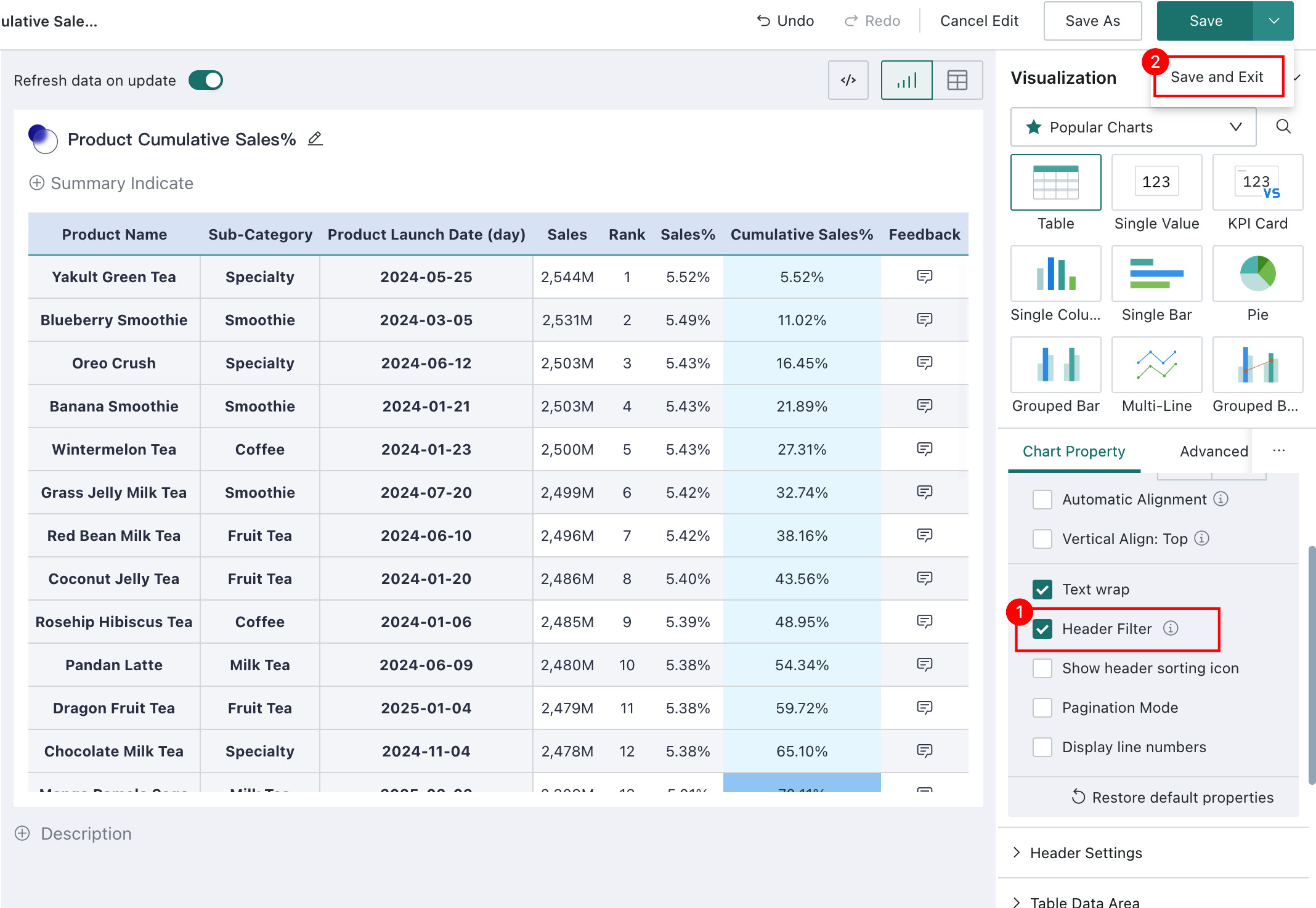
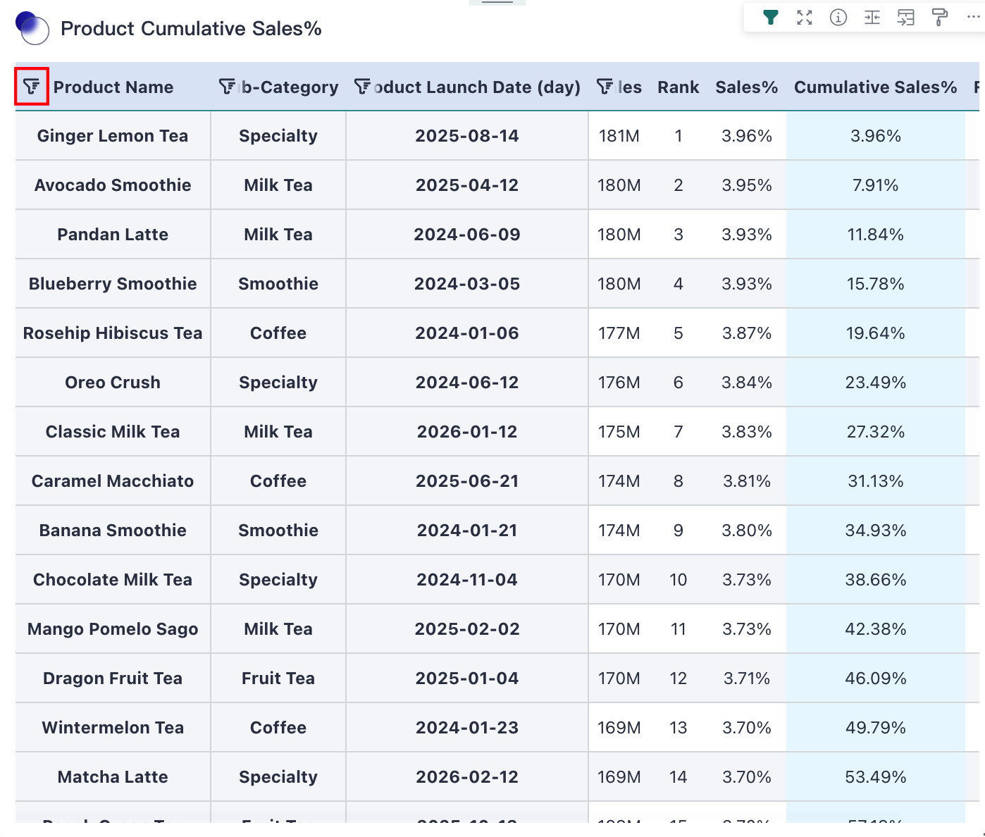
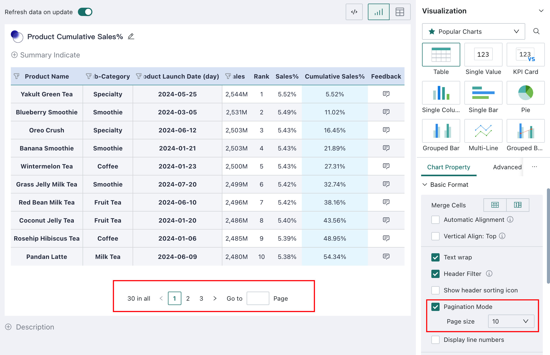
Table Pagination
Supported by standard tables, grouped tables, and detail tables. Not supported by carousel lists.
Table data is not paginated by default. If you prefer to read data page by page, you can enable Table Pagination. After enabling it, you can choose how many records are shown per page. A paginator appears below the table and also displays the total number of records in the current table, including subtotals and totals.
Row Number
Supported by standard tables, grouped tables, carousel lists, and detail tables.
Row numbers are useful for quickly locating rows or showing rankings. After selecting Show Row Number, a row-number column appears as the first column in the table.
-
Exclude Subtotals/Totals: supported only by standard tables and grouped tables. When enabled, subtotal and total rows are skipped when row numbers are calculated, which is useful for ranking scenarios where subtotal and total rows should not affect the ranking values.
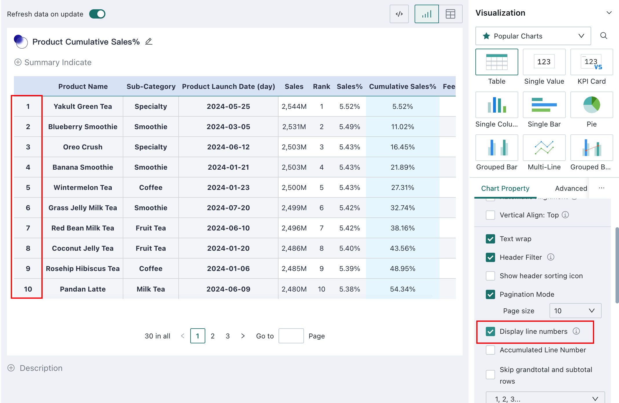
-
Top Three Row Number Display: commonly used for ranking scenarios where the top three positions need special highlighting. Available styles are shown below.
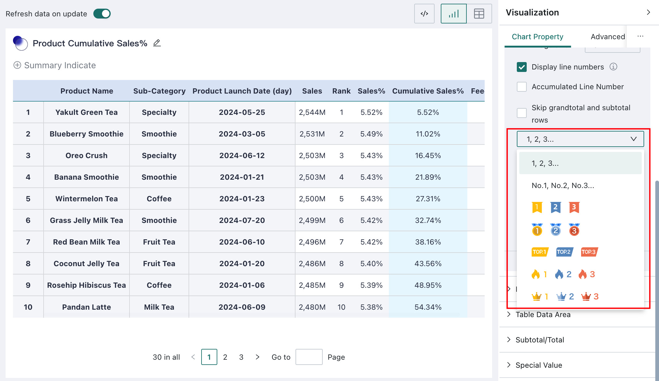
-
Font Settings: supports font type, bold, italic, strikethrough, font size, and font color for row numbers
-
Column Label Name: used to name the row-number column; empty by default
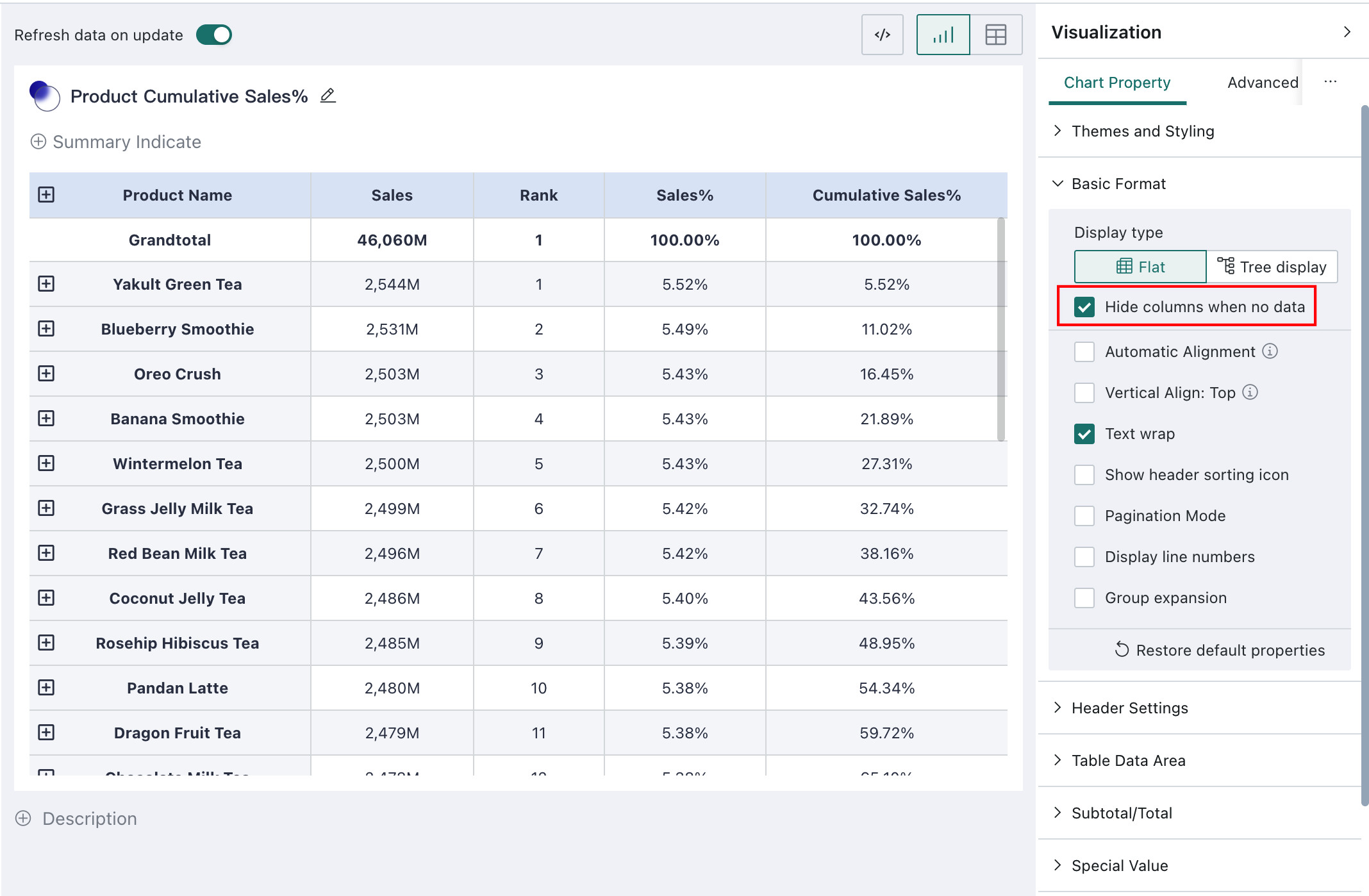
Hide Columns with No Data
Supported only by grouped tables.
When dimensions in a grouped table are collapsed, columns other than the first-level dimension may contain no data at all. In that case, hiding columns with no data reduces redundant information, as shown below:
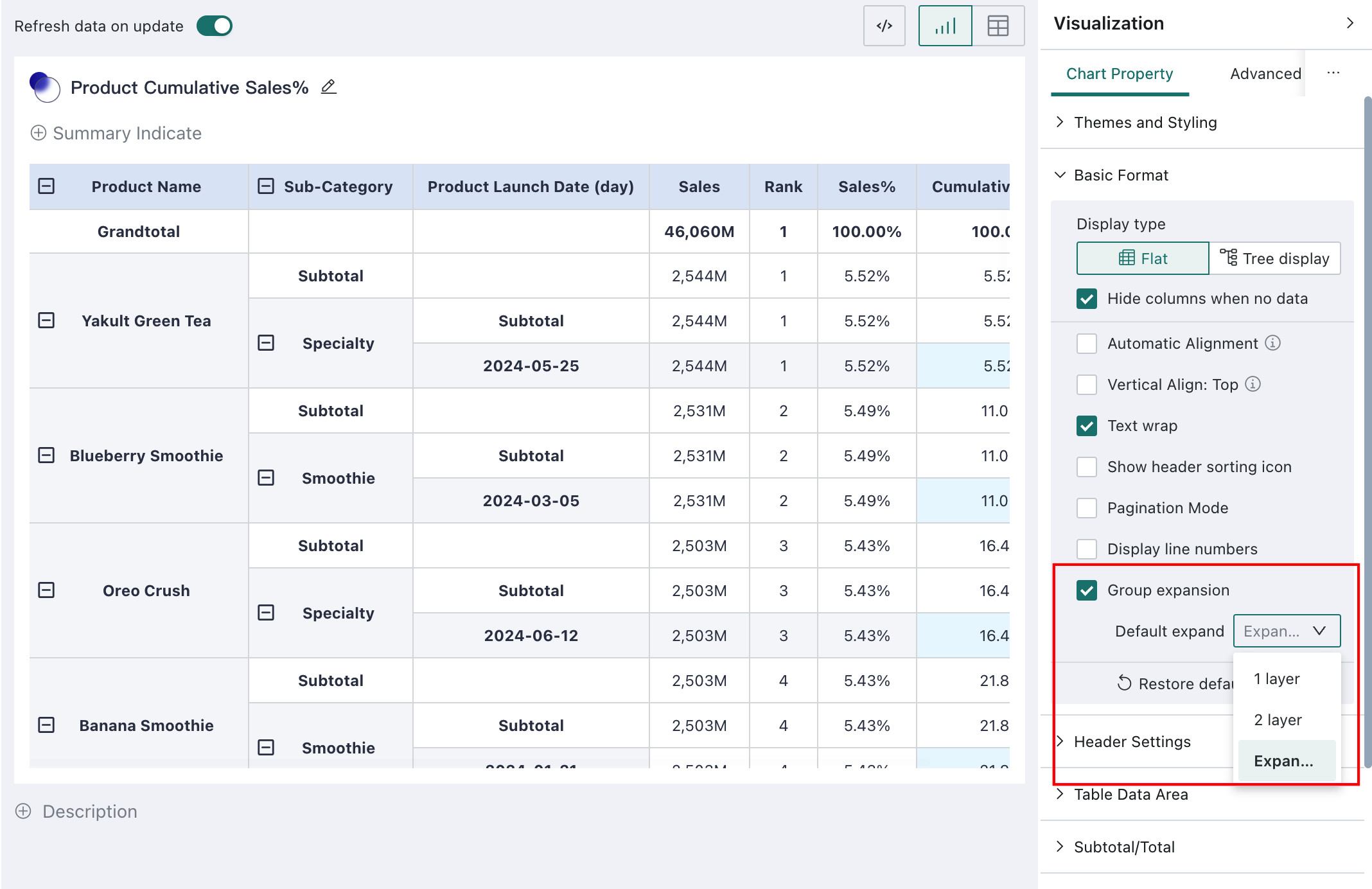
Group Expansion
Supported only by grouped tables.
Grouped tables support configuration of the default expansion level. This is set by the editor and takes effect for all viewers. Three modes are provided:
- Fully collapsed
- Fully expanded
- Expanded to a specified level
For example, when there are four dimensions:
- Not selected: all groups are collapsed
- Selected and expanded to level 1: the first grouping level is expanded
- Selected and expanded to level 2: the first two grouping levels are expanded
- Selected and fully expanded: all grouping levels are expanded
Header Settings and Table Data Settings
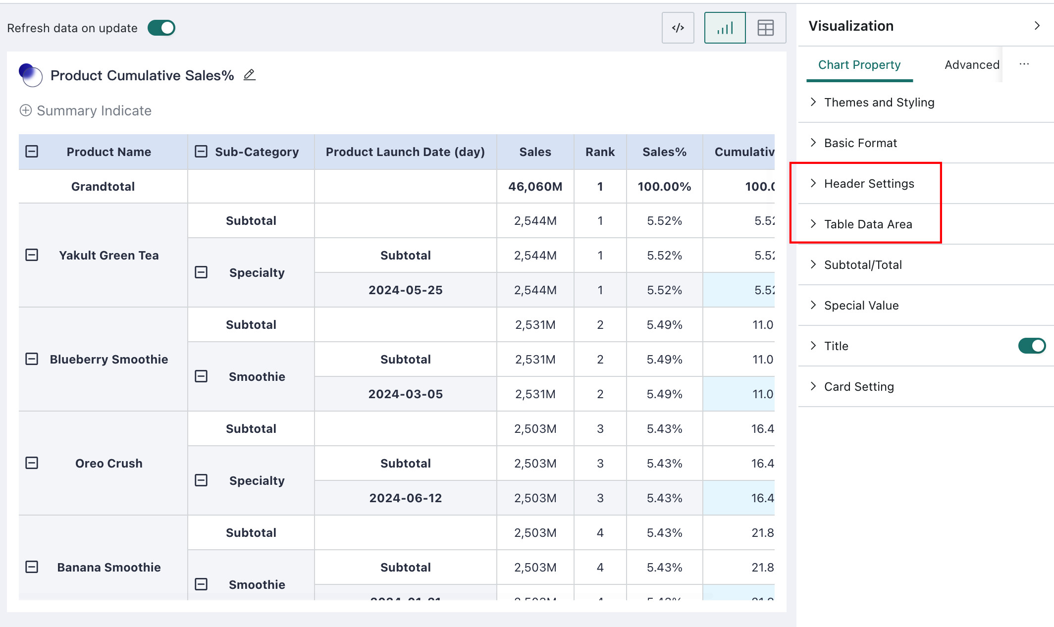
The table area is divided into three parts, as shown above:
- Column Header: the header area formed by each column, including measure names, compare dimension names, and compare dimension values
- Row Header: the header area formed by each row except the column header area, that is, the cells containing row dimension values
- Table Data: the area where the actual data is displayed
Header settings and table data settings support the following:
- Rich font settings for both headers and table data: font type, size, color, bold, italic, underline, and strikethrough
- Fill color for both row headers and column headers
- Row height and column width:
- Column headers and table data support custom row height
- Row headers support header column count and pinned header configuration
- If the pinned header width exceeds 60% of the card size, the extra columns cannot be pinned and the pinning effect becomes invalid
- Alignment configuration for column headers:
- Useful when the header should be centered while dimensions remain left-aligned and measures right-aligned
- Available options: left, center, right, and follow field
- Default: follow field
- When column header alignment is Follow Field, both the header and the table body follow the alignment configured on the field
- When column header alignment is Left, Center, or Right, that alignment applies only to the header area and takes highest priority
- For table data, hover background color is also supported
Subtotals / Totals
The following subtotal and total settings are supported:
- Whether to show subtotals and totals, and where to display them
- Row totals are the columns containing totals calculated for each row
- Column totals are the rows containing totals calculated for each column
- Display format of subtotals:
- Supports Subtotal and Subtotal (Dimension)
- Custom aliases for subtotals and totals
- Background fill and font style for subtotal and total rows
- Restore subtotal and total settings to their initial state
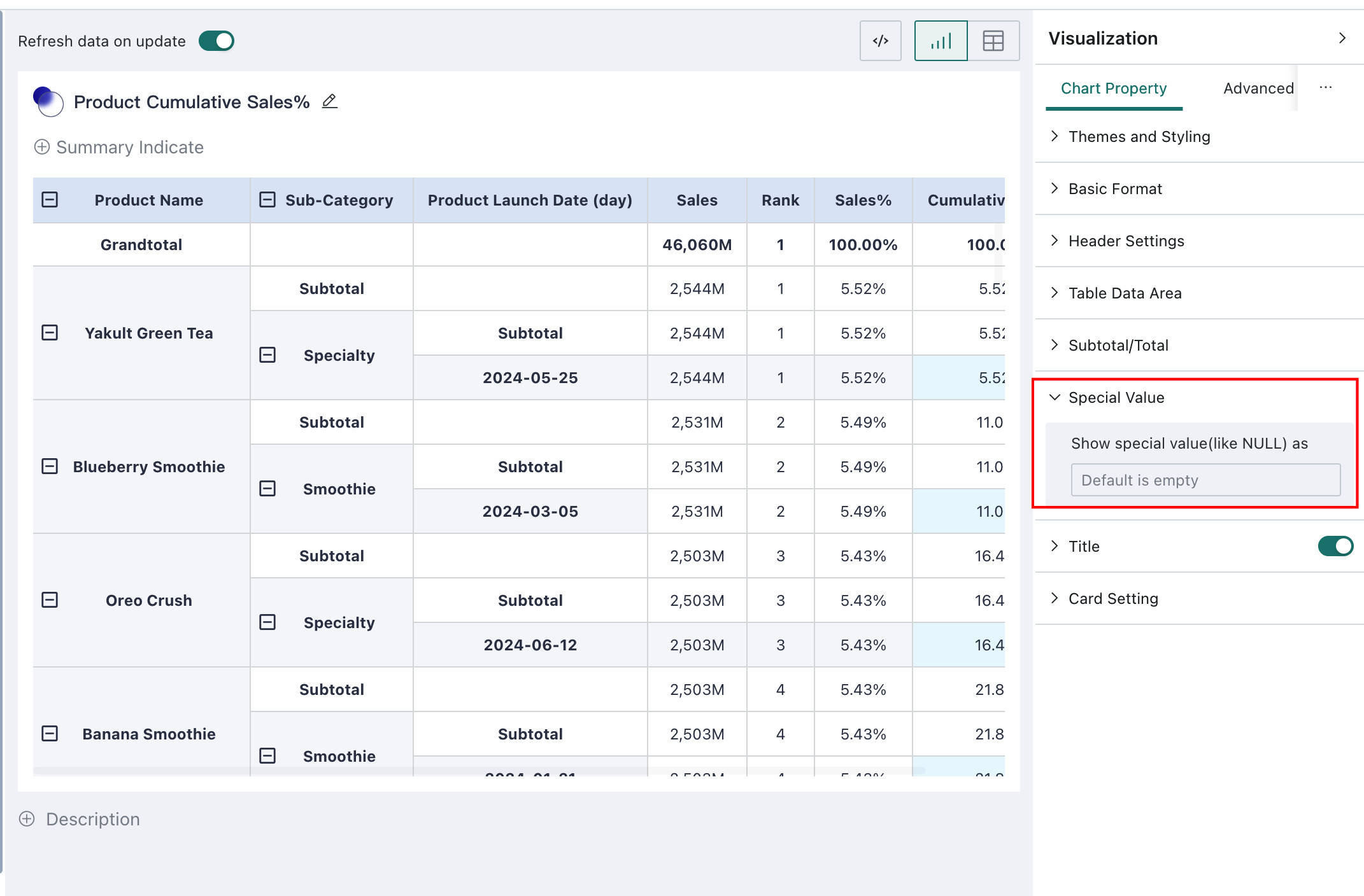
Special Values
If you want to process special values such as null, empty strings, or the text "null", you can use this feature.
It supports replacing special values with other strings, and also supports hiding NULL values in compare fields to reduce ineffective data display in tables.
The configuration method is the same as the one for charts. For details, see Chart - Chart Property.
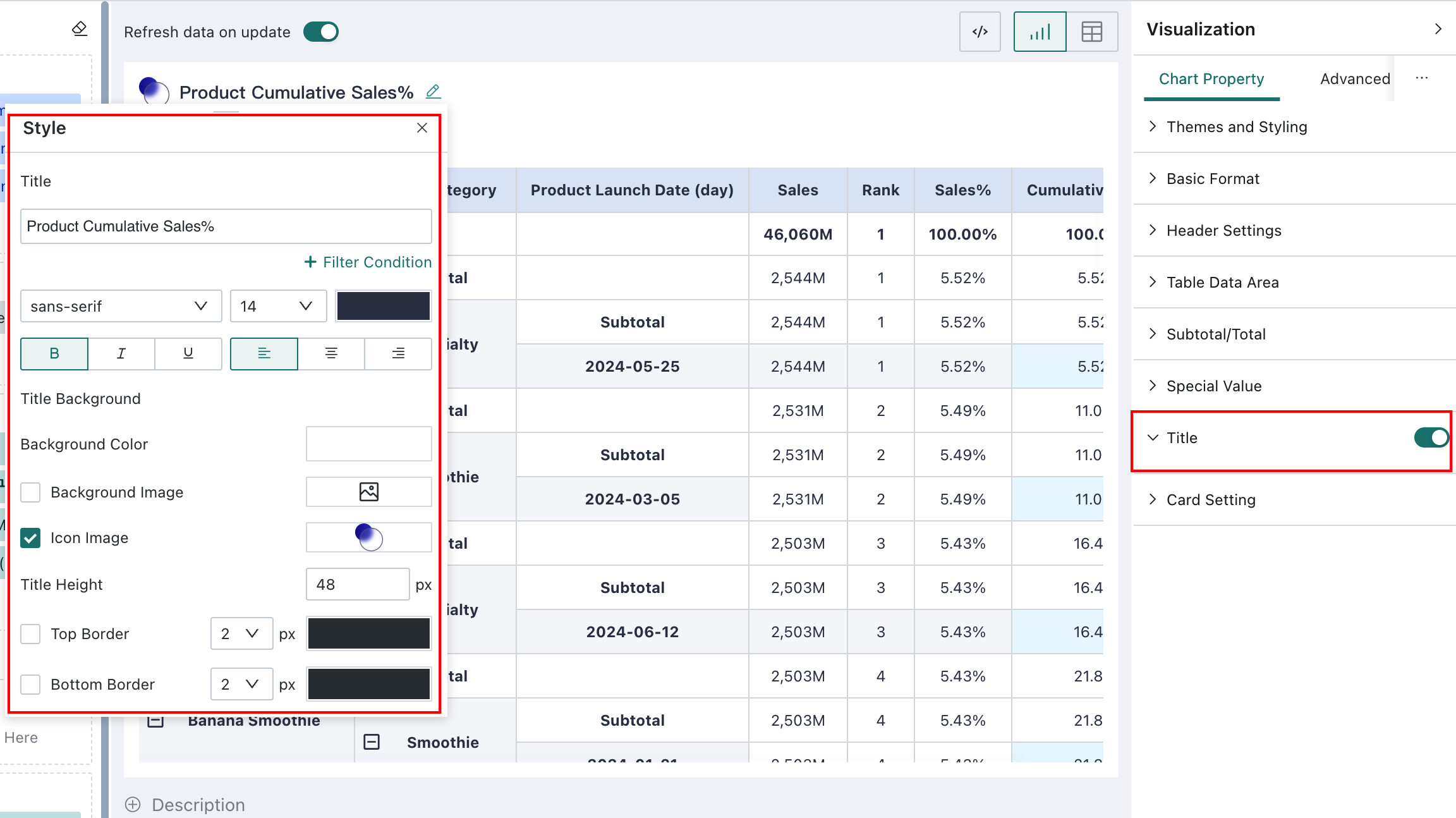
Title
Guandata BI supports configuring title styles for tables in Chart Property. Table titles use the same configuration flow as chart titles. For details, see Chart - Chart Property.
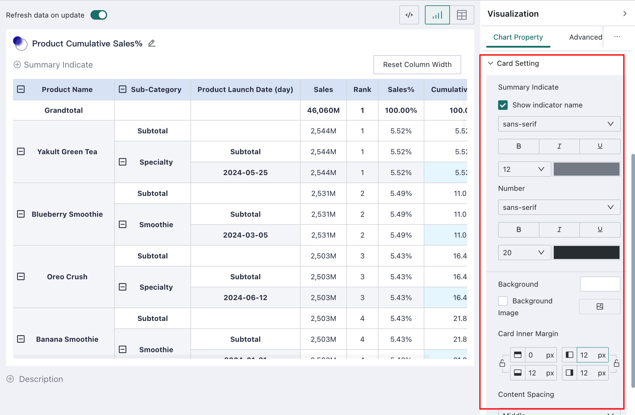
Card Settings
Users can customize the appearance of cards through **Card Settings**. The card settings configuration is identical for both tables and charts. For detailed configuration procedures, please refer to [Chart - Chart Property](3-Chart%20-%20Chart%20Property.md)