Chart Rendering
Overview
Chart Rendering includes a series of operations and settings. Guandata BI supports visual editing through drag-and-drop interactions, allowing users to create chart cards without writing code.
During chart creation, in addition to choosing a data source, you also need to determine which dimension fields and measure fields to display. Dimension fields identify categories or attributes in the data, while measure fields display numeric values. You can then configure options such as color, value, filter, and sort to create different chart types and data presentations based on your analysis needs.
Field Operations
Before creating a chart, users need to confirm whether the fields in the current data source can directly support the intended analysis. If the existing fields do not meet the business requirement, you can create new fields. For example, in a sales scenario, you may create a profit field by calculating the difference between sales amount and cost.
Create a New Field
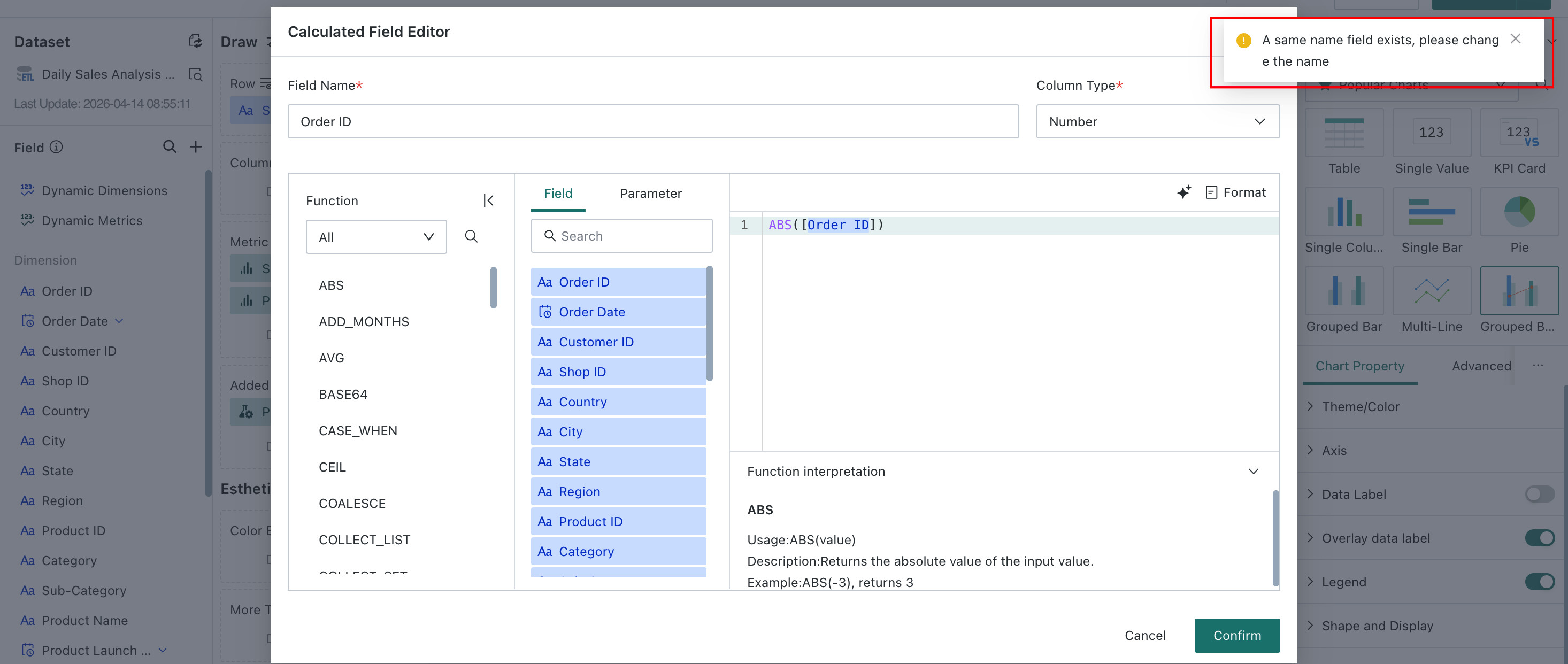
- After a card uses a dataset, the card side does not allow creation of a new field with the same name as an existing dataset field. However, if a field is first created on the card side and then a dataset field with the same name is later created on the dataset side, the system does not block it, so duplicate field names can appear in the card.
- Because duplicate field names in the dataset and the card may cause calculation results that do not match user expectations, the system now warns users when duplicate field names exist while visiting a card on the dashboard page or entering the card editing page.
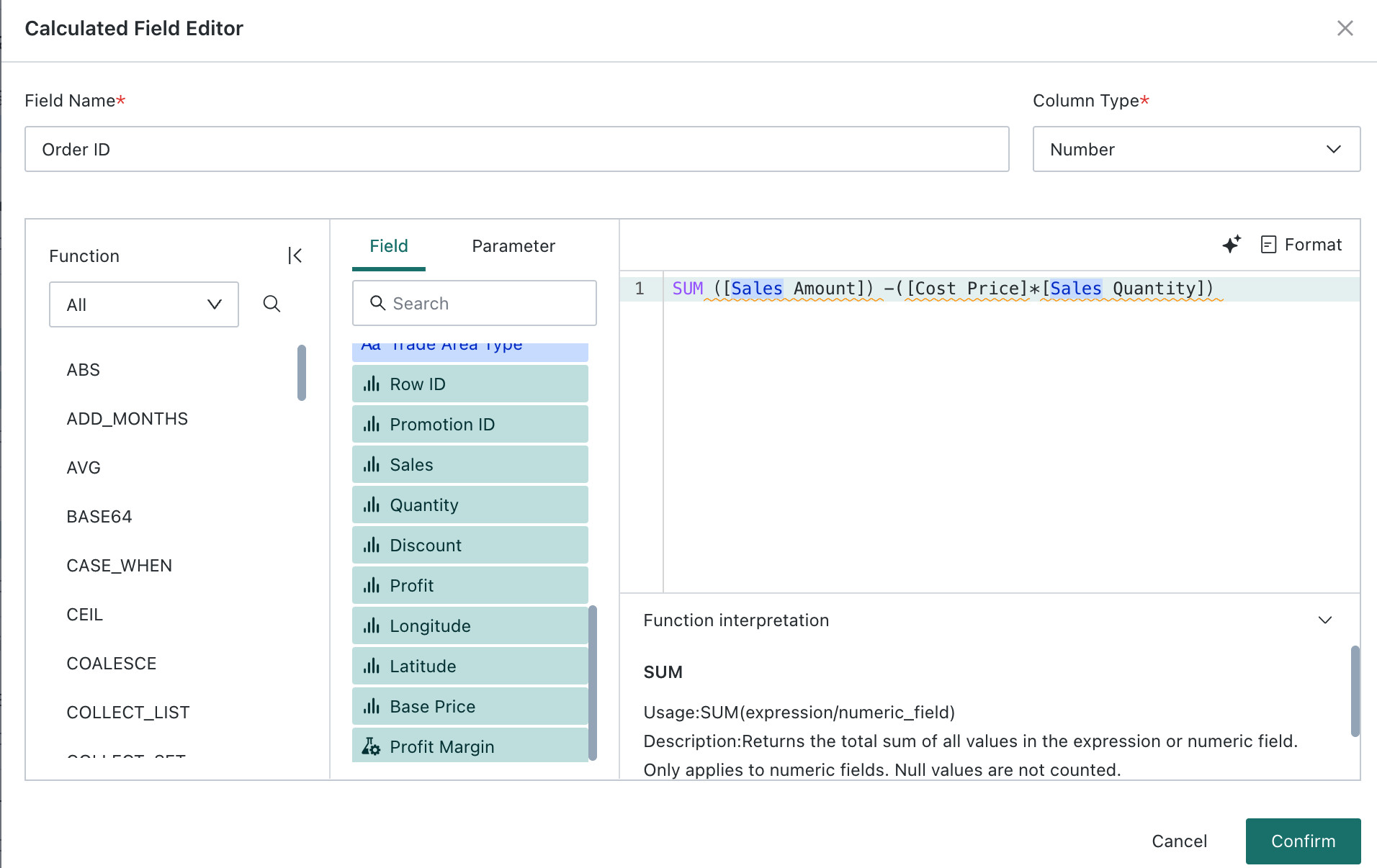
Add Calculated Field
When charting, if the existing fields do not meet the use case, you can create a calculated field to obtain the required data.
For example, if the dataset contains sales amount, sales quantity, and cost price by region, and you want to add a gross profit field:
-
Click Intelligent Coding to use the large model to generate the SQL for gross profit by region.
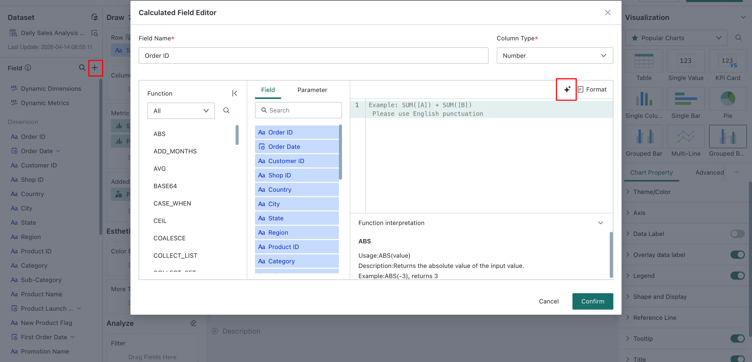
You can also write the formula manually as
[Sales Amount]-([Cost Price]*[Sales Quantity])to calculate gross profit by region.NotesThis kind of calculated field is a local calculated field and only takes effect for the current pivot analysis or visualization dataset.
-
Click Confirm to create the field successfully. You can then see the new calculated field in the dataset overview.
For more details, see Create New Field.
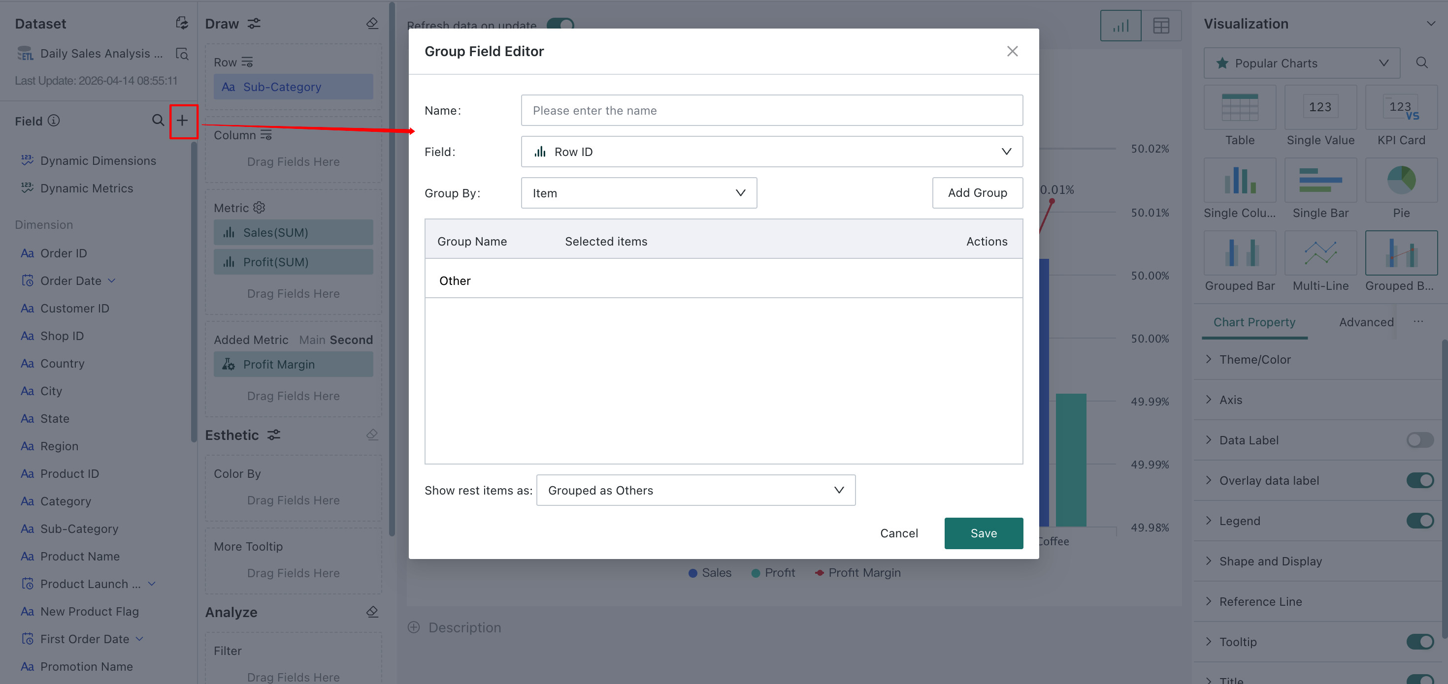
Add Grouped Field
A grouped field is created by grouping existing field values according to certain rules.
Grouped fields support custom grouping through filter conditions so that field data can be consolidated.
For example, if the dataset contains only a province field and you want to analyze sales by region, you can group provinces by geography into regions such as North China and South China, and then analyze sales by region.
For more details, see Create New Field.
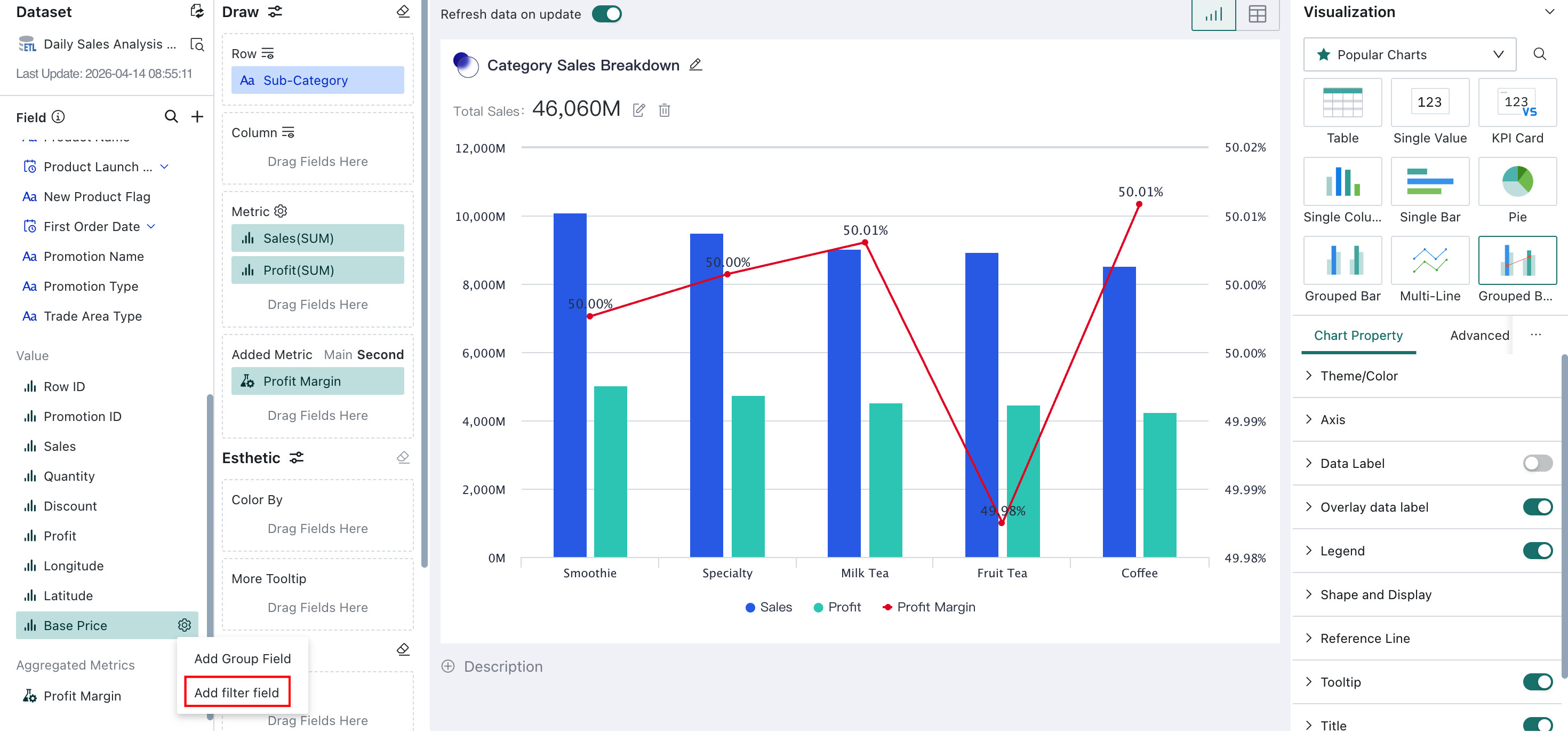
Add Filtered Field
A filtered field applies filter conditions to an existing numeric field and creates a new field from the filtered result.
When users need to analyze numeric values that meet specific conditions, they can create a filtered field and define custom filter criteria to isolate the required data.
For example, if you want to filter the cost price of products whose province is Beijing or Tianjin and whose inventory status is normal, you can filter the Cost Price field as shown below:
For more details, see Create New Field.
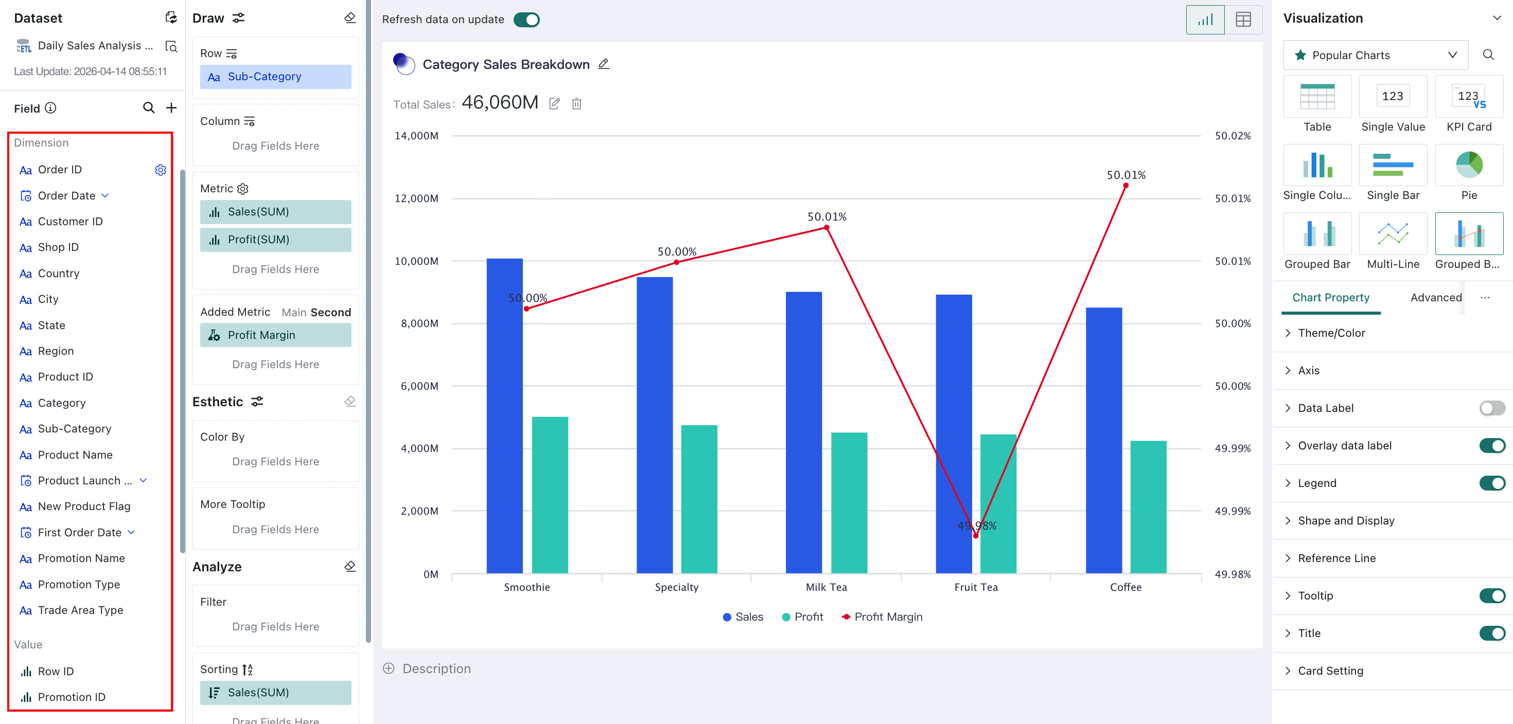
Dimensions and Measures
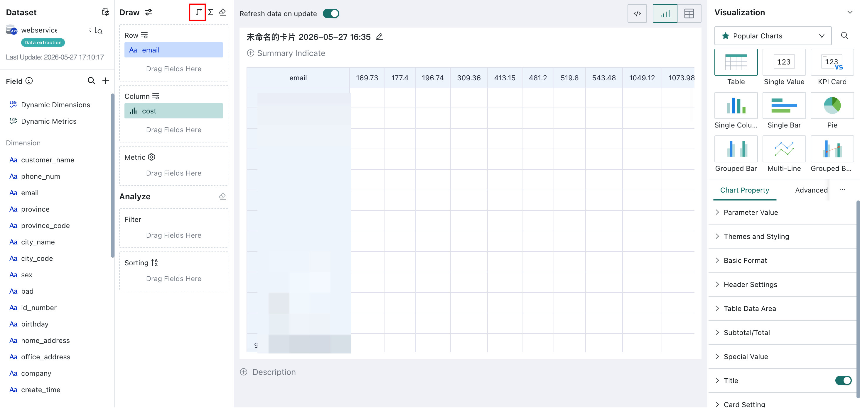
As shown below, the left side of the visualization editor lists all fields contained in the dataset.
Dimensions: categorical data, such as city name, date, and product name, usually text or time-based fields.
Measures: quantitative data, such as sales volume and profit, usually numeric fields.
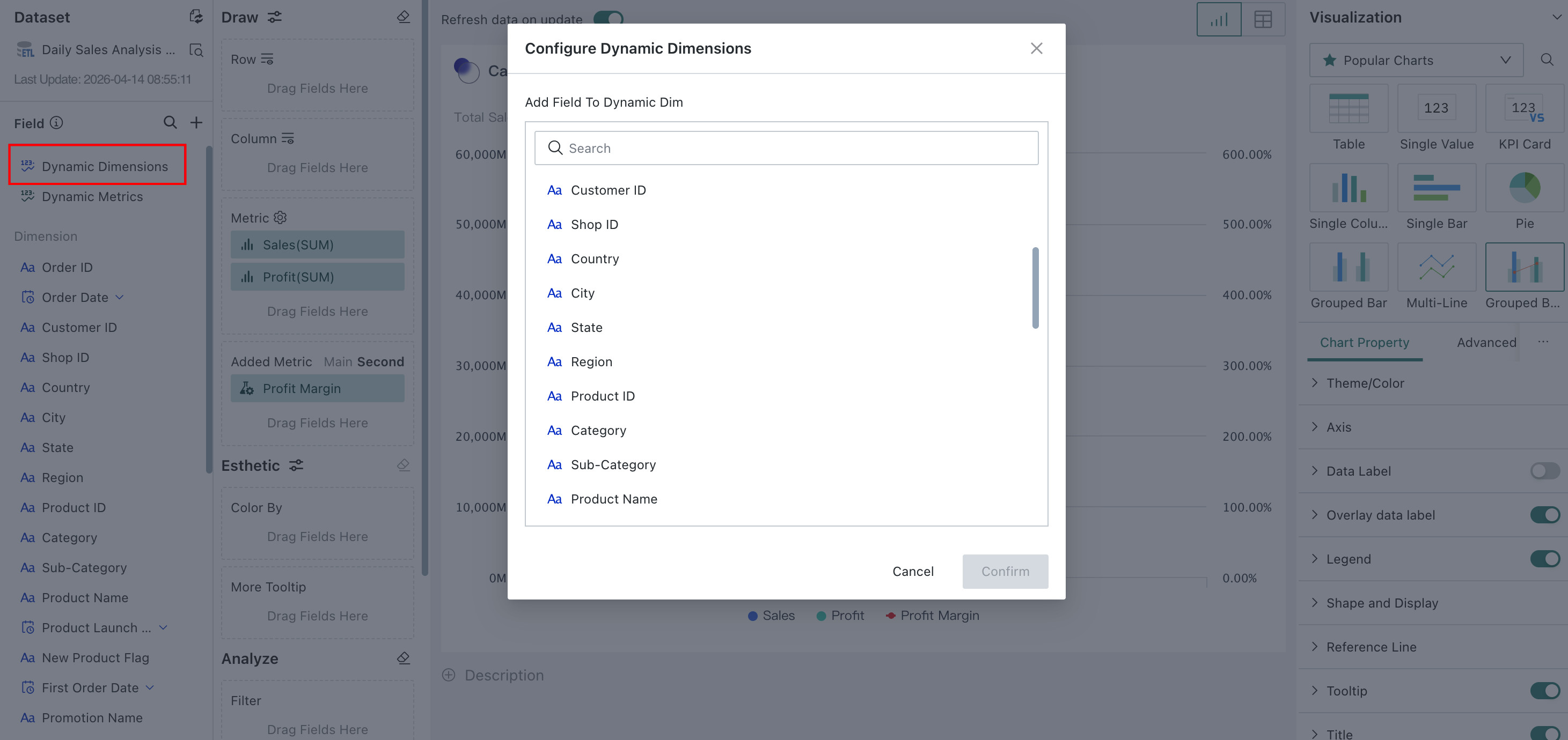
Add Dynamic Dimensions / Measures
In self-service analysis scenarios, users from different roles, businesses, or departments often focus on different dimensions and measures when viewing reports within the same themed dashboard. In addition, some business metrics are better suited to different chart expressions. In these scenarios, basic visualization charts also need to support dynamic field switching so consumers can slice analysis from different perspectives or switch queried metrics.
To satisfy different users' needs for different dimensions and measures and enable relatively free data analysis, Guandata BI supports configuration of dynamic dimensions and dynamic measures. This provides a direct and convenient way to build self-service analysis while significantly improving the user analysis experience.
Supported chart types:
- Column charts: Single Column Chart, Clustered Column Chart, Clustered Column + Line Chart
- Bar charts: Single Bar Chart, Clustered Bar Chart
- Line and area charts: Single Line Chart, Multi-Line Chart, Stacked Area Chart
- Pie and funnel charts: Pie Chart
- Metrics and progress: Metric Card
- Tables: Table, Detail Table, Grouped Table, Heat Map
Differences Between Dynamic Dimensions / Measures, Custom Reports, and Global Parameters
- Custom report: a self-service data retrieval tool that gives users more freedom. For example, compare fields cannot be preset and must be chosen manually each time.
- Global parameters: these fundamentally filter data rows rather than switch fields, so they do not update field names, legends, label names, or data formats together with parameter values. A global parameter can switch one parameter value and affect multiple fields.
Configuration Notes for Dynamic Dimensions / Measures
-
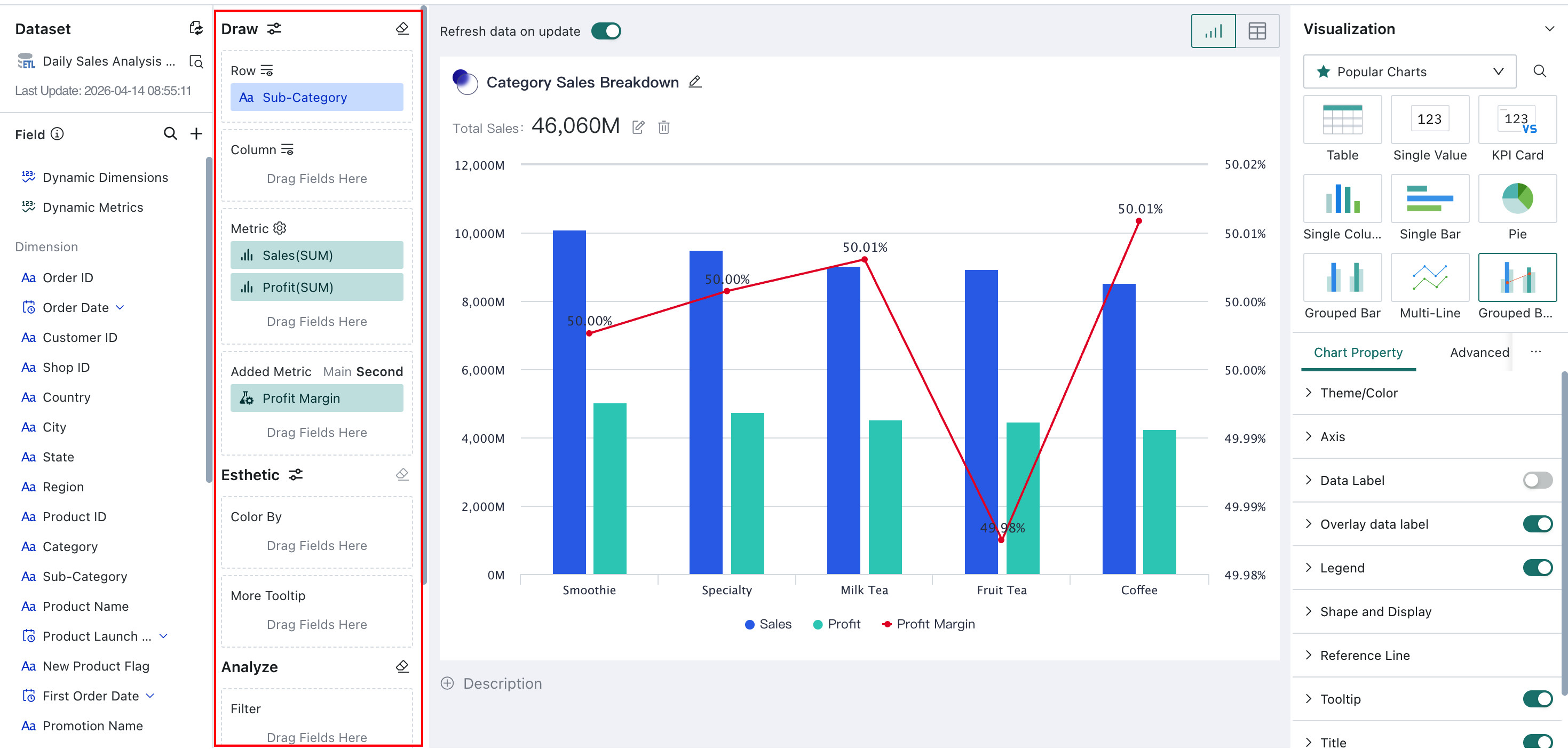
Path: on the card editing page, the left data area contains Dynamic Dimension and Dynamic Measure, which can be dragged into the Dimension, Compare, Measure, or Stacked Measure areas for configuration.
-
Example using dynamic dimension: drag Dynamic Dimension from the left data area into the Dimension area, then add multiple fields that need to be switched. After adding them, the dynamic dimension field supports the same settings as a normal dimension field.
After configuration:
- You can configure single-select or multi-select for dynamic dimensions and dynamic measures. If a chart restricts a certain area to single selection only, multi-select is not supported there.
- You can rename dynamic dimensions and measures.
- You can choose the display order of dynamic dimensions and measures:
- Preset Order means the fields are displayed according to the order configured by the chart creator in the charting area.
- Click Order means the fields are displayed in the order selected by the chart viewer.
- Users can switch fields directly above the chart. The fields chosen in the editing page become the default displayed fields, but viewers can change them later.
Usage Notes for Dynamic Dimensions / Measures
- Dynamic dimensions and measures support reordering fields, and the selected fields are displayed according to that order.
- Fields can be searched fuzzily, and multiple fields can be selected at one time.
- Quick queries support saving dynamic field filters.
- Row rules for conditional formatting also support dynamic field settings.
- After configuration, users can switch the fields above the chart.
When editing a detail table, you can drag dynamic dimensions and dynamic measures into the detail field area to choose fields that can be switched flexibly. Using dynamic dimensions as an example:
- Drag dynamic dimensions or dynamic measures into the detail field area to open the dynamic dimension configuration dialog.
- In that dialog, select fields by clicking them to make them dynamic dimension fields. The configurable options are the same as those for normal dimension fields.
After configuration, the dynamic dimension or measure fields selected in the editing page become the default displayed fields in the table, but users can still change them during use.
When dynamic dimensions exist, Knowledge Feedback and Analysis Result Storage are not supported. Subscription alerts can only be triggered based on the card's default fields. Dynamic measure fields do not support sparkline configuration.
Field Copy
When creating visualization cards, some data calculation logic may need to be reused repeatedly. Guandata BI supports copying calculated fields on the card side so repeated logic can be reused, saving time and improving efficiency.
-
Click the gear icon on the right side of an existing calculated field, such as
Profit Margin, and then click Copy.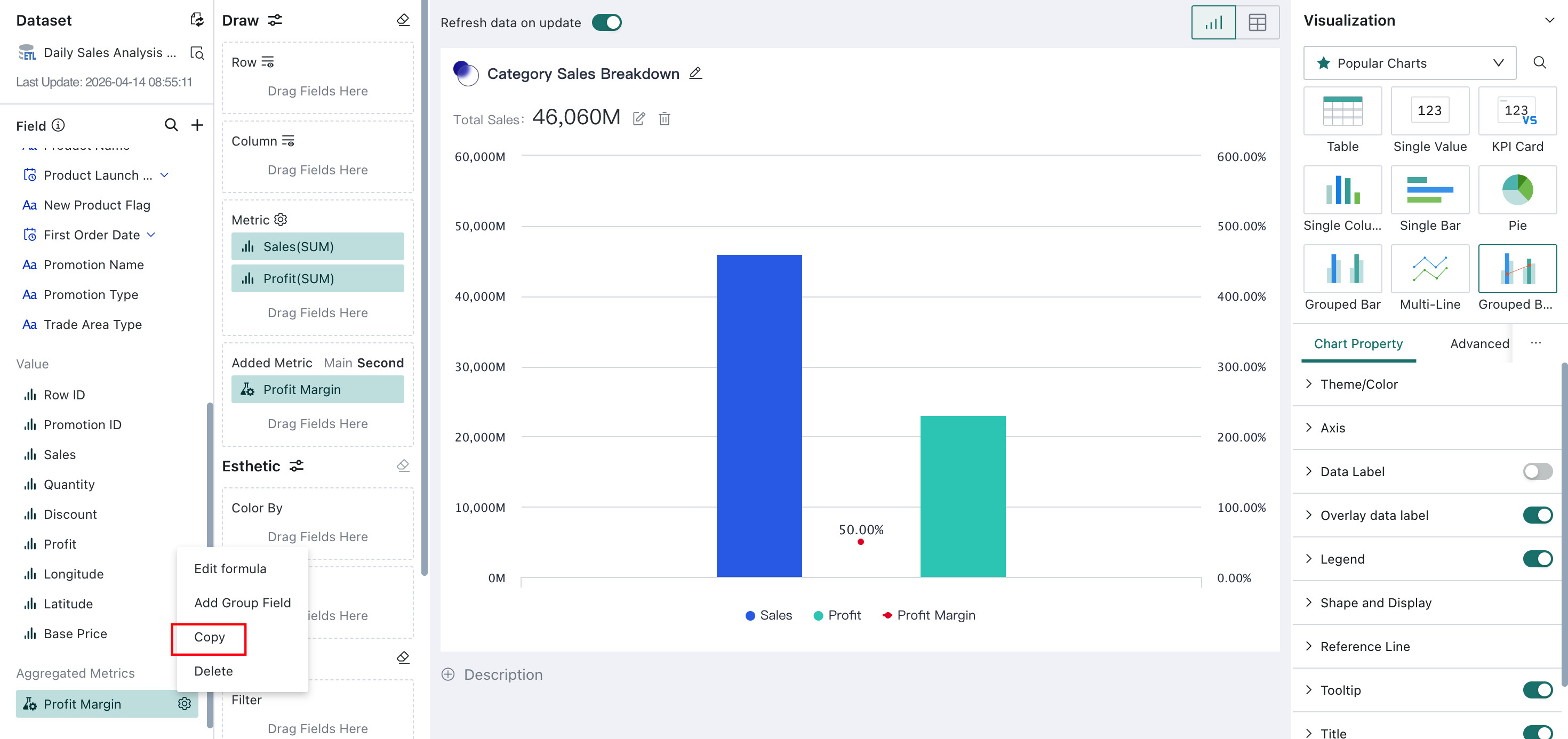
-
In the editor, the system automatically copies the existing formula and names it
xxx_copy_creation timeby default. Both the formula and field name can be modified.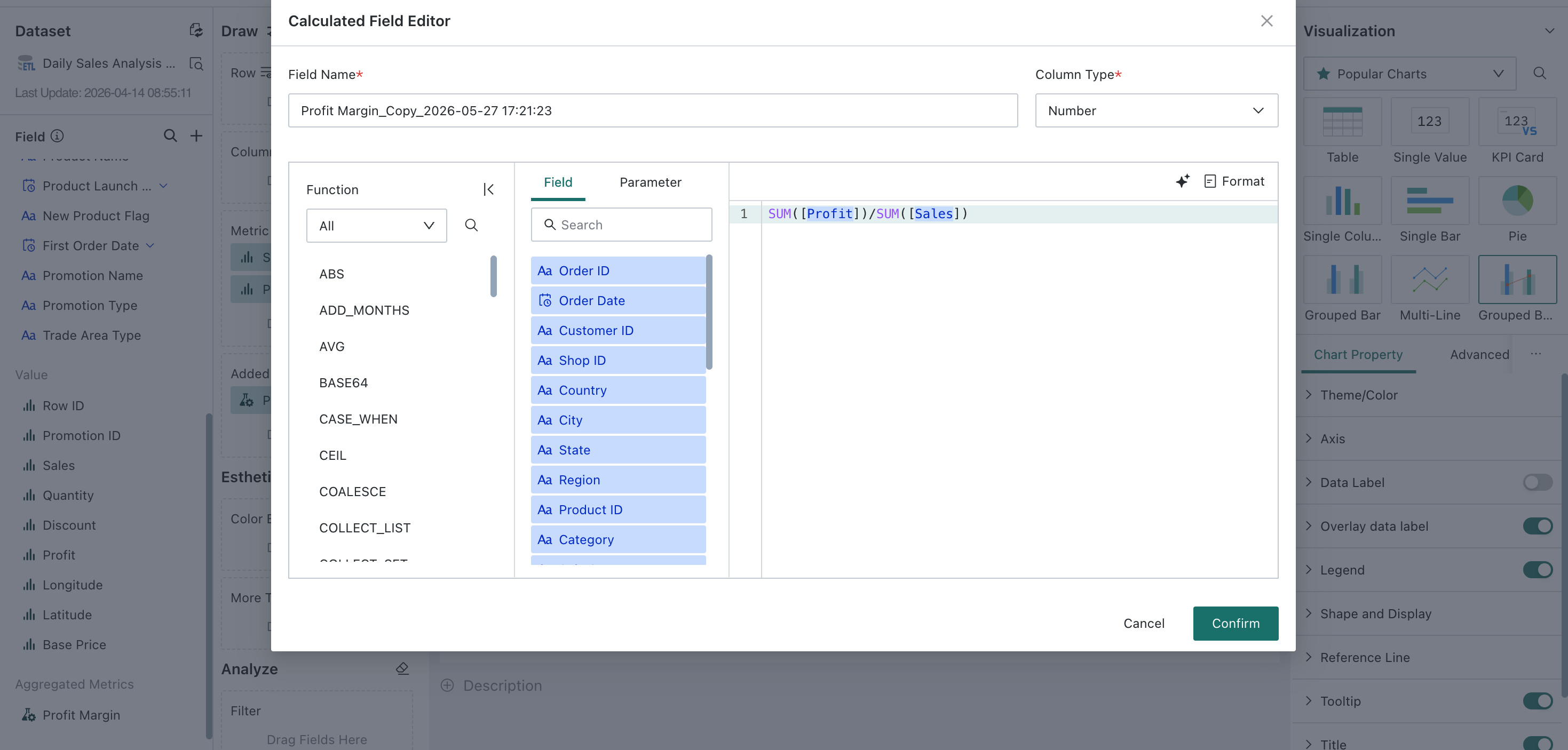
-
After creation, the copied field appears in the dataset overview.
Charting Operations
After deciding which fields to analyze, users can drag them into the charting area to create visualization charts. Based on business needs, users can freely choose and configure both the chart data and appearance for personalized analysis.
General Configuration
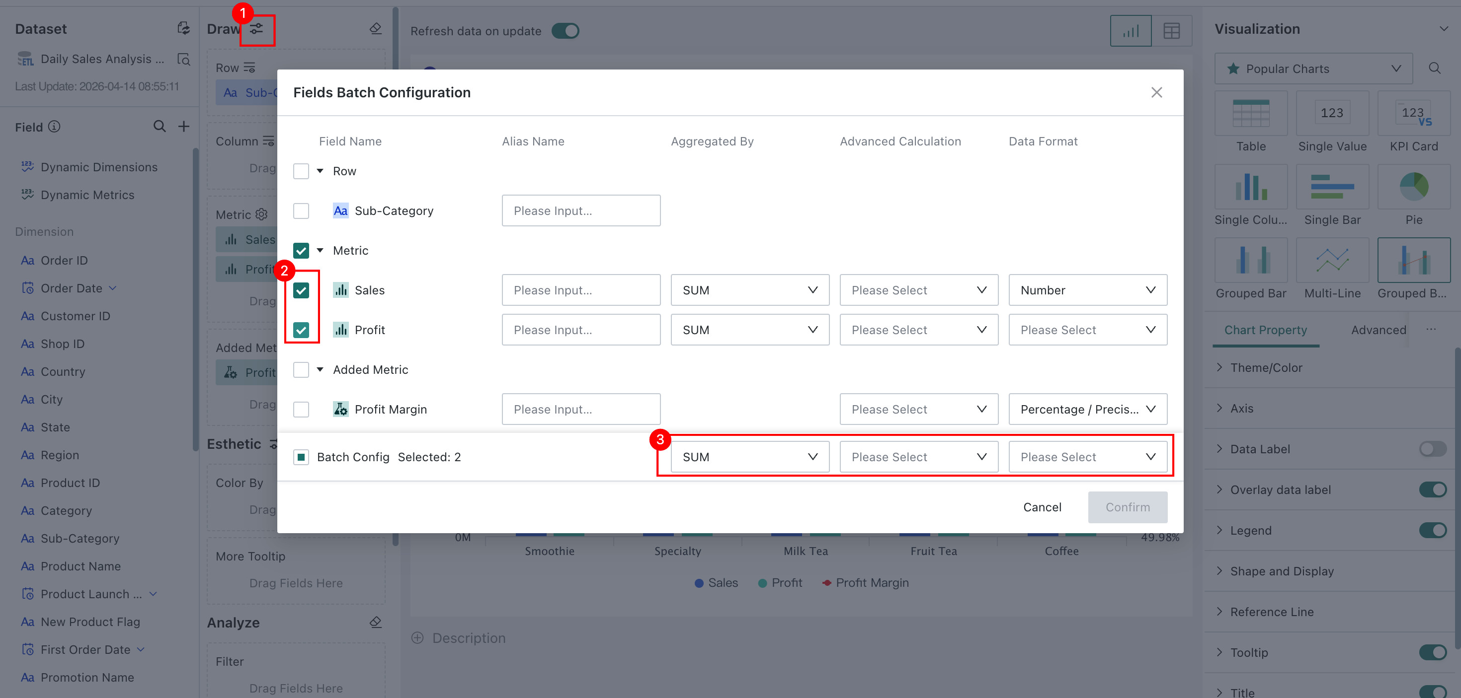
Batch Field Settings
When a large number of fields need consistent formatting, batch field settings can improve card creation and business analysis efficiency.
Click the batch field modification icon next to Charting to open the Batch Field Settings dialog, select the fields you want to modify, and click Confirm after finishing.
-
Different chart types provide different batch settings. For example, tables and line charts:
- Tables support alias, aggregation method, advanced calculand more.
- Line charts support alias, aggregation method, and data format.
-
Different field groups also provide different batch settings. For example, dimensions and measures:
- Dimension groups support alias, alignment, field interpretation, and more.
- Measure groups support alias, aggregation method, advanced calculation, data format, alignment, field interpretation, and more.
Swap Dimension and Compare
Different business scenarios and viewing habits require different layouts. Some dimensions need to appear at the top of a data table, while others need to appear on the left. Analysts can use Swap Dimension and Compare with one click to convert column dimensions into row dimensions and row dimensions into column dimensions.