Dashboard Layout and Beautification
Overview
After a Dashboard is built, you can further improve readability by grouping Cards, refining the layout, and beautifying the overall page.
In this case, two methods are used:
- Group and arrange Cards
- Apply and customize Dashboard themes
Steps
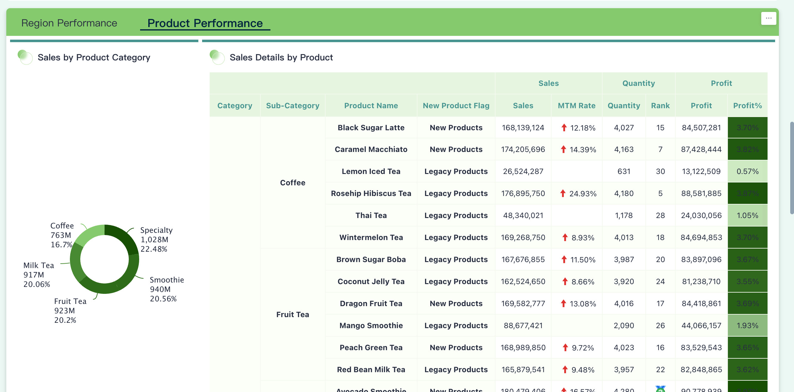
- Card grouping and arrangement: Add Dashboard components and group related Cards together. For example, use a Card Group component to build a unified visual section, or use a Tab Component to place different content in separate tabs.
- Overall Dashboard beautification: Click the
ThemeorPage Stylesbutton, enter theme editing mode, and adjust the overall theme and style settings.
Card Grouping and Arrangement
Tab Component
Tabs are an important component in BI Dashboards. They help organize and classify different data views, enable multi-angle analysis, save page space, and improve readability.
A Dashboard can contain multiple tabs, each representing a business topic or dataset. Users can switch between tabs to view different content. In practice, a tab often contains a set of related data views.
For example, in a financial cost-and-revenue scenario, related indicators such as net margin, gross margin, and operating margin can be displayed within the same tab group to make comparison easier.
To use tabs, create a Tab Component and place the relevant Cards into the corresponding tabs.
Dashboard Themes
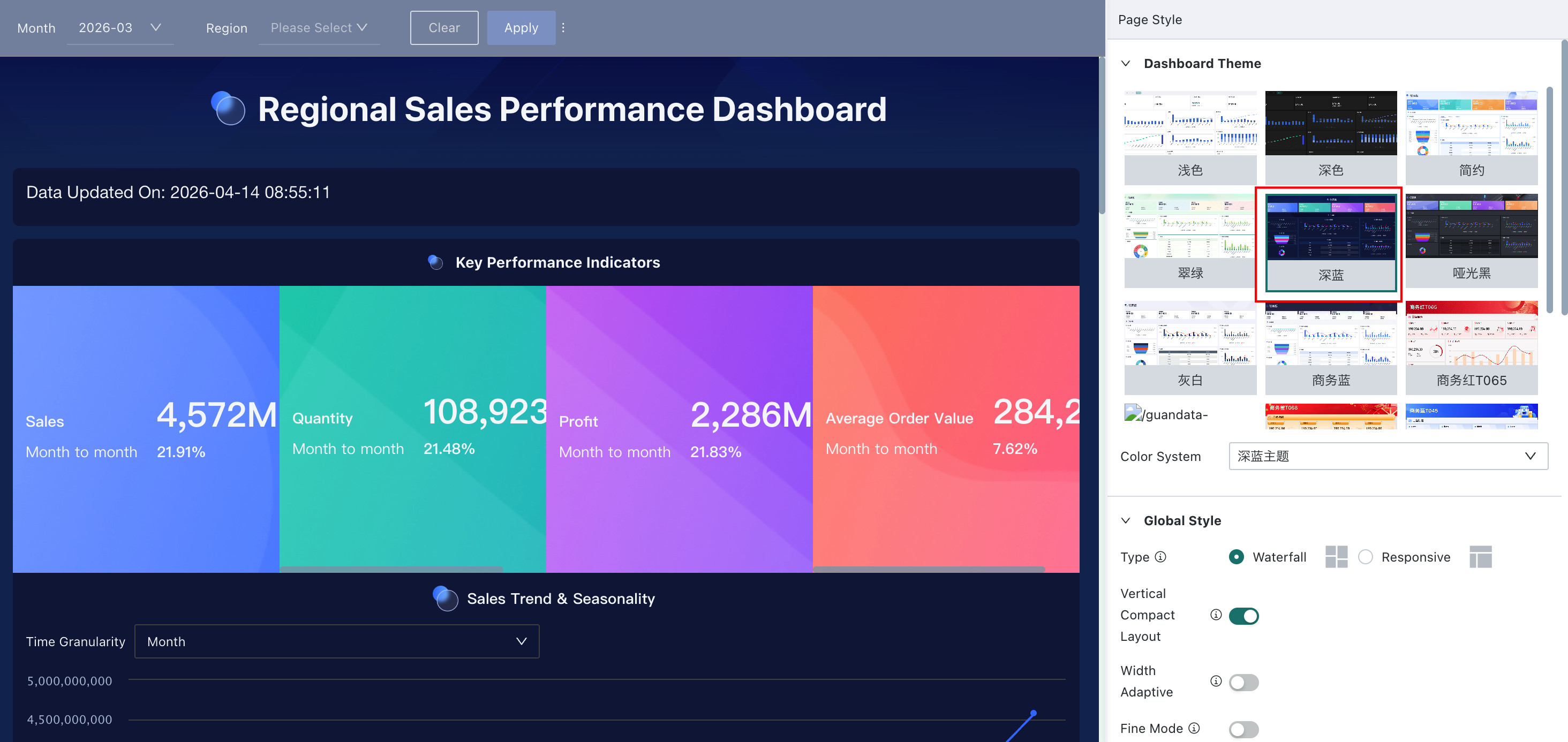
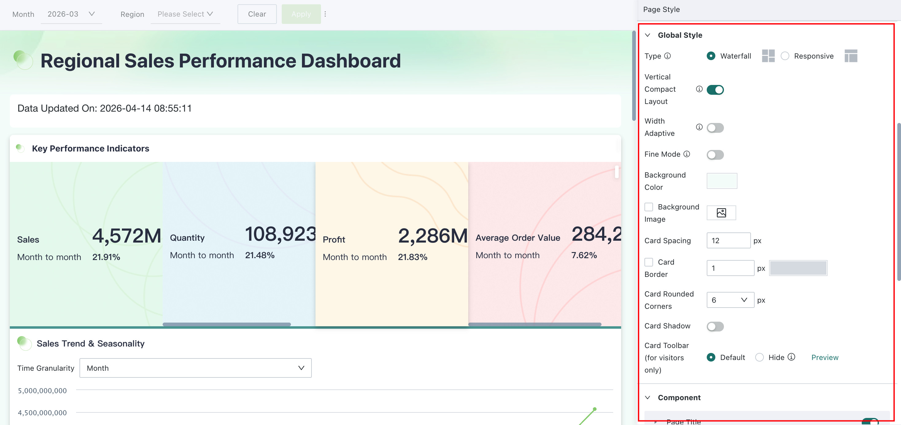
On the Dashboard page, click the Page Styles button in the upper-right corner. A theme configuration panel opens on the right side, where you can configure the Dashboard theme, global styles, component styles, Card styles, and general content styles.
This article focuses on:
- One-click theme switching
- Theme customization
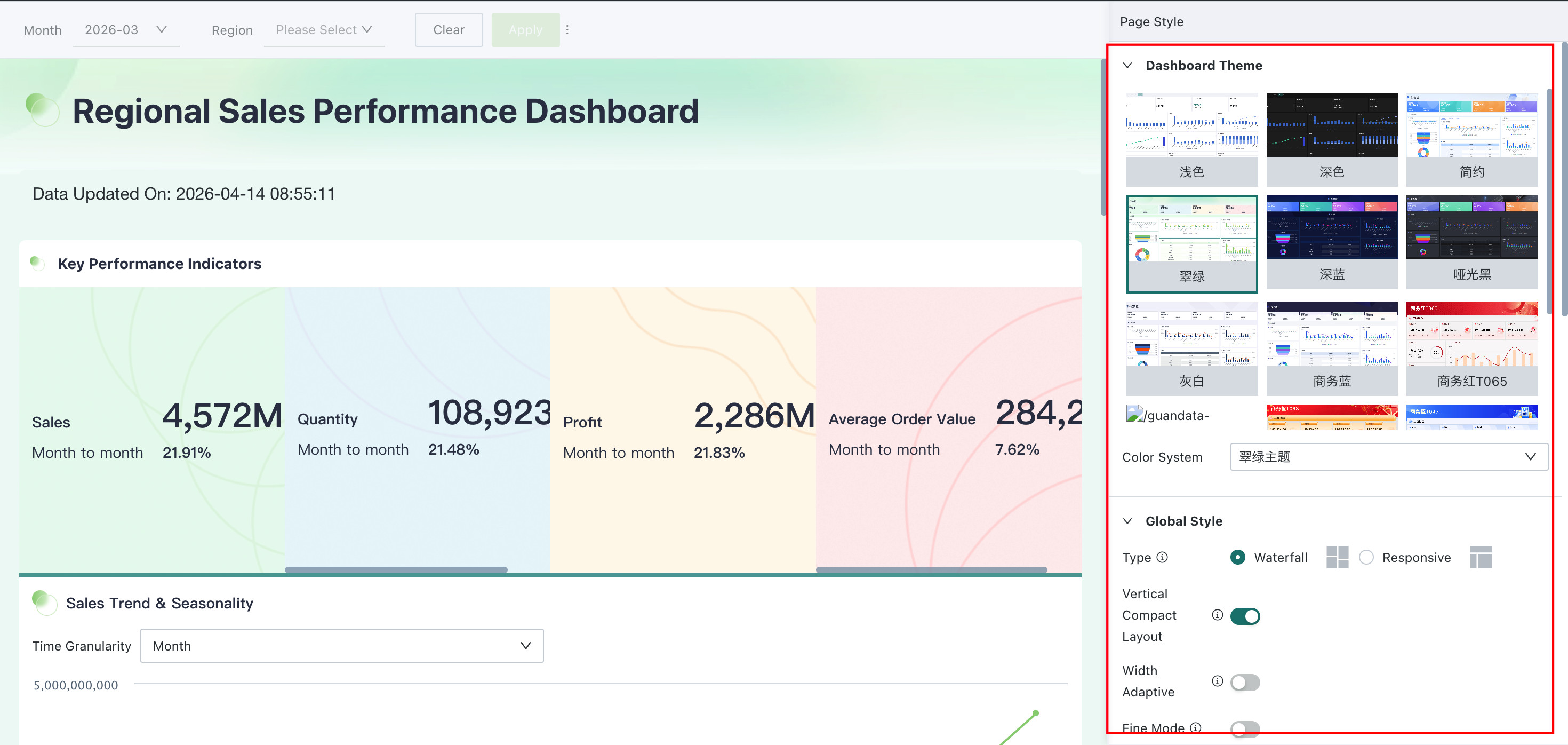
One-Click Theme Switching
Dashboard themes can quickly change the visual style and UI appearance of the page. The system provides multiple built-in themes. In this example, the Gray White theme is used.
Custom Themes
If the built-in themes do not fully meet your needs, you can customize the current theme by adjusting:
- Global styles
- Dashboard component styles
- Card styles
- General content styles
More
You have now learned how to improve the overall visual design of a Dashboard. Next, see Save and Share with Others.