Simple Data Visualization - Charts (Part 1)
Overview
Cards are the elements on a Page or Dashboard and are the smallest unit of analysis. A Card can be a table, a simple chart, or other content types. Guandata BI supports more than 50 visualization types, and Cards can be built quickly by dragging dimensions and measures.
This article uses category analysis as an example and guides you through building intuitive visual charts. The sample dataset is Product Practice Dataset.xlsx.
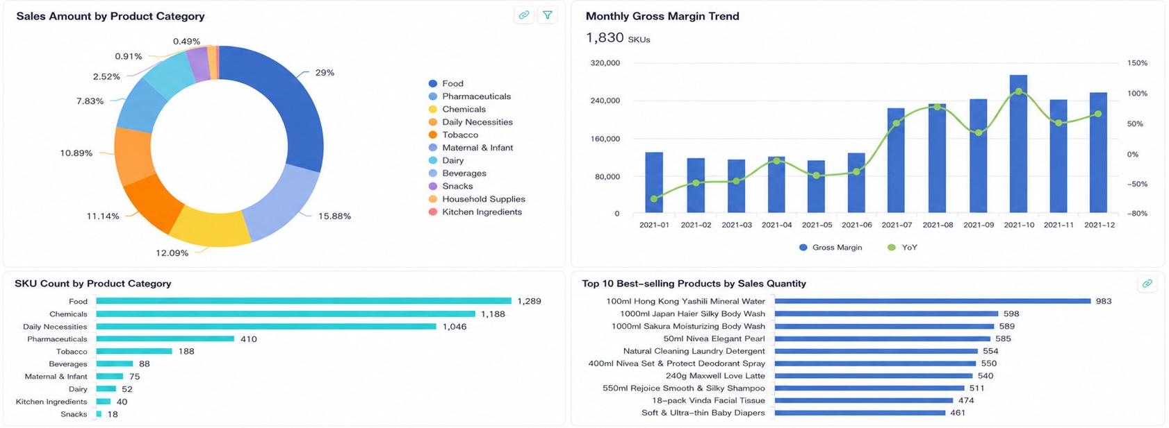
The final example includes:
- Category sales share as a pie chart
- Category SKU count as a bar chart
- Top-selling products nationwide as a bar chart
- Monthly gross profit trend as a combo column and line chart
Prerequisites
- In
Data Preparation > Dataset, create a folder such asProduct Practice. - Import the sample dataset into that folder.
For more details, see Local File.
Steps
- Create a visual chart Card and select the
Product Practice Dataset. - Build a pie chart, bar charts, and a combo chart for the required analysis.
- Arrange the Cards to form the final chart-based report.
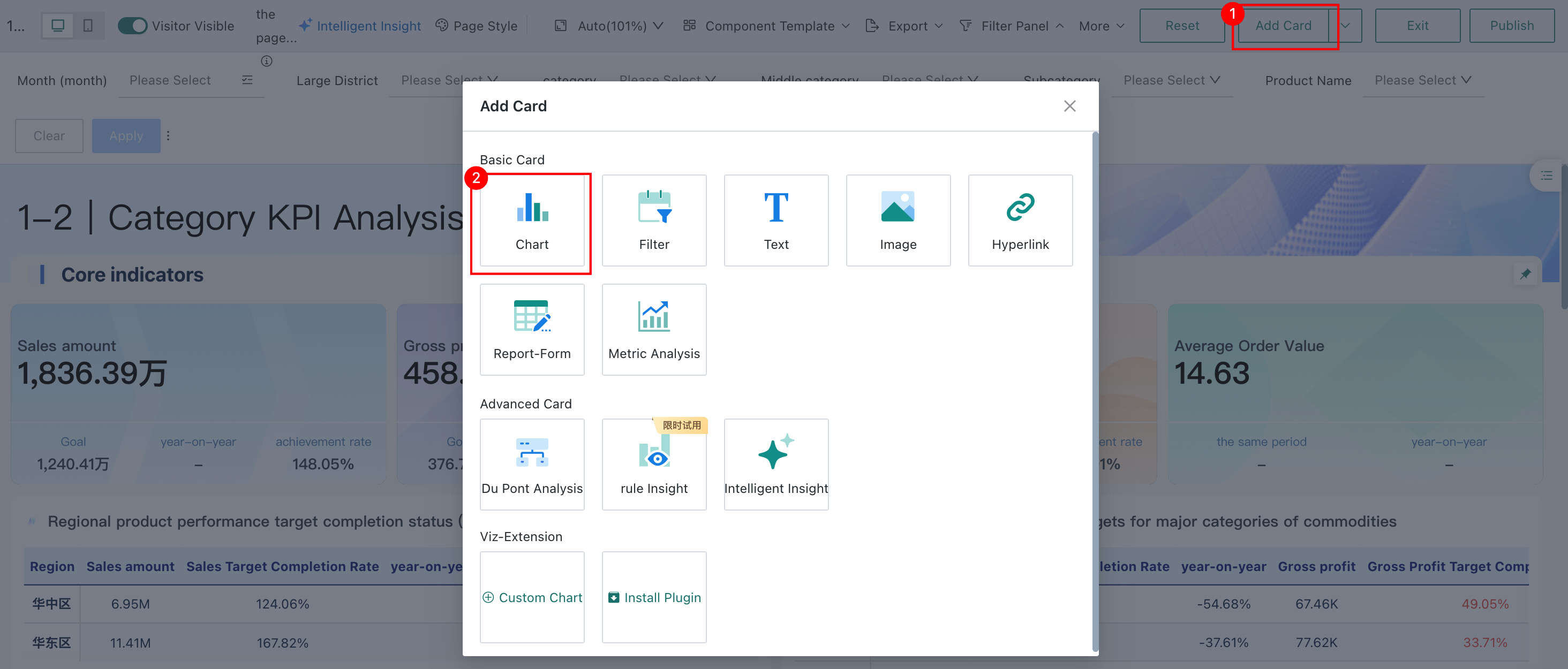
Create a New Card
- On
Data Analysis > Dashboard, clickAdd Cardand chooseChart. - Search for and select the
Product Practice Dataset.
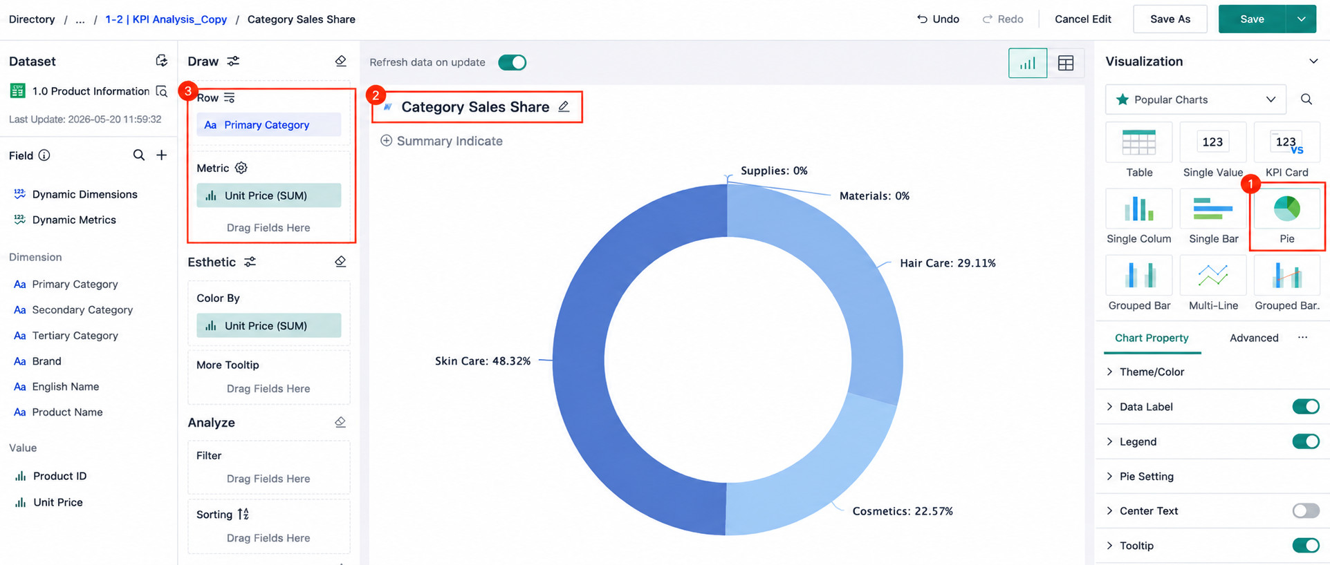
Create Chart Cards
**Category Sales Share (Pie Chart)**- Choose the
Pie Chartvisualization type and rename the Card toCategory Sales Share. - Drag
Primary Categoryinto Row andUnit Price(SUM)into `Metric. - Adjust the chart style as needed. For example:
- Remove category names from data labels to avoid repetition
- Move the legend to the right
- Enable donut display if desired
Manage Chart Cards
After a chart is created, you can reopen it for editing, inspect the Card menu for more operations, and resize the Card by dragging its lower-right corner.
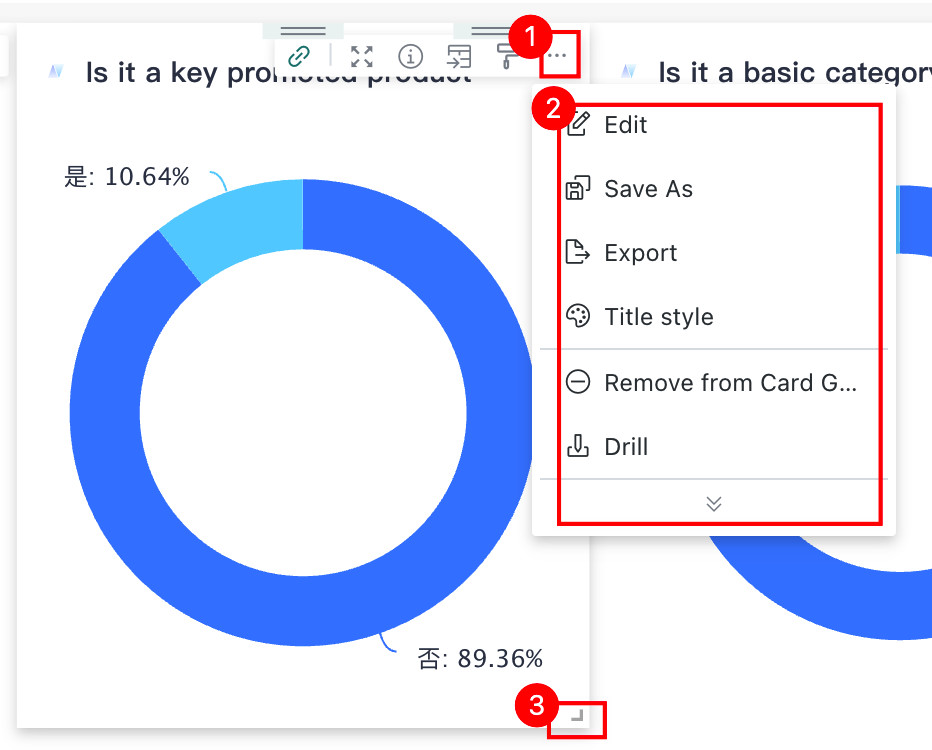
For more details, see Card Management.
More
You have now learned the core steps of creating chart Cards. Next, see Add Dashboard Interactions.