Simple Data Visualization - Tables (Part 2)
Overview
Cards are the smallest analysis units on a Page or Dashboard. In this example, a table Card is used to present detailed product-level data intuitively.
The sample dataset is Product Practice Dataset.xlsx.
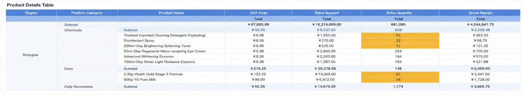
This case uses Province, Product Category, and Product Name as dimensions and displays numeric information such as Sales Amount, Quantity, Gross Profit, and Cost Price. The final table includes subtotals by province and a total for the full table.
Prerequisites
- In
Data Preparation > Dataset, create a folder such asProduct Practice. - Import the sample dataset into that folder.
For more details, see Local File.
Steps
- Create a visual chart Card and select the
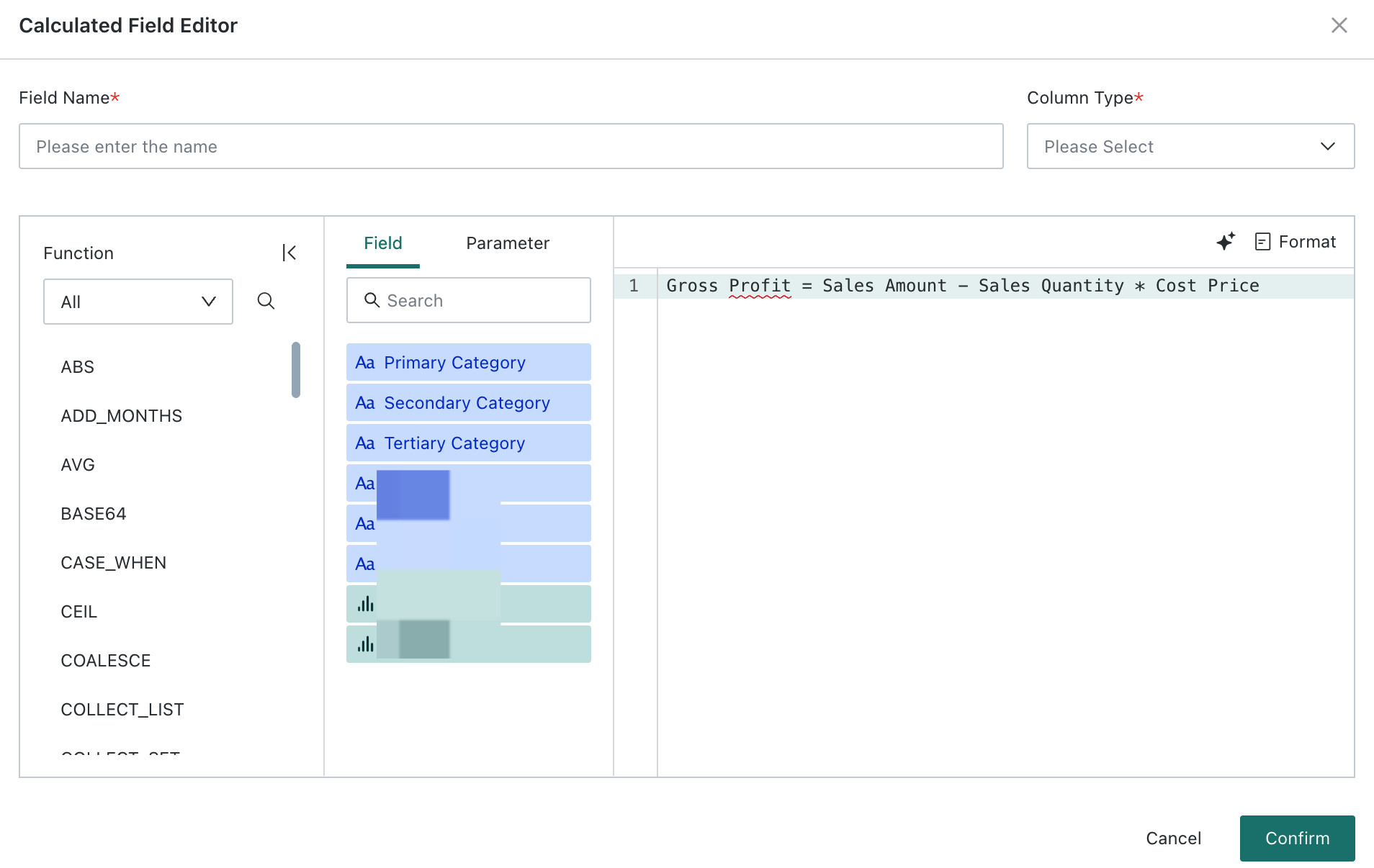
Product Practice Dataset. - Add a calculated field named
Gross Profit. - Drag the required fields into
DimensionsandMeasuresto build the product detail table. - Configure data formats, conditional formatting, and table properties to complete the final visualization.
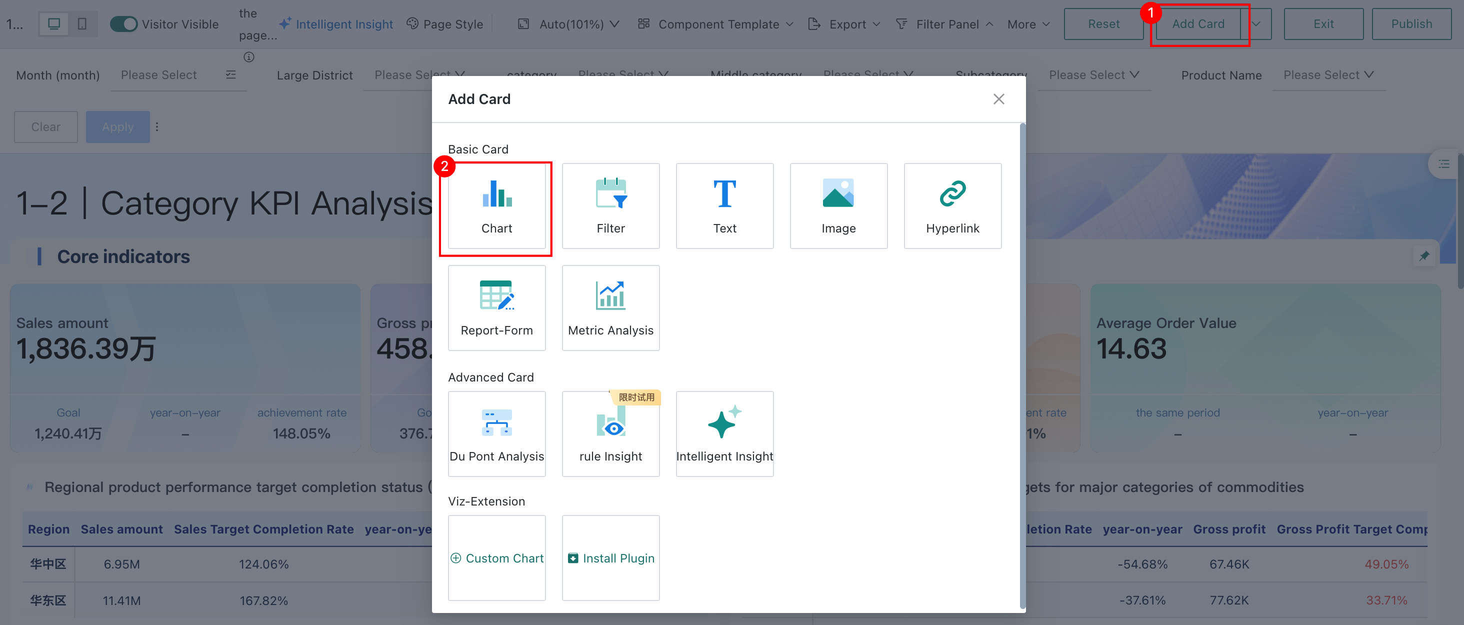
Create a New Card
- On the
Data Analysispage, clickAdd Card. - Choose
Chart. - Search for and select the
Product Practice Dataset.
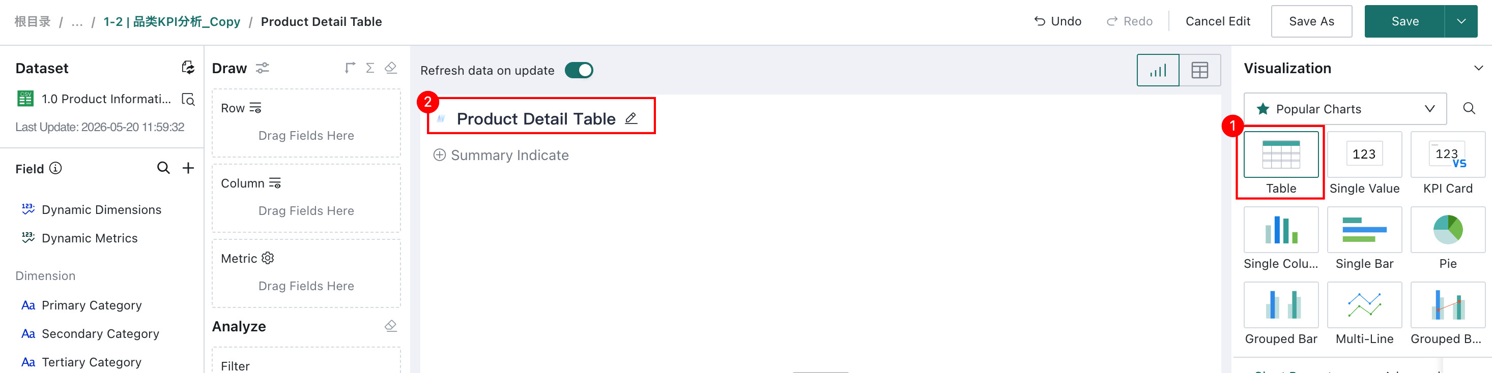
Build the Table Card
- Select the
Tablevisualization type and rename the Card toProduct Detail Table.
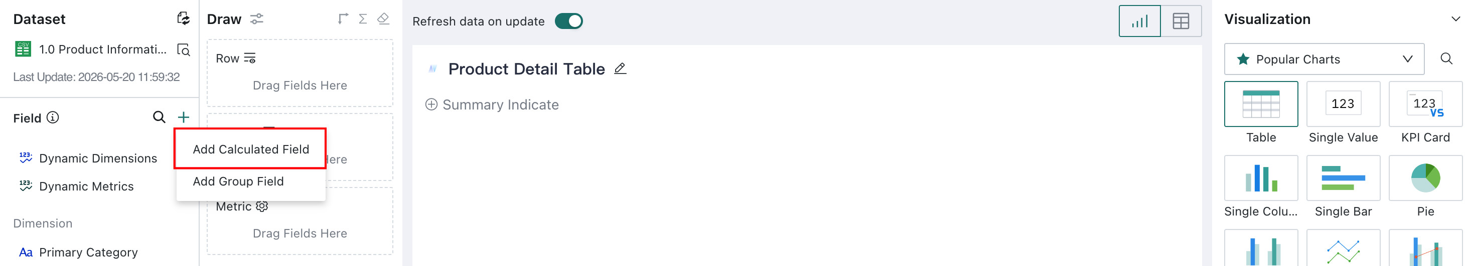
- Add a calculated field:
Gross Profit = Sales Amount - Sales Quantity * Cost Price
-
Drag the following fields into
Row:- Province
- Product Category
- Product Name
-
Drag the following fields into
Metric:- Cost Price
- Sales Amount
- Sales Quantity
- Gross Profit
-
Format
Cost Price,Sales Amount, andGross Profitas currency. -
Enable a column total for the whole table.

-
Enable subtotals on
Primary Category.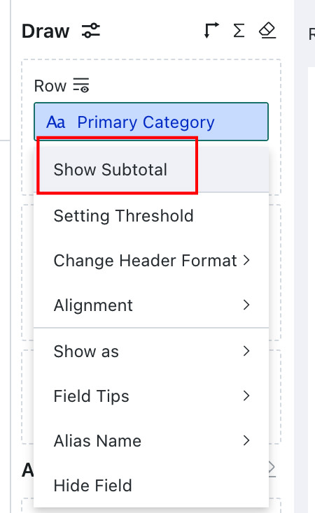
-
Adjust header styles, including background colors, and optionally sync styles to all fields in the same section.
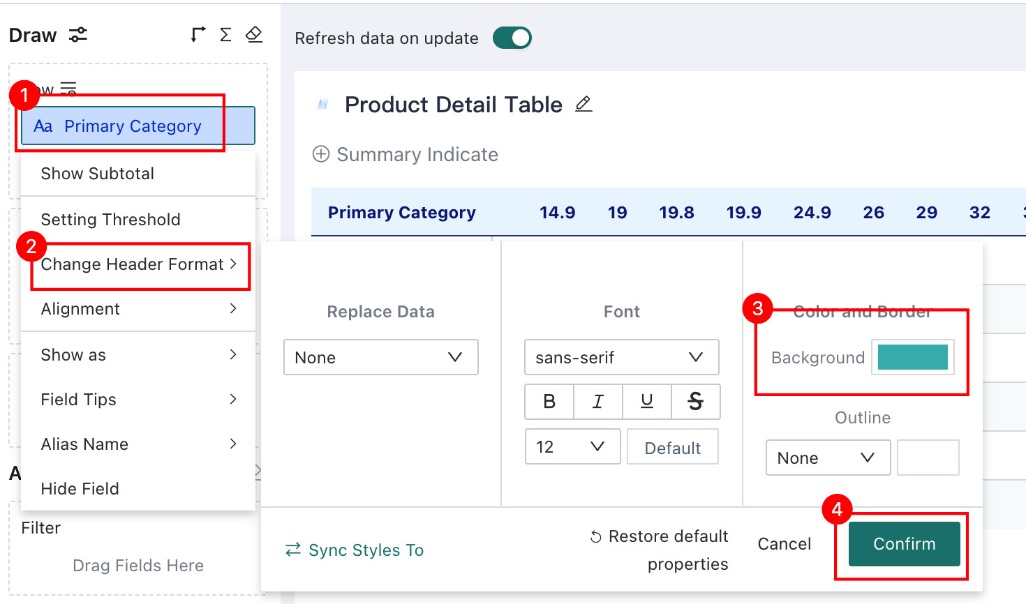
-
Use
Themes and Stylingto enable zebra stripes and adjust background colors.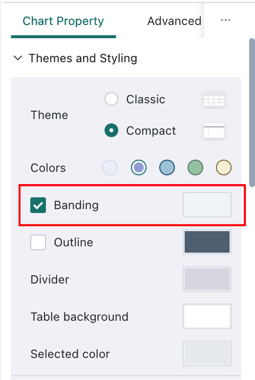
-
In
Subtotals / Totals, choose to show the column total at the top and customize subtotal and total fill colors. -
Click
Save and Exit.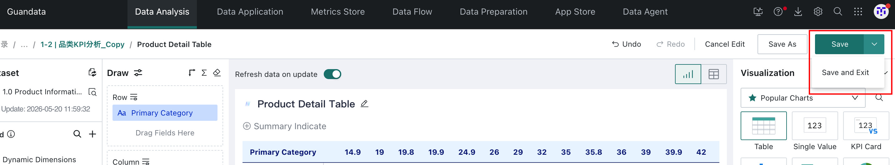
Manage Table Cards
After the table Card is created, you can reopen it for editing, access more operations from the Card menu, and resize it by dragging the lower-right corner.
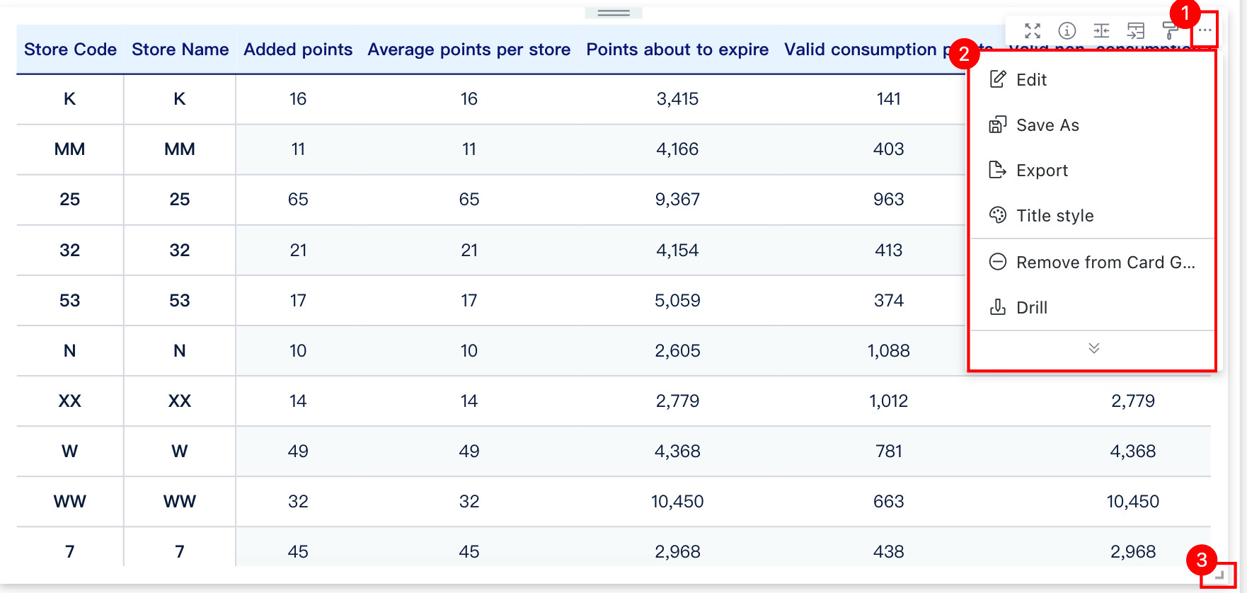
For more details, see Card Management.
More
You have now learned the core steps of building a table Card. Next, see Add Dashboard Interactions.