Use BI to Show Individual Stock and Market Trends Across Different Time Ranges
Background Requirements
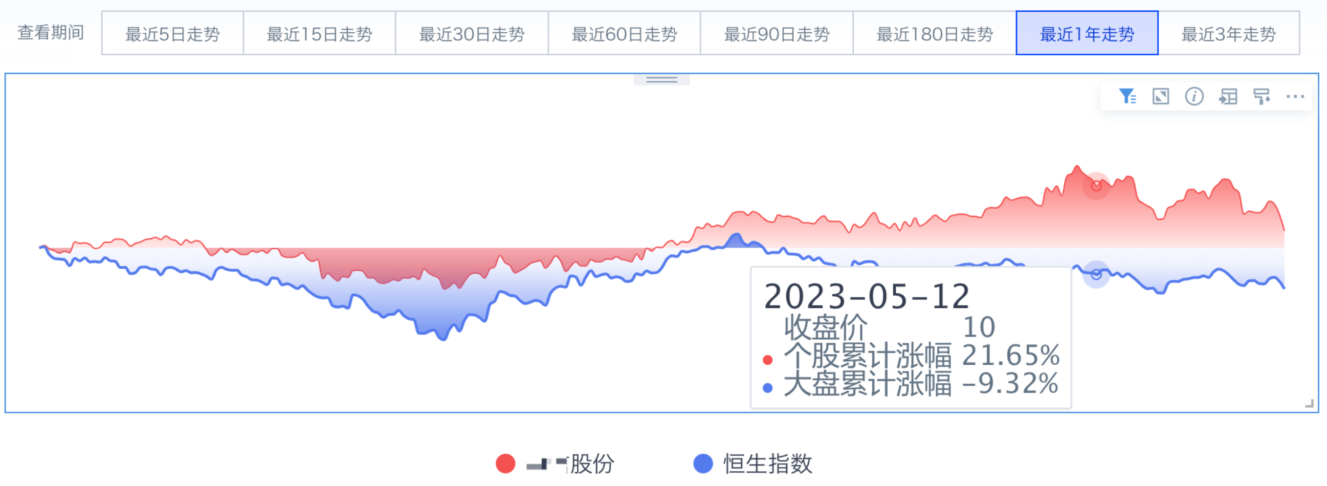
You need to show the stock price of a listed company and the trend of the corresponding listed market index. For intuitive comparison, the requirements are:
- Compare the last 5 days, last 15 days, last 30 days, last 60 days, last 90 days, last 180 days, last 1 year, and last 3 years.
- Show three metrics: individual stock closing price, cumulative increase of the individual stock, and cumulative increase of the market index. This is not yesterday's increase.
- When comparing within the time ranges above, the individual stock and market index must share the same starting point, meaning multiple lines start from the same point.
Final Result
Implementation
Approach: First, calculate the cumulative increase of the individual stock and market index for each time range in ETL. Then, on the page, pass values through global parameters to display data from the corresponding fields.
Data Preparation
- Aggregate the dataset by primary keys: institution code, institution Chinese short name (one-to-one with institution code), and Date.
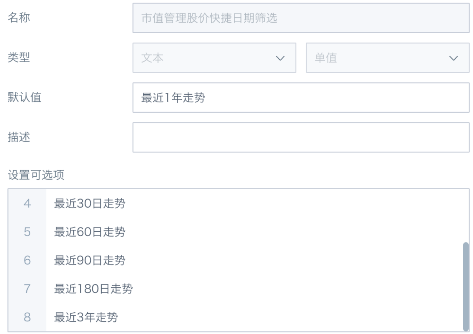
- Create a text-type global parameter.
Use ETL to Calculate Cumulative Stock Price Increase for Each Time Range
Method 1
Use calculating the cumulative increase of the individual stock and market index in the last year as an example:
- Create a calculated field to obtain the maximum date in the dataset.
当前数据集最大日期:MAX([Date]) OVER (PARTITION BY NULL)
- Use an SQL node to filter data from the last year. You can also use a filter node.
SELECT * from input1
where input1.`Date`>= DATE_SUB(input1.`当前数据集最大日期`,364)
- Group by institution code and sort by date.
排名:row_number() over (partition by [机构编码] order by [Date])
- Obtain the base point data for the individual stock and market index.
个股基点:IF([排名]=1,[个股收盘价],null)
大盘基点:IF([排名]=1,[大盘收盘价],null)
- Obtain the final base point values for the individual stock and market index.
个股基点最终值:max([个股基点])over(partition by [机构编码])
大盘基点最终值:max([大盘基点])over(partition by [机构编码])
Explanation: Use the max window function to replace null values in the [个股基点] and [大盘基点] fields without changing the numeric value.
- Calculate cumulative increase.
个股股价累计涨幅(一年):[个股收盘价]/[个股基点最终值]-1
大盘累计涨幅(一年):   [大盘收盘价]/[大盘基点最终值]-1
- Use multiple branches to calculate cumulative increases for each time range separately. Use the longest time range, "last 3 years", as the main table, then join and output the data for each time range.
The ETL model is shown below:

Method 2
- Create a calculated field to obtain the maximum date in the dataset.
当前数据集最大日期: MAX([Date]) OVER (PARTITION BY NULL)
- Mark different time ranges for later date grouping and data filtering.
3年前初始日期:[当前数据集最大日期] - interval 3 years
最近1年: case when [Date]>[当前数据集最大日期]- interval 1 year then '最近1年' end
最近半年:case when [Date]>=[当前数据集最大日期]-interval 179 days then '最近半年' end
- Filter the longest time range, namely data from the last 3 years: [Date] > [3 年前初始日期].

- Calculate the base point data for the individual stock and market index in each time range.
个股基点_最近1年:nvl2([最近1年],first([个股收盘价])over(partition by [机构编码],[最近1年] order by [Date]),null)
个股基点_最近3年:first([个股收盘价])over(partition by [机构编码] order by [Date])
Explanation: Sort by [Date], then use the first window function to obtain [个股收盘价] on the earliest date in the time range. The nvl2 function determines and processes non-null values in [最近 1 年], so only data in the [最近 1 年] time range is calculated.
- Calculate cumulative increase, select columns, and output.
个股股价累计涨幅(一年):[个股收盘价]/[个股基点_最近1年]-1
大盘累计涨幅(一年):   [大盘收盘价]/[大盘基点_最近1年]-1
The ETL model is shown below:

The method comparison is as follows. Choose the one that fits your scenario:
Method 1: The logic is simple and clear, making it easy to start with. It has many ETL branches, so the structure is slightly more complex.
Method 2: Requires proficiency with window functions and has slightly more complex logic. It uses a single ETL line, so the structure is simple.
Create Dashboard Cards
Use Global Parameters to Display Dynamic Metrics
Create two numeric fields and place them in the value field well to implement dynamic metrics. Create one Boolean field and place it in the filter field well to implement dynamic date switching.
个股累计涨幅:
case [DYNAMIC_PARAMS.市值管理股价快捷日期筛选]
when '最近5日走势' then [个股股价累计涨幅(5天)]
when '最近15日走势' then [个股股价累计涨幅(15天)]
when '最近30日走势' then [个股股价累计涨幅(30天)]
when '最近60日走势' then [个股股价累计涨幅(60天)]
when '最近90日走势' then [个股股价累计涨幅(90天)]
when '最近180日走势' then [个股股价累计涨幅(180天)]
when '最近1年走势' then [个股股价累计涨幅(一年)]
when '最近3年走势' then [个股股价累计涨幅(三年)]
else null  end
大盘累计涨幅:
case [DYNAMIC_PARAMS.市值管理股价快捷日期筛选]
when '最近5日走势' then [大盘累计涨幅(5天)]
when '最近15日走势' then [大盘累计涨幅(15天)]
when '最近30日走势' then [大盘累计涨幅(30天)]
when '最近60日走势' then [大盘累计涨幅(60天)]
when '最近90日走势' then [大盘累计涨幅(90天)]
when '最近180日走势' then [大盘累计涨幅(半年)]
when '最近1年走势' then [大盘累计涨幅(一年)]
when '最近3年走势' then [大盘累计涨幅(三年)]
else null  end
日期筛选布尔值:
写法1:
case [DYNAMIC_PARAMS.市值管理股价快捷日期筛选]
when '最近5日走势'  then  datediff([当前数据集最大日期],[Date])<=4
when '最近15日走势' then  datediff([当前数据集最大日期],[Date])<=14
when '最近30日走势' then  datediff([当前数据集最大日期],[Date])<=29
when '最近60日走势' then  datediff([当前数据集最大日期],[Date])<=59
when '最近90日走势' then  datediff([当前数据集最大日期],[Date])<=89
when '最近180日走势' then  datediff([当前数据集最大日期],[Date])<=179
when '最近1年走势' then  datediff([当前数据集最大日期],[Date])<=364
when '最近3年走势' then  datediff([当前数据集最大日期],[Date])<=1094
end
写法2:[最近5日]等字段可替换为计算好的累计涨幅字段
case [DYNAMIC_PARAMS.市值管理股价快捷日期筛选]
when '最近5日走势'  then  [最近5日] is not null
when '最近15日走势' then  [最近15日] is not null
when '最近30日走势' then  [最近30日] is not null
when '最近60日走势' then  [最近60日] is not null
when '最近90日走势' then  [最近90日] is not null
when '最近180日走势' then [最近半年] is not null
when '最近1年走势'  then  [最近1年] is not null
when '最近3年走势'  then  [最近3年] is not null
end
Set Multi-Line Chart and Page Linkage
Card Tips
To ensure that the three value metrics share the same starting point and that the individual stock closing price is displayed first, pay special attention to the following points when creating a multi-line chart:
- Because individual stock price and cumulative increase have very different value ranges, placing all three fields into the value field well, including the stacked chart value field well, produces a poor visualization effect. At the same time, the individual stock cumulative increase is calculated from the individual stock closing price, so the two metrics have the same fluctuation trend. Showing only [个股累计涨幅] can represent the individual stock closing price trend.
Solution: Place the two cumulative increase fields into the value field well, and place the three fields into More Tooltips in sequence. Select Show Tooltip Only.
- After configuring the chart as described above, hovering over the chart shows that the legend color in the floating tooltip does not match the line color. This happens because the value field well and tooltip field well contain different numbers of fields. The two areas apply theme colors independently in sequence, so make sure the value field well and tooltip field well contain the same number of fields.
Solution: Create a numeric constant field. Set its content to null or 0 and use it as the first metric in the value field well. This field does not affect chart display. You can also set its alias to a blank space to reduce its visual presence.
- Other visualization optimizations:
-
Set the first theme color to white so the legend dot before the closing price is white and can be distinguished from other metrics.
-
Hide axes, data labels, and legends.

Page Tips
-
Create a parameter filter and select the parameter used in the card. The filter automatically links to cards on the current page that use this parameter. You can set the parameter filter to the "button bar" style as needed.
-
Because the multi-line chart hides the legend, you can create a custom legend as needed. If fixed content should be displayed, place an image under the multi-line chart. If the legend needs to link with filters, for example showing the selected "institution Chinese short name" for the individual stock and the corresponding market for the market index, use a "carousel list" card. For the implementation method, see the similar case Tips for Using Carousel Lists.

Done.