Basic Color Matching Methods
Overview
Color plays a very important role in visual analysis. When building Dashboards or Data Screens, appropriate color matching can make the presentation of data charts clearer, cleaner, and more accurate. However, in actual practice, for a beginner, it is not easy to skillfully design color schemes for their Dashboards, and it can sometimes be time-consuming and labor-intensive.
Therefore, this article mainly introduces how to design beautiful and suitable color schemes for Dashboards or Data Screens, helping zero-foundation users quickly master the tricks of color matching and easily solve color matching problems for Dashboards and Data Screens. In addition, Guandata BI also provides multiple official color schemes that users can directly select and quickly apply to charts.
Color Matching Principles
Basic Color Principles
Three Elements of Color (HSB)
- Hue (H)
Hue refers to the appearance of a color and is the distinct characteristic that differentiates one color from another. The basic colors distinguishable in physics or psychology are "red, orange, yellow, green, cyan, blue, purple." Black, white, and gray do not have hue properties.
The feelings that hues bring to people are generally divided into three types: cool colors (blue, blue-green, etc.), warm colors (red, orange, yellow, etc.), and neutral colors (purple and green series). Neutral colors basically cannot create warm or cool impressions on their own.
In data visualization applications, hues do not have obvious sequentiality and are generally not used to express the magnitude of data quantities, but rather to express the categories of data columns.
- Saturation (S)
Saturation refers to the vividness of a color, also known as purity.
The higher the purity of a color, the more vivid it is, and the easier it is to form a strong, energetic impression; the lower the purity, the paler the color, and the easier it is to form a mature, steady impression.
- Brightness (B)
Brightness refers to the lightness of a color, also known as luminance.
Brightness is divided into two types: different brightness of the same hue and different brightness of different hues (brightness perceived by the human retina).
In data visualization applications, saturation and brightness can easily distinguish the priority level visually and are mainly used to express sequence or data quantity.
Color Contrast
Color contrast refers to the contrast produced when two or more colors are used together.
Color contrast tool: https://color.adobe.com/zh/create
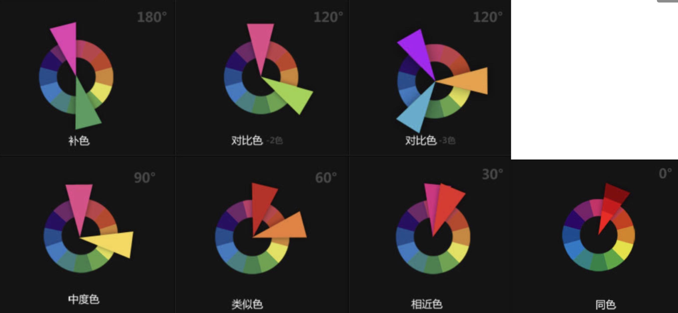
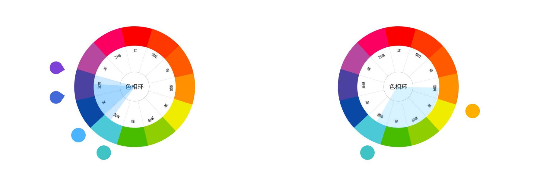
- Same Hue Contrast (0°)
Contrast between different brightness or saturation levels of the same hue. For example, blue and light blue (blue + white) contrast. The contrast effect is unified, elegant, subtle, and steady, but can also easily become monotonous and rigid.
- Adjacent Hue Contrast (30°)
Weak contrast. The contrast effect is soft, harmonious, elegant, and quiet, but can also easily become monotonous, blurry, boring, and weak. The effect needs to be enhanced by adjusting brightness.
- Analogous Colors (60°)
Weak contrast. The contrast effect is relatively rich and lively, but still unified, elegant, and harmonious.
- Contrasting Colors (120°)
Strong contrast. The contrast effect is strong, eye-catching, lively, and powerful, but can also easily become disunified, messy, stimulating, and cause visual fatigue. Various harmonization methods are generally used to improve the contrast effect.
- Complementary Colors (180°)
Strong contrast. The contrast effect is strong, eye-catching, lively, and powerful, but can easily cause visual fatigue. Various harmonization methods are generally used to improve the contrast effect.
Palette Types
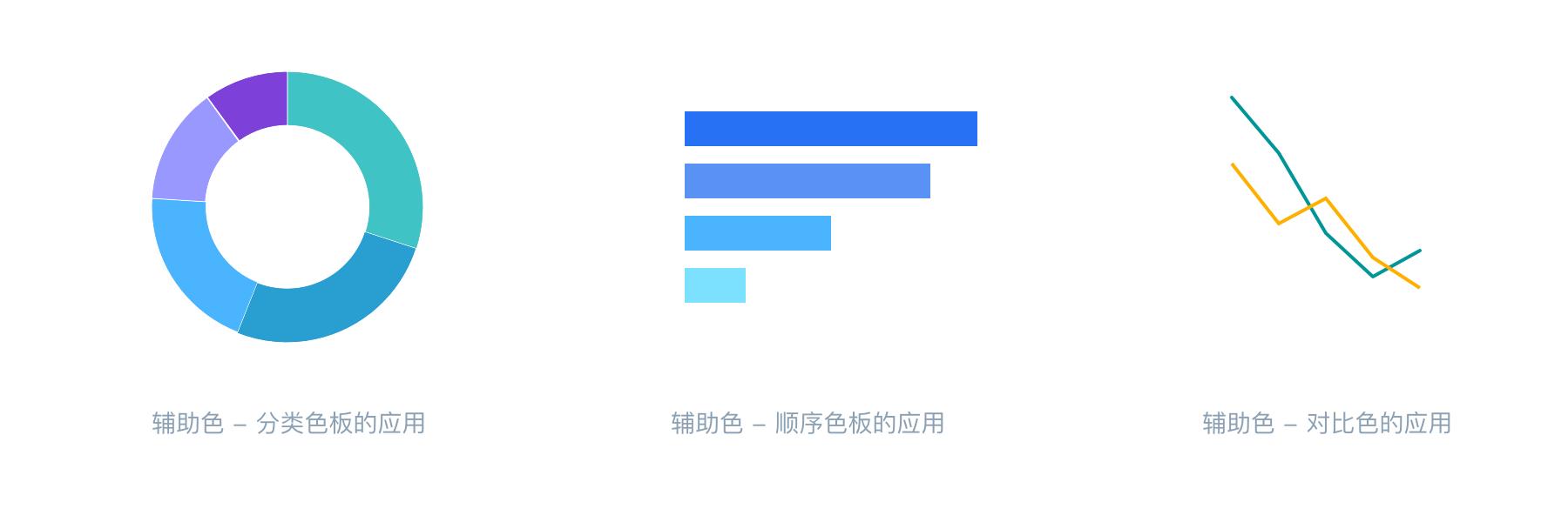
Categorical Palette
Categorical palettes are mainly used to describe data categories. Each category has no fixed order, such as displaying different countries, different enterprises, or different individual classifications.

Sequential Palette
Sequential palettes are mainly used to express the magnitude and gradient changes of values within the same thing. Generally, the darker the color, the larger the value; the lighter the color, the smaller the value.

Diverging Palette
Diverging palettes are mainly used to express the continuous change of data from negative to 0 to positive. They often use a method of transitioning uniformly from one color through a light color to another opposing color, with the middle light color serving as the center value or reference value.
As shown in the figure below: green represents positive numbers, red represents negative numbers, and the middle light color is 0; or green represents positive, red represents negative, and the middle light color represents neutral.

Semantic Palette


Color Matching Methods
With Theme Color
Create an Inspiration Palette
Step 1. Enter the design website: https://dribbble.com/
Step 2. Enter the theme color to get a list of reports related to the theme color
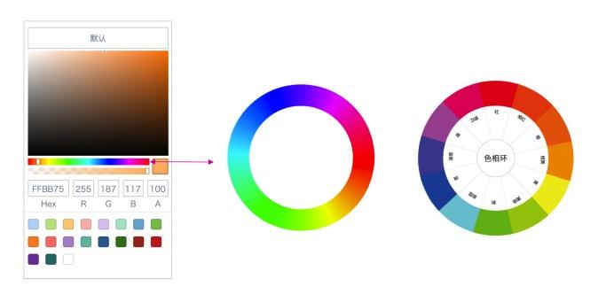
Step 3. Select a favorite image, imitate the color matching, and use the color picker in Keynote or PPT to extract colors

Explore Color Schemes from Brand Colors
Divergence from a Single Brand Color
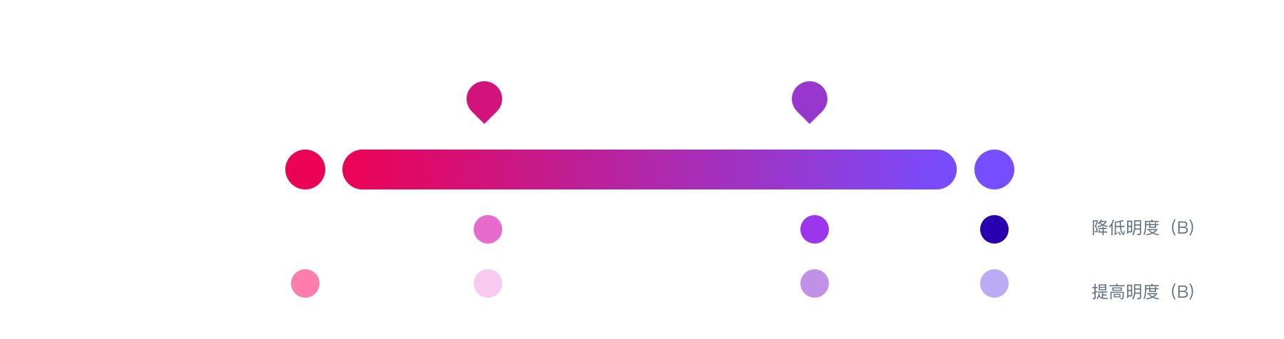
Step 1. Find the brand main color

Step 2. Calibrate the main color
In Dashboards or Data Screens, some basic principles need to be followed:
-
Do not use colors with excessively high saturation in large areas (especially on dark backgrounds) and colors with excessively high brightness (especially on white backgrounds)
-
Do not occupy functional colors (such as pure green, red, yellow)
Therefore, in the above situations, calibration adjustments need to be made on the basis of the brand hue (combined with scenarios such as dark backgrounds for large screens), so that these colors can convey a brand sense when applied to charts.

Step 3. Diverge auxiliary colors
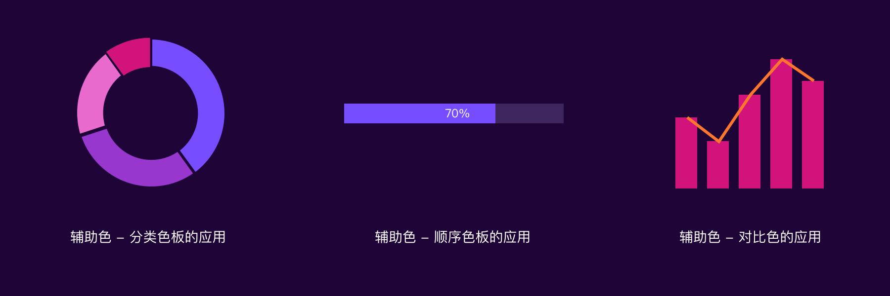
Based on the main color, we need to find a series of auxiliary colors to meet visualization needs. Generally, about 80% analogous colors and 20% contrasting colors (used for layout accents) are needed.
-
For a consistent layout style, select analogous and contrasting colors in the same direction
-
For a balanced layout style, select in the opposite direction
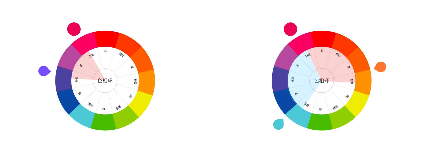
On the 60° color wheel of analogous colors, we can select more colors to create a categorical palette; at the same time, by adjusting brightness and saturation, we can create a sequential palette.
Divergence from Multiple Brand Colors
From the divergence of a single brand color, it can be summarized that in visualization charts, we need a categorical palette, its corresponding sequential palette, and 1-2 contrasting colors. Then, by appropriately placing multiple brand colors into the palette and filling in gaps through similar methods, the divergence of multiple brand colors is completed.
Step 1. Find brand colors
Select the main color from multiple brand colors as the chart main color, and accent colors as contrasting colors or references for contrasting color harmonization.
Step 2. Determine the categorical palette
On the 60° color wheel of analogous colors, we can select more colors to create a categorical palette; at the same time, by adjusting brightness and saturation, we can create a sequential palette.

Application Example:
Without Theme Color
Create an Inspiration Palette
Step 1. Enter the design website: https://www.zcool.com.cn/
Step 2. Enter keywords, such as data visualization, data screen, Data Visualization, Dashboard, etc.
Step 3. Select a suitable image, imitate the color matching, and use the color picker in Keynote or PPT to extract colors
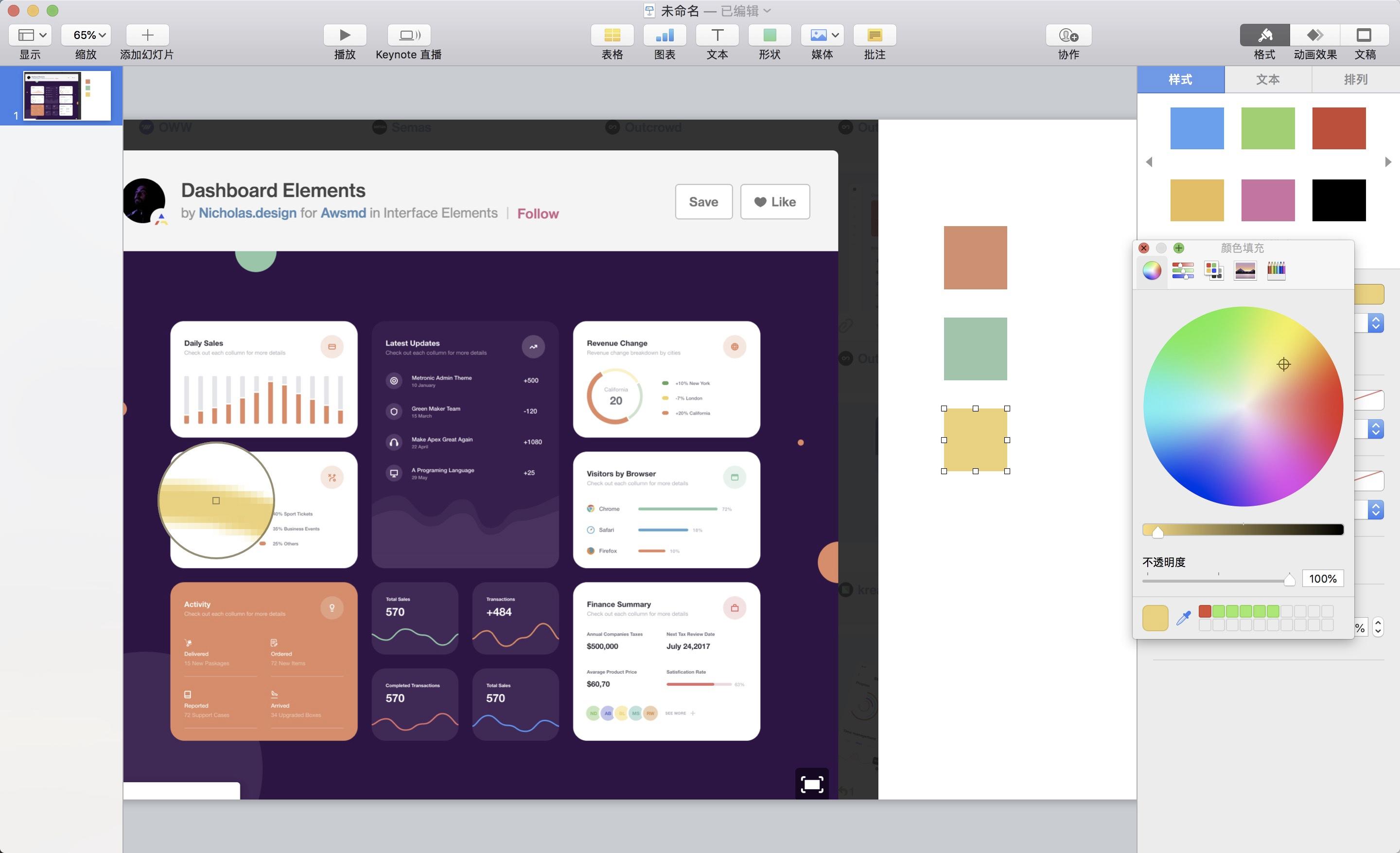
Diverge Color Schemes from Photos/Images
Step 1. Select a suitable photo
You can use the following tools to import photos and extract exclusive color cards: Muzli Colors or Coolors Generator
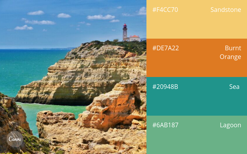
Step 2. Diverge colors
When more colors are needed in the chart, you can extract the main color from the photo again, or continue to diverge based on the main color. Specific operations are as follows:
- Extract the color of the sky from the photo above

-
Continue to diverge based on the main color
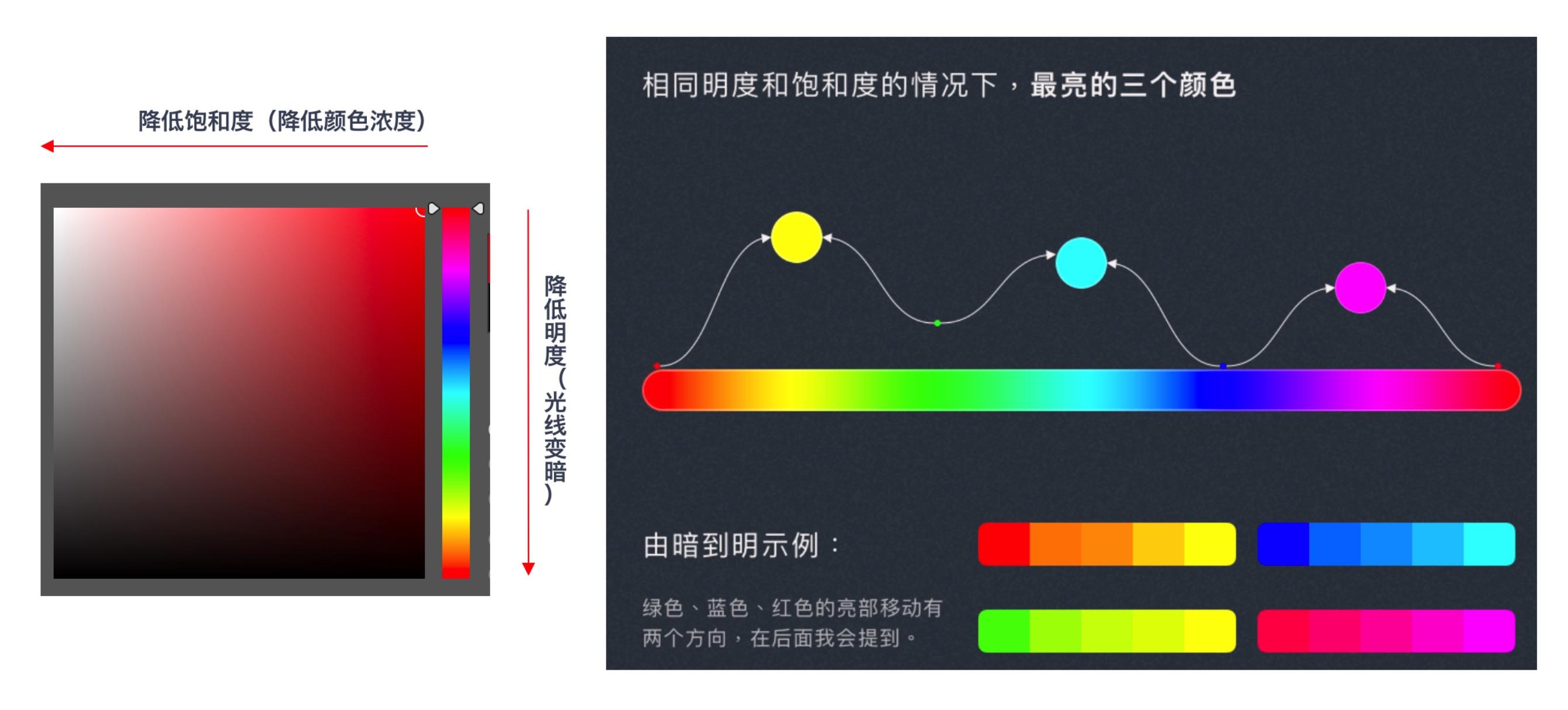
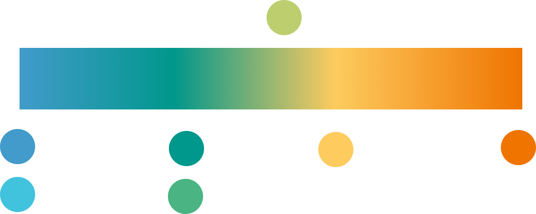
- Determine the approximate positions of the five color cards on the color wheel. Slightly weaken (reduce saturation, increase brightness, shift color value toward lighter colors) or slightly strengthen (increase saturation, reduce brightness, shift color value away from lighter colors) on the color cards to extract new colors generated by the changes
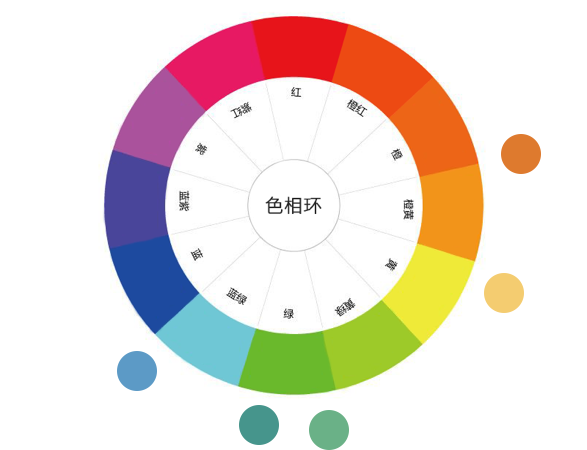
- Pull out a gradient bar according to the color card order to extract distinguishable new colors
After performing the above operations, a categorical palette can be created. At this point, based on the principle that "all colors in the categorical palette are visually balanced, equivalent, and clearly distinguishable," you can perform color fine-tuning again. Specific operations are as follows:
-
Since the orange block and light blue block are brighter and tend to be at the visual center, reduce the brightness of orange and light blue.
-
Since the light blue block is not easily distinguishable from the adjacent dark blue block after reducing brightness, increase the saturation of the dark blue, and slightly shift the blue color value toward purple to widen the color gap.
Common Color Matching Problems
- Low Color Distinguishability
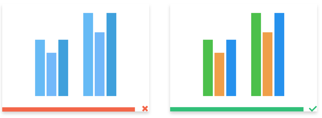
- Using Colors with Excessively High or Low Saturation (on White Background)
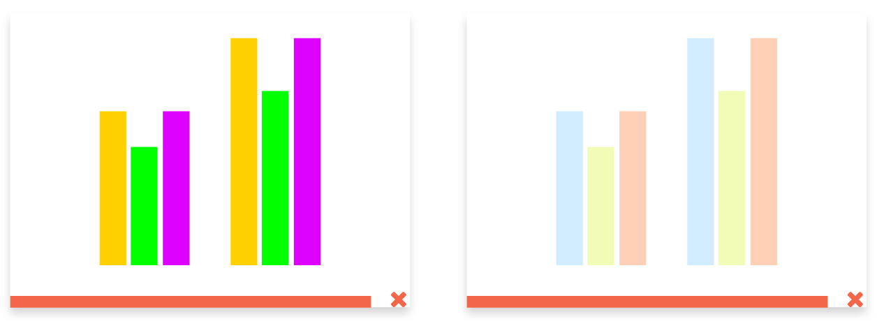
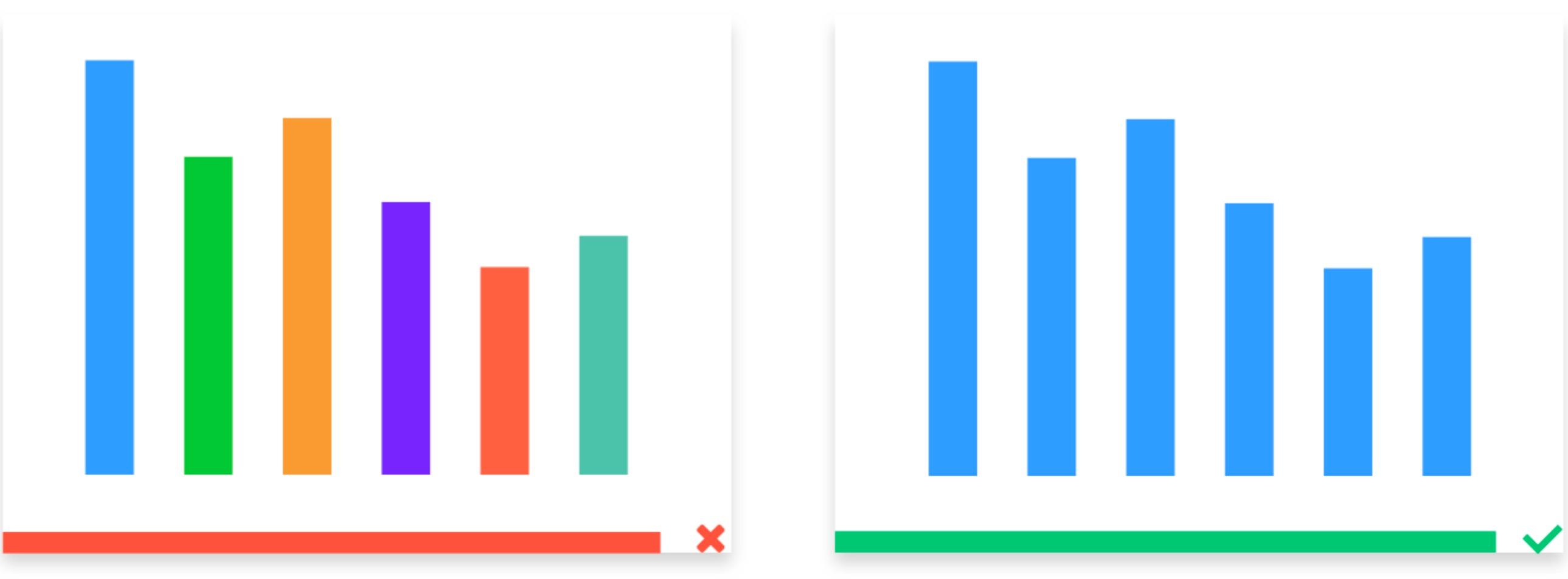
- Using Too Many Colors: Follow the 7±2 Rule, Keep Colors Within 8
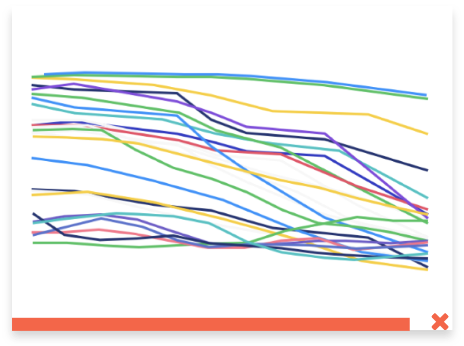
- Data Mapping Rules Are Too Complex: For the Same Data, Keep Mapping Rules to One Type
Common Color Matching Tools
-
Analogous colors / Monochrome gradients / Contrasting color extraction: https://color.adobe.com/zh/create/color-wheel
-
Multi-color gradient extraction: https://palettte.app/
-
Color editing: https://colorbox.io
-
Color card extraction:
-
Design / Inspiration websites:
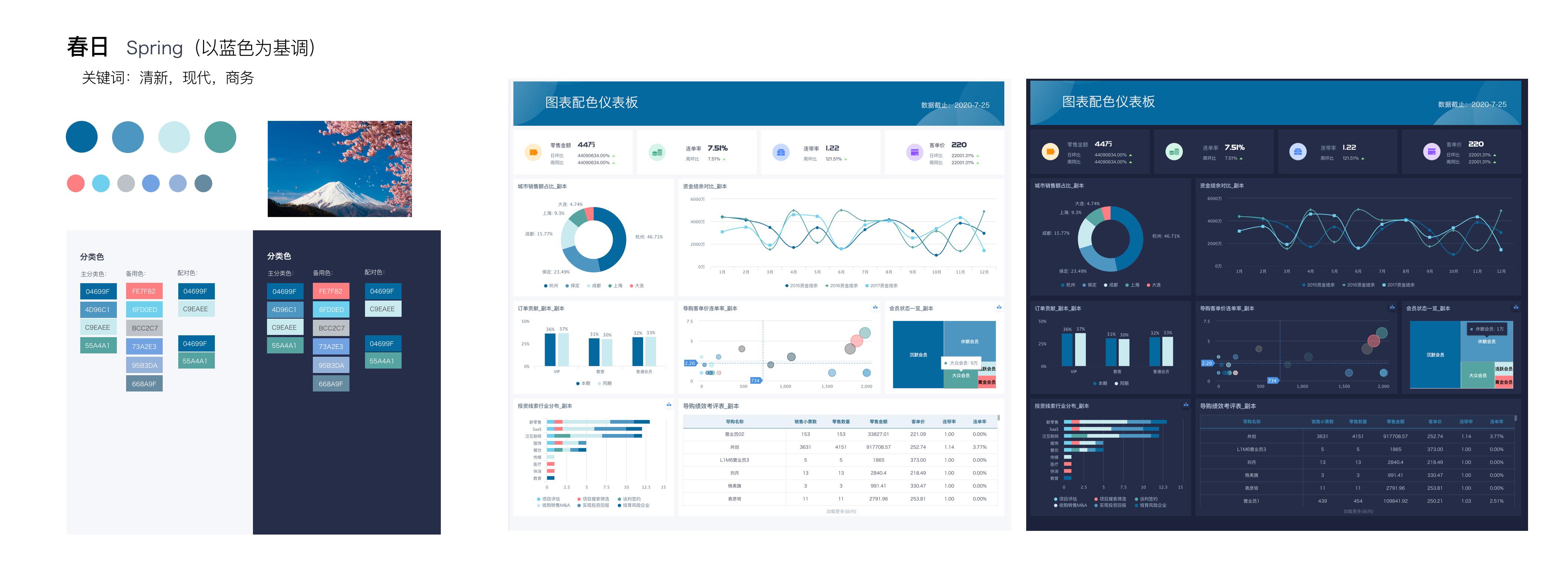
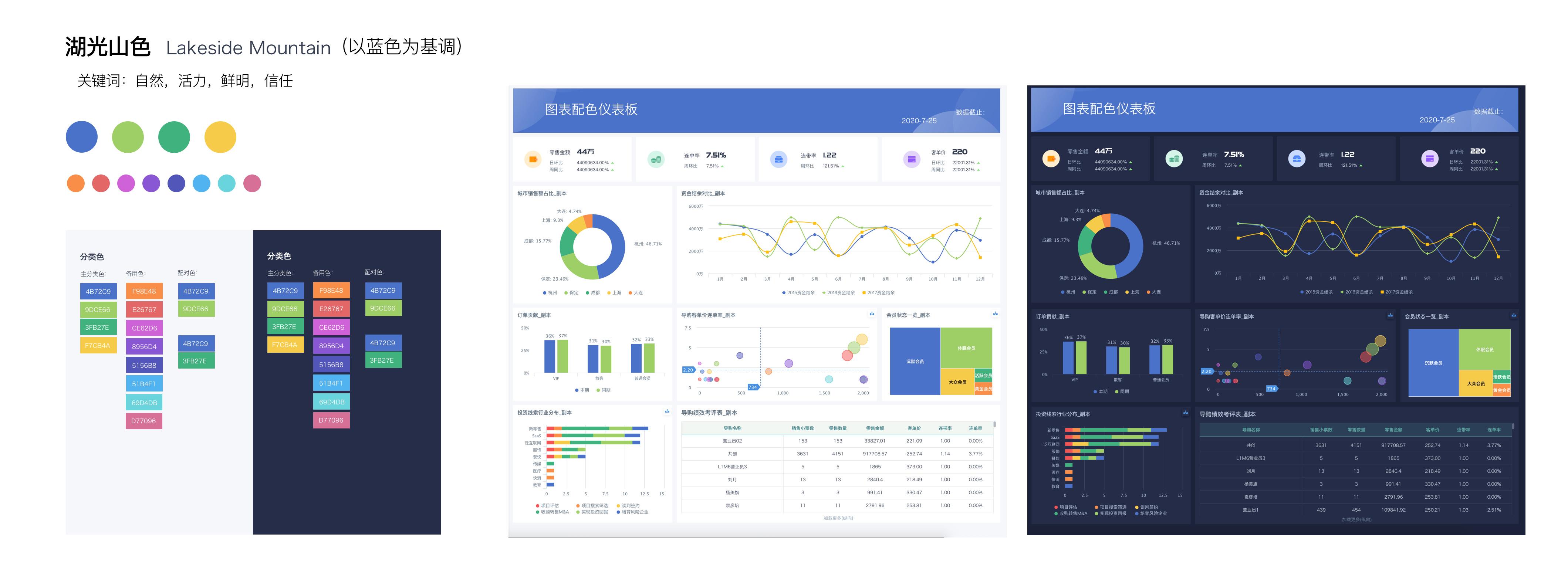
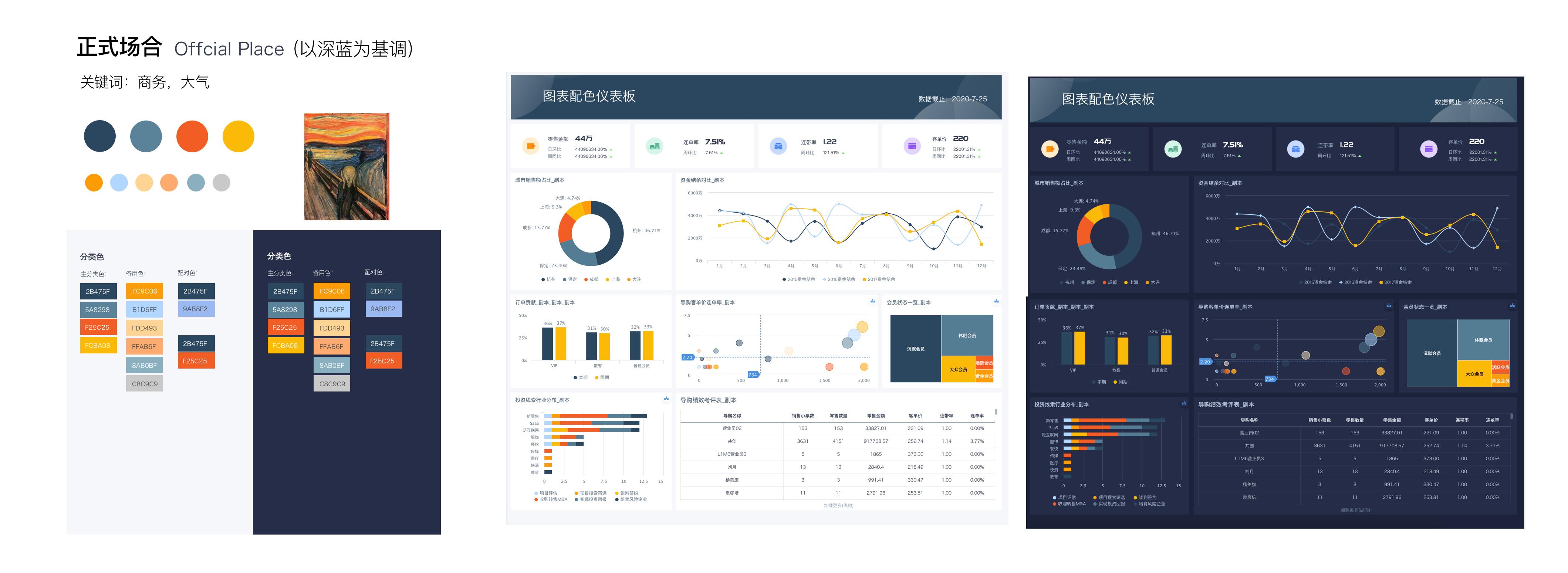
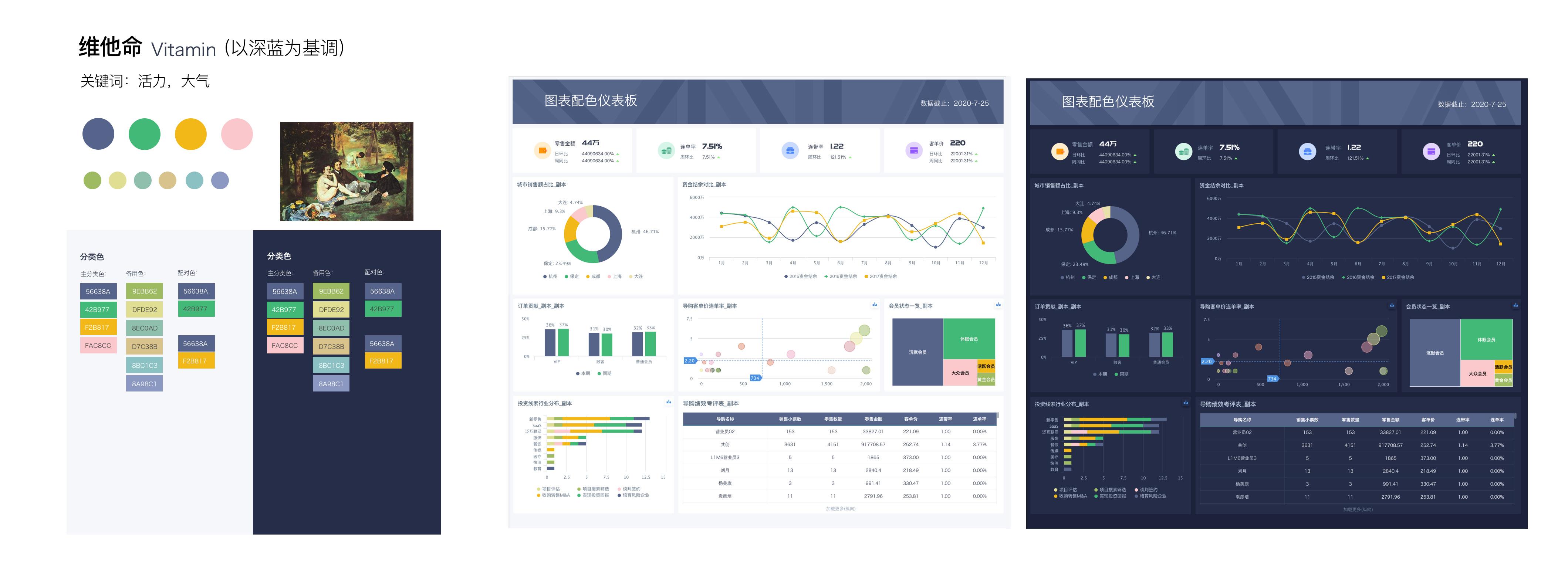
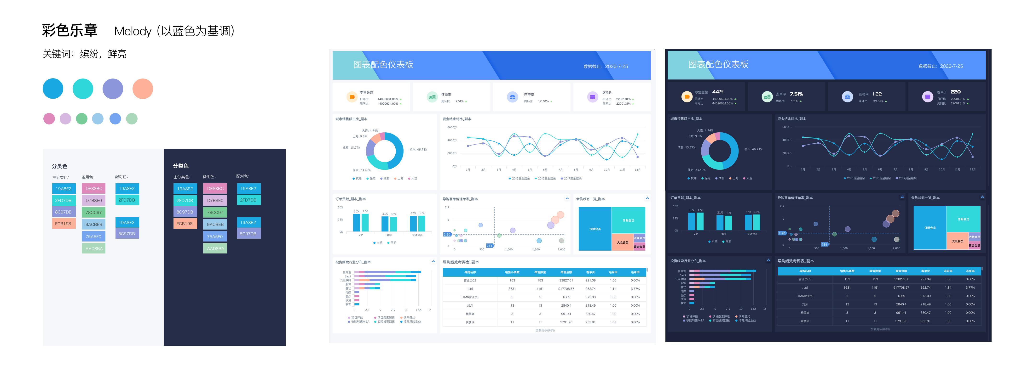
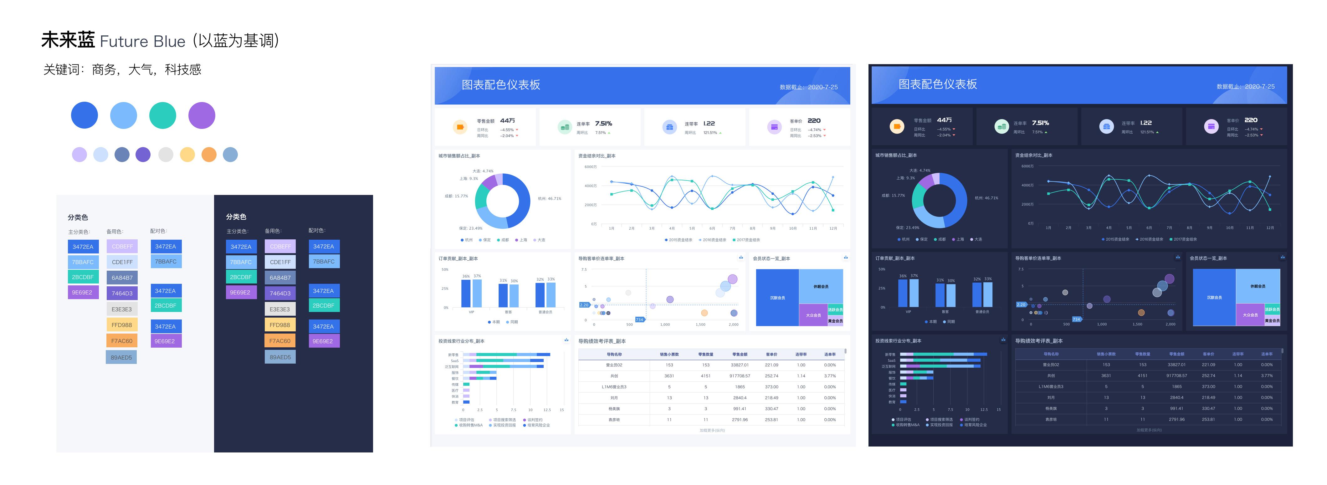
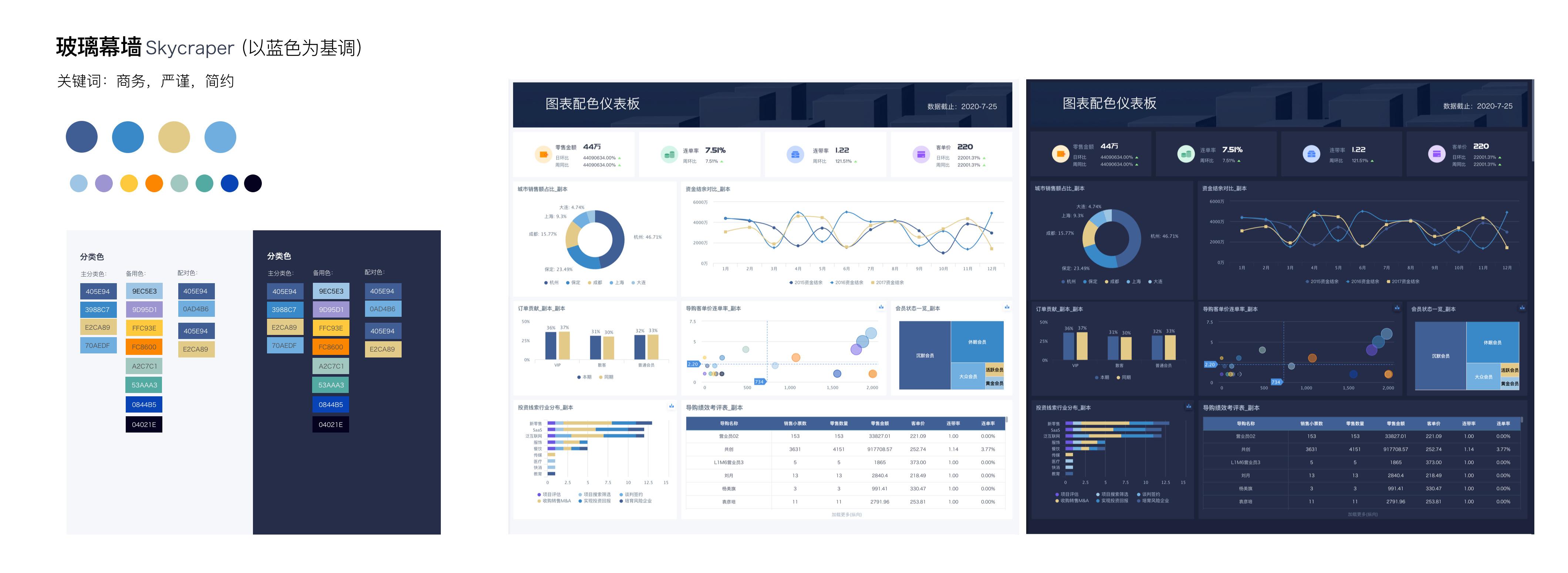
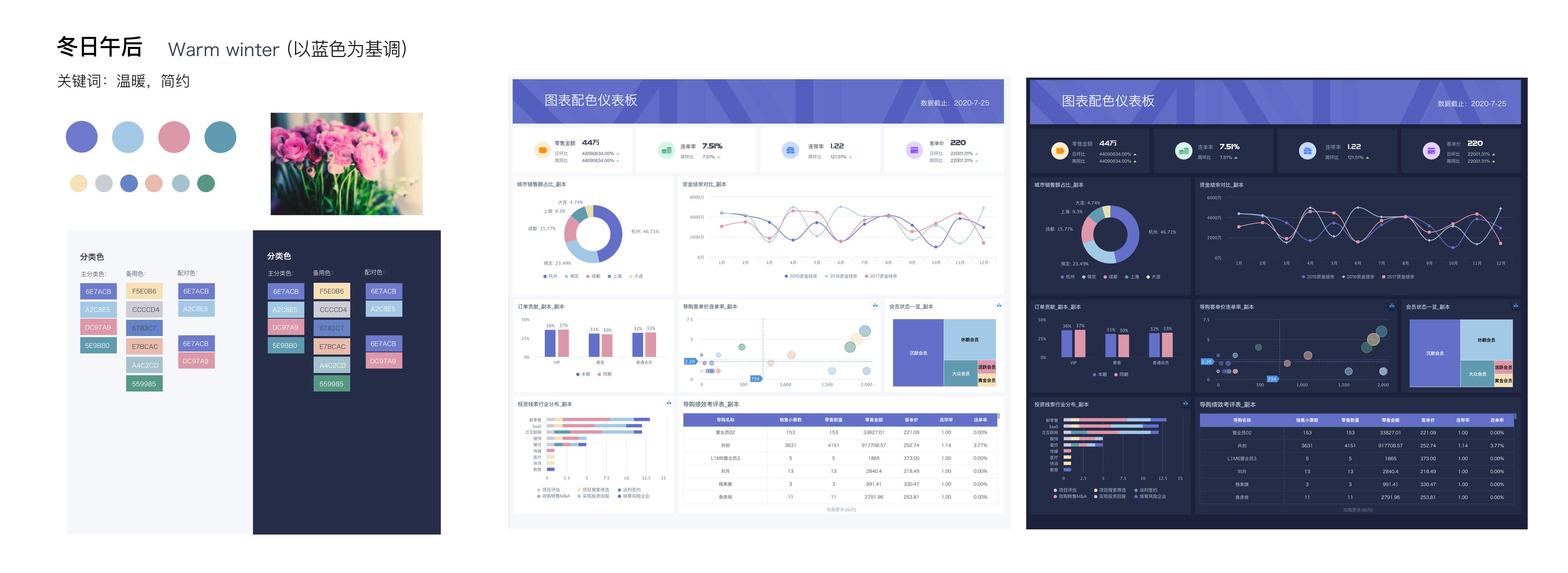
Guandata Official Color Dictionary
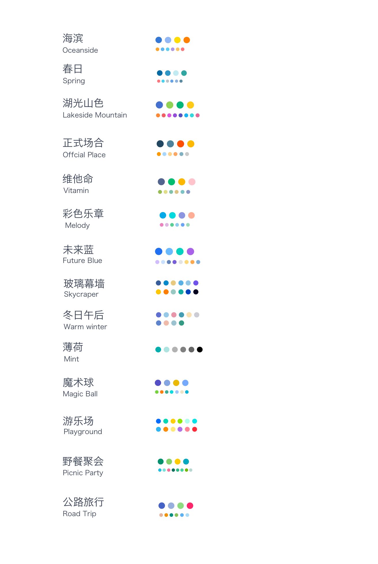
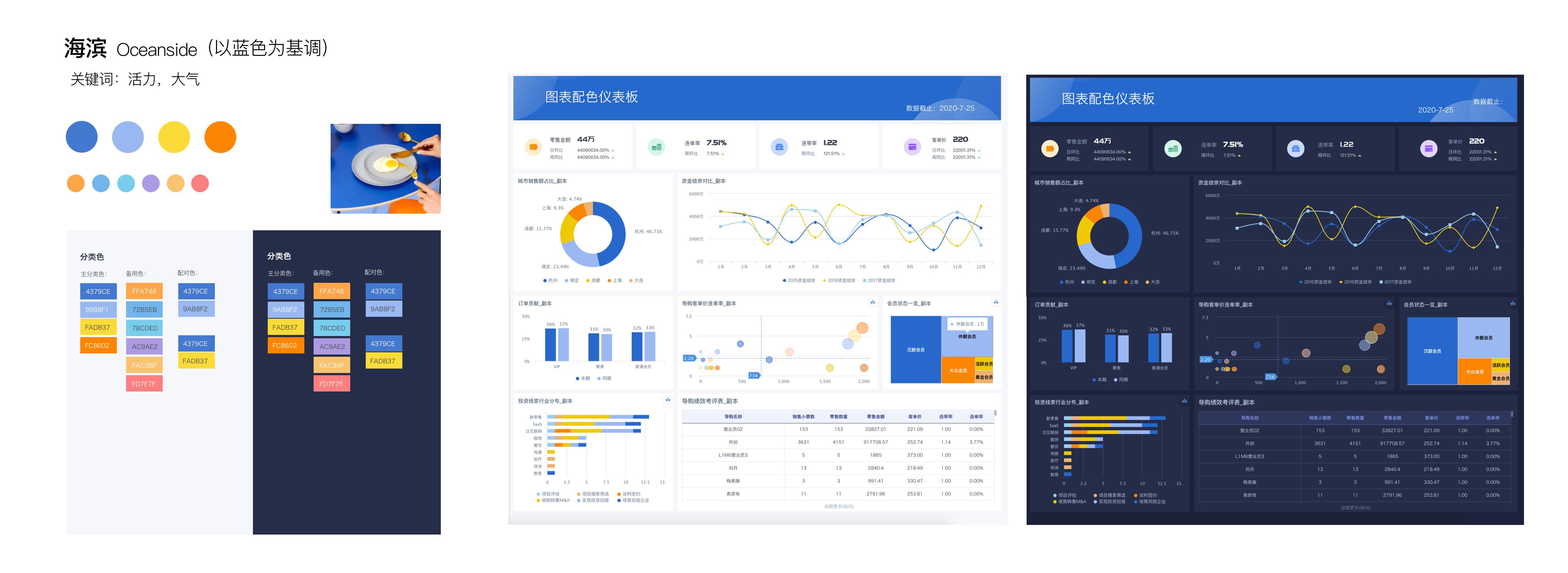
Seaside
Spring Day
Lakes and Mountains
Formal Occasion
Vitamin
Colorful Movement
Future Blue
Glass Curtain Wall
Winter Afternoon
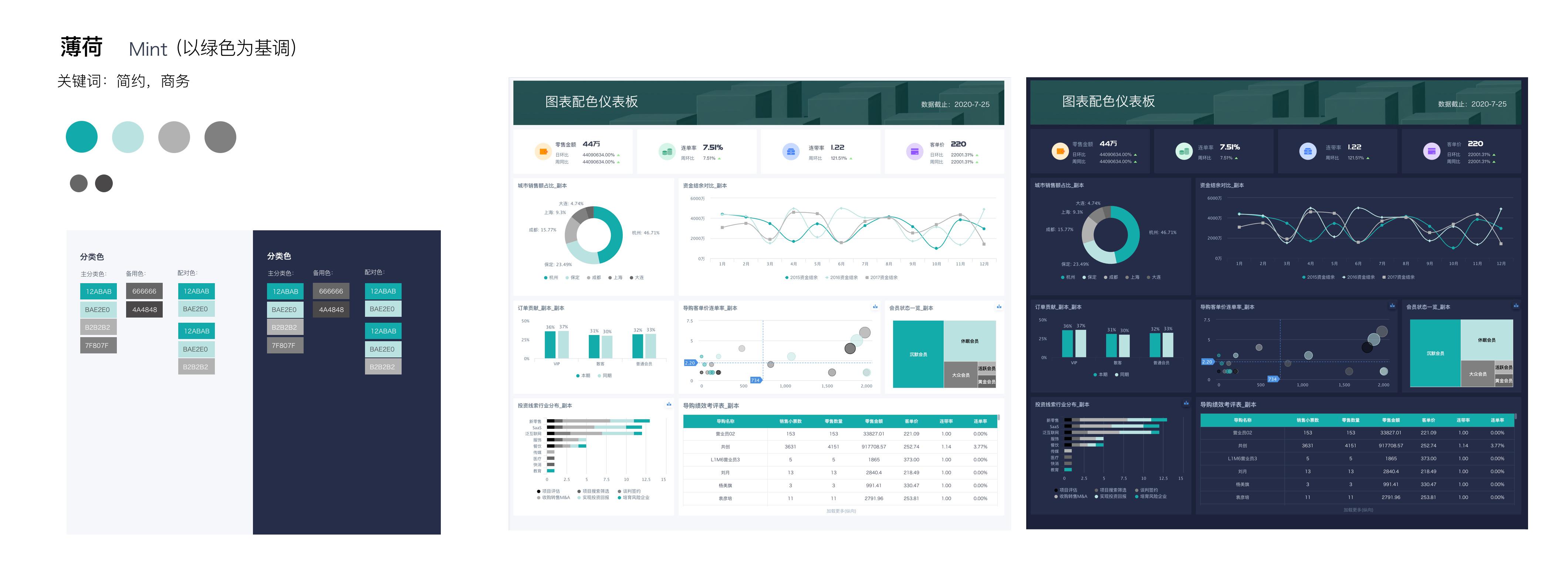
Mint
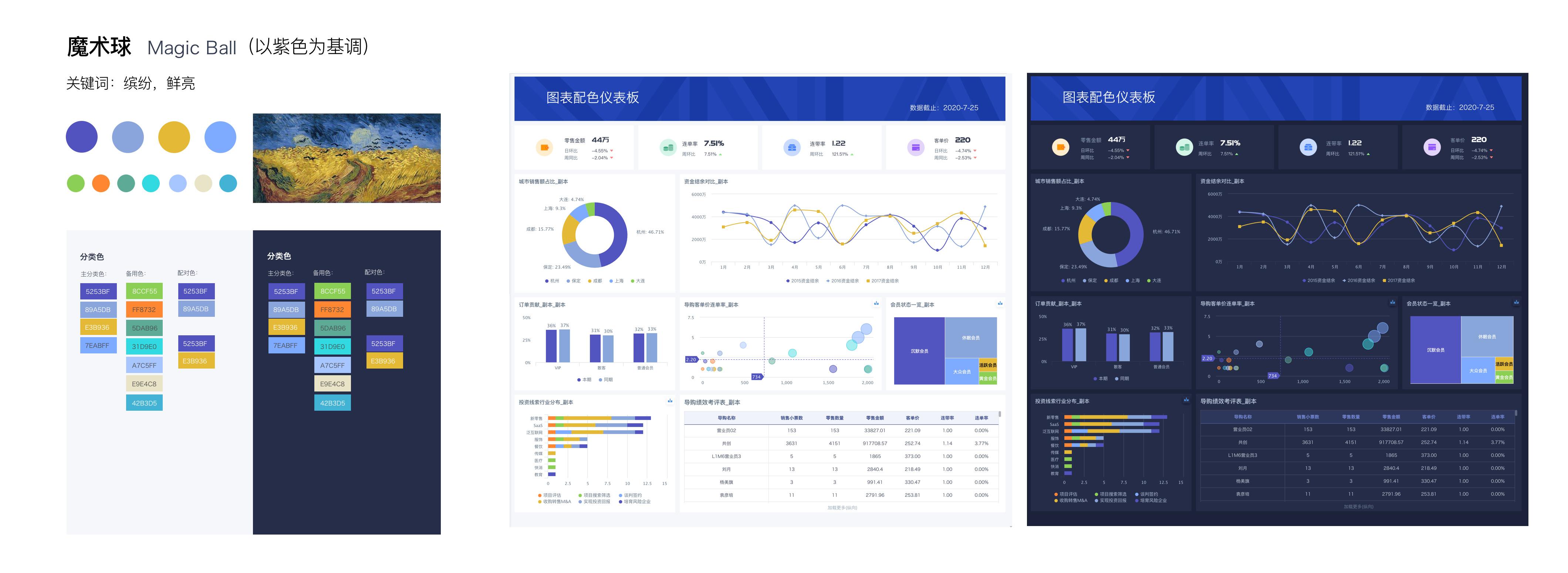
Magic Ball
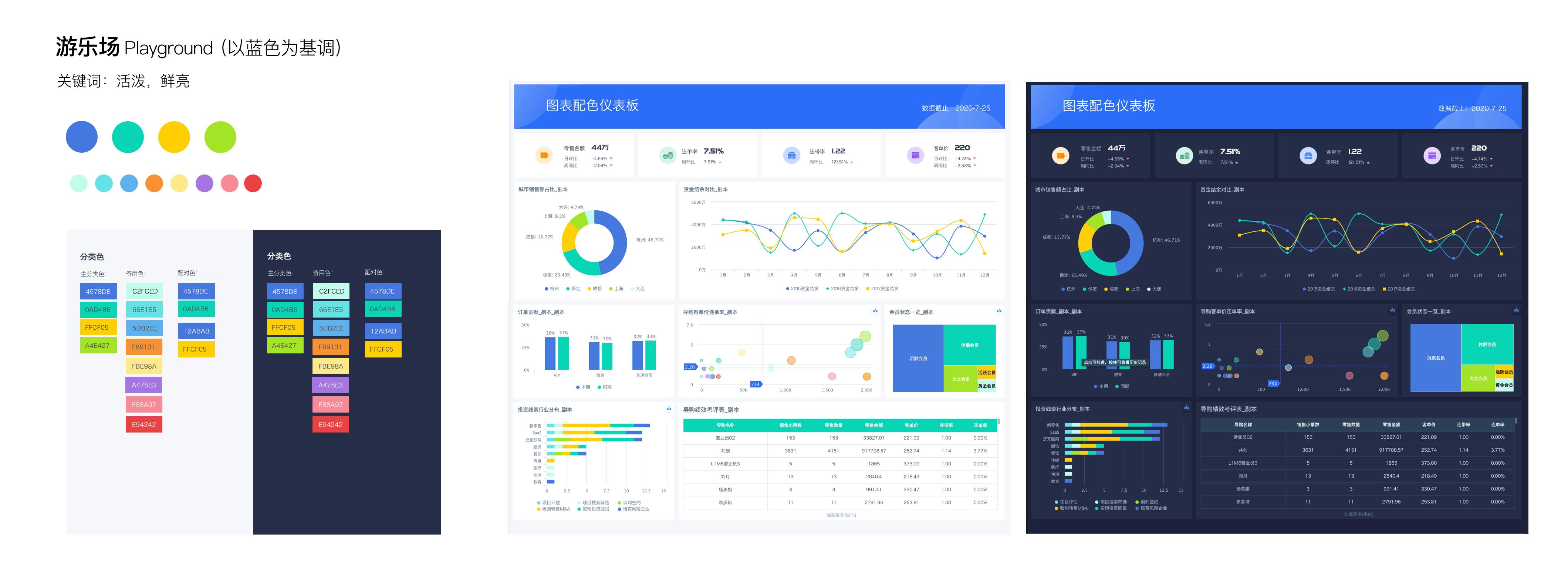
Playground
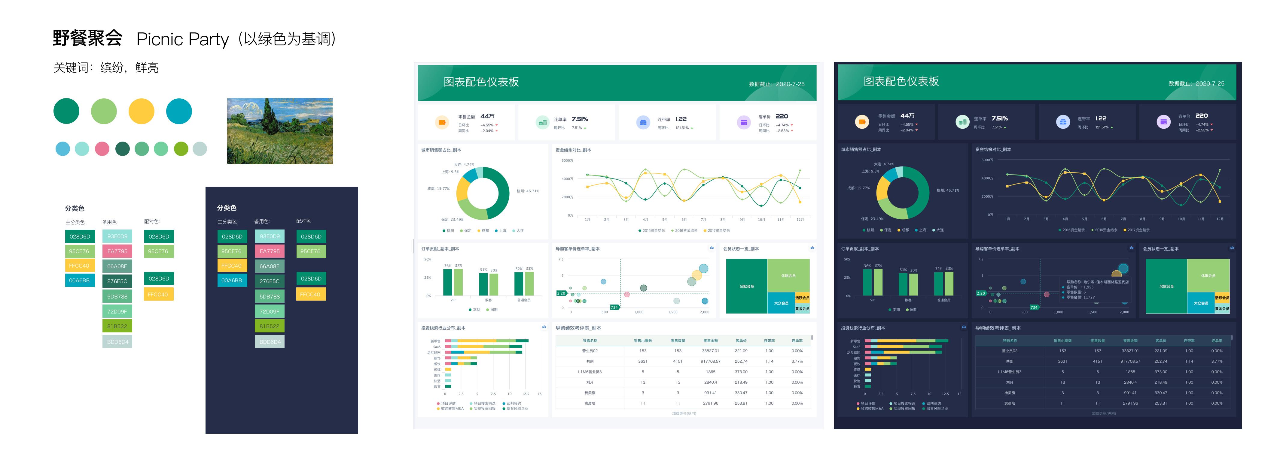
Picnic Party
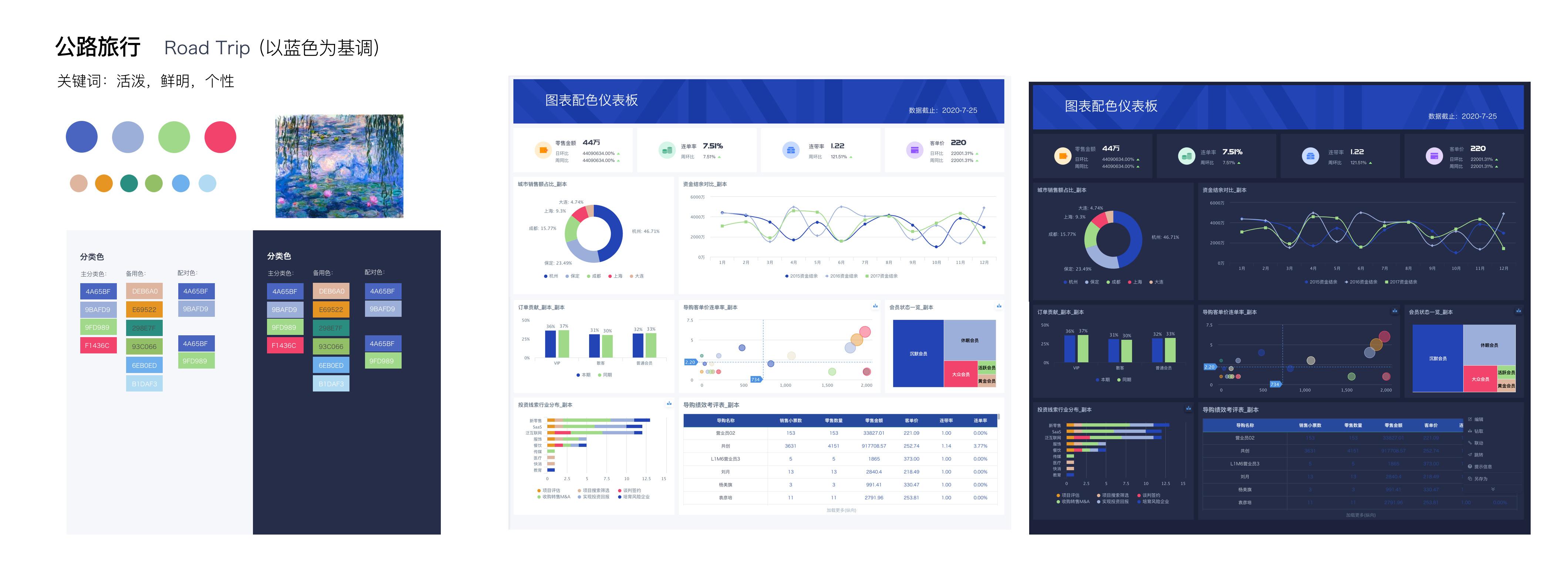
Road Trip