Common Chart Usage Methods
Overview
When building analytical dashboards, we often use multiple types of charts. Among the various chart types provided by Guandata BI, each chart has its own different usage methods.
Therefore, this document mainly introduces the usage methods of some common charts in the Guandata platform, enabling users to quickly get started and create exquisite charts, making chart creation no longer complex.
Usage Principles
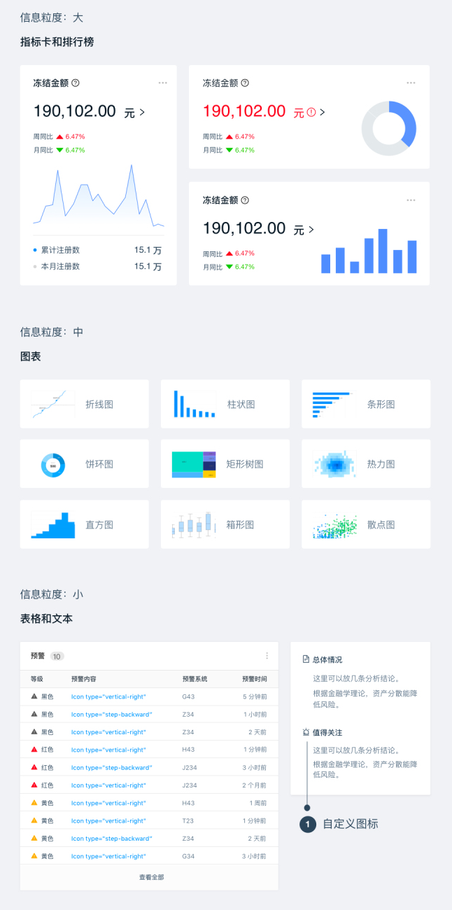
Information Granularity
You need to select appropriate visualization components based on the size of the information granularity.
Visual Encoding
Visual encoding is the process of transforming data into visual charts using graphic attributes. You need to reasonably select visual encodings.
-
Shape: Usually used to express different categories
-
Color: Distinguish categories (categorical palette) / Represent quantity (sequential palette) / Highlight data (diverging palette) / Represent meaning (semantic palette)
-
Size/Area/Length/Angle: Express quantitative data
-
Position: Express data from different geographical locations
-
Direction: Express the nature and relationship of data
-
Density: Express clustering relationships between data points
Information Delivery
When creating charts, you need to design from the perspective of "what information does the reader want to get from this set of charts," and grasp the accuracy and practicality of information delivery. However, sometimes information is not conveyed well due to certain errors. The following lists three common errors:
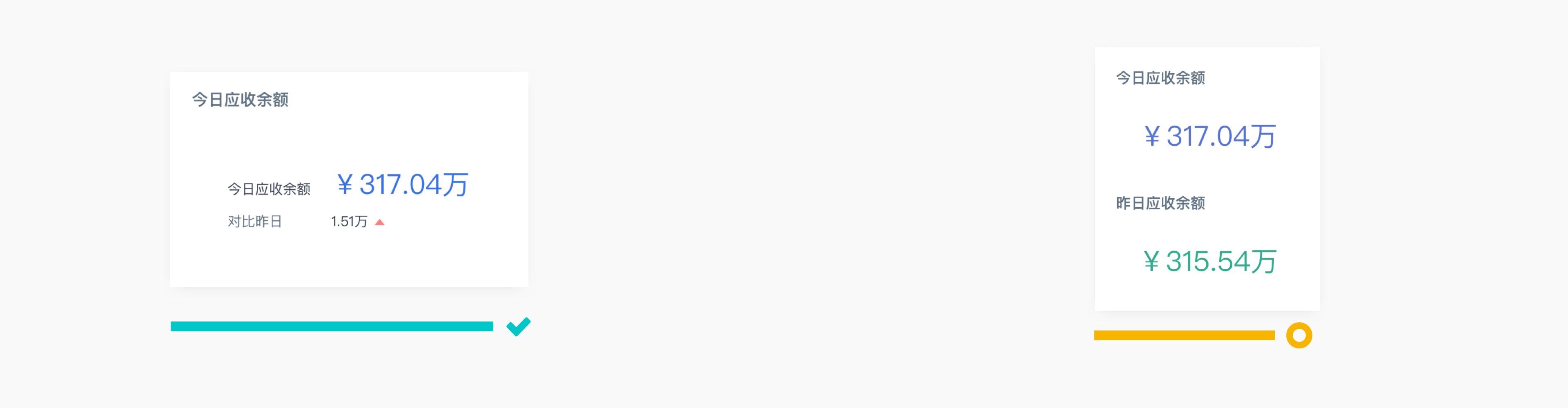
- Missing Context Information: In the stage of examining targets to discover anomalies or opportunities, the displayed metrics require auxiliary information to draw conclusions, such as "How does it compare to yesterday?" "Has the monthly target been reached?" "Has the average level been reached?" etc.
- Overly Detailed Information Display: Too-detailed data is difficult to read. Simplified data provides more intuitive comparison information.
- Clarify Purpose, Avoid Complex Calculations During Reading: Readers should be able to directly read information from the chart, avoiding reading unprocessed information.
Usage Methods
Single Column Chart and Single Bar Chart
Single column charts and single bar charts are mainly used to express single metric data for different categories/time dimensions, etc.
Use Single Bar Chart to Display Long Dimension Labels
Generally, we are accustomed to using single bar charts to express data with long dimension labels, because horizontal readability is better than tilted readability.
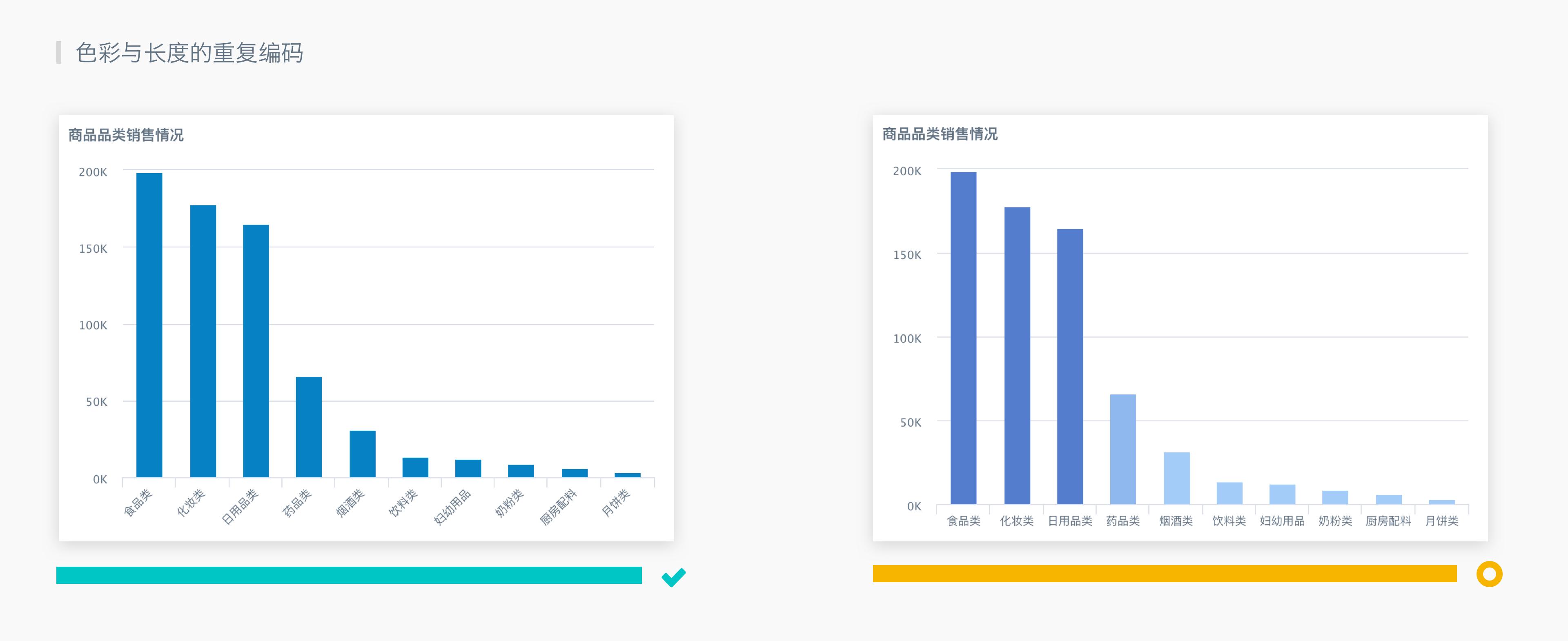
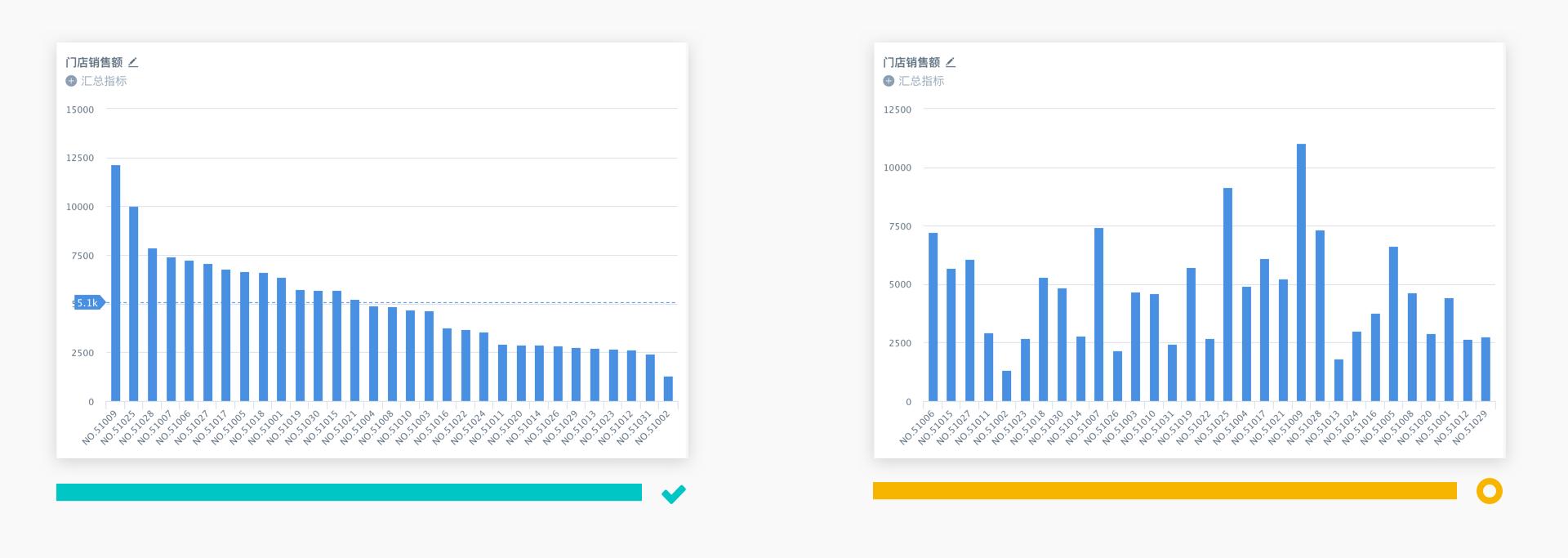
X-axis Can Be Sorted by Value
When using single column charts, unless the category order of the X-axis has specific meaning (such as time series), you can sort by the numerical value, while adding the average value as reference information.
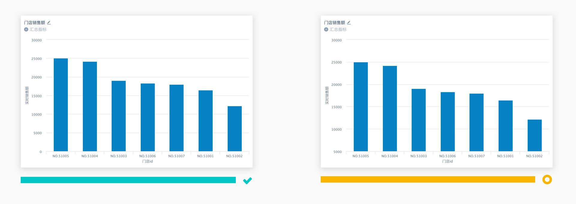
Y-axis Data Starting Point Begins from 0
When using single column charts, the Y-axis data starting point generally begins from 0. Especially for projects with high accuracy requirements, this can greatly improve accuracy. If the data starting point is not 0, it may cause readers to have deviations in data ratio perceptions.
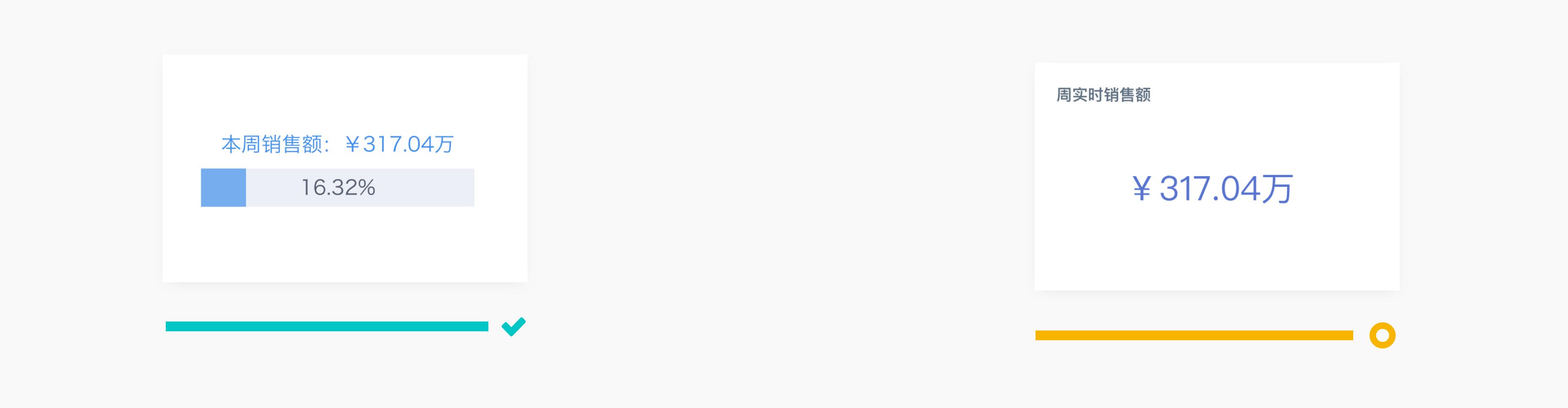
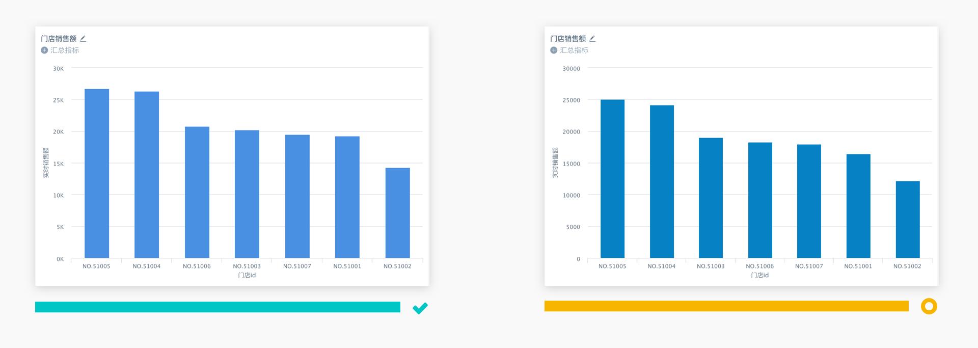
Use Units to Replace Y-axis Values
When using single column charts, you can use units to replace Y-axis values, especially when the values are multi-digit, which can make Y-axis data more concise, thereby avoiding reading inconvenience and layout crowding caused by multiple digits.
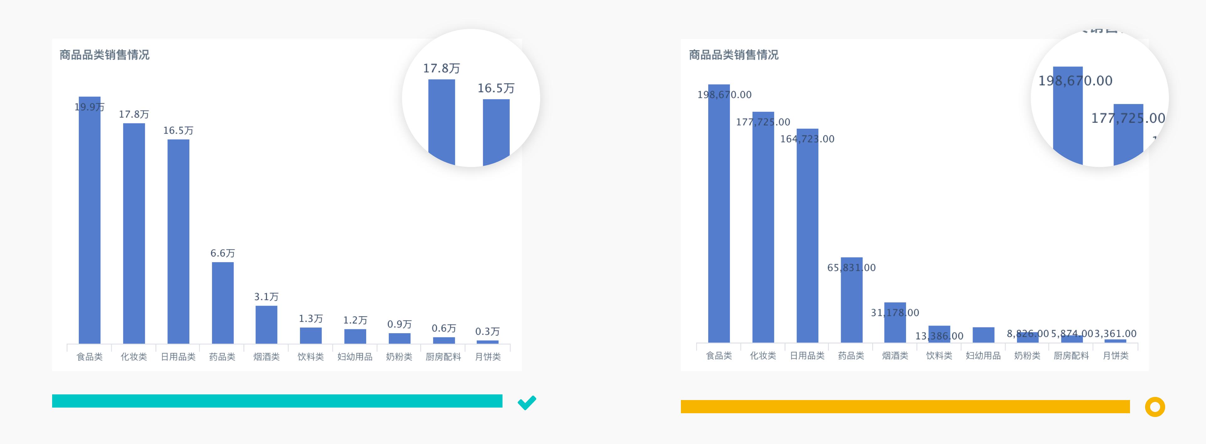
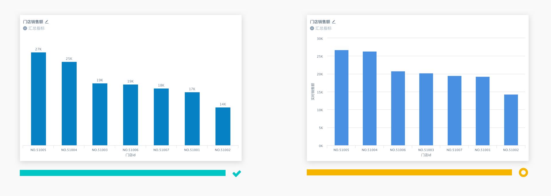
Use Labels to Replace Y-axis
When using single column charts, when the number of data bars is small (<10), you can use numerical labels to replace the Y-axis, thereby improving layout simplicity and data readability.
-
Numerical label expression is more direct than using Y data axis expression;
-
Generally, avoid using numerical labels and data axes simultaneously.
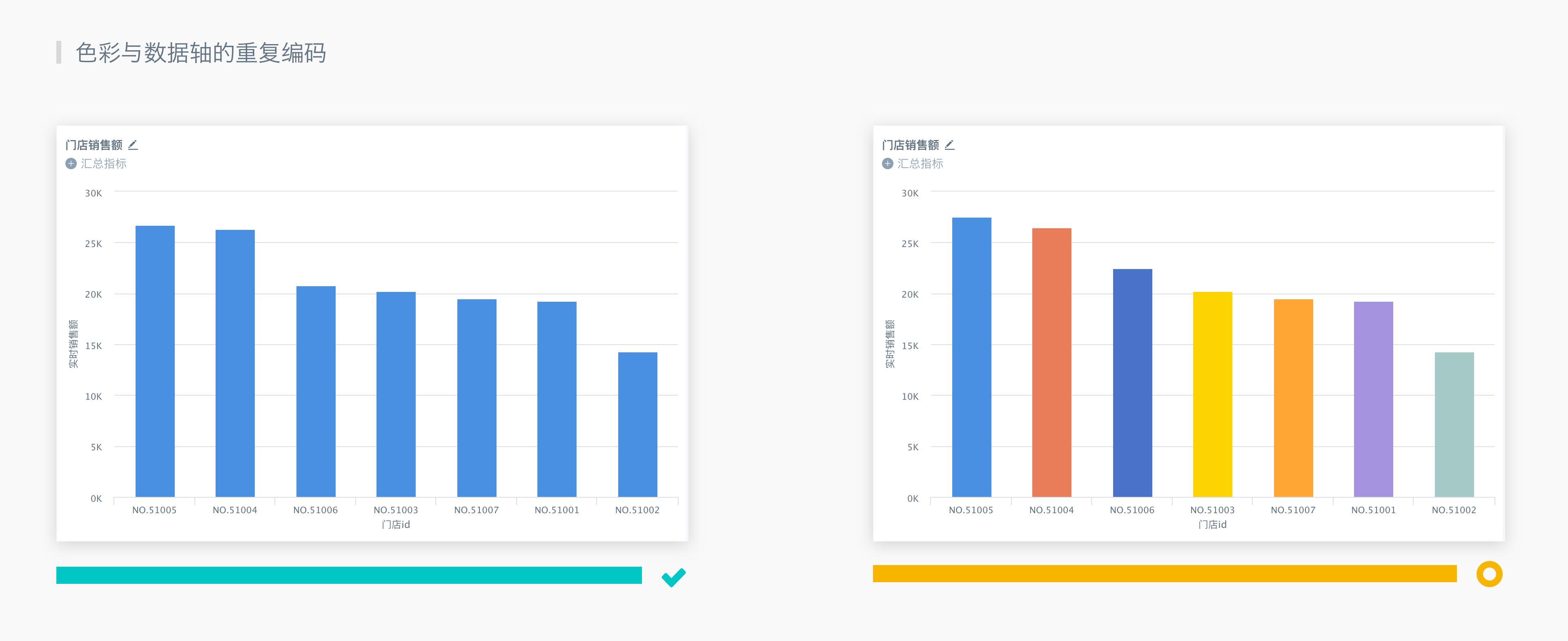
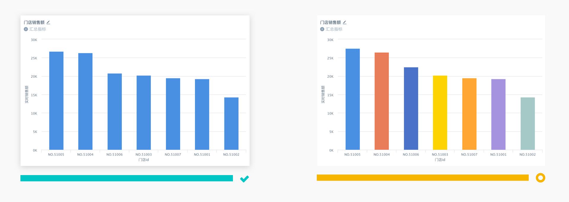
Keep Color Scheme Consistent
Single column charts or single bar charts contain only one type of metric. Keeping the color scheme consistent can improve readability. If different colors are set based on different dimensions, it may increase reading interference.
Line Chart and Area Chart
Line charts are mainly used to express continuous or changing relationship data. Area charts are mainly used to express how each part composes/affects the whole, while percentage area charts are used to express the weight of the impact produced by each part.
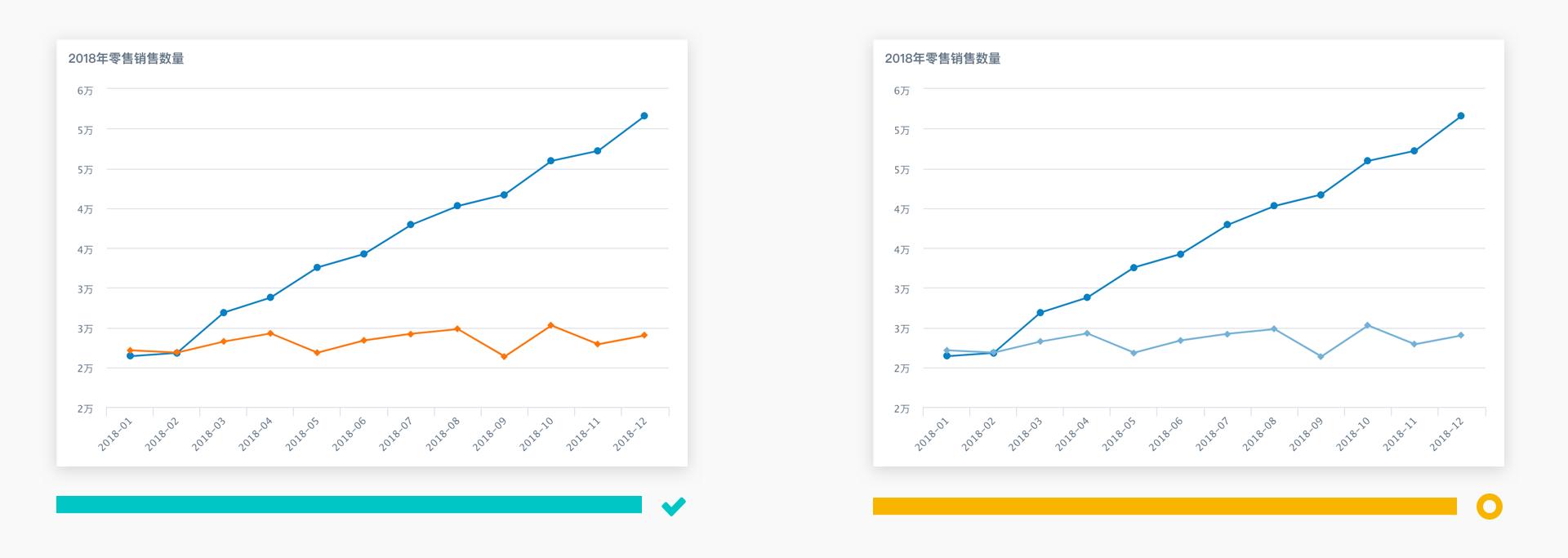
Use Clear and Distinguishable Lines
When using line charts, line colors should be clear and distinguishable, and avoid using similar colors or colors that color-blind individuals cannot distinguish. At the same time, reasonably arrange the height and range of the Y-axis to make each data line clear. When there are more than 5 data lines, consider using other charts to display (same for area charts).
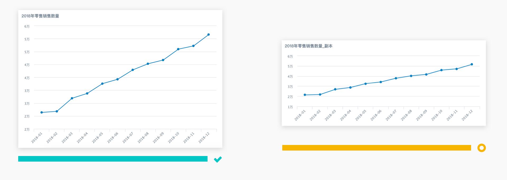
Adjust Layout and Aspect Ratio
When using line charts, you can adjust the layout and aspect ratio to make line charts more readable. For example, when the average slope of the data line is approximately 45 degrees, readability is optimal.
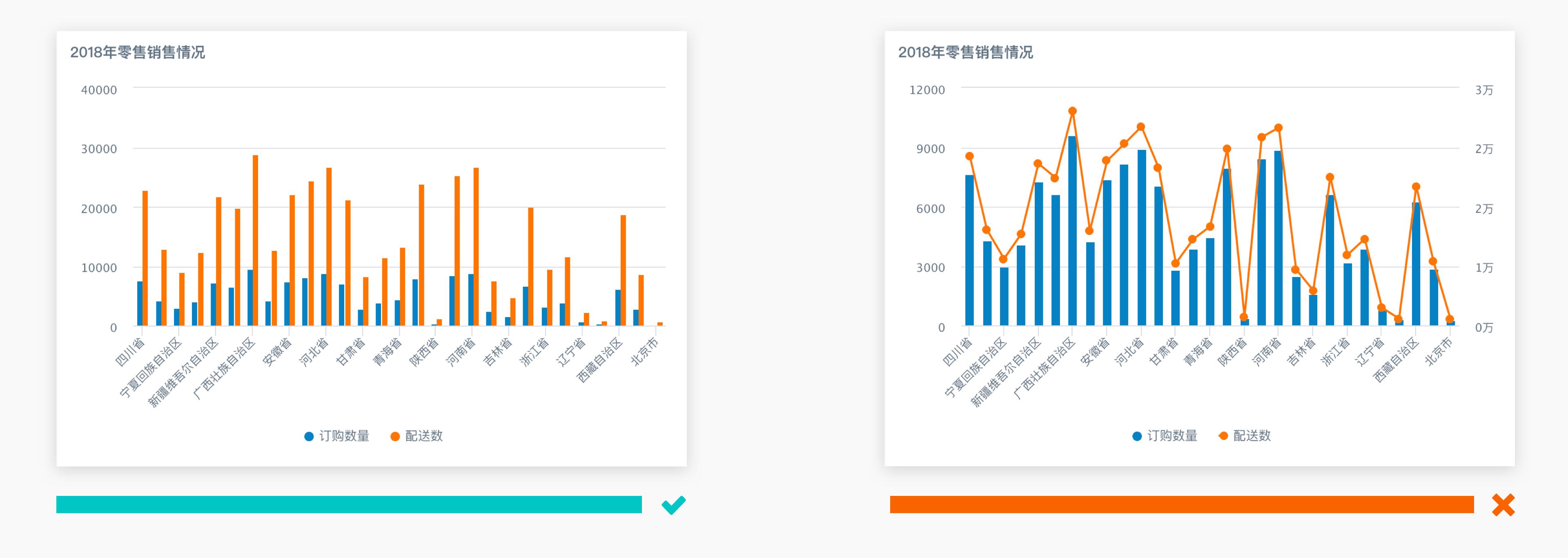
Line Charts Express Continuous Meaning
Line charts are mainly used to express continuous or changing relationship data. If you want to express data from two different dimensions, you cannot simply distinguish them with column charts/line charts. You can use column chart methods with different color mappings.
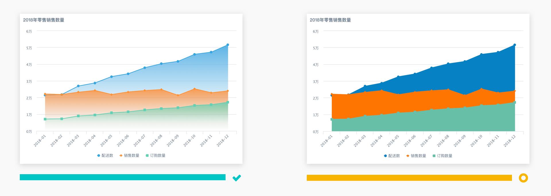
Adjust Fill Saturation or Gradient Fill
When using area charts, if data from different dimensions overlaps, you can reduce fill saturation or use gradient fill; if overlap and occlusion still occur, it is recommended to switch to line chart methods.
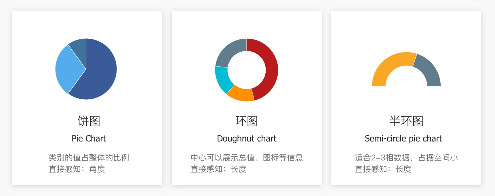
Pie Chart and Donut Chart
Pie charts are mainly used to express the proportion of each component within a single category, and compare various categories through angle size.
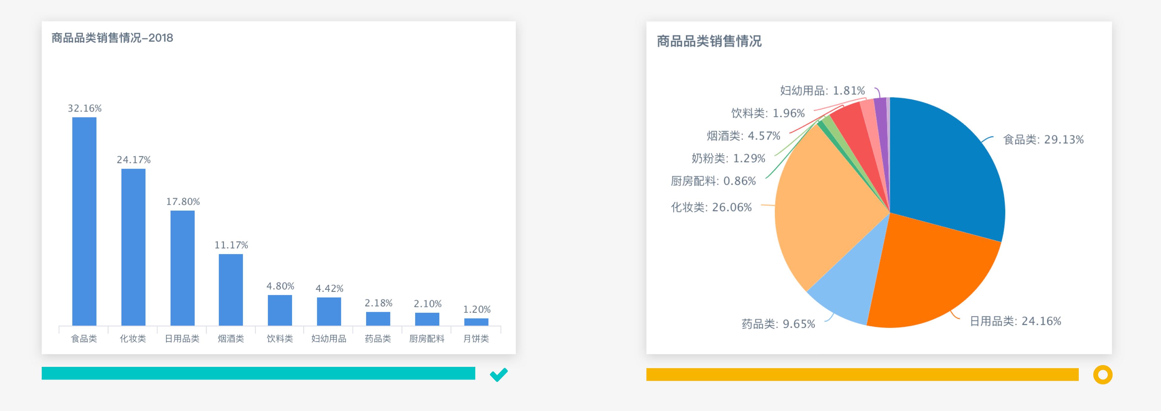
Number of Data Dimensions Should Not Be Excessive
When using pie charts, when the number of data dimensions is too large (more than 6 items) or the differences between parts are not significant (angles are difficult to compare), chart readability will decrease. It is recommended to switch to column charts or other methods to explain differences.
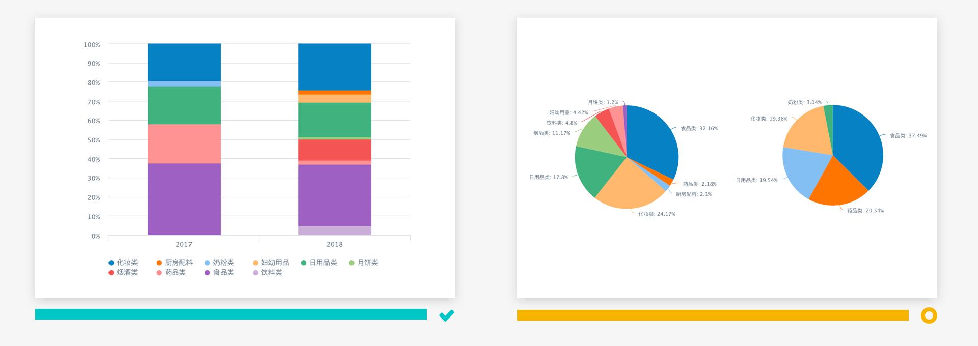
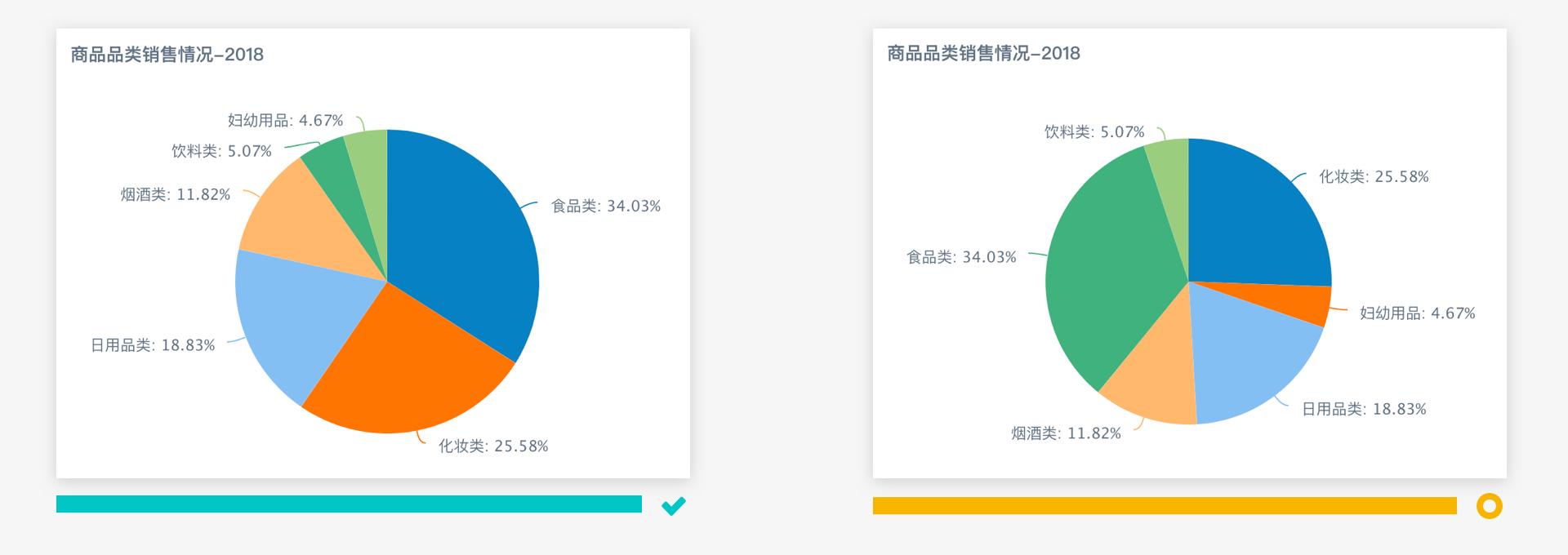
Avoid Using Pie Charts to Express Multi-category Component Relationships
Generally, we use pie charts to present component comparison relationships within a single category. But when wanting to compare component relationships across two (or more) categories, to improve data readability, it is recommended to switch to percentage stacked charts.
Arrange in Order by Data Size
When using pie charts, to help readers quickly establish comparison relationships between parts, it is recommended to arrange them in order by data size.
Table
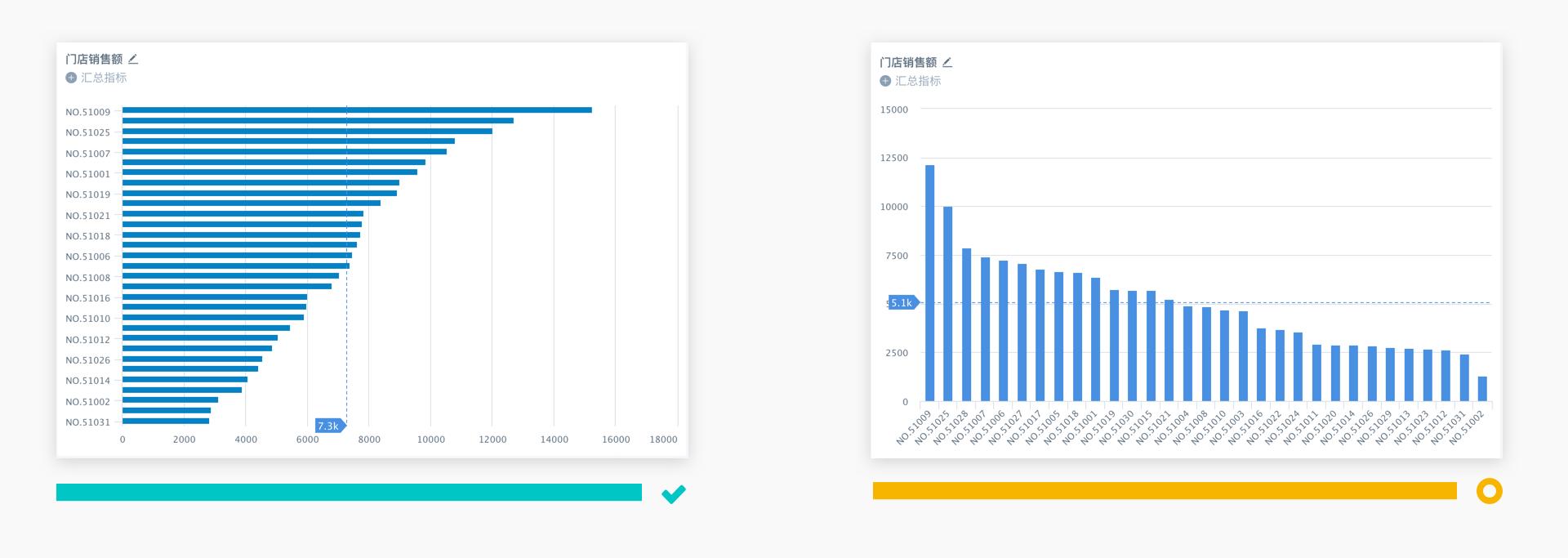
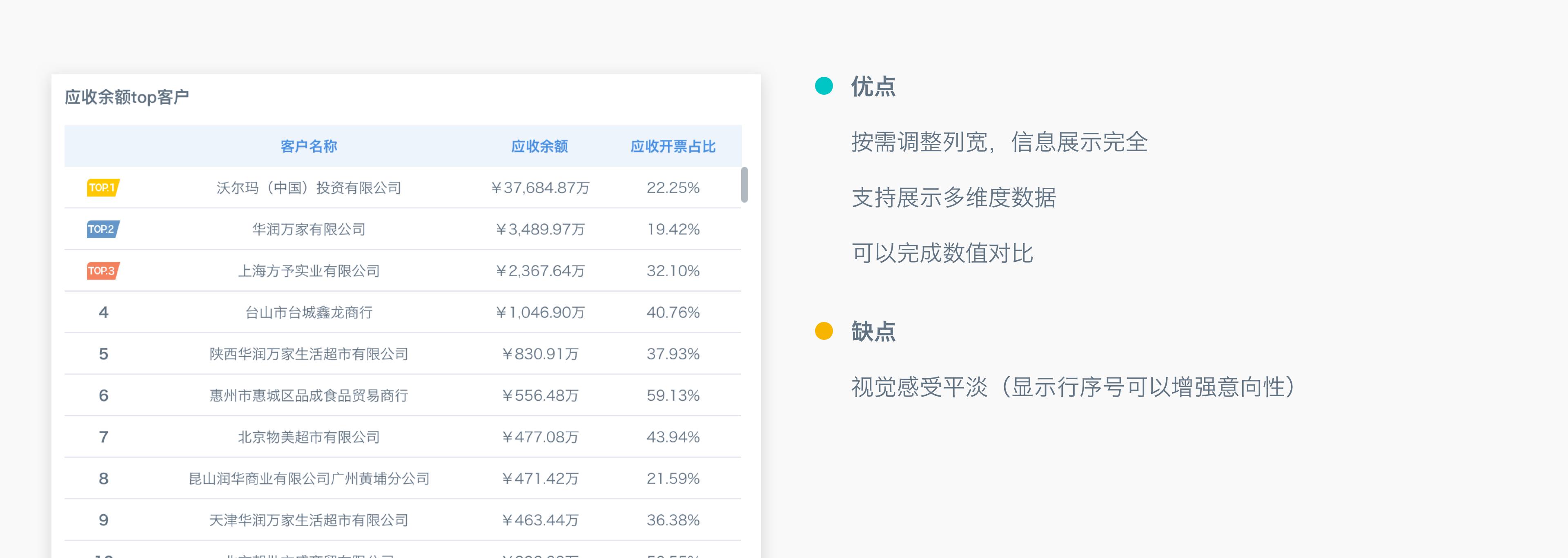
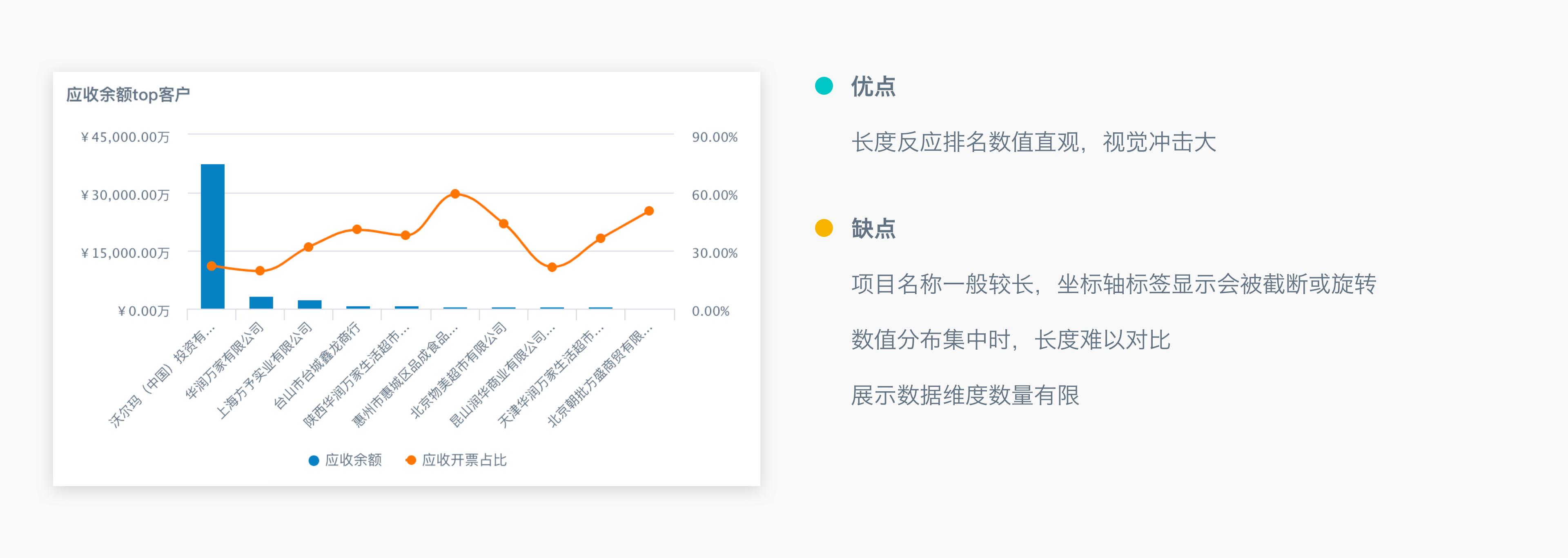
Use Carousel Table or Bar Chart to Display Rankings
When wanting to display ranking status, you can refer to the advantages and disadvantages of carousel tables and bar charts listed in the figure below for chart selection.
- Carousel Table
- Bar Chart
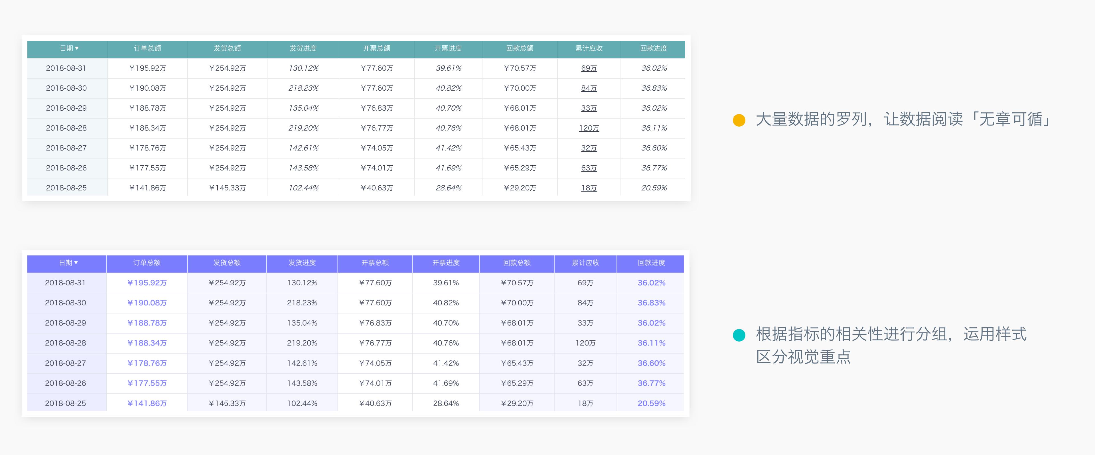
Use Styles to Display Visual Emphasis
When using tables, when a large amount of data is listed in the table, you can group by metric relevance and use styles to distinguish visual emphasis, improving table readability.