Page Components and Styling Usage
Overview
When multiple data points appear within the same view, we are better able to discover their connections and differences. However, when this data is randomly arranged without reasonable categorization, hierarchical structure, or emphasis, it can hinder our judgment and use of the data.
Therefore, this document mainly introduces how to use page layout and component-related features to ensure that data information is displayed in an organized, clear, and accurate manner, while also making the page layout design more beautiful and visually appealing.
Design Principles
Organization:
Define layouts logically and arrange content systematically. Typically use top-to-bottom and left-to-right structural arrangements, or progressive interaction forms, to highlight common analytical thinking: overview first, focus and filter, then view details as needed.
Emphasis:
Place the most important views and key metrics at the top or upper-left of this type of page.
Accuracy:
Ensure data accuracy, clarity, and completeness: use the correct chart types, and explain data definitions when necessary.
Dashboard Components and Styles
Page Layout
Generally, before adjusting the Dashboard page style, we need to determine the Dashboard page layout. Common page layouts include:
By default, the page will adopt a "Card" layout. At the same time, to adapt to various scenarios, we can adjust the styles of these layouts (such as card spacing, background color), continuously experimenting with effects to create more combinations.
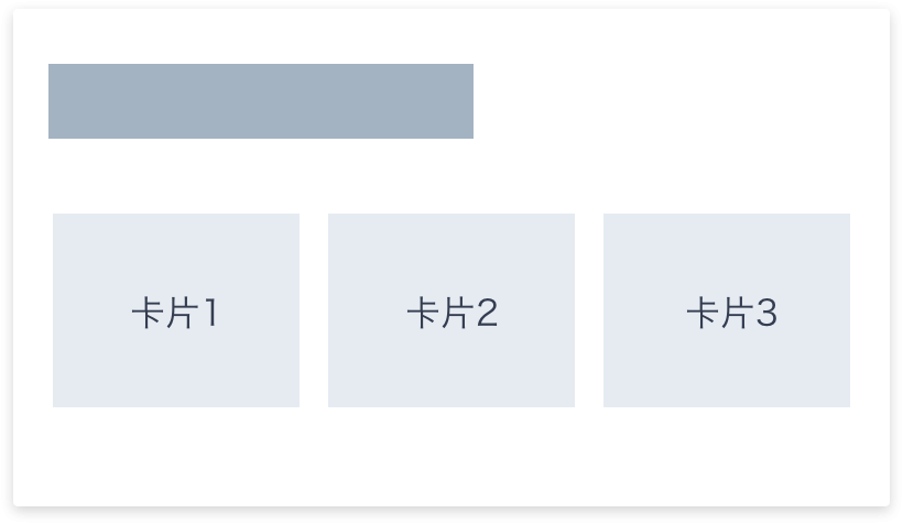
Card Style
Default Card Style
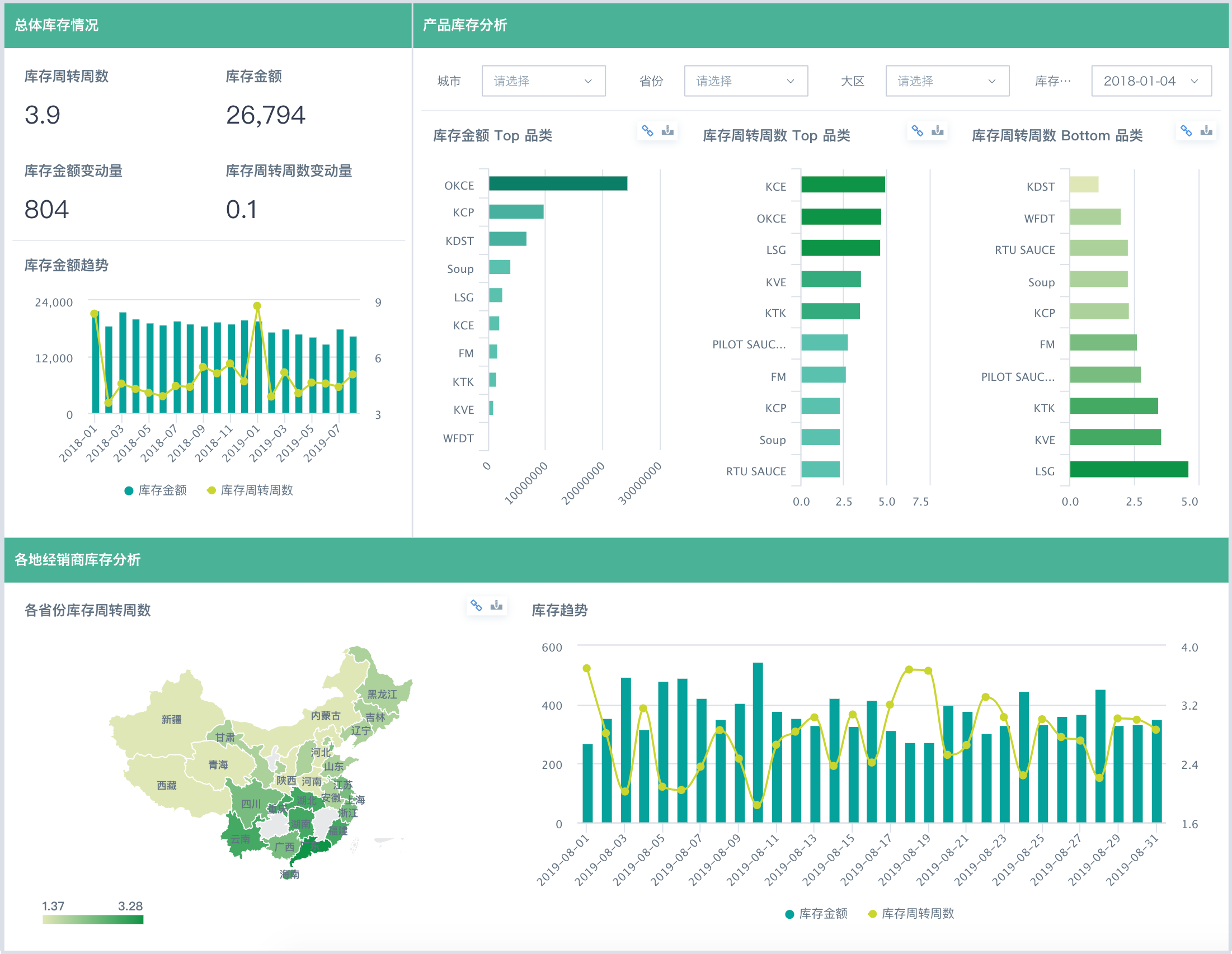
A general-purpose Dashboard layout mode, relatively universal and applicable, with obvious grouping and strong information organization relationships. Each card presents a small amount of information.
Adjustments:
-
Card spacing: 6~20px
-
Page background color: close to the card color (if you want to enhance the effect, increase the contrast relative to the default background color)
-
e.g., 12px, #EAEEF5 (Ibis White theme)
Enhanced Card Style
Based on the default card style, you can increase the card spacing and enhance the contrast between the card background and the page background to highlight the card effect.
It is recommended to use with Card Groups to reflect the organization of information.
Line Separation
When you need to save page space, you can use separator lines (1-2px card spacing) instead of large spacing settings.
Adjustments:
-
Card spacing: 1~2px
-
Page background color: close to the card color (slightly more contrast with the card compared to the card style)
-
e.g., 1px, #DBDFE7 (Ibis White theme)
Note:
-
Separator lines should not be too obvious; saturation should not be too high, and brightness should be moderate.
-
Separator lines should be as continuous and transparent as possible, with increased length and reduced quantity, making the page appear clean and refreshing.
-
When the visual organization relationship is obvious enough, separator lines are not needed
-
Try to use with Card Groups
-
Maintain alignment
-
Document Style
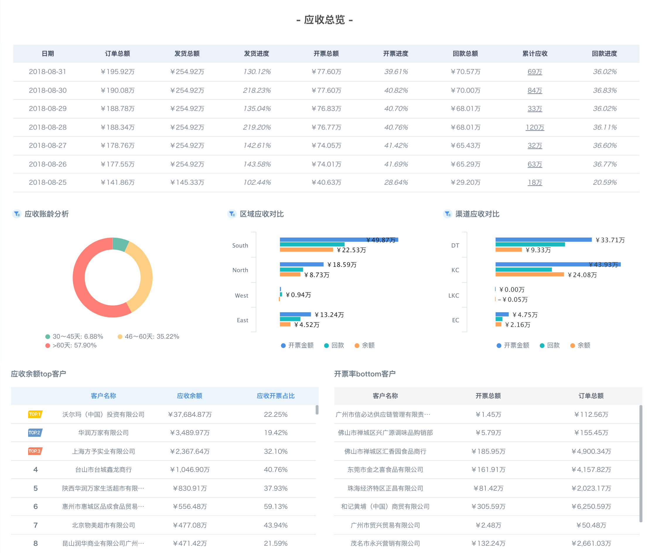
For analytical reports, daily reports, and other report-style documents, as well as when exporting to PDF documents, a document-style page layout mode can be adopted.
Title Background Partitioning
In a document-style layout, all content is laid flat on the page, with a high content density and weak page separation, making it more holistic. At this point, if you want to show the hierarchy and primary/secondary nature of the content, you can use title background color filling and whitespace intervals to create a rhythmic partitioned layout.
Adjustment Points:
-
Card spacing: >2px
-
Page background color: same as the card color
-
e.g., 4px, #FFF (White, Ibis White theme)
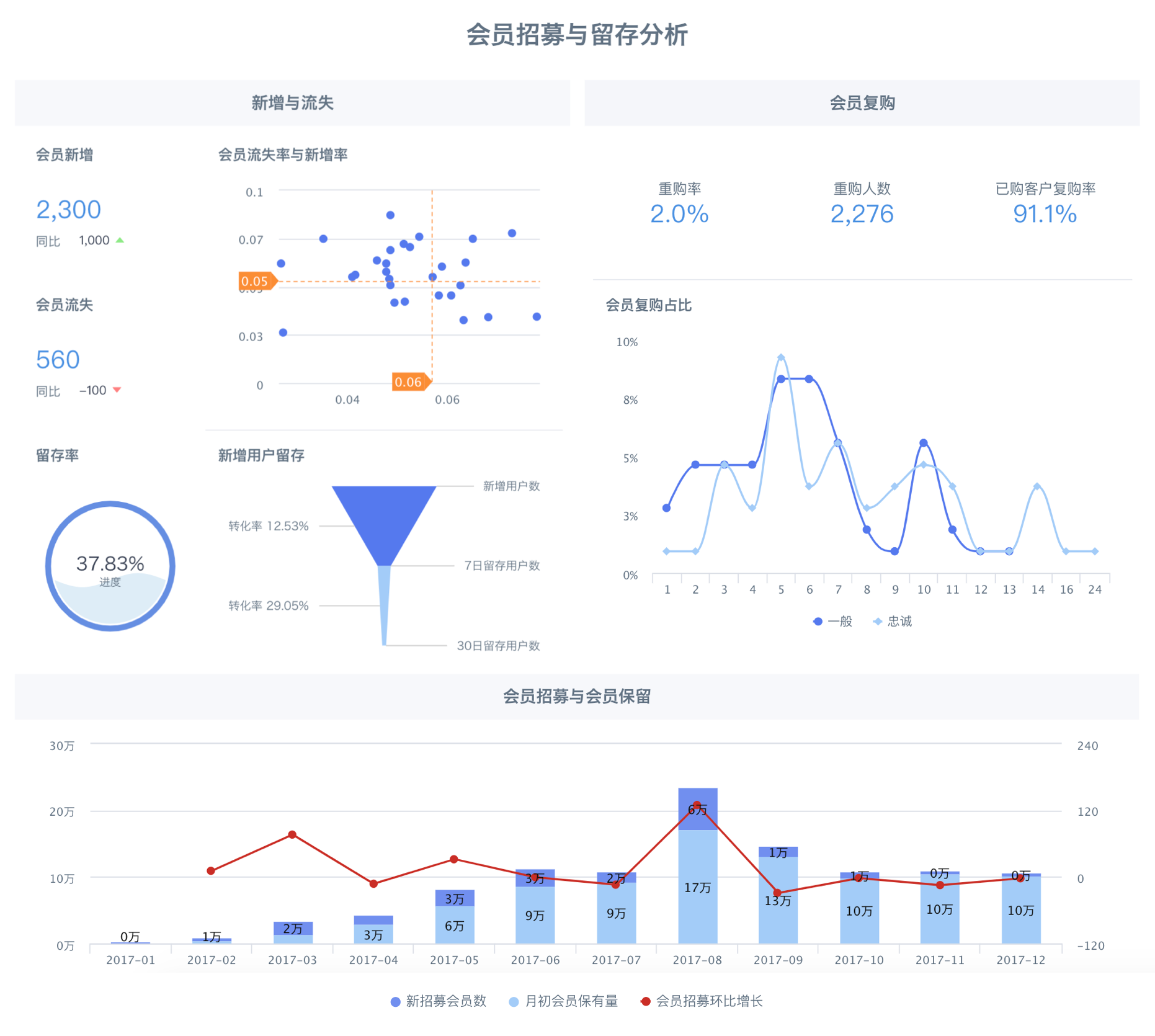
Chart Form Partitioning
In a document-style layout, the chart forms within some cards or card groups themselves can also create a partitioning effect on the page.
Tab Pages
Tab pages in a Dashboard can be used to store peer-level and related content, keeping the interface clean and tidy.
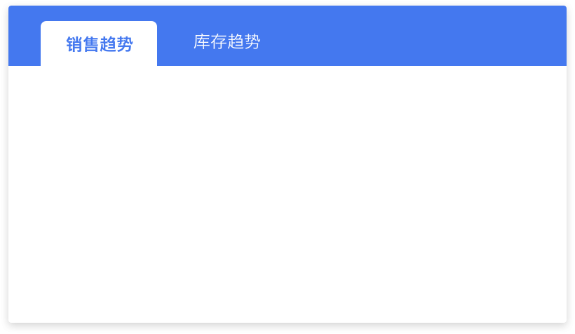
Usage Notes:
-
Tab page names should be concise and clear, and colors should match the theme color
-
The number of tab pages should not exceed 5; when exceeded, consider regrouping and splitting
-
Choose the appropriate style based on the scenario; the default style is simpler and allows users to focus on chart content, while the new style can make the overall page richer
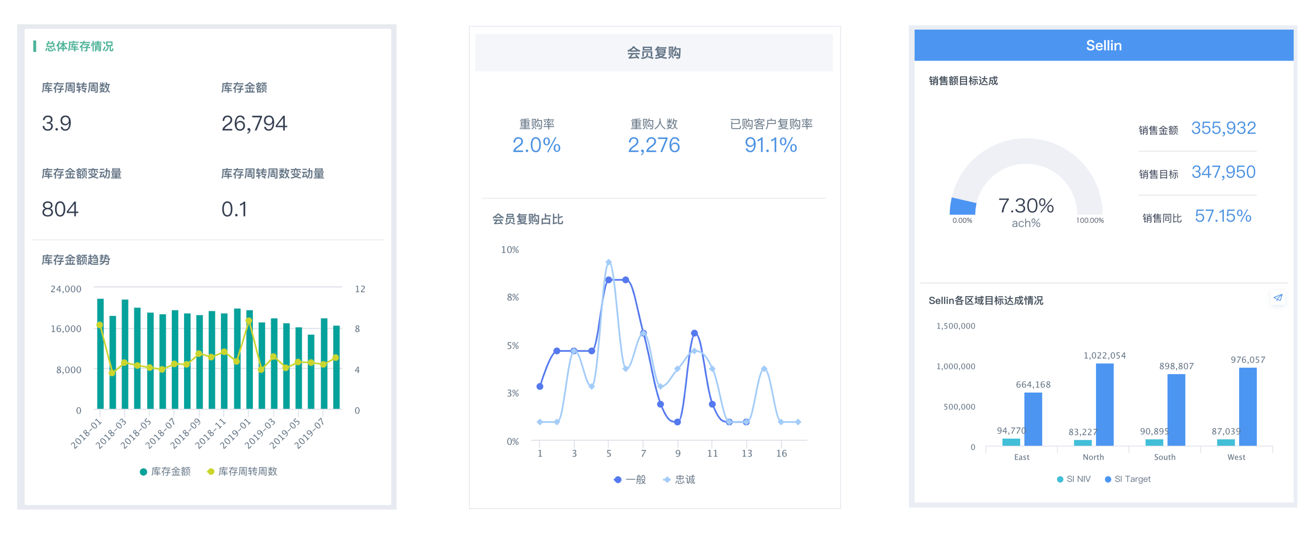
Card Groups
Dashboard Card Groups can be used to combine content from the same series, making the page more organized and improving reading efficiency.
Usage Notes:
-
Cards within a Card Group also need to pay attention to layout neatness; refer to the page layout above for details
-
Group titles can be highlighted through color, background color, font size, symbols, etc.
-
Title alignment should be consistent with the elements within the group
-
Separator lines within Card Groups, like those in the page, should be as long as possible and as few as possible
Mobile Components and Styles
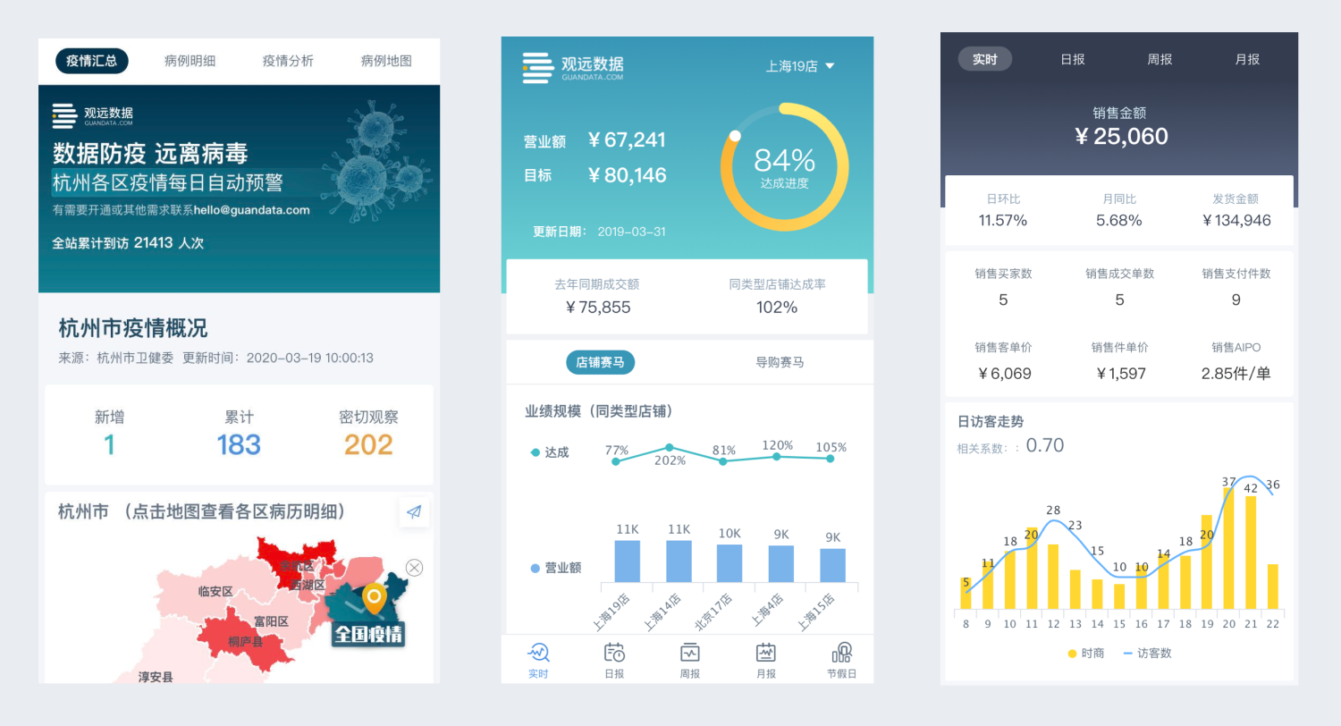
Header Component
The header component in mobile light applications can be used as a page title or to highlight key metrics.
Usage Notes:
-
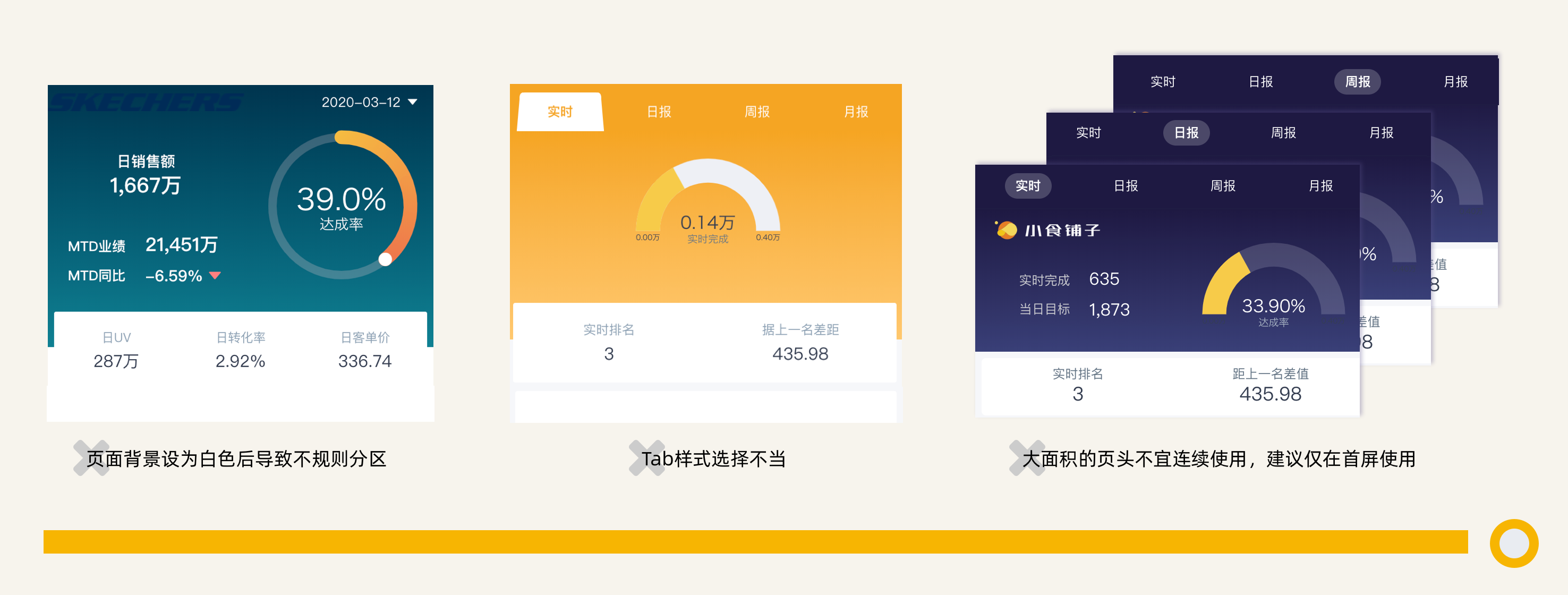
When the header component displays metrics, the page background color needs to be distinguished from the card area to avoid irregular partitioning;
-
When using page components with Tab labels, pay attention to choosing matching colors and styles;
-
Page components are recommended for use only on the first screen and should not be used continuously;
-
Avoid scroll bars.
Tab Labels
Mobile light applications support setting three levels of Tab labels, forming an information architecture.
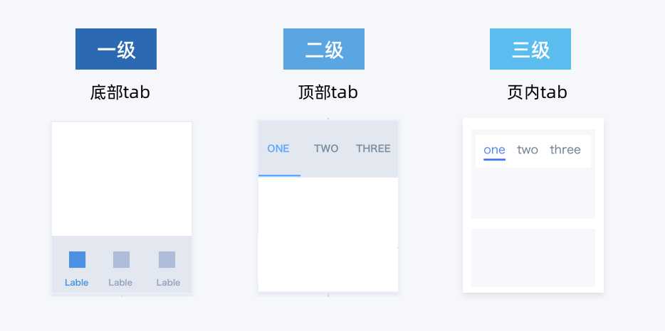
Usage Notes:
-
Hierarchical structure settings need to conform to user mental models:
-
First-level bottom tabs: generally different functional levels, such as "Sales, Inventory, Management"
-
Second-level top tabs: generally similar concepts laid out flat, such as "Daily Report, Weekly Report, Monthly Report"
-
Evaluation indicator for whether the hierarchy is reasonable: when a user wants to find "Sales - Daily Report", there is a traceable path
-
-
Tab page names should be concise and clear
-
Tab content within a page should not be too much (should be displayable within one screen); when too much, consider splitting into second-level top tabs
-
Bottom tab quantity recommended: 3
5, top tab quantity recommended: 24, in-page tab quantity recommended: 2~3
Card Groups
Large Card Groups
Similar to desktop Card Groups, large Card Groups in mobile light applications mainly serve to combine content from the same theme.
Usage Notes:
-
Unlike the desktop, mobile screens are smaller, so Card Group content should not be too much and should not exceed one screen length
-
Card Group titles need to be set
-
Avoid using separator lines
Small Card Groups
For small card combinations in mobile light applications, relevant information can be displayed directly by combining with charts.
Usage Notes:
-
Pay attention to highlighting key information/metrics and alignment
-
Charts are only auxiliary and decorative; there should not be only charts, and avoid icons with unclear meanings
-
Ensure every text is clearly visible (make good use of text cards)
-
Sparklines were proposed by Edward R. Tuft, and you can also refer to Fiori Micro Chart
Metric Card Groups
Metric Card Groups in mobile light applications can unify metric styles and neatly store multiple metrics together.
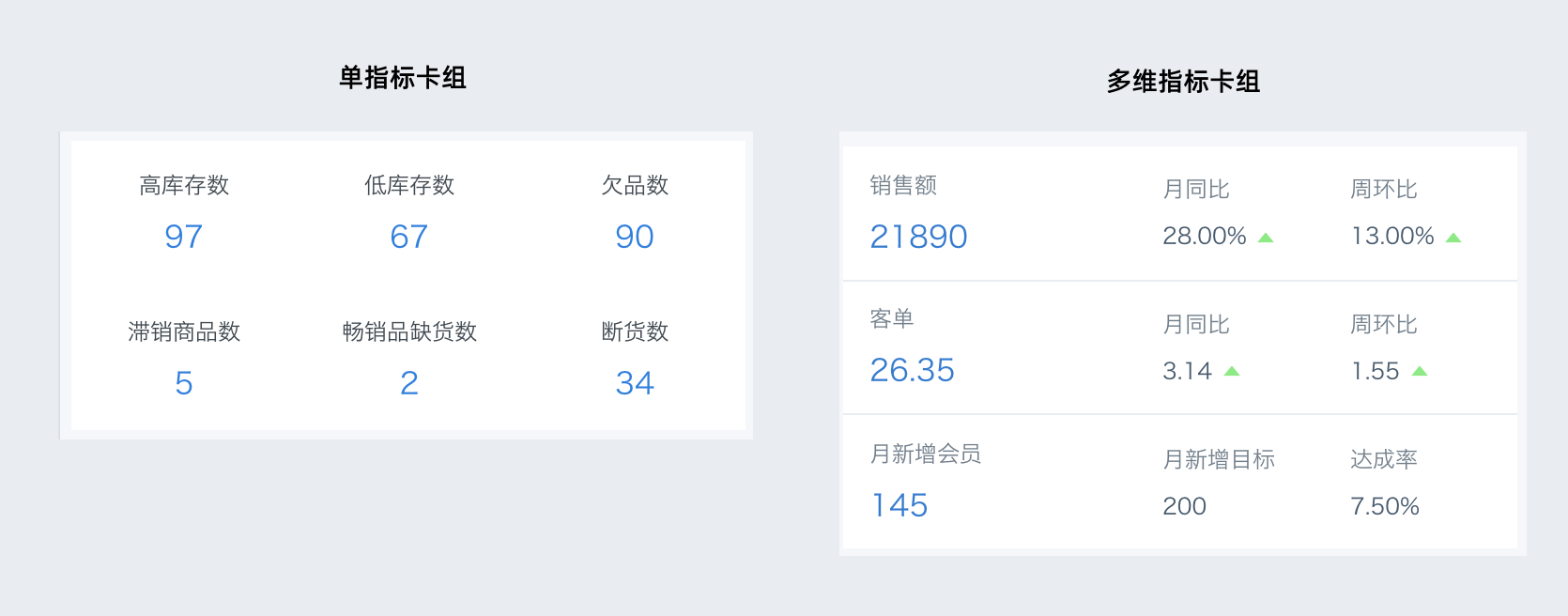
Usage Notes:
-
The number of secondary metrics in comparative Metric Card Groups should be kept consistent
-
When the number of metrics in a comparative Metric Card Group exceeds 5, it is recommended to split into multiple Metric Card Groups
-
Avoid parallel single-row Metric Card Groups and pages full of Metric Card Groups
-
When higher styling requirements are needed, metric cards can be placed within Card Group combinations
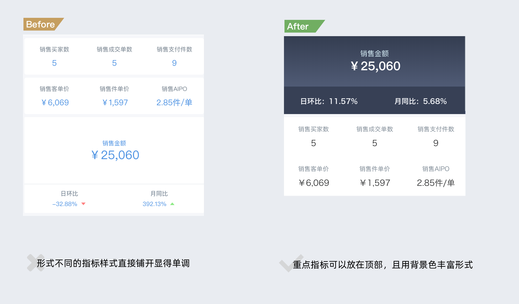
When there are too many metrics on the page, how to optimize the page and display information clearly:
- Place important metrics at the top of the header and set a background color
- Refer to Card Group usage, add charts, and change text arrangement