Custom Chart
Overview
Feature Description
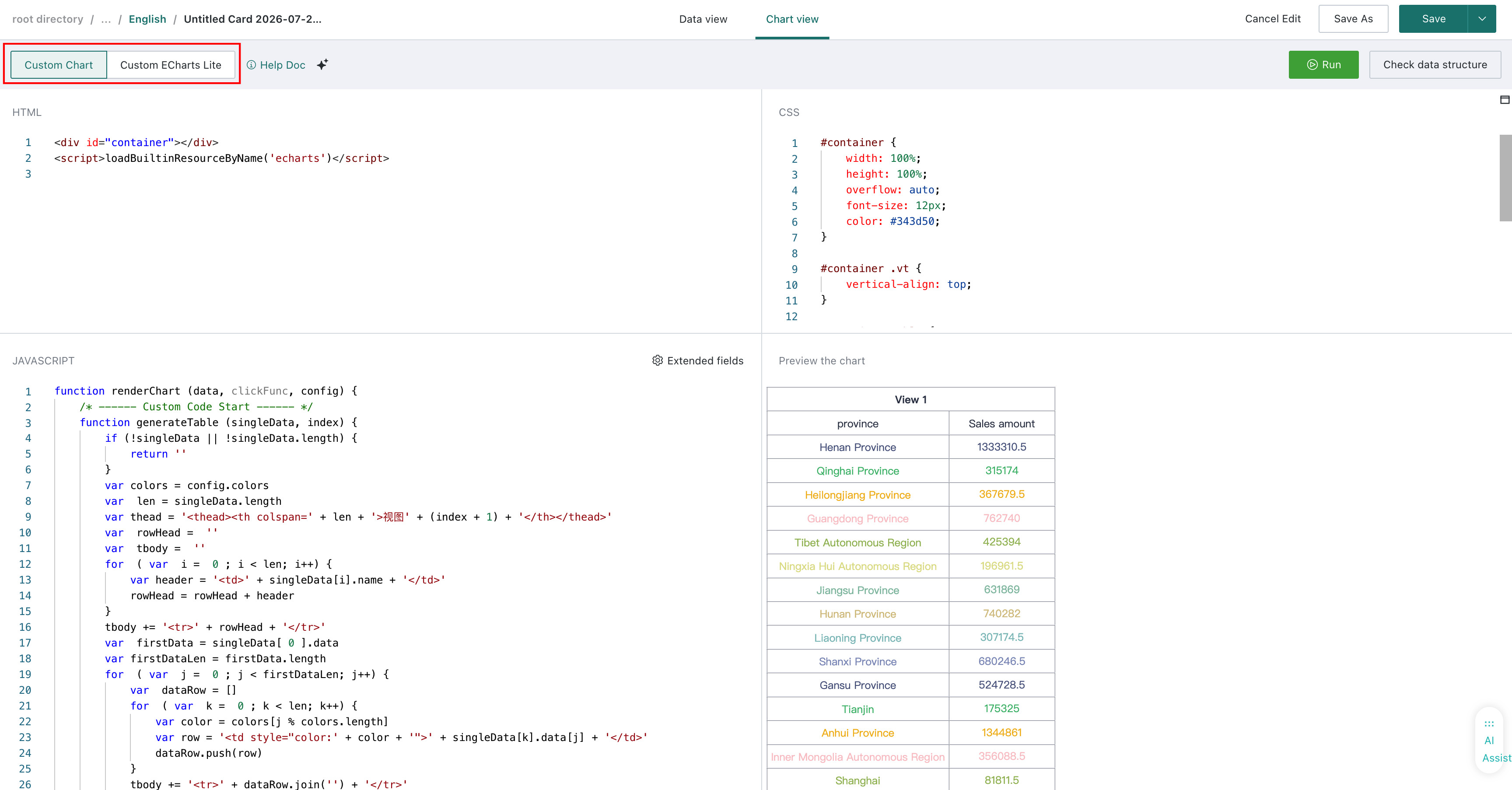
Custom Chart is an open visualization feature provided by Guandata BI. It lets users combine Guandata's backend data-processing capabilities with third-party visualization libraries to build fully customized visualizations. This allows the platform to extend beyond the built-in chart types and support a much wider range of presentation styles.
Guandata BI currently supports two editing modes for custom visualizations: Custom Chart and Custom Chart Lite.
Prerequisites
Building a custom chart requires Guandata's visualization SDK extension package and one or more visualization libraries, and it involves JavaScript development. Users should therefore have basic front-end development skills.
The Guandata BI custom-chart plugin development and packaging repository is available at https://github.com/GuandataOSS/visualization-tool. You can use and extend it as needed.
Custom Chart Usage Guide
Creating a custom chart generally consists of two steps:
-
Data preparation
-
Chart creation
Data Preparation
-
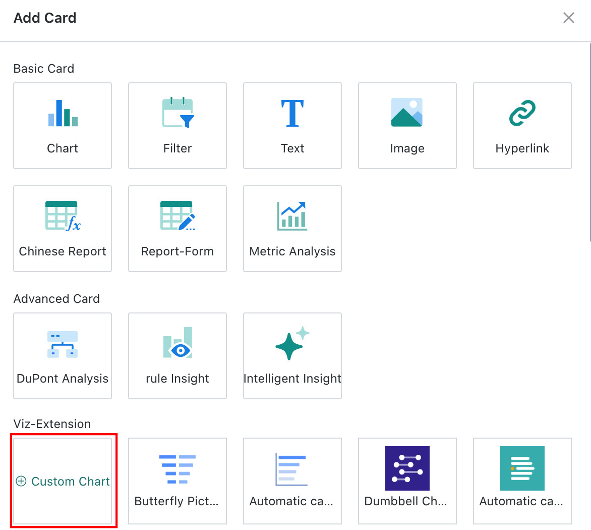
Click Add Card in the upper-right corner of the Dashboard, choose Custom Chart, select a dataset, and enter the custom-chart editor.
-
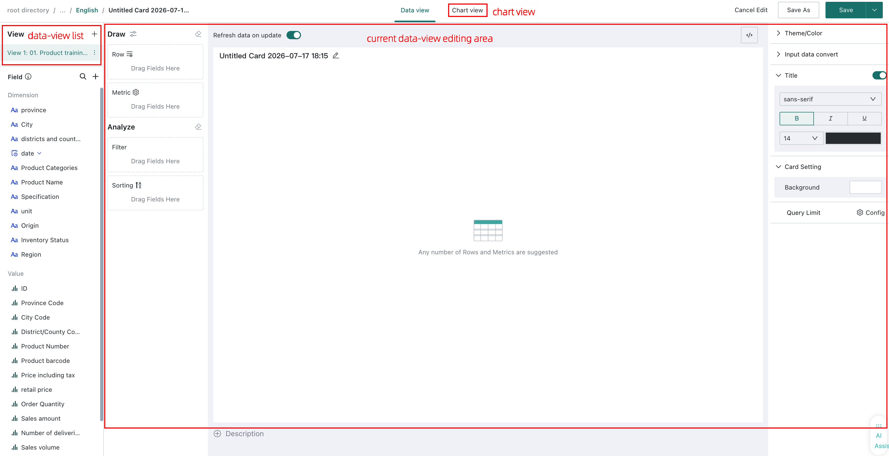
The custom-chart editor is mainly divided into three areas: the data-view list, the current data-view editing area, and the chart view.
-
Data preparation is similar to ordinary visualization analysis. In the data-view editing area, drag the required dimensions and measures into the corresponding zones to prepare data for rendering. The main difference is that Custom Chart can consume data from multiple data views, and those data views are provided to the rendering code in array form.
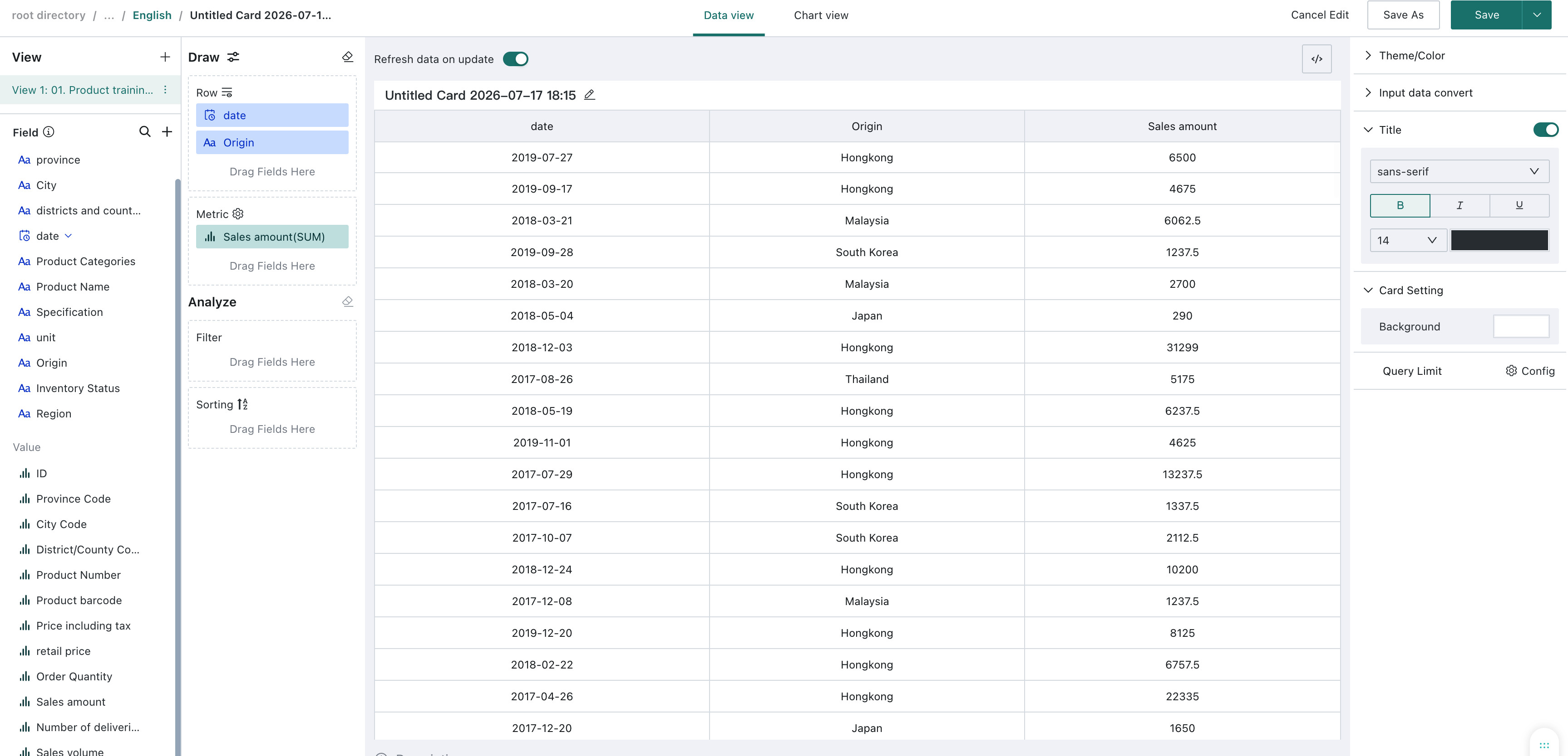
Chart Creation
After data preparation is complete, switch to Chart View. You can choose between the two editing modes. The example below uses Custom Chart.
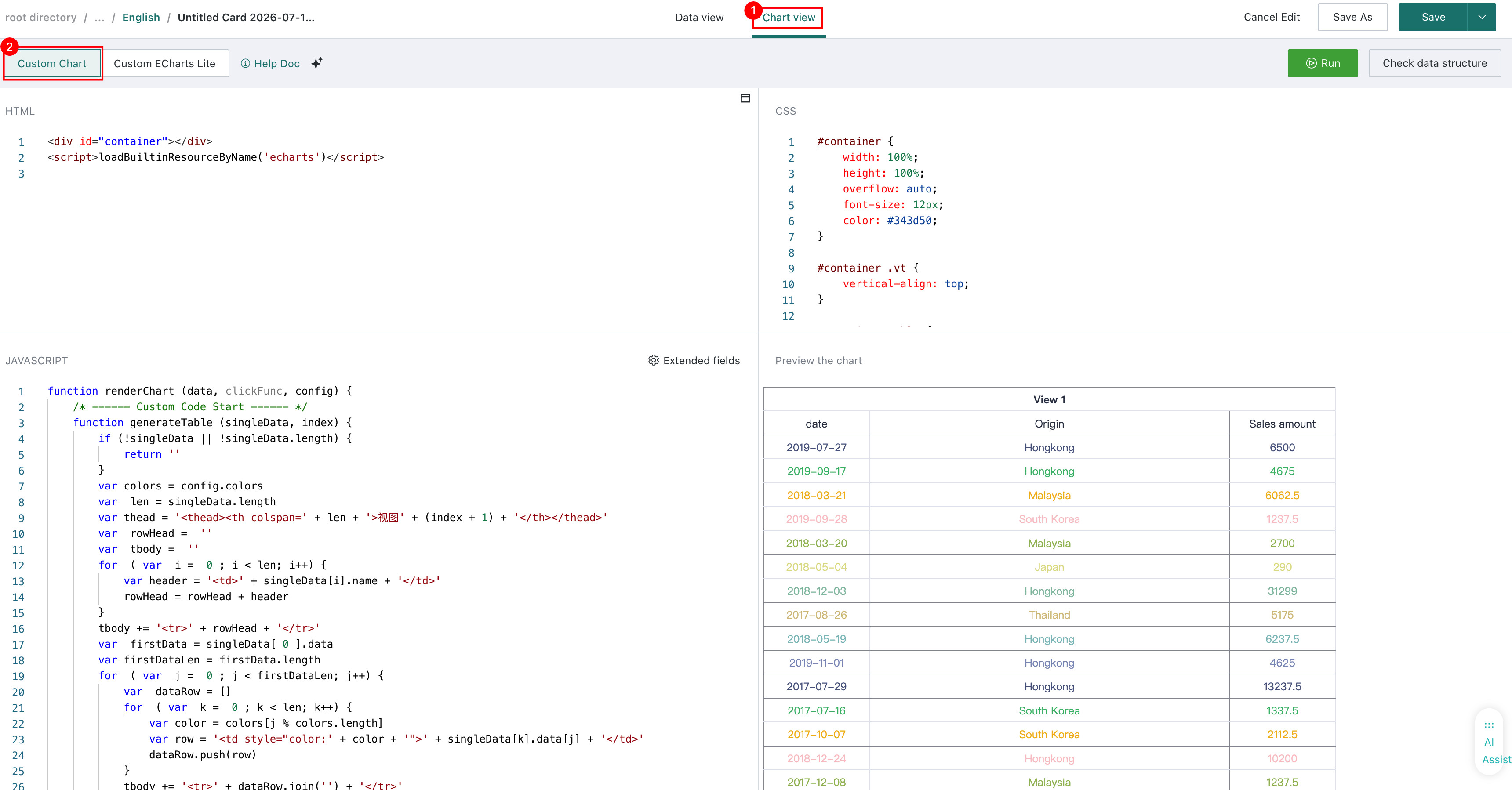
Interface Introduction
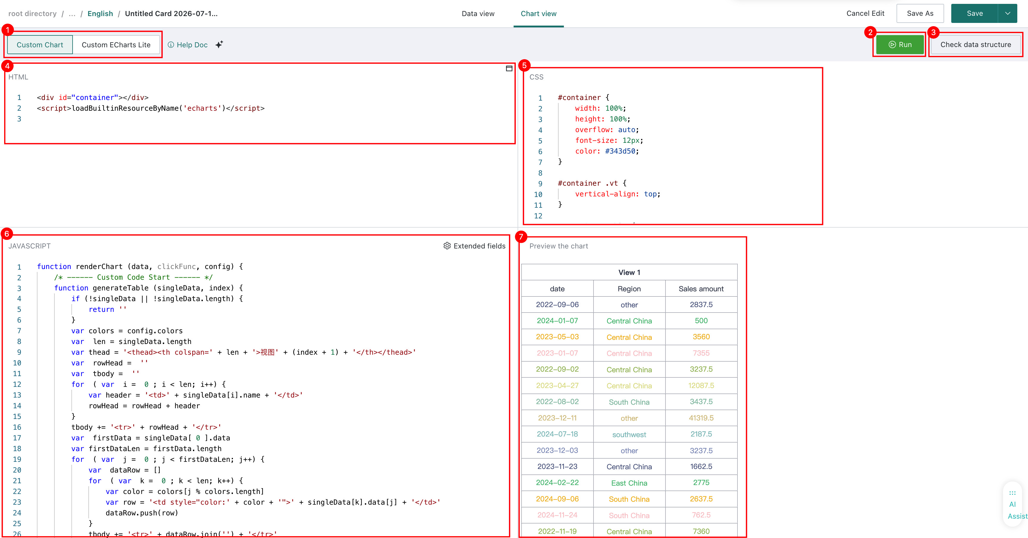
(1) Area Introduction
1. Custom Chart / Custom Lite Chart: Two custom-visualization editing modes
2. Run Button: Runs the current code and updates the chart preview area
3. View Data Structure: Displays the data received from the configured data view
4. HTML Code Area: Used for HTML editing
5. CSS Code Area: Used for CSS editing
6. JavaScript Code Area: Used for JavaScript editing
7. Chart Preview Area: Displays the rendered result
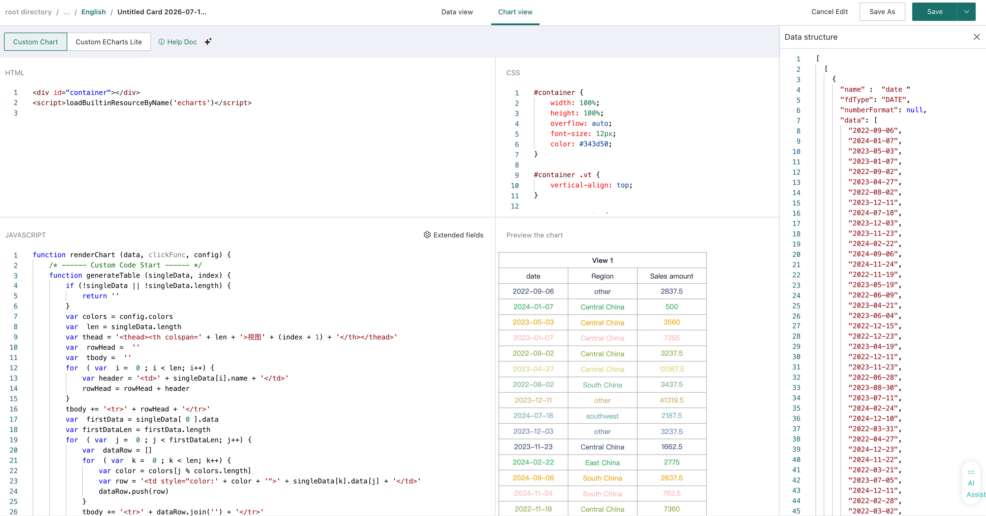
(2) Code Editing Area
The Custom Chart code editor includes three areas: HTML, CSS, and JavaScript.
When you first enter Chart View, the editor contains default sample code. In the preview area, the current Data View is displayed in table form. Each area also supports dragging and maximizing.
- HTML Code Area:
This area is mainly used to define the chart container and reference any required chart libraries.

- CSS Code Area:
This area is used for static style settings. In most cases, only container and layout styling need to be adjusted here. SCSS, LESS, and other preprocessors are not supported; only native CSS is supported.
- JAVASCRIPT Code Area:
This area is mainly used to access chart data and define rendering behavior.
When writing or replacing content in the JavaScript area, place your code between /* ------ Custom Code Start ------ / and / ------ Custom Code End ------ */ inside the renderChart function.
// Guandata's built-in rendering function, generally no need to modify
function renderChart (data, clickFunc, config) {
/* ------ Custom Code Start ------ */
// This is where your code goes
/* ------ Custom Code End ------ */
}
// Guandata's plugin code, used to control the final chart rendering
new GDPlugin().init(renderChart)
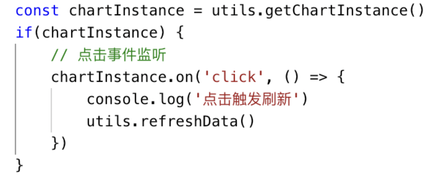
Starting from version 5.6.0, the renderChart function also includes the utils helper, which supports utils.refreshData() for refreshing card data by requesting the backend again.
If you want to display a prompt in the chart area when the incoming parameters do not meet the required conditions, you can customize it as follows:
function renderChart (data, clickFunc, config) {
    if(data[0].length === 0) {
        const dom = document.getElementById('container')
        dom.innerHTML = "Data is empty"
        return
    }
}
Accessible Data and Functions
function renderChart (data, clickFunc,config) {
    /* ------ Custom Code Start ------ */
    // ...custom code for render chart
    /* ------ Custom Code End ------ */
}
new GDPlugin().init(renderChart)
The SDK-related parts of this code work as follows:
GDPlugin
The GDPlugin class is responsible for data communication and for calling the chart-rendering method.
init
init receives a renderChart function. After data is received, GDPlugin calls renderChart with three parameters: data, clickFunc, and config.
data
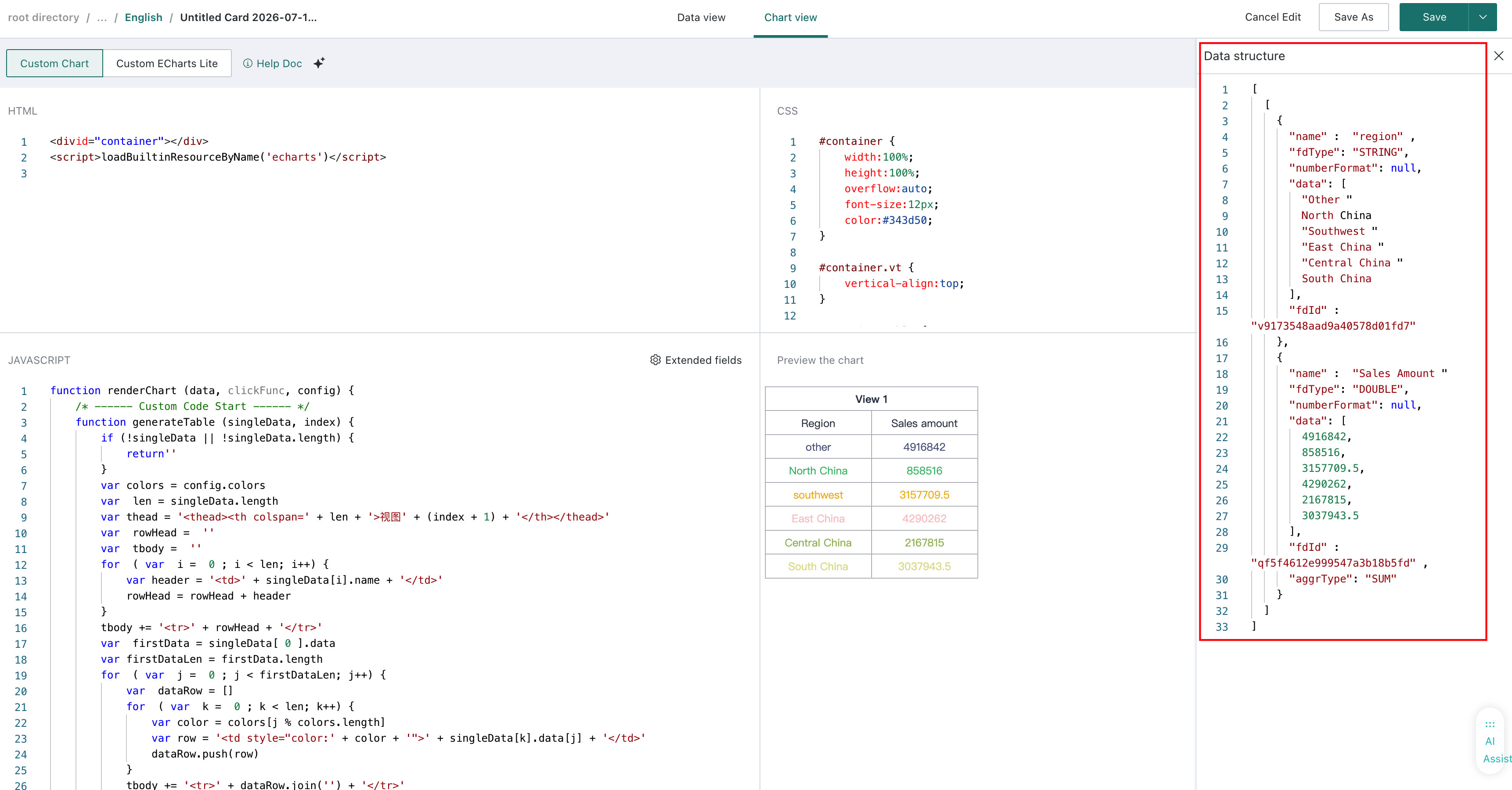
data refers to the data corresponding to the selected fields in the Data View. You can preview the exact structure through View Data Structure. Its format is as follows:
[
  [
    {
      "name": "Region",
      "numberFormat": null,
      "data": [
        "Other",
        "East China",
        "Southwest",
        "South China",
        "Central China",
        "North China"
      ]
    },
    {
      "name": "Sales Amount",
      "numberFormat": null,
      "data": [
        4916842,
        4290262,
        3157709.5,
        3037943.5,
        2167815,
        858516
      ]
    }
  ]
]
clickFunc
clickFunc accepts one parameter and is used to trigger interaction behavior such as linkage and jump actions initiated by the custom chart. Its format is as follows:
function clickFunc(data) {}
// data format:
{
	clickedItems: [ {
  	idx: [ 1, 2 ], // Column index path. e.g., third column of second view dataset [ 1, 2 ]
    colName: 'xxx', // Column name
    value: [ 'xxx', 'yyy' ], // Value format
  } ]
}
config
config contains chart property settings. It currently includes four properties: theme, colors, customOptions, and language.
const { theme, colors, customOptions, language } = config
-
theme: Current system theme color, corresponding values include "LIGHT" and "DARK".
-
colors: Theme colors, configurable on the right side of the "Data View", corresponding to an array, format as follows:
[
  "#4379CE",
  "#99B8F1",
  "#FADB37",
  "#FC8602",
  "#FFA748",
  "#72B5EB",
  "#78CDED",
  "#AC9AE2",
  "#FAC36F",
  "#FD7F7F",
]
- customOptions: Custom configuration settings, supporting configuration of custom charts for easier chart settings after plugin installation.
// customOptions is an object, fields can be defined and used according to the chart
{
  showLabel: false,
  fontSize: 12,
}
- language: Current system language (supported from version 5.6.0).
Linkage Interaction
Custom charts can implement butterfly charts with linkage capabilities using highcharts. The code is as follows:
const DEDAULT_COLORS = ['#2f7ed8', '#f28f43', '#1aadce', '#492970', '#f28f43', '#77a1e5', '#c42525', '#a6c96a']
const DEFALUT_THEME = 'LIGHT'
const chart = Highcharts.chart("container", {
    chart: {
        type: "bar"
    },
    title: {
        text: null
    },
    xAxis: [
        {
            categories: [],
            reversed: false,
            labels: {
                step: 1
            }
        }
    ],
    yAxis: {
        title: {
            text: null
        }
    },
    plotOptions: {
        series: {
            stacking: "normal",
        }
    },
    series: []
});
function renderChart(data, clickFunc, config) {
   /* ------ Custom Code Start ------ */
    if (!data || data[0].length < 3) {
        const dom = document.getElementById('container')
        dom.innerHTML = ""
        return
    }
    const { theme = DEFALUT_THEME, colors = DEDAULT_COLORS } = config || {}
    const isDarkTheme = theme !== 'LIGHT'
    chart.update(
        {
            colors,
            xAxis: [
                {
                    categories: data[0][0].data,
                    title: data[0][0].name,
                    lineColor: isDarkTheme ? '#B4C2D6' : '#DBDFE7',
                    labels: {
                        style: {
                            color: isDarkTheme ? '#B4C2D6' : '#617282',
                        }
                    }
                }
            ],
            yAxis: {
                gridLineColor: isDarkTheme ? '#B4C2D6' : '#DBDFE7',
                labels: {
                    style: {
                        color: isDarkTheme ? '#B4C2D6' : '#617282',
                    }
                }
            },
            legend: {
                itemStyle: {
                    color: isDarkTheme ? '#B4C2D6' : '#617282',
                },
            },
            plotOptions: {
                series: {
                    stacking: "normal",
                    events: {
                        click: (event) => {
                            /* Example of calling clickFunc from chart event */
                              const { category } = event.point
                              if (category) {
                                  const attrCol = data[0][0]
                                  clickFunc({
                                      clickedItems: [
                                      {
                                          idx: [ 0, 0 ],
                                          colName: attrCol.name,
                                          value: [ category ],
                                      }
                                      ]
                                  })
                              }
                        }
                    }
                }
            },
        },
        false
    );
    const length = chart.series.length;
    Array.from({ length }).forEach((_, index) => {
        chart.series[length - index - 1].remove();
    });
    data[0].slice(1).forEach(function(serie, index) {
        if (index === 0) {
            chart.addSeries(
                { ...serie, data: serie.data.map(item => -item) },
                false
            );
        } else {
            chart.addSeries(serie, false);
        }
    });
    chart.redraw();
}
new GDPlugin().init(renderChart);
Using Data Format
Since the data format configuration is based on d3-format, you need to import d3-format first when using it, and then call the methods provided by d3-format for formatting.
Online address for importing d3-format:

Define formatting utility function:
const isEnLang= (currentLang) => {
    return currentLang === 'en-US' || currentLang === 'en'
}
var formatCondenseNumber = (value, digits = 2, prefix = '', suffix = '', lang = '') => {
    const isPositive = value > 0
    const absVal = Math.abs(value)
    digits = Math.min(digits, 6)
    let [ num, unit ] = [ null, '' ]
    let [ nums, units ] = [ [], [] ]
    if (isEnLang(lang)) {
        // English, K M B T
        nums = [ 1000, 1000 * 1000 ]
        units = [ 'K', 'M' ]
    } else {
        // Chinese large-number units
        nums = [ 10000, 10000 * 10000, 10000 * 10000 * 10000 ]
        units = [ 'wan', 'yi', 'zhao' ]
    }
    let i = nums.length - 1
    for (; i >= 0; i -= 1) {
        const base = nums[i]
        if (absVal >= base) {
            num = (absVal / base)
            num = Number(num).toFixed(digits)
            unit = units[i]
            break
        }
    }
    if (i < 0) {
        num = Number(absVal).toFixed(digits)
    }
    const signSymbol = (isPositive || absVal === 0) ? '' : '-'
    return `${signSymbol}${prefix}${num}${unit}${suffix}`
}
var genFakeValue = (value, decimalPlaces) => {
    if (typeof value !== 'number') return value
    if (decimalPlaces === 0) return value
    if (value.toString().indexOf('.') === -1) return value
    const [ integer, decimal ] = value.toString().split('.')
    const digits = decimal.length
    if (digits - decimalPlaces !== 1) return value
    const fakeDecimal = value > 0 ? +`0.${decimal}01` : -`0.${decimal}01`
    return +integer + fakeDecimal
}
var numberFormatFn = (params, lang) => {
    const { value, format } = params
    const { specifier, locale, prefixUnit = '', suffix = '', divideDataBy = 1, decimalPlaces = 0 } = format || {}
    const newSuffix = prefixUnit + suffix
    const fakeValue = genFakeValue(value, decimalPlaces)
    if (format && format.isAuto) {
        const prefix = locale?.currency?.[0] || ''
        return formatCondenseNumber(fakeValue, decimalPlaces, prefix, suffix, lang)
    }
    if (typeof specifier !== 'string') {
        return fakeValue + newSuffix
    }
    const fakeDividedValue = genFakeValue(fakeValue / divideDataBy, decimalPlaces)
    if(locale) {
      const defaultLocale = {
          decimal: '.',
          thousands: ',',
          grouping: [ 3 ],
      }
      return `${d3.formatLocale({ ...defaultLocale, ...locale}).format(specifier)(fakeDividedValue)}${newSuffix || ''}`
    }
    return `${d3.format(specifier)(fakeDividedValue)}${newSuffix || ''}`
}
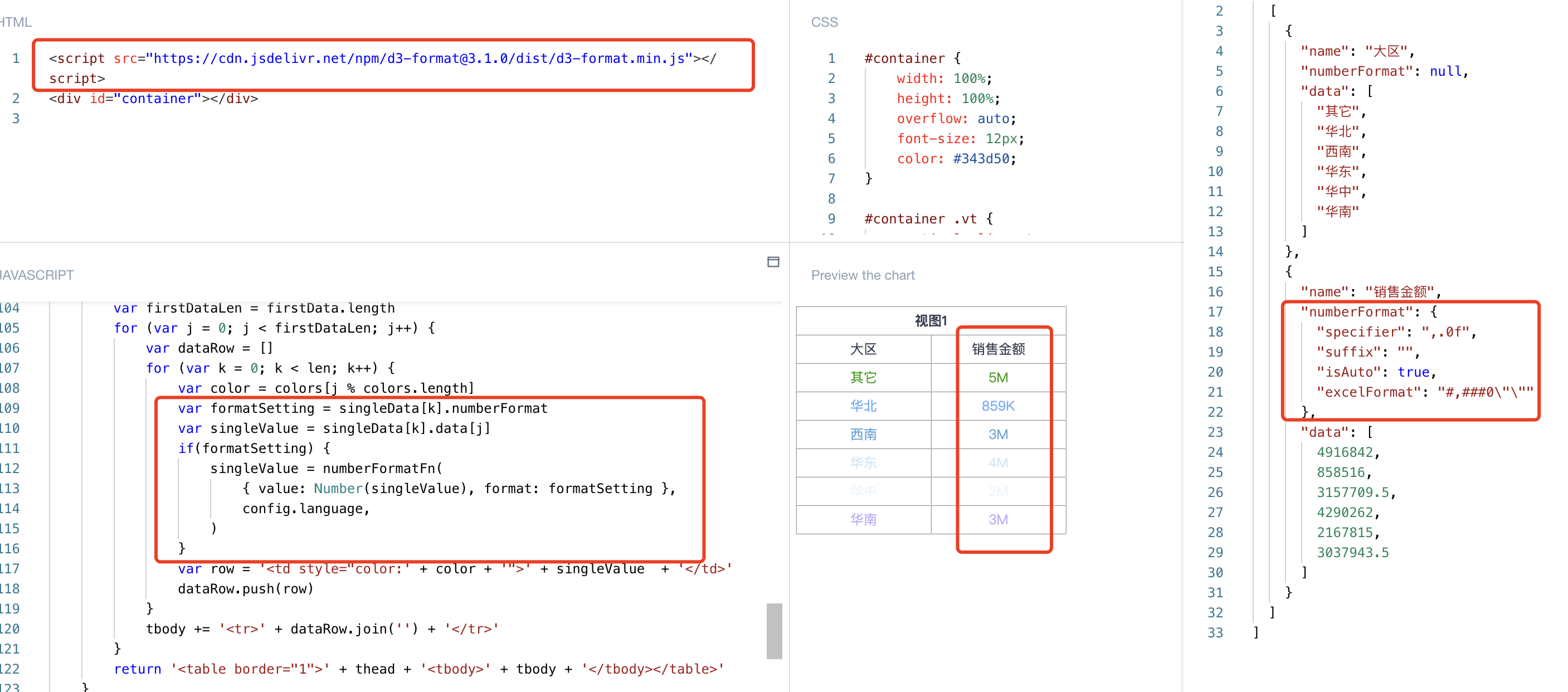
Use the above-defined formatting utility function to format values:
// Using the original table drawing template code as an example (the third parameter config of renderChart passes language)
var formatSetting = singleData[k].numberFormat
var singleValue = singleData[k].data[j]
if(formatSetting) {
    singleValue = numberFormatFn(
      { value: Number(singleValue), format: formatSetting },
      config?.language || '',
    )
}
var row = ''' + singleValue  + '
You can see the corresponding effect as follows:
Drawing Example
The following steps will show you how to draw a "Nightingale Rose Chart" step by step through "Custom Chart"
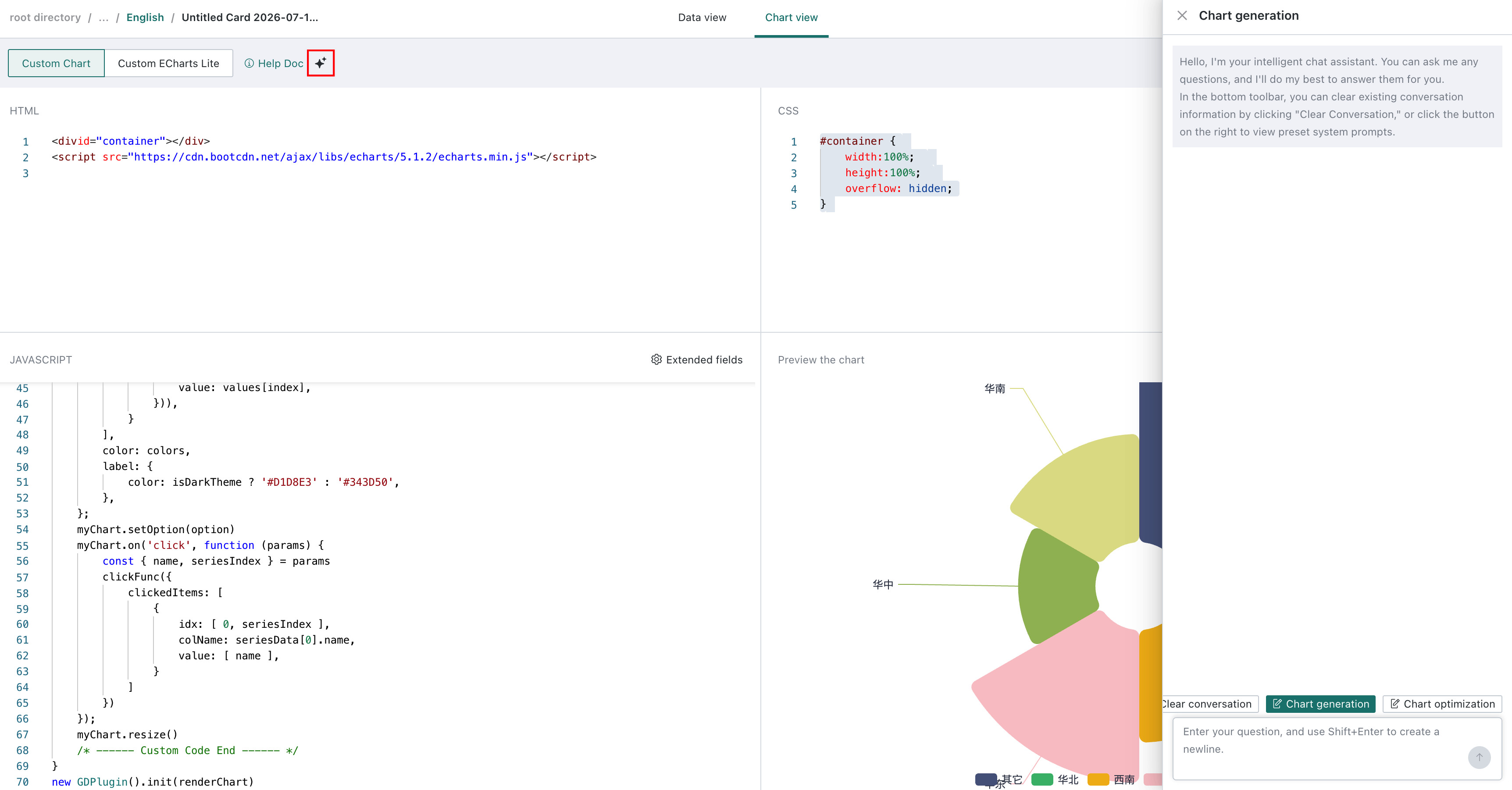
You can click the button to bring up the AI Assistant and describe the chart you need to generate directly in natural language. For details, see Intelligent Chart Generation Assistant.
Step1. Data Preparation
-
Click "New Card" in the upper right corner of the Dashboard, select "Custom Chart", and choose a dataset.
-
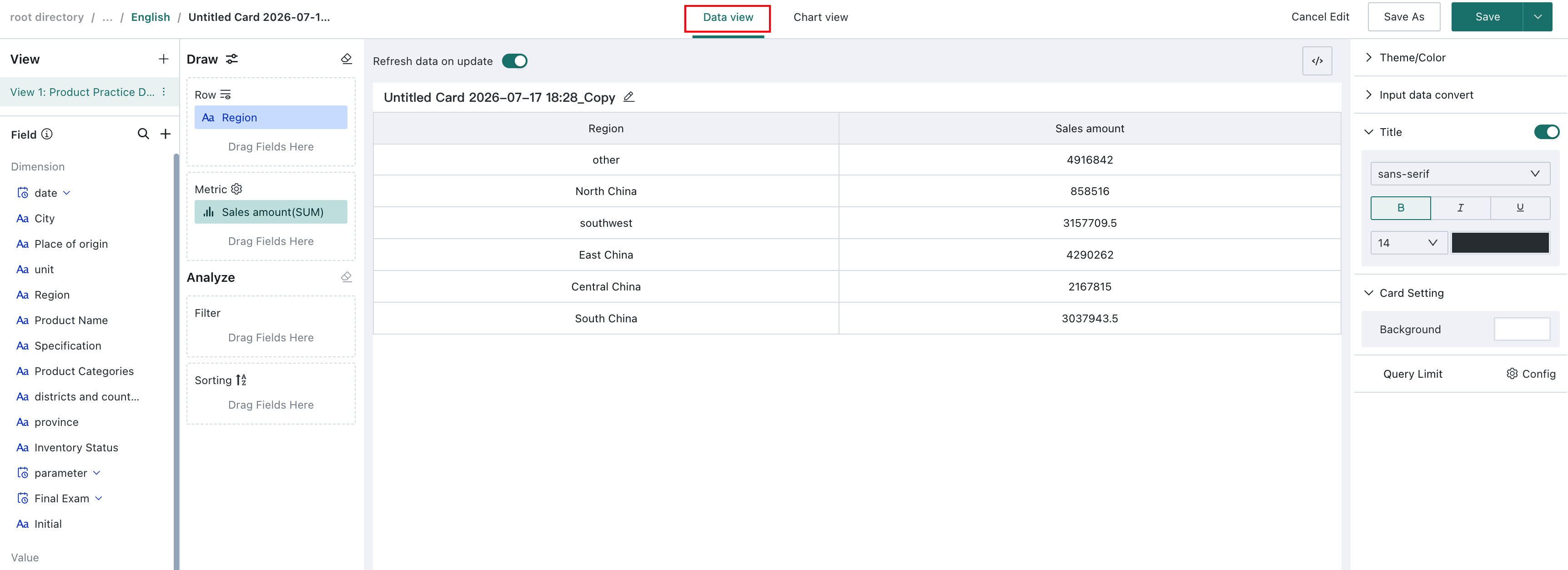
Enter the custom chart editing page, select data in the "Data View". Here we choose two fields: "Region" and "Sales Amount".
-
Switch views, click the top of the page to switch from "Data View" to "Chart View".
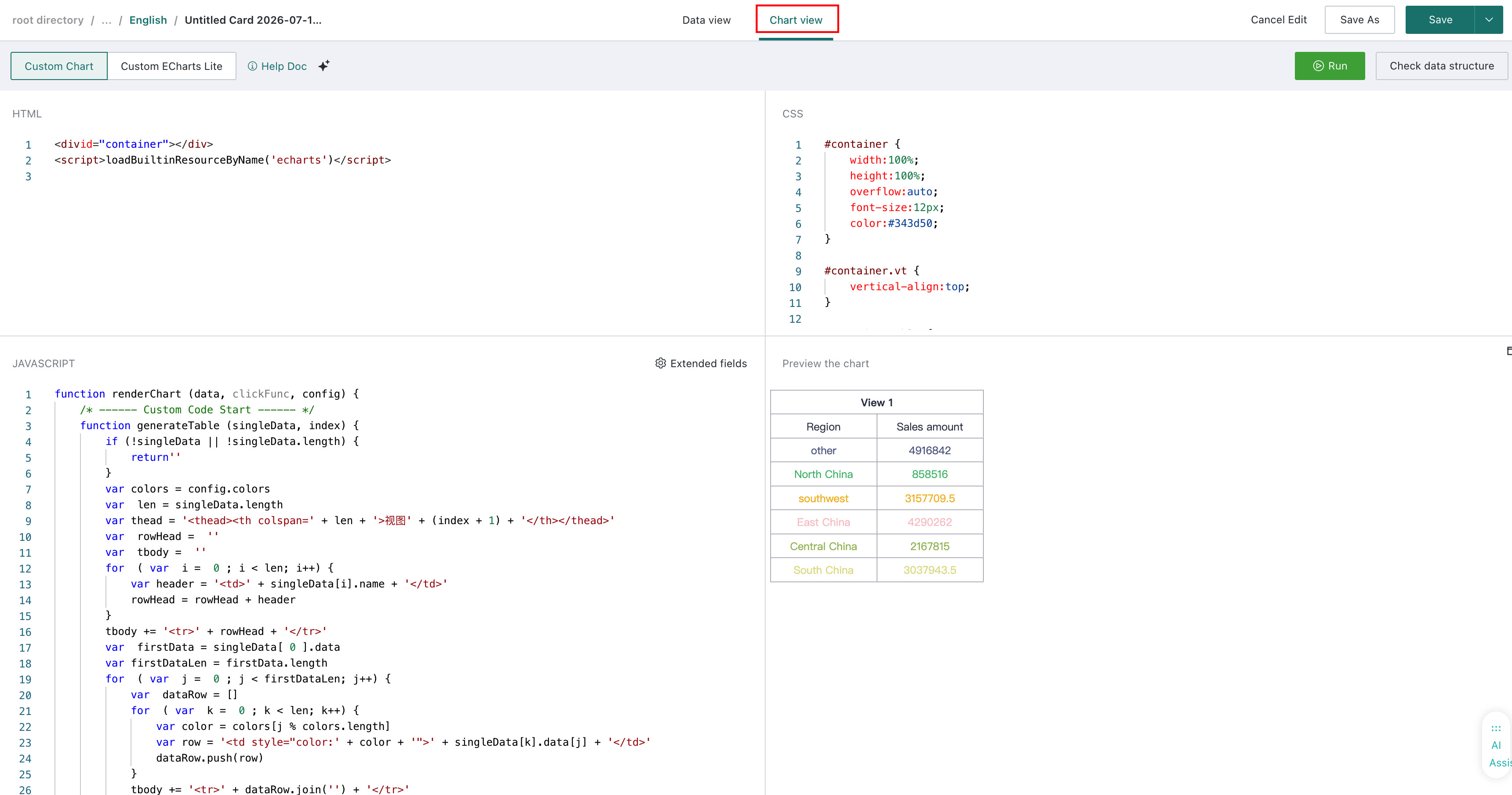
Step2: Rendering Function Parameters
After data is accessed, we need to render this data.
-
In the "Chart View", click "View View Data Structure" in the upper right corner to preview the data passed from the "Data View".
-
Next, we need to replace the code data in different modules of the "Chart View". The specific code is as follows:
(1) HTML: Mainly used to define the chart libraries to be referenced during chart rendering. Below, enter the CDN link libraries needed for chart drawing:

(2) CSS: Mainly used for style settings (SCSS/LESS and other preprocessor languages are not supported; only native CSS is supported).
#container {
    width: 100%;
    height: 100%;
    overflow: hidden;
}
(3) JAVASCRIPT: Mainly used for chart data access and specific rendering action settings.
const myChart = echarts.init(document.getElementById('container'))

const customOptions = {
    showToolbox: true
}

function renderChart (data, clickFunc, config) {
    /* ------ Custom Code Start ------ */
    // Read configuration
    const { theme, colors } = config
    const isDarkTheme = theme === 'DARK'
    // Configuration uses default settings, to be integrated later
    const { showToolbox } = customOptions
    // Use data from view dataset 1
    const seriesData = data[0]
    const [ names, values ] = [ seriesData[0].data, seriesData[1].data ]
    const option = {
        legend: {
            top: 'bottom',
            textStyle: {
                color: isDarkTheme ? '#D1D8E3' : '#343D50',
            }
        },
        toolbox: {
            show: showToolbox,
            feature: {
                mark: { show: true },
                dataView: { show: true, readOnly: false },
                restore: { show: true },
                saveAsImage: { show: true }
            }
        },
        series: [
            {
                name: 'Nightingale Chart',
                type: 'pie',
                radius: [ 50, 250 ],
                center: [ '50%', '50%' ],
                roseType: 'area',
                itemStyle: {
                    borderRadius: 8
                },
                data: names.map((name, index) => ({
                    name,
                    value: values[index],
                })),
            }
        ],
        color: colors,
        label: {
            color: isDarkTheme ? '#D1D8E3' : '#343D50',
        },
    };
    myChart.setOption(option)
    myChart.on('click', function (params) {
        const { name, seriesIndex } = params
        clickFunc({
            clickedItems: [
                {
                    idx: [ 0, seriesIndex ],
                    colName: seriesData[0].name,
                    value: [ name ],
                }
            ]
        })
    });
    myChart.resize()
    /* ------ Custom Code End ------ */
}
new GDPlugin().init(renderChart)
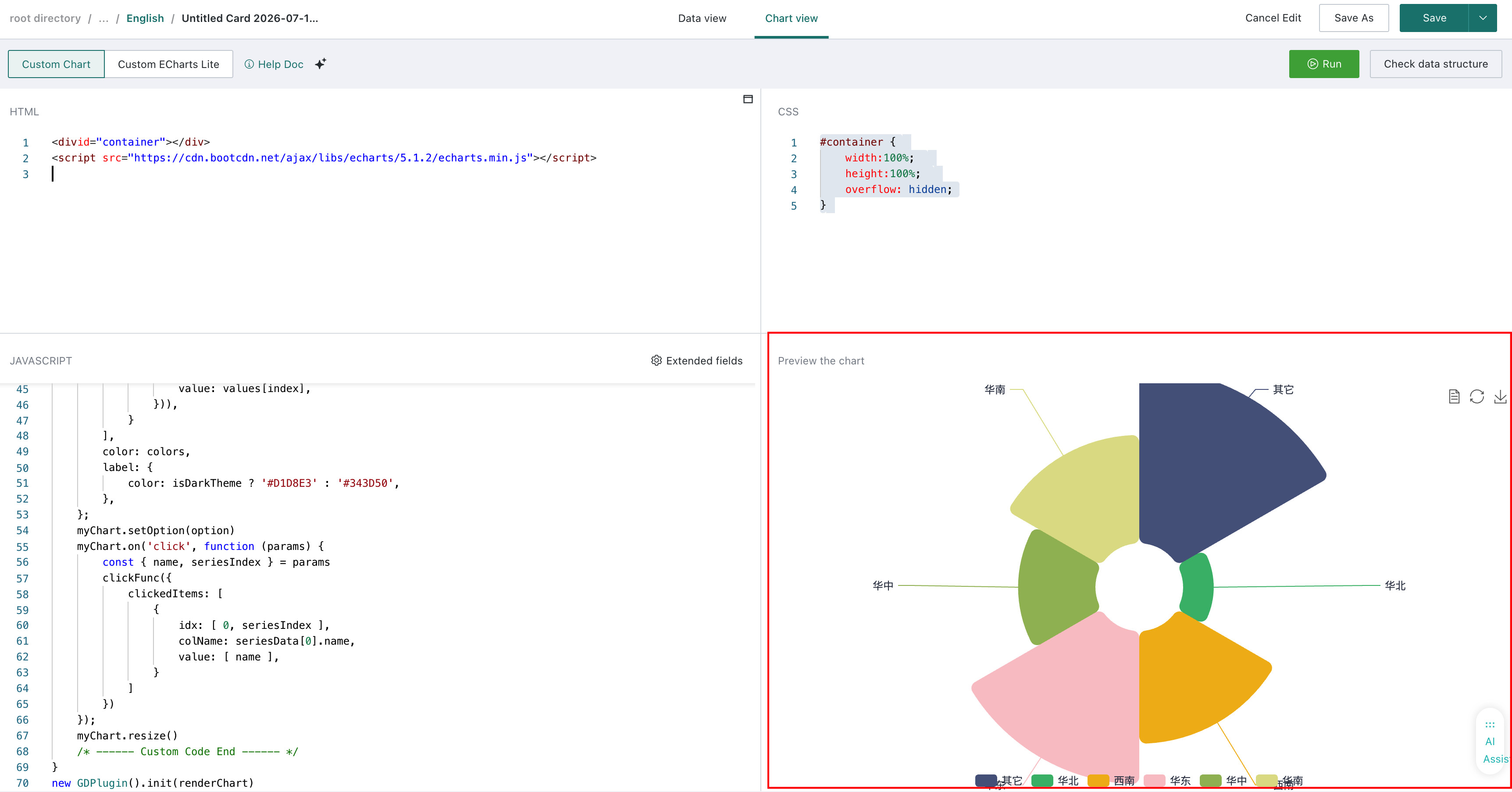
Step3: Result Display
After all replacements are completed, click "Run" to complete the creation of the "Nightingale Rose Chart". The display effect is as follows:
Custom Chart Lite Usage Guide
Custom Chart Lite (Custom Chart Lightweight Version) is a visualization editing mode based on Custom Chart. Compared with the Custom Chart interface, Custom Chart Lite only retains the Java Script and chart preview area. The Java Script area only needs to generate the corresponding Echarts option.
Drawing charts with Custom Chart Lite has relatively lower development skill requirements for users. Users can directly select charts on the Echarts official website and draw them on the BI platform.
Data Preparation
The data preparation process for Custom Chart Lite is the same as for Custom Chart. For specific operations, see the Custom Chart Usage Guide above. The following example uses ECharts to create a custom visualization.
Chart Creation
After data is prepared, switch to the "Chart View". You can choose two different chart visualization editing modes. Here, select the second one, "Custom Chart Lite".
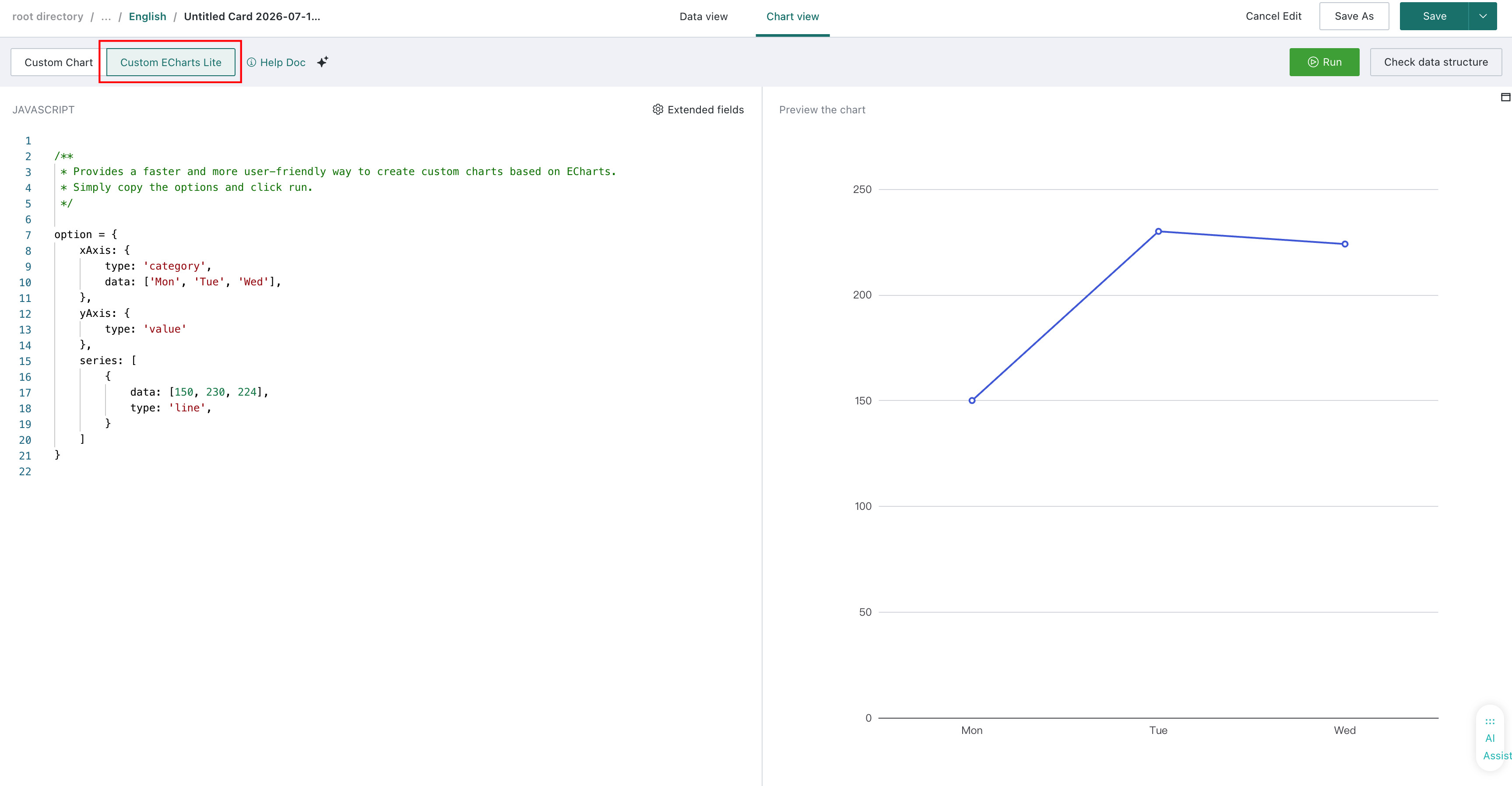
Interface Introduction
The Custom Chart Lite view page is divided into two areas:
-
Left: JavaScript Code Area
-
Right: Chart Preview Area
As shown above, you only need to write code to generate the option in the Java Script code area, then click Run to preview the corresponding chart.
Quickly Draw Based on ECharts Official Examples
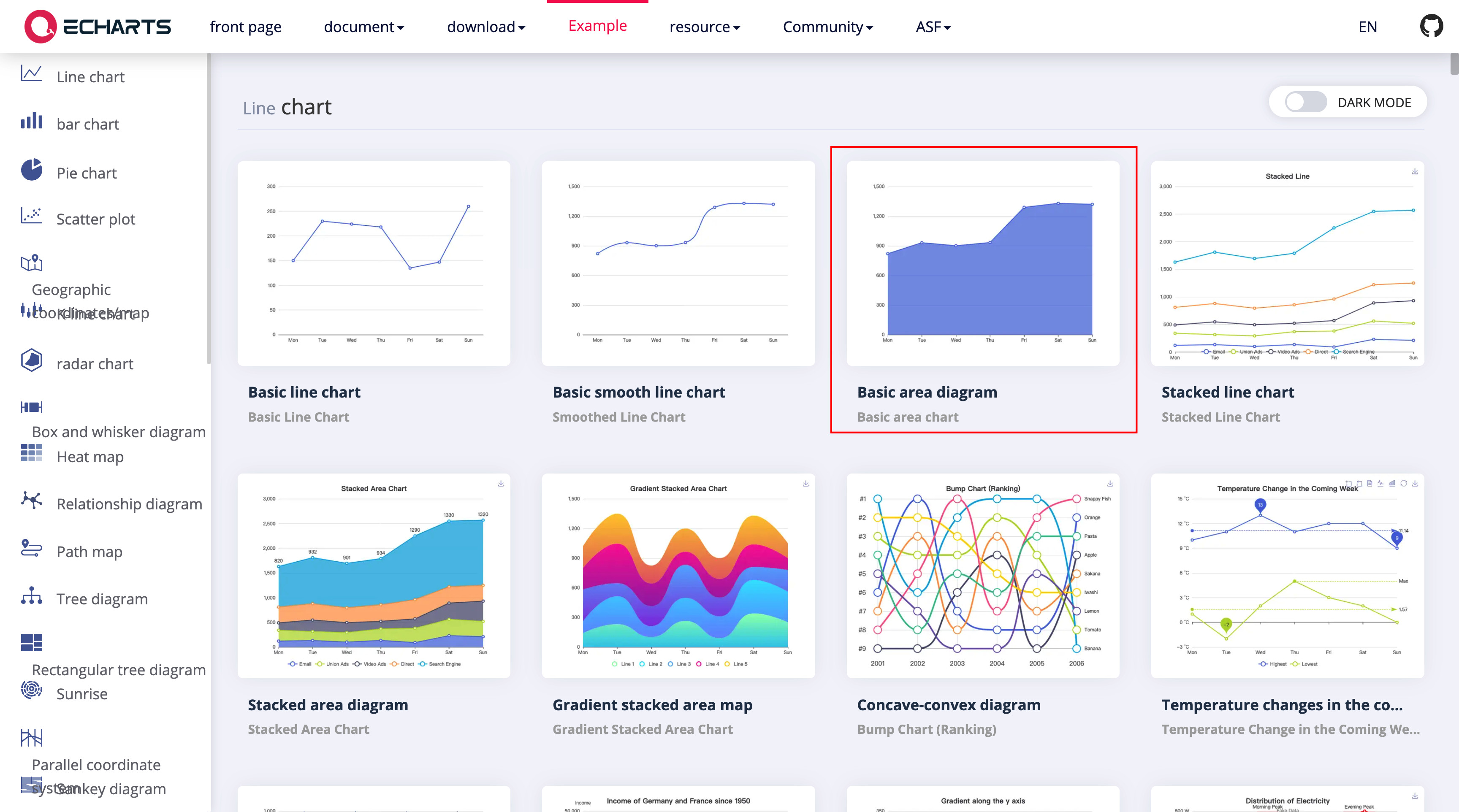
On the Echarts (https://echarts.apache.org/examples/zh/index.html) official examples, find the chart style you want to draw. Below, we use drawing a "Basic Area Chart" as an example.
-
Click to enter the detail page of this example.
-
Copy the existing option from the left code editing area.
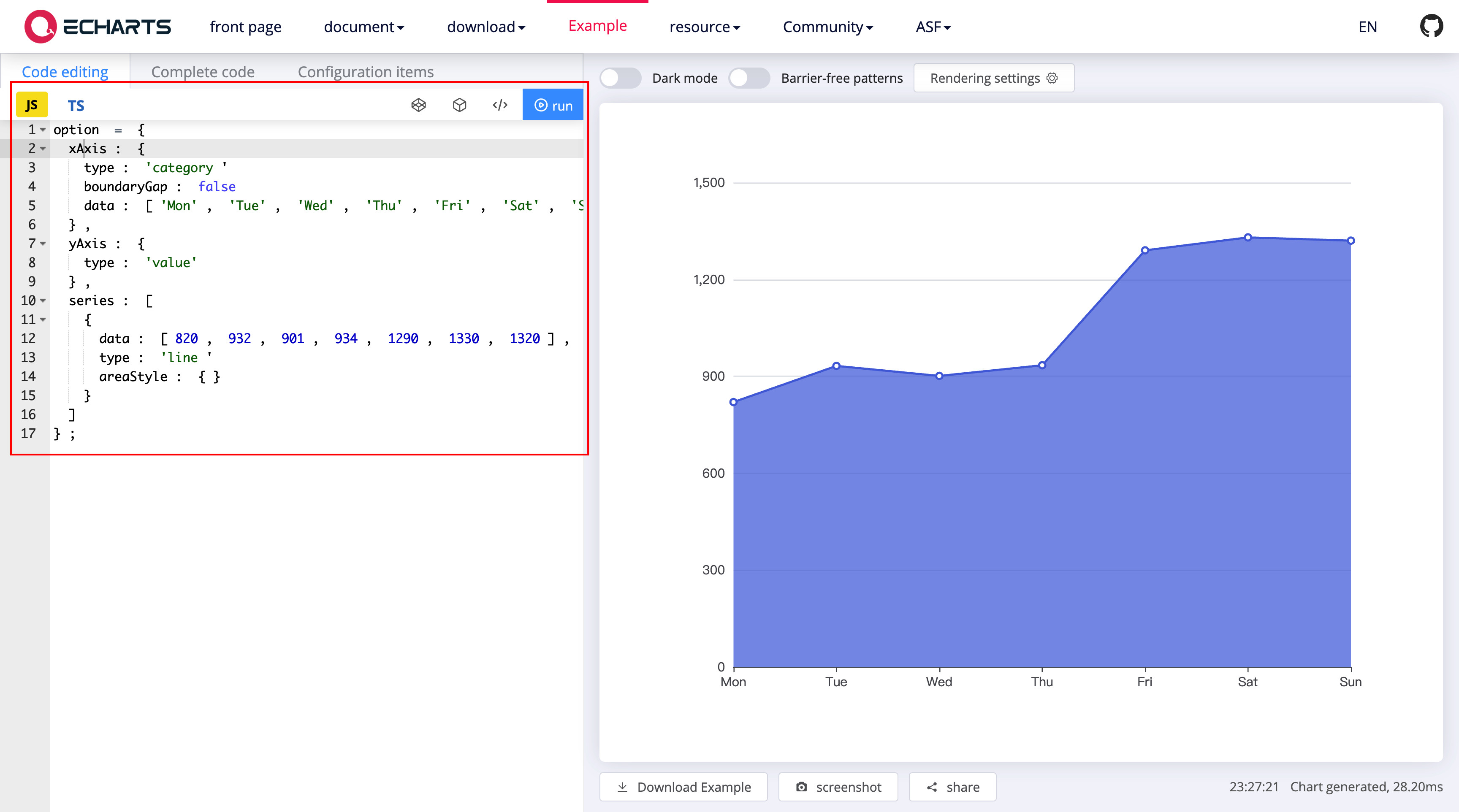
The corresponding code is as follows:
option = {
  xAxis: {
    type: 'category',
    boundaryGap: false,
    data: ['Mon', 'Tue', 'Wed', 'Thu', 'Fri', 'Sat', 'Sun']
  },
  yAxis: {
    type: 'value'
  },
  series: [
    {
      data: [820, 932, 901, 934, 1290, 1330, 1320],
      type: 'line',
      areaStyle: {}
    }
  ]
};
- Paste the copied option into the Custom Chart Lite editing interface, click Run, and the chart will be drawn.
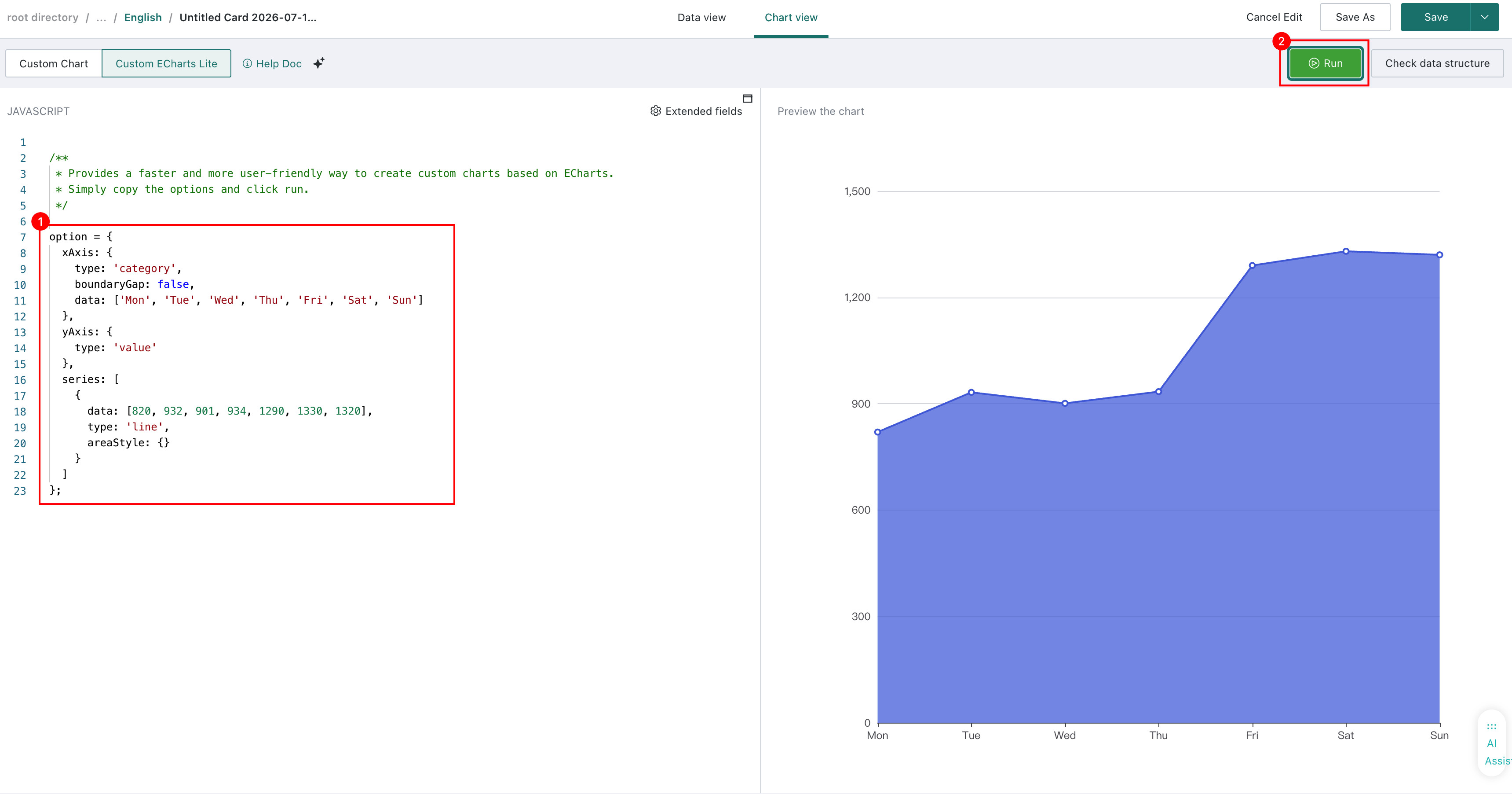
The display data in the above chart uses simulated data provided by ECharts official. If you want to replace it with internal data from the BI platform, you need to select and configure data in the "Data View".
Accessible Data and Functions
The code in the Javascript code area is part of the function body that runs to generate the actual drawing option. It can directly access variables such as data, config, clickFunc, etc. Be careful not to overwrite them.
data
data is the data corresponding to the dataset fields selected in the "Data View" step. You can view the data corresponding to the selected fields through "View View Data Structure".
type IData = Array < Array < {
   name: string, // Field name
   data: Array, // Data corresponding to this field
}>>
config
interface IConfig {
    colors: string[], // Colors corresponding to the selected chart theme in "Data View"
    customOptions: object, // Custom chart property configuration items
    theme: 'LIGHT' | 'DARK', // Current system theme color
    language: // Current system language, supported from 5.6.0
}
clickFunc
clickFunc, accepts one parameter, used to support interaction information such as linkage and jump initiated by custom charts.
type IClickedItem = {
    idx: number[] // Column lookup path. e.g., third column of second dataset [ 1, 2 ]
    colName: string // Column name
    value: string[] // Value
}
type IClickFunc = (params: { clickedItems: IClickedItem[] }) => void
utils
-
Provides some utility functions
-
numberFormat: Format data using d3-format
-
getChartInstance : Used to get the ECharts chart instance
-
type IFieldNumberFormat = {
    divideDataBy?: number,
    excelFormat?: string,
    prefixUnit?: string,
    specifier: string,
    suffix?: string,
    locale?: object,
    decimalPlaces?: number,
    isAuto?: boolean,
}
type IUtils = {
    numberFormat: ({ value: number, format?: IFieldNumberFormat }) => any,
    getChartInstance: () => any
}
window
The window in the current browser environment has been trimmed. Fields such as localStorage and indexedDB cannot be accessed.
Linkage Interaction
As mentioned earlier, the JavaScript code area can use clickFunc and getChartInstance. Next, we will use these two methods to implement click-triggered linkage interaction.
- Enter code:
option = {
    xAxis: {
        type: 'category',
        data: data[0][0].data,
    },
    yAxis: {
        type: 'value'
    },
    series: [
        {
            data: data[0][1].data,
            type: 'line',
        }
    ]
}
// Get ECharts chart instance
const chartInstance = utils.getChartInstance()
if(chartInstance) {
    // Remove all click event listeners
    chartInstance.off('click')
    // Click event listener
    chartInstance.on('click', (params) => {
        // Assemble clickedItems based on click event parameters
        const clickedItems = [{
            idx: [ 0, 0],
            name: data[0][0].name,
            value: [ params.name ],
        }]
        // Call clickFunc if available
        if(clickFunc) {
            clickFunc({ clickedItems })
        }
    })
}
-
After clicking Save and exiting, configure the linkage relationship on the card, and the linkage interaction can be triggered.
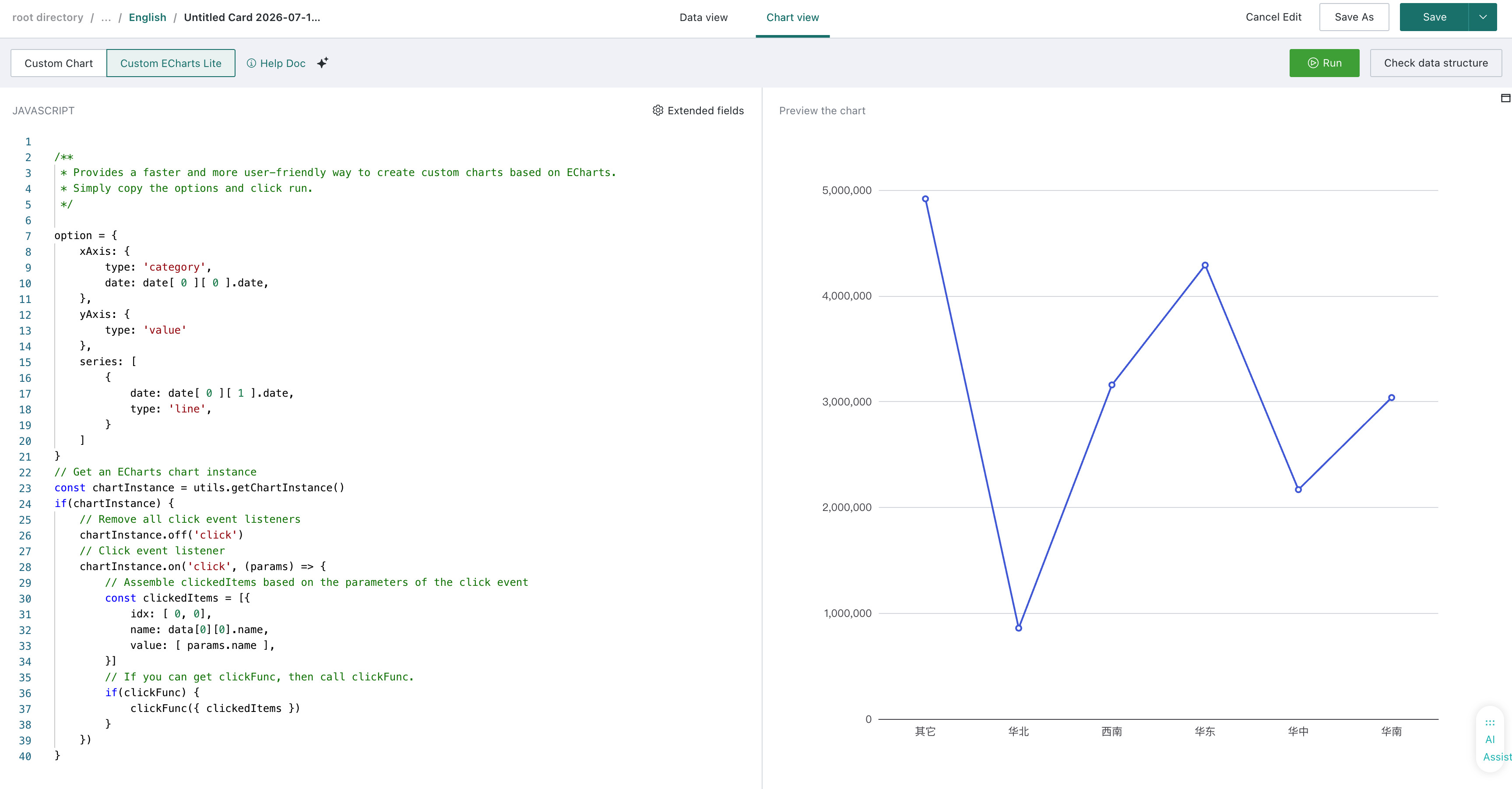
Using Data Format
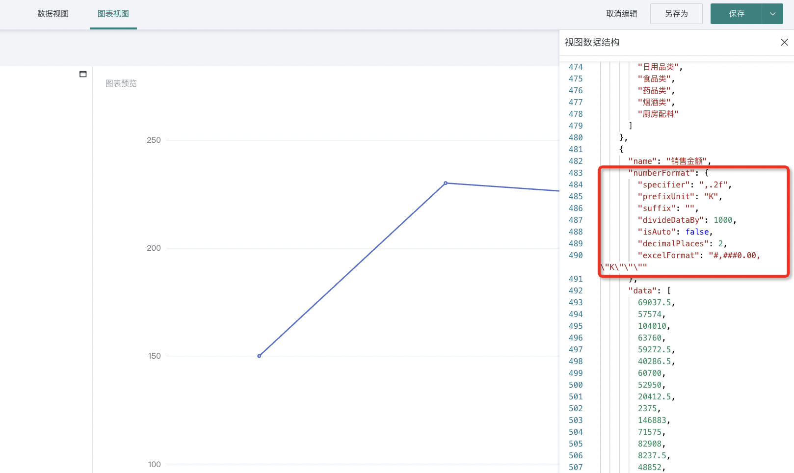
1. Set the data format of numeric fields in the "Data View", and you can view the formatting result from the table.
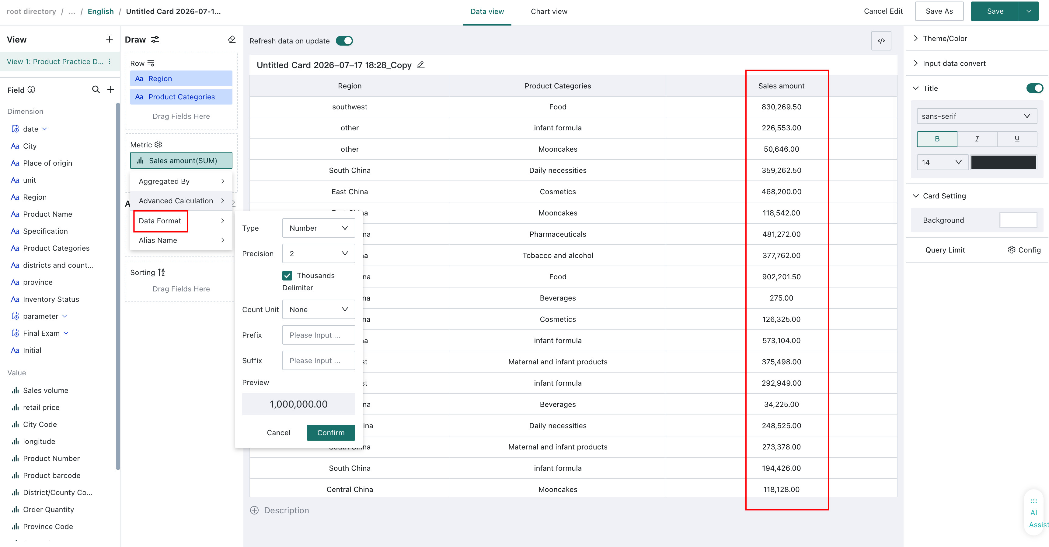
2. In the "Chart View", you can view the view data structure to see the configuration corresponding to the current data format setting.
3. Use the provided utility function utils.numberFormat to format the corresponding data using the current data format settings.
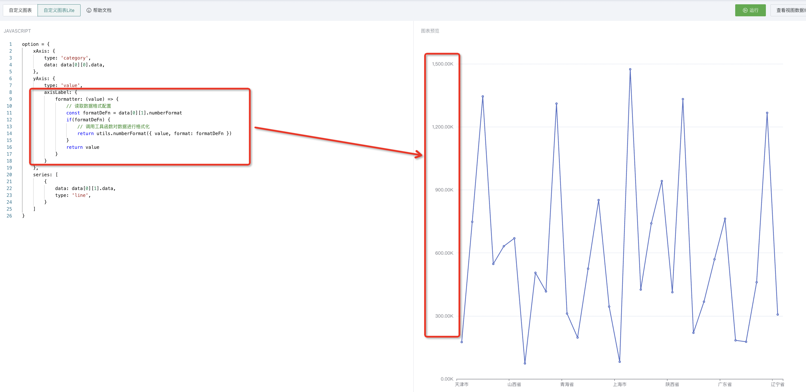
The corresponding code is as follows:
option = {
    xAxis: {
        type: 'category',
        data: data[0][0].data,
    },
    yAxis: {
        type: 'value',
        axisLabel: {
            formatter: (value) => {
                // Read data format configuration
                const formatDeFn = data[0][1].numberFormat
                if(formatDeFn) {
                    // Call utility function to format data
                    return utils.numberFormat({ value, format: formatDeFn })
                }
                return value
            }
        }
    },
    series: [
        {
            data: data[0][1].data,
            type: 'line',
        }
    ]
}
ECharts Configuration Properties
Since ECharts has default style configurations, simple use can be achieved by setting axes (xAxis and yAxis) and series.
If style optimization is needed, you need to set properties according to the Configuration Tutorial. Below are explanations for some settings.
-
legend: Legend
- left, top, right, bottom : Set the distance of the legend from the container
-
grid: Drawing grid. When drawing based on multiple grids, you need to set the drawing grid properties for each chart
-
left, top, right, bottom: Set the distance of the drawing grid from the container
-
width, height: Set the width and height of the drawing grid
-
containLable: Whether the grid area contains the axis tick labels. When true, it is commonly used to "prevent label overflow"
-
-
xAxis/yAxis : x-axis / y-axis of grid
-
gridIndex: The index of the grid it belongs to. Needs to be set when there are multiple grids
-
axisLabel
-
rotate: Rotation angle of tick labels. Can be set to prevent label overlap when display space is insufficient
-
hideOverlap: Hide overlapping labels
- boundaryGap: Blank strategy on both sides of the axis. Note that the behavior differs between category and non-category axes. Also invalid when min and max are set
- For non-category axes, boundaryGap needs to be an array containing two values, representing the extension range of the data minimum and maximum values respectively. That is, if boundaryGap is set to [ 0.5, 1], and the data range is [ 50, 120], then the final range is [ 50 - 0.5 * 50, 120 + 1 * 120], which is [ 25, 240]
-
-
toolbox: Toolbar, built-in tools such as "Export Image", "Data Area Zoom", etc.
Drawing Example
The following steps will show you how to draw a Nightingale Rose Chart step by step through "Custom Chart Lite".
Step1. Data Preparation
-
Click "New Card" in the upper right corner of the Dashboard, select "Custom Chart", and choose a dataset.
-
Enter the custom chart editing page, select data in the "Data View". Here we choose two fields: "Region" and "Sales Amount".
-
Switch views, click the top of the page to switch from "Data View" to "Chart View". Select "Custom Chart Lite" in the upper left corner, click "Switch" in the popup, and enter "Custom Chart Lite" mode.
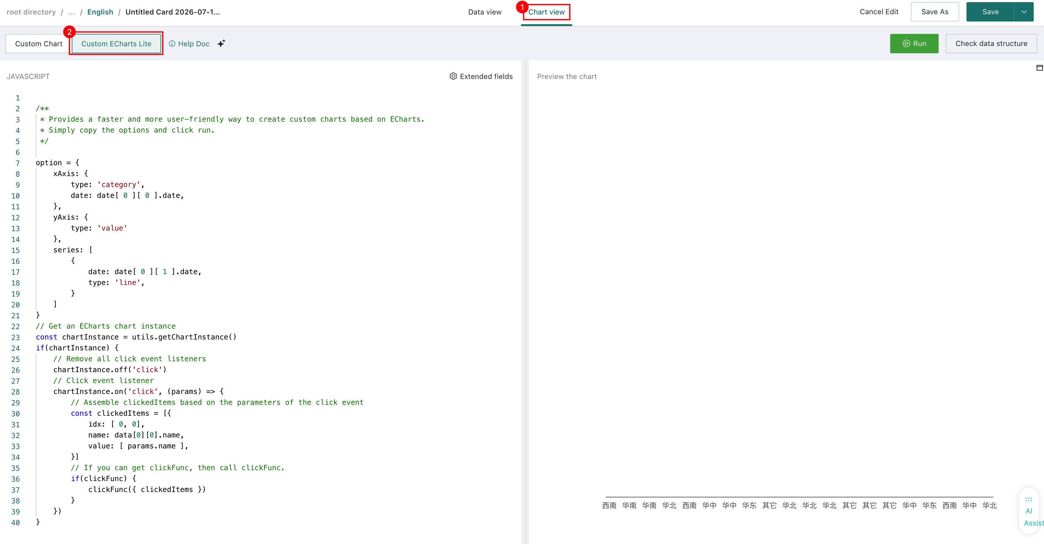
Step2: Chart Creation
In "Custom Chart Lite" mode, a line chart with mock data is displayed on the right side of the interface by default. Next, we need to replace it with our desired chart and data.
-
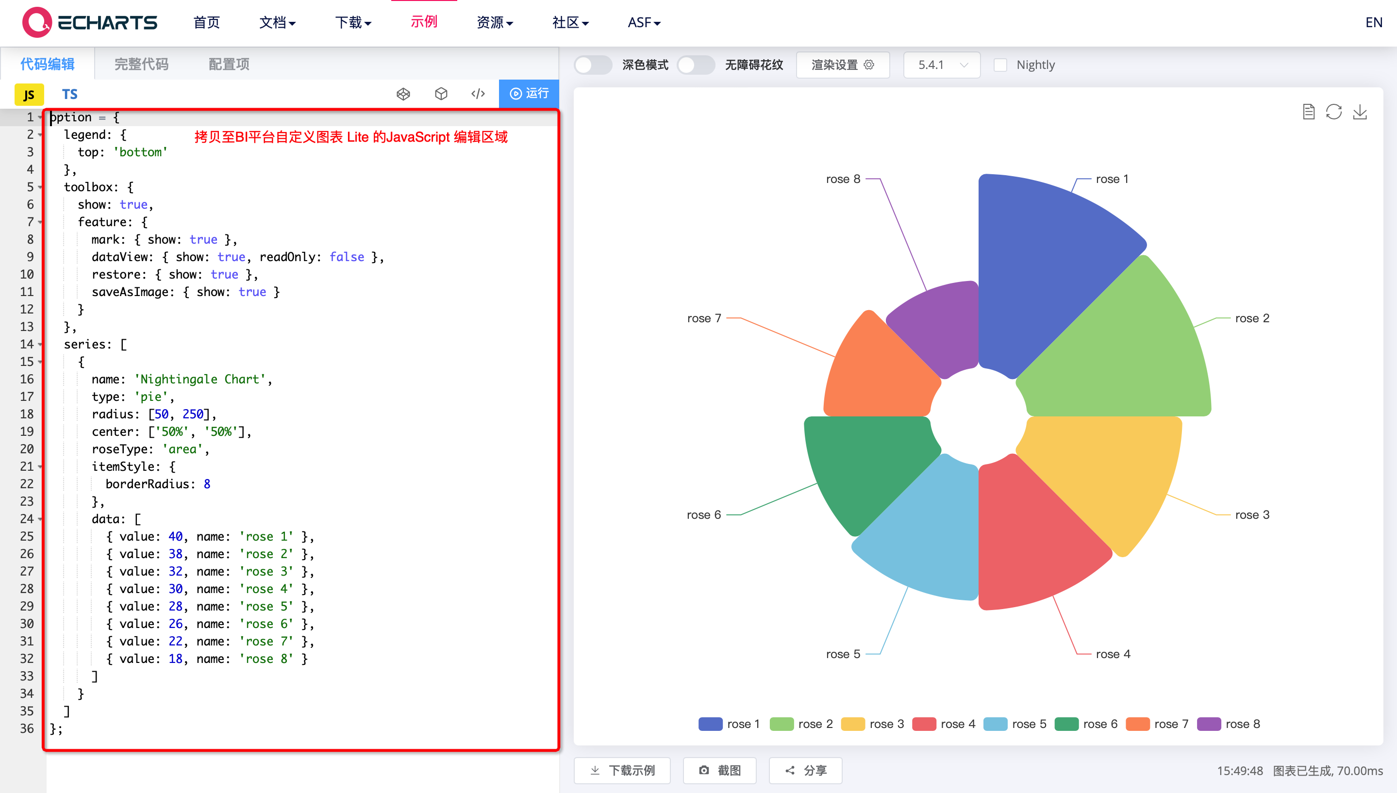
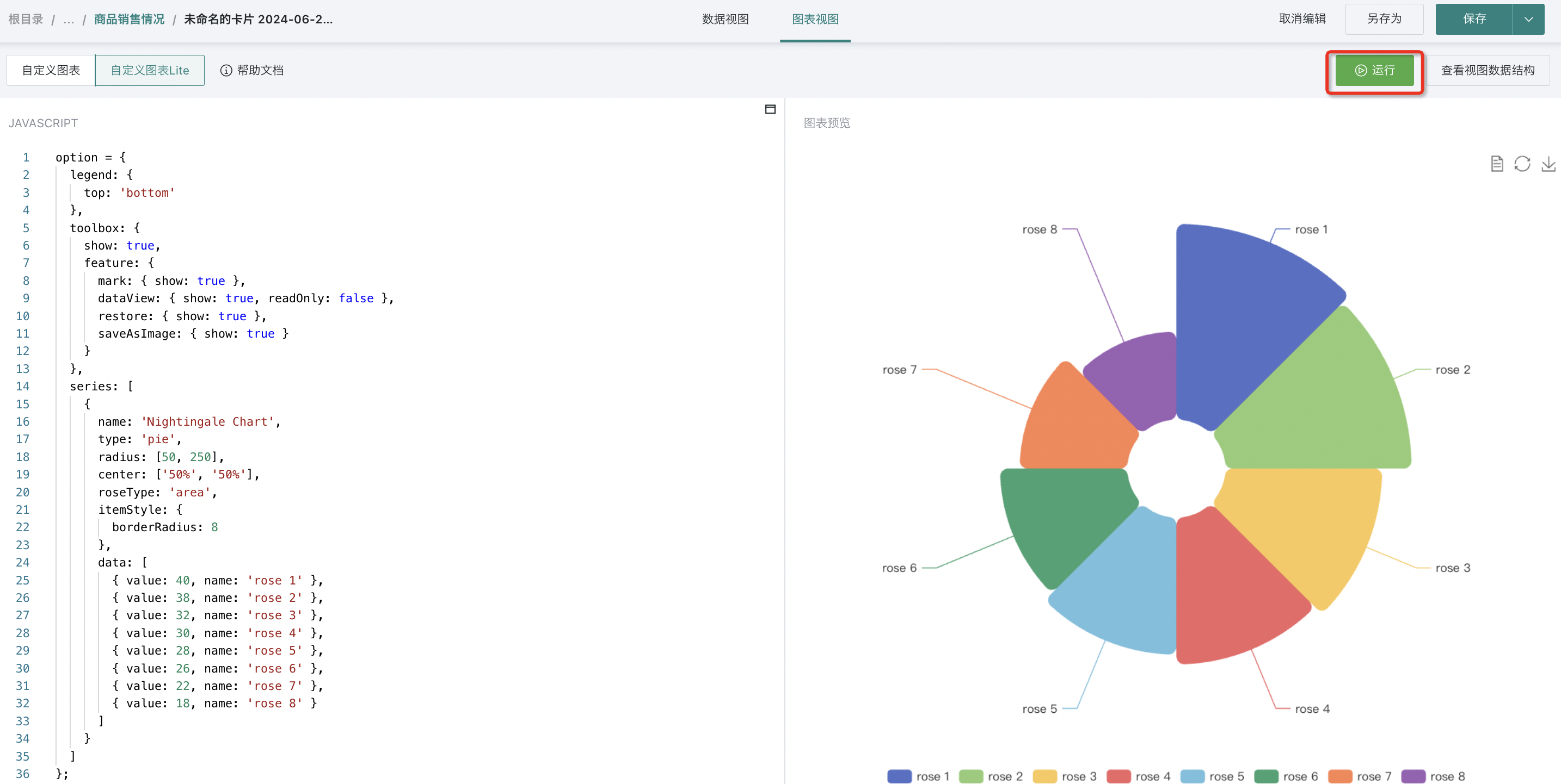
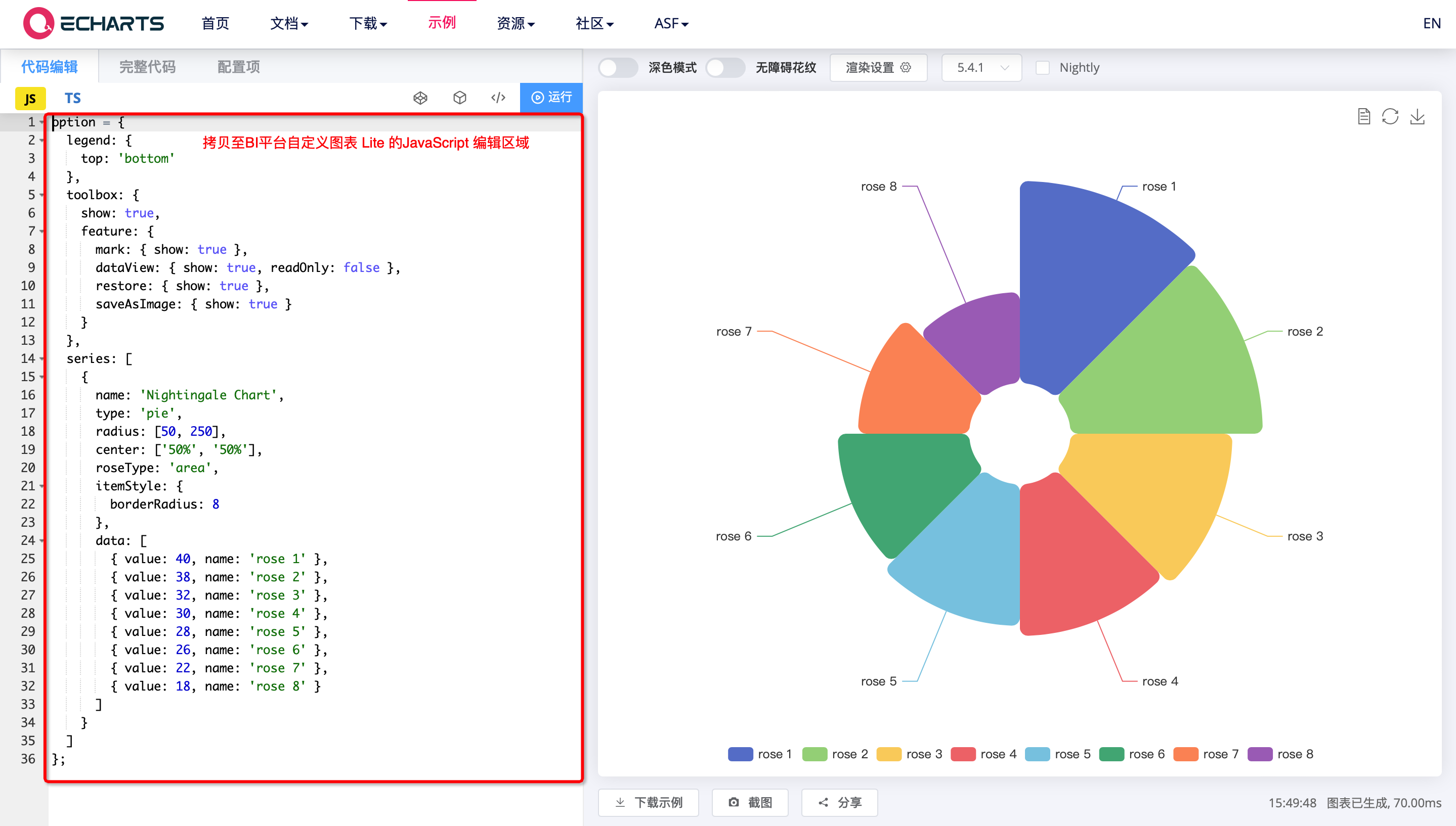
Open the Nightingale Rose Chart official example, copy the corresponding option from the left side to the BI platform's chart editing area.
-
Click "Run", the display effect is as follows:
-
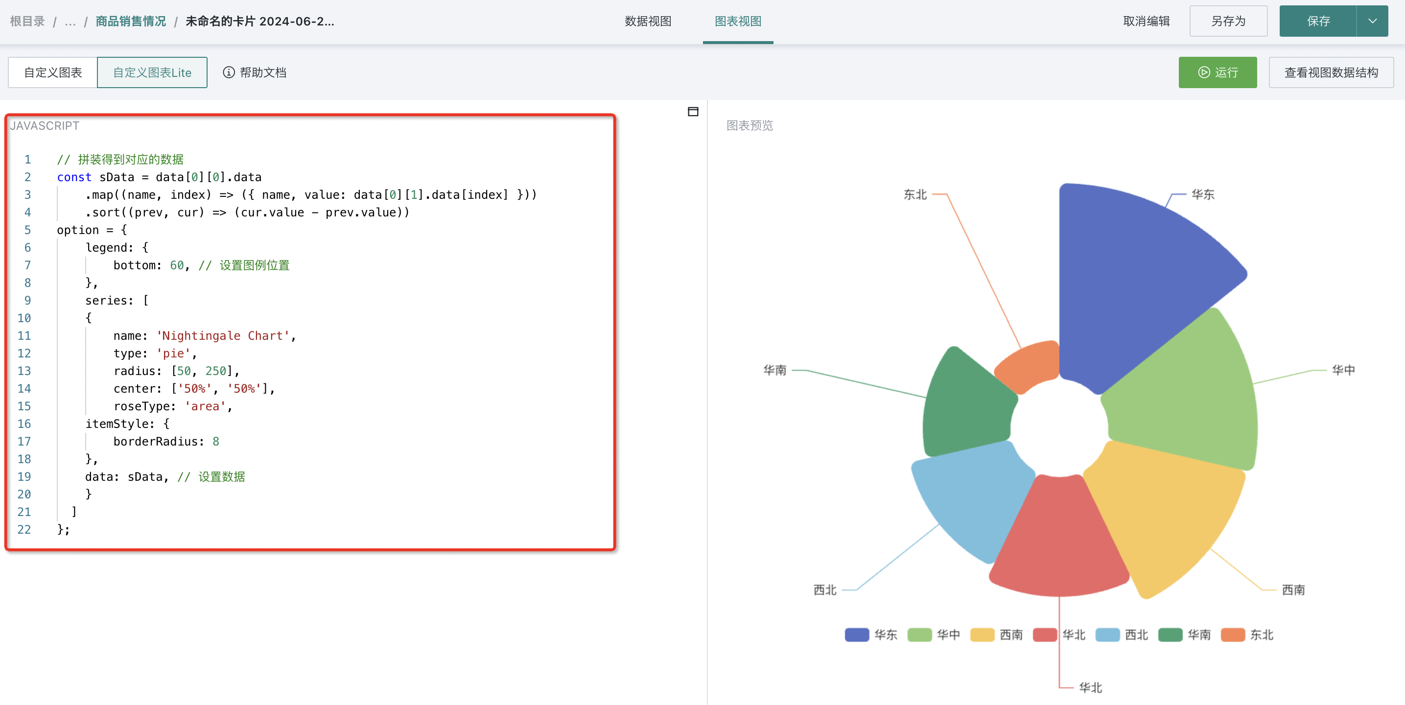
At this point, the data in the chart area is still simulated data. We need to replace the data with the data selected in the "Data View", so we also need to modify the JAVASCRIPT code on the left side. The example code is as follows:
// Assemble corresponding data
const sData = data[0][0].data
    .map((name, index) => ({ name, value: data[0][1].data[index] }))
    .sort((prev, cur) => (cur.value - prev.value))
option = {
    legend: {
        bottom: 60, // Set legend position
    },
    series: [
    {
        name: 'Nightingale Chart',
        type: 'pie',
        radius: [50, 250],
        center: ['50%', '50%'],
        roseType: 'area',
    itemStyle: {
        borderRadius: 8
    },
    data: sData, // Set data
    }
  ]
};
Step3: Result Display
After modification is complete, click "Run" to complete the creation of the "Nightingale Rose Chart". The display effect is as follows:
More Sample Code
Below, using the antv-g2 dynamic chart as an example, we briefly explain how to combine third-party chart libraries and existing datasets to generate a cool chart.
-
First, we need to introduce a third-party visualization library in the page. We need to find similar CDN or other online resources and introduce them in the HTML block through
. For specific operation details, refer to antv-g2 browser introduction method.
-
Transplant the JavaScript implementation part of the chart into the area between "Custome Code Start" and "Custom Code End", click "Run" to move the graphic into the BI platform as-is.
-
You can see that this chart needs three types of data (province, year, value). In the data view, we also need to add 2 dimensions and 1 measure (filtering and sorting can be done when necessary). In Step 2, we have prepared a set of data for "Date (Quarter) + Region + Sales Amount". At this point, we need to transform the data passed by renderChart into the data structure required by the antv-g2 dynamic chart.
-
Then adjust the chart configuration according to your needs, and a cool chart is generated.
The last line of JavaScript code new GDPlugin().init(renderChart) will ensure that renderChart is re-executed every time the data changes. Therefore, it is recommended not to place one-time constructions such as new chart that are used continuously inside renderChart.
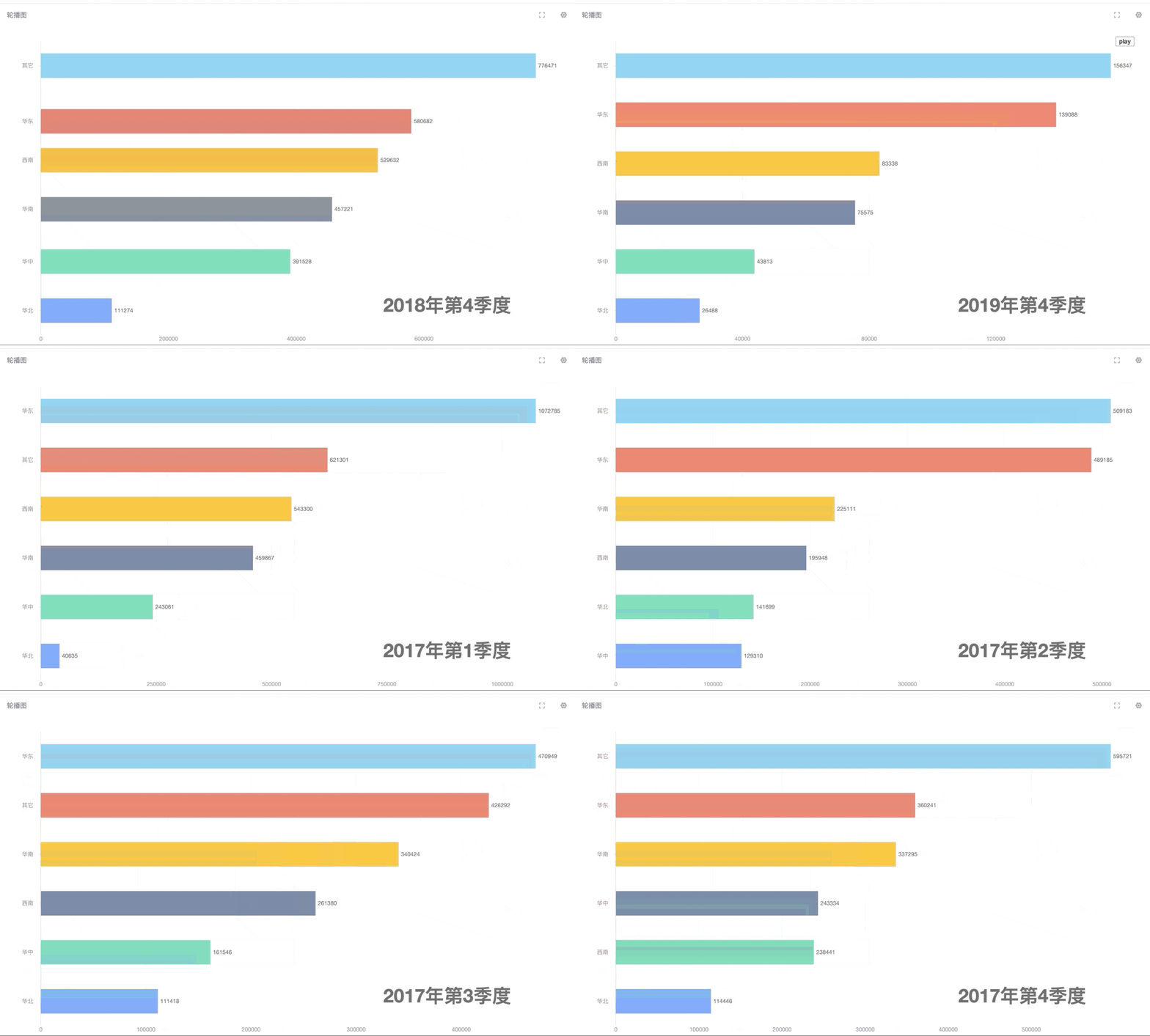
Below, we provide sample code implementations of the above "Bar Scrolling Carousel Chart" using AntV G2, Highcharts, and eCharts for your reference.
AntV G2 Implementation
a. HTML Code Block

b. CSS Code Block
#container {
    width: 100%;
    height: 100%;
    overflow: auto;
    font-size: 12px;
    color: #343d50;
}
.replay {
    position: fixed;
    top: 10px;
    right: 10px;
}
c. Javascript Code Block
var config = {
  loop: false, // Whether to loop playback false: do not loop true: loop (boolean, no quotes needed)
  interval: 1200, // Carousel interval time, default is 1200ms, less than 1000ms will be counted as 1000ms (number, no quotes needed)
  sort: 'asc', // Chart sorting method asc: ascending desc: descending (default) with lower left corner as origin (string, needs English quotes)
  type: 'bar', // bar: bar chart column: column chart (string, needs English quotes)
  showCount: Infinity, // Infinity: show all (default), when a number such as 10, it means the chart displays a maximum of 10 categories (number, no quotes needed)
  textStyle: { // Dynamic dimension
    fontSize: 40, // Font size (number, no quotes needed)
    fontWeight: 'bold', // Font weight bold: bold (default) normal: not bold (string, needs English quotes)
    color: '#ddd', // Font color (string, needs English quotes)
  },
  padding: [ 20, 60, 20, 60 ], // Spacing between chart area and container edges: top right bottom left, mainly to make room for axis category labels
  colors10: [
    '#5B8FF9',
    '#5AD8A6',
    '#5D7092',
    '#F6BD16',
    '#E86452',
    '#6DC8EC',
    '#945FB9',
    '#FF9845',
    '#1E9493',
    '#FF99C3',
  ], // Category color palette, used when category count is less than or equal to 10
  colors20: [
    '#5B8FF9',
    '#CDDDFD',
    '#5AD8A6',
    '#CDF3E4',
    '#5D7092',
    '#CED4DE',
    '#F6BD16',
    '#FCEBB9',
    '#E86452',
    '#F8D0CB',
    '#6DC8EC',
    '#D3EEF9',
    '#945FB9',
    '#DECFEA',
    '#FF9845',
    '#FFE0C7',
    '#1E9493',
    '#BBDEDE',
    '#FF99C3',
    '#FFE0ED',
  ], // Category color palette, used when category count is less than 20
}
var sortIsDesc = config.sort === 'desc'
var typeIsBar = config.type === 'bar'
var Chart = G2.Chart
var registerAnimation = G2.registerAnimation
registerAnimation('label-appear', function (element, animateCfg, cfg) {
  var label = element.getChildren()[0];
  var coordinate = cfg.coordinate;
  var startX = coordinate.start.x;
  var finalX = label.attr('x');
  var labelContent = label.attr('text');
  label.attr('x', startX);
  label.attr('text', 0);
  var distance = finalX - startX;
  label.animate(function (ratio) {
    var position = startX + distance * ratio;
    var text = (labelContent * ratio).toFixed(0);
    return {
      x: position,
      text: text,
    };
  }, animateCfg);
});
registerAnimation('label-update', function (element, animateCfg, cfg) {
  var startX = element.attr('x');
  var startY = element.attr('y');
  var finalX = cfg.toAttrs.x;
  var finalY = cfg.toAttrs.y;
  var labelContent = element.attr('text');
  // @ts-ignore
  var finalContent = cfg.toAttrs.text;
  var distanceX = finalX - startX;
  var distanceY = finalY - startY;
  var numberDiff = +finalContent - +labelContent;
  element.animate(function (ratio) {
    var positionX = startX + distanceX * ratio;
    var positionY = startY + distanceY * ratio;
    var text = (+labelContent + numberDiff * ratio).toFixed(0);
    return {
      x: positionX,
      y: positionY,
      text: text,
    };
  }, animateCfg);
});
function transformData (data) {
    var result = {}
    var q = data[0]
    var zones = data[1]
    var values = data[2]
    q.data.forEach(function (item, index) {
        if (result[item]) {
            result[item].push({ value: values.data[index], zone: zones.data[index] })
        } else { result[item] = [{ value: values.data[index], zone: zones.data[index] }] }
    })
    return result
}
function handleData(source) {
  source.sort(function (a, b) {
    if (sortIsDesc) {
      return b.value - a.value;
    } else {
      return a.value - b.value
    }
  });
  return source;
}
function setAnnotation (chart, content) {
  var position = ['90%', '90%']
  var textAlign = 'start'
  switch (true) {
    case typeIsBar && !sortIsDesc:
      position = ['95%', '90%']
      textAlign = 'end'
      break
    case !typeIsBar && !sortIsDesc:
      position = ['5%', '10%']
      break
    case !typeIsBar && sortIsDesc:
      position = ['95%', '10%']
      textAlign = 'end'
      break
    case typeIsBar && sortIsDesc:
    default:
      position = ['95%', '10%']
      textAlign = 'end'
  }
  config.textStyle.textAlign = textAlign
  chart.annotation().text({
    position: position,
    content: content,
    style: config.textStyle,
    animate: false,
  });
}
var $replay = document.querySelector('.replay')
var chart = new Chart({
  container: 'container',
  autoFit: true,
  height: 500,
  padding: config.padding,
});
var interval
function countUp() {
  var dataSource = countUp.dataSource
  var count = countUp.count
  var data = handleData(Object.values(dataSource)[count]).slice(0, config.showCount)
  var colors = data.length <= 10 ? config.colors10 : config.colors20
  var text = Object.keys(dataSource)[count]
  if (count === 0 && !countUp.once) {
    chart.data(data);
    // Horizontal bar chart or vertical bar chart
    if (typeIsBar) {
      chart.coordinate('rect').transpose();
    }
    chart.legend(false);
    chart.tooltip(false);
    chart.axis('zone', {
      animateOption: {
        update: {
          duration: 1000,
          easing: 'easeLinear'
        }
      }
    });
    setAnnotation(chart, text)

    chart
      .interval()
      .position('zone*value')
      .color('zone', colors)
      .label('value', function (value) {
        return {
          animate: {
            appear: {
              animation: 'label-appear',
              delay: 0,
              duration: 1000,
              easing: 'easeLinear'
            },
            update: {
              animation: 'label-update',
              duration: 1000,
              easing: 'easeLinear'
            }
          },
          offset: 5,
        };
      }).animate({
        appear: {
          duration: 1000,
          easing: 'easeLinear'
        },
        update: {
          duration: 1000,
          easing: 'easeLinear'
        }
      });
    countUp.once = true
    chart.render();
  } else {
    chart.annotation().clear(true);
    setAnnotation(chart, text)
    chart.changeData(data);
  }
  ++countUp.count;
  if (countUp.count === Object.keys(dataSource).length) {
    if (config.loop) {
      countUp.count = 0
    } else {
        clearInterval(interval);
        $replay.style.display = 'block'
    }
  }
}
function replay () {
  $replay.style.display = 'none'
  clearInterval(interval)
  countUp.count = 0
  countUp()
  interval = setInterval(countUp, config.interval)
}
window.addEventListener('load', function () {
  $replay.addEventListener('click', replay)
})
window.addEventListener('unload', function() {
  $replay.removeEventListener('click', replay)
});

function renderChart (data) {
    if (!data) return
    countUp.dataSource = transformData(data[0])
    replay()
}
new GDPlugin().init(renderChart)
Highcharts Implementation
The Highcharts version is the same as AntV G2 except for JavaScript (data view dimension and measure definitions, CSS code block). In terms of config, padding is missing (because Highcharts can automatically adjust spacing based on label length).
a. HTML Code Block

b. CSS Code Block
#container {
    width: 100%;
    height: 100%;
    overflow: auto;
    font-size: 12px;
    color: #343d50;
}
.replay {
    position: fixed;
    top: 10px;
    right: 10px;
}
c. JavaScript Code Block
var config = {
  loop: false, // Whether to loop playback false: do not loop true: loop (boolean, no quotes needed)
  interval: 1200, // Carousel interval time, default is 1200ms, less than 1000ms will be counted as 1000ms (number, no quotes needed)
  sort: 'asc', // Chart sorting method asc: ascending desc: descending (default) with lower left corner as origin (string, needs English quotes)
  type: 'bar', // bar: bar chart column: column chart (string, needs English quotes)
  showCount: Infinity, // Infinity: show all (default), when a number such as 10, it means the chart displays a maximum of 10 categories (number, no quotes needed)
  textStyle: { // Dynamic dimension
    fontSize: 40, // Font size (number, no quotes needed)
    fontWeight: 'bold', // Font weight bold: bold (default) normal: not bold (string, needs English quotes)
    color: '#ddd', // Font color (string, needs English quotes)
  },
  colors10: [
    '#5B8FF9',
    '#5AD8A6',
    '#5D7092',
    '#F6BD16',
    '#E86452',
    '#6DC8EC',
    '#945FB9',
    '#FF9845',
    '#1E9493',
    '#FF99C3',
  ], // Category color palette, used when category count is less than or equal to 10
  colors20: [
    '#5B8FF9',
    '#CDDDFD',
    '#5AD8A6',
    '#CDF3E4',
    '#5D7092',
    '#CED4DE',
    '#F6BD16',
    '#FCEBB9',
    '#E86452',
    '#F8D0CB',
    '#6DC8EC',
    '#D3EEF9',
    '#945FB9',
    '#DECFEA',
    '#FF9845',
    '#FFE0C7',
    '#1E9493',
    '#BBDEDE',
    '#FF99C3',
    '#FFE0ED',
  ], // Category color palette, used when category count is less than 20
}
function transformData (data) {
    var result = {}
    var q = data[0]
    var zones = data[1]
    var values = data[2]

    q.data.forEach(function (item, index) {
        if (result[item]) {
            result[item].push([ zones.data[index], values.data[index] ])
        } else { result[item] = [[ zones.data[index], values.data[index] ]] }
    })
    return result
}
var sortIsDesc = config.sort === 'desc'
var typeIsBar = config.type === 'bar'
function getPosition (chart, label) {
    var x
    var y
    switch (true) {
        case typeIsBar && !sortIsDesc:
            x = chart.plotWidth + chart.plotLeft - label.width - 10
            y = chart.plotHeight + chart.plotTop - label.height - 10
            break
        case !typeIsBar && !sortIsDesc:
            x = chart.plotLeft + 10
            y = chart.plotTop + 10
            break
        case !typeIsBar && sortIsDesc:
            x = chart.plotWidth + chart.plotLeft - label.width - 10
            y = chart.plotTop + 10
            break
        case typeIsBar && sortIsDesc:
        default:
            x = chart.plotWidth + chart.plotLeft - label.width - 10
            y = chart.plotTop + 10
    }
    return {
        x: x,
        y: y,
    }
}
var chart = Highcharts.chart('container', {
    plotOptions: {
        bar: {
            colorByPoint: true,
        },
        column: {
            colorByPoint: true,
        },
    },
    chart: {
        type: config.type,
        marginLeft: 100,

    },
    title: {
        text: '',
    },
    yAxis: {
        title: {
            text: ''
        },
    },
    xAxis: {
        type: 'category',
        labels: {
            animate: true
        },
        reversed: config.sort === 'asc',
    },
    tooltip: {
        enabled: false,
    },
    legend: {
        enabled: false
    },
    series: [{
        dataLabels: {
            enabled: true,
            format: '{y:,.0f}'
        },
        dataSorting: {
            enabled: true,
            sortKey: 'y'
        },
        data: [],

    }]
});
var interval
var label
window.addEventListener('load', function () {
  document.querySelector('.replay').addEventListener('click', replay)
})
window.addEventListener('unload', function() {
  document.querySelector('.replay').removeEventListener('click', replay)
});
function replay () {
  document.querySelector('.replay').style.display = 'none'
  clearInterval(interval)
  countUp.count = 0
  countUp()
}
function countUp () {
    var count = countUp.count
    var dataSource = countUp.dataSource

    var textData = Object.keys(dataSource)

    var seriesData = Object.values(dataSource)

    var length = seriesData.length
    if (countUp.label) countUp.label.destroy()
    countUp.label = chart.renderer.label(textData[count], null, null).add()
    countUp.label.css({
        fontSize: `${config.textStyle.fontSize}px`,
        fontWeight: config.textStyle.fontWeight,
        color: config.textStyle.color,
    }).attr(getPosition(chart, countUp.label))
    var colors = seriesData[0].slice(0, config.showCount).length <= 10 ? config.colors10 : config.colors20
    Highcharts.setOptions({ colors: colors })
    chart.series[0].setData(
        seriesData[countUp.count].map(function (item) { return item.slice(0) }).slice(0, config.showCount),
        true,
        { duration: 1000 }
    )
    ++countUp.count
    interval = setInterval(function () {
        countUp.label.attr({
            text: textData[countUp.count]
        })
        chart.series[0].setData(
            seriesData[countUp.count].map(function (item) { return item.slice(0) }).slice(0, config.showCount),
            true,
            { duration: 1000 }
        )
        ++countUp.count
        if (countUp.count === length) {
            if (config.loop) {
                countUp.count = 0
            } else {
                clearInterval(interval)
                document.querySelector('.replay').style.display = 'block'
            }
        }
    }, config.interval < 1000 ? 1000 : config.interval)
}
function renderChart (data) {
    if (!data) return null
    countUp.dataSource = transformData(data[0])
    replay()
}
new GDPlugin().init(renderChart)
ECharts Implementation
The difference between Echarts and AntV G2 is that the configuration currently does not have a column chart form (type = 'column'), no padding, and the play button is always present when not looping infinitely.
a. HTML Code Block

b. CSS Code Block
#container {
    width: 100%;
    height: 100%;
    overflow: auto;
    font-size: 12px;
    color: #343d50;
}
.replay {
    position: fixed;
    top: 10px;
    right: 10px;
}
c. JavaScript Code Block
var config = {
  loop: false, // Whether to loop playback false: do not loop true: loop (boolean, no quotes needed)
  interval: 1200, // Carousel interval time, default is 1200ms (number, no quotes needed)
  sort: 'asc', // Chart sorting method asc: ascending desc: descending (default) with lower left corner as origin (string, needs English quotes)
  showCount: Infinity, // Infinity: show all (default), when a number such as 10, it means the chart displays a maximum of 10 categories (number, no quotes needed)
  textStyle: { // Dynamic dimension
    fontSize: 40, // Font size (number, no quotes needed)
    fontWeight: 'bold', // Font weight bold: bold (default) normal: not bold (string, needs English quotes)
    color: '#ddd', // Font color (string, needs English quotes)
  },
  colors10: [
    '#5B8FF9',
    '#5AD8A6',
    '#5D7092',
    '#F6BD16',
    '#E86452',
    '#6DC8EC',
    '#945FB9',
    '#FF9845',
    '#1E9493',
    '#FF99C3',
  ], // Category color palette, used when category count is less than or equal to 10
  colors20: [
    '#5B8FF9',
    '#CDDDFD',
    '#5AD8A6',
    '#CDF3E4',
    '#5D7092',
    '#CED4DE',
    '#F6BD16',
    '#FCEBB9',
    '#E86452',
    '#F8D0CB',
    '#6DC8EC',
    '#D3EEF9',
    '#945FB9',
    '#DECFEA',
    '#FF9845',
    '#FFE0C7',
    '#1E9493',
    '#BBDEDE',
    '#FF99C3',
    '#FFE0ED',
  ], // Category color palette, used when category count is less than 20
}
var sortIsDesc = config.sort === 'desc'
function transformData (data) {
    var result = {}
    var q = data[0]
    var zones = data[1]
    var values = data[2]
    q.data.forEach(function (item, index) {
        if (result[item]) {
            result[item].push({ value: values.data[index], name: zones.data[index] })
        } else { result[item] = [{ value: values.data[index], name: zones.data[index] }] }
    })
    return result
}
function handleData(source) {
  source.sort(function (a, b) {
    return a.value - b.value
  });
  return source;
}
function getPosition () {
  var left
  var top
  var bottom
  switch (true) {
      case !sortIsDesc:
          right = 10
          bottom = 20
          break
      case sortIsDesc:
      default:
          right = 10
          top = 10
  }
  return {
      right: right,
      top: top,
      bottom: bottom,
  }
}
var position = getPosition()
var $replay = document.querySelector('.replay')
var myChart = echarts.init(document.getElementById('container'))
var option = {
  baseOption: {
    animationDurationUpdate: 1000,
    animationEasingUpdate: 'quinticInOut',
    title: {
      textStyle: config.textStyle,
      right: position.right,
      top: position.top,
      bottom: position.bottom,
    },
    timeline: {
        data: [],
        axisType: 'category',
        autoPlay: true,
        show: false,
        playInterval: config.interval,//Playback speed
        loop: config.loop,
    },
    grid: {
      left: 0,
      bottom: 0,
      top: 0,
      right: '5%',
      containLabel: true,
    },
    xAxis: {
      type: 'value'
    },
    yAxis: {
      type: 'category',
      inverse: config.sort === 'desc',
      data: [],
    },
    series: {
        name: 'Sales',
        type: 'bar',
        label: {
          show: true,
          position: 'right',
        },
        itemStyle: {
        }
    },
  },
  options: []
};
// Use the specified configuration and data to display the chart.
var $replay = document.querySelector('.replay')
function replay () {
  myChart.setOption(option, true)
}
window.addEventListener('load', function () {
  if (config.loop) {
    $replay.style.display = 'none'
  } else {
    $replay.addEventListener('click', replay)
  }

})
window.addEventListener('unload', function() {
  $replay.removeEventListener('click', replay)
});

function renderChart (data) {
    if (!data) return
    const dataSource = transformData(data[0])

    for (var dynamicVar in dataSource) {
      handleData(dataSource[dynamicVar])
      const yAxisData = dataSource[dynamicVar].map(item => item.name).slice(0, config.showCount)
      option.options.push({
        title: {
          text: dynamicVar
        },
        yAxis: {
          data: yAxisData,
        },
        series: {
          data: dataSource[dynamicVar].slice(0, config.showCount)
        }
      })
      option.baseOption.series.itemStyle.color = function (params) {
        const colors = dataSource[dynamicVar].slice(0, config.showCount).length <= 10 ? config.colors10 : config.colors20
        return colors[yAxisData.indexOf(params.name)]
      }
      option.baseOption.timeline.data.push(dynamicVar)
    }
    myChart.setOption(option);

}
new GDPlugin().init(renderChart)