Enterprise Visual
Overview
Enterprise Branding refers to the configuration and management of enterprise Pages, color schemes, and related elements so that the platform aligns with the enterprise's visual brand standards and strengthens internal brand recognition.
Usage Guide
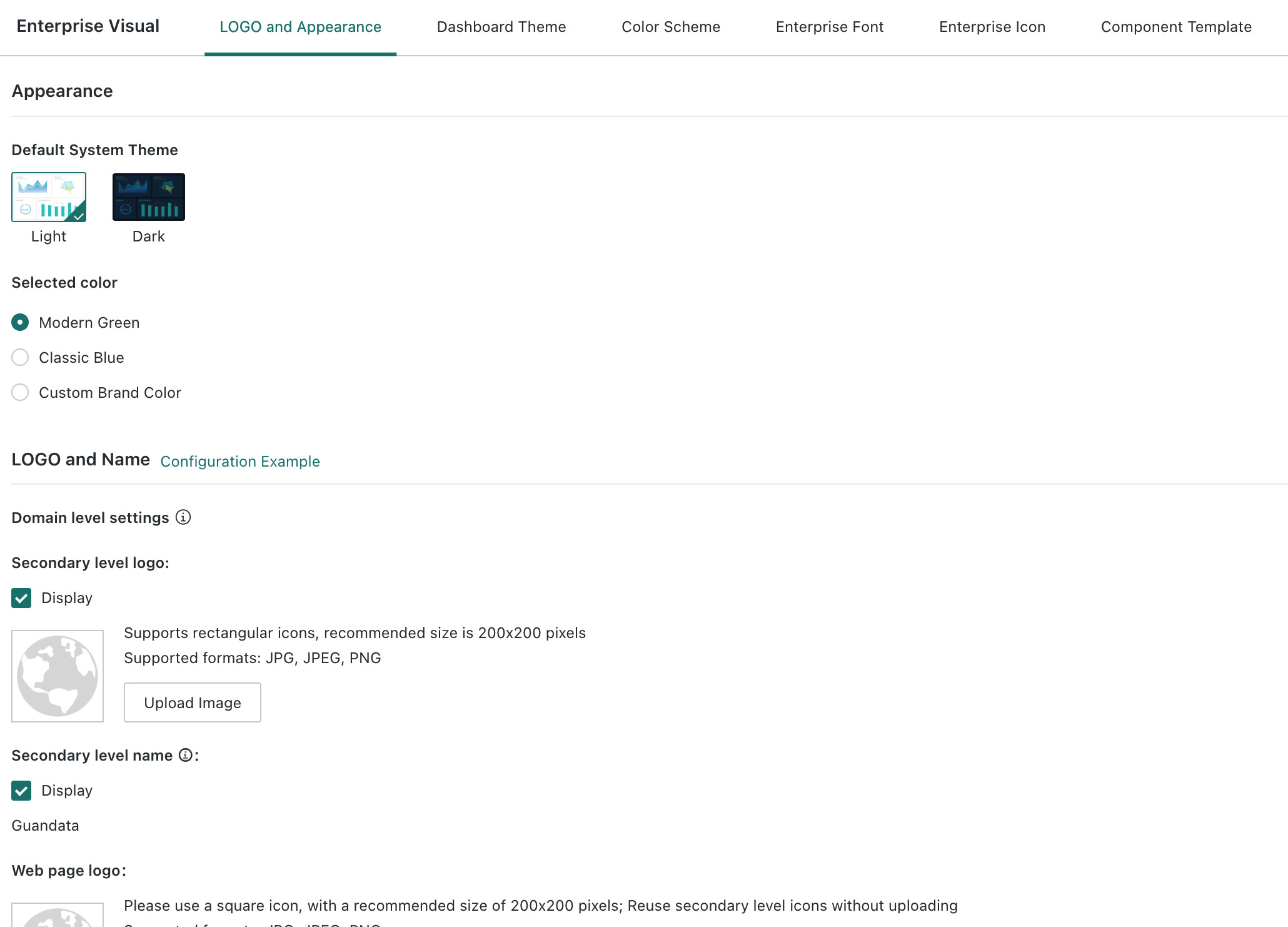
Logo and Appearance
In Enterprise Branding > Logo and Appearance, you can choose the default platform theme and color scheme, upload a favicon, modify the login page Logo and background image, and hide the vendor Logo and label.
- Changes to the login icon require a forced refresh. Other modifications take effect immediately after they are saved.
- Self-service modification requires the L1008 Login Page Customization license item to be enabled.
Dashboard Themes
Under Dashboard Themes, you can centrally manage theme Resources for Dashboards, including the six built-in Dashboard themes, themes downloaded from the marketplace, and custom themes. For details, see Page Style (Theme).
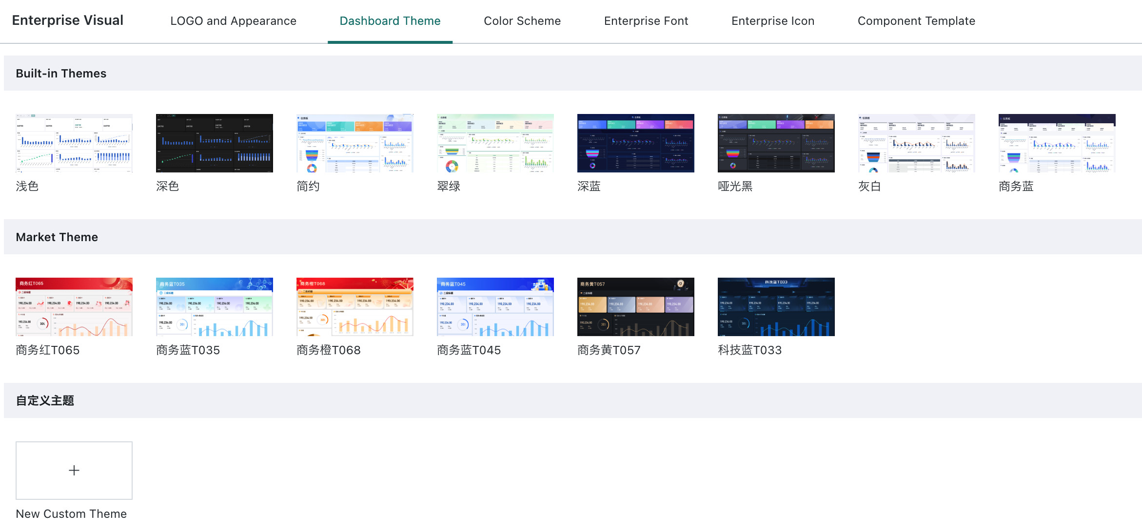
- Built-in themes support preview only.
- Themes downloaded from the marketplace support preview and deletion. Deleting them does not affect Pages that already use the theme.
- Custom themes support creation, editing, and deletion according to enterprise needs.
Color Schemes
Under Admin Center > Enterprise Configuration > Enterprise Branding > Color Schemes, you can manage color schemes.
System color schemes: can be hidden or shown, and can be set as default.Custom color schemes: can be hidden or shown, set as default, edited, migrated, or deleted.
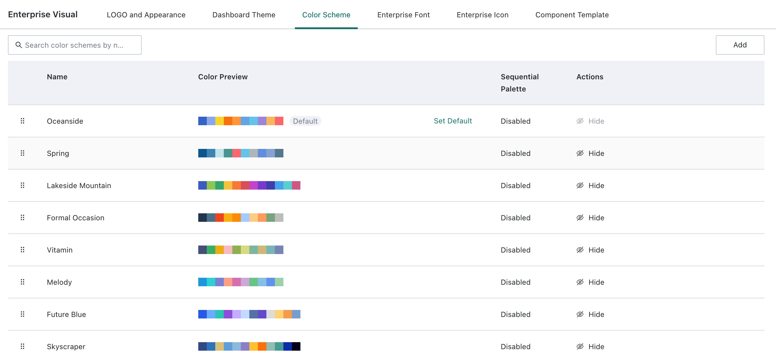
To create a custom color scheme, click Create in the upper-right corner, enter the name of the color scheme, then enter HEX color values below. Press Enter after each value and repeat to add multiple colors. After all colors are entered, click OK to save the custom color scheme.
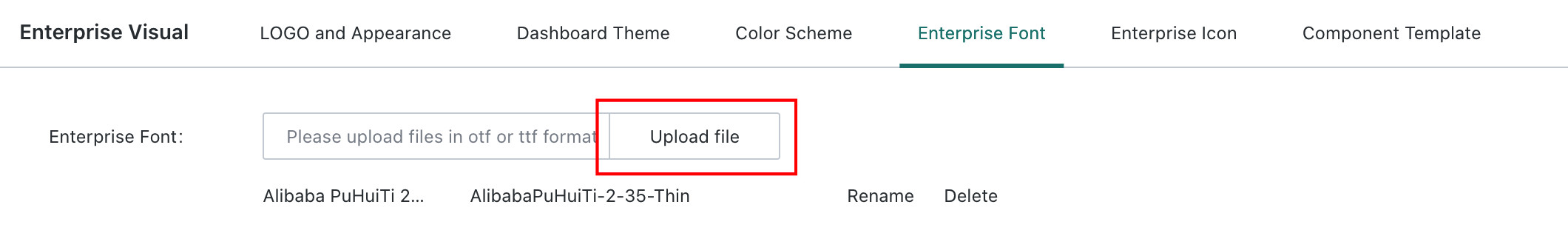
Enterprise Fonts
Under Enterprise Fonts, you can view the fonts in the enterprise domain. You can upload .otf or .ttf files to add fonts, and you can rename or delete existing font styles.
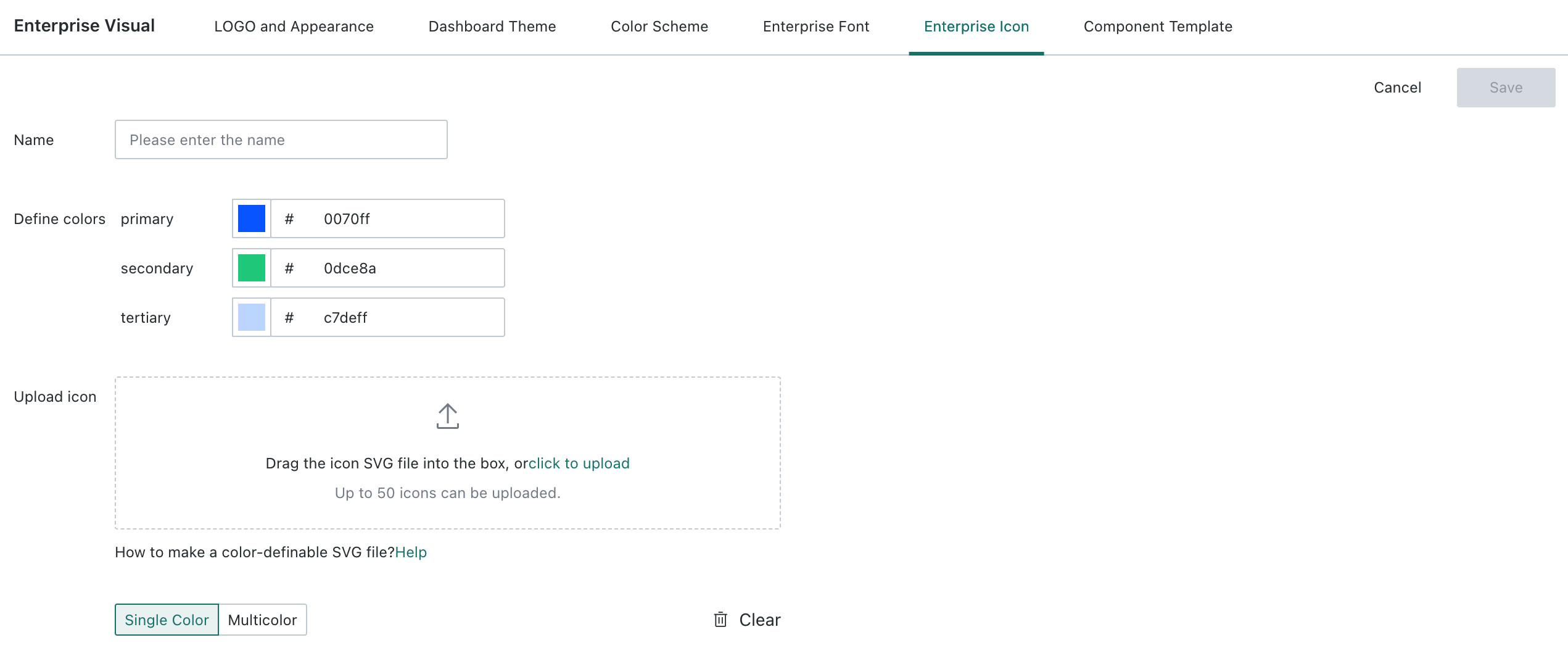
Enterprise Icons
Under Enterprise Icons, you can edit, delete, and hide existing enterprise icons.
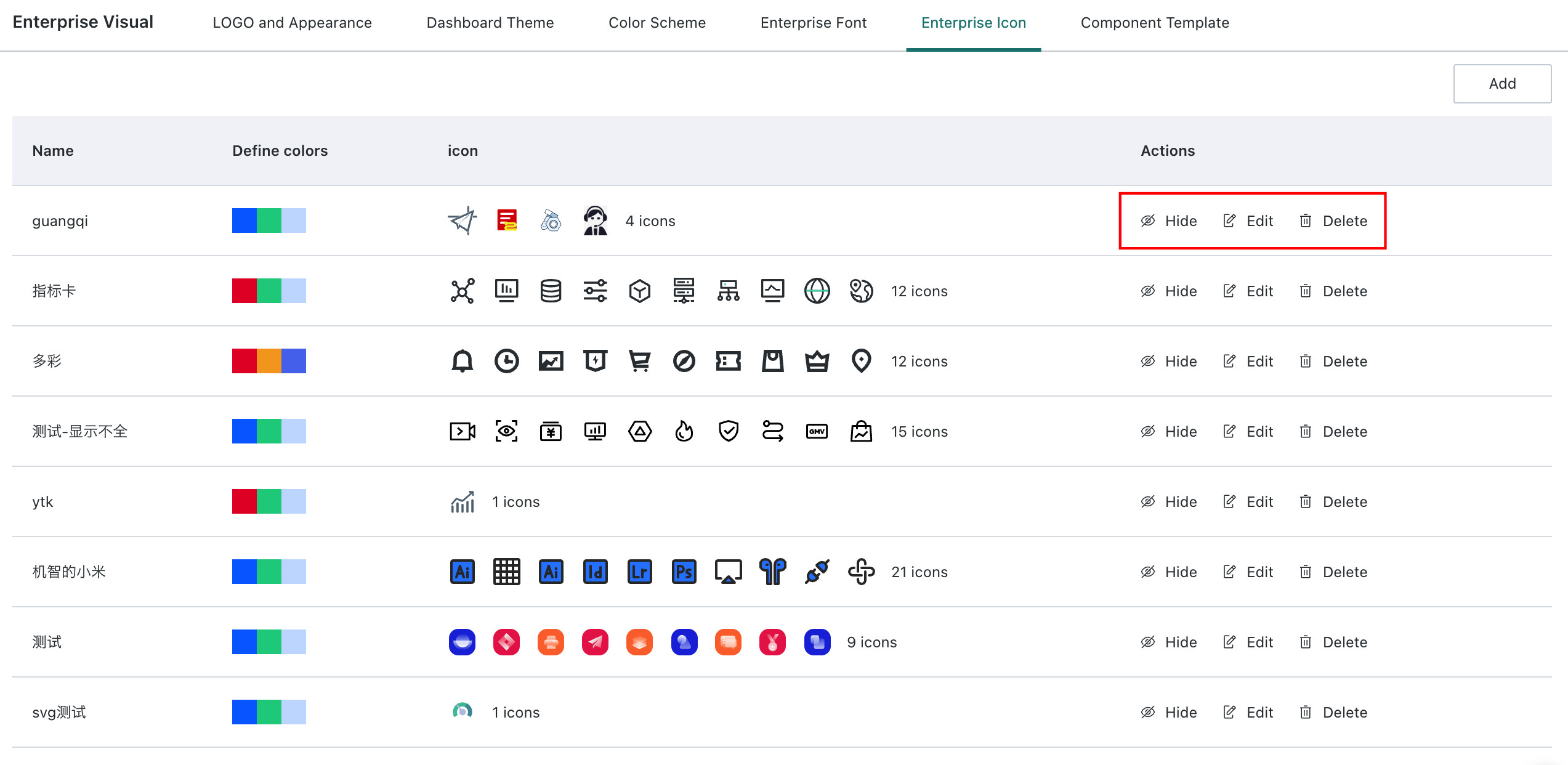
You can also click Add to upload a new enterprise icon, then click Save after completion. For icon design requirements, see Enterprise Icon Design Specifications.
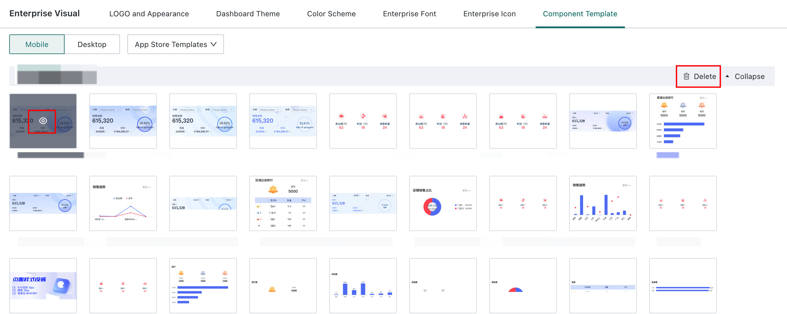
Component Templates
Under Component Templates, you can view and manage self-built templates added to Dashboards and component templates downloaded from the marketplace. For more details, see Component Template.
-
For self-built templates:
- Single template: supports rename, preview, delete, and move to the default group.
- Group: supports rename, delete, and add template.
- Other: supports adding groups.
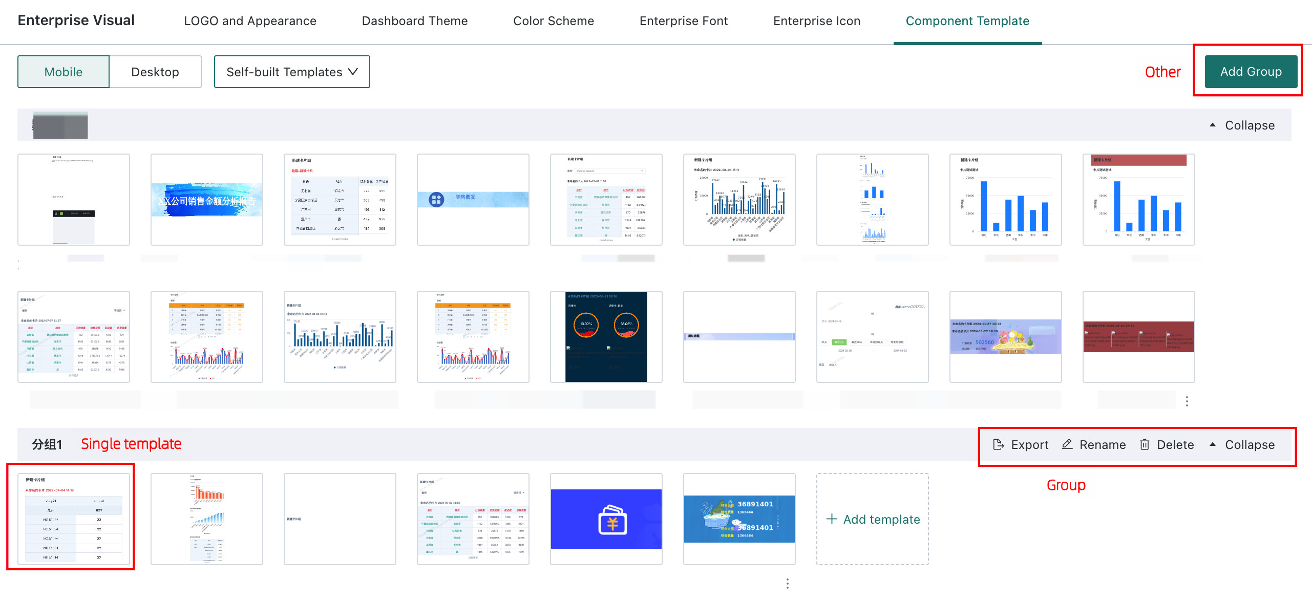
-
For marketplace templates: supports Preview and Delete Entire Group.
Enterprise Icon Design Specifications
Enterprise icon design specifications define the rules that must be followed when using enterprise icons on the platform.
Enterprise Icon Design Workflow
Set the Icon Size
When drawing icons, the recommended size is 48 × 48 px. Keep the main content within 44 × 44 px, leaving a 2 px bleed margin.
Draw the Icon
When designing icons, layers must be separated in the design software. One to three layers are supported, and they should be named primary, secondary, and tertiary to define paths whose colors can be modified. The icon style may be outline, filled, or a combination of both, but the full icon set should remain consistent in style, stroke weight, corner radius, and perspective.
.png)
Save as SVG
Save the file in SVG format and use an appropriate file name.
Enterprise Icon Design Rules
- Closed shapes: graphics must be closed, and no unclosed shapes are allowed.
.png)
- Nodes: minimize the number of nodes used in the graphic and simplify the shape by removing unnecessary nodes.
.png)
- Merge shapes: if there are two or more shapes, or shapes with Boolean relationships, merge them.
.png)
- Fill color: completed shapes must be filled with the appropriate color. Solid colors are recommended. Gradients are not currently supported.
.png)
- Size: draw the graphic within the defined boundary and try to fully use the drawing area. The actual icon size can be adjusted flexibly.
.png)
- Outline conversion: convert strokes to outlines so they become closed shapes.
.png)