Butterfly Chart Usage Guide
Background
A butterfly chart, also known as a tornado chart, is a special type of bar chart that intuitively compares differences between two groups of data.
Use Cases
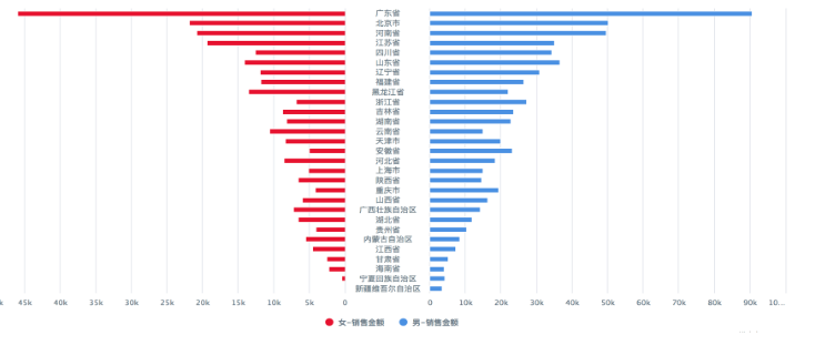
It is suitable for comparative analysis of two metrics of the same type under the same dimension, such as comparing consumption amounts of male and female members across different regions.
Prerequisites
1. Create a card and make sure the Install Plugin entry under Visualization Extensions is visible. If it is not visible, contact Guandata staff to enable the Visualization Extension Plugin switch.
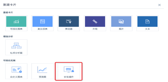
2. Click the nine-grid icon in the upper-right corner of the page, go to App Marketplace — Visualization Extensions — Butterfly Chart, and download the plugin. The plugin is in JSON format.
3. An administrator enters the card creation interface, clicks Install Plugin, selects the downloaded butterfly chart plugin, and installs it. After installation, all users can use this chart type.
Operation Guide
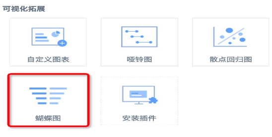
1. Create a card, select Butterfly Chart under Visualization Extensions, and select a dataset.
2. Select three columns of data based on the page prompt: one dimension and two values.
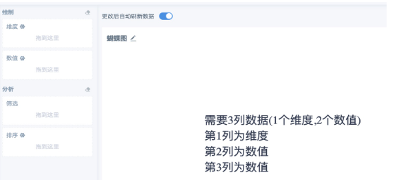
Note:
A. In general, use this chart when metric values are non-negative.
B. Butterfly charts are generally used to compare two groups of data under the same dimension. Most of the two metric fields used should come from the same field. If the metrics are not already split in the dataset, create calculated fields to recalculate the two groups of data to compare. For example, use if([Gender] = 'Male', [Retail Amount], 0) to calculate consumption amount by gender. You can also use the YoY/MoM feature to compare data across two periods.
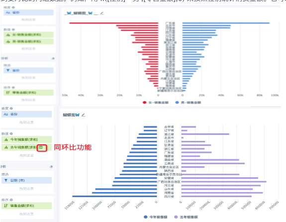
3. Place the metric field used for value statistics into the sort area. For example, in Figure 1 above, if consumption amount by gender is calculated for each province, you can sort by the total consumption amount of each gender or by the total consumption amount of each province without distinguishing gender. In Figure 2, because the year is filtered, sales amount is sorted by the total sales amount of each province in the selected year.