Migration Map Usage Guide
Background
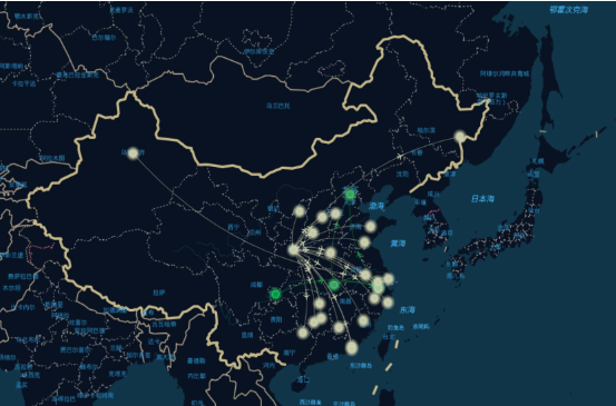
A migration map dynamically and in real time displays migration trajectories and migration volumes on a map, allowing users to intuitively view data sources and destinations. It is commonly used in scenarios such as population migration, logistics migration, traffic monitoring, and security attack source monitoring. Guandata currently supports migration maps on China maps.
Dataset Preparation
The dataset must contain at least three fields: the start point of the migration path, the end point, and the measurement metric. Start point and end point fields should be string text fields. Their values should be Chinese administrative divisions, supporting provinces, cities, districts, and counties. Keep names standardized and consistent as much as possible to avoid recognition failure or incorrect recognition.
Notes
1. For example, both Hangzhou City and Hangzhou can be recognized by the system. However, if both forms are used at the same time, the data is separately counted and displayed, so it is best to use one naming style consistently. Not all administrative divisions can be recognized after removing suffixes. For example, Pudong New Area can be recognized, but the abbreviation Pudong cannot. Yanbian Korean Autonomous Prefecture can be recognized, but the abbreviation Yanbian cannot.
2. When city and county names are the same, or when other duplicate names exist, such as Hotan City and Hotan County, keep the administrative division name complete and avoid using only Hotan.
3. To ensure visualization quality, we recommend using administrative divisions at the same level for start points and end points. For example, use city-to-city at the national level, and district-to-district within a city.
Usage Steps
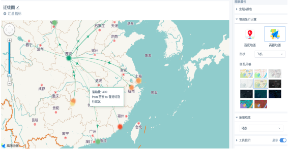
1. Create a Visualization Chart card and select Migration Map under Map. Follow the visualization drawing prompts and drag the corresponding fields into the drawing area, with start point first and end point second. If the chart is cluttered, set filter conditions.
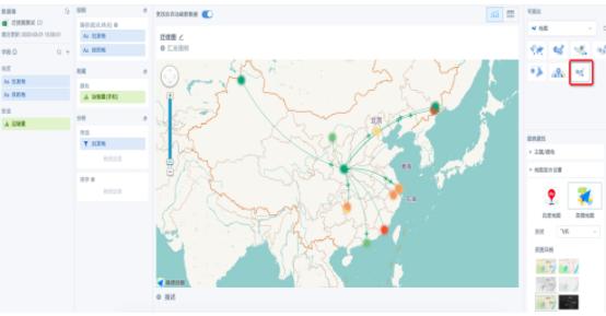
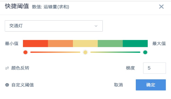
2. We recommend using a numeric field, such as Transport Volume, in the Color area. Configure aggregation method, advanced calculation, and data format as needed. For color settings, you can choose a color style based on the desired gradient, or configure Custom Threshold. If a text field is used, color settings do not currently take effect, pending optimization. The chart uses the first color of the selected theme under Theme/Color on the right by default.
Other Style Settings
- The right side of the editing page provides multiple style settings. For example, the map supports Baidu Map and Amap, multiple basemap styles, and four migration path icon types: airplane, truck, arrow, and circle.
- Value labels and values do not support format settings. They are displayed in a floating window only when the mouse moves over the migration path.
- Click the plus or minus signs on the left zoom bar, or use the mouse wheel or touchpad, to zoom the map scale.