Dumbbell Chart Usage Instructions
Background
Dumbbell Chart, each group of data consists of two data points and a connecting line, resembling a dumbbell. Dumbbell charts are a great visualization method, emphasizing the change from one point to the next, and making some comparisons between the two, to represent the transition process of certain indicators. Dumbbell charts convey the "before" and "after" positions of various indicators and the ranking of indicators. If you want to visualize the impact of specific indicators on different objects, such as the profit margin transition of various subcategory products in a certain year, then it is very useful. Guandata BI visualization extension already supports the use of dumbbell charts.
Dumbbell charts are mainly used for:
① Displaying the relative positions of two data points in the same time period (increase or decrease);
② Comparing the difference in data values between two categories.
To enrich the visualization types for business analysis, Guandata data visualization charts have added dumbbell charts, supporting use in version 4.2.0 and above.
Usage Prerequisites
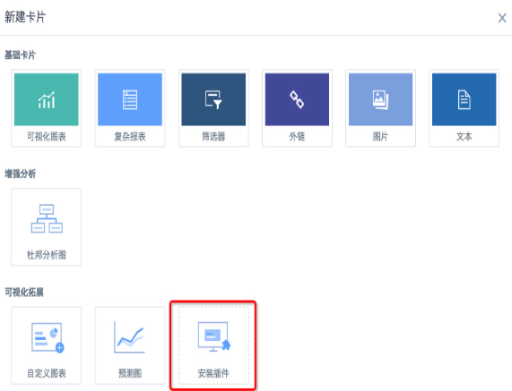
1. Create a new card, ensure the "Install Plugin" entry under visualization extension is visible. If not visible, you need to contact Guandata personnel to turn on the "Visualization Extension Plugin" switch.
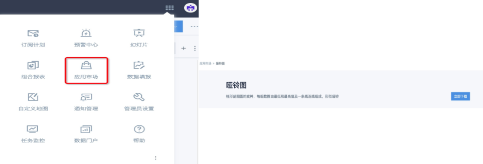
2. Click the nine-grid in the upper right corner of the page, go to "App Market" — Visualization Extension — Dumbbell Chart, download the plugin, the plugin is in json format.
3. Administrator users enter the new card interface, click "Install Plugin", select the previously downloaded dumbbell chart plugin, after installation is complete, all users can use this type of chart.
Note: Guandata BI dumbbell charts currently only support displaying two numerical values and arrow styles. If other styles are needed, it is recommended to use custom charts to design them yourself (need to contact Guandata personnel to turn on this feature switch).
Data Preparation
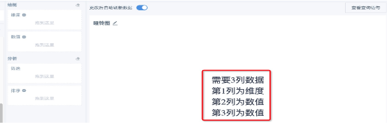
Need 3 columns of data, the 1st column is dimension, the 2nd and 3rd columns are the numerical values of a certain indicator before and after the transition respectively, currently need to ensure that this indicator is a percentage value. For example, you can use "Year-over-year Growth Rate" and "Percentage" in advanced calculations, or create new calculated fields to get the percentage indicators that need to be displayed, or use them in combination.
Usage Method
1. Create a new card, select "Dumbbell Chart", select dataset;
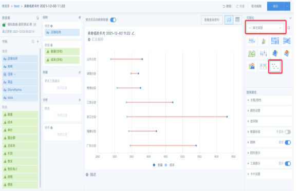
2. According to the page prompts, drag in dimension fields and 2 percentage indicator fields of the same type, set filters and sorting as needed.
Note:1. Other types of already created cards cannot be switched to card types in visualization extensions, only new cards can be created; 2. It is not recommended to drag in non-percentage indicators, because the system defaults to setting numerical fields as percentage type, large numerical values have poor visualization effects and are not conducive to analysis. Comparison as follows:
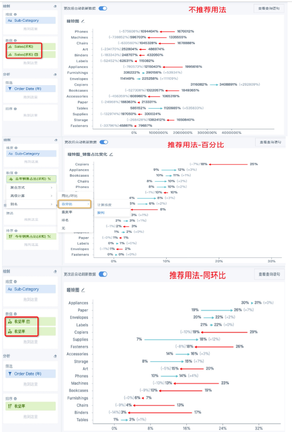
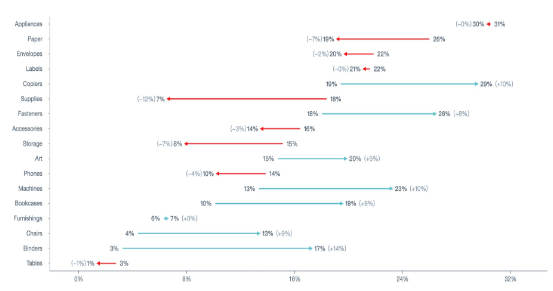
Chart Interpretation
1. By default, upward trends are displayed as blue-green arrows pointing right, downward trends are displayed as red arrows pointing left. Styles currently only support adjusting card title format and card background, other styles (such as adjusting percentage precision, arrow style, theme color) are not supported for adjustment, and will be continuously optimized in the future.
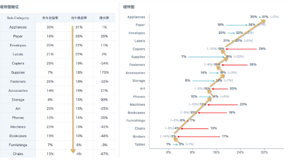
2. The numerical value at the arrow departure position is the first indicator value, the numerical value pointed to by the arrow is the second indicator value, and the value in parentheses is the difference between the two numerical values (not the year-over-year growth rate). The two indicator values are not distinguished by left-right distribution, but by arrow direction, please refer to the comparison chart below with the same content table card.
3. The coordinate axis values increase from left to right, so the sorting may be opposite to other chart types. For example, in the figure below, two charts use the same field for sorting, the left table is arranged in descending order, and the dumbbell chart is arranged in ascending order.
Notes
-
Regarding null values, null, and invalid text values, they are not drawn, only normal data points are drawn;
-
Regarding the tooltip and data labels when the mouse hovers over a point, only the data content of that point is displayed;
-
If both points are invalid values, neither data labels nor tooltips are displayed.