Radar Chart Usage and Scenarios
Background
A radar chart is a graphical method for displaying multivariate data in the form of a two-dimensional chart with three or more quantitative variables represented on axes starting from the same point. The relative positions and angles of the axes are usually not informative. Radar charts are also known as web charts, spider charts, star charts, spider web charts, irregular polygons, polar charts, or Kiviat diagrams. Radar charts can display analyzed numbers or ratios, making it easy to view various data metrics and data change trends at a glance.
Prerequisites
Prepare the dataset. If you need to compare multiple numeric metrics, first create fields in the dataset, card, or ETL to preprocess values and reduce value differences to an appropriate range.
Data processing methods:
1. Perform multiplication or division on values, and mark the measurement unit after the field name.
2. Calculate values with mathematical formulas based on industry data index calculation methods.
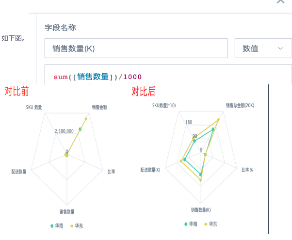
For example, when fields with large values such as total sales amount and sales quantity are displayed together with percentages as metrics, the visualization effect is poor. We recommend scaling down large values and multiplying percentages by 100 for display. Comparison effect:
Application Examples
Scenario 1: Radar Chart Arranged by Dimension
This is suitable for displaying content arranged by dimension fields, text type, when only one metric is displayed.
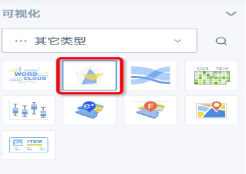
Creation method: 1. Create a card and select Radar Chart from the Other Types list, or search Radar Chart directly.
2. Drag in one dimension field and one value field. You can place one dimension field in the comparison area as needed. In the example below, the radar chart is arranged by province. Because there are too many provinces, drag this dimension field into the filter area for filtering. As the number of options increases, the chart gradually becomes more circular.
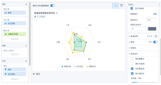
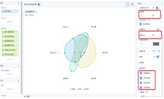
3. Configure chart style in the right-side settings panel.
Scenario 2: Radar Chart Arranged by Metric
This is suitable for displaying content arranged by metrics, numeric metrics, with three or more metrics. Creation method: 1. Create a card and select Radar Chart from the Other Types list, or search Radar Chart directly.
2. Drag in one dimension field and multiple value fields, at least three. In Graph Display in the right-side settings panel, select Arrange by Metric. In this scenario, we do not recommend adding comparison fields, because they affect metric arrangement. For example, when there are six values, the chart is a hexagon. After adding a comparison field with two groups, it becomes a 12-sided shape.
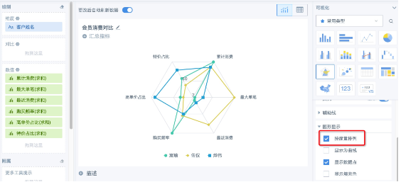
3. Configure chart style in the right-side settings panel. For example, if the value range in the figure above is 0 to 100 and the middle graphic feels too full, adjust the axis range and data step under Axis — Primary Value Axis (Y Axis) to achieve the expected effect.