Sunburst Chart Usage Methods and Scenarios
Background Introduction
Sunburst Chart (also known as Sun Chart) is a variant of pie chart, equivalent to a combination of multiple pie charts. Pie charts can only represent the proportional relationship of one layer of data, while sunburst charts can not only represent data proportions but also express the hierarchical relationships between data. Sunburst charts can express the hierarchical and attribution relationships of data on the basis of pie charts representing proportional relationships, clearly expressing data with parent-child hierarchical structures. In a sunburst chart, one ring represents one level of data, and the segments on one ring represent the proportion of that data at that level. The innermost ring has the highest level, and the further outward, the lower the level, and the more detailed the classification. Between adjacent layers, there is a relationship where the inner layer contains the outer layer.
Click to see partial details:
- Applicable Scenarios:
Sunburst charts not only have the advantages of pie charts but can also show the relationships between data hierarchies. They display data relationships through the area, color, and arrangement of rectangles, going beyond traditional pie charts and ring charts. They can express the hierarchical and attribution relationships of data on the basis of pie charts representing proportional relationships, clearly expressing data with parent-child hierarchical structures. Sunburst charts are suitable for displaying data at different levels.
2. Non-applicable Scenarios:
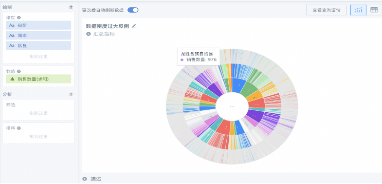
Sunburst charts are not suitable for displaying data with too many categories, cannot have negative values, and cannot have zero values. When the proportions of data are relatively close, making it difficult for the human eye to distinguish, it is recommended to use other graphics.
Application Examples
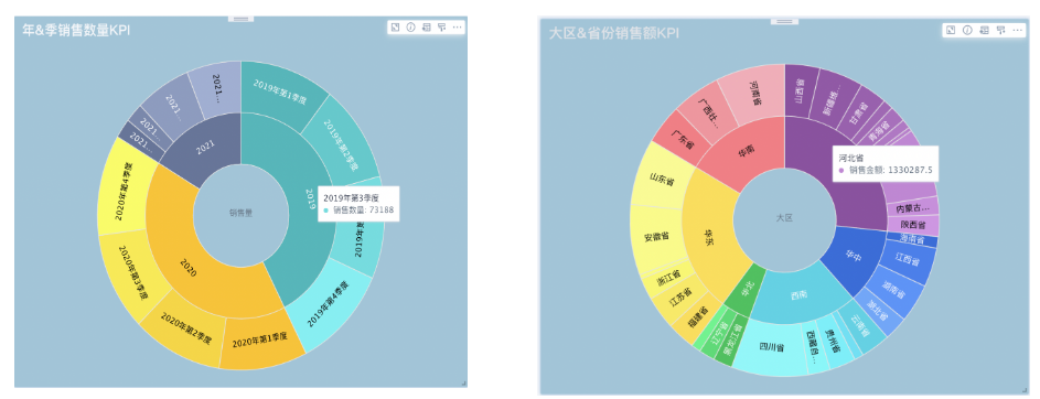
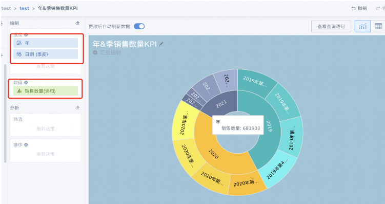
Sales: At the end of the year, we need to summarize annual sales and hope to see the segmented sales amounts and their proportions for different time periods, from year—quarter—month—week, to intuitively see which quarter performed well throughout the year, not only to summarize experience but also to make more adequate preparations for next year's performance sprint;
-
Data preparation: Prepare the corresponding dataset, it is recommended to do data cleaning work in advance;
-
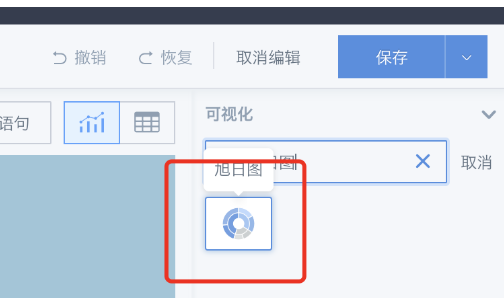
Create new card: New card - Visualization chart - Select data table - Search for sunburst chart;
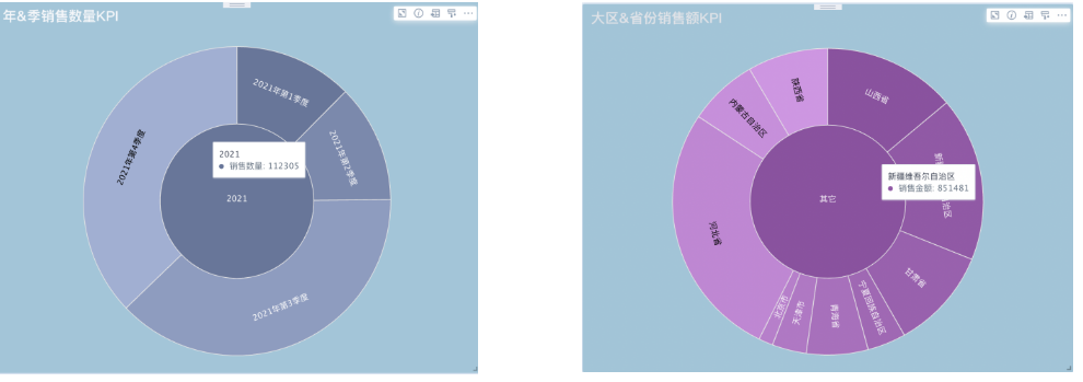
- You can drag dimension fields and a numerical field as needed, it is recommended not to have too many dimension fields, two charts show the best effect. Take the following figure as an example, the sunburst chart compares sales quantities by year and quarter, with the inner layer containing the outer layer;
Recommendations
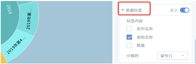
(1) It is recommended not to check too much content in the data labels, as it will reduce the aesthetic appeal of the chart;
(2) If there are too many data categories, it is not recommended to use sunburst charts, consider using other graphics;