Practical Tips for Cards
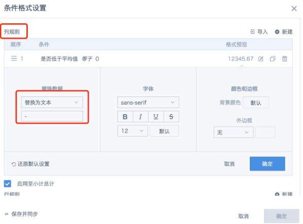
1. How to Quickly Replace 0s in a Table with -
Set conditional formatting for value fields in the table, replace with text, and set "Save and Sync" as needed. You can also check other cards.
2. How to Highlight Comparison Between Two Columns or with the Average
Use the "Set Conditional Formatting" feature:
(1) Compare two columns: Set conditional formatting - new column rule - type "Comparison" (e.g., target sales less than sales shows red text with yellow background)
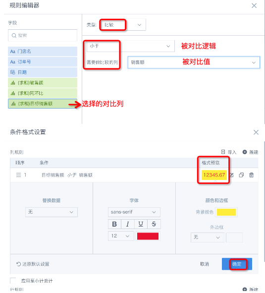
(2) Compare with average: Set conditional formatting - new column rule - type "Comparison"
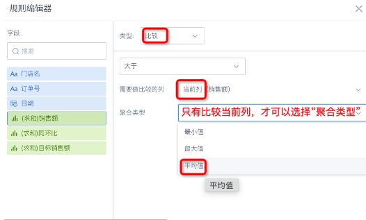
Note: In the rule editor, the field selected by default on the left is the one you entered conditional formatting for, but you can change it.
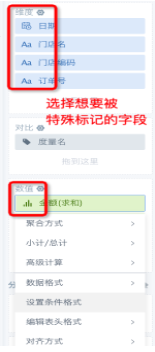
3. How to Set Different Colors for Different Columns/Bars
- Table cards: Use conditional formatting - column rules.
- Bar/Column charts: Drag the dimension field into the color bar.
4. How to Hide Fields in Cards
-
Use column permissions on the dataset to hide the column, or remove the column in ETL and use the output dataset in the card.
-
If the field is used in the card dimension bar but you don't want users to see it (e.g., ID number), set conditional formatting - column rule, replace the field content with a space, set the field alias to a space, adjust column width, and set no border to visually hide it.
5. How to Remove Leading Zeros from Text Data
Solution
- Solution 1: Use regex to remove zeros.
REGEXP_REPLACE([Product Code], "^(0+)", "")
- Solution 2: Multiply or divide by 1 to remove zeros and use string formula to convert to text.
string(int([Product Code]/1))
or
cast(int([Product Code]/1) as string)
Note:
- Use int because multiplying or dividing text by 0 and then converting to string may add a decimal place. The int function solves this.
- If you multiply or divide by 0 and set the field type to text, the format may not convert successfully, causing issues for later data processing and card creation (currently needs formula conversion).
6. How to Get the Max or Min Value Among Multiple Fields
Solution: Use least() and greatest() functions in a new field, e.g., least(A,B,C,...), greatest(A,B,C,...). Can be used for multiple fields and works for numbers and dates.
7. How to Set the Export Format for Card Data
Select "Table Template Settings", upload your template, then select "Export Table Data".
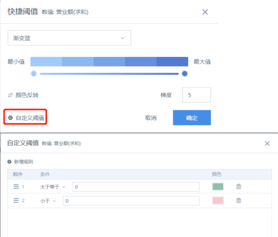
8. How to Clearly Distinguish Positive and Negative Colors in Bar Charts
(1) (Same for bar charts) Drag the "value" field into "color", select "Color Settings";
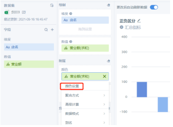
(2) Set custom color thresholds
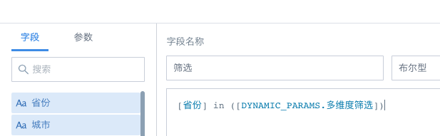
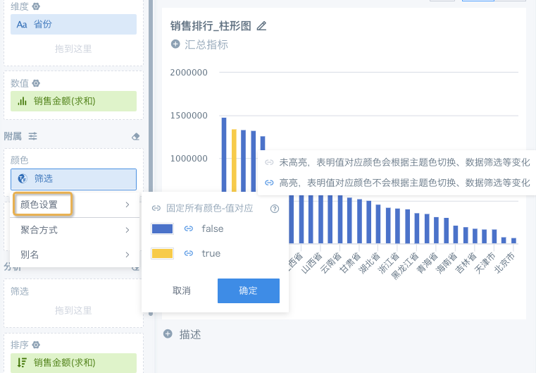
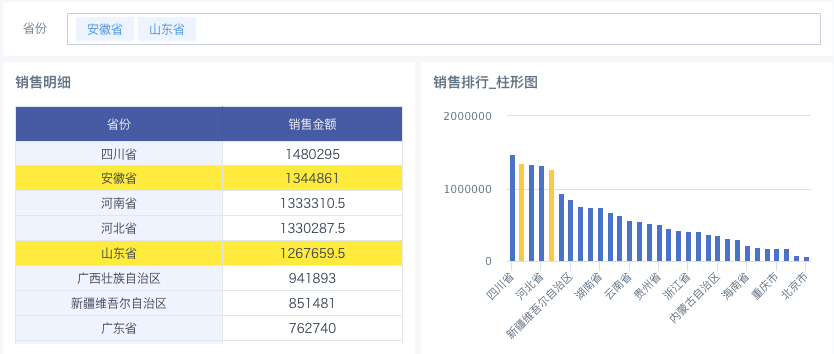
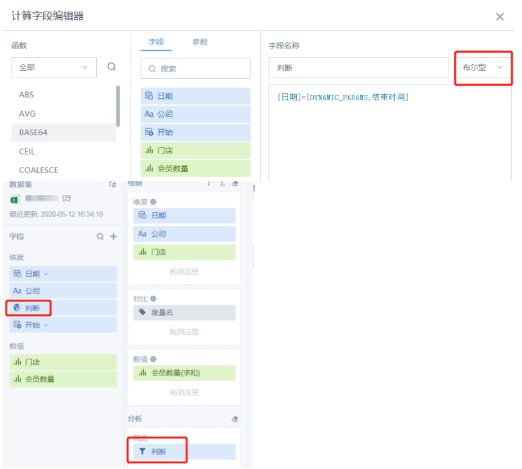
9. Use Global Parameters to Highlight Filtered Data
(1) Prepare a single or multi-value text global parameter as needed;
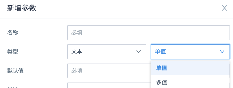
(2) Create a new card, add a field to reference the parameter, set the field type to boolean;
Single select: [Province] = [DYNAMIC_PARAMS.Multi-dimension Filter] Multi-select: [Province] in ([DYNAMIC_PARAMS.Multi-dimension Filter])
(3) For bar, column, map, and other chart types with a color bar: put the new "filter" field into the color bar and set the color.
(4) For tables: set conditional formatting--row rule, set background color for "filter" equals true.
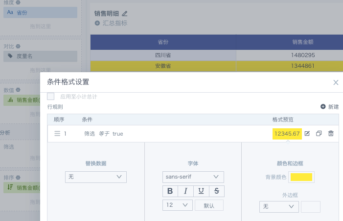
(5) Add a "Province" filter on the page to link the global parameter in the card. Final effect:
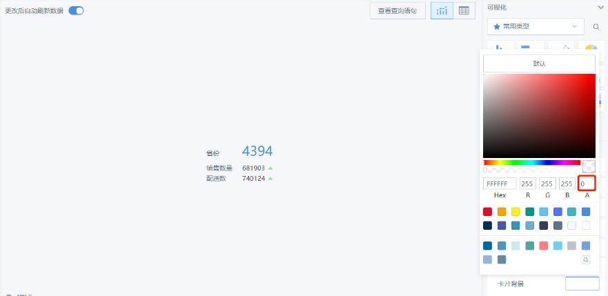
10. How to Set Transparent Background for Cards
Card Settings - (right) Card Background - set "A" to 0:
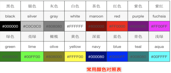
Extension: Color codes (from: What is the code for transparent color in CSS?)
Common color codes:
-
Common color words: green, yellow, red, transparent, etc.
-
followed by six characters, e.g., #FF0000 (red), #000000 (black), #F9F900 (yellow), etc.;
-
rgb values: rgb(param1, param2, param3), where R, G, B are red, green, blue values (integer or percent)
-
rgba(param1, param2, param3, param4), where the fourth parameter is opacity (0-1). 0 is fully transparent, 1 is fully opaque.
-
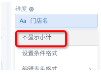
How to Remove Subtotals in Tables
For normal tables, click the dimension field and choose not to show subtotals; for grouped tables, subtotals cannot be removed.
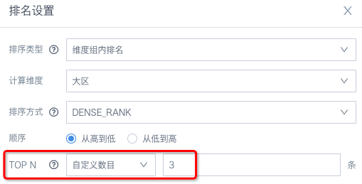
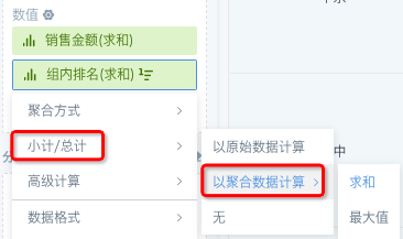
12. How to Calculate the Total for TOP10 When Only 10 Dimensions Are Shown
Use advanced calculation - ranking TOP N instead of limiting the number of dimensions; then manually change subtotal/total calculation to "aggregate data calculation".
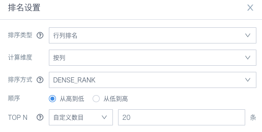
13. How to Show Only the Top 20 by Rank
Solution 1: Sort the value field in descending order, then set the dimension to show 20.
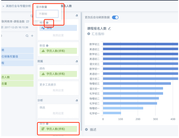
Solution 2: Use Advanced Calculation - Ranking on the value field, set TOP N to the desired number.
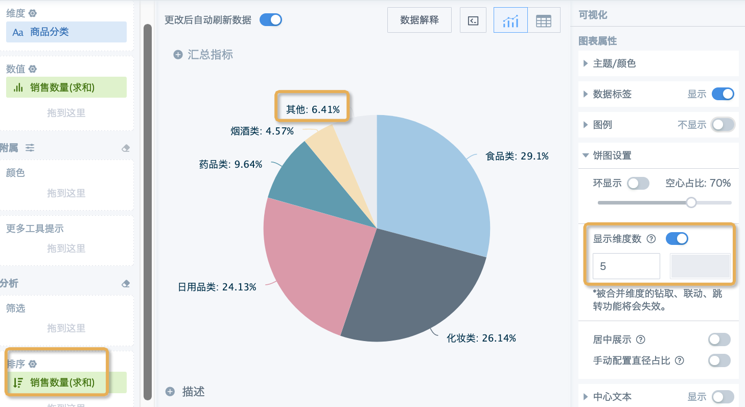
14. How to Show Only Top N in Pie Chart and Group Others as "Other"
Sort the value field in descending order, open the pie chart settings on the right, set the number of dimensions to keep, and set the color for "Other".
15. How to Show Only the Most Recent N Days in Ascending Order by Time
If limiting the number of dimensions doesn't meet your needs, filter for the most recent N days in the filter, then sort by the date field.
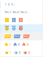
16. How to Set Sort Icons
(1) In the table edit page, check Show Row Number;
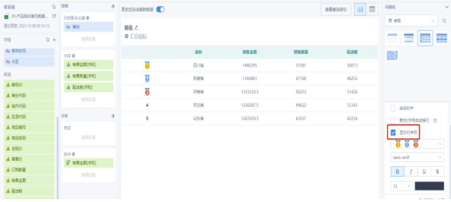
(2) Select the icon to display; currently only supports the icons in the options.
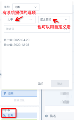
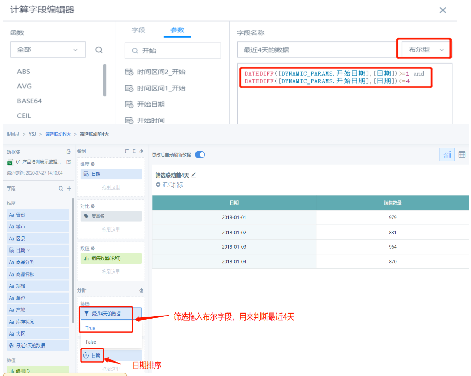
17. How to Link Filter Date to the Previous N Days of Data
(1) Create a date-type global parameter and a parameter filter
(2) In the card, create a boolean field using the DATEDIFF function to filter whether the data is within the previous x days of the filter date. Put the field in the filter condition (for sorting, put the date field in the sort dimension)
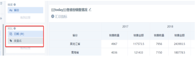
18. How to Prioritize Sorting by Comparison Field in Tables
Drag the comparison metric and comparison field, e.g., drag [Date] before the metric name to sort by [Date] first, then show the corresponding field under each date:
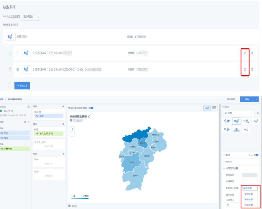
19. Do Not Show City-level Maps
In map display settings - map range, select the outline as needed:
- National outline--dimension: province
- Provincial outline--dimension: city
- City outline--dimension: district/county
20. Heat Map, Symbol Map Not Displaying Map
Check the order of latitude and longitude; latitude should come first, then longitude.
21. How to Set Map Colors
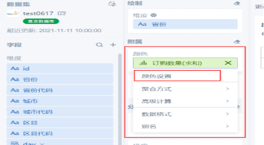
(1) Open the card edit page - left edit box, select the specific field in the "Color" bar, "Color Settings"
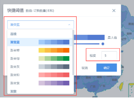
(2) Set the color as needed. Gradient can have up to 10 colors. If all colors are the same after setting quick thresholds, it may be due to many null values in the data.
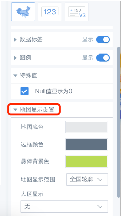
(3) In the "Map Display Settings" on the right, set the map background color, border color, hover background color, etc.
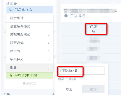
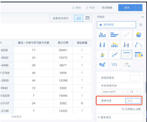
22. How to Adjust Table Column Width and Wrap Long Text
- Column width: In table mode, you can manually drag to adjust column width, or set it on the right.
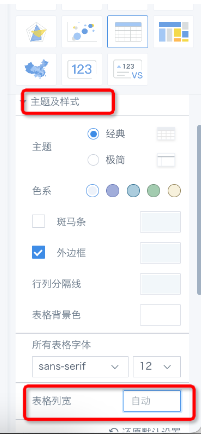
- Header wrap: (Due to framework limitations, header fields cannot be wrapped by pressing Enter.) In the new BI version, you can drag column width to wrap automatically, or set an alias for the dimension field and add a line break where needed.

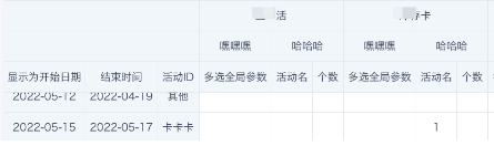
23. Table Pagination Shows Different Number of Columns on First and Second Pages
Column width is auto by default and changes with data length. To see the same columns on both pages, set fixed column width (auto wrap by default).
24. How to Fix Table Headers
Table headers are fixed by default, and are also fixed by default when there are comparison metrics or groups.
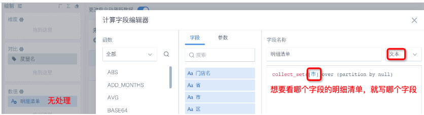
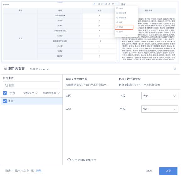
25. How to Show Detail List via Linkage
(1) Create a table card, create a new field (text type), use collect_set to aggregate details into an array; drag into "value", aggregation: none.
- To count unique values, use: size(collect_set([Field]) over (partition by [Group Field])), type: numeric
- To count all, use: size(collect_list([Field]) over (partition by [Group Field])), type: numeric
(2) On the original card, use the "Linkage" feature to link to the newly created detail list card.
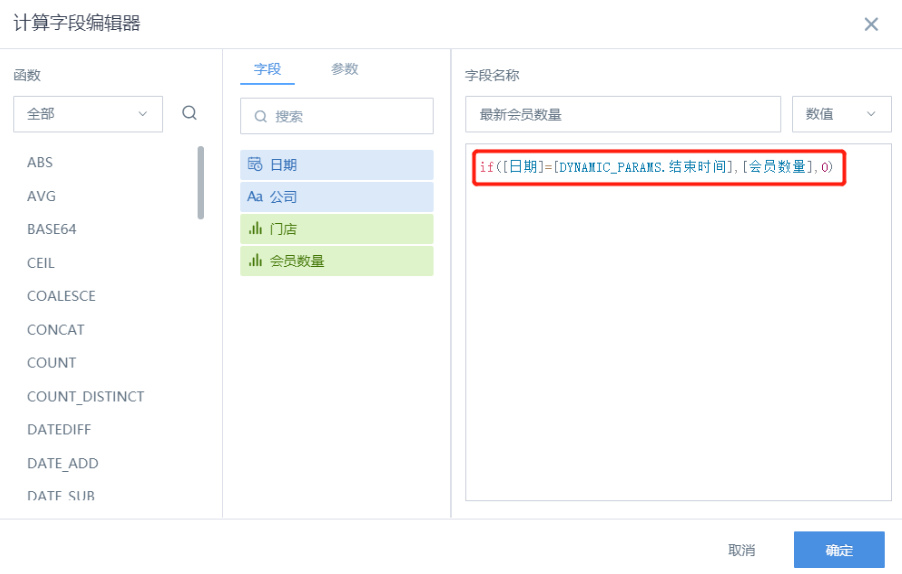
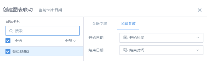
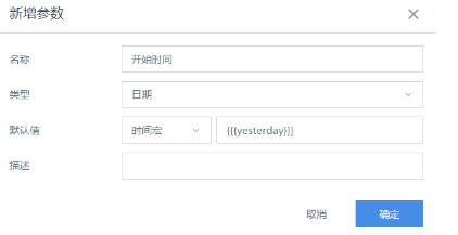
26. How to Get Data for the Last Day of the Filtered Date
Solution 1
Set the start and end time of the date selector as two global parameters (need to create two date filters), then use the end date parameter in the member data field calculation.
- Create two date-type global parameters, "Start Date" and "End Date";
- Create two date filters;
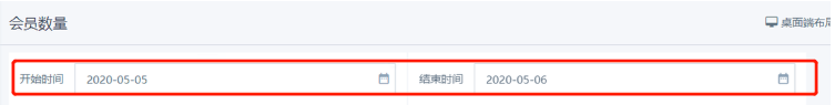
- Reference the "End Date" parameter in the card;
- Set linkage between card and filter.
Solution 2
Same principle as Solution 1, but only one date filter is used.
- Create two date-type global parameters, "Start Date" and "End Date";
- Create one date filter;
- Reference both time parameters in the card, with "Start Date" used directly in the card field for linkage, and "End Date" used for judgment (set as boolean type);
- Set linkage between filter and card.
27. How to Calculate Completion Rate When the Target Is Negative
(1) Use a bullet chart instead of a dashboard chart. For example, Guangdong's target is -60, achieved amount is -50, the gap is over 10, which is visually clear:
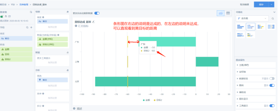
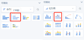
Bullet charts can be column or bar type, use as needed:
(2) Bullet charts show the gap visually but cannot calculate percentage. To show percentage, use a table and create a field: Completion Rate = [2 - (Actual Amount / Target)] × 100%
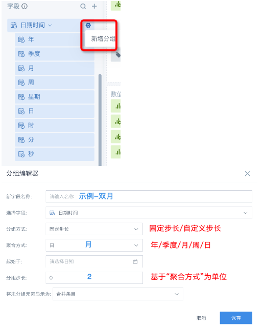
28. How to Set Biweekly, Bimonthly, Semiannual, etc. Date Cycles
(1) Date field dropdown has preset cycles (year, quarter, month, week, day for date fields; hour, minute, second for timestamp fields) (2) For other cycles, use "Add Group"
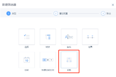
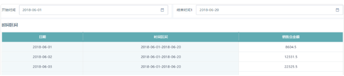
29. How to Show the Filtered Date Range on a Card
(1) Create two "date" type global parameters as start and end dates, set default values as needed;
(2) Use the two global parameters to create two parameter filter cards;
(3) On the linked card, create three calculated fields:
- Date type field: "Date Field" case when [Date]>= [DYNAMIC_PARAMS.Start Date] and [Date]<= [DYNAMIC_PARAMS.End Date1] then [Date] else null end
- Text type field: "Date Range" concat(string([DYNAMIC_PARAMS.Start Date]),"-",string([DYNAMIC_PARAMS.End Date1]))
- Numeric type field: "Total Sales Amount" case when [Date]>= [DYNAMIC_PARAMS.Start Date] and [Date]<= [DYNAMIC_PARAMS.End Date1] then [Sales Amount] else null end
(4) Effect:
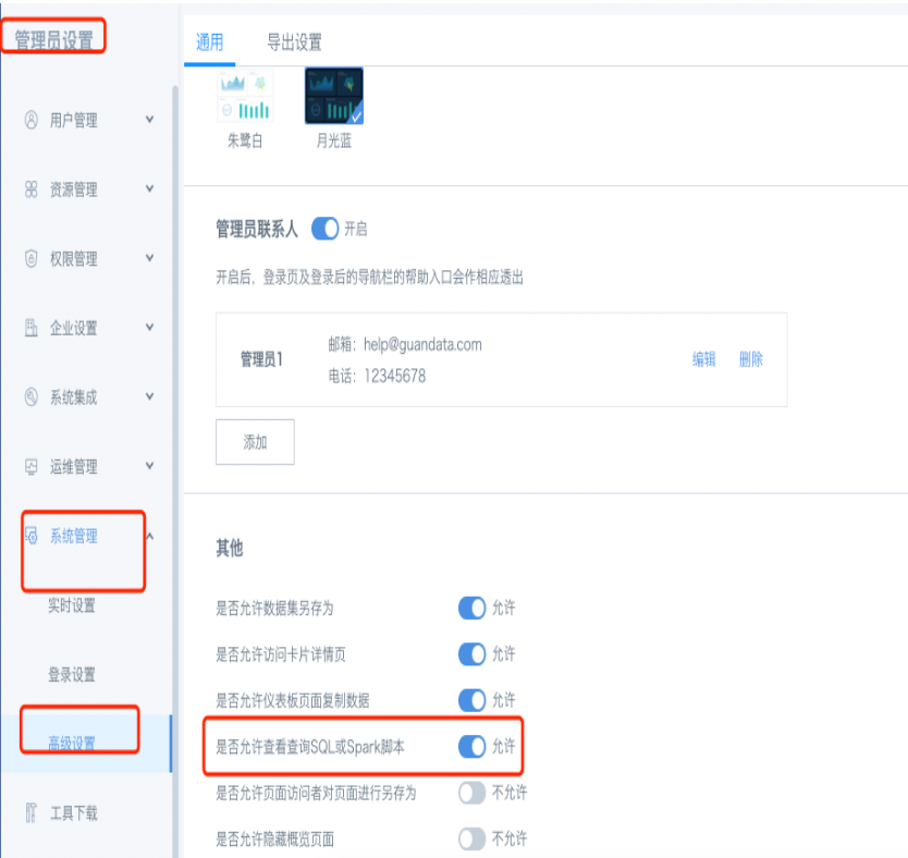
30. Why Can't I See the Card's Query SQL
Make sure the switch "Allow viewing query SQL or Spark script" is turned on in Admin Settings - System Management - Advanced Settings.
31. What Does "Selected Date" Mean in Advanced Calculation YoY/MoM
Selected date = base date Selected date is today ==> compare today with yesterday Selected date is yesterday ==> compare yesterday with the day before Selected date is n days ago ==> compare n days ago with n-1 days ago Selected date is this year ==> compare this year with last year Selected date is last year ==> compare last year with the year before Selected date is n years ago ==> compare n years ago with n-1 years ago
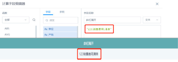
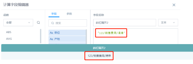
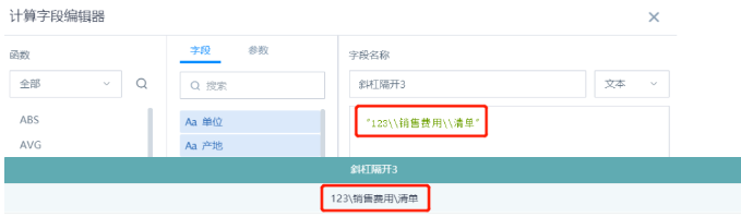
32. How to Use Slashes in New Fields / \
(1) Right slash "": escape. In Guandata, "" disappears when used, effect:
(2) Left slash "/": remains. Effect:
(3) Double right slash "\": keeps one. Effect:
33. Advanced Calculation - Proportion Logic for Aggregated Fields
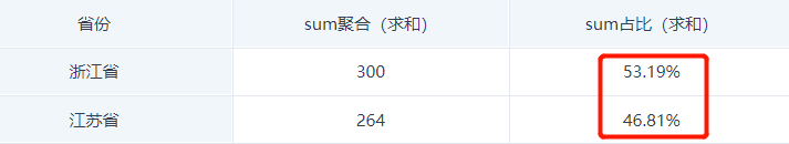
(1) Proportion after aggregation (sum): sum([Sales Amount]) over (partition by [Province])
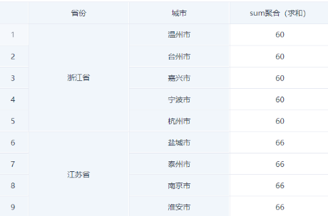
- For example, Zhejiang = 60, each row for Zhejiang is 60, so 560=300; Jiangsu = 66, 466=264. Zhejiang's proportion is 300/564=53.19%, Jiangsu's is 264/564=46.81%.
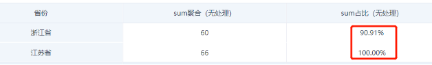
(2) Proportion after aggregation (none): system defaults to max value.
- For example, Zhejiang sum (none) = 60, Jiangsu = 66, so proportion is 60/66=90.91%, Jiangsu is 66/66=100%.
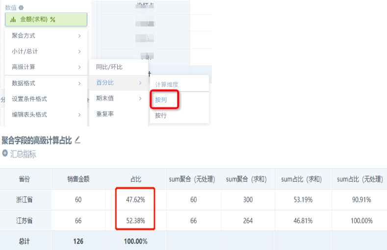
(3) To get Zhejiang's proportion = 60/(60+66), Jiangsu's = 66/(60+66), drag the "sum (sum)" field (or source data field) into "value", advanced calculation - percentage - by column.
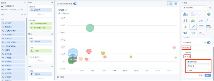
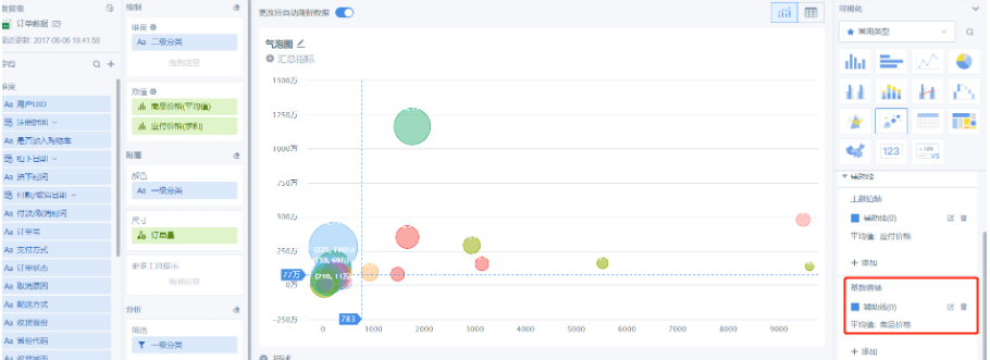
34. How to Use Reference Lines to Make a Quadrant Chart
(1) Create a bubble or scatter chart. For details, see: Bubble and Scatter Charts (2) Add a reference line to the main value axis (X axis):
35. How to Jump to Different Pages from the Same Table
Requirement: 1) Use a specific field hyperlink to jump to other pages (Guandata's default is to jump by clicking any field, which is not desired); 2) Pass the current dimension info to the target page; 3) Different dimension info jumps to different pages.
Effect:
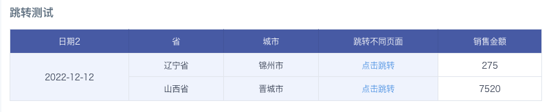
How to implement:
- Create two target dashboard pages, each with a filter that can accept parameters; copy the target page link and filter id;
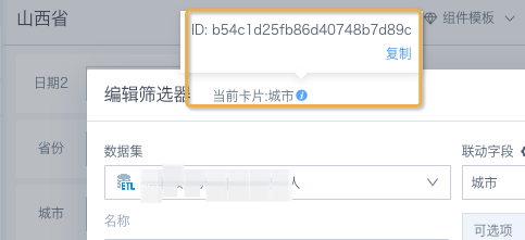
- In the table card, create a text field to concatenate the target page URL with filter conditions; drag into the dimension bar, set as hyperlink.
case
when [Province]='Shanxi' then concat('https://app.guandata.com/page/b6a88413f23fc4b188cc1416?b54c1d25fb86d40748b7d89c=',[City],'&w2775bf304ebd412c8b9dd35=',[Date2])
when [Province]='Liaoning' then concat('https://app.guandata.com/page/uf668e9ecc3fa4af6bdbaf81?ne6ce9f8526494ac4afd0983=',[City],'&g1f6f5afd283b434585e25bd=',[Date2]) end
36. How to Deduplicate and Sum
Requirement: For the same dimension values (store, product), the value (order count) is the same. Want to sum each value only once per dimension. Using sum will double count, sum(distinct) only works for aggregate metrics, can't use partition by as a window function.
How to implement: Similar to count(distinct) Idea: Value field needs to be aggregated by dimension: [Order Count]=sum([Original Order Count]) over (partition by [Store],[Product]) Deduplication steps:
- Get value for each group [Value]=max([Order Count]) over (partition by [Store],[Product])
- Deduplication count [Count]=size(collect_set([Product]) over (partition by [Store]))
- Deduplicated sum [Dedup Sum]=sum([Value]/[Count]) over (partition by [Store]) = sum(max([Order Count]) over (partition by [Store],[Product])/size(collect_set([Product]) over (partition by [Store]))) over (partition by [Store])
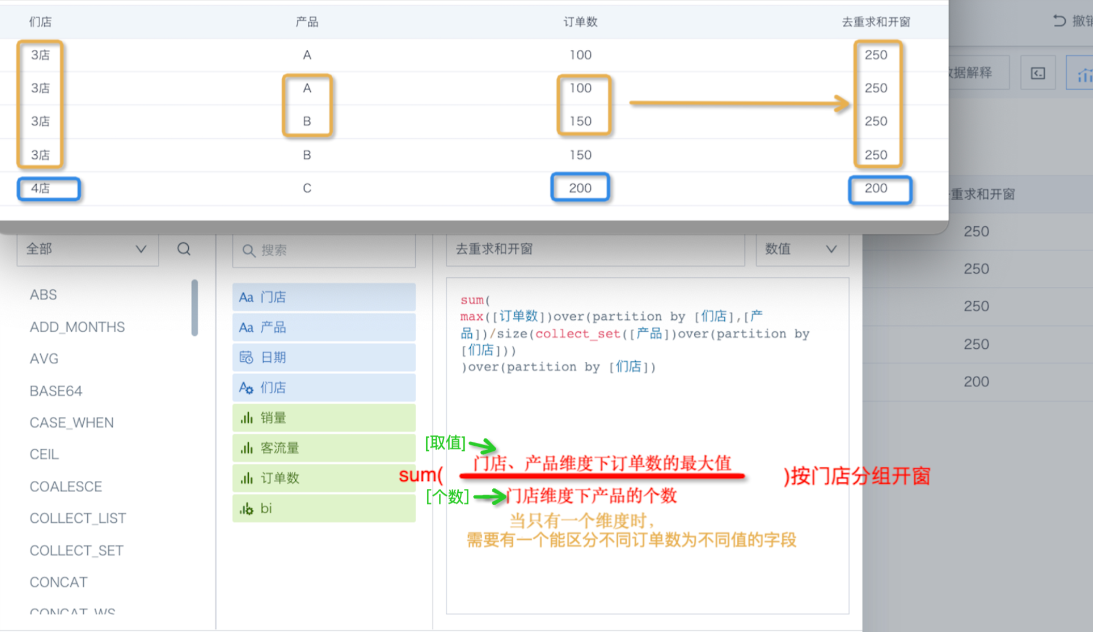
When editing the formula: the logic is to take the max order count per store, product, divide by the number of products per store, then sum by store. If only one dimension, need a field to distinguish each row's order count. Then sum by store.