Form Design
Create a Form
-
Click
Data Preparation > Form Entry > New Form.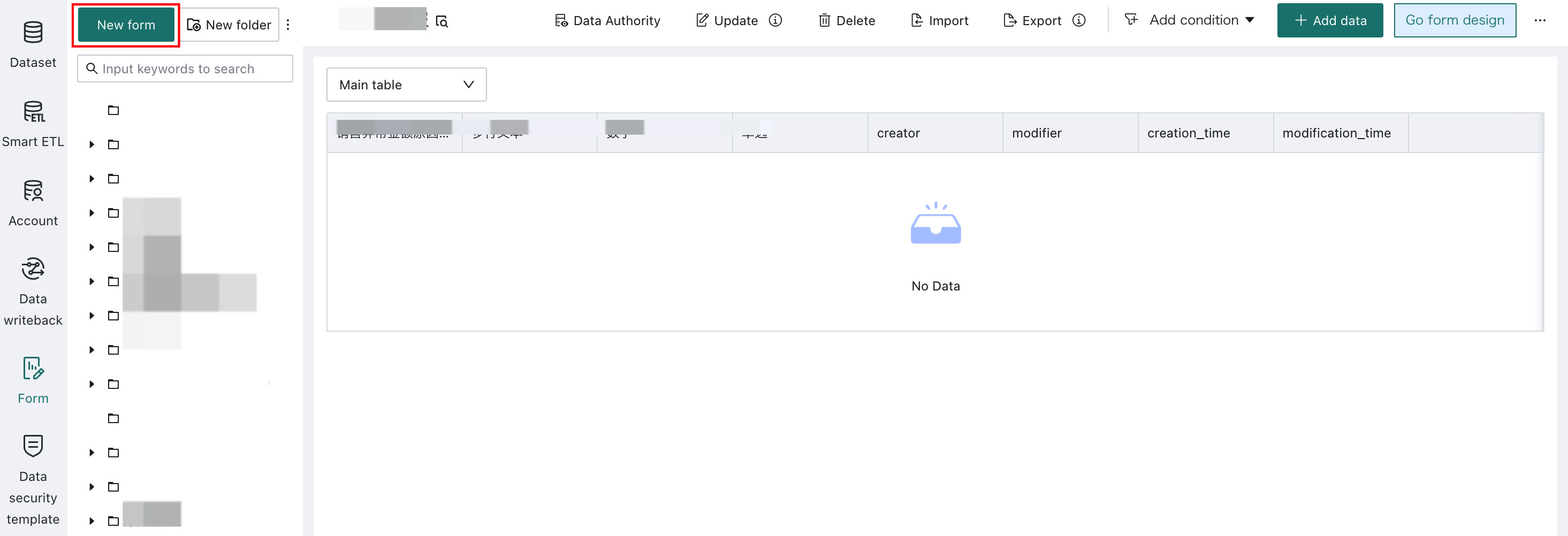
-
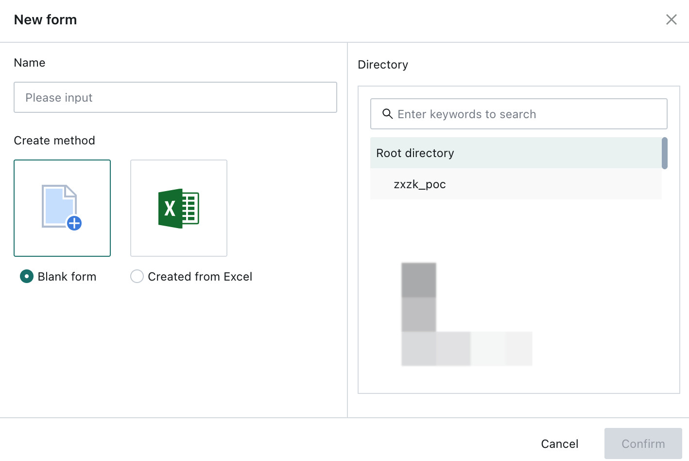
Choose either
Blank FormorCreate from Excel.Blank Formmeans the form is designed from scratch, including controls, canvas, and properties.Create from Excelmeans an existing Excel header can be imported so the form does not need to start from zero.
Create in Online Editing Mode
-
Choose
Blank Formto enter the Form Editing page and start designing the form. The page consists of three parts: the control panel, the canvas preview area, and the property settings panel.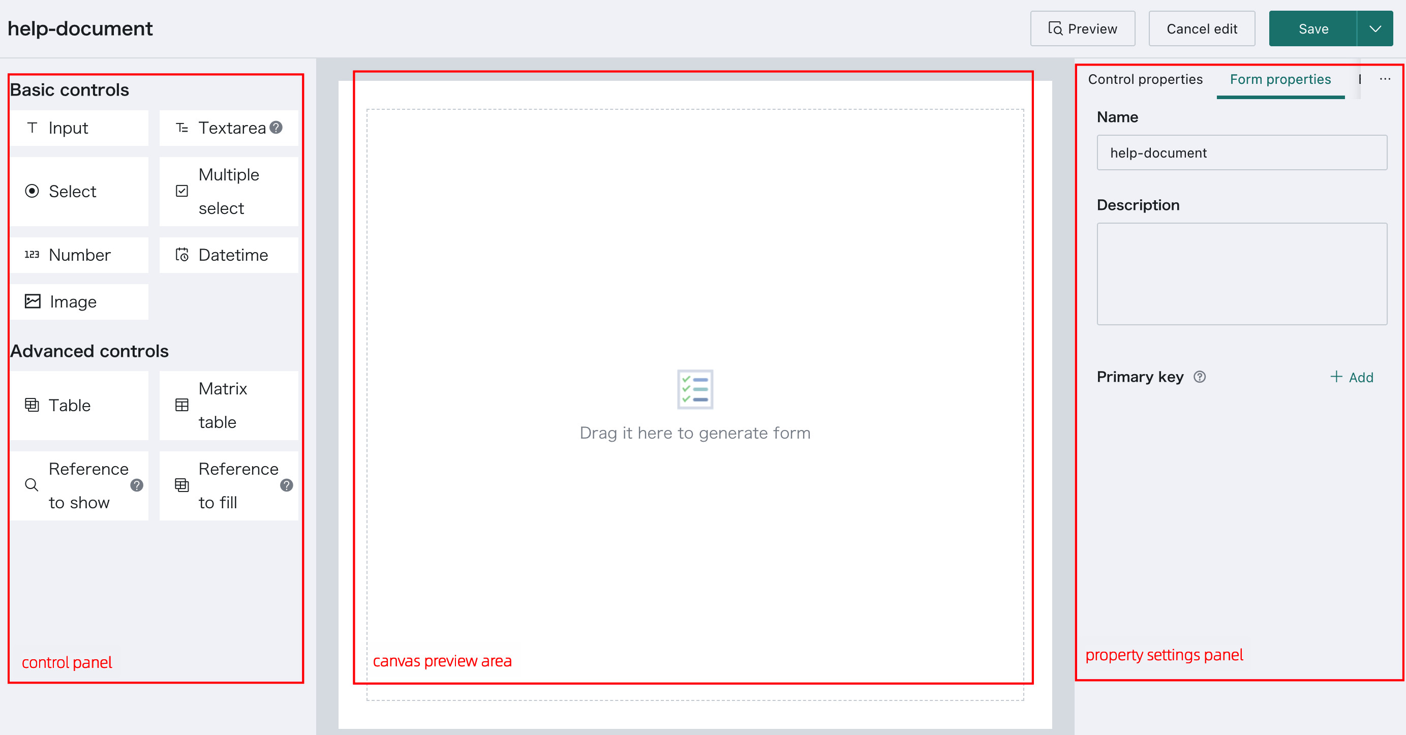
The available controls currently include 7 basic controls and 4 advanced controls. See Basic Controls and Advanced Controls.
-
Click a control from
Basic ControlsorAdvanced Controls, drag it onto the canvas, and position it freely. Copy and delete operations are also supported.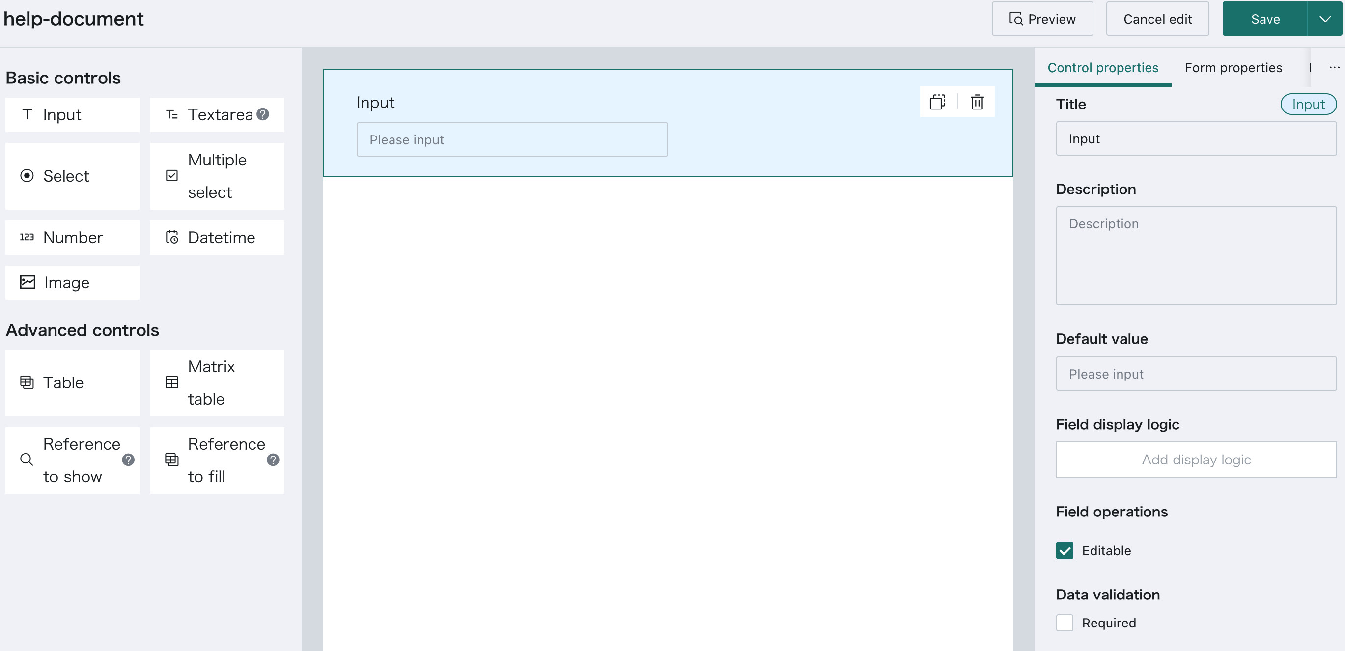
-
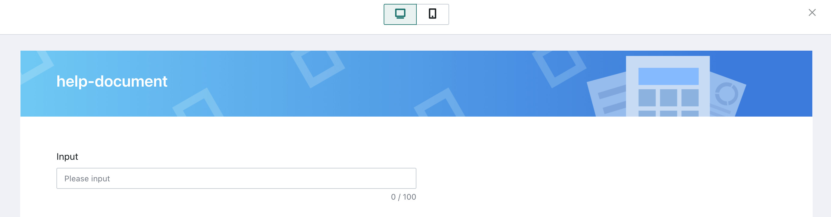
After the design is complete, click
Previewat the top of the page to view the final result.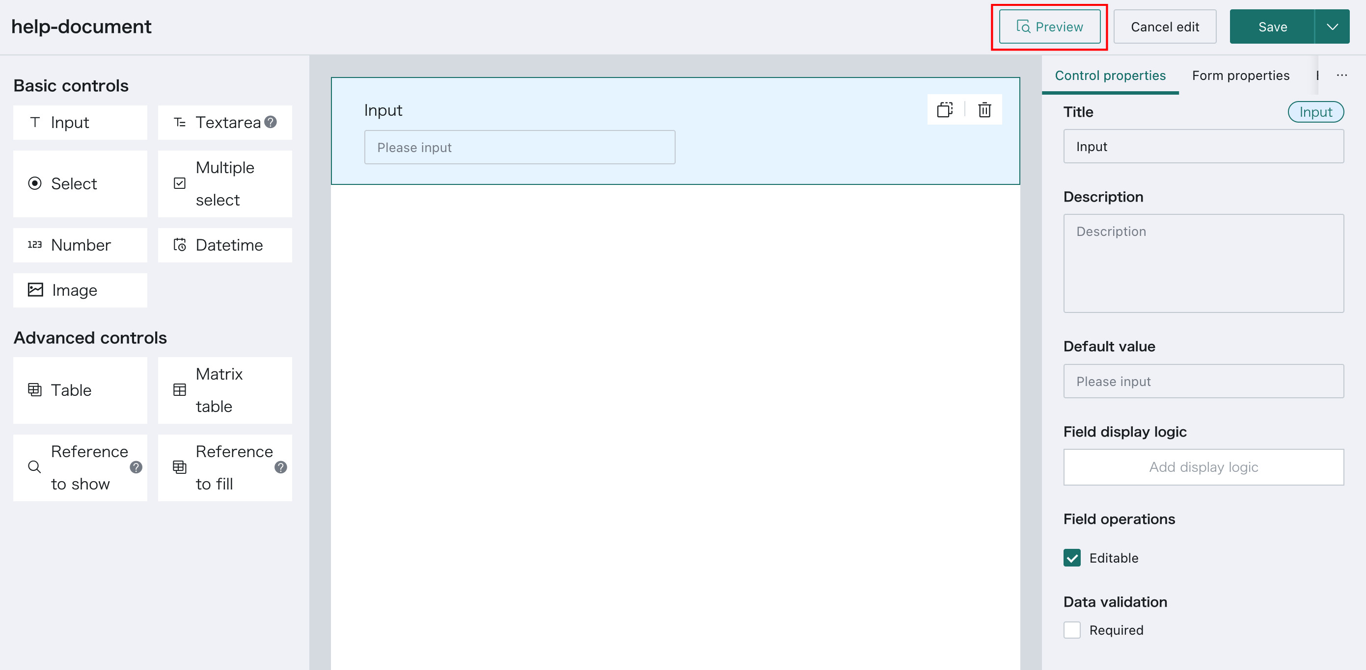
Create by Importing Excel
-
Choose
Create from Excelto enter theNew Formdialog, then clickUpload Fileor drag a file into the area.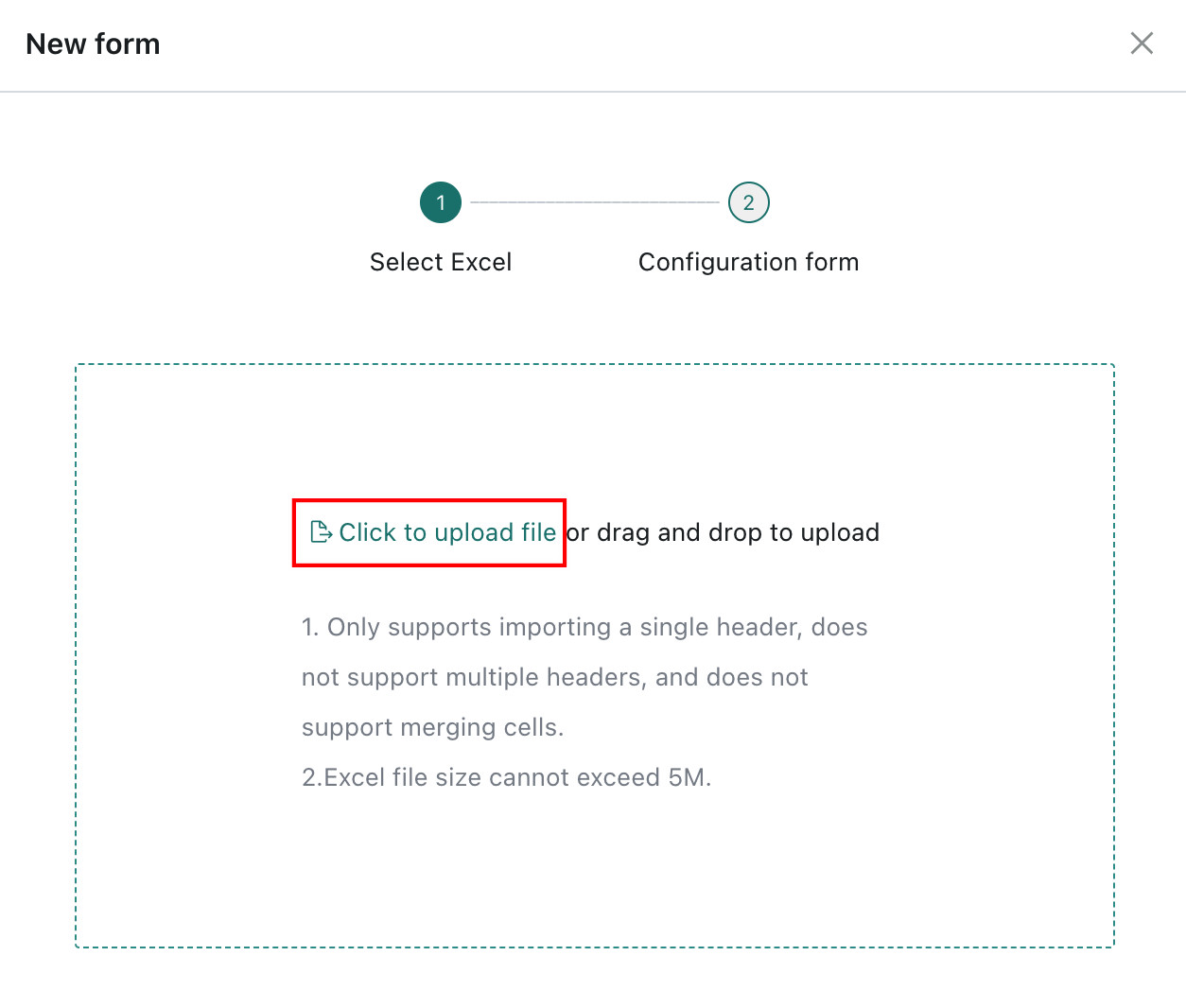
-
After upload, go to the configuration page, enter the form name, and choose a control type for each field. Supported control types include single-line text, multi-line text, single choice, multiple choice, number, date and time, and image. Advanced controls are not supported at this stage, but can be added later in the Form Editing page. After clicking
Confirm, the form opens in the editor.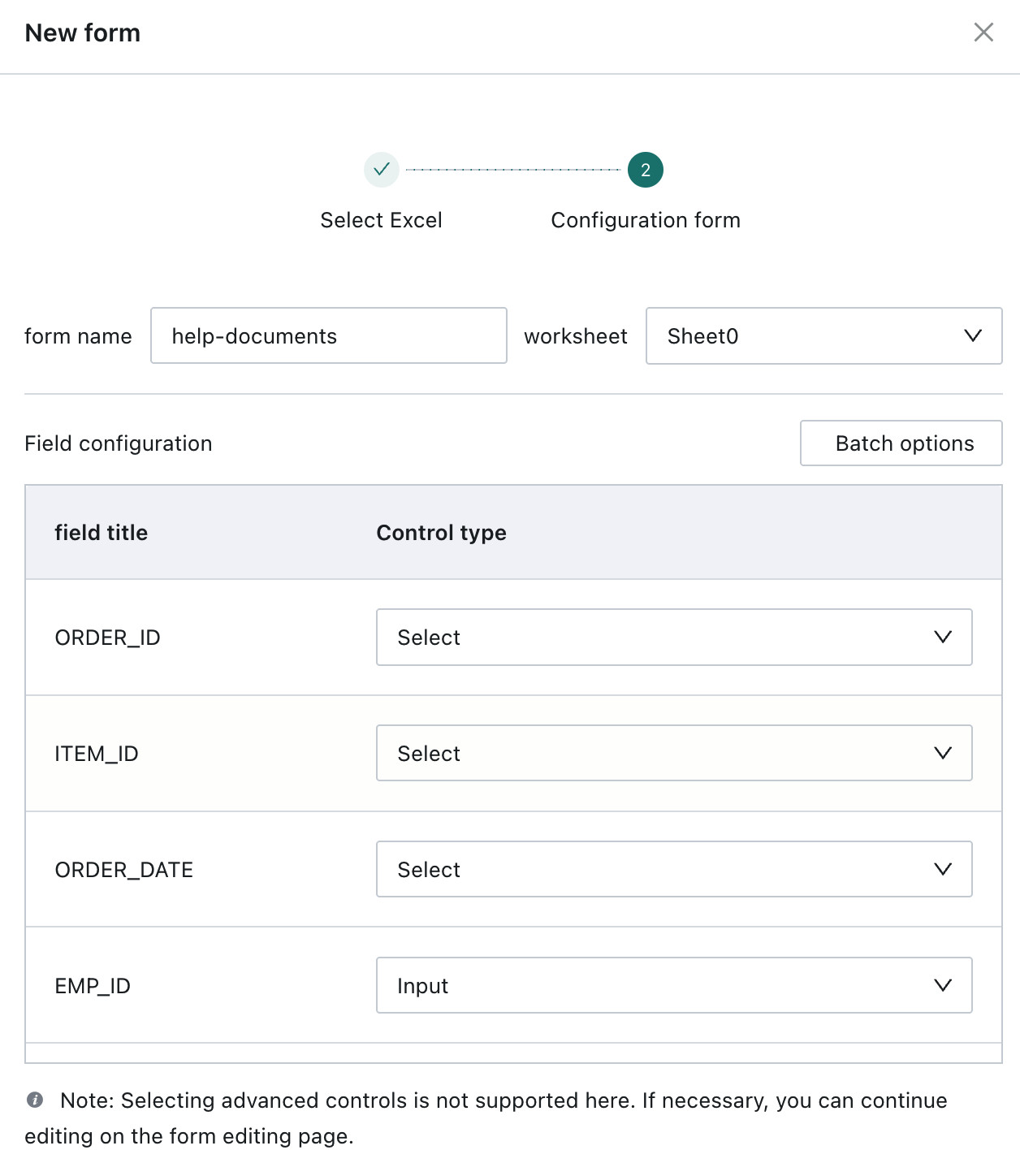
-
In the Form Editing page, the imported field controls already exist. Users can continue editing the form name, form properties, default control values, and so on.
- Excel import supports only a single header row, not multi-row headers or merged cells.
- The Excel file size must not exceed 5 MB.
Add and Explain Form Controls
The following controls are available:
| Control Type | Description |
|---|---|
| Basic Controls | 7 basic controls: single-line text, multi-line text, single choice, multiple choice, number, date, and image |
| Advanced Controls | 4 advanced controls: subtable, matrix table, Reference to Show, and Reference to Fill |
Basic Controls
Single-Line Text and Multi-Line Text
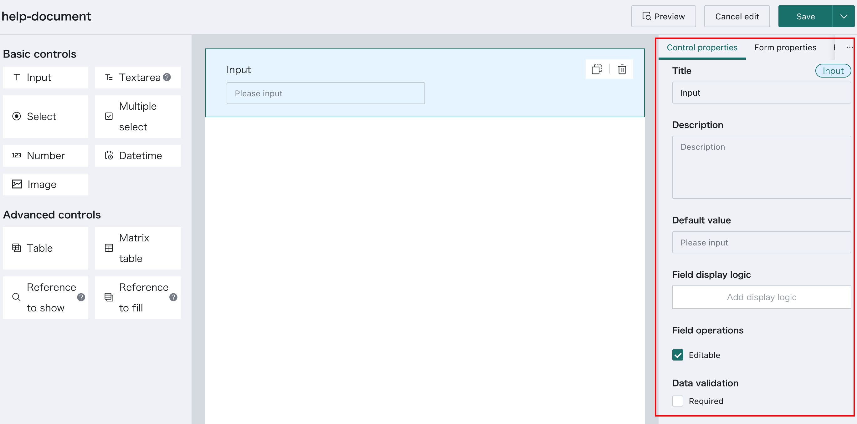
Control Description: These controls generate text fields.
Control Properties: The following are the common properties available for all controls, both basic and advanced. Control-specific properties are described in the relevant sections below.
| Basic Property | Description |
|---|---|
| Title | The form field name |
| Description | Helps form submitters understand what the field is collecting |
| Default Value | Supports custom input |
| Field Operation | Supports field editing |
| Data Validation | Defines whether the field is required. The default is optional |
Select and Multiple Select
Control Description: These controls generate text fields.
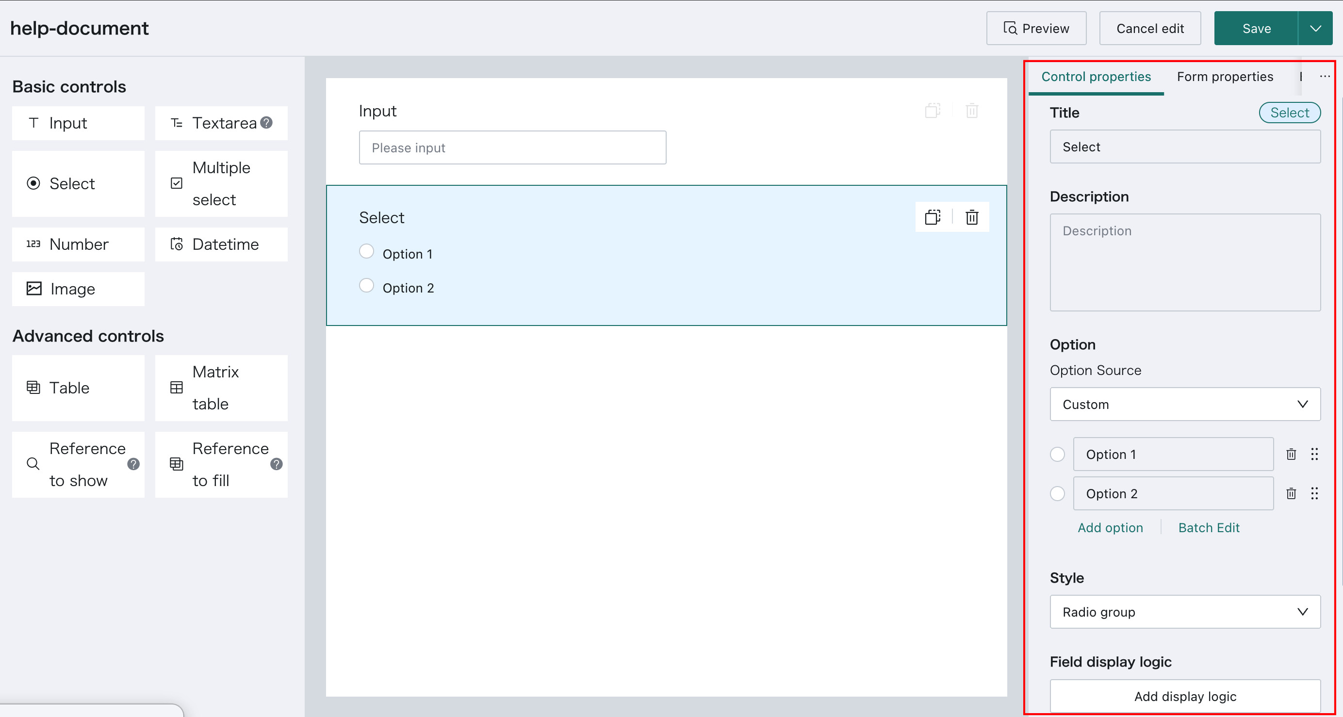
Control-Specific Properties: The following properties are specific to these controls, especially Style and Options.
-
Style: If the option source is
Custom, the style can be eitherRadio GrouporSelect.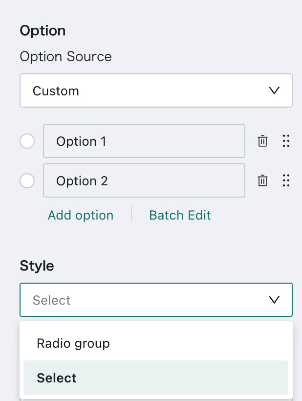
If the option source is
From Dataset, onlySelectis supported.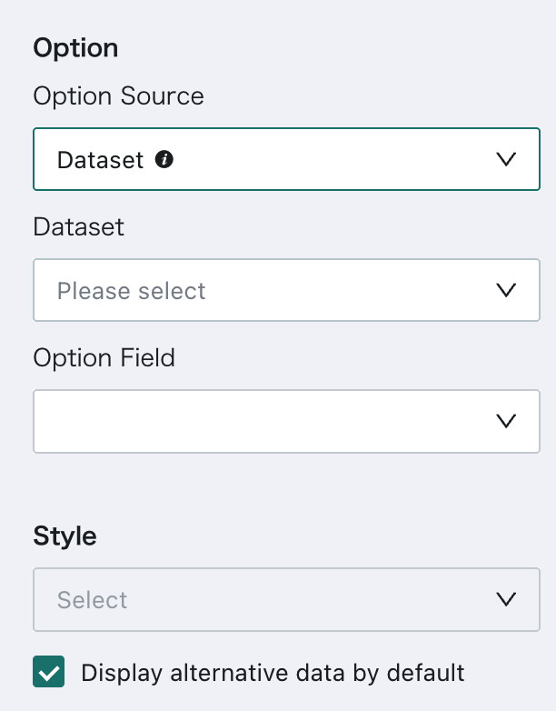
-
Options: If the source is
Custom, options can be added one by one or in batch, and their display order can be adjusted by dragging the icon next to each option.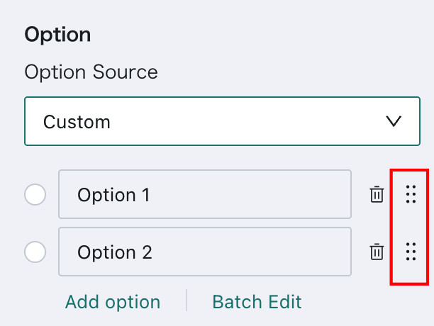
If the source is
From Dataset, filter conditions can be added inData Filtering.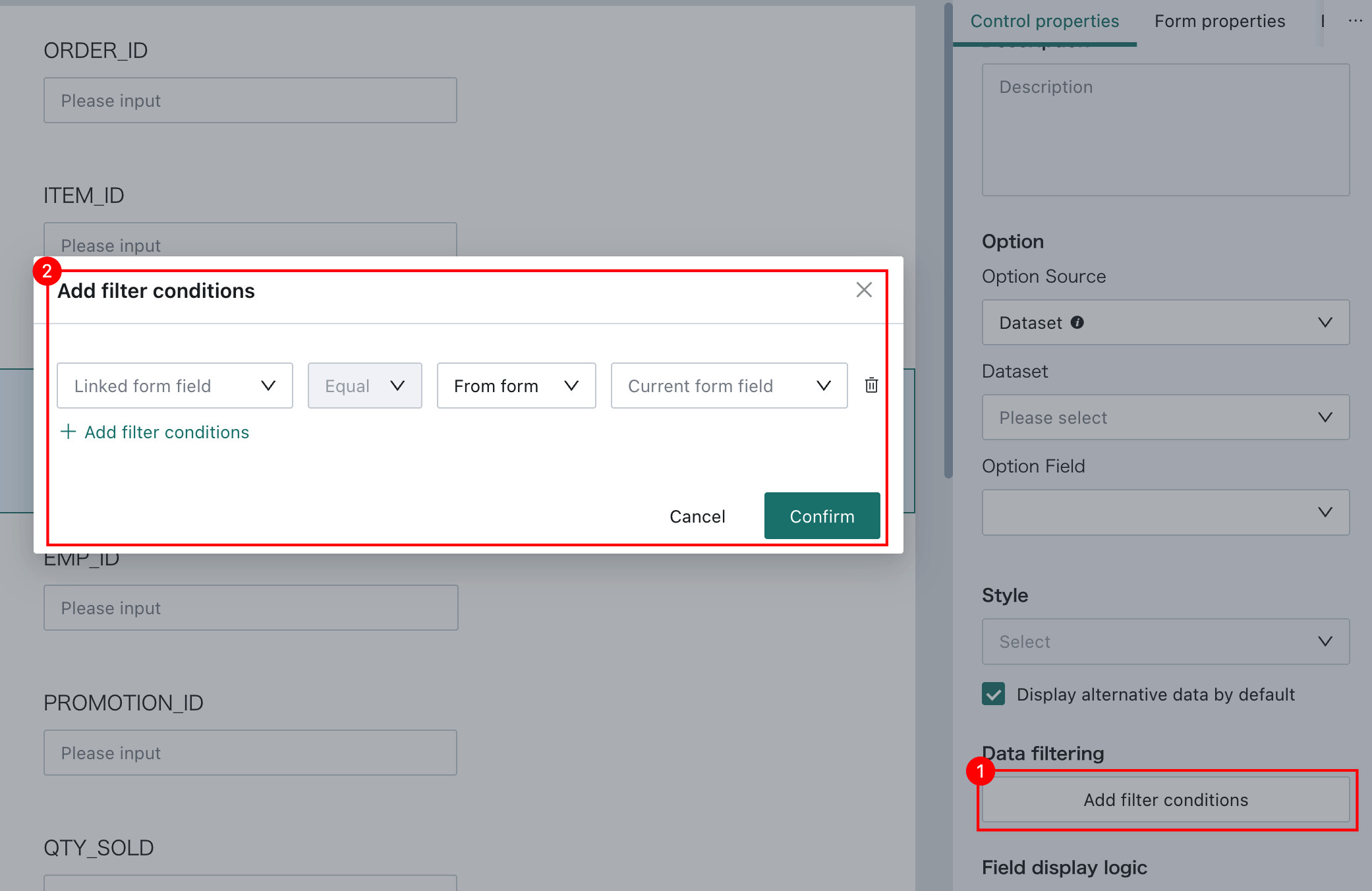
-
Field Display Logic: Controls can be displayed conditionally. When a single display rule is configured, the display logic dialog lets users define the conditions under which the current field should appear.
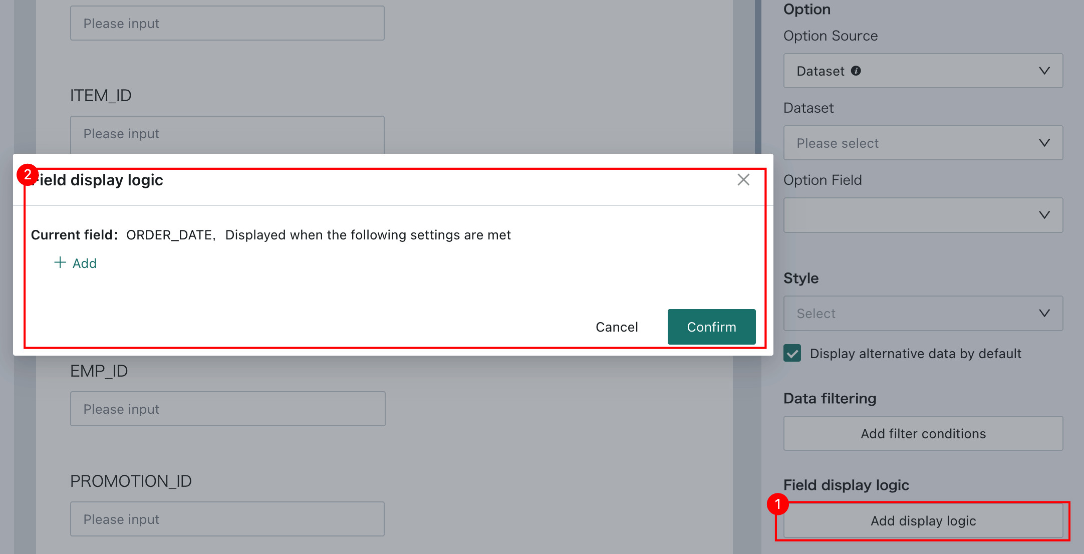
Users can also click
Addto define multiple display rules for the same field.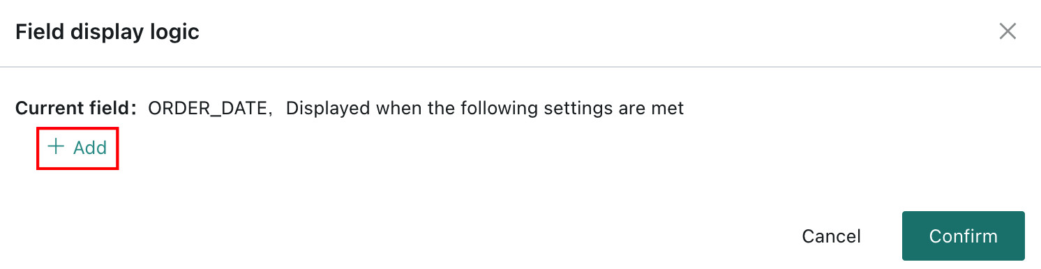
After display logic is configured, data collection behavior follows that logic. Any type of control can be conditionally displayed.
NoteEach basic control supports
Field Display Logic.
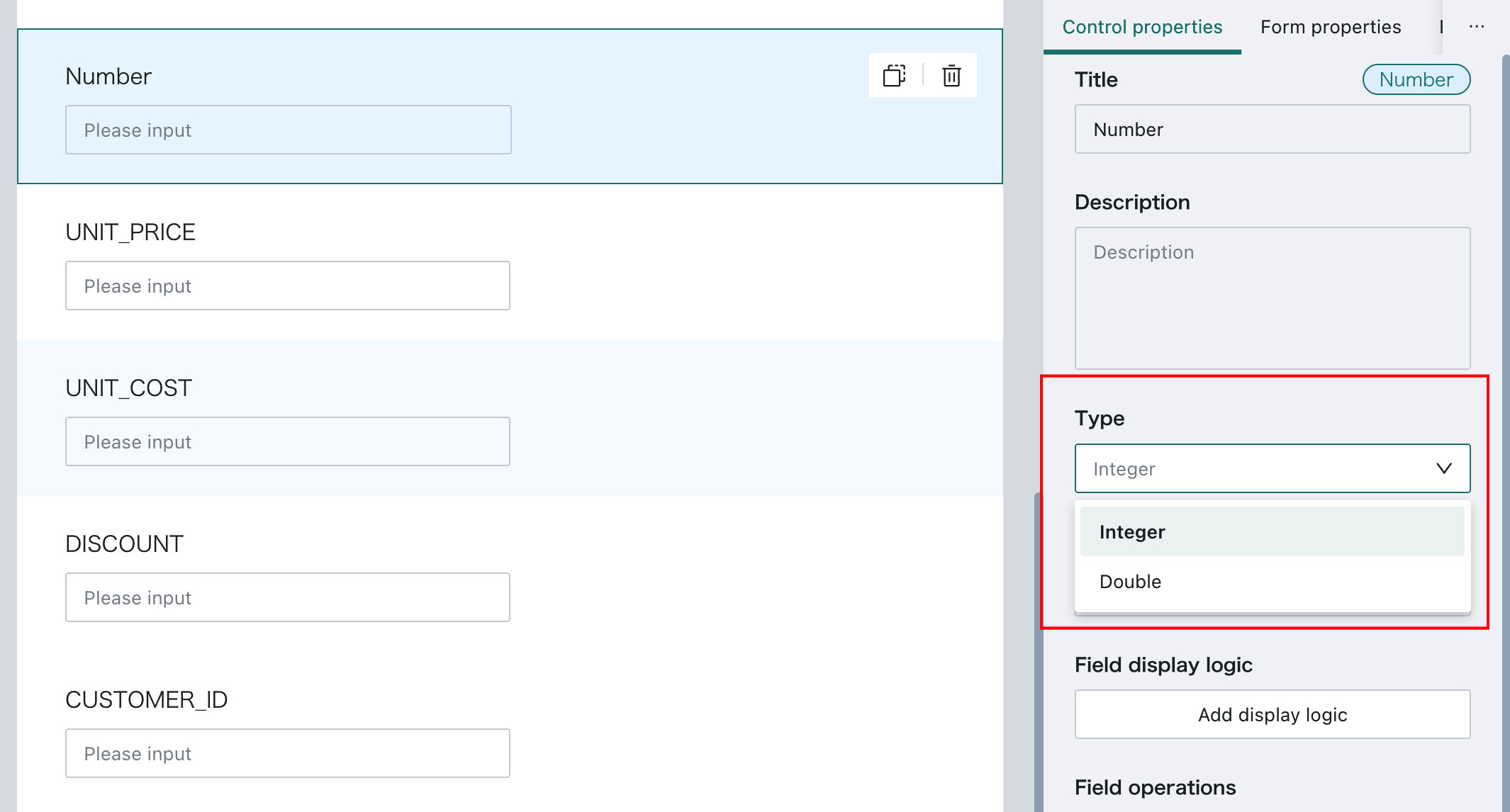
Number
Control Description: The Number control generates numeric fields.
Control-Specific Properties: Users can choose between Integer and Decimal. Decimal fields support up to 6 digits of precision.
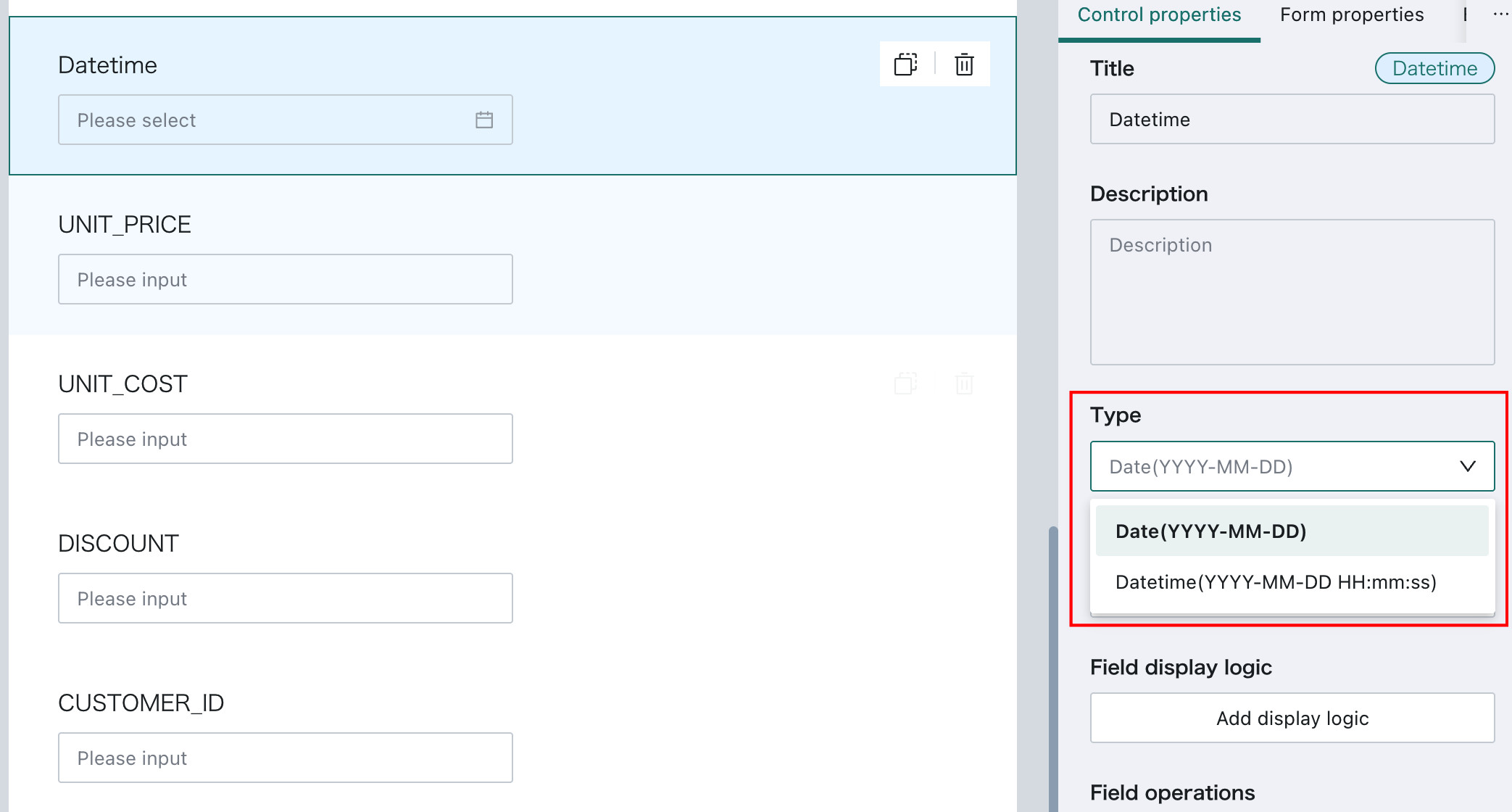
DateTime
Control Description: This control generates date-related fields.
Control-Specific Properties: Depending on the selected type, it can be Date or Timestamp.
Image
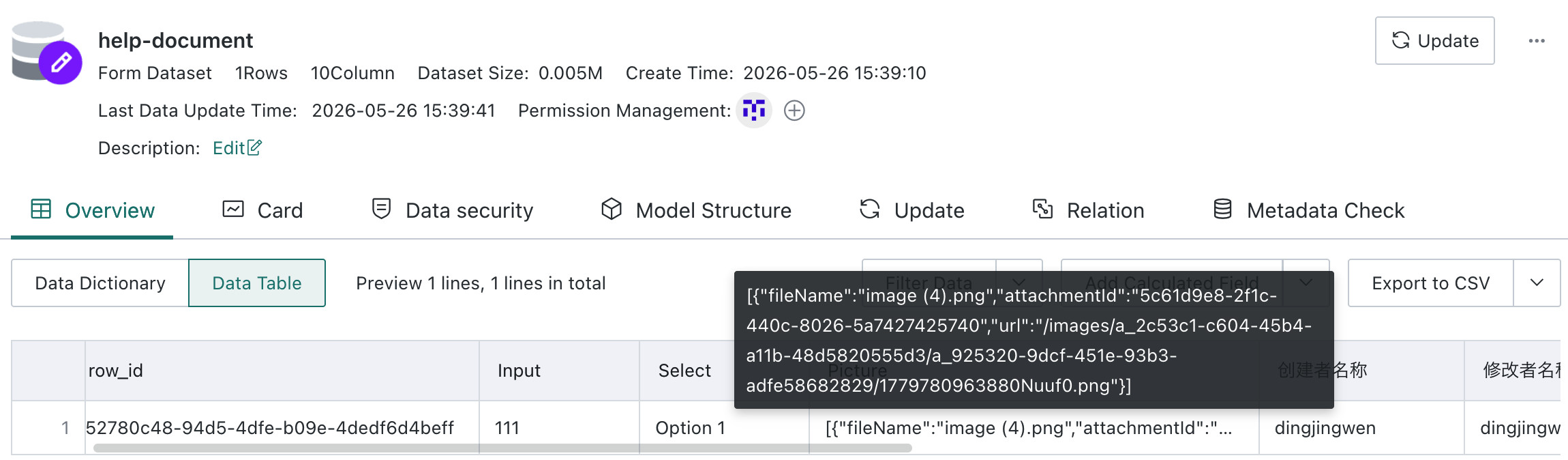
Control Description: The Image control supports jpg, jpeg, png, bmp, and gif. There is no file size limit during upload, but the uploaded image is compressed to within 1 MB. The maximum number of images supported per submission is configurable.
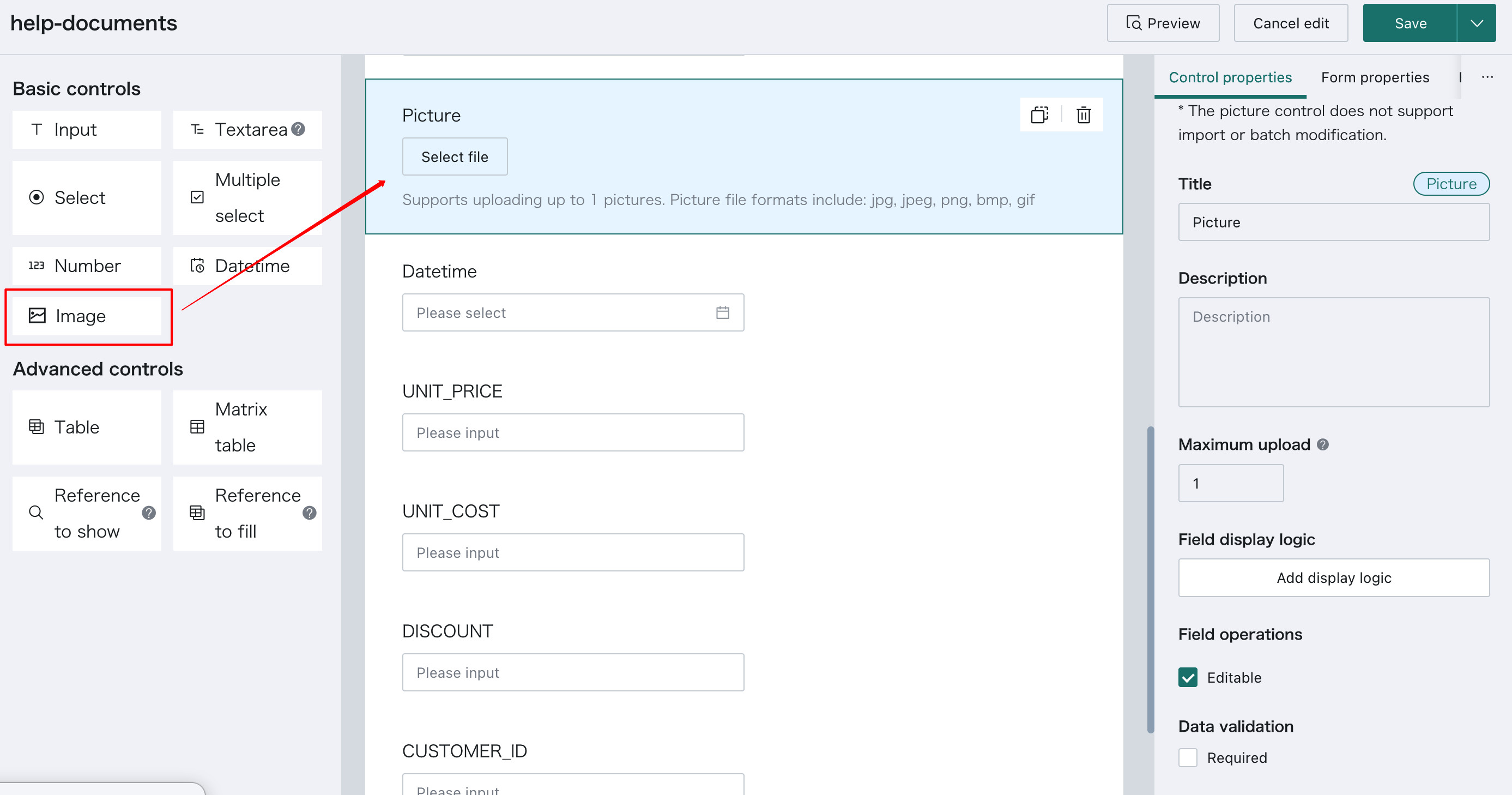
After an image is uploaded, it is stored on the BI server. The corresponding field in the form stores information such as the image path and file name, making it easier for other systems to use the image.
The Image control does not support Batch Edit or Batch Import Upload.
Advanced Controls
Table
The Table control inserts a child form into the current form. Fields inside the child form are created by adding controls. Currently, 7 basic controls and 1 advanced control, Reference to Fill, can be added inside a subtable.
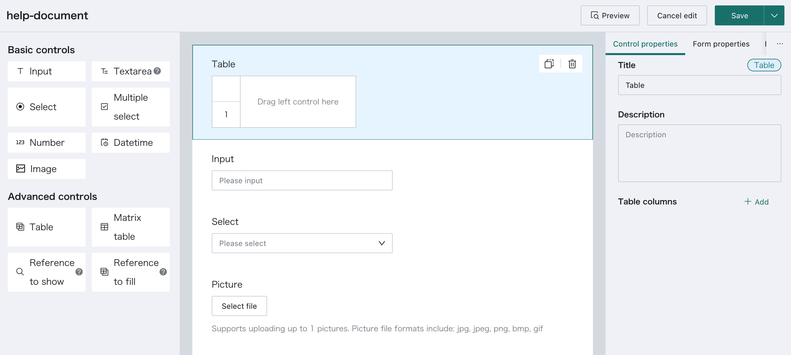
Controls can be added into the subtable either by dragging them directly into the table or by clicking Add in the control property panel.
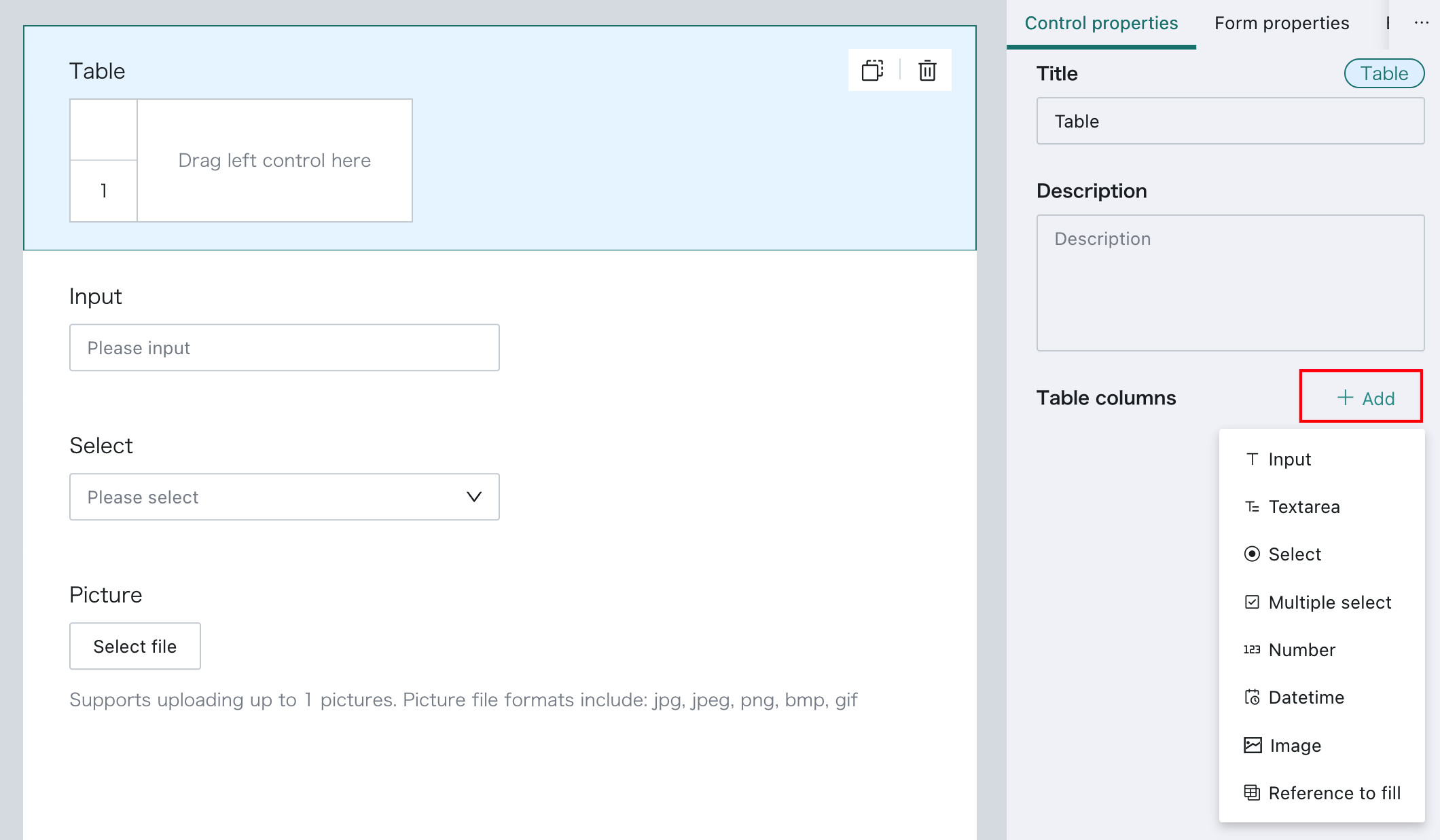
If the field order inside the subtable needs to be adjusted, users can drag the table fields within the property panel.
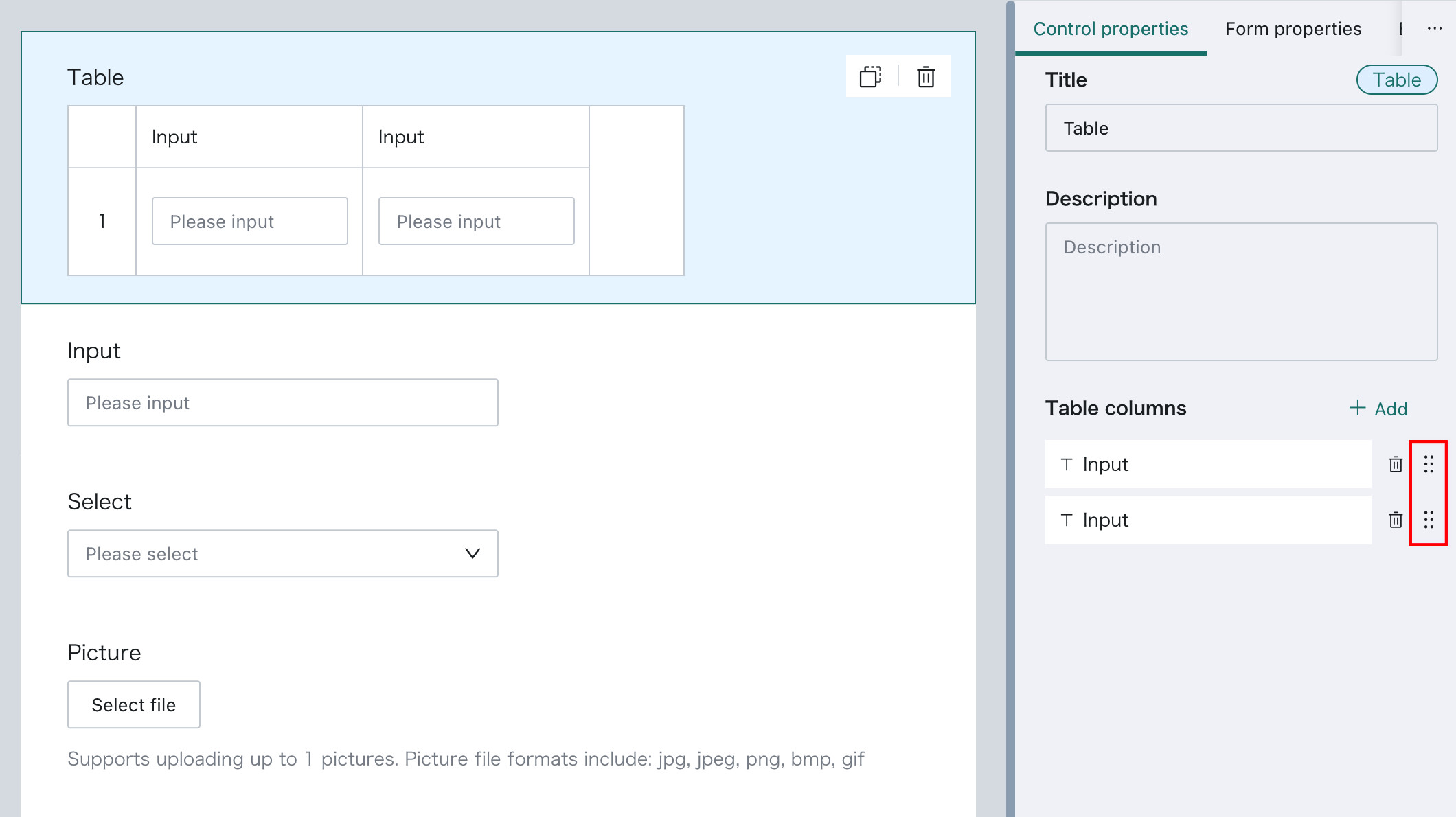
On desktop, Subtable supports Batch Add, through Excel import, and Clear, which is convenient for large-volume submissions.
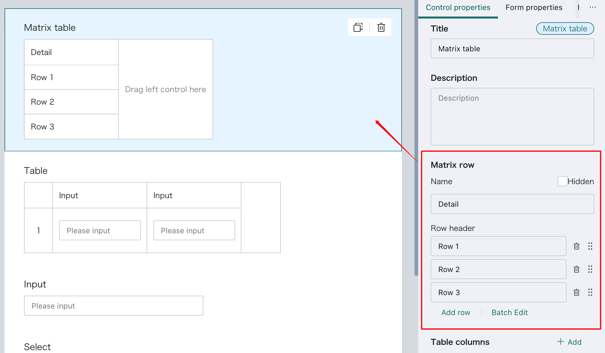
Matrix Table
Matrix Table is a special type of subtable with a predefined row count and row headers.
The first column, row header information, and row count can be configured directly. Other operations are the same as Subtable.
Reference to Fill
This control reads data across tables and fills data from other forms into the current form. The referenced data is saved as part of the current form data. This control can be placed inside a table control.
Use Case
In a store ordering scenario, when users enter order details row by row, they may need to input product name, unit, price, and order quantity. The first three pieces of information are relatively fixed master data and should always remain consistent with the product master table. Instead of asking users to enter those values manually, Reference to Fill can read them directly from the product master table and populate the current form automatically.
Usage
In addition to common properties such as Title and Description, Reference to Fill has five dedicated settings:
Related Table, Display Fields, Data Filtering, Batch Add, and Auto Display.
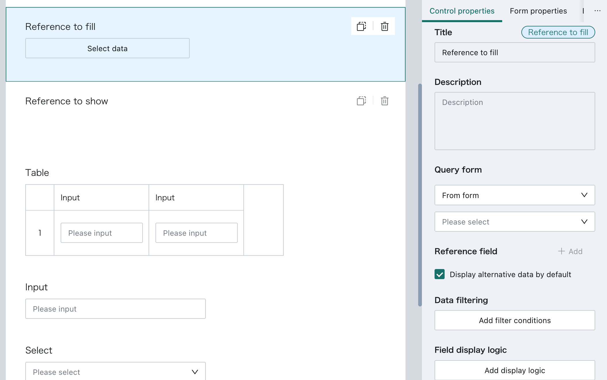
Related Table and Display Fields are used to choose which fields from another form should be referenced. Data Filtering is used to restrict which referenced data is shown in the dropdown list.
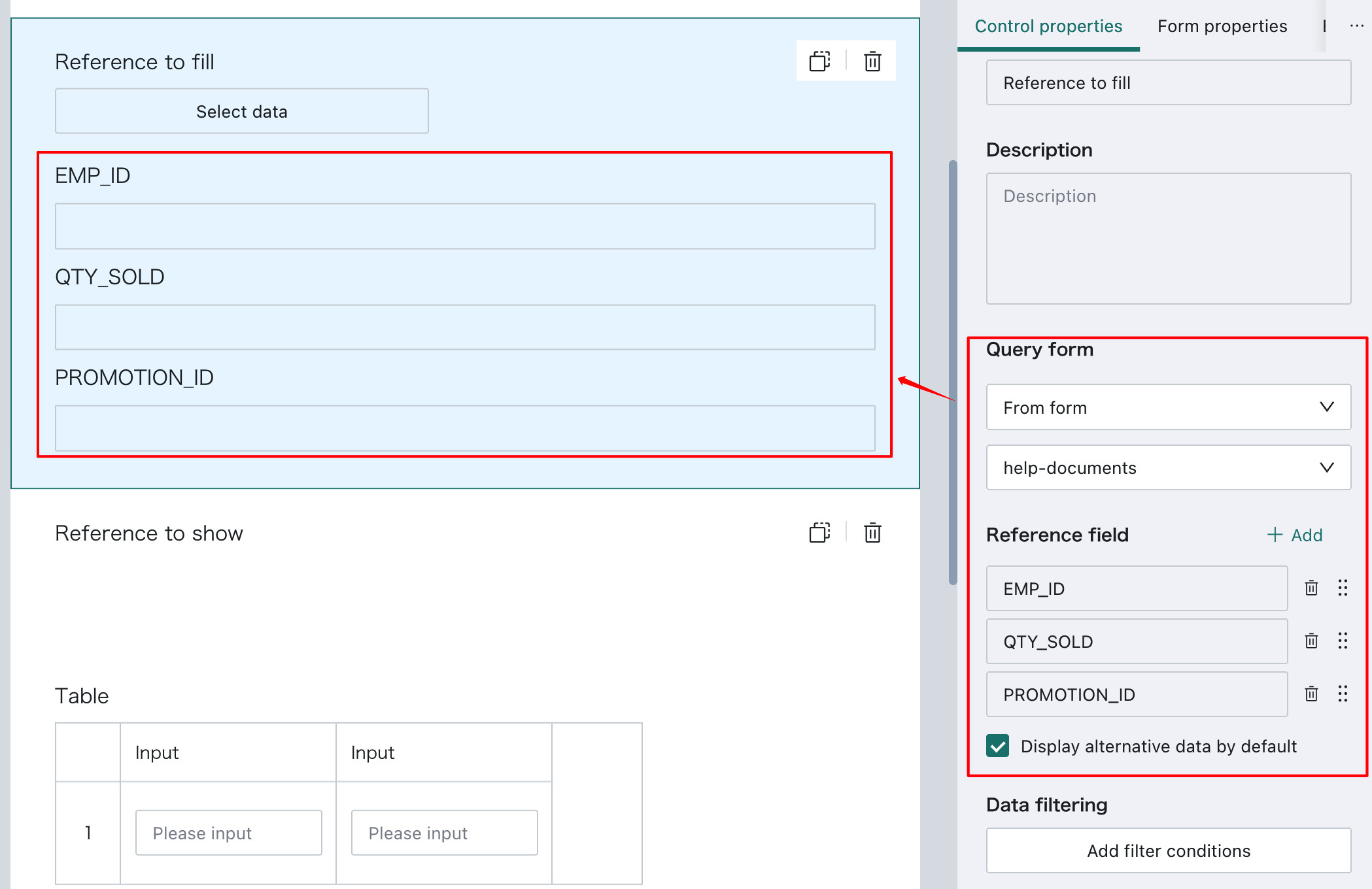
Referenced data can be displayed automatically by default. The setting entry is under Referenced Fields, using the option Automatically Display All Data.
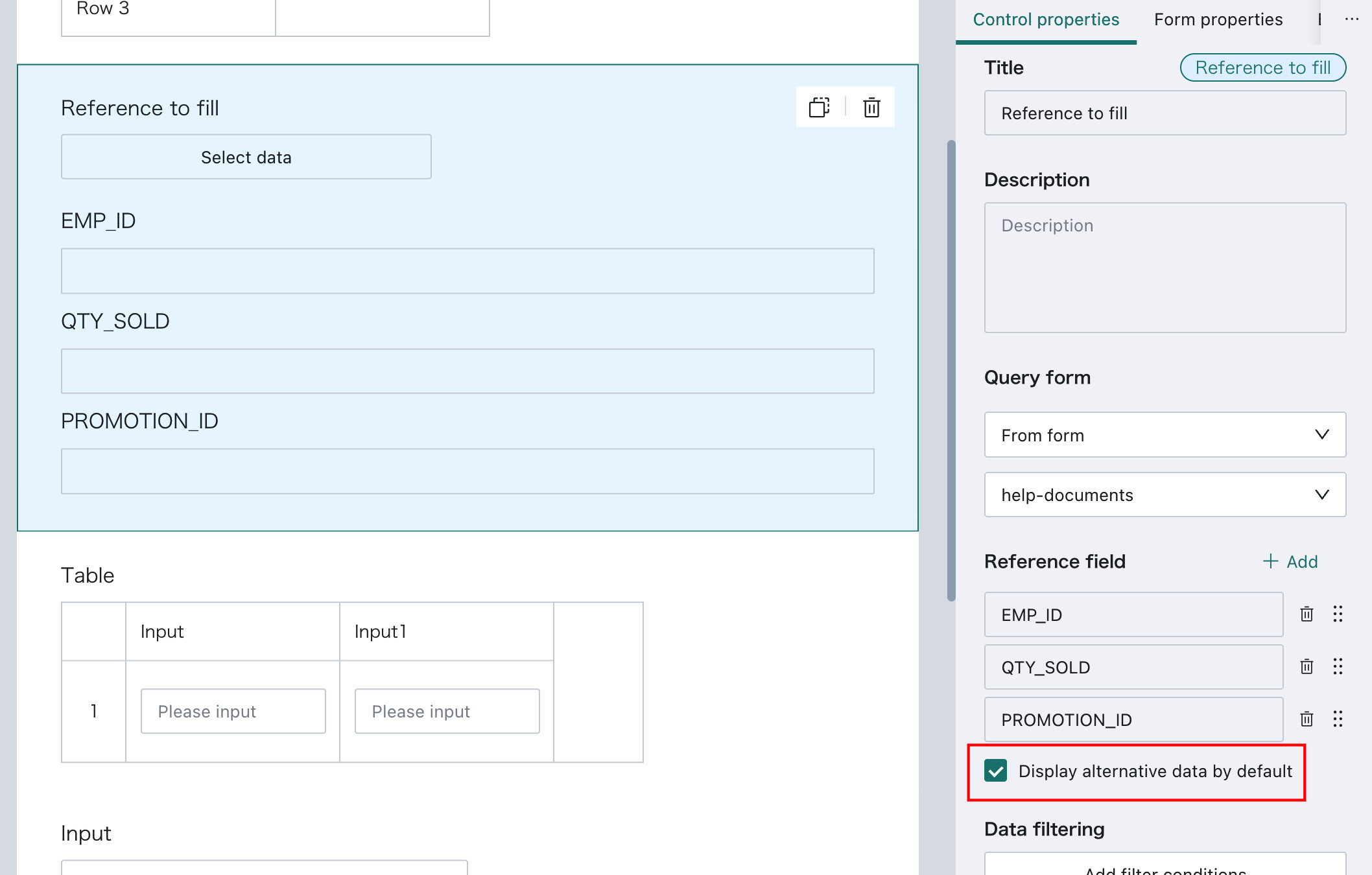
- When the Reference to Fill control is placed on the main form, it supports only one item and therefore does not support
Automatically Display All Data. - When the Reference to Fill control is placed inside a Matrix Table, the number of automatically displayed rows follows the row header count defined by the Matrix Table.
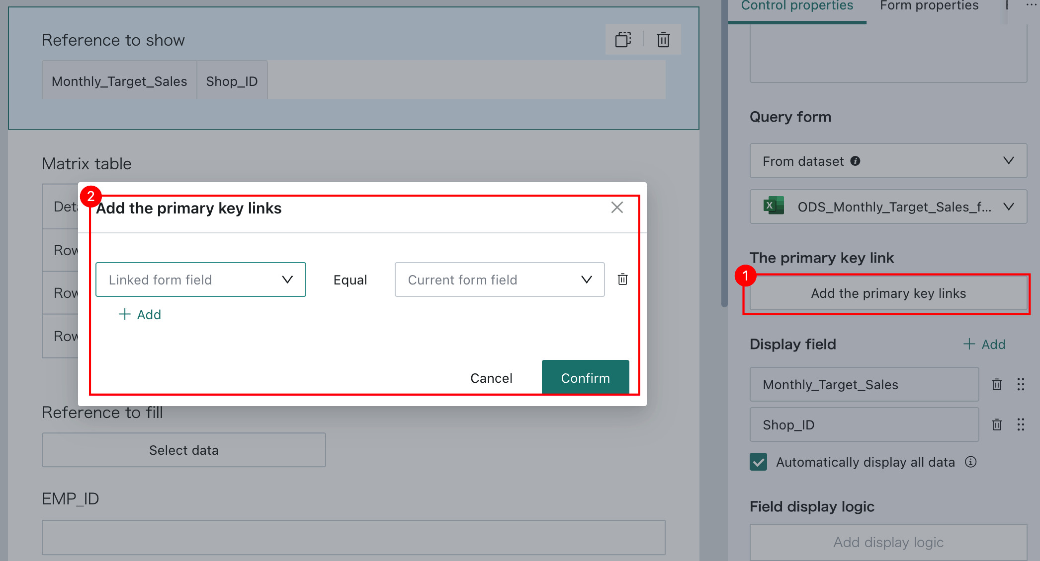
Reference to Show
This control reads data across tables and displays data from another form in the current form as reference information for the submitter.
Difference from Reference to Fill
- In Reference to Fill, the referenced data is saved into the current form as part of the form data, and the control can be placed inside a table control.
- In Reference to Show, the displayed data is for reference only and is not saved into the current form. Reference to Show cannot be placed inside a table control.
Use Case
For example, when a store submits this month's target, it may need to view last month's sales performance as reference information. If Reference to Show is not used, the store manager may need to switch back and forth across multiple data sources manually. With this control, the previous month's performance can be viewed directly in the current form.
Usage
In addition to common properties such as Title and Description, Reference to Show has three dedicated settings: Related Table, Related Primary Key, and Display Fields.
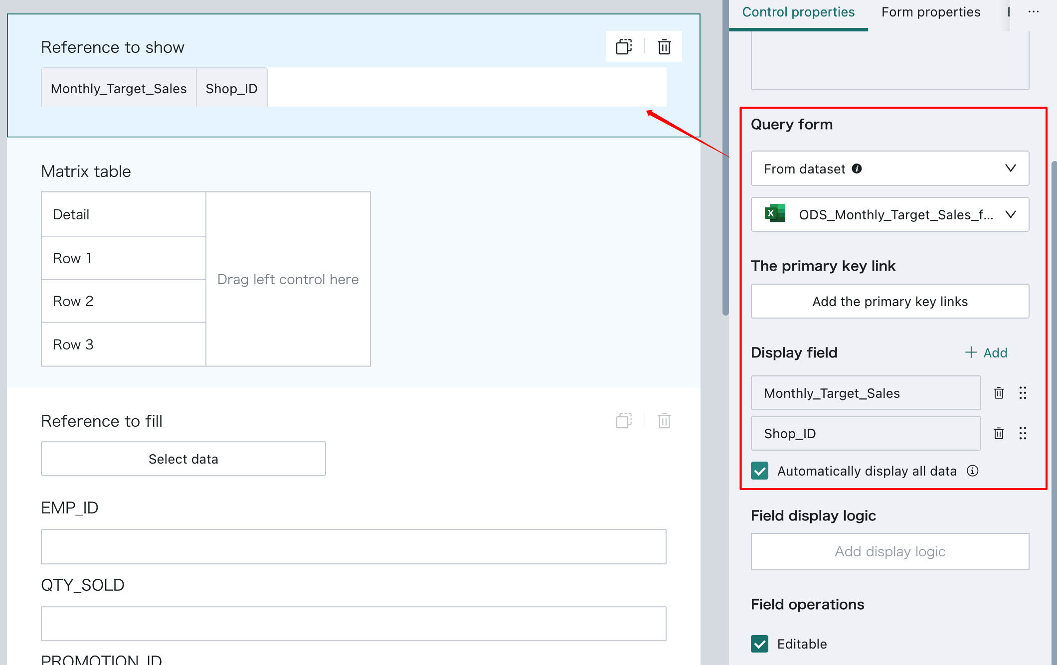
After choosing the related table and display fields, users need to configure the related primary key to filter the related table data and show only matching records.
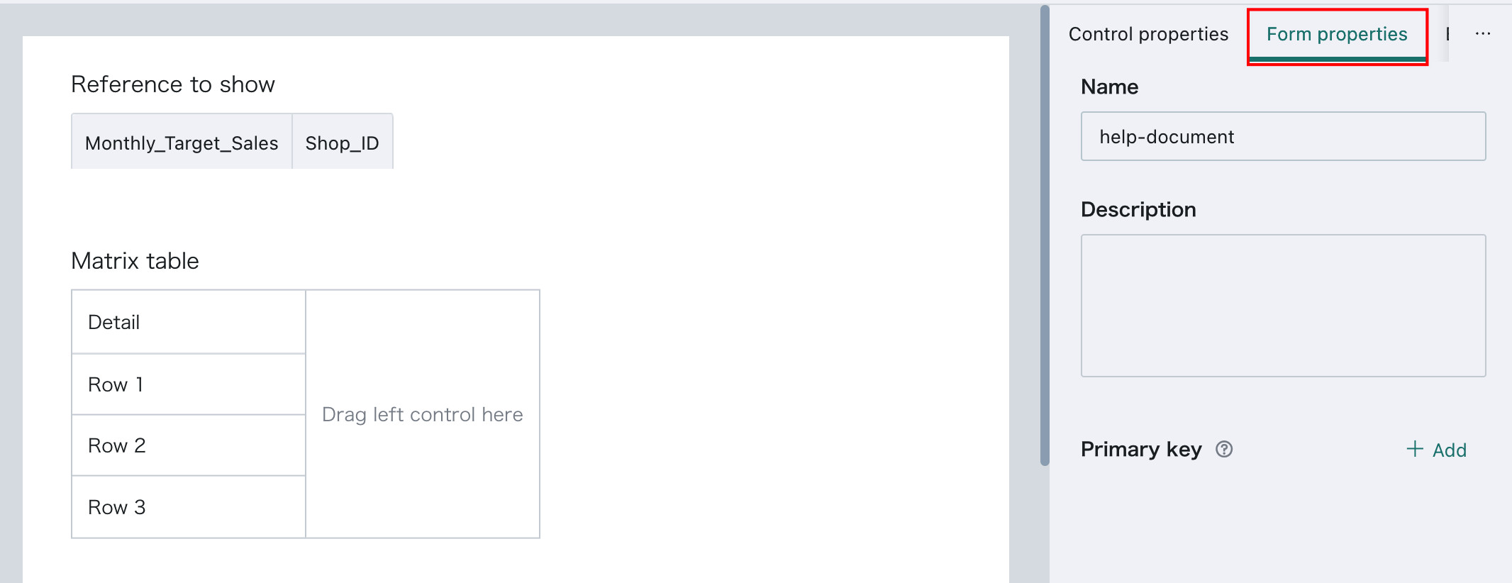
Form Property Configuration
After form design is complete, users can configure form-level properties such as the form name and description.
| Form Property | Description |
|---|---|
| Name | The form name |
| Description | Helps form submitters understand the purpose of the current form |
| Deduplication Primary Key | Changes to the deduplication primary key apply only to newly submitted data after the change and do not affect historical data. The configuration logic is the same as the deduplication primary key used in database integration. See Standard Database Connection Guide. |
After the form is published, users can configure data permissions for the form. See Form Entry - Data Management.
Notes
- Field names inside the same form cannot be duplicated.
- A form must contain at least one basic control.
- A subform must contain at least one control.
- A Reference to Fill control must contain at least one referenced field.
- Form names must be globally unique.
FAQ
Q: How do I configure multi-select for Reference to Fill?
A: You need to use Subtable or Matrix Table first, then drag the Reference to Fill control into the table.
Q: How do I access the data collected through Form Entry?
A: You can create a Form Dataset in Guandata BI, choose a form that you have permission to access, and then use the resulting dataset in ETL or Cards.
Q: Does Form Entry support submissions from users outside the organization?
A: No. Form Entry is positioned as an internal enterprise data collection tool and is strongly bound to the BI account system, including permission control for submitted data.